


|
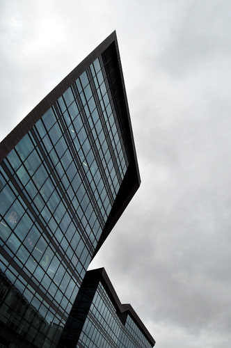
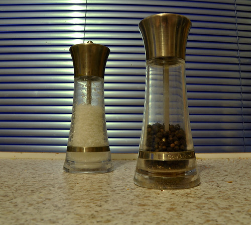
Pickman posted:The crop improves the image, but personally I think it would have been better if we could see what the model was looking at below the balcony. I would have liked to see a bit more of the street scene below as a backdrop. Failing that, it would have been good to see more of the models face, since she is now the focus of the image. I am still very new when it comes to photography so, take my critique with a grain of salt. I feel like the still shot would benefit a lot from some isolation. The blinds in the background are too distracting. I feel like if you had used a wider aperture to get a shallow DOF or shot it to a single colored background/foreground than it would help out. Also the composition of the shakers could use some work. I'm not really sure but the shot seems like it could use a better angle. I also find the fact that the shakers don't have an even level of salt to pepper to be distracting, though I think I am just being nitpicky with that one. I honestly couldn't tell you what to do in post as I only shoot film so hopefully someone else can chime in on that. In reference to the first photo, I find the Pac-man in the window to be far more interesting than the building itself. The Angle isn't really helping you out there and I feel like the shot would benefit in having more of the building in it as the top of the building is not very interesting. I have never had a critique done for me so I just kind of went into flickr and chose 3 random shots. Please rip them to pieces ") 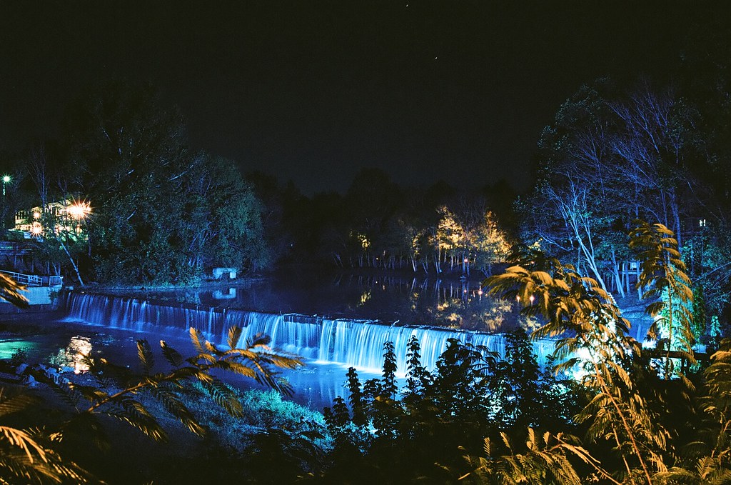 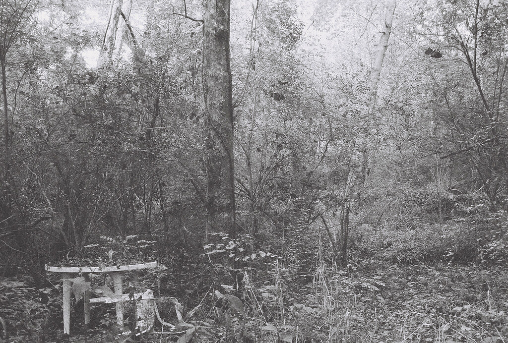 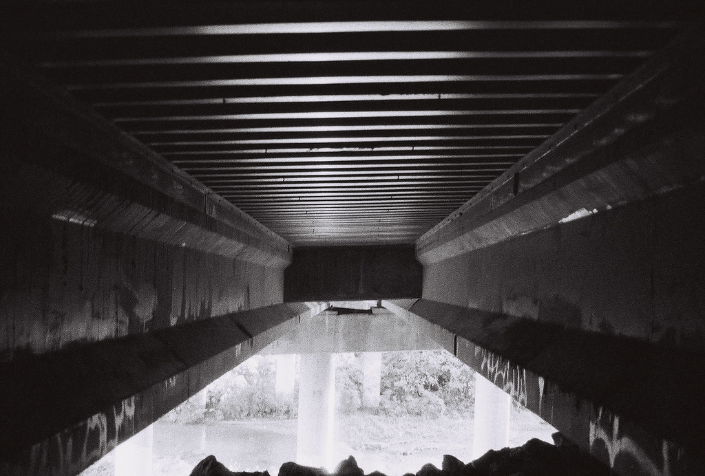
|
 #
¿
Dec 5, 2011 03:34
#
¿
Dec 5, 2011 03:34
|
|


|

|
| # ¿ May 3, 2024 05:18 |
|
|
Dread Head posted:I'll take a stab at this one. The color is a little too drab for me, and I feel like the image would be stronger if taken on a better day. I like the sense of motion from the waves, but without any context the image sort of falls flat. What about this spot interested you? Crosspost from SAD: 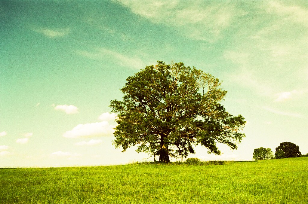
|
|
#
¿
Jan 13, 2012 20:28
|
|

|
Gazmachine posted:
I didn't mean disrespect to Dreadhead in anyway so I hope my post didn't come off that way Landscape photography is incredibly difficult and I am in no way qualified to judge anyone on it. I just went off the first impression as I have not seen much of his/her other shots, and was required to give critique before posting, and noticed his/hers hadn't been mentioned. The comment of the color was more geared towards the sky. The technical aspects are great but that much was obvious (I agree that the water looks great) so I tried not to focus on it. As for my shot, I drive by that tree quite a bit on the way to school/to see my girlfriend and friends. It's mostly farmland out there so the tree has always stood out for me and has always looked inviting. I tried to capture that feeling by getting the grass in the foreground leading a pathway up to the tree and show the isolation of the tree. The sky was also pretty good for the day and had a good amount of cloud to blue ratio so I wanted to include that, and with it being iso 50 film I wanted to make sure I had enough light although I might have gone too early in the day. But I do feel like the brightness and warmth of the sun could be inviting especially with the shadows and shade the tree create. As for the processing, it was shot on Velvia 50 film as I knew at that would saturate the colors and bring them out a bit. Unfortunately there's no place in my area that develops E-6 film so I had to get the film developed at the local lab and get it cross processed. I knew this would give an interesting look to the shot but not ruin the film. It is however unpredictable so a good bit of it was out of my control. I do not own any editing software and my negatives are scanned to cds. I apologize as I should have included a concise explanation of what I was going for with the shot in my original post, especially after the critique I gave. TLDR; Tried to make a tree interesting. pootiebigwang fucked around with this message at 00:55 on Jan 14, 2012 |
|
#
¿
Jan 13, 2012 23:51
|
|
|
AtomicManiac posted:
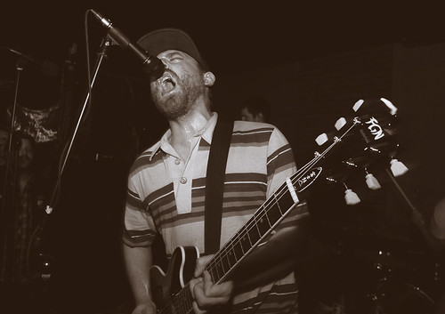
I like this. I'm a sucker for band photos and feel you captured the energy of their music in this shot. Gives me a pretty good indication of what to expect if I were to go see this band play. I am going to echo the previous critique in that there's not a whole lot to separate this photo from other band photos of punk/hardcore bands. Do you know this band personally or were you just in the crowd? See if they wouldn't mind you getting in there with them instead of the more onlooker perspective you have going on here. Also if the crowd is interacting in any way (dancing, moshing, general arm throwing) try and see if you can get them in the shot as well. I personally love a photo that shows the relationship between band and audience rather if it's the band interacting directly or the audience reacting to the music.  Self portrait on Tri-x 400. Bluntly spelling out my mindset. I have this whole meaning/explanation set aside but afraid of going into it for fear of taking poo poo far too seriously. Does this come off as cliche? I personally like it in that it looks a lot like how I imagined it would when going in to shoot it. I wish I could have gotten the top of my head to show as I had messed my hair up to reflect the "craziness" that I felt happening in my life at the moment.
|
|
#
¿
Mar 30, 2012 08:44
|
|
|
Revolucion posted:Have confidence in your work buddy, if you do it will continue to shine through what you do. Knowing your intention is a handy thing to have when trying to give you a critique that relates to what you want the photo to be viewed as. As far as I see it, cliché is only ever cliché if you intend it to be, if an idea is something of your own will and want, it can never really be cliché Yeah I have been going through one of those "Everything I shoot is poo poo and unoriginal" mindsets as of late. I feel like I have gotten the technical aspects down of taking a good photo but artistically it all falls flat. As for the meaning (apologies up front if this is too e/n), like I said the words "this is a boy" are reflecting my mindset. I don't mean "child like wonder" I mean I am emotionally stunted and haven't developed emotionally past a 16 year old. I have come to the conclusion that I put on a face and hide my true emotions. How I act when I am around people and how I actually feel are two completely different things. So I decided to hide my face behind how I feel instead of showing my face and hiding my emotions. I included the map in the background to kind of represent an "educational experience" (world maps/globes always make think of history classes) in that I have never dove too deeply into my own mindset. A death and some therapy kind of forced me to have an outside perspective on my life, actions and emotions and to say it has been enlightening is an understatement. If the top of my head was in the frame it would show a very chaotic hair style that reflected how chaotic I felt my life was at that point. I have my hand on my heart to reflect "This is me, this is how I am and I accept that." I wish there was something I could have included that reflects change as this mindset is something I am working on and realize is unhealthy and don't plan on keeping up. Apologies again for the e/n explanation but it's an e/n type photo (in my eyes) so I guess it fits. As for the color I agree. Not owning photoshop and working with film limits a lot of the extra post production work I could do. That said I am still pleased with it in that it does match pretty close to what I had in mind visually.
|
|
#
¿
Mar 30, 2012 16:37
|
|
|
TheJeffers posted:
I'm really not "getting" this shot. What was the intention going into it? Was this a seat you stumbled upon and just thought it was interesting or was it the scene as a whole? As I learned from my last critique, giving some indication as to what you are going for goes a long way to helping you get the best critique possible. In my opinion, your backgrounds are too distracting and the seat itself isn't too interesting. I feel like a good bit of what is bothering me is the angle in which it was shot. The way there are three different wall patterns clashing with each other (the brick pattern going into the wall with towels going into the floor) is not doing your shot any favors. I'm a fan of trying to take everyday objects and making them look interesting but I don't think it was achieved in this shot. If possible, try getting your lens a little more open aperture wise to isolate it from everything else. Keep at it! I'm waiting to get a roll of film back today so I'll post something later tonight after I pick it up. Edit: Got it! I was told by some friends to come shoot a BBQ that they have every other Monday. They want me to start doing it every time they have one as they want pictures to get more people interested. So far there are anywhere from 15-30 people attending at a given time. Same location every time. So basically all I did was document the evening and try to take pictures that weren't lovely. I basically shot it like I would shoot an event that I was getting paid for. This is my first time going into shooting with that mindset. I was working with low light and Portra 400 film so long exposures were all I took as I don't own a flash. 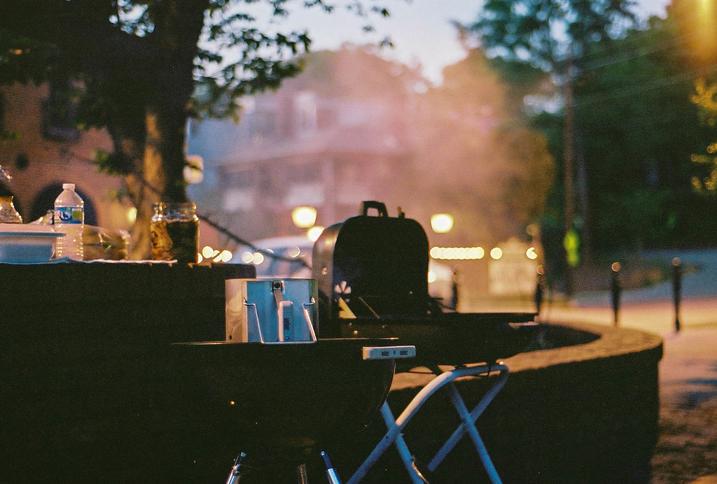 BBQ = grill. Liked the colors I got out of the film and wanted to get the grill while it was cooking food. Don't like the amount of grain but I guess that comes with the territory. I wanted to make sure it was strong compositionally and feel like I got that even if it was only a picture of a grill.  I wanted to get her because she seemed deep in thought in an event filled with motion and talking. I took a good bit of shots like this one where I was trying to capture the feel of the event. All the movement and excitement that usually comes with this shindig. People tend to be drinking a good bit, conversations happening everywhere, and the general feeling of the night being a blur (probably the beer). The lighting there is all over the map though and I wish there was something I could do to better control it yet still maintain that sense of motion that I am going after.  I then started shooting more portrait-esque shots against this brick wall. Basically pulling people aside and telling them to look into the camera. I really don't know much about portraits and directing so I figured it best to get a good bit of drinks into people so their personalities would come out. I think I might go with a center crop next time and avoid getting the water spout in the shot. So basically I'm looking for advice on how to handle event photography as I honestly don't have a clue as to what I am doing and I would like to. pootiebigwang fucked around with this message at 07:58 on Apr 16, 2012 |
|
#
¿
Apr 15, 2012 22:54
|
|

|
McMadCow posted:
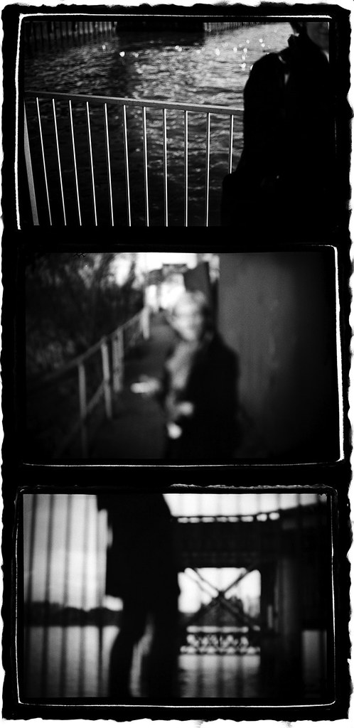
I am really happy to see conceptual ideas posted in this thread for once as I generally find those critiques more compelling and fun than the standard "rule of thirds, fix your focus, change color here..." critiques that tend to populate this thread. These are very compelling. Here's my half baked idea and this might be further from what you were going for but it is what speaks to me. I get the sense of a relationship that has gone arise, this person was obviously important enough to be photographed but at this point they might be more of a memory than something that is concrete and physical in the narrator's life as of now. As our own memories are generally just glimpses of a moment and are very rarely so vivid. Even memories that I have that I know are so vivd still have characters whose faces I can no longer make out as time as gone by. So it feels almost like a fond farewell in a way, to a person that might have meant a lot at the time this was taken, but as life moves on becomes more and more of a memory and whose face just fades along with the memory leaving only the semblance of a human and not a particular face. Apologies for the stream of consciousness/word vomit but it is immediately what I thought of when I looked at the image. Overall I think it is very successful in its story telling and feel the images have a good sense of balance and flow to them where I am not looking at any particular image and wishing it was different or removed. I have no idea if this is any way shape or form helps, but I have always really dug your work and I hope you pursue these conceptual ideas in the future.
|
|
#
¿
Aug 25, 2014 21:01
|
|
|
mulls posted:I think you're dead on. The middle one is weakest because the composition looks a little haphazard and the shadow over his face isn't so attractive. I think the first is the strongest because the gestalt silhouette is the most dramatic. I haven't posted in this thread in years so take my advice with a grain of salt. Portra rules and the color you got in the water is fantastic, and it balances really well with the sky. Flickr raped your sharpening, which is unfortunate, but the flickr way. Watch your edges though, the out of focus tree on the right isn't doing the photo any favors. But I would also challenge you to look outside of the pretty river. Don't get me wrong, if your goal was to take a well exposed photo of a river while you were walking/driving across the bridge, than I think you have rocked it, But proper exposure doesn't really make the photo interesting, and this is just a photo of a river, a river where upper class folks live on its banks, which in my opinion is kinda boring, at least when the only view is of their houses from afar. Get closer, the whole sweeping painterly landscape thing isn't necessarily the end all be all of landscape photography (look at the landscape thread for plenty of evidence). It's a finely exposed photo, but something tells me you can do more. Keep shooting, focus on composition and what is in your frame and rather or not the information matters. Pay attention to light and where it is falling as a scene will look dramatically different if taken at a different time of day. But definitely keep shooting film. I haven't posted my own work for critique in a long time and I desperately need to, so I hope some people come out and tear my poo poo to pieces. I have started (keyword is definitely started) shooting a project on the contemporary south. Mostly it's a reflection of myself through the southern landscape that I live in, but who loving knows if any of that is successful and is coming through. 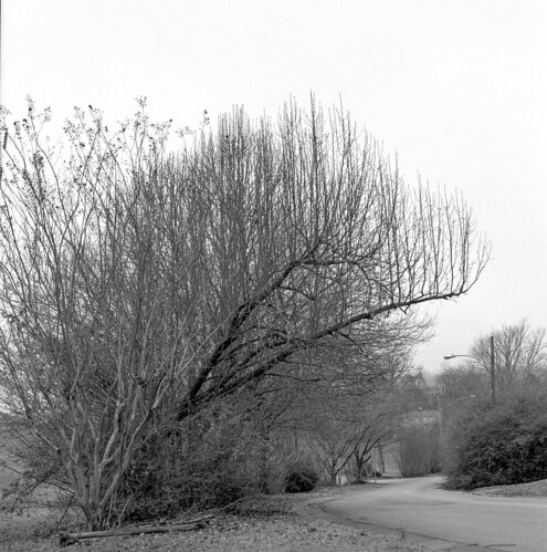 Untitled by Dev Luns, on Flickr Untitled by Dev Luns, on Flickr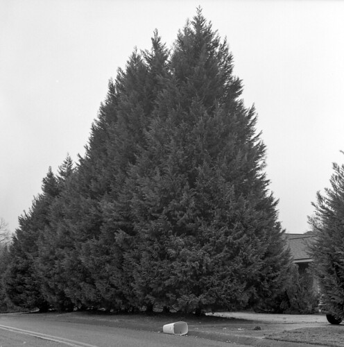 Untitled by Dev Luns, on Flickr Untitled by Dev Luns, on Flickr 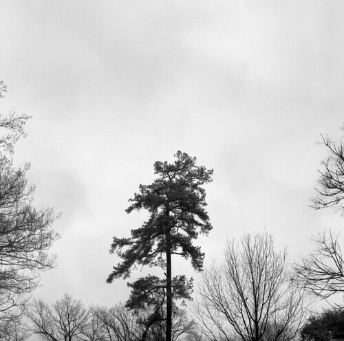 Untitled by Dev Luns, on Flickr Untitled by Dev Luns, on FlickrThis is just a bit of what I have started, and I am going to be working on this through the rest of the year. Please rip it to pieces and feed me any and all sorts of feedback. I am shooting daily/nightly so there is more that is coming out, but I would like someone else's view on this and what they see and any advice that can be given. EDIT: hosed up and didn't read the op so I removed a bunch, not trying to bogart the thread. pootiebigwang fucked around with this message at 08:22 on Feb 3, 2015 |
|
#
¿
Feb 3, 2015 04:41
|
|

|

|
| # ¿ May 3, 2024 05:18 |
|
|
thetzar posted:What you're doing here strikes me as one of those things that works better as a series than as singles. I feel like you're going for a Bernd & Hilla Becher sort of thing. If that's true, great, keep going -- but keep going. The only one of these that stands out to me as a single is the middle one, with the tipped-over trash can. There's a hint of a story/context there that I like. The first one has a tree in a nice shape, but I'm looking more a the road. The third is severely cropped� in an interesting way with the secondary branches framing the center tree � but very different than the others.. I think you should consider whether you want these to be singles � in which case they need to have the strength to stand on their own � or as a set, in which case more similarity needs to be sought (I think). The Bechers were rigorous about consistent framing and choice in subject. That rigor turned their work from 'here are a bunch of random photos of blast furnaces' into 'whoa, this has impact.' Thank you for the write up. Yeah these are all a part of a series and not really meant to be singles. I posted more before I edited it down but pretty much anything in my flickr from the last 2 months is in consideration, with the exception being some of the portraits, so please look through those as well as I would love to get more insight into what you think. I wanted it to be a reflection of myself and how I feel/see in my environment. Long story short I was looking for a more melancholic/quiet tone with a sense of isolation to be present throughout them but don't really know if any of that was achieved. I am also painfully bad at self editing (obviously), which I really don't know how to work on. I just keep shooting and hoping to start finding a common thread. I do love the Bechers and am a big fan of anyone involved in the New Topographics, so I would say that group is definitely an influence, though I don't know if I am looking to do a typology in the way the Bechers did, although this isn't the first time I have had my stuff compared to them and wonder now if it is a direction I should head in. As for yours I completely dig the feel and look that you have achieved. The lifeless rooms compliment the stiff parts of the body incredibly well. I do agree that the one portrait of the figure looking down doesn't fit as well with the rest of the series, mostly due to it having the outside world visible where the rest of the series is so focused on the lifeless work area. I would also say the thumbs up one doesn't work as well in my opinion as it feels lighter in tone to the others which have a haunting quality to them. I do love the consistent lighting in all of them and the work flows really well together. I don't think the mixing of the body parts is a bad thing, just as long as they have that puppetry look that Magic Hate Ball referenced (and they all do). Cool stuff. pootiebigwang fucked around with this message at 06:32 on Feb 9, 2015 |
|
#
¿
Feb 9, 2015 03:09
|
|