


|
I like where you're going quazi! I have been wanting to try similar stuff ever since I stumbled on John Doogan and Darby Hudson. Darby Hudson is actually an illustrator but he uses parts of images and PS in a lot of his work. I have a magazine with a tutorial in it of the 1st image of a circus
Hotwax Residue fucked around with this message at 02:34 on Jan 21, 2012 |
 #
¿
Jan 21, 2012 02:31
#
¿
Jan 21, 2012 02:31
|
|

|

|
| # ¿ May 6, 2024 11:53 |
|
|
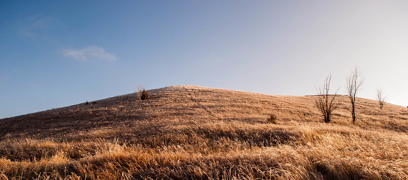
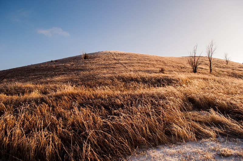
Mr. Despair posted:This is a shot I took a few months ago in the evening as some snow flurries were coming in. I like how there's a nice split down the middle between the incoming snow and the blue skies. I'm not sure which of these crops work better, or if I should try something else with this.  Tekapo Canal by Paul.Simpson, on Flickr  Mackenzie Country by Paul.Simpson, on Flickr
|
|
#
¿
Apr 6, 2012 22:14
|
|
|
onezero posted:This broke my brain as well. Incredible shot, and lucky to have so little wind. One question, the color blue is slightly different from the sky to the reflection...did you do some saturation adjustment on the water?
|
|
#
¿
Apr 7, 2012 21:09
|
|
|
Augmented Dickey posted:I want to do something with this one, but something just doesn't look quite right to me. Maybe i would benefit from a tighter crop?  Lake Hayes by Paul.Simpson, on Flickr  Orari by Paul.Simpson, on Flickr
|
|
#
¿
Apr 9, 2012 01:24
|
|
|
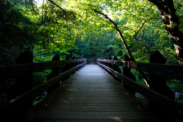
Break Fast posted:Speaking of noise, here is a photo I took some time ago. In the second one the path leads the eye nicely. The light seems a bit harsh and there is some blown highlights between the branches. That is always a problem when shooting trees/forests, the dynamic range is normally to big for your camera's sensor to deal with. Maybe you could reduce the exposure a lot and make it all dark and moody looking. -----  Autumn Poplars by Paul.Simpson, on Flickr  Hay by Paul.Simpson, on Flickr  Baa by Paul.Simpson, on Flickr Edit: VVV straightened the trees, thanks ")
Hotwax Residue fucked around with this message at 07:11 on Apr 20, 2012 |
|
#
¿
Apr 20, 2012 02:11
|
|


|
Wafflecopper posted:Landscapes are something I'm trying to get better at. I posted one in this thread a while back and it was critiqued (quite fairly) for having awkward composition. How is the composition in this one? Also it was obviously a cloudy day with flat lighting which I know isn't generally considered ideal for traditional landscape photography but I thought the mist and clouds gave a shot a kind of spooky, ethereal feel. However I did have to mess around with some graduated filters in lightroom to make the shot less flat. Did I pull it off?
|
|
#
¿
Apr 24, 2012 07:23
|
|
|
liwet posted:Another Drawing-a-Day resident here! I think this exchange thing is a pretty cool idea. TomR posted:Here is a photo of mine. ------  Crown Terrace by Paul.Simpson, on Flickr Scott Kelby says you shouldn't take dead tree photos but screw him ")  20120418-_MG_8883-Edit.jpg by Paul.Simpson, on Flickr
|
|
#
¿
Apr 25, 2012 04:51
|
|
|
aliencowboy posted:1. This feels a little too weighted to the right because of where the hills fall off and the horizon being a little crooked. This is nitpicky stuff for the sake of being nitpicky. It's a landscape and it works. You do these well. I love the simplicity of your second two shots. Who knew a pair of shoes could be interesting! The only nitpick I have is the sky in the third shot is a little bright and drags my eye away from the beautiful tones of the car. Great work as per usual. fivre posted:
|
|
#
¿
Apr 25, 2012 23:11
|
|

|
I feel like this one should be more neutral, or maybe a bit more contrasty. And maybe a little too much room on the right? Just nitpicking really.aliencowboy posted:------- I'm struggling with this one. It is two exposures blended manually, but I just can't seem to get it to look right to my eyes.  Bob's Cove by Paul.Simpson, on Flickr Hotwax Residue fucked around with this message at 07:41 on May 9, 2012 |
|
#
¿
May 9, 2012 04:17
|
|


|
dukeku posted:Trying out slides at night, metering is a little tricker than with print film. Cacator posted:Here's a few I took on a trip to Switzerland and exclusively used an X100: tijag posted:I figured out all my color issues and can now actually post something that looks like it did in Lightroom. Hotwax Residue fucked around with this message at 07:11 on May 12, 2012 |
|
#
¿
May 12, 2012 07:05
|
|

|
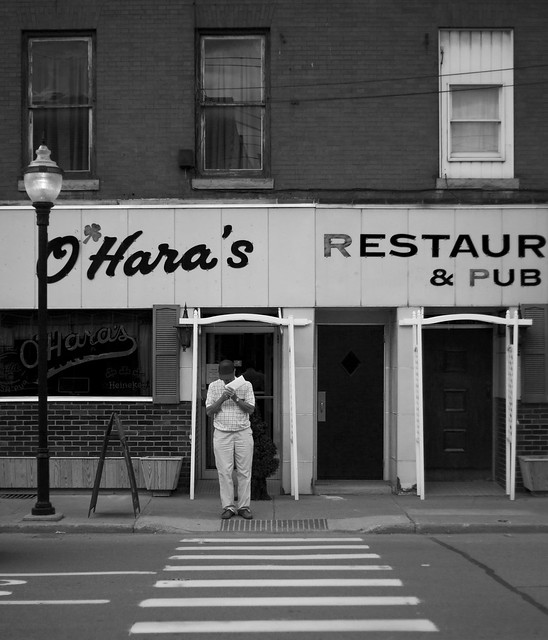
I like how the person is framed by the white thing and the eye is lead nicely by the crossing, but I still think there is too much going on in the image and the guy is a little small. You could crop it just above the O'Hara's sign and I think that would make it stronger. ----- Too blue?  Disappearing Act by Paul.Simpson, on Flickr e: wasn't straight 
Hotwax Residue fucked around with this message at 05:19 on Jun 10, 2012 |
|
#
¿
Jun 10, 2012 04:20
|
|
|
LargeHadron posted:No, but crop the left to make the trees even on both sides.
|
|
#
¿
Jun 10, 2012 05:17
|
|
|
Voronoi Potato posted:Thanks Torgeaux, I was wondering what he meant exactly and that makes much more sense. I'll keep posting here and hopefully I'll get better. -----  Remarkables by Paul.Simpson, on Flickr
|
|
#
¿
Jun 12, 2012 02:14
|
|

|
Oprah Haza posted:Meh, haven't really shot much of anything at all lately. ------ I tried to hold myself back from maxing out the contrast slider and smashing the blacks 
|
|
#
¿
Jun 22, 2012 05:15
|
|

|
CarrotFlowers posted:I'm a big fan of your landscapes, always have been. I really like this one too. The colours are gorgeous, and the bridge is nicely exposed in contrast to the water. I do feel like it's been done a lot though. I know a lot of your other landscapes feel quite a bit more original to me, so while I think this is very pretty, I also think it was an easy picture for you to take so I'm not quite as impressed as I usually am. VVV Thanks! I don't think I have enough foreground to do that without losing a good chunk of the sky unfortunately. Hotwax Residue fucked around with this message at 08:40 on Jun 22, 2012 |
|
#
¿
Jun 22, 2012 07:53
|
|
|
Dread Head posted:My summer solstice.
|
|
#
¿
Jun 23, 2012 21:55
|
|
|
xzzy posted:Are they making plans to rebuild it? I hate seeing old buildings fall apart.  Probably to late to save it now, unfortunately. Probably to late to save it now, unfortunately.
|
|
#
¿
Jun 28, 2012 21:06
|
|

|
sensy v2.0 posted:
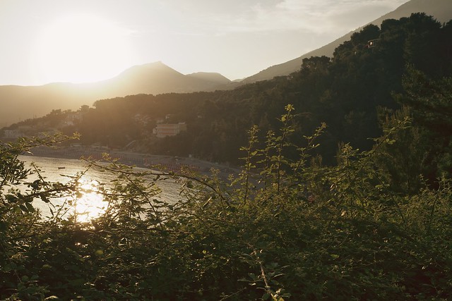
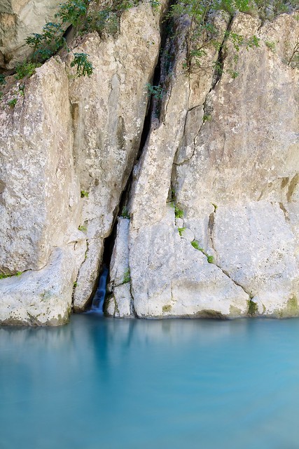
The 2nd image has some nice tones and what looks like an interesting beach but the plants in the foreground take up way to much space and kind of block what I really want to see. With the last one I think you could have zoomed in a lot more on the waterfall. With nothing to give a sense of scale it would have had people trying to figure just how big/small it really is, which would have added more interest I think. ----  Foreground is a bit meh
|
|
#
¿
Jul 8, 2012 23:36
|
|

|
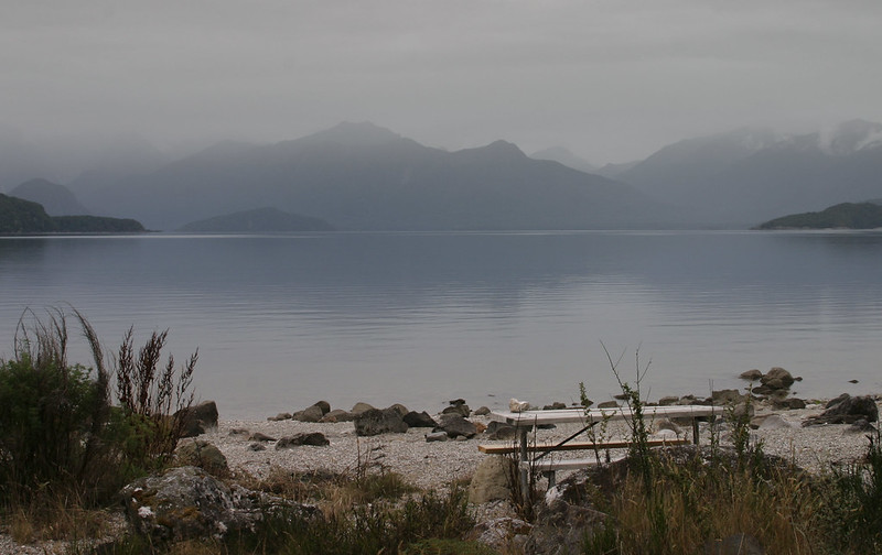
The Clit Avoider posted:Something about this just doesn't scan properly to my eyes. The composition is conventional, but I think with the colour profile and, the (shall we settle for uninteresting?) foreground, there's a large area in the picture that doesn't really do much. Part of the reason the foreground fails to draw attention is that it's quite small and almost seems as if the beach-head was included as an afterthought. The mountains are the obvious focal point, and are great, but I'd like to see the framing either 2 feet forward (cutting out the end of the beach-head, and just making the picture the tide and mountains) or 2 feet back and a looser crop (giving more top space, but also introducing more foreground). At the moment it feels a little too tight at the top and bottom and with the cool blue shade being the prevailing colour it doesn't quite work for me. Leviathor posted:My feeling is that it looks claustrophobic for such a grand scene. The lack of foreground and almost telephoto-like compression leads me to think this is a crop from the original 25mm framing. Thanks guys. I knew something wasn't right, aside from the boring foreground, but I couldn't put my finger on it. I think you're right about the claustrophobic feeling. The interesting thing is that it isn't a crop of the original shot and I was as low as my tripod will let me get. White balance has been difficult as well for some reason. Looks like I'll have to head back there for another go, which isn't very exciting because it was cold as gently caress
Hotwax Residue fucked around with this message at 21:20 on Jul 9, 2012 |
|
#
¿
Jul 9, 2012 21:15
|
|
|
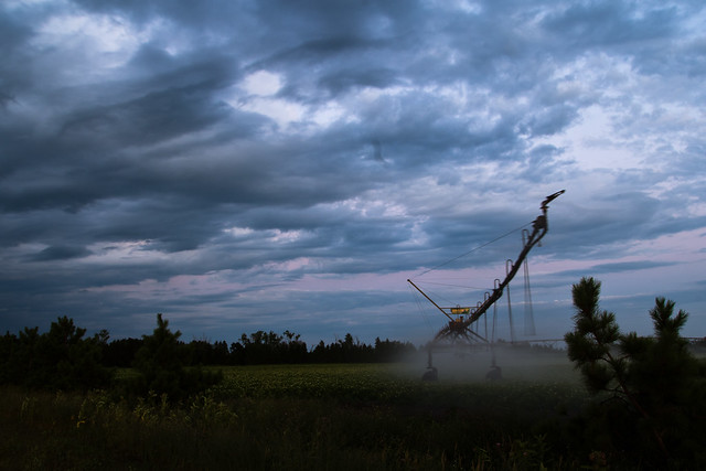
The love the tones in the 2nd one but I don't like how the irrigator exits the frame. It leads the eye out of the frame and just doesn't quite seem right. Apply the processing of the 2nd shot to the last one and I think you'd have a winner.
|
|
#
¿
Jul 12, 2012 08:10
|
|

|
geeves posted:
--- I tried something new. Not overly happy with the result but keen to have another crack at it.  Stary Sky by Paul.Simpson, on Flickr
|
|
#
¿
Aug 10, 2012 04:23
|
|
|
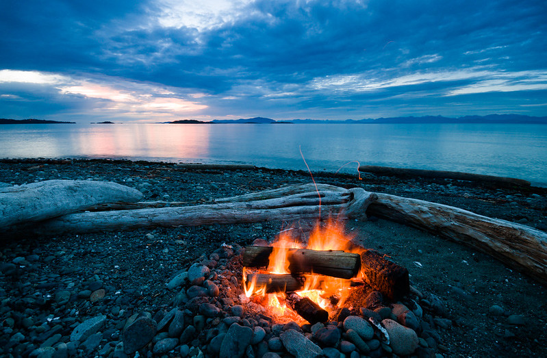
Falco posted:This is fantastic. The foreground and sunset are great themselves, but throwing in some stars was a real stellar move. Do you usually try to nail hyperfocal focusing on shots like this? I haven't had great luck with that, but feel its the only way to get everything in focus. I don't usually bother with hyperfocal, the distance markers on my wide angle only go to 3 feet and then infinity anyway. My normal technique is to focus about a third of third of the way into the photo which, most of the time, is close enough to setting the focus ring to infinity.
|
|
#
¿
Aug 11, 2012 20:58
|
|
|
geeves posted:Actually getting a better shot of the stars would be what you can improve.. But you need the 85L to do so. xenilk posted:I'm curious but what are you not happy about?
|
|
#
¿
Aug 13, 2012 05:27
|
|
|
David Pratt posted:Since a couple of people mentioned this, I uploaded the b&w version without the split toning or contrast adjustment:  torgeaux posted:
----- Tried another night time landscape. I'm worried that it looks to much like day time. I tried making it darker and less blue, but it just didn't look right to my eyes and processing night photos isn't something I'm used to.  Remarkables at Night by Paul.Simpson, on Flickr
|
|
#
¿
Sep 15, 2012 20:15
|
|

|
This one seems to have been missed. I really like the depth and drama of the shadows. They fit the overall mode of the the photo well, and all the important elements are well lit. The brightest part of the bath competes with her face a bit too much though. And those white doors in the background are a little distracting. All fixable though ----  Waves by Paul.Simpson, on Flickr And still playing around with star photos  Sunset Stars by Paul.Simpson, on Flickr
|
|
#
¿
Sep 27, 2012 07:52
|
|

|
dopaMEAN posted:
----  Hotwax Residue fucked around with this message at 20:13 on Nov 28, 2012 |
|
#
¿
Nov 28, 2012 06:23
|
|
|
dopaMEAN posted:I think the next thing I'd like to figure out is how to adjust depth of field. From the brief primer my aunt gave me on the camera, it sounds like I could control how much of the background was in focus using this, but I can't figure out how to make it work yet. I should probably grab a photography book from the library, now that I'm thinking about it. rio posted:I feel that while well executed, the wood in the foreground is not as interesting as the location itself, and I wish I were just looking at a straight up landscape featuring less water, the mountains/treeline and more sky. I also think that if you want to include the elements on the left of the photo that they should be more prominent. As they are now, it seems to be more of a distraction than an integral part of the composition. With your photo I think you're including to much environment. My eye keeps getting pulled towards the white building at the top and its pretty busy up there.
|
|
#
¿
Nov 28, 2012 08:42
|
|
|
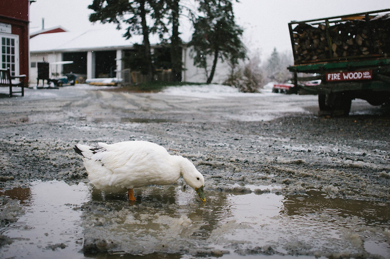
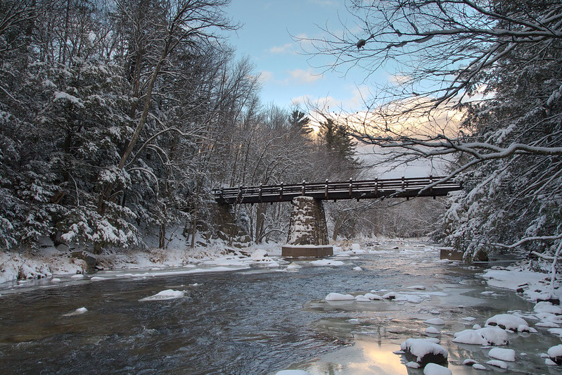
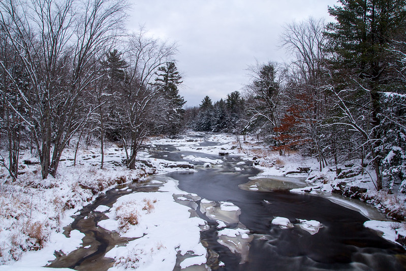
Casu Marzu posted:Wide angles are cool. This building structure thing is cool. It would be nice if you could lighten up the darker portion of the structure to get a bit more texture out of it. It is a shame the bird in the background isn't whole, I might have been tempted to crop/clone it out, but otherwise I really like the framing. I think the 3rd is the stronger of the 2 river photos, it feels colder and more wintery. Shampoo posted:
-----   Not sure if the cows are too small but unfortunately I couldn't get any closer. Hotwax Residue fucked around with this message at 03:47 on Dec 13, 2012 |
|
#
¿
Dec 12, 2012 19:41
|
|
|
LargeHadron posted:Here are a few of my own. I've had this shot sitting around for a while, I'm not so sure about the sky or how dark the rest of the image is. 
|
|
#
¿
Apr 28, 2013 03:16
|
|


|

|
| # ¿ May 6, 2024 11:53 |
|
|
Dren posted:I like the second one a lot because fog but you've pushed the blue and the green too much in the first one and it comes off looking a bit unnatural. I disagree, I don't think it looks unnatural at all. I think the full sun is hurting the image a little though. The fog photo I like but the bottom seems a little chopped off.
|
|
#
¿
Jun 26, 2013 21:21
|
|