


|
huskyjackal posted:
You can never save a boring photo with trendy processing. If it's boring, it's boring. Discard and try again. Right now with the colours and the way the dog is staring at me, I feel like if I was on drugs I'd be tripping out.
|
 #
¿
Nov 13, 2012 04:50
#
¿
Nov 13, 2012 04:50
|
|


|

|
| # ¿ May 21, 2024 23:55 |
|
|
Oprah Haza posted:Yeah I'll finish the set and put it up once it's ready. I don't care for the "oh, it's supposed to be introspective? let's make everything DARK AND SHADOWY AND EXAGGERATED!" approach. It's the tiny minutiae. I purposefully made it seem like a snapshot against the wall, thus the "take on a headshot". I think I'll get four or five other individuals. Thanks! I can see what you're going for, and the subtly of it would be nice, but I still think it's a bit off. I've thought about it a few different ways and I think it comes down to her posture. It's too rigid/posed for it to be a simple introspective shot. I can agree with the rest of it - the background, the hair shadow, etc, but the posture just throws me off. I think body language and not just the facial expression will really help this series.
|
|
#
¿
Jan 15, 2013 05:17
|
|
|
T Fowl posted:No, actually that was naturally the way the camera rendered the sky. I use to do photography long ago when I was younger but my camera became very obsolete and I didn't have money for a newer one. I just got a D5100 though and I am trying to refine my stuff. It's too strong. If you use vignetting, make it look a lot more subtle and you'll be happier with the results.
|
|
#
¿
Jan 18, 2013 04:31
|
|
|
LibbyCr posted:From the restaurant we were at: I'm not sure what the assignments are, and ignoring the "why did you take this picture" question, the shot has some framing issues. You've cut off the top of the middle bottle, the very bottom of all three, and the handle on the right hand mug. So even for a simple shot like this, be careful about what your framing is doing to the shot.
|
|
#
¿
Feb 3, 2013 23:01
|
|

|
Cyberbob posted:With my three images for the day, I can't decide which I like best. I know which one I prefer, but I thought I'd publish all 3. They're different enough, and hopefully hold up on their own. The second one is really nice. I love her skin tones, her pose and the bit of bra over the top of her shirt adds just a little something to it, but not too much. It also reminds me of American Beauty without being an obvious copycat. I'd say the third is the weakest. I think the eye contact in the first 2 are key. And yes, she does look a little bigger in the first one, but she still looks totally gorgeous and I wouldn't say it's unflattering.
|
|
#
¿
Feb 22, 2013 07:47
|
|

|
tau posted:Caught Spaz playing with Hoosier (a Yorkie mix) for a bit. Hoosier left to go outside and Spaz hung out where he was hiding. He's a pretty patient cat as he sat for this 13 second exposure. The photo is not as sharp as I'd like it to be (13 second exposures will probably do that, right?), and the picture looks better at smaller resolutions in my opinion. It seems like a very odd choice of settings for this shot. Why f18? Why a deliberate slow shutter if you're worried about having a sharp image? Just trying to understand the thought process, as it looks like a regular shot of a cat that could have been done with a faster shutter and a wider aperture. The wider aperture would also help to blur some of the background, as it's not very attractive and not adding anything to the picture.
|
|
#
¿
Mar 12, 2013 03:01
|
|

|
sw1gger posted:Cool stuff, man. I really like the angle of the bridge though the branches may be a bit clutered. The sheen off the bridge is awesome. Personally, and this is just a taste thing, I prefer richer colors over straight up desaturation. I also think more thought could have been given to the outfit of the subject. I really like the bottom two. Sometimes I find your processing can be a little heavy handed, but it looks really nice in these two. I do wish there was eye contact in one of them though - I think it would really add some intensity to the set. And it's more of a hmua thing, but I wish her hair didn't look so slick and gelled. A soft hair look done up like that would have made it a lot better I think. I don't buy the first one. It's pretty cool, but her shirt needs to have some floatiness from the water in it, and the highlights at the top are too muted to give such strong lighting on her. Cool concept though.
|
|
#
¿
Apr 25, 2013 06:42
|
|


|
I'm confused as to when I said she should be bubbly? If anything, I said eye contact would add more intensity. I said a soft hair look, as in, not hard gelled, but I never said the model should look bubbly. I also never said "this doesn't follow the rules of pin up and therefore is wrong". Jeez peeps, try not to read so far into an opinion. Pardon me for critiquing in pad and not fawning over your poo poo.
|
|
#
¿
Apr 26, 2013 02:33
|
|
|
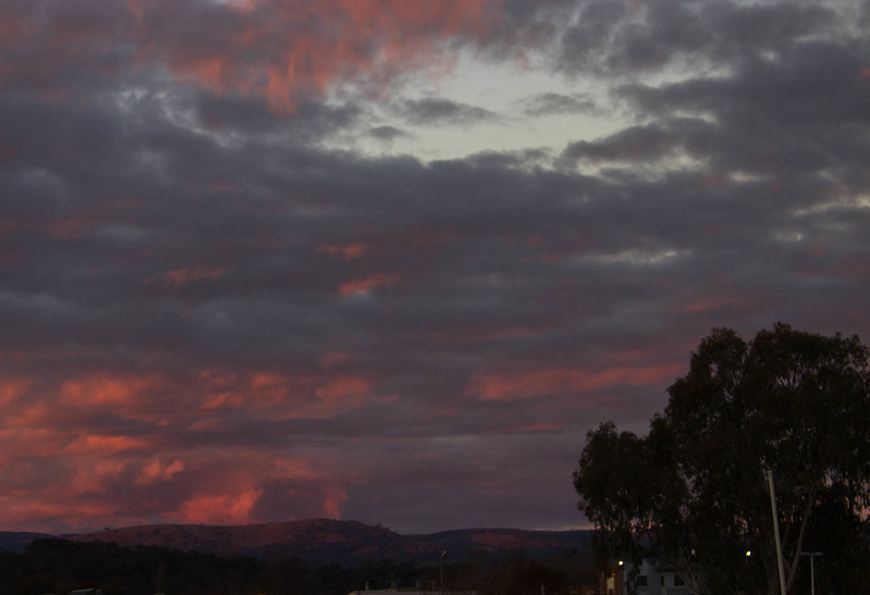
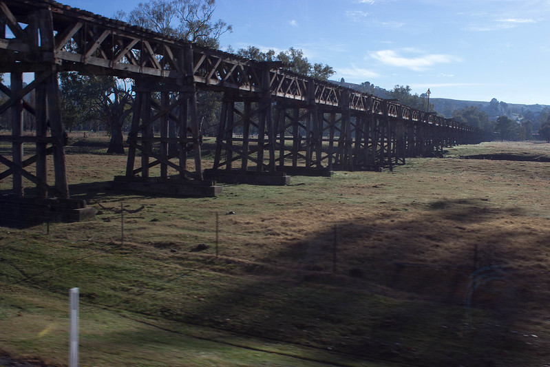
Dr. Garbanzo posted:The only thing I don't really like about this shot is the central position of the building. If it was cropped a little to the left or right it'd have a little more impact. The sky in the first one is interesting, but I don't like the foreground elements. The lower right hand is busy and cut off enough that I can't really tell what it is. There are also some buildings in the middle that are cut off and distracting. I'm not sure what the situation was, but if you were able to move past those obstructions and just have the hills in view, that would make for a stronger photo. Either that or include the buildings intentionally, without cutting them off. The second one looks like a snapshot from a moving car. The shadow on the right I don't like, and the blurred post on the left just enhances the fact that it was taken from a moving car. There are also some reflections from the window creeping in on the right. Could be a nice shot of the bridge if you were able to pull over, and the light was right. ---------- I feel like the Dorkroom isn't huge on commercial photography, but here goes anyway. I did a shoot a couple of weeks ago and this was one of my favourites of this girl. She's not a model and not comfortable in front of the camera, so that was something I struggled with - helping her overcome that. Her chin is tucked in a little too much for my liking, but I like it other than that.  105A8298_2_web by Breanne Unger, on Flickr
|
|
#
¿
Jun 24, 2013 22:38
|
|
|
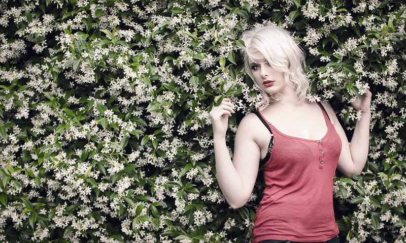
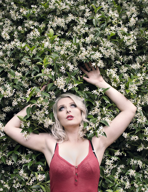
voodoorootbeer posted:Is this window light? It's very pretty - directional enough to get definition on her face and skin but still diffuse enough to be flattering. The way she's holding her right hand seems a little awkward (might have been better with the hand turned so the backs of her fingers brushed the wall?) but overall the pose works very well and complements the lighting nicely. Sure is window light! Northern window light in fact ") Thank you. The posing was a little stiff - I'll keep that in mind next time. Thank you. The posing was a little stiff - I'll keep that in mind next time.xenilk posted:Love the window light on that one, if you wanted you could have defused it a little bit more so her stomach has the same amount of light than her face but other than that it's fine. Her eyes are gorgeous and the posture is great. I have to agree with the other poster than her right hand is the weak point of that photo since everything else is well posed the right arm just feels out of place. I would say you could have moved it along her body to define the right side of her waist but that's just me. Thanks, man! I did bring some fabric to diffuse the light, but didn't even think about using it once I saw it was a north facing window. I did try to dodge and burn a bit in post to even the light out a bit, but looks like I could have pushed it a bit more. So when you guys say her right hand, you mean her actual right hand, correct? The one above her head?
|
|
#
¿
Jun 28, 2013 05:56
|
|
|
LibbyCr posted:I finally acquired a telephoto lens and am loving it. These roses came out surprisingly "3d" and I think it may be due to the lack of background light and using a flash, although I'd certainly appreciate it if someone could confirm/deny. It's an effect I'd like to be able to capture at will. This is straight out of camera. This just looks like any flower shot with straight on flash. I'm really not a fan of it at all. It's washed out all the colour and depth to the photo and reminds me of the 80s. I think you could go for a much better flower shot with off-camera flash or ambient lighting.
|
|
#
¿
Jul 13, 2013 21:19
|
|

|
Bob Socko posted:Here's a photo of mine that is bugging the hell out of me. I would have deleted it, but my kid wants to give it to my wife for her birthday, and it's either this or a balloon or a helicopter. I'd agree you should have gotten lower when shooting this, and I'd have changed the composition from dead center. However, I'll focus on post processing since it's a gift. I think you could do with a better crop, the empty space at the bottom of the frame and the dead center composition isn't doing much for me. Cropping it up into an 8x10, removing some of the bottom would help a lot too, and depending on how large you are printing it, it's easier to find frames for 8x10. I don't think the colours are bad, but I would go a bit heavier on the processing just to give it some extra punch. It's a really cute picture, though!
|
|
#
¿
Jul 27, 2013 05:53
|
|

|
Claw Massage posted:Both of these look pretty flat to me, if you were to shoot the same shot early in the morning or late in the evening I think it would help make them both more interesting. The first one doesn't really look like much more than a picture of some boats that anyone could take as a snapshot. The second one at least has more to look at, but I would probably crop out the people on the left because I don't think they add anything but my eye keeps looking over at them hoping that they are doing something cool. Also one of the masts looks cut off at the top. These are both terrifying to me and I like them because of it. Really creepy. edit: I hope that's what you were going for.
|
|
#
¿
Aug 3, 2013 00:41
|
|


|

|
| # ¿ May 21, 2024 23:55 |
|
|
Claw Massage posted:Thanks I'll give it a try. I keep my monitor probably brighter than I should anyway. But yeah I did want to keep them on the dark side because of the poses they did. I like them underexposed like that. It may not be technically right, but I think it's different and increasing the exposure would change the feel.
|
|
#
¿
Aug 4, 2013 05:25
|
|