|
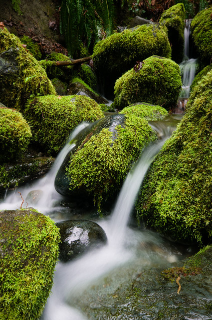
I quite like this. The composition is very good, you really get across the beauty of the area you're in (or the beauty of the immediate area anyway.) The stepping effect from the retreating stones is the epitome of woodland waterfall. I do think you've overexposed a little and gone for slightly too long am exposure time. The glare from two of the rocks takes from the image, I think, it just draws my eyes, and then that makes me think that overall it's too bright for what I'm picturing as a secluded, canopy covered forest stream. With the exposure time, I think it's a little more of my personal taste. To me that smooth water is more to do with seascapes. Waterfalls, especially those forest stream ones should be bubbling and gurgling. I think if you had a shorter exposure time you would have still gotten an ethereal effect of the blurred water, but you would have captured some of the bubbling and spitting coming from it, and made it very much akin to a rugged stream, while keeping the idea that it's eroding the boulders. I asked about the image hosting situation, and was still left a little confused. So to avoid all doubt (and because I needed it anyway) I just bought a domain name and some hosting. I've checked with a few people and the DNS has propagated for them, if it hasn't for you then you haven't missed much anyway.  This is an image I shot last year. It was taken on a photowalk, probably a few weeks after I started trying to shoot as much as I read about photography. What I was going for was the alien-ness and scale of the buoys. I took about a hundred shots on that photowalk, and there are only two I'm happy with now. And I'm only happy with them after converting to black and white. And that's partly the reason I'm mostly shooting black and white film now. My thoughts on it are that I should have just ignored the sky. It was a very bright day, with almost total but very thin cloud cover. I should have just let the sky blow even more, and gotten a bit more depth in the black. I've also gone back and forth between this image and one with the second buoy back in focus. I prefer this one, as I think the eye is drawn to the bottom right, then it moves back towards the out of focus second one, before maybe noticing the third one and all movement gives a sense of scale between the three.
|
|
|
|
|
| # ¿ Jun 2, 2024 06:04 |
|
Yeah, I don't know what I was thinking with the "buoy" thing, they are fenders. It may be because I was just looking at a site for a boat-things jumble sale and maybe that confused me. I'm definitely in agreement over deepening the blacks. I'll see if I still have the raw file and take a look. (I should have it.) I guess the sense of scale isn't coming through, because the fender in the foreground was about half the size of the other two in the background. I'd say I was more going for a weird/alien feel with scale as a secondary factor, because those fenders were pretty drat weird. I'd love to have been able to get the third to "step" again out of the second, but they weren't placed that way. And as for the radial patterns and geometric lines thing, that's just not something I have an eye for yet and I don't remember "seeing" anything at the time. Although looking at it, I probably should have tried for the chain sprouting from the end of the second fender, and having the tyres at the edge of that surface framing the shot. Thanks for the comments, I appreciate the helpfulness. I think having heard what you have to say I'll try a trip back out there, seeing as it's twenty minutes from the city centre. Mrenda fucked around with this message at 01:50 on Apr 3, 2012 |
|
|
|
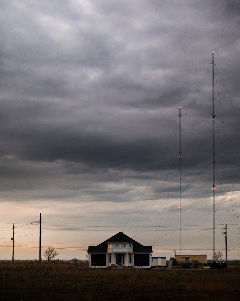
TomR posted:I decided to take a photograph today: I love this. I started out wanting to hate it. It would be incredibly easy to hate if there was something off about it. And it wouldn't even be a "look and dismiss" viewing, it'd be something I'd remember and remember to dislike it. Straight off I saw the masts on the right and how their anchor lines were cut off and I thought I was going to not like it. Then I saw the house right on an axis and more alarm bells started going off. But then my eyes started dancing around the picture. The backwards L formed by the poles and masts, cutting a diagnol at each other. The house right in the middle to take up the foreground, diverting your attention from the lines drawn between the poles and masts. The little lights on masts contrasting against the sky. And that big sky, a huge area of nothing at all to contrast the busy lower-right foreground. There's so many pieces to the photo, and they all merge like a collage. If someone had arranged the subjects to show off their understanding of geometry I wouldn't have batted an eyelid. And it's so much more than that. The dark tone of the image, the spark of light from the masts, the thunderous, foreboding sky. If this was up large on a gallery wall I'd stop and look hard at it, and then I'd finish the tour of the gallery and come back and look some more. And I'd even remember it that night. A really excellent image. I love it. Another one from my harbour walkabout.  I didn't like this when I first went through the images after this shoot. I came back on it a few months later and decided I quite liked the harbour scene, especially the yellow, blue and green of the foreground and how that colourfulness follows through with the blue sea, red ship in the background and blue sky. I also chose this image because I haven't done much with photoshop bar follow tutorials, and I needed to work at it to get the proper colours to come out of it. My main problem with it is that there's no point of focus, maybe something living in the shot could draw focus and illustrate the contrast against the industrial side of the harbour. And I have a lot of hesitation about whether I overegged the colour. Also, I know posting images without critiquing others isn't on. How about critiquing if you don't post an image? I could understand it going either way.
|
|
|
|
8th-samurai posted:Please tell me that "overegged" is short for overegglestoned. Overegged means that you over-did/over-extended/pushed something too far, e.g. here it would mean I made the colours too vibrant, saturated, etc. It would be nice if it was short for overegglestoned, but I don't think it is.
|
|
|
|
HookShot posted:
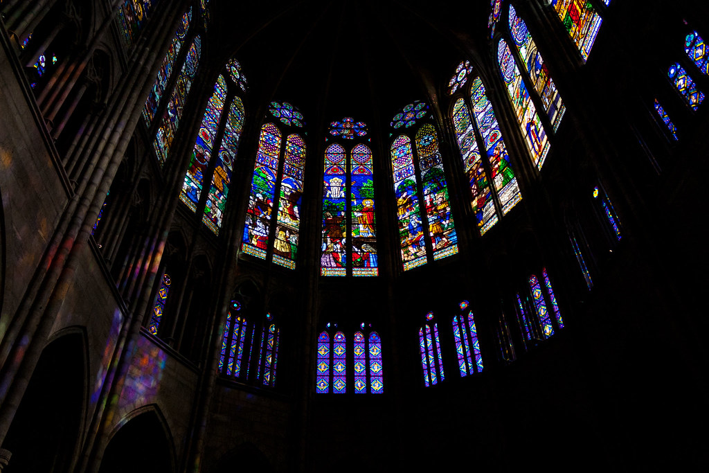
The subject is interesting. I definitely dig the darkness versus light vibe going. I don't think you've done it just with this though. I think you've gone in try to encompass too much. First off, when thinking of churches I think of symmetry at the altar areas, if that's not there don't try and force it by getting the whole semi-circle in. The way that the right is in darkness and the left has some detail leaves me wanting a perfectly symmetrical shot, with the light and darkness opposing each other, but you obviously don't have that with that curch. Instaed I would have split this into two shots. On the left hand side you could have the projected colours balancing off the glow of the glass with the light coming through. Like a subject reflecting in water. On the right hand side I think you have the darkness that makes for an ok shot, but the curve of the building would add enough shape to the shot to let the lighted windows work on their own. TheJeffers posted:
I like this. I think the colours grab my attention and it mixes well with the shapes. It's like a strange still life of a weird photo booth. But being a still life everything needs to be perfect. I think the green curtain on the right is dominating too much of the image. My attention should be drawn to the chair and the geometric patterns on the wall while I take in the colours, and then begin to acknowledge the imperfections in the subject. But the green curtain is almost invading the the space of the chair, and definitely taking a chunk out of the shadow, which is another shape that provides interest in what is just a mixture of colour and shapes. Cacator posted:Ah. I'll keep playing around with it. Seems like I should crop wider but keep him off to the right? Centering him is a little boring I'll admit. I'm not getting into this image at all. The composure and idea I could definitely get into but I think it's like you've taken a big hammer in exposure and light to something really very delicate. The lighting behind is extremely bright, too bright for me in that it's almost hurting to look at it. Combine that with the shadows on his face that look like he's playing on a flood-lighted sports pitch (many different light but hard shadows, that give an almost stereoscopic feel) and my eyes dart straight to the edge of the image for relief. And the edge of the image is so bright it does nothing to drive my eye back to the subject. I think if you up'ed your shutter speed just a little to tone down the ambient light, it'd kill off some of the glare for me, and would take some brightness out of the edges of the image and drive me more towards the subject. The other option would be to get even more light on his face, take all shadows away and have the right hand side of his jacket exposed a little better to give a very crisp and detail image against the garishness of the lights. Some images of my own. These were all taken for a relative of mine. She has a house in a scenic part of West Kerry that she rents out to people who want to holiday down there. We drove down Friday night, spent all day Saturday going around taking pictures: of her house in the morning, the town nearby in the early afternoon, the scenic coastline areas in the late afternoon, then some shots of her house again at night. The only real thing I'm going for with the images is to make someone think they'd like the area and the house enough to rent the place. There's three images, the first one is my favourite, because I think it's different to the usual type of stuff that's taken of the area. Unfortunately I was very time limited and couldn't wait for the right light to take the pictures so I had to make do, and I'm not knowledgable to get the right green in lightroom/photoshop, plus I don't really trust myself with it. (Edit: And forgive the bit of dirt I didn't see to clone out.)  The second one is just of a beautiful part of the coast. I don't have a lens wide enough that could take in the whole seascape, although I doubt there actually is a lens wide enough. Even still, this was the basic kit lens and you can see some distortion on the horizon.  Finally there's an interior night-time shot that's trying to get across the idea of a tranquil isolated place, where you can have a quiet night contemplating the heritage and culture of the area. 
Mrenda fucked around with this message at 21:42 on Apr 19, 2012 |
|
|
|
TheJeffers posted:
I like this. It feels like an advertising shot, a lot going on, a lot to draw your eye. I think there's an interesting distinction between the city on the left curving down towards the middle, with the buildings in the background curving down to the people in the middle foreground showing a human busy-ness. Contrasting that on the right seems to be a very industrial scene, the busy highway and the wheel in the background show humanity but really the flatness of the buildings and the sea, especially with the port cranes in the background showing the more industrial side. I also like the contrast between the left foreground with the colour of all the people's clothes and the grey-blue of the right background, and also the reflection of the buildings in the left background against the grey concrete of the highway. I think it's a nice shot capturing an interesting view of a multi-faceted city. Shampoo posted:I actually like the other shot more. I think the vertical crop and the stump add context to the photo. Plus. I like the colors and clarity in the first one more, but I can't say it's technically "better" or anything, just a different aesthetic. I do wish you put the whole flickr link though, I like reading the EXIF info for photos I like to see how they were taken I'm not a fan of this. It's too dark for me, while I can make out everything it looks too gloomy. One the one hand this could work if you had an imposing structure view against an impressive sky, but by throwing in the lines it detracts from this and the perspective doesn't work for "imposing" either, for which I'd imagine you'd need to stick closer to traditional compositional rules. The lines also don't work on their own because there's nothing leading them into the picture (again traditional composition.) I think you've gone halfway between two shots here and not succeeded in blending them. One the one hand you could have an abstract shot with the lines, or you could have the imposition of the structure, but neither work together. This is the first image I've tried processing from a scan. I'm a bit unsure about the colours, if it's too muddy in general (although the original buildings are in a very muddy brown brick setting.)  This is of a set of old council flats in my town. Right around the corner from here is some very run down flats, lots of graffiti about heroin addicts, rubbish/trash everywhere and they're in the same style of council flat as these. Contrary to that these flats come across as quite well looked after. I wanted to get across an image that would be recognisable to many people as a poor area but one that's quite calm in setting and with a level of dignity. I'm worried that the photo means more to me due to my familiarity with the area than anything that comes across in the photo.
|
|
|
|
GrandpaPants posted:An accordian player in Barcelona. The aspect that sticks out most for me here is the pattern of the stone and the pattern made from the different colour "blocks" in the image. With that, the door/gate throw off any symmetries going on in the image. I think you either need to cut out the door on the side or have composed with the pattern from the door taking up equal importance with the accordion box and player. I don't think there's enough going on for a tighter square crop to work. quote:A medina in Morocco. I am really iffy on this photo, since I think that there's a lot of blown out details (like in the blowing, uh, curtains?), but I wanted to see what other people think since I tend to overthink flaws in things I stare at for an hour. This doesn't do anything for me, nothing catches my eye. It seems to clean in general, the blown cover on top is a big portion of the image with nothing going on and there's no event in the rest of the image to hold your attention. I know I posted only a day or two ago but these are the last of my scanned images I'm happy to post. All from a Paddy's Day parade a few years back.   
|
|
|
|
murp posted:Took this tonight while experimenting with light earlier. Still lifes are really hard because you have to nail everything. In this the dark colours are too dark and they just disappear. The ears of the Furby are almost blacked out and there's too much distraction going on behind them. The teddy on the left has head cut off by shadow. The background in general (what you have everything sitting on and under) is not distinct enough to be interesting in and of itself but is too busy to keep attention on the central items. If I were you I'd reduce down the whole scene to one or two things and focus on bringing out one or two elements from them. I think you have an interesting thing going with the texture of the Furby. The bear and knife are nice with two contrasting textures. The blacked out teeth of the toy to the right could come across as menacing with the right lighting. Overall I think you're just trying to show too much in the photo. rio posted:
I think you timed this shot really well. There's so much going on that it's great to dart your eye around picking up little stories of what's happening with the people in the shot. The guy jumping in the background, the waitress on the left looking over her shoulder, the middle foreground table with the short-haired girl looking really into the story and the blonde girl to her left looking bored, or maybe disgusted. It's a great story but the haze across the image takes away from all that. I imagine to pull these type of shots off perfectly would involve a lot of staging, a lot of lighting and a lot of money. And to pull them off you need every detail crisp and distinct. When you don't have that available to you I think it's just a case of shooting off as many frames as you can and trying to get the best one, even if it means doing it repeatedly over many nights. (Although I'm sure someone will have a better technical solution than me.) Overall it's a great story but technically it's not right for me. thetzar posted:I was out in Pennsylvania with my girlfriend and long-suffering model for the holidays with family. I made her stand in front of some headlights. You've nailed the colours in this, the shadows stretching back are all great, the skyline and sky colours work fantastically. Her pose is perfect, literally like someone caught in headlights. What let's it down is that the light is most on her hip area. It might be true to reality that the light would shine there when coming from a car but the meat of the image is in her face. The reaction in her face is correct for what I would imagine so it's disappointing that it's not the focus of the image. Without other lights or gobos to play with you have to move focus away from her face (where most people will naturally look.) So if you have to use the light that's available from the headlights I think the only alternative is to have her hands become the focus of the image. Have her move them down to where the beam lands, and maybe give her something to hold, maybe even have her look down at her hands so her looking at her hands reinforces them being the centre of attention. Either way I'd look for a reason to use that location again. Both of these were taken before dawn after a big storm. The city flooded a little the night before and I was out a high tide to see if there was any standing water left. There wasn't be the city felt like a ghost town, even though it would normally be just about to show signs of life as people begin to come to work.  AIBJanuaryFloodsRS by mrendatious1, on Flickr  KOConnellsJanuaryFlood4RS by mrendatious1, on Flickr
|
|
|
|
Yeah, it's the English Market at about 7.30am. I'm not sure if it was even open for anything but deliveries as the second set of gates was mostly closed when I went to leave. It was incredibly quiet there at the time and a lot of the lights were turned off making it much darker than it usually is. Unfortunately/fortunately since the Queen visited the market it's become packed with tourists. It can actually be quite tough to navigate the crowds when you're trying to buy dinner. (And thanks for the critique, I've been thinking a lot about photographing Cork.)
|
|
|
|
grack posted:
Going by the title I presume the contrast here is supposed to be the pawn shop next to the church. The church isn't interesting enough as the lead in to the image and the hoarding on the pawn shop is not distinct enough to stand out as relief to the church. It looks like a photograph of a street rather than a photograph of two contrasting buildings. I think to get the pawn shop to stand out it needs to be far more central with the hoarding far more of the subject of the shot. A straight on shot might work but then you're left seeing if the buildings are interesting enough in their own right. I'd try and see if a straight on shot of the pawn shop with only half the church in frame would work. So the Pawn Shop being the main subject and just including as far as the cross on the church. Right now at least half the contents of the frame add nothing to the image. grack posted:
This is a confusing image. On the one hand you have the man in the middle who I presume is the focus of the shot but then you have the woman in the background. I think the man on his own could be enough to validate the image but the darkened woman in the background just adds confusion. She's definitely very much a part of the photograph as she's so central, but she doesn't add anything and actually takes away from the man. Maybe you've tried to darken her out but unless you had an amazingly shallow depth of field I'm not too sure how you could avoid her distracting from what seems to be the subject. If you're going for a stepped feel, where your eye is lead from the man to the women in the background then she's too dark to be viewed properly. Also if this was what you were going for I'd have cropped out the detail at the front and try to just have the contrast of the two people, especially as it's only their heads and upper torso that can be seen. All that being said I quite like this image. The amount of detail and elements of the shot means it's quite a thematically vibrant image. My images:  With this I'm concerned about the negative space on the left and right. While I think a crop this close is necessary, I'm left wondering about whether I've left too little space on the right to cater for the man, it might seem a little like he's leaving the frame. Really though it's the toddler who is the subject, so with them I think I have the right balance between the space on the left and  With this I'm concerned about the tilt/rotation on the image. The guy in the image was really tall, and he had a bend in his back to reach the butcher's table. However without anything to give reference to that it might look a little like the image is not straight. This is especially noticeable when the foreground elements were all curved on a corner. I'm also worried a little about his positioning in the frame. While I'd like to have him on a third line I also want to include the "Sunday Roast" text and the detail from the awning at the top. Any closer crop to achieve the positioning of the man on the third line would mean losing both of those. And I'd love to hear any other comments or issues people have with these two images. Edit: Changed to a better rotated version of the second image. (No-one had commented on it yet.) Mrenda fucked around with this message at 17:00 on Mar 30, 2014 |
|
|
|
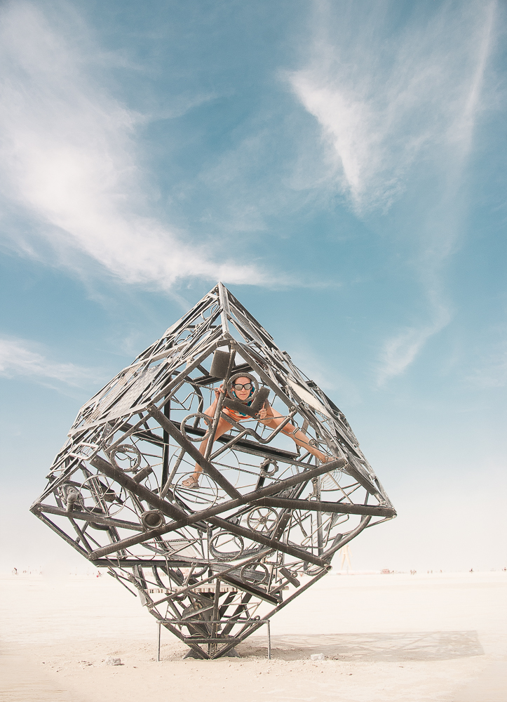
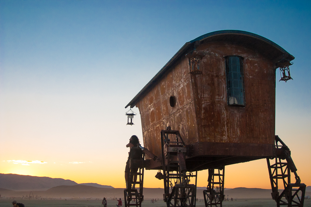
I have no photos from myself because I'm a horrible person who hasn't taken pictures in months.CommunistCow posted:A few things from burning man. Trying out some new lightroom processing techniques: I like this. It gives me the impression of a Storm Thorgerson album cover, or at least something in that direction. quote:
I'm not a fan of this. I think the few people in the foreground take away from the image. It'd be better with either no foreground people and desolation or lots of foreground people and a carnival feel. This straddles the two ideas not very well. McMadCow posted:
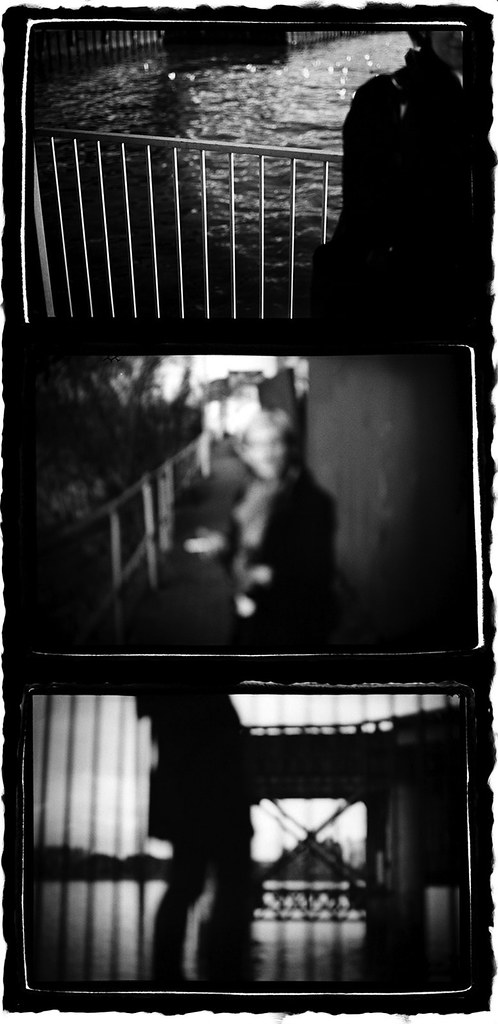
I appreciate the other comments you've received but I don't think I get the same level of narrative from the images. If it's memories fading or the relevance or understanding of an event fading then I'm not sure the narrative in the photos makes me think of a walk where something happened, rather events being jumped around from a particular evening. I think it's a very simple thing that's holding me back from getting a progressive story from the images. The in focus railings in the first shot are quite prominent, the out focus railings in the third shot make me think of it as a better progression narratively in setting than the second shot is. So it should be railings-railings-notrailings to give an impression of something happening on a walk. If you're suggesting that there's a loop going on here, where the railings of the last shot is supposed to indicate that this event will again progress to the first shot in a continuing repetition of the events then I think there's not enough indication or symbolism of that in the rest of the two images. Although there is water in both as well. Edit: On second look I like her face. Mrenda fucked around with this message at 05:30 on Sep 6, 2014 |
|
|
|
Skizzzer posted:
I'm not a fan of in-photo framing. I generally think it's a bit tired and cliched. This is slightly better in that at least it's different, however I don't feel there's enough of a defining contrast between the frame and the subject matter. That could be addressed if there was something tying the frame to the subject compositionally. The best I can imagine is going for a voyeuristic feel, that already seems slightly present in the subject matter. Throwing your camera bag on the grass in front of you, to lay the grass flatter and give the look of someone stalking and coming up on the people. Even just that little area of stalks on the right could be pushed forward to give some perception of motion towards the people. Otherwise I think it's good. Nice depth of field, especially with the grass before the people and nice contrast in colour between the people and the grass surrounding them. -CHA posted:
I think the street thread about backs-of-heads applies just as much to this even if it is of a bird. There's nothing to set the idea of the bird flying away from something or towards something to justify the back-of-bird perspective. There's great clarity in the detail of the bird and that you have motion in the wing tip while retaining that clarity is a good testament to technicality of the shot. The undulation of the trees/hedges in the foreground is a nice compositional detail, but that's not enough to rescue it as an image of something. It's not quite a spacial/geometrical abstract, and it's not an image of anything happening. It's bordering between those two styles and is lacking because of it. It might work as a very large print, as it would bring out the detail in the bird and also the abstract nature of the foreground. It's very dependent on printing though and for me it doesn't work as a totality in a small jpeg on a monitor. I've been pretty much exclusively shooting black and white film over the past year (and not very much at that.) With The Dorkroom's encouragement of "just loving shoot more" I went out to try my hand at shooting colour. I kept to the same theme as I've found I like with black and white, people amidst a city, with an emphasis on the city. This time I just looked for areas with colour and a lack of texture that wouldn't work with black and white. I'm not a fan of this one, I'm more wondering if it works within the style of the second image. And then it'll be something I go back and re-shoot with the idea to tie it into a collection. Probably something with a single person, possibly leaving the frame, i.e. a person a little more to the left. [IMG]No this image was poo poo. I have a better plan.[/IMG]  Thanks to RangerScum for help with the editing of this image. Mrenda fucked around with this message at 03:41 on Oct 30, 2014 |
|
|
|
Shellman posted:
The silhouette seems to be the main focus of this shot but I can make out what it's of. I see the TV in the background, so I'm guessing there's people there watching but there's no indication that they are there watching. I'd like to see a relaxed family, or slovenly singleton reclined and basking in the glow of a TV. It might be cliched but "family and tv" works certain ways. If you're trying to show a real life TV room, with crap about the place, well-lived-in and with the ephemera and trinkets that goes with it then the silhouette takes away from that, because I'd really be looking to see the detail of the room and how it's influenced by the TV centrepiece (another cliche.) My photo... 
|
|
|
|
mAlfunkti0n posted:Personally I would cut that bus out on the right side since only half was captured, I don't feel it adds anything to the image. This seems to be about the contrast of a tight, enclosed, claustrophobic space of the cave and the wide expanse of the ocean beyond it. To fully describe the nature of the cave you need to have the entirety of it available for examination, against the openness of the ocean outside. You've lost detail in the darker parts of the cave and that detracts from the image. The cave also doesn't seem that enclosed, you've chosen a landscape orientation and that adds width to the cave. It may very well have been a large cave but in comparison to the ocean it's still tiny. I'd like to have seen this in a portrait orientation, with more detail in the darker parts of the cave and more of a leading line with the water pools at the bottom.
|
|
|
|
Skizzzer posted:
I like the second one, I think the aspect ratio on the first one and the squat, almost skewed look of the flowers don't particularly work for it. I had something written up about how I was concerned with the depth of field, but as I looked more at the photos I realised it has quite an unsettling effect which actually plays into the alien/foreign aspect you've put across, especially in the second, with the flower in focus. The out of focus but not too out of focus effect with the other flowers in the second photo makes them all seem part of the same "whole" (apart from our own understanding.) While the various stages of flowering in view make it seem like the whole entity is still developing, and getting ready, and poised. The warm tone and softness add to the calm effect of something that still manages to come across quite threatening, with the main in focus flower looking just-about-ready to leap. The third image I didn't comment on because I don't feel it works with the first two, and of those the second is far better. It's definitely different from a pretty flower picture, showing them as alien and possible even encroaching. And this is the second photo to get me feeling all Day of the Triffids today. This is my photo. I would like it to be critiqued.  0.00001 by Niamh O'Donovan, on Flickr
|
|
|
|
tau posted:
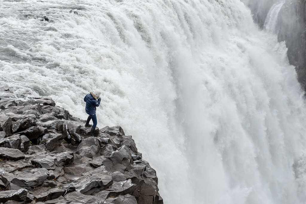
I don't know the purpose of this shot. Not that I don't know what I'm supposed to be looking at. I've taken plenty of these shots myself. Nice distraction of the lights, the rows and angled umbrellas. But I don't know the purpose of it. I don't know what's significant about it. I don't know why this little enclave somewhere is somehow worthy of a shot. It's not desolate, it's obviously set up to host people, but there's no sense of it being unwantedly abandoned. There's plenty of reason to be there, it's inviting, to a degree but it's wet. Is that the point? Today is wet? thetzar posted:The first shot seems very dark in the shadows. The main subject is striking a cool pose, must the sharp contrast of the picture across the frame keeps this photo feeling kind of cluttered to me. The leading lines to the corner almost start to form up some nice shapes, but they're very broken up. To me, the first shot just isn't hitting. First one. I don't think there's enough contrast between the building in the background and the branches/twigs in the front. It's just blurring into disorganised noise without being a commentary on the chaos of a forest. You're framing the building with twigs, and it seems too smart, like your pointing us there but for no reason. Second one. I like this. It wouldn't be something I hang on my wall. It's an almost contrived situation of someone who could fall. I don't like pointed photography unless it has a purpose behind it and this doesn't really. Someone close to the edge of waterfall, it looks good, it's a nice shot. You should be pleased. Good composition, great processing and something I would be proud of. It doesn't tell me anything though. It raises no questions. Third one. Not a fan. His coat is contrasting the background in a weird way. His coat is too bright, as is his face. It's like a technical exercise in lighting. Show someone and don't expose for the background, except his coat is dark as well but well lit, and his face is too bright. I'm also not a fan of the subtle shadow on the right hand side of his face. This really seems like a test shot for lighting rather than a photograph that conveys anything of the subject. InternetJunky posted:Trying something new, don't be gentle It looks like a photorealistic pencil drawing of a cat by a guy who has no artistic sensibility but fully believes lions are superior to wolves. He often argues this point with his taller, lankier friend who has greasy black hair and always plays the Drow in their D&D games.  Psychiatric Hospital Grounds by Niamh O'Donovan, on Flickr
|
|
|
|
alkanphel posted:Generally when you actually do a critique session, you come with a curated body of work, not just one photo. It's the same here, if you really wanted constructive critique. If you're just taking it without intent, it also usually shows in the individual photo. Of course on the flipside, a series that has intent or narrative might not have it once broken down into individual photos. The counterpoint to that is HCB, who is so far removed from what photography has come to be and probably always was once it established itself that he bears little relevance to anyone attempting to work. Everyone one of his great photographs (usually his early works) is steeped in a fullness of what he was trying to capture. He always maintained he wanted to be a painter rather than a photographer, and his photography reflected that. He was a poo poo hot photographer, but his photography always falls flat for me outside of its immediacy because he doesn't seem to be saying much outside of a moment. What he says in that moment is vast, and it's entirely possible that because no-one else has managed that he feels outside of what photography is. I say all of that by implying HCB's work predominantly showed a single situation/scenario/scene and something in that moment. Maybe portrait photography could come close, and maybe street photography is the closest we can get in spirit but the man could idolise a single scene. Everything in one photograph stands on its own, and usually falls into a central idea. Photography seems to have gone away from that, and instead looks for a treatise on what the photographer sees or says for the world. Building up lots of scenes, all for an idea or comment, or in many cases an aesthetic that impresses. A single photograph can work, but photography has worked against it despite collectors buying a single image that stands isolated on a wall. Photography works in a gallery or in a book. Both curated, both set in terms of what precedes it, and hopefully what will come after. The idea that a single image can store all we need to know or think about something is abandoned outside of context. HCB's work didn't need context, now people are working hard to establish the context their photographs need. I'm sure this has something to do with modernism or post-modernism.
|
|
|
|
Magic Hate Ball posted:Who's HCB? Henri Cartier-Bresson
|
|
|
|
|
| # ¿ Jun 2, 2024 06:04 |
|
Soopafly posted:These are both helpful critiques - thanks! The goal of the set was to show a timeline of a balloon - not necessarily a rising one, just a deflated-to-inflated - and create an ambiguity of scale. I also tried to display a passage of time, but I can see that it comes across in a very clunky way. The composition was intended to create an ambiguity of scale, with some balloon shots taking up the whole frame and others including elements like the trees and fire to show disparate scales. In retrospect, this could have worked better using drastically different framing than I did to get that point across, because there's little context besides the balloons themselves. I was trying awful hard to make them have stylistic similarities but not hard enough to make them have a cohesive point. I think all three on the right hand side follow a nice theme, and it's well finished by the third. Each of them has a contrast in light, the first has the illumination of the flame set against the opacity of the material, the second has the shadow being cast across the balloon, and the third has the duller material against the depth of the night/morning sky, and it's an appropriate bookend as the warming tone shows a progression in time. For me the question would be whether to go with the image in the middle right, or the middle left. The middle right seems a better overall photo, but that comes down to crop as it is. The one on the left could be made into a square form which would work with the other two and keep the shape/dominance of the balloon coherent through all images. I think there could be more to how you present them with canvas flipping and how they're hung. And I appreciate how they're both sweet (they're of balloons) and melancholy (progressing into a night and its semiotics, and also the danger of people going up in them at night.) It makes it very different from what I would see as a normal dawn to daylight balloon ride.
|
|
|


