|
TomR posted:
Also, it feels like there are 3-4 potential images here. The right third could be this, maybe? Bottom Liner posted:Day 6 My immediate reaction: This feel good. It's 62F and the air smells earthy with a bit of highway. This is a great example of what I brought up earlier -- the long shadow invites me in from a distance, and once I'm zoomed in, the detail tells the story. There's a sense of movement - the camera is panning from left to right and slowly zooming into the guitar. There's stuff going on here and the photo alone doesn't give away everything. Nice. --- What the hell am I doing? Is this any good? Hackneyed clich� bullshit? It's a pretty big departure from what I usually do. Tear it apart. 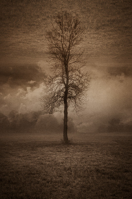 earth tree earth by jwallacephoto, on Flickr 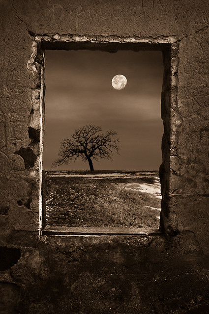 dead of winter by jwallacephoto, on Flickr  path of power by jwallacephoto, on Flickr
|
 #
¿
Jan 17, 2012 01:48
#
¿
Jan 17, 2012 01:48
|
|


|

|
| # ¿ May 3, 2024 15:18 |
|
|
AIIAZNSK8ER posted:I hope you know of Uelsmann because these give off that vibe. Not sure about the sepia, but I'll keep playing. Thanks for the feedback!
|
|
#
¿
Jan 17, 2012 05:36
|
|
|
AIIAZNSK8ER posted:Put some people into those spaces and find a way to bring more life into the scene. 
|
|
#
¿
Jan 17, 2012 15:09
|
|
|
Bottom Liner posted:The first one is perfect. Awesome. It's a candidate for getting printed. Bottom Liner posted:
Day 7: Interesting color tinting, but the purply-red skin tones are getting a bit strong. I think I like it, even though it would be hypocritical of me to criticize someone's use of vignetting and color filters to make a photo look aged. Good separation from the background, and still there's enough info to communicate the perspective of the road. The straight-on pose seems a bit forced, but I really have no idea how to critique portraits. Day 8: It brings out the "NOPE!" in me, but I'll tough it out. The light totally makes this. It makes me wonder whether this is something the hand from the Apple iPhone marketing photos does on its day off. One technical issue though -- the part of the snake behind the thumb seems a bit hard-edged for being that far out of the shallow depth of field. Did you do use any lens blur filters? Day 9: Maybe it's my monitor, but the contrast seems really crunchy. I'm not getting any detail up where you're saying the clouds should be. I'm also not getting a sense of depth. Everything is scrunched in mid field, there's no foreground or background. ("Day 7" has more depth.) Also, the trash cans aren't really doing it for me. Now despite me sounding all complainy, there's some really good potential between those trees and that light. Try some more shots in this area! With landscape shots, the location of the photographer is almost more important than the subject -- they are built around communicating space rather than an object. Experiment with shooting from different angles; position yourself so a subject or two comes into the foreground. (Temporarily move a trash can to the middle of the road?) The easiest way is to use leading lines along the ground from the bottom of the frame (say, if the road extended toward us.) Once that happens, that necessary "space" appears out of nowhere. --- Here's some more photo fiddling. With how much manipulation is going on, I'm not sure how well these work in a strict photography thread. And even though the compositions are new, the source images aren't. Some of the source photos were taken a month ago, others are around six years old. It's really easy to meander around with no goal, but I probably need to focus on a point for these things. "What am I trying to say?" is really difficult to answer given that these aren't done for commission work. The ground and trees are from here. The 'sky' is from the uncropped version of this Antelope Canyon photo. The structure is from after this house fell over. There's a couple more photos in there for texture. 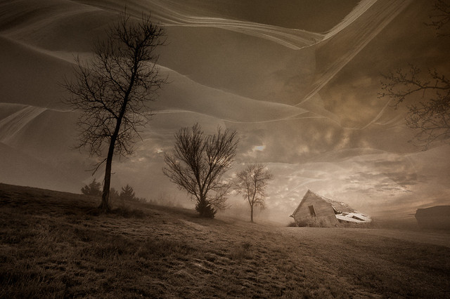 golden slumbers by jwallacephoto, on Flickr One of the source images. The sky is made of two cloud photos stacked up. The water is from a close up shot of this spring. 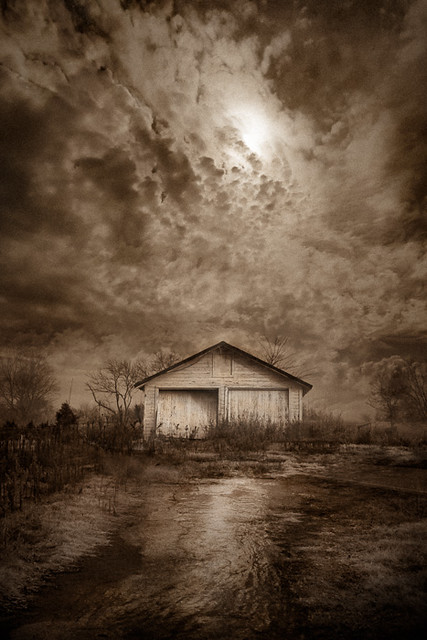 last place to look by jwallacephoto, on Flickr Not to lead you guys on, but I'll admit this one feels the most contrived of the three. Some 'landscaping' around the base of the mountain might help to break up that hard edge. (It's just sitting there! Yeah, I'm turbo lazy.) Anyway, the mountain is one of the walls of Antelope Canyon, but this is more an experiment of how many sky photos I can stack up. (Not sure, but I think there's five here.) 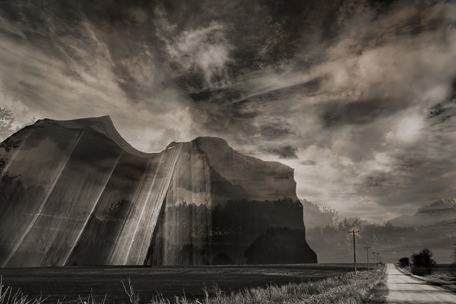 north of perry by jwallacephoto, on Flickr
|
|
#
¿
Jan 20, 2012 00:05
|
|


|
Bottom Liner posted:
They all seem to have a sense of a narrative, even though they don't feel like they're in the same universe together (in a storytelling sense). I like the transparency of the feet in Day 11. It makes me think that the subject of Day 10 could be slightly transparent, to connect the two. To further the thematic connection, try rotating Day 10 as a vertical. (The waves are great. You could have easily shot this with flat water; glad you didn't!) Not sure where to go with Day 12. It seems a bit straightforward and grounded in comparison. There's no sense of weightlessness which the other two images have. If anything, the noise reduction in 12 is a bit too smooth. It could use a little more grain. William T. Hornaday posted:Here are a couple recent photos that I want some critique on, particularly the processing. It seems to be a direction I've been unconsciously going in lately with my photos and I'm really fighting myself as to whether I like it or hate it. I'd love a second and unbiased opinion. Does it look bad? Fake? Gimmicky? Good? The processing might work better on images with more action.
|
|
#
¿
Jan 26, 2012 17:14
|
|


|
carcinofuck posted:
First: I find myself drawn toward the valley in the background. Everything else kinda runs together. Love the light quality though, it actually feels hot (as it should, it's a desert!) Second: Be careful with the blue saturation. The shadows are getting a bit colorful. There's no dominant subject, but I'm a sucker for southwest alien landscapes. Third: Great use of magenta and yellow. It's a shame that this kind of light only happens for a few minutes. I'd love to see more with this quality to them. Fourth & Fifth: Try posting them a day apart from the first three Medusula posted:The second one has no dominant subject. Maybe that building, but it's way in the background. Maybe the water, but it's not really doing anything interesting -- just sitting there reflecting the sky, like it always does. And given that the sky is pretty much gone, shooting in a different time of day would add some good punch to it. --- Here's more of whatever this is: Hrm, might have to tone-down the stars. They didn't seem this punchy when I was working on it.  little white building by jwallacephoto, on Flickr This is a bit silly. 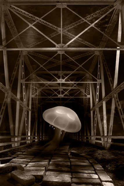 jelly bridge by jwallacephoto, on Flickr
|
|
#
¿
Feb 8, 2012 20:37
|
|


|
|
| # ¿ May 3, 2024 15:18 |
|
|
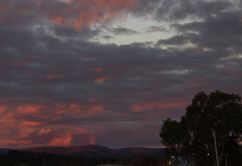
That reminds me of one of my old ones. Having the main subject slap bang in the center can work, but the other elements in your photo aren't strong enough to carry my eye around. Did you take any other shots of it? Say, where it's off to one side? Pleasant warm tones. I don't think it needs the left side of the tree, or even the large swath of grass on the right. A tighter (vertical?) crop might help. Dr. Garbanzo posted:A couple from a trip to Tumut in southern NSW I'm a cloud person. I really want this image to grab me, but it's coming off a bit flat. The presence of a foreground naturally begs for attention, but the most interesting thing here is the sky. The foreground is spending most of its time hiding from me. (Is that a house? What's with the pole?) Viewing it as a thumbnail really shows how dark and featureless that foreground is. Dr. Garbanzo posted:
--- I had a great time in Italy, as long as I don't dwell on the fact that most of my shots were at high noon in full sun. (Public transit was a bit limiting, and safety after dark is risky in spots.)  cloister and flowers by jwallacephoto, on Flickr 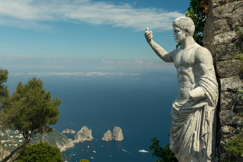 Capri by jwallacephoto, on Flickr 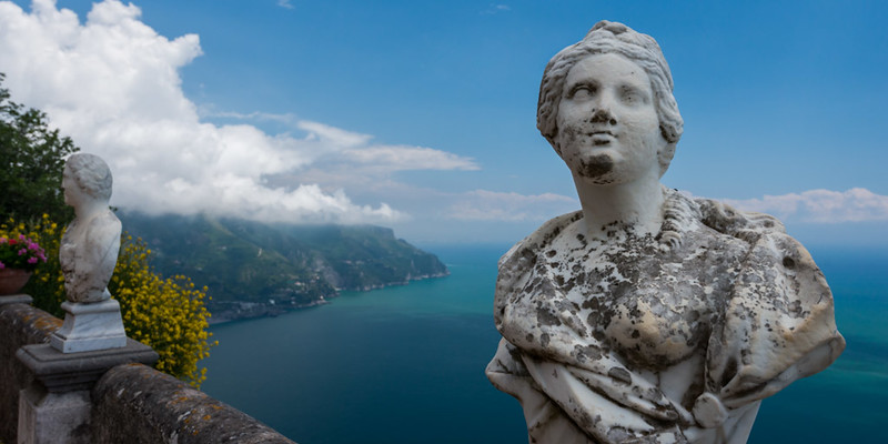 terrace of infinity by jwallacephoto, on Flickr
|
|
#
¿
Jun 25, 2013 17:17
|
|