


|
Dude, you could publish a tabletop book of your animal pictures. They are incredible. There is no content in this post because these are so good it's well beyond my ability to critque them.
|
 #
¿
Jan 26, 2012 01:21
#
¿
Jan 26, 2012 01:21
|
|


|

|
| # ¿ May 6, 2024 11:50 |
|
|
Medusula posted:I love this. The color and the space and the serenity. I like that little cabin on the left, the stillness of the water. Makes me want to go to there. The first one had too much sky space for me. -- I'm quite new and trying to improve. This picture is not good, but I feel like, it should have been, or could have been something. Please help me to improve my processing and composition. 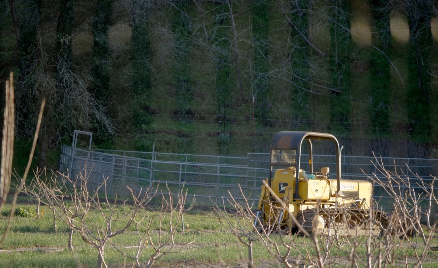
|
|
#
¿
Feb 11, 2012 02:49
|
|

|
Augmented Dickey posted:A few shots from the driving range yesterday...not sure if they work or not. Lately I've really been enjoying shooting with this fossil of a DSLR for some reason. The picture of the feet and grass is amazing. I love the depth of field and the sense of motion captured in the image. aliencowboy posted:This is really incredible. I love your processing. I wish I knew what it was that you did to make these images look so... I can't even find the words. Your style resonates with me. I had a series of your pictures of some canyons as my desktop backgrounds on my previous computer. --  472-2 by tijag, on Flickr  458-3 by tijag, on Flickr 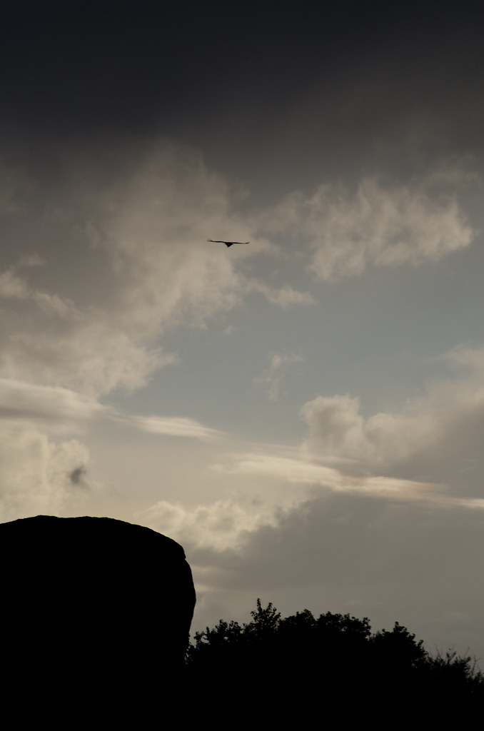 457-2 by tijag, on Flickr I just recently started taking pictures again. I find I don't know what I like to take pictures of, or what style I should have. I guess I'm reasonably happy with how these turned out, but I look forward for all the critiques you are willing to share with me.
|
|
#
¿
May 9, 2012 04:57
|
|


|
Holistic Detective posted:I think the first of these is definitely the strongest. There's just too much empty space in the second and that gradient at the top is a bit distracting. Thank you for the feedback. Surprisingly I didn't apply that gradient. That's mostly what it looked like out of the camera. I think I will try a tighter crop on the second one and get rid of the emptiness.
|
|
#
¿
May 10, 2012 00:29
|
|
|
Holistic Detective posted:Huh, in that case I apologise and retract the comment. That is some freaky sky. It was a storm moving in, and parts of the sky were still blue skys, and parts were rain clouds. Was risking my D7k to take pictures. I know I adjusted the blacks and whites etc, so that part of the sky, which was dark to begin with, got even darker, but the 'gradient' look to it, is what the sky was like.
|
|
#
¿
May 10, 2012 00:47
|
|
|
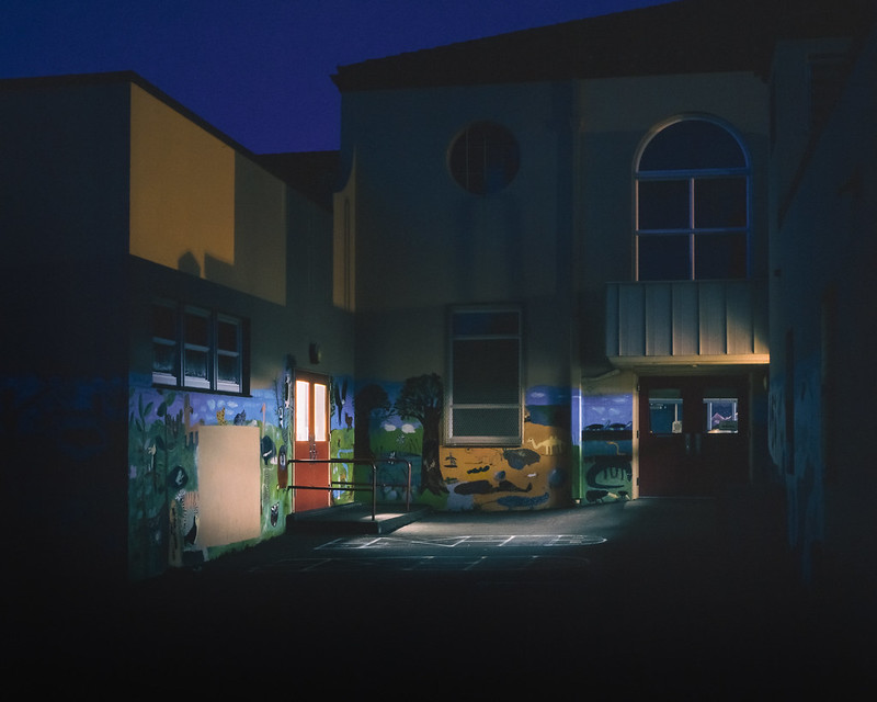
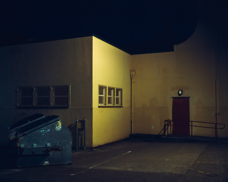
doctor 7 posted:Just reposting these two which seem to got lost in the critique chain I really like the casual nature of the picture with your parents. Actually it looks like it might have been a challenging situation to get a good exposure because of all the shadows and bright lights, but it's really pleasant and nicely exposed. It feels warm and classy and I'd like to have breakfast with you guys.  482-2 by tijag, on Flickr I have never done so much post work on an image. Actually I'm really just trying to learn what the various things in Lightroom do. Here is the original straight out of the camera.  482-3 by tijag, on Flickr Did I do too much/go way over the top? Even 'that sucks I like the original better, and the original sucks too' would be useful critque for me. edit: what the heck it is SOOO much darker on flickr than it is on my computer  what is going on? I exported it as sRGB, 100% jpg. what is going on? I exported it as sRGB, 100% jpg. wtfflickr by tijag, on Flickr tijag fucked around with this message at 05:29 on May 11, 2012 |
|
#
¿
May 11, 2012 05:11
|
|
|
Reichstag posted:I'm a sucker for power lines, and I like this, but the composition makes me think that maybe it wasn't supposed to be the focus of the shot? dukeku posted:Trying out slides at night, metering is a little tricker than with print film. I love both of these. The top one has like a menacing evil playground feel. The bottom one just has amazing color and I love the exposure. Is the sky clipped to black in the bottom image, or is that a really dark blue? Side note: I figured out all my color issues and can now actually post something that looks like it did in Lightroom.  20120425-482.jpg by tijag, on Flickr
|
|
#
¿
May 12, 2012 07:04
|
|

|
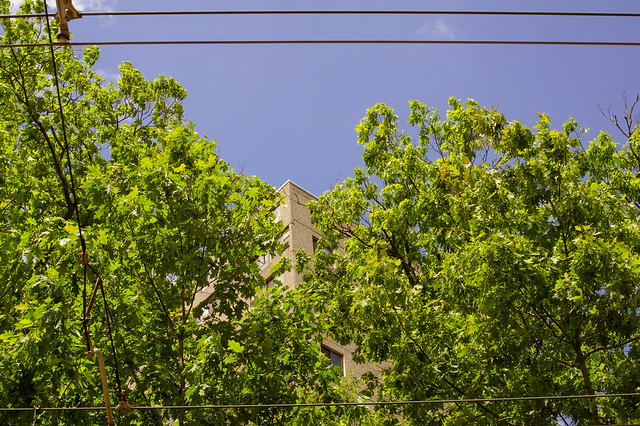
LargeHadron posted:I shot this photo. The scene was appealing to me, probably because the trees seem to part and make way for the building, and the wires act as a frame. There are probably millions of other photos out there that do this same thing better, but I am very recently becoming interested in photographing hidden beauty in scenes that are typically ignored or considered ugly at first glance. Yay or nay? I see what you're going for here, but for me there is too much green, and the area of the screen that's green is also very distracting, with lots of small little leaves. Then the blue area of the screen is essentially flat with no detail at all.
|
|
#
¿
Jun 26, 2012 00:15
|
|
|
ogopogo posted:I'm a huge fan of verticality in photography, so this really struck a chord with me. The division of ocean, sky and clouds creates a very pleasing flow. As was stated previously, it feels a touch underexposed in the bottom third. Other than that, it's terrific! If you're getting color shifting from uploading your color profile in Windows 7 isn't set right.
|
|
#
¿
Jun 27, 2012 03:12
|
|

|
Mr. Despair posted:
I loved this picture and wanted to weigh in on the processed one vs. the 'natural' one. For me the image is far more striking when processed with the white background. It feels singular and monolithic in a way that the one with the natural processing and the clouds just doesn't. At least for me. Here is a picture from my Scotland trip. It's quite boring and 'generic' so I'm wondering if anyone has suggestions for processing or cropping that might make it less boring. 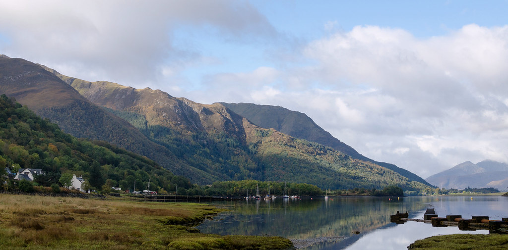 20121006-_DSC4355 by tijag, on Flickr
|
|
#
¿
Dec 19, 2012 23:21
|
|
|
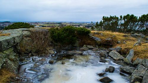
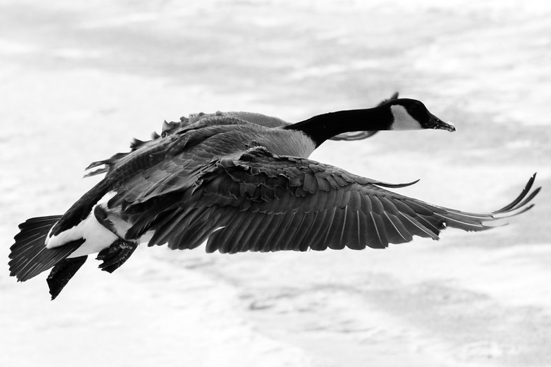
Vlex posted:I took this near my parent's house in western Norway, you can barely make out the North Sea between the slate sky and extreme background. It's the edge of a small pond that is somewhat inexplicably at the very summit of a hill/small mountain. You can correct the horizon, push the exposure up a little bit, and check the 'remove chromatic aberration' box in Lightroom. Casu Marzu posted:
Sorry you got probated because you didn't read the rules, but I have to say this picture is really glorious. From where did you take this picture? It seems like it would be quite rare to be above a bird like this. You did a great job with whatever you did to get this image. tijag fucked around with this message at 23:06 on Jan 8, 2013 |
|
#
¿
Jan 8, 2013 23:03
|
|
|
BANME.sh posted:This'll be my first post in this thread There is a lightroom checkbox that will likely remove all that chromatic abberation. Also, as a critque of this photo, it's Possible that this may be a subject for an interesting picture, but the fact that it's cut off at the top, and then all the back ground image stuff, makes this feel very much like a snapshot to me. tijag fucked around with this message at 16:59 on Feb 19, 2013 |
|
#
¿
Feb 19, 2013 01:26
|
|


|

|
| # ¿ May 6, 2024 11:50 |
|
|
BANME.sh posted:I was shooting in AP, but I'm not sure why I didn't have it wide open. 1) I'm not sure what AP is, do you mean 'aperture priority'? If so, then in that mode [usually referred to as 'A'], you have control over the aperture. So the reason it wasn't at the max aperture would be that you didn't roll the dial to make it 1.8. 2) Yeah, I made a preset in Lightroom to check that box for all pictures I take. Dunno if that's smart or not, but I notice the CA a lot with my 35mm f/1.8G, and lightroom helps to kill it. 3) try harder, shoot lots of pictures. Don't worry, I'm also trying to make that transition myself. I just didn't post anything for critque. ")
|
|
#
¿
Feb 20, 2013 01:37
|
|