|
rio posted:
rio posted:Onwards - in your shot, perhaps what feels off is the focus. The buds in the lower right feel more in focus that what the viewer would consider to be the focus of the picture - the flower eyes. Still pretty cool, but I might defocus those buds to draw attention from that misfocus. 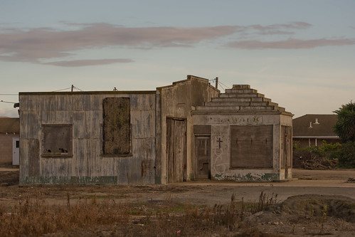 Sweet digs by Krakkles, on Flickr Krakkles fucked around with this message at 14:32 on Dec 6, 2011 |
 #
¿
Dec 6, 2011 14:28
#
¿
Dec 6, 2011 14:28
|
|


|

|
| # ¿ May 1, 2024 05:58 |
|
|
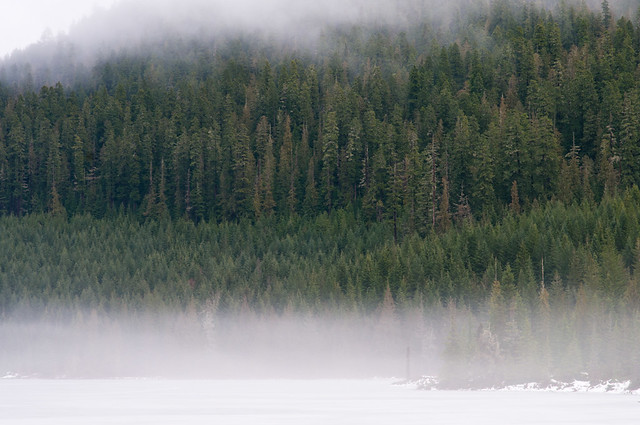
CarrotFlowers posted:I really enjoy both of these. The first one seems slightly off-level, but it could be my lovely monitor isn't level. The bright, saturated foreground blends nicely with the muted colours and contrast of the fog. I love these as well. I disagree on the levelness of the first one - the trees are crooked. If you look at the man walking (ostensibly the subject?), he's vertical.
|
|
#
¿
Dec 12, 2011 20:09
|
|
|
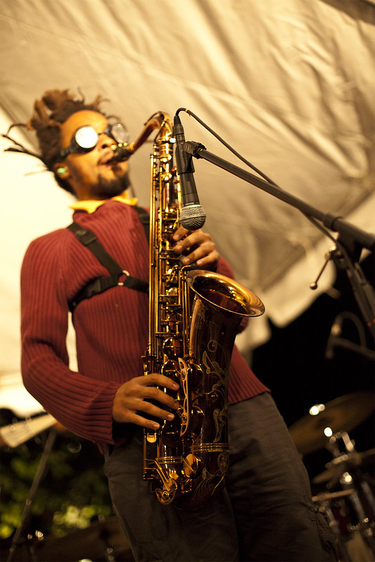
rio posted:About the lens, I might have just not said what I was trying to say clearly. He is looking for a defocused background on a portrait. 18mm for a portrait is not really that flattering usually, but will give him the largest aperture on that lens, so all I was saying is that he would either have to sacrifice the blur or a portrait-appropriate focal distance when using that kit 18-55.  DSC_0288-2.jpg by Krakkles, on Flickr With low-end lenses, focal length is the way to get the blurry background. See: Canon S95. I don't know the specs for sure, but I can almost guarantee you're not going to get an aperture low enough on that kit sony lens to get that effect - but you will be able to get it with the length.
|
|
#
¿
Dec 18, 2011 20:33
|
|
|
Dread Head posted:
|
|
#
¿
Feb 1, 2012 06:37
|
|
|
Quite a cool concept! I feel like the framing is a bit odd - having the lego man at 1/3 from left with the car taking up the right 2/3 and/or centered around 1/3 from the right might present a stronger image. The only other thing that bugs me is that you can see light coming through the lego man. Photoshopping that out and/or putting duct tape along the front of him to reduce it might help. More depth of field may work too - you can't quite tell that it's a hot wheel burning, and that could go either way, I think.
|
|
#
¿
Feb 6, 2012 02:36
|
|
|
truncated aardvar posted:(edit) In retrospect I don't think you'll get much of a DOF increase anyway with that lens.
|
|
#
¿
Feb 6, 2012 04:02
|
|
|
Trambopaline posted:Yeah fair enough. Better than indifference for sure. I was trying to go for the, hey look at me i've got an old camera, trying to make that the focus of the image, but i guess something just got lost in the translation. I think in completely obscuring the face, you've made us think about that more than the camera. I'd say lighting the camera well and using (underexposure? ...not sure of right term here) to obscure yourself would work better.
|
|
#
¿
Feb 6, 2012 07:23
|
|
|
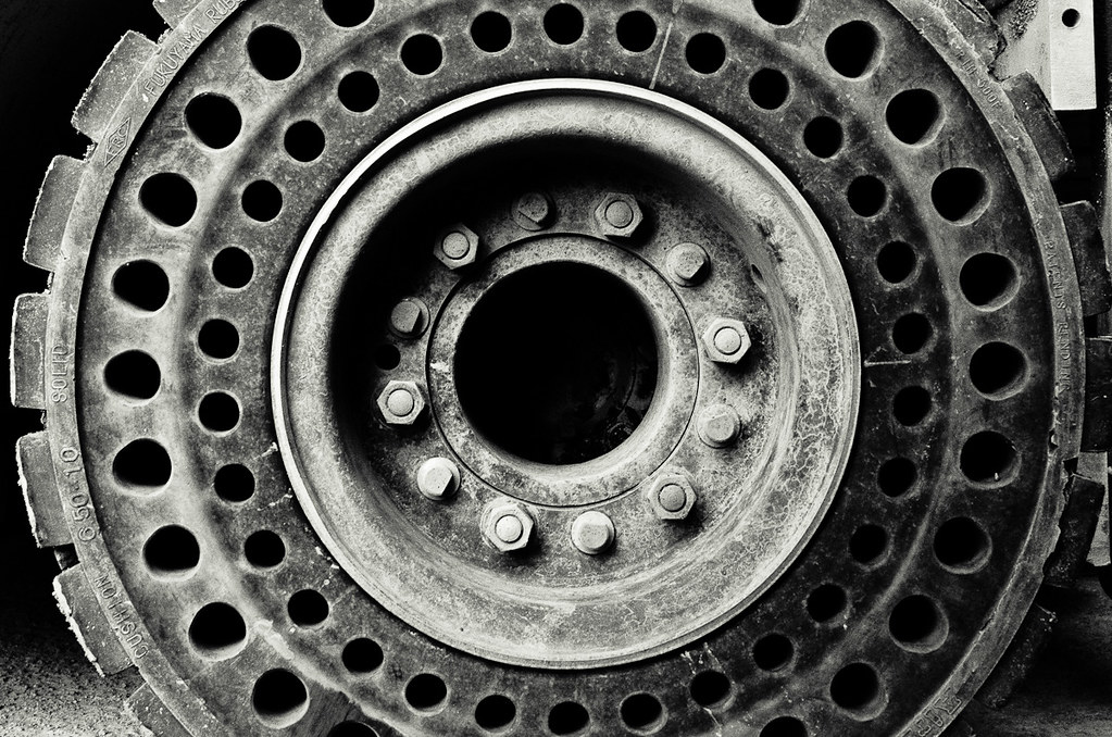
truncated aardvar posted:I revisited some shots of a forklift I took some weeks ago and delved once more into b&w (or in this case kinda sepia). Thoughts on contrast, sharpness, etc would be appreciated.
|
|
#
¿
Feb 25, 2012 00:27
|
|
|
ohrwurm posted:
ohrwurm posted:Sky too bright/harsh in this one? Also not too sure on the composition, maybe should have included more of the lower portions of the buildings?
|
|
#
¿
Jul 10, 2012 21:02
|
|


|
I love this shot over in Low Effort: I aspire to someday be this good.
|
|
#
¿
Jul 14, 2012 22:25
|
|
|
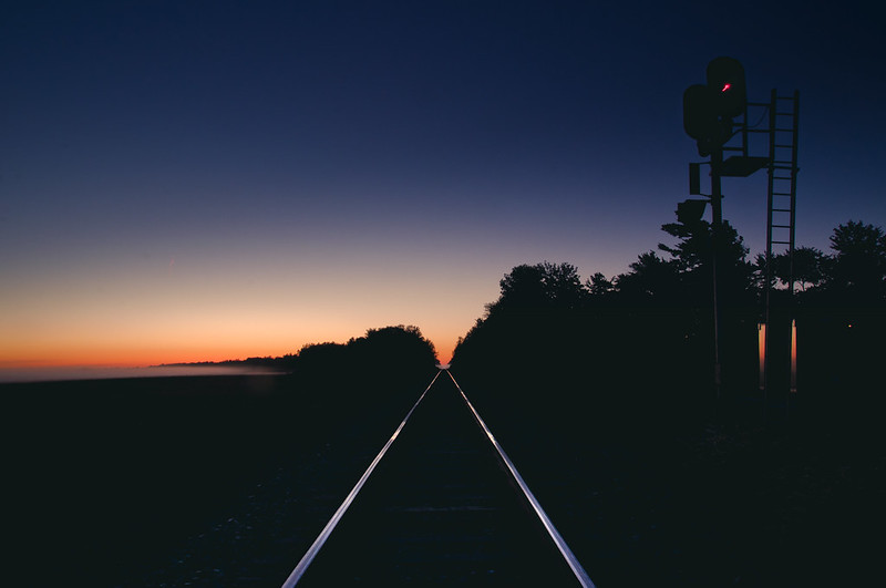
TheJeffers posted:
There's a really good composition somewhere near where this shot was taken, I think, but I'm not exactly sure where it is. Also, jesus christ: Love the colors, love the composition, love the lines of light formed by the railroad tracks. Krakkles fucked around with this message at 02:59 on Sep 17, 2012 |
|
#
¿
Sep 17, 2012 02:50
|
|

|
geeves posted:
|
|
#
¿
Oct 3, 2012 04:52
|
|
|
Mathturbator posted:Does this have anything going for it? I think it's quite pretty. A bit red on my screen, though.
|
|
#
¿
Oct 10, 2012 07:24
|
|

|
Dr. Platypus posted:
|
|
#
¿
Dec 28, 2012 03:04
|
|
|
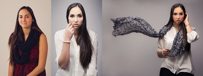
xenilk posted:That's a pretty subtle edit. As other pointed out once you know it you can spot a few differences but otherwise I couldn't have told. Could you walk us through the process and about how long it took you approx.? Wow, that's the same girl? Impressive!
|
|
#
¿
Dec 28, 2012 05:07
|
|
|
Druckman posted:
|
|
#
¿
Jan 4, 2013 03:31
|
|
|
smallmouth posted:I like the first one best as well. Although mostly because I think her pose looks a lot more interesting. What did the sky look like without the composite? I gotta be honest, there isn't enough of the building to be interesting, and there's very little to no detail in the sky even with the compositing.
|
|
#
¿
Feb 1, 2013 20:32
|
|

|
It's really interesting, but I think that it's so dark that it stretches into the territory of just being confusing.
|
|
#
¿
Feb 11, 2013 07:06
|
|
|
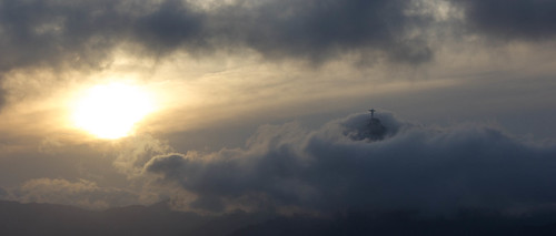
Edmond Dantes posted:I just got back from Brazil: There's some interesting tension created by the angling of clouds and the statue, but not at all in a "oh god straighten your photo" way. If anything, I wish the sun was a bit less bright and the clouds a bit brighter, but it's quite good as is. Krakkles fucked around with this message at 08:27 on Feb 20, 2013 |
|
#
¿
Feb 20, 2013 08:23
|
|
|
I think all three of those are fantastic, hands down. The first, at first glance, no, I couldn't tell it was a bomb. After a sec, especially with the EOD patch, yeah, it was pretty obvious. The second would be better if his eyes were in better focus, but it is very strong as is. The third doesn't feel overproduced at all - I think the vignetting serves well to center focus on the soldiers center frame. Incidentally, all three of these are now in my "desktops" folder.
|
|
#
¿
Mar 22, 2013 19:14
|
|
|
Yeah, there's definite wisdom there. I know that my candid or unplanned shots have consistently improved based on practicing through planned or controlled shots - the experience lends itself to better technique.
|
|
#
¿
Jan 26, 2017 17:49
|
|
|
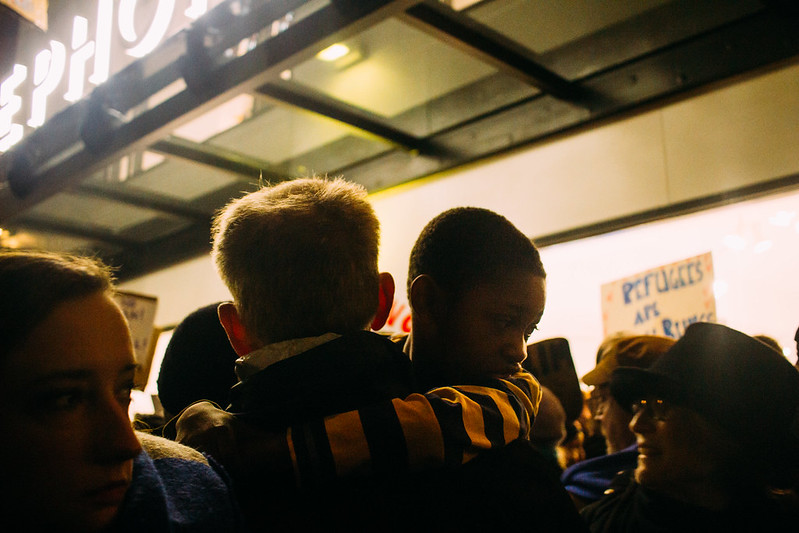
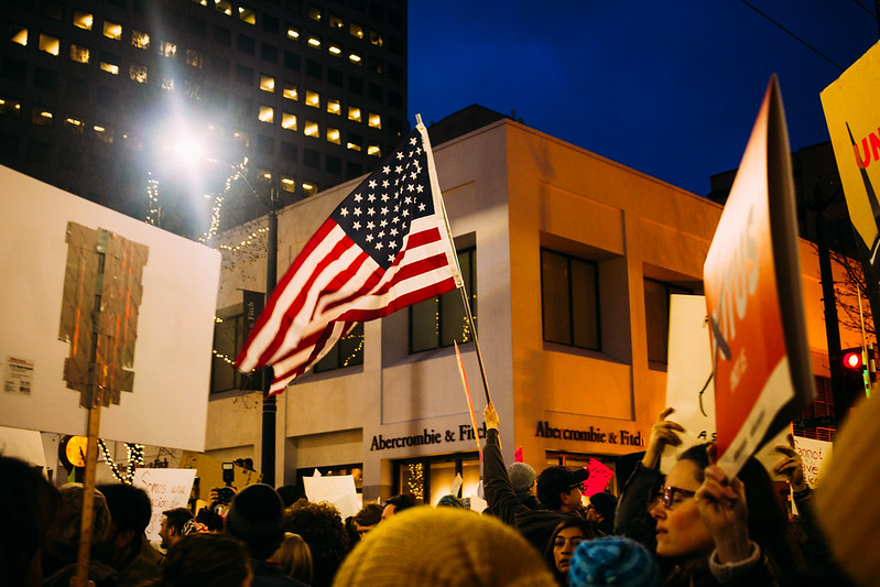
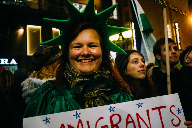
Magic Hate Ball posted:These are okayish. Your main problem is lack of focus. What are you trying to convey about these subjects? The first photo has beautiful tone, but it's essentially a picture of nothing. The photo of the flower is awkwardly framed, I find my eye drawn towards the big white area in the middle, which is essentially featureless. The potential point of interest, the tip of the blossom, is shoved way up towards the top. The bridge photo is kind of a dead picture. It's a collection of lines and a clutter of architectural structure. Bridges are tricky - like most public art, they're usually designed to look blandly nice, so a photo of a bridge usually just looks blandly nice, at best. The third, I like it, but the framing would be better if a bit more of the sign was visible - the entire word, for example. The second. Man. That's a great shot. The flag, the people, the sign that's just barely legible - you think you know what it says, but you can't really read it. The only thing that I would like better would be if the sign on the left were more interesting - the taped together, white back looks basic and mechanical, and not in an interesting way. Your shots make me think of Santa Monica.  The Moon over the Plains by Nate H, on Flickr
|
|
#
¿
Jan 31, 2017 08:22
|
|
|
murk posted:Why f/32 on this one? Would a larger aperture have been better?
|
|
#
¿
Feb 1, 2017 17:18
|
|
|
VelociBacon posted:Yes, you get diffraction issues at those high stops, everything would have been in focus anyways at f/11 or so. It probably would have also concealed the dust on the lens, which I'm now wanting to clean. Sigh.
|
|
#
¿
Feb 1, 2017 17:47
|
|
|

|
| # ¿ May 1, 2024 05:58 |
|
|
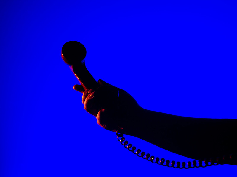
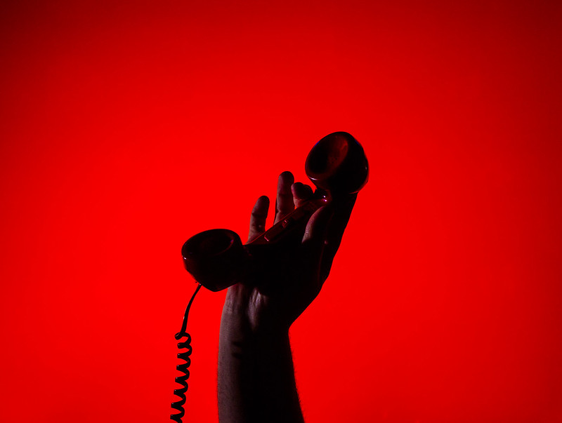
Magic Hate Ball posted:This is okay. The colors seem a little muted, and I wish the darkness below the trees was a proper black because there's just the shades of some stuff down there that's distracting my eye. 1 and 3 are amazing. The second one has a little too much negative space - the shadows on the hand and phone blend a little too much.
|
|
#
¿
Feb 2, 2017 03:34
|
|