


|
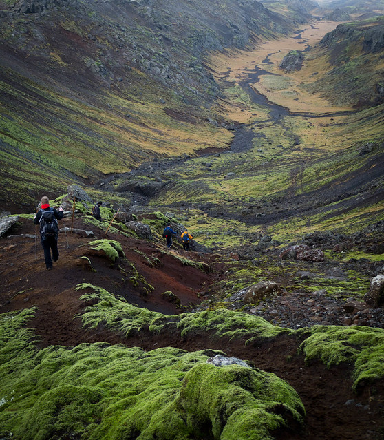
David Pratt posted:Which of these works better? How can I accentuate the hikers? You don't get quite the sense of scale as you do from the first, but the second one is without a doubt way better. There's a really nice sense of flow in from the path in the foreground leading upwards that guides your eyes to the hikers and then further out into the valley. It works really well. To accentuate the hikers, try duplicating the layer you have and mask the hikers out. Play with the levels or curves to soften the image around them (keep it subtle though). Maybe use a gradient on the layer mask to keep the foreground as is, there's some really nice rich greens and textures there that help make the photo.
|
 #
¿
Nov 22, 2011 13:25
#
¿
Nov 22, 2011 13:25
|
|


|

|
| # ¿ Apr 28, 2024 10:25 |
|
|
You're going to hate everything you're shooting now in a month or two anyway. Dive into Lightroom and start making some mistakes. Get them out of the way sooner than later.
|
|
#
¿
Nov 22, 2011 22:09
|
|
|
William T. Hornaday posted:While the processing is quite good, I don't think this one is up to snuff. Usually your animal photos function very well as portraits, but I just don't feel any personality in or connection to the subject here. The tiger one kicks all sorts of rear end. I wouldn't change a thing. Also, thanks for the step-by-step shots, they're really insightful. burzum karaoke fucked around with this message at 19:38 on Jan 27, 2012 |
|
#
¿
Jan 27, 2012 19:35
|
|

|
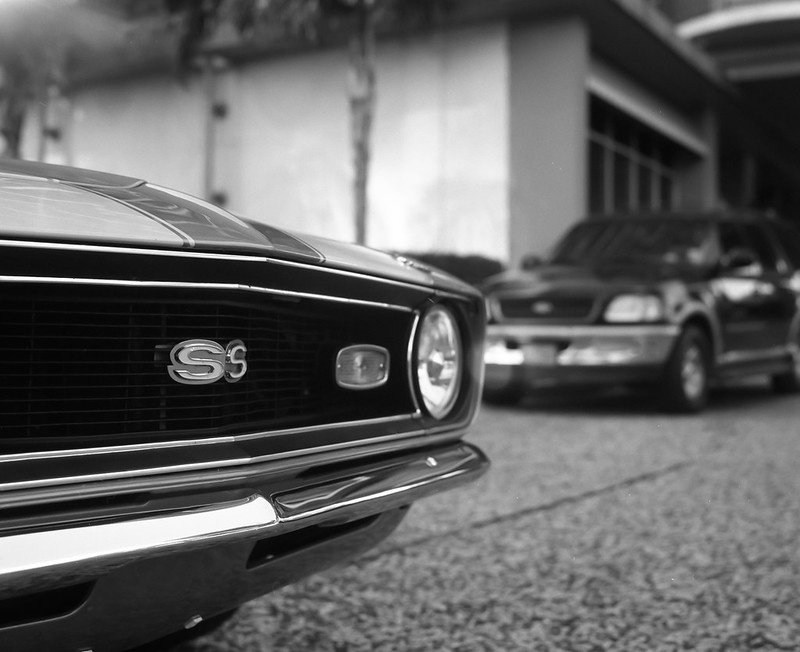
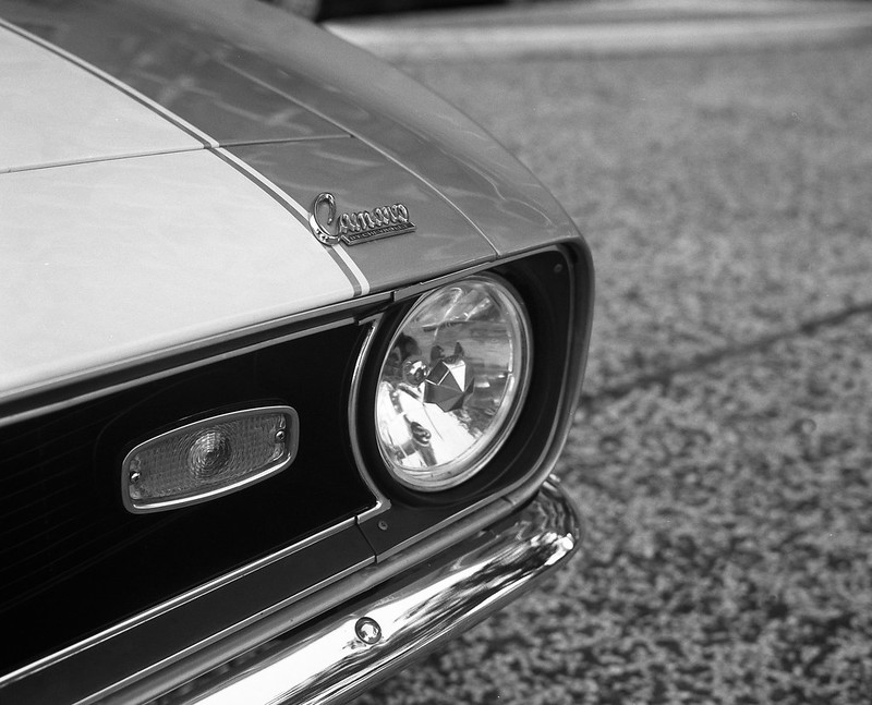
Augmented Dickey posted:I feel like you're being neglected. 1. This is dope. I love, love, love the tonal range and composition. The rays of light pouring in overhead balance the weight of this photo perfectly for me. There's a really cool dreamlike and timeless quality going on here. 2/3. Technically well shot, but the SUV is really distracting and takes me out of the image. The last one is just kinda boring. Try thinking about context when shooting static objects, even if only vaguely implied. Hotwax Residue posted:
1. This feels a little too weighted to the right because of where the hills fall off and the horizon being a little crooked. This is nitpicky stuff for the sake of being nitpicky. It's a landscape and it works. You do these well. 2. This one just seems like it's begging to have more dynamic range or a greater feeling of depth. Maybe dodge some of the highlights a bit more, especially in the background hills, it might help frame the tree better and pop some of the secondary focal points. As an optional homework assignment: after taking a shot like this, try doing it again, but spreading it over 4-10 photos and stitch 'em together (just to humour me!). Shots like this are just begging for MF/LF depth of field control. * * * * * * * * * * * * * * * * * * * * * * * * * * * * * * * * * * * * * * * * * * * * * * * * * * * * * * * * * * * * * * * * * * * * * * * * * I had some fun with a roll Portra 160 and my new FM2n   . . . . 
|
|
#
¿
Apr 25, 2012 13:45
|
|


|
xenilk posted:Hey Ottawa buddy! Where do you get your rolls developed? GPC Labworks on Bank Street, it's next door to the Henry's.
|
|
#
¿
Apr 25, 2012 17:18
|
|
")
|
Musket posted:
It's cool that you're pushing your images and you shouldn't be afraid to do so either, just try to keep an overall sense of balance in mind. Augmented Dickey posted:***************************************************************************************************************** The weather around here is finally starting to be consistently pleasant. It's been motivating me to get up at ungodly hours in the morning and drive out into the country, exploring the back roads before having to scramble back into the city for work. Waiting for the weekend would be easier, but where's the fun in that?  
burzum karaoke fucked around with this message at 13:38 on May 9, 2012 |
|
#
¿
May 9, 2012 01:29
|
|


|
xenilk posted:I'm not even going to bother critiquing that picture. It's freaking awesome. I wish I could follow you with a GPS, would love to shoot at those locations and I know you're near! http://g.co/maps/2778m ") Now that I think about it, I should just start pre-scouting areas with Google street view, it would save some gas. QPZIL posted:Mother of jesus. What lens are you using? I saw in the EXIF that the focal length was 29mm or so. I used the Tamron 17-50 2.8 with a polarizer. For the first picture, I'm alright with how dark it is, but that could vary well just be my monitor settings. I'll check it out on my work computer tomorrow to verify. As for the composition, it's a bummer about that front tree competing with the house. I was hoping the cluster of trees on the left would be enough to offset it, but coming back to it with fresher eyes, I think you're right, Hotwax. Thanks for the feedback/comments, guys. burzum karaoke fucked around with this message at 23:27 on May 9, 2012 |
|
#
¿
May 9, 2012 23:21
|
|
|
MrBlandAverage posted:There's something about these I don't like quite as much as most of your work. The first one especially seems super flat - I think what makes most of your stuff work is when your processing style emphasizes the directionality of light. I agree actually. While I think the lack of contrast works in favour of the mood of the first image, I'm going to see if I can breathe a better sense of depth into it, but overall, I'm pretty happy with this one despite some of its faults. I'm growing increasingly unhappy with the farm one though, especially at the muddiness of where the fence meets the barn on the left. I'll try to rework them over the weekend. burzum karaoke fucked around with this message at 09:46 on May 11, 2012 |
|
#
¿
May 11, 2012 09:42
|
|
|
Turd Nelson posted:Here's another shot from the Japanese gardens. I was trying to emulate the look of Alien Cowboy's stuff. How do the colors come off? Too green? Wow, I'm flattered!  . Like others have said, those leaves in the top right are pretty distracting. The background tree on the right is a little overpowering in comparison to the central tree. This tree is a great secondary focal point, but the highlight is competing a little too much with the main tree for me, try toning it down a little. Other than that, maybe darken the negative space on the lefthand side, it might help keep focus pulled inward (my eyes keep wandering over there). These are all just nitpicks though, I think you did a really good job with this; the colour cast is working well and the image sets a nice tone. . Like others have said, those leaves in the top right are pretty distracting. The background tree on the right is a little overpowering in comparison to the central tree. This tree is a great secondary focal point, but the highlight is competing a little too much with the main tree for me, try toning it down a little. Other than that, maybe darken the negative space on the lefthand side, it might help keep focus pulled inward (my eyes keep wandering over there). These are all just nitpicks though, I think you did a really good job with this; the colour cast is working well and the image sets a nice tone.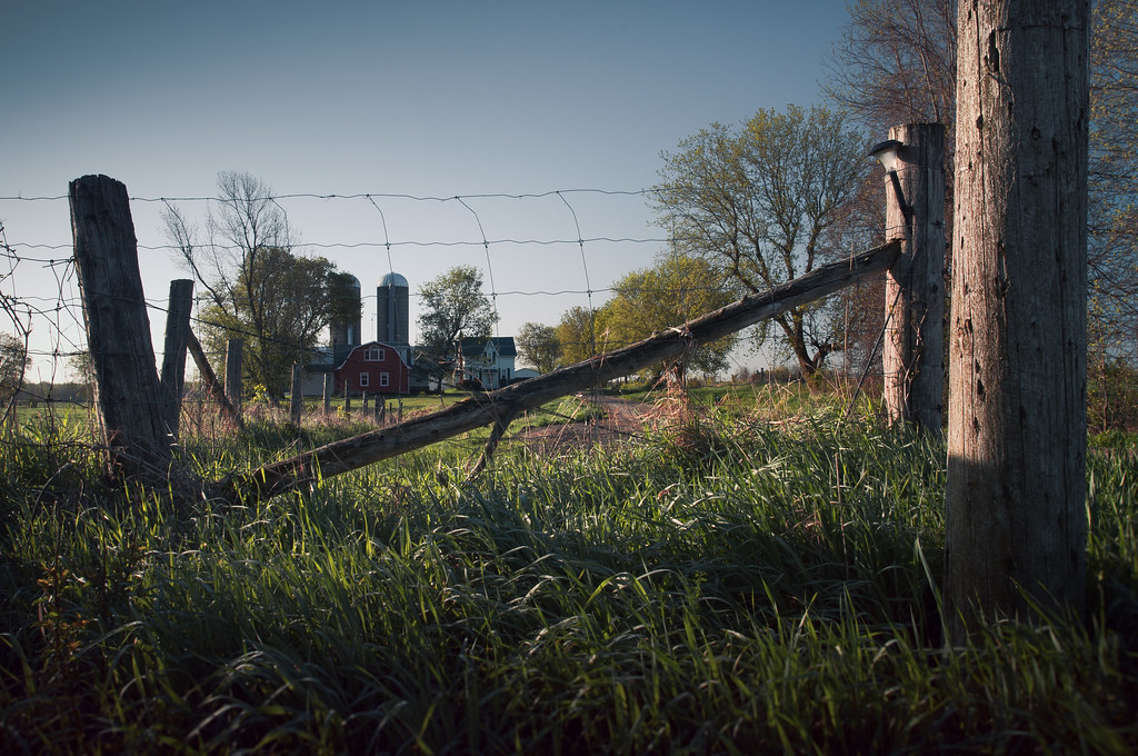
burzum karaoke fucked around with this message at 01:42 on May 23, 2012 |
|
#
¿
May 23, 2012 01:40
|
|
|
Lon Lon Rabbit posted:On the other hand, I guess if you were trying to subvert the warm, inviting and rustic farm image and make it look inaccessible, well done? That cross beam frames the farm just like a NO SMOKING/NO ENTRY cross-out sign! That's what I was going for with the farmhouse/silos secondary to the fence but if it's not working, it's not working.
|
|
#
¿
May 24, 2012 01:38
|
|
|
Kin posted:My first attempt at something in HDR (well, what i think is HDR). Glen Coe!! I was there last year mouth gaping at the scale of the scenery. I think you did a fine job exposure blending and stitching, especially without a tripod. The only thing that I think hurts the image is the inclusion of the gravel/brickwork in the foreground. It takes me out of the scenery. I don't think the answer is to just chop off the bottom half, but it is a stitch so you've got plenty of resolution to crop guilt-free and find new composition within what you have.
|
|
#
¿
May 26, 2012 19:37
|
|

|
^^ thanks!Kin posted:Here are two attempts at cropping my image: I think you're focusing too much on trying to include everything in the shot, and by doing that, you're removing any context of scale that's provided by the midground or centre-foreground. As a starting point, try entering some common size ratios (2x3, 4x5, 1x1 or even cinematic ratios like 16x9 or 2.35x1) into Photoshop or Lightroom's cropping tool as something to work with. Play around with those, try finding a composition with a sense of scale while retaining balance throughout the scene. burzum karaoke fucked around with this message at 23:07 on May 26, 2012 |
|
#
¿
May 26, 2012 22:58
|
|


|
a foolish pianist posted:The snow looks fine for me? Nope.  It's a really nice shot. The girls are framed well by the trees and there's a ton of personality in their expressions. The snow falling in front of the trees looks really good too. The foggy shot of the water has a nice mood to it too, but I wish the sky or the water was favoured more. I think simpler shots like these are a bit more demanding of bolder composition choices. burzum karaoke fucked around with this message at 00:19 on Jun 10, 2012 |
|
#
¿
Jun 9, 2012 23:57
|
|
|
Metalslug posted:I really wish I could offer some good criticism, but this is my first foray into photography.... There's some weird green colours going on in the treeline, other than that, I think it would benefit from shifting the yellow in the sky a bit more orange and maybe desaturating the greens slightly, but it it's a killer shot. Good job!
|
|
#
¿
Jul 3, 2012 06:17
|
|

|
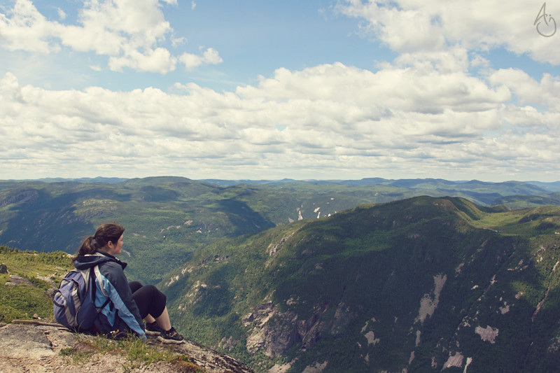
Krakkles posted:I love this shot over in Low Effort Thanks!  KingColliwog posted:A few pictures from my hiking trip : The processing works, but I do agree with Mannequin's sentiments. I guess it depends if you're taking your camera with you on a hike or if you're hiking to take photographs. If the former, just take in the view and don't worry too much about getting anything other than snapshots around 10am-2pm. Use this time to make note of what might like good based on where the sun will be later. There are the odd occasions where midday light is the right light, but it almost never is. If you want to hike with the intention of taking photos, try to be there for early morning, late afternoon or both. I like the changes you've made since the portrait thread. Nice stuff! burzum karaoke fucked around with this message at 07:47 on Jul 15, 2012 |
|
#
¿
Jul 15, 2012 05:29
|
|


|
edit: whoops
|
|
#
¿
Jul 15, 2012 05:42
|
|
|
If you're going to blur the image that obviously, either free lens the shot, use a lens baby or tilt shift lens.
|
|
#
¿
Aug 8, 2012 06:46
|
|
|
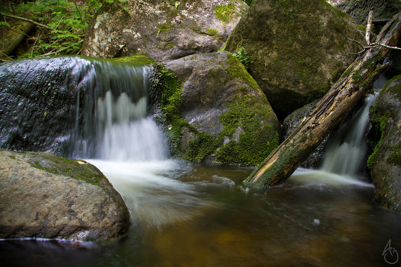
I don't mind the darkness so much, but I have a weird thing for dark forest shots. The contrast of the first one works a little better. There's too much contrast in the second one-- my eyes are going from his head to the tree canopy instead of down the path.
|
|
#
¿
Aug 20, 2012 22:58
|
|
|
mr. mephistopheles posted:Also I don't smile ever. SMILES? WHO NEEDS 'EM.  1. The window on the first one is only really distracting in the thumbnail for me, BUT I think it works well in the fullsize version. If I had to suggest anything, maybe place something in the foreground/on the table to help lead the eye toward you a little better. 2. I like that you caught both eyes in the light and the love the definition of the harsh shadows across your face. I'm not going to pretend that all portraits need a rim or fill light, but your camera-right side could use a some definition to balance out how brightly you're lit by the main light, even if just to carve out the faintest outline. The amount of chest in this crop seems a little superfluous too, you could probably crop just below the armpit. 3. I agree with Gazmachine on this one, but as someone who took a shot of himself in a storefront mirror yesterday, I understand the temptation. There's a reason we've all seen these pictures before; they're fun to take. If anything, just rotate it 90 degrees clockwise. First two don't do anything for me, but this one is absolutely fantastic. burzum karaoke fucked around with this message at 12:12 on Aug 27, 2012 |
|
#
¿
Aug 27, 2012 12:04
|
|


|
Thanks! I can't take credit for the idea though, I've seen this kind of shot done before and better.
|
|
#
¿
Sep 17, 2012 03:59
|
|
|
xenilk posted:
I think it's cool that her jeans pop as well as they do against the yellow-green colour palette, but it takes too much focus away from her face. Also, the way her shirt is falling gives her an unflattering silhouette.
|
|
#
¿
Sep 28, 2012 04:15
|
|

|
xenilk posted:I have to agree with you on that one. As much as I like the flowing clothes I think they often screw the silhouette when there's no belt or anything to define the waist when seated. When she's up I can use the hands to define it but I'll have to figure out a way to do it when seated! I guess it'll be my challenge for Fall! Maybe try shooting your models in motion? It would give some added energy to the photos and highlight any flowing garments.
|
|
#
¿
Sep 28, 2012 17:50
|
|
|
Mathturbator posted:Does this have anything going for it? The square thing at the bottom left is really distracting and pulling my focus to the bottom of the frame. It's a really cool picture though. Good use of colour and shape. I'd almost want to play with the reflection to highlight the transition from balconies and windows at the bottom to the clarity of the sky's reflection at the top.
|
|
#
¿
Oct 10, 2012 06:22
|
|

|
Mathturbator posted:Thanks, I cloned that out. I'm not sure what you mean about the reflection?  I don't really know how to say it, but I was thinking something like this, where the light of the reflection is clearly defined against the shadows of the interior. I didn't notice this until I opened the file, but there's a person sitting at their desk mid-frame, it's a really cool detail and gives some context beyond it just being an architectural shot. Maybe find a way to crop the image to play it up?
|
|
#
¿
Oct 11, 2012 06:08
|
|
|
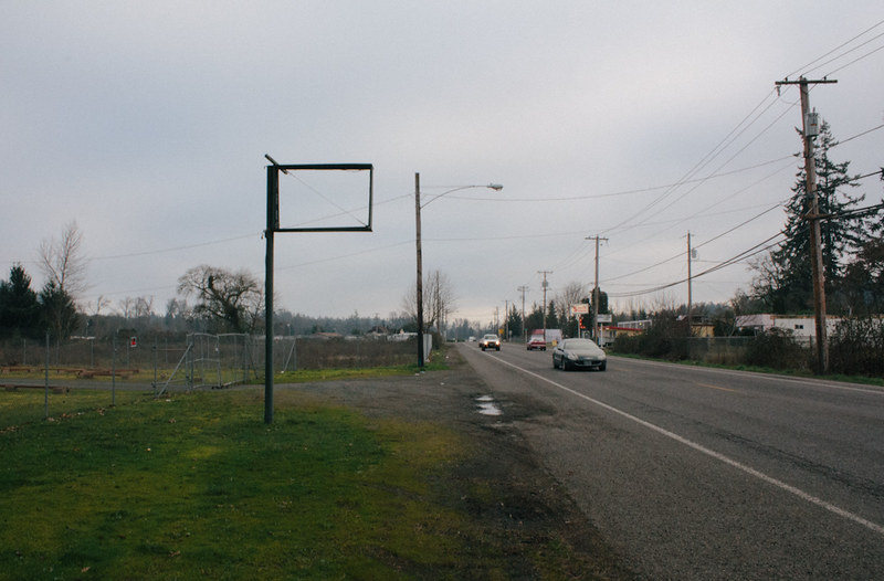
Chill Callahan posted:
There's a strong sense of tension and unease I get from the building being at odds with the angle of the wires and road (which do work nicely to frame the house). I don't know if this was your attention, but I do like it quite a bit. burzum karaoke fucked around with this message at 04:56 on Nov 16, 2012 |
|
#
¿
Nov 16, 2012 04:54
|
|

|
Shiruan posted:
The colour one is a few minor tweaks short of phenomenal. The black and white one is functional, but forgettable. Try brightening and desaturating the blues in the top portion of the photo and kick up the contrast in the cloud a little. I think those changes will give a little better sense of scale and add a nice dichotomy between the cloud and elephant. Boosting the midtones of the elephant's skin just the tiniest bit might give it a little more punch too without looking aggressively processed. edit: I just want to add that there's a cyan cast to the image that isn't very typical of pictures I've seen of Africa. I like that a lot. burzum karaoke fucked around with this message at 23:30 on Feb 6, 2013 |
|
#
¿
Feb 6, 2013 23:26
|
|


|
slardel posted:A couple of shots from me... First one tells me something, second one doesn't.
|
|
#
¿
Feb 25, 2013 08:17
|
|
|
InternetJunky posted:I'm not sure what to do with these three shots. Find a way to breathe some context into them by maybe including them as a part of a larger series. I don't think they're particularly interesting on their own.
|
|
#
¿
Sep 2, 2013 16:36
|
|

|
RangerScum posted:I'd be interested to hear critiques on this photo of mine: Composition/processing is fine, but I think the balloons come off as very hackneyed and shallow. I think your head's in the right place, but finding a subtler way to convey your message would go a long way.
|
|
#
¿
Sep 22, 2013 23:21
|
|

|

|
| # ¿ Apr 28, 2024 10:25 |
|
|
Subjects of interest (content) can do well to function as catalyst in seeking photographic form but are unlikely representative of "good photography" if merely used to describe. A greater context or tension needs to be established either within or externally to the photograph.
|
|
#
¿
May 30, 2017 12:47
|
|