


|
Brewdog posted:
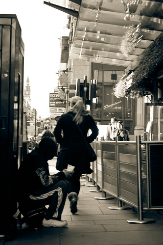
I can't even tell what's going on. I can barely see the beggar, and it just looks like the woman is a pedestrian walking in the middle of the frame.
|
 #
¿
Nov 24, 2011 08:00
#
¿
Nov 24, 2011 08:00
|
|


|

|
| # ¿ Apr 28, 2024 08:37 |
|
|
Ambihelical Hexnut posted:It looks like the cover of some Italian Criterion film (which is a good thing)
|
|
#
¿
Nov 25, 2011 21:12
|
|
|
I think you need a lens with a much shallower DOF, like a prime lens. Here is something I took with a 50mm prime, 1.8 II as an example:  Also, think about the rule of thirds when shooting people.
|
|
#
¿
Dec 13, 2011 20:29
|
|
|
I know you can't do this, but I would have preferred the photo without any headlight traffic. It would seem much "spookier" in my opinion.
|
|
#
¿
Jan 25, 2012 03:30
|
|
|
too much noise on the first one for me. I really like the second one. they're isolated which works well
|
|
#
¿
Feb 7, 2012 03:07
|
|
|
Eclogite posted:I would have liked this photo more if the tree took up the entire width of the frame.  IMG_2713_1 by gronke, on Flickr 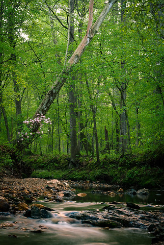 IMG_2715 by gronke, on Flickr the fucked around with this message at 03:11 on Apr 5, 2012 |
|
#
¿
Apr 5, 2012 03:09
|
|

|
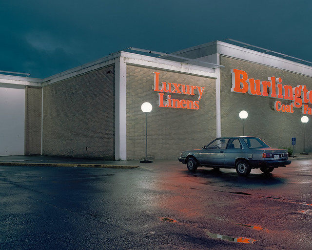
dukeku posted:Here's 2 recent photos of mine: The lighting is really really good. I am not sure how I would have gotten that last one without getting the interior all blown out, but you did it well. I like the first one better, and I think it's because the second one seems a little too close for comfort. I want to see more of the building and the parking lot. The first one has that desolate, abandoned look to it because you're further out, and I think the second one would look better the same way.
|
|
#
¿
Apr 9, 2012 22:32
|
|

|
Since I just posted a crit, here are some photos: IMG_2927 by gronke, on Flickr  IMG_2836 by gronke, on Flickr
|
|
#
¿
Apr 10, 2012 00:12
|
|
|
dukeku posted:Better than the second one, but it'd be even better if you didn't cut her chin off with the railings. it was either that or her eyes 
|
|
#
¿
Apr 10, 2012 00:34
|
|
|
DJExile posted:
Cool photo, I would have liked it will a little more contrast, though. I want to see the bird POP, but he's kind of faded. Maybe up the greens a bit too to make his coat more "lustrous." Also, it looks like you cropped it? I think it would have been nice to see the bird at the end of a branch by maybe framing him off to the side and a bit smaller. Here are two more photos I took of that girl:  IMG_2807 by gronke, on Flickr  IMG_2862 by gronke, on Flickr
|
|
#
¿
Apr 10, 2012 19:38
|
|

|
Buceph posted:One of the first things I ask myself is "What is the point of what I'm looking at?" I can't tell that with this picture. It seems relatively properly exposed, but what's the point? I'm looking at a fireplace and some books on a coffee table. If it's supposed to be inviting, it isn't. The places I'd imagine sitting in are cluttered and disappearing into the foreground, so I feel like I'm squished in there between the two pieces of furniture. ---------------------- Someone critique this for me 
|
|
#
¿
Apr 19, 2012 23:23
|
|

|
David Pratt posted:
Interesting effect. However, are those lens flares added in post? They struck me as such which takes away from the photo. It looks like a lot of post was done on the photo in general, which isn't a bad thing necessarily, it's just that the water seems rather.. radioactive. ----------- Here are some self-developed photos I took on 35mm:  1612910-R1-E023 by gronke, on Flickr  1612910-R3-E048 by gronke, on Flickr  1612910-R3-E052 by gronke, on Flickr
|
|
#
¿
May 2, 2012 21:00
|
|

|
TheJeffers posted:
I agree with what the others said. A farther away shot would have looked better. Give it more space. Having it sit in the middle of a landscape with nothing but a field around it would add to the strangeness of a giant metallic object being in a field, which is what I assume you were going for. Here are some assorted shots: A drunken disabled man attempts to breakdance in a nightclub, much to the amusement of onlookers 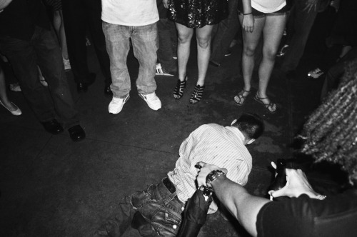 A man plays "When Saints Go Marching In" for tips on a DC corner while a tourist seems lost 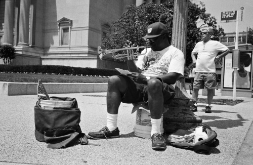 A man protests alone against the government outside his "bunker." 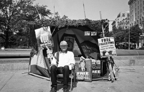
|
|
#
¿
May 21, 2012 22:15
|
|

|
LargeHadron posted:I have three of my own that I think are pleasing to look at, but I want to know if I am disillusioned or if they are actually decent. You are not. They are good. With the first one, the orange cone just below the sign is a bit distracting. I also would have liked no people in the photo, but that's just me. I really really like the second one, especially the variation in how the ... holes? look. I still can't figure out what it is, which is part of why I like it so much. It just looks industrial and dystopian and cool. This last one has really good framing and positioning of the subject. I need to know which one of these is the best, or if I should change anything: 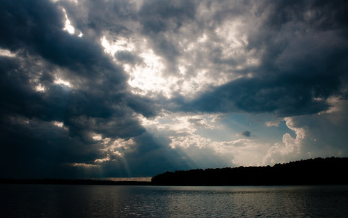 IMG_3067 by gronke, on Flickr  IMG_3068 by gronke, on Flickr  IMG_3063 by gronke, on Flickr
|
|
#
¿
May 24, 2012 04:38
|
|
|
MrBlandAverage posted:All of these look like they got metered for the bright part of the sky and as a result there's no detail in anything else. This might be okay if the "everything else" weren't a major part of the composition of each. That was the post. I wanted to emphasize the bright light coming through the dark storm clouds. Too much contrast/saturation/etc? Here is an original as an example: http://i.imgur.com/KN1De.jpg the fucked around with this message at 04:57 on May 24, 2012 |
|
#
¿
May 24, 2012 04:49
|
|
|
xenilk posted:Here's one of mine, been awhile! I don't like the jeans, frankly. I think the style ages the model (who already looks a bit old anyway). I'm not sure exactly what you're going for. Is she supposed to be alluring? Inviting? Threatening? This is more of a snapshot a day photo, but since Soundmonkey wants everyone to post here...  (USER WAS PUT ON PROBATION FOR THIS POST)
|
|
#
¿
Jun 1, 2012 06:43
|
|

|
Gazmachine posted:EDIT: Another landscape...thing. Does this do anything for anyone? It's alright. I can't tell that the thing in the foreground is a beach chair until I stare at it for a bit. The wind ruined it. Honestly I would have liked it better without that foreground beach chair, it gives a little bit more of that desolate look I think you were going for. 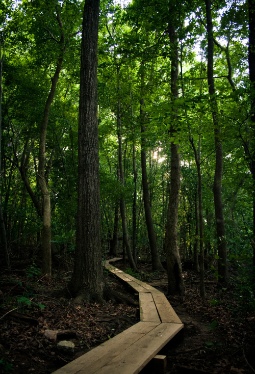
|
|
#
¿
Jun 15, 2012 21:58
|
|

|
CarrotFlowers posted:I have seen this same picture a thousand times. It just seems very done. It's boring. I think you could push yourself a lot more. How could I shoot that area differently? Or should I just avoid it altogether? If you're referring to specifically me and that photo, I have posted one that was similar, but it was at least a mile away from this spot. And, the problems with that earlier photo (bad lighting, blown out, etc) I think were fixed with this photo, and it was probably the different location and time of day that did it.
|
|
#
¿
Jun 15, 2012 22:45
|
|
|
Use a longer exposure. It looks like whoever developed it had to boost it a bit to overcome how dark it was, and you're ending up with noise out the rear end, which looks bad. I really like that chess pic, my only concern is that the horizon doesn't seem level at all. The band pic doesn't really have a focus which bugs me.  
|
|
#
¿
Jun 16, 2012 06:29
|
|
|
downfall posted:
The extremely shallow DOF doesn't work for me. I would have liked it a lot better if I could see the whole insect. Right now it almost just seems like a tilt-shift filter was applied to the image.
|
|
#
¿
Jun 16, 2012 19:12
|
|

|
lazer_chicken posted:Canon Rebel XS, Ilford HP5 plus. Wait... what? The Rebel XS is just a digital camera, right?
|
|
#
¿
Jun 23, 2012 05:22
|
|

|
|
| # ¿ Apr 28, 2024 08:37 |
|
|
ogopogo posted:
I like the color. The tight crop, especially with her shoulders not being completed, makes them look really wide and odd, and it makes her arms look fat. I also would have liked her hair with more volume. Right now it looks rather slick since it's pulled back behind the head. I've also read in portrait photography books that the person should never face directly shoulders square into the camera (although this rule is quite often broken), but here I think that holds true. It just doesn't look right.
|
|
#
¿
Jun 27, 2012 01:57
|
|
