


|
I took some pictures while walking (not standing still to take a picture) to a pub last night (after already having consumed a fair amount of alcohol), and although I probably shouldn't have done that, I like how this one turned out. Is the motion blurriness effective or does it just make it look like a mess? Please advise.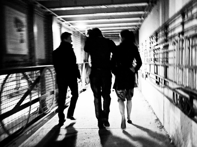 PB230155 by Cacator, on Flickr Brewdog posted:
Cacator fucked around with this message at 22:36 on Nov 24, 2011 |
 #
¿
Nov 24, 2011 22:14
#
¿
Nov 24, 2011 22:14
|
|


|

|
| # ¿ Apr 27, 2024 21:13 |
|
|
Enigma89 posted:I really dig this. But I can see what you mean about maybe looking a bit too messy. The only thing I wish was that the people had a bit more exposure so I could see a bit more details on them, but I dig it. I probably could do that, I actually just threw on one of the B&W presets in Lightroom and thought it looked better. I'll see what I can do without losing the contrast with the background.
|
|
#
¿
Nov 29, 2011 17:03
|
|
|
Opinions on the framing with this? It was just a snapshot so he was originally centred and I cropped it, I feel he's still a little too in the middle but it was better to have the traffic lights be more centrally positioned. Also, should there be more space above his head? Below? I don't take a lot of portraits. LN by Cacator, on Flickr TheJeffers posted:From last night: It's too bad that out of focus green towel on the right is in the way, a bit distracting.
|
|
#
¿
Apr 15, 2012 19:12
|
|

|
Gracias for the input, y'all. I cropped closer and pushed him towards the right, could have gone a little further but I wanted to keep just a bit more of those trees on the right in. LN by Cacator, on Flickr
|
|
#
¿
Apr 16, 2012 08:54
|
|
|
Bottom Liner posted:I don't think the crop works, it draws attention to the fact that the image isn't quite sharp, which wasn't noticeable before. The wide street in view was what made the photo for me, filling the frame with him more isn't as strong because his pose and expression are a bit deer-in-the-headlights. It was ok in the original frame, but looks awkward here. Ah. I'll keep playing around with it. Seems like I should crop wider but keep him off to the right? Centering him is a little boring I'll admit. Edit: Here's the uncropped version for comparison  Edit 2: Let's try again.  LN by Cacator, on Flickr Cacator fucked around with this message at 01:44 on Apr 17, 2012 |
|
#
¿
Apr 16, 2012 16:27
|
|
|
Here's a few I took on a trip to Switzerland and exclusively used an X100: Artistically Placed Tree by Cacator, on Flickr Clock Tower Graffiti by Cacator, on Flickr  Stechelberg by Cacator, on Flickr  Alps by Cacator, on Flickr Clouds over Luzern by Cacator, on Flickr The last one I'm having trouble with, don't know if it is exposed too little or if I should convert it to black and white or if something less blue would work better. HookShot posted:
I usually like taking shots like this at art museums and did at the Kunsthaus in Zurich, but I can't really explain why, if it's just the aesthetics or the way space is used in a museum or what. Not really a critique, but how would you describe it? Cacator fucked around with this message at 21:42 on May 12, 2012 |
|
#
¿
May 11, 2012 20:03
|
|


|
David Pratt posted:This is pretty boring. Central composition, and it's just a picture of someone else's art. Fair enough if you're documenting street art, but as a photo it doesn't stand on its own. Understandable, I guess I can crop closer to push it to the left.  Clock Tower Graffiti by Cacator, on Flickr quote:This seems underexposed to me. I understand you had to to get the god ray in as much detail as you did, but I'd be tempted to draw an exposure gradient across the bottom left of the picture to lighten it up. Either that or darken it completely so it's just a silhouette against the sky. Went with the former and added the gradient. Thanks for the input.  Clouds over Luzern by Cacator, on Flickr Cacator fucked around with this message at 05:07 on May 12, 2012 |
|
#
¿
May 12, 2012 05:05
|
|
|
Hotwax Residue posted:I think the the horizon should be lower in the frame. And maybe you could have got down closer to the flowers, that would make the tree appear larger.  Artistically Placed Tree by Cacator, on Flickr Would a center crop work as well?
|
|
#
¿
May 12, 2012 12:09
|
|
|
the nicker posted:Really digging this. It looks like veins spreading through some type of tissue, like a leaf under a microscope. I almost wish the bench wasn't visible through the foliage at the bottom to complete the illusion. It looks like the close-up of a cornea to me, actually (do not do a google image search for cornea). Here's a few more from my trip to Switzerland:  Kunsthaus Zurich by Cacator, on Flickr  Rolex Learning Center by Cacator, on Flickr  On the Waterfront by Cacator, on Flickr
|
|
#
¿
May 19, 2012 00:49
|
|
|
xzzy posted:That guy's actually doing a kickflip, isn't he? (on cobblestone too, making him a legitimate badass) Nope, he's doing a legitimate leg-powered human jump. And I have no skill with image manipulation. It was a difficult shot to get since the X100 is most definitely not meant for action.
|
|
#
¿
May 19, 2012 06:18
|
|

|
Magic Hate Ball posted:I've actually got two other photos of him, but I'm not sure what I think of them, so here they are: I prefer the second one, it's better framed and makes you think "what he lookin' at?" whereas the first one seems just like a snapshot you took while he was walking by. Which it probably is? I'm a bit stuck on this one. I like the original perspective (left) looking up at the tree, then I ran it through the Lightroom auto-align so it looks a bit more "correct" but I'm not sure what I prefer, or how much to boost the red capes on the girls. Or maybe I could go easier on the processing? Help!!  
|
|
#
¿
Nov 17, 2015 09:50
|
|

|
I've got three different framings of this that I can't decide on. I'm also not sure if the colours are oversaturated (it's the default Astia profile though so I haven't touched anything). I'm leaning towards the first image due to its intimacy but there's a bit of a flare from the light above stuck in there.   Nigel Tufnel posted:
Could you maybe recentre the building so that the base of the building fills the bottom of the photo? I feel like there's too much empty space on the left side. I'd get more of an impression that the edges of the buildings are converging at the top.
|
|
#
¿
Jun 3, 2017 16:14
|
|

|

|
| # ¿ Apr 27, 2024 21:13 |
|
|
Nigel Tufnel posted:I recropped in 4:3 and I do like it more. Thanks for the suggestions! Yeah that's something I hadn't considered when taking the photo (I was totally creeping on those people) but the road framing is the best in that one for sure.
|
|
#
¿
Jun 4, 2017 19:38
|
|
