


|
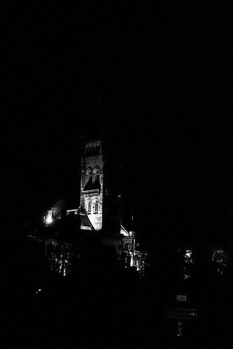
Brewdog posted:Here are a couple of my recent shots. Be harsh please: Yes, it does. If you're going for a high contrast yet low key (i.e. dark) shot of a building, get a lot closer, and fill more of the frame. It might have looked good as landscape too. Brewdog posted:
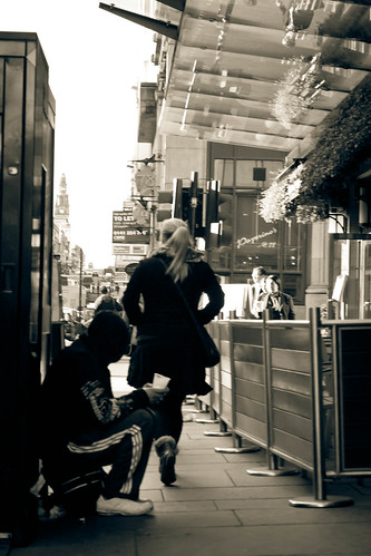
I like your motive here, but there needs to be more of a focus on what you're trying to achieve. You want it to be about the begger and the woman, yet they're minor elements in the photo. It's a If you moved to the right a little before taking it, you'd get more separation between the woman and the begger (and you'd see it more as people shot with street in it, rather than a street shot with people in it), you'd see more of the pavement and get some cool lines going on too. Here's a couple of shots for a local locksmith. I wanted a backlight but I'm getting some harsh light on the reflective keys. 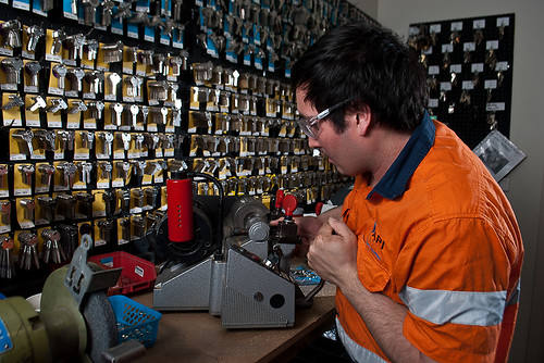 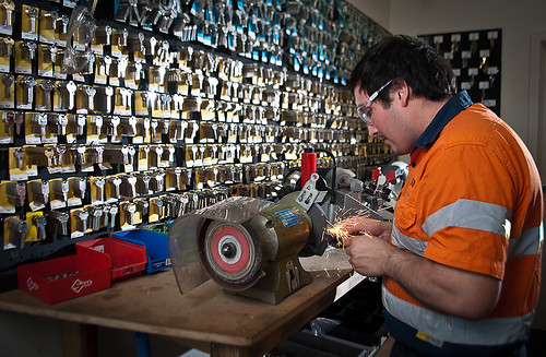 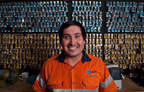
|
 #
¿
Nov 25, 2011 05:41
#
¿
Nov 25, 2011 05:41
|
|

|

|
| # ¿ Apr 28, 2024 11:19 |
|
|
VomitOnLino posted:Okay. First one, absolutely love the openness, the loneliness, like a ghosttown.. something you'd see in North Korea or on the outskirts of an Indian city, etc. Tone is spot on, but I do find the trees on the left to be a little distracting. Their tone is darker than everything else in the image. Second one I really like too, but I want to know more about it. What's its setting, why is it there etc. Not a critique but I feel like I want to know more  Third one I think is a little simplistic. I wanna either see more of the man, or more of what he's looking at. Having either of those would make it more interesting. Mine: Three entirely different shoots.  Angelo with Fire #1 by Rick0r McZany, on Flickr 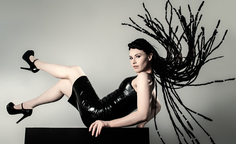 Ayr Lox'ide #1 by Rick0r McZany, on Flickr 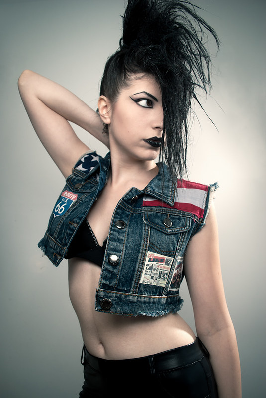 Punk D'Amour by Rick0r McZany, on Flickr
|
|
#
¿
Apr 3, 2012 11:05
|
|


|
Cacator posted:Gracias for the input, y'all. I cropped closer and pushed him towards the right, could have gone a little further but I wanted to keep just a bit more of those trees on the right in. Another hint, to make men look more masculine, angle him so the light is hitting the side of the face that is not facing the camera. Posing Males 101 ") One from me on behalf of the wife.  K J Storey by MrsMcZany, on Flickr
|
|
#
¿
Apr 17, 2012 01:40
|
|

|
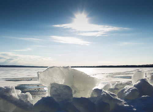
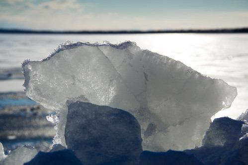
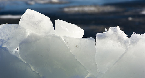
Phummus posted:I like all three of these...the third being my favorite. The first two are just a hair too dark for my tastes. With these three, I think the first one is more along the lines of what you're after in a typical "coffee table landscape book" shot. There needs to be more separation between the foreground and the background IMO. More context, not like 'Bam, block of ice, Bam, landscape' I think the elements are fighting for focus. Is it a shot of the ice, or a shot of the landscape. They need to compliment each other more. Stick to the rule of thirds for now and see how that works out for you. I really like the second one, it brings out the details in the ice better than the third IMO.
|
|
#
¿
Feb 20, 2013 21:52
|
|
|
With my three images for the day, I can't decide which I like best. I know which one I prefer, but I thought I'd publish all 3. They're different enough, and hopefully hold up on their own.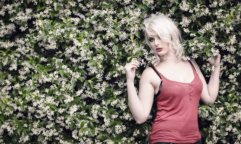 Steph on Green #1 by Rick0r McZany, on Flickr  Steph on Green #2 by Rick0r McZany, on Flickr 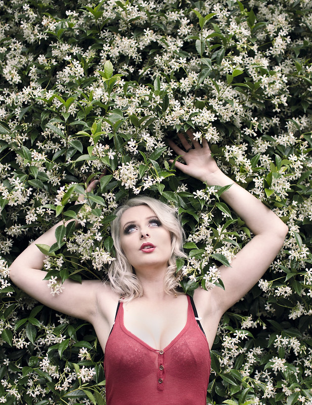 Steph on Green #3 by Rick0r McZany, on Flickr C&C encouraged
|
|
#
¿
Feb 20, 2013 21:55
|
|
|
Primo Itch posted:On a first glance it looked like a dirty fingerprint on the lenses/sensor/film/whatever, and them BAM! spiderweb. I like it, but agree that the light is a little bit distracting. 1) My first thoughts were "I want to see it straightened" - but you've mentioned that, so I'll trust your judgement that it looks better on the angle The in-focus red Stop signs, are stealing a bit too much 'eye-time' for my liking. They're drawing my attention away from the rest of the shot, in an (IMO) negative way. Otherwise I like the Out of Focus look of it all 2) When I have challenging verticals like that, I normally just go by the most prominent, in this case, I think it's the back building and its windows. A couple of degrees anti-clockwise would fix it IMO. Other than that, I like it. 3) The colours are nice, but not enough to save the shot I don't think. It might sound harsh and I apologise if it does, but I think it belongs in the "not interesting enough to keep" category. I can see what you're going for, but it's just not doing it for me, sorry For me, Experimenting with close hard light sources in the absence of a real ring-flash, and my younger cousin who's been begging for photos for a while. Not a model by any stretch, but I think it turned out alright. Yes, I could have photoshopped out the reflections on the glasses, but wanted it as raw as possible. Pretty much SOOC. Maybe I'm not ready for SOOC 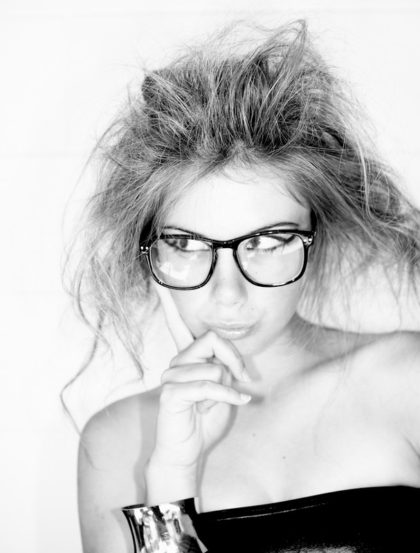 Kass B&W by Rick0r McZany, on Flickr
|
|
#
¿
Mar 18, 2013 00:05
|
|

|

|
| # ¿ Apr 28, 2024 11:19 |
|
|
Oprah Haza posted:1. You can pop out the glass from the frames for better results. Holy crap, I never thought about popping the glass out. Thanks for that tip! I'll have to try it next time. And I meant "pretty much SOOC" to mean "convert to B&W, curves, done." So, minimal tinkering
|
|
#
¿
Mar 18, 2013 03:43
|
|