


|
WebDog posted:
This is awesome. Some of it is true and some of it isn't, but great insight. Consideration must be made to who has multiple film deals with the studio (Efron) or a huge deal with a TV show (Kutcher). It is also the publicist that comes in and screws everything up, not the agent. Most of these aren't from getty though, they're unit photography pulled from the film, Kutcher withstanding. That was actually a photo from production. He fought really hard on everything, probably because he didn't want to be in the film. This thing was a nightmare. I was more pleased with how this turned out... 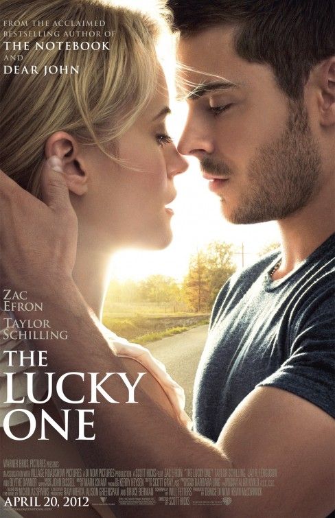 There is actually a lot of work done on this but for once it came out looking natural. I'm not a huge fan of how the sun under Taylor Schilling's chin makes her face a bit distorted but it looks good one-sheet size. With how much work went into it making everybody happy I was glad that it came out looking like they're actually there. For once. Some people have complained about how it looks flat and just a picture slapped up and a title slapped on but that is not at all the case. This could have gone VERY wrong.
|
 #
¿
Mar 3, 2012 18:06
#
¿
Mar 3, 2012 18:06
|
|


|

|
| # ¿ May 21, 2024 01:14 |
|
|
Max22 posted:How much of Zac Efron's bicep were you contractually obligated to show? We actually shrunk him down. He plays a soldier and got fairly ripped for the role. We decreased his pecs too.
|
|
#
¿
Mar 3, 2012 23:39
|
|
|
westborn posted:Sorry, but with the text hugging the edge so closely and the adopted expectation of centered credits at the bottom, this looks like someone cut off a big piece of the left side of the poster. I don't disagree and I had nothing to do with that decision so I don't feel bad. However I should point out that this is the bar:  The worst.  Like a poster in the classroom of Saved by the Bell.  Like the image but hate the billing block. Hard to read too.
|
|
#
¿
Mar 3, 2012 23:53
|
|
|
WebDog posted:I actually thought the woman in the far right square was Michelle Pfeiffer. It is.
|
|
#
¿
Mar 5, 2012 03:27
|
|
|
Robert Denby posted:Remember the poster for "Darling Companion" that just had a dog on it? No indication of what it was about or anything? Here it is for reference: I saw this on IMP. Does anybody buy that they are looking at each other?
|
|
#
¿
Mar 12, 2012 19:13
|
|

|
And I would love to watch this...
|
|
#
¿
Mar 14, 2012 04:04
|
|
|
Because it isn't real and isn't sourced from a photo shoot. It is just a really good photoshop.
|
|
#
¿
Mar 15, 2012 20:39
|
|
|
Bloody Hedgehog posted:The phrase "Die Hard" existed long before the film came out. I think it dates back at least a couple hundred years. I remember being entirely confused why they would name a film after a car battery. When I first saw it I kept waiting for the battery part, I mean until it started to get awesome and I forgot about it.
|
|
#
¿
Mar 20, 2012 01:34
|
|
|
Crackerman posted:As mediocre as the film is I really like the title Live Free or Die Hard. Pity it's called Die Hard 4 point loving 0 here in the UK. I just caught Live Free or Die Hard for the first time about a week ago and I was pleasantly surprised. I don't think it was mediocre at all. Also on the off-hand chance UK or other goons from foreign lands don't know, the phrase is a play on words with an American Revolutionary War motto... quote:The phrase comes from a toast written by General John Stark on July 31, 1809. Poor health forced Stark, New Hampshire's most famous soldier of the American Revolutionary War, to decline an invitation to an anniversary reunion of the Battle of Bennington. Instead, he sent his toast by letter:
|
|
#
¿
Mar 20, 2012 22:34
|
|
|
Does it revolve around John McClane busting up a bunch of Flatliners?
|
|
#
¿
Mar 20, 2012 22:38
|
|
|
TheBigBudgetSequel posted:The character posters are even worse. What really bugs me is that the characters in the actual film, besides Depp of course, don't really look like typical Burton characters. The posters make them look that way, and it's loving cheap and lovely. It was not, it was done by another team. However this film is based on a long-running British soap opera that Depp is a huge fan of. I haven't seen it but I hear it is pretty good and has a distinct campy tone and that is what they're trying to get across.
|
|
#
¿
Mar 21, 2012 18:14
|
|
|
LesterGroans posted:and clearly a product of the Alice/Chocolate Factory era Burton. I don't know what this means. There are hundreds and hundreds of different comps and many many directions that they go, then meeting after meeting happens and the production team along with the executives choose which direction they want to go and then they cut and paste and spice and dice. If there is any connection to those films it is probably due to the taste of the filmmakers, not any kind of direct correlation to past films. I also should remind everyone that these are designed to be one-sheet size and there is a big difference when you view it that way as opposed to your screen. I'm not really defending it because I don't really like this very much, I'm just saying what happens.
|
|
#
¿
Mar 21, 2012 18:43
|
|
|
Yeah I just went over and asked, someone said it was British and they are wrong and just made me wrong. So gently caress you, coworker.quote:Dark Shadows is an American-produced gothic soap opera that originally aired weekdays on the ABC television network, from June 27, 1966 to April 2, 1971. The show was created by Dan Curtis. The story bible, which was written by Art Wallace, does not mention any supernatural elements. It was unprecedented in daytime television when ghosts were introduced about six months after it began.
|
|
#
¿
Mar 21, 2012 19:01
|
|
|
She's pretty good but she's pretty much a steaming pile of poo poo compared to Depp and Bonham-Carter, despite any audience backlash of them working together all the time.
|
|
#
¿
Mar 22, 2012 00:04
|
|
|
LesterGroans posted:Here's a teaser trailer for it. Here it is in English Cosmopolis
|
|
#
¿
Mar 22, 2012 19:41
|
|
|
That's really messed up because I think Eastern Promises is the best of the bunch and it isn't close. You should watch it again.
|
|
#
¿
Mar 22, 2012 20:41
|
|
|
I was eight when Jaws 3D came out. Yes I'm old. My older brother was 17 and worked at a movie theater. They had a very illegal after-hours 3D screening for my idiot brother and all his degenerate friends and my brother brought me. An eight year-old. To loving JAWS. I grew up in Kansas thank god because I wouldn't even go near a waterbed for years.
|
|
#
¿
Mar 23, 2012 04:11
|
|
|
Bloody Hedgehog posted:Why would that be illegal? I just meant that the owners/bosses certainly didn't know about or approve a bunch of 17 year-old employees and all their friends watching a movie after hours with booze and weed. It was 1983. Think Dazed and Confused. Jaws 3D is atrociously bad, btw and also has a horrible poster in keeping with the topic. 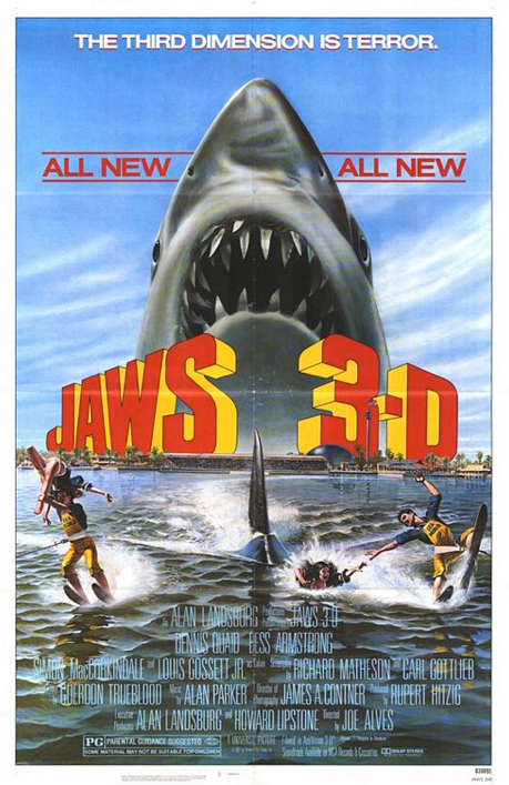
|
|
#
¿
Mar 23, 2012 17:24
|
|
|
Cartoon Man posted:This is the best part of Jaws 3D. Thank you. This has to make Spielberg cry blood tears.
|
|
#
¿
Mar 23, 2012 19:36
|
|
|
The "and Demi Moore" for some reason reads like a punchline to me. Who went and skewed the image of Woody Harrelson? It's like they free transformed it. That sucks.
|
|
#
¿
Mar 23, 2012 19:56
|
|
|
Hey you guys Steve Guttenberg totally looks like this now...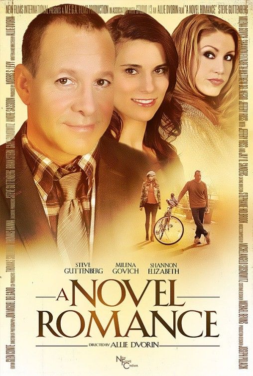 And not at all like this... 
|
|
#
¿
Mar 28, 2012 18:42
|
|
|
Run, Cadet Mahoney, run!
|
|
#
¿
Mar 28, 2012 18:49
|
|
|
Codependent Poster posted:Shannon Elizabeth doesn't look like that either. She has always been a sassy latina who constantly looks like she's in the middle of swallowing food, what are you talking about?
|
|
#
¿
Mar 28, 2012 18:51
|
|
|
HoldYourFire posted:Looks like they included a photo of Natalie Portman by mistake! No man they photoshopped it so bad you can't even tell that's Danica Patrick. I will say this, though. At least they managed to leave his eye wrinkles in and kept his eye colo-  Welp. kiimo fucked around with this message at 19:02 on Mar 28, 2012 |
|
#
¿
Mar 28, 2012 18:58
|
|
|
Horrible Bosses.
|
|
#
¿
Mar 29, 2012 17:29
|
|
|
No one in the history of cinema was as hot as Salma Hayek in her prime.
|
|
#
¿
Apr 3, 2012 19:05
|
|
|
It sounds like a textile-manufacturing conglomerate.
|
|
#
¿
Apr 3, 2012 22:56
|
|
|
Bloody Hedgehog posted:I could see that happening. I'm thinking it plays out more like Bip...
|
|
#
¿
Apr 7, 2012 19:53
|
|

|
Lizard Combatant posted:Yup which is why I'm secretly hoping Django isn't a spaghetti (even though I'd still enjoy it) because I love a 'good' Western far too much to see all the amazing potential there wasted. Pretty excited for this drat film. In my opinion the best western ever made is a spaghetti western. (The Good, the Bad and the Ugly)
|
|
#
¿
Apr 12, 2012 17:43
|
|
|
Spatula City posted:Jackie Brown is the best Tarantino movie, by a really wide margin. It's almost a perfect movie. Pam Grier and Robert Forster should have won Oscars for it. I love Jackie Brown but Pulp Fiction is a top 15 movie of all time for me.
|
|
#
¿
Apr 12, 2012 19:00
|
|

|
Cacator posted:He said since Roger Rabbit or Super Mario Bros. Kind of surprised he isn't in this... 
|
|
#
¿
Apr 17, 2012 17:11
|
|
|
I was just about to post these. What an odd direction for that campaign.
|
|
#
¿
Apr 19, 2012 02:38
|
|
|
I'm not saying I don't like it, it's just a sharp right-turn from the mysterious, ethereal vibe they were going for. This looks like a campaign for a sci-fi techy movie like Minority Report or something. They exorcised the sense of impending doom is I guess what I'm saying.
|
|
#
¿
Apr 19, 2012 02:46
|
|
|
Gross. I just noticed the "powered by Verizon". That makes me want to vomit and I work in advertising.
|
|
#
¿
Apr 19, 2012 02:54
|
|
|
Don't break my suspension of disbelief with your lovely cross-marketing strategy. How can you not have a big enough budget for loving Prometheus to avoid something like this? What is this, a struggling NBC sitcom?
|
|
#
¿
Apr 19, 2012 03:27
|
|
|
Deadpool posted:Your suspension of disbelief is broken by use of a company that actually exists? I don't think that's how it works. I was immediately disgusted because I could hear the cross-promotion meeting happening because I've been to them. It might not offend others, who knows. But personally I don't like mixing a futuristic sci-fi/horror movie with present companies, at least not Verizon because I feel like it dips into a tongue-in-cheek effect that a movie of this magnitude should be above. The fact that I'm even thinking about that takes me out of the story. I suppose it would be one thing if it was an iconic company like IBM but Verizon is way too new, way too contemporary. Plus it is a phone carrier service, what does that have to do with androids? Maybe Allied Signal or some kind of engineering company but not a phone carrier. Blech. I dislike. kiimo fucked around with this message at 04:13 on Apr 19, 2012 |
|
#
¿
Apr 19, 2012 04:11
|
|
|
Die Laughing posted:How'd you feel about Blade Runner? I was too young to recognize what was going on. Walking around the city and being bombarded with ads in the film is a little more acceptable to me (because that happens in real life) than having "powered by Verizon" on your poster but I suppose the fact that it is a viral ad unlocked through a Verizon application make it much more tolerable, I didn't know that. I just saw them on IMP Awards.
|
|
#
¿
Apr 19, 2012 17:26
|
|
|
 Maybe me dumb, but I didn't know that was a word. I had to look it up to be sure. I can't tell if I like that or hate it.
|
|
#
¿
Apr 20, 2012 18:36
|
|
|
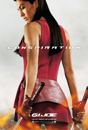
HoldYourFire posted:The last one looks like they accidentally included a Mortal Kombat character. To be honest they all kind of look like they could be Mortal Kombat posters. The Rock is Jax of course.
|
|
#
¿
Apr 20, 2012 20:17
|
|
|

|
| # ¿ May 21, 2024 01:14 |
|
|
Nothing beats the three episode arc that the Nissan Rogue got on Heroes. Saved this which tickled my fancy at the time and still does. http://i89.photobucket.com/albums/k203/kiimosabe/heroes.jpg (Please please please don't probate me for posting a macro, it is from a different time.)
|
|
#
¿
Apr 20, 2012 22:22
|
|