|
Faltese Malkin posted:Here's a larger picture of those awesome Hurricane uniforms: They paired the orange jersey with white pants in that one, much better look than the orange on orange imho
|
|
|
|

|
| # ¿ May 4, 2024 04:01 |
|
 lmao the dude on boxes
|
|
|
|
DJExile posted:The ND undershirts are wild Why do I like this? It's soooo close to being a hideous Affliction shirt, and yet it works. What is this sorcery?
|
|
|
|
These jerseys are outstanding.
|
|
|
|
Saints Row, bitches!
|
|
|
|
Thermos H Christ posted:Saints Row, bitches! I just checked and it turns out this still the best
|
|
|
|
Tedd_Not_Ed posted:The Aggies are bringing out throwback uniforms to the 1939 National Champions, and while the shirts are nothing really to write home about, the leather patterned helmet is: God these are so close to awesome, but they completely dropped the ball on the jersey. Those goddamn Adidas patterns on the shoulders and chest clash so badly with the rest of it.
|
|
|
|
Super dope if you ask me. Loving that black in particular.
|
|
|
|
  These might be my favorite new uniforms I've seen since those Navy Dress Whites last year. Better view of the helmet: 
|
|
|
|
The Notorious ZSB posted:Can't argue looks slick UNC, also Michigan St got some updates to their uniforms as well. I'm still dreaming of decent Hokie uniforms from Nike one day. Sparty had some Baylor uniforms made up for some reason. Not an improvement over their usual look, imo.
|
|
|
|
lmao at the positioning of the legs on that nuclear cardinal they must be so long and so horribly broken
|
|
|
|
I cannot be the only one who saw that URL and instantly thought I had been sent to a Goatse mirror
|
|
|
|
Nostalgia4Butts posted:
Only problem being that it is not dark in a football stadium during a game. They're gonna need some actual illuminated Tron suits.
|
|
|
|
JesustheDarkLord posted:It's pretty cool but they need to paint the field lines in matching paint for that game and then use a glow in the dark ball. I have been saying for years that we need a blacklight bowl.
|
|
|
|
Ugh the writing on the legs is terrible
|
|
|
|
 Texas equipment Twitter posted these and I want to own them.
|
|
|
|
Vanderbilt Football Presents: Billy Elliot
|
|
|
|
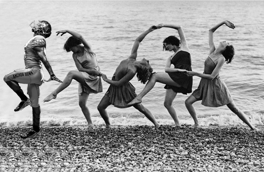 (not mine)
|
|
|
|
lol
|
|
|
|
The rain-darkened Texas jerseys looked fantastic last weekend, this is what they should always look like: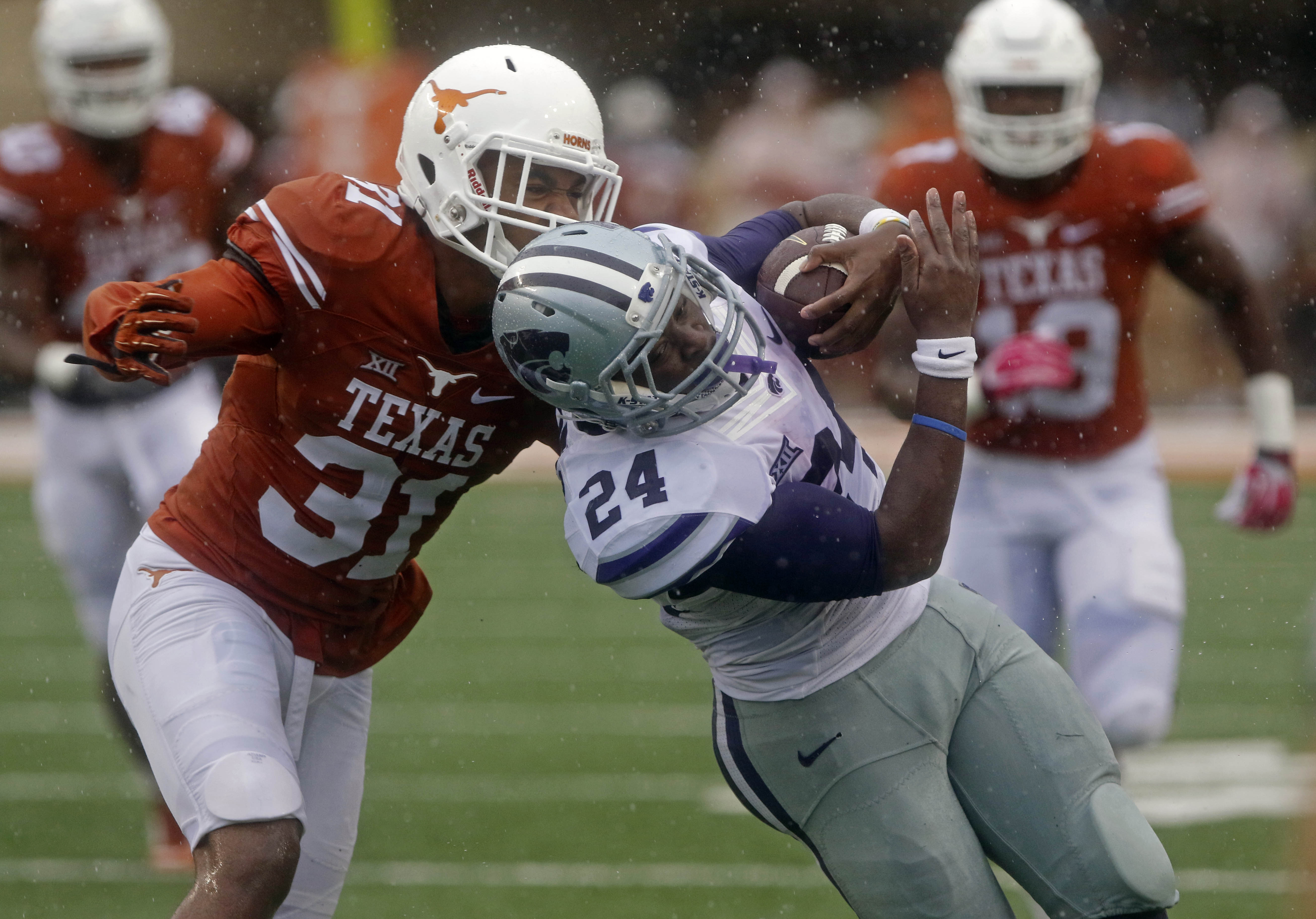  vs  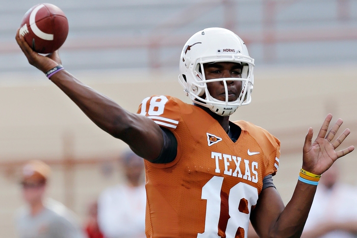
|
|
|
|
shiksa posted:why does the helmet actually match the wet ones way better than the regular color? that's dumb. The helmet logos have been messed up for years. For the longest time we had the chocolate brown ones you see in the lower picture, which drove me crazy. Then midseason last year we changed to metallic ones as seen up top. I'd prefer a non-metallic burnt orange one, but the current ones are at least better than the brown. In no way is that a shade of orange. But yeah if they burnt the jerseys a bit more I'd prefer that. Wouldn't mind a more cream colored white, either. Closer to the actual colors of a Longhorn.
|
|
|
|
squarerandom posted:Can we go back to the numbers on the helmet too. Tia~ gently caress no
|
|
|
|
Hockles posted:I agree, but they can only use 1 helmet, per concussion protocol Wait, it's a concussion thing? Do different colored helmets cause more concussions?
|
|
|
|
The Notorious ZSB posted:They really need to add different color socks/shoes and gloves to those things. The solid footie pajamas look is not a strong one. but then it wouldn't be COLOR RUSK PRO ZOOM JET COMBAT now would it
|
|
|
|

|
| # ¿ May 4, 2024 04:01 |
|
The Notorious ZSB posted:They finally updated the design to the new template, but I assure you outside of the color of trim its a super generic uniform that is always behind the curve. This is every Nike school including Texas, but god I hate the look of the conference logo, school logo on the collar, and Nike swoosh all at the same height and close together. It looks so cluttered and NASCAR-ish. 
|
|
|


