

|
Thank you to JaimeTheD for the suggestion! This month's theme is "Epic" which is up to personal interpretation I suppose. I guess I'd define it as works intended to induce a feeling of awe in the viewer, usually with heavy narrative elements Here's some arts that feel like they have an "epic" quality to me at least (history painting and Romanticism are good sources to find works like this)        
|
 #
?
Mar 1, 2015 19:47
#
?
Mar 1, 2015 19:47
|
|


|

|
| # ? May 7, 2024 16:22 |
|
|
Don't have anything epic yet. Going to try doing some huge structures and landscapes later this week. However I'll post what I've been working on today. Finished the ice dragon:  wrestled with the detailing on the magma dragon. Still not happy with the values but I think the texture is sound.  Started drawing a death knight character. Trying to go for a Warhammer Fantasy style; exaggerated heroic proportions and ornate, gothic detail: 
|
|
#
?
Mar 2, 2015 00:42
|
|

|
 I found my pentel brush pen and I forgot how amazing that thing is goddamn I'm so used to rapidographs now I'm so shaky with a brush but it's still super fun this is a ghost of a kid who died in a fire
|
|
#
?
Mar 2, 2015 01:07
|
|

|
Is that the refillable-with-cartridges pen? I've seen those about, assumed they were a gimmick thing.
|
|
#
?
Mar 2, 2015 01:16
|
|
|
petrol blue posted:Is that the refillable-with-cartridges pen? I've seen those about, assumed they were a gimmick thing. yeah, though I haven't been using it with the cartridge, just as a dip pen. works awesomely, with washes and straight ink, super versatile.
|
|
#
?
Mar 2, 2015 01:32
|
|
|
They're really nice, the brush tip is pretty springy if you keep it in good shape. They're also highly portable for on-the-go drawings.
|
|
#
?
Mar 2, 2015 01:45
|
|


|
EPIC STILL LIFE WITH POTATO
|
|
#
?
Mar 2, 2015 02:04
|
|

|
Revisited the death knight and decided to just finish the original sketch drawing using traditional media (cheap blue office pen) with a few highlights added in with photoshop. I think the line drawing I did was way to lifeless, there's a lot more expression in the lines of the pen sketch. edit: Forgot to post the image I'm talking about. Whoops 
Propitious Jerk fucked around with this message at 19:10 on Mar 2, 2015 |
|
#
?
Mar 2, 2015 19:08
|
|
|
Alright, further progress on the deer and fox pic made.More suggestions and crits are welcome, and once again thanks for all the suggestions made in the previous thread.
|
|
#
?
Mar 2, 2015 20:44
|
|
|
Not a drawing, so I apologize in advance, but I would really like some C&C. This is for a song by my friend's band called "Restless" I based the imagery on the lyrics but am not sure if I like the composition. 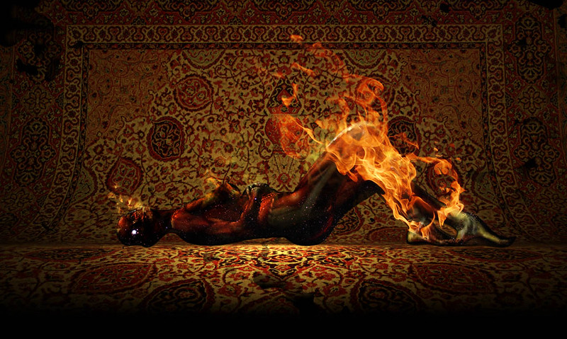 vs.  Here is the website for the band. I also did the Ouroborus on the website. *** SirJohanna posted:Alright, further progress on the deer and fox pic made.More suggestions and crits are welcome, and once again thanks for all the suggestions made in the previous thread. Really cute. I would increase the atmospheric perspective / mist maybe. Also change the antler's color because the antlers are matching the tree branches a lot - or maybe that is intentional - I dunno. Make them slightly more yellowish? sigma 6 fucked around with this message at 21:59 on Mar 2, 2015 |
|
#
?
Mar 2, 2015 21:48
|
|


|
having a lot of fun with this project 
|
|
#
?
Mar 2, 2015 22:50
|
|
|
Another drawing in the same style as the knight. This time it's a kobold.
|
|
#
?
Mar 2, 2015 23:04
|
|
|
neonnoodle posted:EPIC STILL LIFE WITH POTATO That's the most brutal still life. You can just see the rise and fall of the potato. I really like how cheery these are despite the morbid undertones. I'd already decided on a  Sooo.. epic theme? Ok, I can work with that: 
|
|
#
?
Mar 2, 2015 23:24
|
|

|
Propitious Jerk posted:Another drawing in the same style as the knight. This time it's a kobold. This is pretty great. Best thing I can think to do is increase the contrast. Maybe adjust levels slightly or add VERY slight vignette FX. VVV I also do the eye thing. I guess it is because eyes are relatively easy to draw but often capture the "life" of the subject. Most brush pens have the ink reservoir built in, and have caps. I never clean mine, but maybe I am doing it wrong. Or, they are just cheap pens. I dunno. VVV sigma 6 fucked around with this message at 01:35 on Mar 3, 2015 |
|
#
?
Mar 2, 2015 23:48
|
|
|
 Epic close up? Does anyone else default to 'eyes' while waiting for inspiration? It's kinda creepy. How do you clean those brush pens if you're dipping them? Water or alcohol, or something else?
|
|
#
?
Mar 3, 2015 00:06
|
|
|
petrol blue posted:
Yes, I default to starting with an eye of some sort all the time. Cat's eyes, demon eyes, comic book pupil-less eyes... Hell, even those anime "I'm dying/scared" face eyes that are basically scribbled circles...
|
|
#
?
Mar 3, 2015 01:52
|
|
|
petrol blue posted:
haha yea  I just use water to clean the brush, works well enough!
|
|
#
?
Mar 3, 2015 02:09
|
|
|
   bad week for productivity
|
|
#
?
Mar 3, 2015 04:29
|
|


|
sigma 6 posted:This is pretty great. Best thing I can think to do is increase the contrast. Maybe adjust levels slightly or add VERY slight vignette FX. Thanks for the feedback. I think I'll add in a bit of a darker gradient to the background above the water line and play around with sliders a bit to brighten it up.
|
|
#
?
Mar 3, 2015 05:46
|
|
|
OK - this is more what I was going for. I don't know if it is "epic" but I hope it is at least "restless."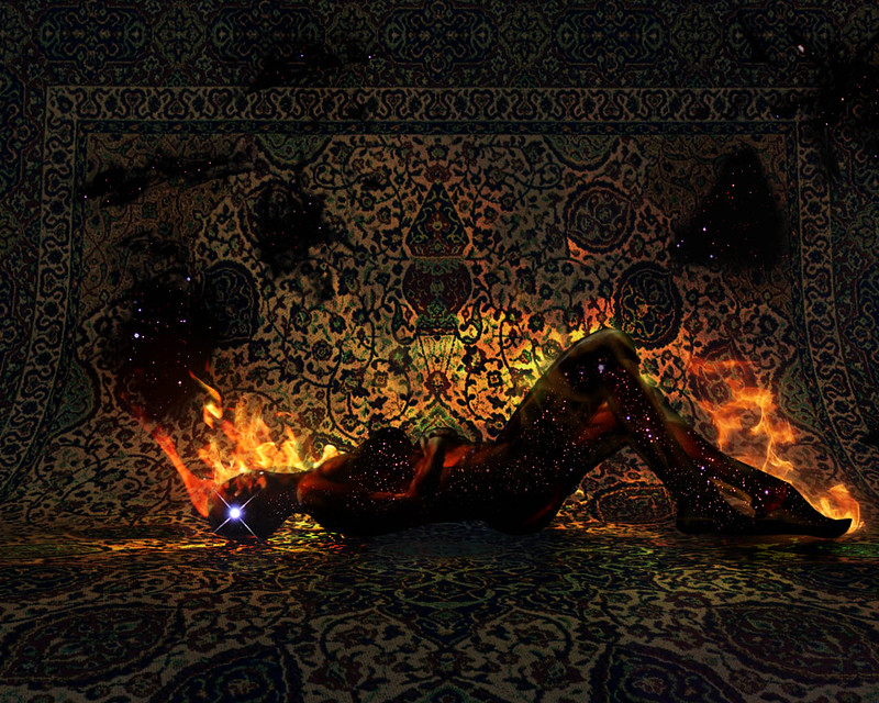
|
|
#
?
Mar 3, 2015 08:07
|
|
|
sigma 6 posted:Really cute. I would increase the atmospheric perspective / mist maybe. Also change the antler's color because the antlers are matching the tree branches a lot - or maybe that is intentional - I dunno. Make them slightly more yellowish? Thanks for the feedback, I'll see what I can do about that.
|
|
#
?
Mar 3, 2015 12:07
|
|
|
 Working my way through our rpg party. This is the Artificer. Not an epic pic, but she is part of the group who got in a fistfight with the moon and later surfed an elephant through lava into hell, and if that's not epic, I dunno what is.
|
|
#
?
Mar 3, 2015 16:47
|
|
|
Some black and white work done for a Pathfinder Module called Freeing Nethus.     
|
|
#
?
Mar 3, 2015 19:41
|
|

|
^^^ That work is nothing short of amazing! ^^^
|
|
#
?
Mar 3, 2015 20:09
|
|
|
This is my fave, nothing like playing drunken knifey-fingery. (Is there a proper name for that?) Seriously though, they're all great.. but what happened with the manticore's forelegs? Poor little stumpy. Progress happens. Or blood, at least. Note how I cleverly hide most of the hand: I wasn't pleased with it, redrew a bunch of times with different magical artifacts, swore I'd never touch this piece of poo poo again like twice already, then went with my gut feeling. I'm gonna have to work on them again, 'cause the linework on them came out too blorp. This is partially because I'm used to doing a much larger piece, then scaling it down when done. This was getting too big, and the program was lagging or ignoring me when I was putting down lines too quick, so I made it smaller and of course that happens.  When I can't get anything done, I default to a circle and some pleasing lines. There's certain shapes you just like drawing, a certain way your hand likes to move when it's got nothing proper to do. Usually at some point the circle-line combo starts looking like a deformed monster of some sort, so I just go from there.
|
|
#
?
Mar 4, 2015 00:36
|
|
|
If he's holding the knife, and holding the pint...  Those all look stunning, am well impressed. Those all look stunning, am well impressed.Seriously, who saw two fingers on the table and thought "welp, third times the charm"? petrol blue fucked around with this message at 01:18 on Mar 4, 2015 |
|
#
?
Mar 4, 2015 01:16
|
|
|
Holy smokes, Beelzebub, those are great. They remind me of pouring over the artwork in Warhammer books as a kid (a good thing). I've not posted in one of these threads since before there was a theme. I'd like to start again because I hardly ever draw / doodle for fun these days and I miss it. This wee guy is the first panel of a make-it-up-as-I-go comic I'm drawing on Instagram right now. Not exactly epic but, um, maybe the story will get epic?
|
|
#
?
Mar 4, 2015 12:45
|
|
|
Beelzebub posted:Some black and white work done for a Pathfinder Module called Freeing Nethus. Wow, stunning work! I checked out your site as well and your colour paintings are astounding. You wouldn't happen to have an art book available or a link to some of the publications you've done work for?
|
|
#
?
Mar 4, 2015 18:13
|
|
|
Thanks everyone!Propitious Jerk posted:Wow, stunning work! I checked out your site as well and your colour paintings are astounding. You wouldn't happen to have an art book available or a link to some of the publications you've done work for? I don't have an art book compilation yet, maybe in another decade or two. My facebook page has my latest stuff on it. https://www.facebook.com/joshhassartandillustration So far all my published work has been for Pathfinder through a publisher called Kobold Press. I think I have four book covers in print that were done for Zack Parsons (SA's El Pinto Grande). I'll have a bunch of work coming out this summer for Pathfinder monster manuals and an advanced player races manual. I've been painting for a long while, but only just started getting work in the past year and a half. So hopefully it continues to grow into bigger and better things.
|
|
#
?
Mar 4, 2015 18:52
|
|
|
Beelzebub posted:I don't have an art book compilation yet, maybe in another decade or two. My facebook page has my latest stuff on it. https://www.facebook.com/joshhassartandillustration I'll have to check out those titles. I don't think you'll have much trouble getting more work with your level of skill. I think your pictures blow a lot of the other stuff I've seen in Pathfinder and other roleplaying publications out of the water. speaking of water; blue dragon is done. 
|
|
#
?
Mar 4, 2015 20:19
|
|
|
Progress on the forsaken lady:
|
|
#
?
Mar 4, 2015 23:07
|
|


|
Phylodox posted:Progress on the forsaken lady: You should get all your large areas of value in and work your way down to the small detail for the entire piece rather than putting a ton of detail into an eye and then moving onto the nose etc. Also, I wouldn't mask every different hue in the image you can always paint back over. You'll probably find you can paint a lot faster and your image will be a lot more loose. I've been watching a lot of FZD videos on youtube to help with my painting, you might find this one handy: https://www.youtube.com/watch?v=jXyz_uivkM4 He works on the entire painting at once and has all his major forms defined before moving on to the detail. Brown dragon done: 
|
|
#
?
Mar 5, 2015 00:41
|
|
|
So I have a problem with my digital painting maybe someone can help with. I feel like the colors I use end up making portraits that are weirdly saturated if that makes sense. Like the palette doesn't seem to actually mesh together well? And I've tried the usual ways of selecting palettes, hell I've tried pulling colors directly from images I liked the palettes for, but it always seems to come out kind of jarring. Does anyone know what I'm talking about?
|
|
#
?
Mar 5, 2015 00:51
|
|


|
Reene posted:So I have a problem with my digital painting maybe someone can help with. If you're using a program with transparent layer support you could try creating a top layer with a colour fill and then put it down to a low (20-5%) transparency. This is kind of the same as doing a wash using traditional media. It usually serves to even out the hues in your image and tie them together, like giving them all the same stage lighting. Also you can always try turning the saturation down. I grabbed an image of yours from last thread to demonstrate, hope you don't mind. Desaturated: About 50% which is quite high but you get the point   Colour wash on a colour layer: Transparent blue layer overlay at about 10% opacity. Photoshop has a 'color' layer feature which preserves the light and dark values.  Colour wash on a normal layer: Transparent blue layer overlay at about 10% opacity. This is a normal layer so the darker lines of the image are a bit washed out. you lose your true blacks this way.  None of these are really perfect answers to your problem, but are some quick tricks to use to tweak a finished image if it's a bit off.
|
|
#
?
Mar 5, 2015 01:20
|
|
|
It's been awhile since I've posted, but here are a few drawings that I completed this week. This one's from a long figure study, drawn from reference:  This one was from a workshop yesterday, drawn from original reference: 
|
|
#
?
Mar 5, 2015 05:24
|
|

|
Reene posted:I feel like the colors I use end up making portraits that are weirdly saturated if that makes sense. Like the palette doesn't seem to actually mesh together well? And I've tried the usual ways of selecting palettes, hell I've tried pulling colors directly from images I liked the palettes for, but it always seems to come out kind of jarring. Does anyone know what I'm talking about? There are a lot of people more qualified to answer this in this thread, but I had my tablet out already so here goes. Basically I followed the advice in this video: https://www.youtube.com/watch?v=9kQllLy_X4I In short, you pick your dominant or main color, and then your other colors become desaturated based on their distance on the color wheel from that main color. So if the main color is red, your greens will hardly be saturated (almost gray, see his video). They'll still read as green though, because they're near red. Or in your image, the same one Propirious Jerk used, if we wanted to draw a blue blob the lady's face, the color we'd actually use would be almost gray:  So step one is to make your non-main colors much less saturated. The video gives a rough formula for this, based on how far apart the colors are on the color wheel. The other thing that stands out to me is that your shading (within a single color) is pretty reliant on adding black or white to the "true" color, without changing the saturation much. (most everything in your image is saturated close to the max) Obviously the overall brightness needs to change, but mess with the saturation and nudge the color itself around too - you can make the highlights more blue and the shadows more red, or vice versa. Basically don't be afraid to dip in to the parts of the color pallet that look really gray and washed out - they look that way because (as you're picking them) they're right next to the absolute most saturated version of that color. In context they'll still read as red, blue, whatever. Don't be afraid to get a little away from the base color too - yellow highlights will still read as orange on an orange surface.   Excuse the paintover! I decided your "main" color is her skin tone. So you can see the main change is making the green background much less saturated. It still reads as green. I also added some yellowish and bluish greens in the grass too. I added some yellowish highlights and reddish shadows to the skintones, both at medium to low saturation. I moved away from the base color in the hair - highlights are now almost pinkish. But if you grab the color picker you'll see it's actually a really dark, desaturated reddish pink. In context it looks bright though. I also threw some desaturated blues and reds in to her gray clothing for variety. Hopefully that's somewhat helpful!
|
|
#
?
Mar 5, 2015 05:36
|
|
|
More band posters. Next one's gonna be Scooby Doo themed, but after that I'mma try something that isn't in this dumb cartoon style.
|
|
#
?
Mar 5, 2015 06:39
|
|
|
Thank you both for the advice! I'll play around with this as soon as I get my new tablet. (my graphire 4 finally crapped out.) Might even go over that last image there, since it did stand out how her skin, hair, and everything didn't really work together too well.
|
|
#
?
Mar 5, 2015 06:50
|
|
|
 Dragons are all done! Dragons are all done!
|
|
#
?
Mar 5, 2015 18:15
|
|
|

|
| # ? May 7, 2024 16:22 |
|
|
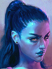
Propitious Jerk posted:You should get all your large areas of value in and work your way down to the small detail for the entire piece rather than putting a ton of detail into an eye and then moving onto the nose etc. Also, I wouldn't mask every different hue in the image you can always paint back over. You'll probably find you can paint a lot faster and your image will be a lot more loose. That's pretty much what I do, except that I like to work on a few different layers. I like to keep completely different elements (like the hood vs. the face) separate for as long as possible. The eyes were actually the last thing I did because I like to have one or two elements with a little bit more detail to kind of anchor down the image before I start developing the rest. EDIT: And another update on our forsaken lass:  I wasn't too happy with this until I added some of the deeper shadows and highlights and grunged her face up a bit, and then it popped for me. Probably one of my favorite World of Warcraft pieces to date. Phylodox fucked around with this message at 22:08 on Mar 5, 2015 |
|
#
?
Mar 5, 2015 20:47
|
|