

|
sigma 6 posted:This is loving amazing, but the arrangement of the legs and tail looks really weird. You seem to be missing anatomical elements here. I know it is mythical creature but it does look ... odd. Thanks for the crit! My references were some lizards fighting in the sand. But I probably didn't capture the foreshortened elements well enough. Here's another one from the same project as the others. A slimy creature called a dipsa in a nest of eggs. 
|
 #
?
Sep 14, 2015 16:12
#
?
Sep 14, 2015 16:12
|
|


|

|
| # ? May 4, 2024 12:37 |
|
|
Underwater.
|
|
#
?
Sep 15, 2015 00:04
|
|

|
A quick study in oil.
|
|
#
?
Sep 15, 2015 16:35
|
|

|
Aerodactylus scolopaciceps 
|
|
#
?
Sep 16, 2015 04:59
|
|

|
Beelzebub posted:
You really have the best job in the world
|
|
#
?
Sep 16, 2015 12:49
|
|

|
Mermen best men.
|
|
#
?
Sep 16, 2015 23:51
|
|
|
T shirt design for a HS reunion. Really not happy with it. Please help! New  Old 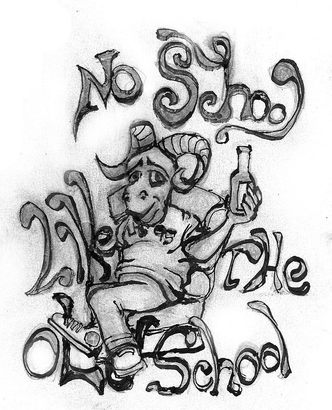 The sports team is "The Rams". Beelzebub: Your welcome. I really like your work alot. Just bugged out over that bit of anatomy. EDIT: Watercolor I made from the other day.  sigma 6 fucked around with this message at 16:33 on Sep 17, 2015 |
|
#
?
Sep 17, 2015 05:29
|
|


|
bitmap: The worst thing about it, I'm an accountant. *puts gun in mouth* neonnoodle: Nice study! Rock monster thing for Pathfinder. 
Beelzebub fucked around with this message at 23:08 on Sep 17, 2015 |
|
#
?
Sep 17, 2015 22:29
|
|
|
Keeping with the nautical theme...
|
|
#
?
Sep 18, 2015 10:31
|
|

|
^^^ Now that's radd!
|
|
#
?
Sep 18, 2015 15:36
|
|
|
sigma 6 posted:T shirt design for a HS reunion. Really not happy with it. Please help! Ok, I'm not a pro but this is what I'd do if it was me (feel free to pipe in if I'm not getting it):  I assumed you want to keep as much of the old model "intact", but you can still make small changes that make a big difference. First off, you use one of those calligraphy pens for the ink that lends itself well to a more angular design, you should use that! It's a caricature so don't be afraid to exaggerate the defining parts like the horns, the sunglasses, the hand throwing the v or the converse shoes. Next up, he was slouching funny (drawing characters sitting is not a strong point for me either) so I gave him a gut from whence the legs emerge. As a bonus, the defining gut line draws the attention to the text on his shirt. I know gently caress all about typography, but making the letters follow a curved line sort of "gathers up" the design for me. The words "like" and "the" in this sentence are filler words that the brain sorta fills in itself when it sees the big words of "no school" and "old school" so there is no need to keep them big like the rest of it. You could make them tiny under the "no school" or before "old school" and it would still read OK. However, here I placed them on the same line as the visually most interesting part of the drawing, so the eye flows easily over them and takes them in without them disrupting the pic too much (they're still pretty big here). I would make the text more angular, but if you wanted to go for the sort of old-style soft letters, I'd take it a step further to make them lean into each other more, give them more lumpiness, if only at the bottom so that if you still want them to follow a "wave" line, it's easier to see where the wave travels. In conclusion: 
|
|
#
?
Sep 18, 2015 15:52
|
|
|
Been doing religious based art lately for some reason. Having fun with some plague doctor/nun type stuff.
Baldbeard fucked around with this message at 20:31 on Sep 20, 2015 |
|
#
?
Sep 19, 2015 02:13
|
|

|
Sharpest Crayon: Thank you so much!! I have today to finish it.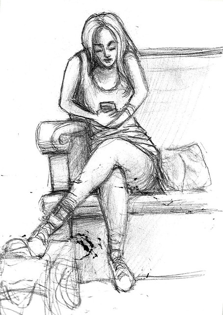
|
|
#
?
Sep 20, 2015 19:40
|
|
|
Tried to do a low-res, low-detail study of a photo to get less fussy and concentrate on shape, value, light, etc.
|
|
#
?
Sep 20, 2015 23:35
|
|

|
Another mush study
|
|
#
?
Sep 22, 2015 02:10
|
|
|
neonnoodle posted:Tried to do a low-res, low-detail study of a photo to get less fussy and concentrate on shape, value, light, etc. What a curious effect that is. It looks like paper but has a strong sense of three dimensions.
|
|
#
?
Sep 22, 2015 02:18
|
|
|
Here's "Shanna the She Devil" for DailySketchChallenge on DA I'd never heard of this character before but she hangs out with dinosaurs apparently. Humboldt Squid fucked around with this message at 05:16 on Sep 22, 2015 |
|
#
?
Sep 22, 2015 05:00
|
|
|
Anurognathus ammoni
Humboldt Squid fucked around with this message at 12:12 on Sep 22, 2015 |
|
#
?
Sep 22, 2015 11:59
|
|
|
neonnoodle posted:Tried to do a low-res, low-detail study of a photo to get less fussy and concentrate on shape, value, light, etc. This is ridiculously adorable, and I don't even like dogs that much. I struggled with the body on this sketch. Still not right. Dammit. Still not good at drawing anatomy from my head. 
|
|
#
?
Sep 23, 2015 07:52
|
|
|
 AaaaaaAAAaaaaa I would play this game forever and ever! I usually hate those gradients but they work so well here. AaaaaaAAAaaaaa I would play this game forever and ever! I usually hate those gradients but they work so well here. AAAAAAAAAAA I would piss myself playing this game oh gods why do they have such human faces. AAAAAAAAAAA I would piss myself playing this game oh gods why do they have such human faces...so jelly. 
|
|
#
?
Sep 23, 2015 19:35
|
|
|
Today I tried drawing for the first time in my adult life. I need watercolors.  
|
|
#
?
Sep 23, 2015 19:39
|
|

|
You still need a drawing to put the water color over. Also, the better the drawing, the better the resulting painting. However, many painters are pretty loose with the drawing part, preferring to spend the vast majority of time painting. Figure drawing from last night. 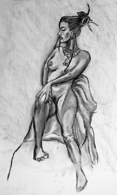 Here's how that T shirt design came out. Wish I had more time, or used a different font, or took the advice of using the font to surround the character. Oh well, things can always be better ... regardless, thanks again Sharpest Crayon! 
sigma 6 fucked around with this message at 21:39 on Sep 23, 2015 |
|
#
?
Sep 23, 2015 21:27
|
|
|
im bored with this time to move onto something new the focus was doing a facial study with lighting so happy with that. cbf working over everything else to get it cleaned up. theres now water to suit the theme of the thread!
|
|
#
?
Sep 24, 2015 12:18
|
|


|
Rotting Wind for Pathfinder.
|
|
#
?
Sep 24, 2015 14:37
|
|
|
Hey the back to the future font is pretty cool! Could've used the opportunity to spell out "back to school". It's nice and clean for a rush job, though. The instant I saw this I just burst out laughing, that dude is so hosed. Good job on drawing a terrible concept like "rotting wind", too. Pocahontas would be proud of how you paint with all the colours of the wind. Also water elemental.  Stealthy edit to add conchpiece of glory. 
Sharpest Crayon fucked around with this message at 00:22 on Sep 26, 2015 |
|
#
?
Sep 25, 2015 00:03
|
|
|
doodle
|
|
#
?
Sep 26, 2015 09:19
|
|
|
 I have no idea
|
|
#
?
Sep 26, 2015 15:17
|
|
|
kill six billion demons is a cool comic.
|
|
#
?
Sep 27, 2015 05:24
|
|
|
Humboldt Squid posted:kill six billion demons is a cool comic. Kill Six Billion Demons is an awesome comic! Abbadon is the buisness! Super rad painting btw! 
|
|
#
?
Sep 27, 2015 07:54
|
|
|
Doodling.
|
|
#
?
Sep 28, 2015 01:54
|
|
|
I need to doodle more often. 
|
|
#
?
Sep 28, 2015 03:52
|
|

|
Humboldt Squid posted:kill six billion demons is a cool comic. Just burned through the first 10 and this is really good! Thanks. Back to lurking.
|
|
#
?
Sep 28, 2015 12:17
|
|


|
Today's daily drawing is actually some prototyping. Left side is an idea for a cane head which I hope to sculpt in zbrush and cast in bronze from a 3d printout. Right side is a pose for an old 3d character I haven't touched in ages. 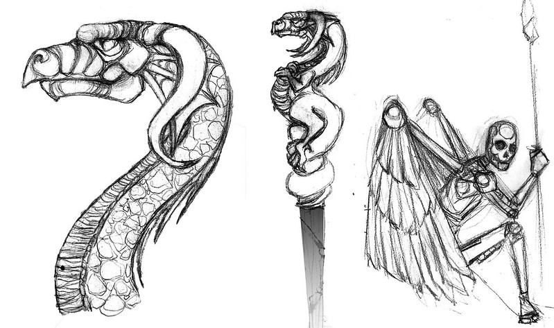
|
|
#
?
Sep 29, 2015 00:03
|
|
|
Wenupteryx
|
|
#
?
Sep 29, 2015 08:10
|
|
|
water is hard! im using a steve hanks painting for water reference
|
|
#
?
Sep 29, 2015 14:03
|
|
|
ideas for next month?
|
|
#
?
Sep 30, 2015 00:40
|
|
|
Humboldt Squid posted:ideas for next month? Well, October so Halloween so...macabre?
|
|
#
?
Sep 30, 2015 00:57
|
|


|
Macabre sounds good to me. Horror would also be appropo. So this cane may or may not have wings. Hmmm. Apparently, the more parts stick out, the harder they are to cast in metal. 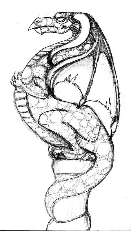
|
|
#
?
Sep 30, 2015 03:28
|
|
|

|
|
#
?
Sep 30, 2015 09:06
|
|
|

|
| # ? May 4, 2024 12:37 |
|
|
Water is coming along, I think I need to block out more white spaces for the light reflections
snaeksikn fucked around with this message at 14:26 on Sep 30, 2015 |
|
#
?
Sep 30, 2015 14:08
|
|