


|
The Cheshire Cat posted:Either inflation or (if the chart is inflation adjusted) just general economic downturn making materials more expensive. You got that backwards. An economic downturn usually makes materials cheaper, due to reduced demand. This is why Keynesian economics work. In a price slump, it's a good idea to borrow money to invest in infrastructure or housing, which also helps turn the economy around by creating jobs. What happened to the US cost of construction, I can't speak for, it's probably some other mechanism in play. You've had a major downturn followed by a major upturn. Hippie Hedgehog has a new favorite as of 22:47 on Jun 27, 2018 |
 #
¿
Jun 27, 2018 22:45
#
¿
Jun 27, 2018 22:45
|
|


|

|
| # ¿ May 10, 2024 00:58 |
|
|
Funny yet insightful! +5.
|
|
#
¿
Jul 22, 2018 10:36
|
|
|
evobatman posted:It looks like this graphic (and IAFD) includes only "movies", as in titles that are published on DVD. It doesn't seem to include online work for websites such as Brazzers, Bangbus, DDF and so on, and I'm gonna guess that's a much much bigger market both in jobs and consumption. Which accounts for the decrease of the words "boobs" and "butt" in film titles - fewer films are made. Same with the map of states - surprise, it turns out that more porn performers come from the more populous states. A per-capita index would have been somewhat interesting.
|
|
#
¿
Aug 19, 2018 13:03
|
|
|
Someone just made a mind map and threw on two axes as an afterthought, right?
|
|
#
¿
Sep 19, 2018 07:41
|
|
|
What's a "session low" in this context? Is it the daily low of the exchange rate?
|
|
#
¿
Sep 21, 2018 16:08
|
|
|
The Cheshire Cat posted:The only category they’re anywhere close to comparable is share price, and based on the other numbers that just seems like it’s massively inflated. I believe that's exactly the point of the graph. They think Tesla is grossly overvalued, hence the quotation marks.
|
|
#
¿
Oct 5, 2018 17:39
|
|
|
Plinkey posted:is this funny or awful, i can't tell? Neither, I think?
|
|
#
¿
Oct 17, 2018 14:24
|
|
|
I presume that the awful part of this is the choice of colors?
|
|
#
¿
Oct 28, 2018 10:41
|
|
|
Kennel posted:I kind of like this (text is irrelevant). Something to do with Finnish healthcare... Is the top bar "erectile dysfunction"? 
|
|
#
¿
Oct 29, 2018 09:53
|
|

|
It's almost as if the Laffer curve only makes sense if you plot it for a single specific country, as you vary the tax rate and leave every other variable as they are... (That's how I suspect a Laffer curve is meant to be used, anyway.)
|
|
#
¿
Nov 1, 2018 16:28
|
|
|
evobatman posted:I'm gonna guess that if you try to get rid of the stockpile of cheese, the market will interpret this as a increased demand for cheese. Production will increase, thereby making the stockpile bigger. See also: EU agricultural subsidies; Price of table wine in France vs price of bottled water in France. (Or for a more market-driven pricing shenanigan: Price of milk in Sweden vs price of bottled water in Sweden.) Hippie Hedgehog has a new favorite as of 20:00 on Nov 4, 2018 |
|
#
¿
Nov 4, 2018 19:54
|
|
|
Fathis Munk posted:It generates random moral dilemmas, some of them are hilarious That is awesome, I need to go and take that quiz. Pet ethos: The machine should always continue straight, no matter the consequences, because taking action to kill a particular person is less ethical than by inaction allowing a particular person to die. Hippie Hedgehog has a new favorite as of 14:07 on Nov 7, 2018 |
|
#
¿
Nov 7, 2018 14:04
|
|

|
OK so just to make sure I'm parsing this right... * Men have gone from ~85% to ~65% * Women have gone from ~32% to ~55% Is that right? And the graph makes it look like women have overtaken men. This is some devious poo poo. These FRED people seem to love doing this. This one is actually not quite as bad, because it makes a point of how these two statistics are opposite, and it would look terrible if you used the same scale on both lines:  Though I can't help thinking that would have looked better as two separate graphs, shown above each other, or side by side. Hippie Hedgehog has a new favorite as of 13:05 on Nov 10, 2018 |
|
#
¿
Nov 10, 2018 13:01
|
|

|
I'd say it doesn't work all that well because tables and electricity (rather than pizza toppings) are arguably the infrastructure.
|
|
#
¿
Dec 4, 2018 15:45
|
|
|
Am I the only one noticing he's calling his flip chart a whiteboard?
|
|
#
¿
Dec 6, 2018 21:42
|
|
|
Byzantine posted:Peach is pretty clearly the reigning monarch. Maybe it's a traditional thing. Someone didn't play Super Mario 3.
|
|
#
¿
Dec 20, 2018 15:03
|
|
|
Works even worse because the data is bad: the 747 was first flown commercially in 1970, so the autism number from 1996 is completely irrelevant. It's still in production so the data point might as well be 2018 as 1996.
|
|
#
¿
Dec 29, 2018 23:43
|
|
|
Karia posted:"No, no, the fuschia square, not the magenta square." Reported for misspelling fuchsia so it sounds less offensive.
|
|
#
¿
Feb 6, 2019 12:50
|
|
|
I don't know who this Prager guy is, but he needs to keep his U away from me.
|
|
#
¿
Mar 7, 2019 20:00
|
|

|
That's kinda almost not terrible because they already picked out the top 25 so the reader doesn't need to compare the graphs to each other. Imagine if there were a hundred, unsorted. Still, it's clearly not the best visualization...
|
|
#
¿
Mar 7, 2019 22:30
|
|

|
Is this a good time to mention that my employer's Employee Satisfaction Survey asks the following question? I would recommend my closest manager to others 1(Do not agree in the slightest) 2 3 4 5 6 7 8 9 (Agree completely) Yes, my manager got a terrible result, something like 3 on average. And yes, anything below 7 is considered a fail. And yes, he's still on the job a year later.
|
|
#
¿
Apr 6, 2019 21:50
|
|
|
The Cheshire Cat posted:This seems like the weirdest question because like, who "recommends" a manager, ever? No the scores were fine for most managers, just seldom above 7 because employees don't expect to answer a customer satisfaction survey... I hadn't heard about NPS before and realized now that it's really odd to use it for manager feedback. Everyone gets the summary of company-wide scores vs your unit's scores emailed to them. It's a weird kind of survey in several ways. They used the same scoring scale for all the questions but very few were "I would recommend X". Most were more generic like "I feel that <company> top management are doing a good job" or "I am proud to work at <company>", or "I am empowered to do the best work I can do" etc.
|
|
#
¿
Apr 7, 2019 08:59
|
|
|
Peanut Butler posted:lol it also does the thing where the average is skewed by infant mortality Isn't including infant mortality the normal way to calculate life expectancy?
|
|
#
¿
May 11, 2019 09:23
|
|
|
klafbang posted:Only if you want to lie with statistics. If you actually want to express the age people should expect to live to, you�d go with the life expectancy at 5 or something to clean it of the infant mortality rate. You're not wrong about how statistics work. Unfortunately, that's not how people and governments normally report life expectancy. Most reports on public health use Life Expectancy at Birth (LEB) despite its disadvantages. Very rarely will you see the CDC report e5 numbers. Example: https://www.cdc.gov/nchs/data/databriefs/db293.pdf quote:In 2016, life expectancy at birth was 78.6 years for the total U.S. population�a decrease of 0.1 year from 78.7 in 2015 (Figure 1). This is probably because for developed contries like the U.S, the numbers give a fairly small additional error. https://www.ssa.gov/oact/STATS/table4c6.html For males, LEB is 76.04 and e5 is 71.60. An error of half a year is probably acceptable for most purposes.
|
|
#
¿
May 11, 2019 11:16
|
|
|
klafbang posted:Sure, but that means you can only compare the values for developed countries in "recent times." Which is a) super limited and b) not what is happening. Again, you're not wrong about statistics, you're just missing my point: LEB is still used everywhere, for better of for worse, even when better comparators are available. I suppose that one reason is that LEB is (marginally) easier for the general public to understand. (I know, that's a lovely reason but that's the news for you.) Another might be: Dilb posted:Improvements in life expectancy at age 10 aren't just due to old people getting a few more years in, it's a result of a lot fewer young people randomly dying. Which means when discussing olden times, it's hella hard to pick a "right" starting age. And in fact, the "right" starting age will be different for different societies and different times, making any comparison useless. BTW I'll bet those young people randomly dying were mostly at work in the agricultural sector... Hippie Hedgehog has a new favorite as of 07:55 on May 12, 2019 |
|
#
¿
May 12, 2019 07:41
|
|
|
Our CEO sent this out. Apparently the HR strategy has changed. Exactly how, though? (Blacked out a phrase that's too easily googleable, to protect the innocent.) 
|
|
#
¿
May 21, 2019 09:38
|
|
|
HisMajestyBOB posted:But then Europeans would get confused by dates like 2019-05-28 and think it's the "2019th day of May, 2028". I think you're confused about Europeans. All the European contries that I've worked with prefer the ISO date format. Maybe the British use day-month-year but screw them, they're leaving anyway.
|
|
#
¿
May 29, 2019 08:45
|
|
|
Mods can we please probate anyone who posts about imperial vs metric or date formats after this post?
|
|
#
¿
May 31, 2019 21:32
|
|
|
Henchman of Santa posted:The two left ones should be switched. Not sure the man has enough of an ideology to be placed firmly at any point on that axis.
|
|
#
¿
Aug 30, 2019 20:29
|
|
|
Loving how the unarmed citizen still gets armed in the face. 
|
|
#
¿
Sep 9, 2019 20:50
|
|

|
 . .From here: https://alexdanco.com/2019/09/07/positional-scarcity/
|
|
#
¿
Sep 13, 2019 13:28
|
|
|
foobardog posted:Surprisingly the article is kind of an interesting model, though it definitely feels like "ah, look at these clever ways to obtain rent despite having an abundance" unironic liberal but what if we monetized the rot. Yeah I think he has a lot of good points, he's obviously clever, but that diagram is something special. Paladinus posted:Passed by a workshop on zoöps today. Holy poo poo the amount of terminology. I guess it's "non-humans" because we can't call them animals? Presumably because humans are also animals? I guess #8 is what we'd call a breeding programme? What the hell is a zo�nomic instrument, then, is that a person or a thing? https://www.libarynth.com/zoop [quote] It is the name of a variety of the legal format of the co-operation in which humans as well as certain collective bodies of non-humans can be owner-employees. [quote] Wait, so non-humans can be owner-employees, then surely they're not talking about animals but something else? Edit: Oh wait they're referring to the New Zealand thing where a river or a forest can be a legal entity. Wow. Then what the hell is #8? Where did you run into this, it's some of the weirdest stuff I've seen in a long time. Hippie Hedgehog has a new favorite as of 21:28 on Sep 13, 2019 |
|
#
¿
Sep 13, 2019 21:16
|
|

|
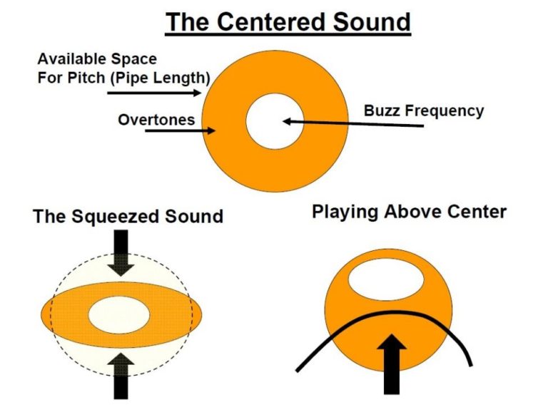 From here. It does make more sense than it looks like, to a brass player, but if you try to interpret this diagram from a physics/math perspective, it's awful. The article as a whole is great but that diagram is someone trying to "dance about architecture".
|
|
#
¿
Oct 21, 2019 19:10
|
|
|
I think the more simple explanation is that education correlates quite well with income, and they didn't adjust for that. I'm pretty sure the trend would go away if they corrected for income level. (High-income Republicans care less about climate change or racism, because they profit from them and/or are not affected personally, just as pointed out above. They also oppose taxation more strongly than poor republicans which ought not surprise anyone.)
|
|
#
¿
Nov 18, 2019 14:10
|
|
|
This is good, but I feel like cats are lower effort than ferrets. Which is more fun, I couldn't say.
|
|
#
¿
Dec 14, 2019 19:15
|
|

|
Coming the table from a leftist perspective, it reads like one huge argument for shorter work days. The various statistics I came across by a quick Googling seem to indicate an average hourly wage of between $23 and $28, but I doubt either includes non-working Americans. Really, a median wage would be more appropriate for this purpose than an average. Also, undershirts notwithstanding, are eggs really that cheap in the US? I pay twice that over here.
|
|
#
¿
Jan 3, 2020 09:03
|
|
|
AFAIKT, the Bay Area is one of the most expensive places in the US to shop for groceries, so it may not be representative. (Anecdotally, from a relative who moved there.) Isn't it a little bit ridiculous for the GOP to claim these extremely low average prices though?
|
|
#
¿
Jan 3, 2020 09:53
|
|
|
That is ridiculously cheap.
|
|
#
¿
Jan 5, 2020 20:24
|
|
|
From an annual report of a pretty major company (50k+ employees). I'm sure this could be explained somehow. If anyone ITT can do that, I'd be grateful.
|
|
#
¿
Jan 24, 2020 10:04
|
|
|
|
| # ¿ May 10, 2024 00:58 |
|
|
Platystemon posted:O.K. but why do Europe and Latin America comprise a region? In a word: language. At least, that's my best guess.
|
|
#
¿
Jan 25, 2020 22:59
|
|