


|
A big part of the fun of this thread is making fun of crazy interior design people spot in the wild, but when people post their own homes be respectful of how personal that is. Not everything posted here is going to be to your taste and that's okay. If someone posts for help with a design goal, your options are: 1. Help 2. Don't post  2020 mod edit: 2020 mod edit: corgski posted:I'm going to start probing for making GBS threads on other people's design and housing choices in this thread when they aren't actually legitimately terrible. -- end mod edit -- learnincurve posted:If you like a thing then buy that thing, don't worry about it The ferengi bathroom vandal thread prompted a lot of good discussion about design trends and how to balance form and function, as well as people showing off their real-life remodels or rooms in need of a remodel. So I thought we could do more of that! Some fun resources for bad design: McMansion Hell - more about architecture than interiors, since everyone pictured has the same heavy, brown Ashley furniture set, but this site has great primers on the language of home design and some fundamental concepts like symmetry and visual weight. gently caress Your Noguchi Coffee Table - Mocks trendy design and room staging cliches - mottos scrawled on walls, fake hunting trophies, "it" furniture pieces, etc. No longer updating, sadly, so I'd love suggestions for similar blogs. Interior Desecrations - Horrors of 20th Century interior design. Some of you have probably had to rip a shag-carpeted conversation pit out of your own homes, and this is the place to tell us about it Who/what are you designing for? Are you designing for you by yourself, you and your family, or your imagined future home buyers? Most people will tell you that trying to predict the tastes of your future buyers is a big financial risk, especially if you don't expect to sell for several years. Be cautious installing expensive, trendy materials. The HGTVs and Pinterests of the world told everyone to install granite countertops ten years ago, and now home shoppers look at that and go "well we'll have to rip that out right away." "That's just my taste" Differing tastes are great! Some people like warm, eclectic spaces with lots of handcrafted details, some people want to live in swedish teak spaceships (yo). The conversation to have in this thread is whether what you think you want is actually what you want, and whether you're taking the right steps to achieve it. The OP of the Bathroom Overhaul thread wanted a "luxury Vegas hotel bathroom," which makes my insides shudder, but it's still something that can be done well if attention is paid to fundamental design theories like color, line, and balance, as well as practicalities about how the space will be used, and how to renovate without killing everyone who sets foot in your home (surprisingly tricky!) How to Adapt Your Inspiration One of the big mistakes people make when taking design inspiration from commercial spaces (hotels, restaurants), design publications, or show homes, is that a normal person's everyday home has to be multifunctional in the way other uses of interior design do not. If you only have one bathroom in your home, you're going to be doing more with it than the typical hotel guest does - washing the dog, coloring your hair, hanging underwear up to dry, sitting on the toilet playing phone games until your legs go numb, I don't know your life. So when you see a room and go "I love that! I want to copy that for my home!" Ask yourself a few questions: 1. Is this space professionally cleaned? Restaurant kitchens get a surgical-quality scrubdown every night. Hotel bathrooms employ maids who clean dozens of copies of the same bathroom every day and quickly become experts in scraping toothpaste scunge out of vessel sinks. 2. Is this space used the same way I would use mine? My office has a showpiece of a kitchen, with white travertine counters and high-gloss white cabinets and pleasingly discreet, purpose-built places to stow away coffee cups and everything else people use. It's a joy to be in, but it's also the last thing I'd ever want in my own home, because there's nowhere to scrub a saucepan or store some knives, and even making a peanut butter and jelly sandwich in there buys you five minutes scrubbing the counter so nothing mars the glittering white effect. 3. Will the effect be the same if I can't afford high-quality materials? Pinterest is full of tragic DIY attempts to replicate really expensive luxury interior design touches. If a kitchen in Vogue Interiors has gold-plated cabinet pulls and you can only afford spraypaint, will you be happy with the result? Even something as subtle as choosing the wrong wood grain or stain can throw off the effect of a professionally-designed look. Better to ask yourself what you're responding to about the room - is it the color? The layout? The lighting? The fact that there are no dirty dishes in the shot? A look I love:  I really respond to airy, delicate wood furniture. This set is by Thomas Moser, something I will never, ever be able to afford, but lately I'm aware how much my personal design sensibilities are a reaction to how much plastic and fiberboard fill the homes of everyone at my stage in life. I think that's a big part of today's design trends in general - people are emphasizing unpainted wood, glass, porcelain, stone, and hard-to-maintain metals like brass and copper that show off you can afford the time and/or the staff to polish it regularly. I also like materials that build up a patina with use, like soapstone and zinc. A look I hate: 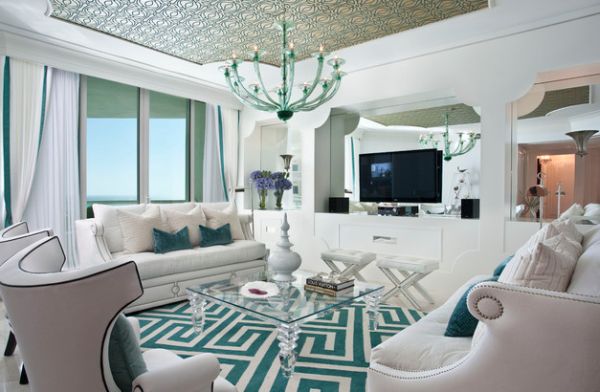 Hollywood Regency  Like a lot of design trends, this is fine when it's done with a lot of care and put in the right place. A literal Hollywood celebrity's living room? Sure. But this style has a lot of motifs that were tragically easy to knock off - you'll see so much clunky mirrored furniture chevron-patterned poo poo at Homegoods - and it's been co-opted by commercial interior design that's slowly working its way down the food chain. It used to be only high end hotels and salons did this look, now it's every frozen yogurt store in the strip mall. Something I'd buy if I could afford it, even though it's ridiculous:  15,000 earth dollars and I'd have nowhere to put it, but prettyyyyyy... So what do you like? What do you hate? What did you gently caress up trying to replicate in DIY? What are the design element dealbreakers when you look at a new place (popcorn ceilings and sliding shower doors, for me). Somebody fucked around with this message at 04:59 on Sep 14, 2020 |
 #
¿
May 9, 2017 19:18
#
¿
May 9, 2017 19:18
|
|

")

|

|
| # ¿ Apr 28, 2024 05:28 |
|
|
Bad Munki posted:This thread is super germane to my interests right now and the title is on point. I'll be posting here a little later on with my current project: great room fireplace full makeover, featuring a 14.5' long, 4" thick, 16" deep live edge walnut slab that I finally found a log for, it's getting cut out of the tree in the next few weeks and then will spend pretty much all summer in the kiln. That's cool as poo poo! Do you do woodworking or is this a commission? What about the fireplace, are you doing natural stone?
|
|
#
¿
May 9, 2017 19:31
|
|


|
Baronjutter posted:Hi, we like the same things I think. Yeah I lucked out there too. I'm extremely anti-clutter, which my husband agrees with for the shared spaces. Both of our offices are more cluttered though, piles of books and memorabilia on shelves, but I like that because those are our private spaces. I love having a quest - mine is a set of these rocks glasses:  Totally unremarkable 80s mass-market affairs, but they have the perfect shape and weight and feel great in your hand. I have one, and the low-key hobby of checking for others in every thrift shop I happen to be in. Way more fun than just ordering a set off ebay right now. One thing that's really informed my design philosophy lately is how much I dislike the commercial sphere intruding on private spaces. There's a big Martha Stewart-fueled trend to treat your kitchen like a restaurant. Chalkboard "menus," plain white dishes, signs on doors, and labels on every container. I really dislike that. I don't need a label on the flour canister because it's my canister. I put the flour in there. I think there's some conspicuous consumption tied up in that trend. Not only are you literally enumerating all your possessions, but by transforming your home into more of a public-facing space, you're subtly communicating that you entertain guests a lot, so frequently that your home is practically a B&B. One thing I did take from that trend is decanting everything I can into reusable canisters. I really dislike having advertising and logos intrude on my home space, so instead of a kitchen cabinet full of packages "shouting" at me whenever I open the door, all the crackers and pasta and whatever are stowed away in "quiet" unmarked containers. I don't like decorating with movie posters and vintage ads for the same reason, even though I know a lot of people do. And don't even get me started on mass-media "collectibles" like those Funkopop things. They're all going to come to life and take over one of these days, I know it.
|
|
#
¿
May 9, 2017 19:49
|
|
|
WrenP-Complete posted:In on the first page! I'm so excited for this thread! Very very much so. Please bring me all the bad design disasters you can find. I eat them for food.
|
|
#
¿
May 9, 2017 19:51
|
|

|
Migishu posted:Oh man Trading Spaces. I remember that show. Hildi! 6 of the Scariest Trading Spaces Makeovers The homeowners wanted a family-friendly living room, so Hildi glued straw to the walls.   (This was for a house with toddlers in it) That show's coming back, so many more nightmares incoming, I'm sure.
|
|
#
¿
May 9, 2017 19:56
|
|
|
Here's a good example of how trendiness and halfassedness combine to make bad design happen: Faux Shiplap for the Fireplace Wall "Faux" is your first tip-off that something bad is about to happen, and if you follow interior design you know that shiplap (a type of horizontal wood siding) is a trend that's in the "omnipresent" stage and thus riiiight about to become hideously unfashionable. Here's a high-end shiplap interior. It's, you know, Fine. The wood is real and installed well.  Here's what this blogger did:  Not quite the same thing. At first glance maybe it looks good, but notice how the boards are turning up at the corners, and how the wall doesn't recede into a muted, natural-textured negative space like it does above. Why did it turn out so different? Cheaping out on materials: We decided to use MDF because it�s cheap, lightweight, and easy to paint. MDF doesn't have wood grain, which is a subtle but important element in the shiplap look. Half-assing the techniques: He used pennies to space the boards, but since they aren�t cut perfectly straight the gaps are not even. MDF is thin and can get fuzzy around the edges if it's not cut cleanly. It also likes to peel away from surfaces it's glued/nailed too, especially when it's exposed to heat like oh, say, from a fireplace... Hubris: When the time came to cut around the fireplace mantel, I thanked God for my engineer�s brain. What is it with engineers? McMansion Living: The architectural detail it adds to my builder grade house is priceless A big problem is people move into these featureless beige shoeboxes with no architectural interest, so they don't see the difference between slapping something temporary and disposable up on the walls vs. a space that is actually built well with a certain effect in mind. This look will go out of fashion immediately and deteriorate quickly, so best-case scenario it's coming down in a year or two, and whoever does it is going to have a lovely time with a crowbar and some sandpaper getting that wall back to a blank slate. There's a divide I make in my mind between putting design on a room, like this, where a supposed architectural detail is just thrown on the wall like a poster, and putting design in a room.
|
|
#
¿
May 9, 2017 20:20
|
|
|
 Remember, design principles dictate that any room with a motto wall also feature discreet buckets or wastebaskets for your guests to vomit in upon entering.
|
|
#
¿
May 9, 2017 20:29
|
|
|
WrenP-Complete posted:The photos that you are posting work if I click and open them in a new tab, but not in thread. I'm not sure if I'm the only one with this issue. Sorry D: I was having that problem with other people's posts yesterday. Idk.
|
|
#
¿
May 9, 2017 20:34
|
|
|
All the pics WrenP posted are great. They're also all spaces where the architecture is doing a lot of the work. Adapting designs that highlight architectural details into cookie-cutter homes is what makes people veer off into faux territory, which is were design disasters lurk. More than one person has tried to replicate that rustic exposed beam look with paint and foam, and it always ends in tears. Best-case you end up with an effect a bit like an amusement park or theme restaurant.
|
|
#
¿
May 9, 2017 20:59
|
|
|
The Rise and Fall of Trading Spaces
|
|
#
¿
May 9, 2017 21:05
|
|
|
GET HER Baronjutter posted:Can I rant about the field of interior design? Yess this is exactly the place for rants like these, tell us more. I hate homes that have only been designed from the inside as much as homes that have only been designed from the outside. I also think siting and geography are important. Your treehouse-effect living room isn't going to make sense if your yard is bare grass, and that fukkin' shiplap looks stupid in New Mexico. Tiny Brontosaurus fucked around with this message at 21:34 on May 9, 2017 |
|
#
¿
May 9, 2017 21:31
|
|

|
Patrick Spens posted:So did a colour palette murder your family or something? There is too much white and grey in the world these days. Can I interest you in some maximalism? 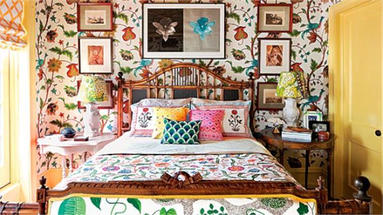
|
|
#
¿
May 9, 2017 22:12
|
|
|
Bad Munki posted:Honestly now I'm a little nervous to post our actual design for our new fireplace! No do it! Only constructive criticism for poster's projects. Unless you're a dick, but it's easy to not be a dick!
|
|
#
¿
May 10, 2017 01:54
|
|

|
Bad Munki posted:
That's going to be lovely I think  And A+ top-quality blanket fort. For anyone looking for fort construction tips, I highly recommend enhancing your cardboard box variety with a stick-on LED light like they make for closets. Huge hit every time. When people were posting random designs back in the bathroom thread, there was a room with drawers under the fireplace like that and a lot of people were surprised to see it. Do you have any limitations to what you can store down there? Will the drawers get hot?
|
|
#
¿
May 10, 2017 04:38
|
|

|
learnincurve posted:Why is there a fawn sat in a bowl of oranges? You wouldn't need to ask that if the god was with you
|
|
#
¿
May 10, 2017 06:53
|
|
|
Shadownerd posted:If you're into DIY Jo-Ann Fabrics have individual metal tropical leaves for sale in with their summer stuff and you could either find a simple gold lamp like this or find a black one and spray paint it gold to match, then stick a bunch of the metal leaves on top with e6000 or something. Just a thought! Cool, thank you! I'll have to see if we have Jo-Ann Fabrics around here.
|
|
#
¿
May 10, 2017 22:44
|
|
|
beep-beep car is go posted:When I see that kitchen, all I hear is "I love how much my dishes are covered in sticky greasy dust all the time!" What kind of kitchens do you like? I like them on the sterile laboratory side myself
|
|
#
¿
May 12, 2017 18:39
|
|
|
I have started to really dislike counter island seating after too many years in cramped apartments where that was the only option. I think a lot of design trends are reactionary like that - luxury to me is a dining room table and the space to put it in. People went nuts for granite countertops after laminate became the cheapo standard. I think natural materials will always age better than engineered ones (from a style perspective at least. Ask me about my finicky pet, a butcher-block prep table), and less adornment better than more. There's a similar principle in fashion - 60s styles never fully go out of style because they fit close to the body, and the human body always makes sense to us aesthetically. Styles that obscure the shape of the body tend to go out of fashion faster and look silly, because the reference point is lost. So I think if you're designing a kitchen now that you want to age well, focus on the design "speaking" to the basic functions of the kitchen - wash, prep, cook. Kitchens that try to "say" "we entertain so much our place is practically a restaurant" or "we're exquisitely modern and only eat things that have been
|
|
#
¿
May 12, 2017 22:53
|
|
|
Coca Koala posted:What do you think is going to look dated and silly about this? The only thing that really strikes me as objectionable is the stools, although I guess I'm not certain how I feel about the cupboards as well. I am not used to looking at things with an eye towards how they might fare in the changing aesthetics of the future, so I'm curious what you're seeing that I'm not. The pendant lights for sure, the horizontal wood grain, goofy giant faucet, super-thick counter slab, and eventually the ravages of time are going to turn those nice shiny stainless steel appliances into "ew it's like the 2010s in here, we have to rip this all out"
|
|
#
¿
May 13, 2017 01:07
|
|
|
beep-beep car is go posted:I can't speak for others, but the wood color and the style of cabinets - while simple - is pretty striking. Striking usually means dated in a few years. Yeah it's not so much "this is objectively ugly, avoid" as a reminder to renovate for what you personally like, because there's no such thing as a futureproof remodel. The only thing that might come close is if you live in a historical home and restore a room to period-appropriate style.
|
|
#
¿
May 13, 2017 01:38
|
|
|
RobotDogPolice posted:I'm not sure what to do with our living room. The TV stand doesn't fit on the mantle, so we're going to get it mounted on the wall, preferably with one that allows us to lower the TV closer to eye level. The closest outlet is on the adjacent wall, so we might try installing a new outlet as well. We eventually plan on getting some small speakers too. How much does it usually cost to have an electrician install an outlet and route some cables? The lamp and the end table are what we have on hand. I'll eventually shop around for something nicer. I'm not wild about the pillows, the yellow ones are pretty limp and the fuzzy ones feel weird. This is a great room to work with! Lovely floors and nice sunlight Do you ever light the fireplace? That affects your curtain choices since the window's kind of close. I always feel like you can't go wrong with a shade + gauzey tie-back curtains combo, so you can block out all light or just have some diffusion for privacy. What about a jute shade?  Or roman blinds:  I'm a big fan of using window treatments for color since they get so nice and translucent like this, but you can of course find them in any neutral you'd want too I see a coatrack behind the couch - I assume that's the entryway area back there? Would it be at all possible to push the couch back so it's not blocking the window, and move the rack or hang hooks on another wall? That would give you enough space for a coffee table and let the window be more of a showpiece. I think mounting the TV with a height adjustment arm is a great idea. Instead of separate speakers you might look at a slim-profile soundbar that can just sit on the mantel there. For electricity, what's on the other side of the fireplace wall? If it's a room with outlets on that side I think that makes it a little less expensive to install them on this side.
|
|
#
¿
May 13, 2017 19:30
|
|

|
PRADA SLUT posted:Where did the "putting words on walls" thing come from (or, pictures with words and/or phrase on it)? Was it like this big high-art thing that got diluted down and cheapened, or did it appear independently in it's current state somewhere? I think it was driven by two factors, which really have the same root. "Lifestyle" social media stars propelled the trend, because photographing yourself in front of some BIG words OF varying SIZES is an easy way to fake a sense of significance. It's part of how middle-class interior design is increasingly looking to commercial spaces for inspiration. Hey, Chipotle puts words on their walls, why not us. Underneath both aspects of the trend is the problem of people having no artistic reference points besides advertising.
|
|
#
¿
May 15, 2017 00:49
|
|
|
PRADA SLUT posted:Is there any way to mount a Nelson Sconce to concrete? I've got a raw concrete wall behind a bed I want to mount some sconces to, in a non permanent way. The sconces normally mount with screws to the back, which is fine for drywall but not concrete. Ceiling is concrete as well, so no ceiling-mounted options. You have killer taste - is the rest of your bedroom Herman Miller-y too? I like the idea of pairing something graceful like this with a raw concrete wall. There are ways to screw into concrete, which will leave a mark but you can dye to match when you patch it. Depending on how heavy the lamps are you miiiight be able to do something with heavy-duty adhesive strips? But if a lamp falls off in the middle of the night you'd probably die of a heart attack. HelloIAmYourHeart posted:Tomorrow I will make an album of my grandparents' house, because it was quite something, but for now here is a teaser: 100% toile bedroom. Toile wallpaper, lampshades, bedding, and upholstery. 
|
|
#
¿
May 15, 2017 05:25
|
|

|
PRADA SLUT posted:Most of my place is Herman-Miller-esque. I have a number of pieces from Herman Miller, but I'm trying maintain as few pieces of furniture or decor as possible so it doesn't look like I just bought an entire Design Within Reach catalog. The living room has an Arco and an Eames, surrounding a I would love to see pictures! I'm always lusting after a Pendleton quilt but Much Bigger Brontosaurus is always like "we live in a desert" "you kick off all the blankets every night anyway" "why don't you just cover the bed in Kinfolk magazines if you wanna be basic" So we have a TJ Maxx special and I live unfulfilled 
|
|
#
¿
May 15, 2017 06:27
|
|
|
PRADA SLUT posted:Is there a resource of bad design and why it's bad? I'm not looking for "LUL design fail" blogs or whatever, but more like the ones that take an analytical approach to why something is good / bad. I often see photos of interior design that feel "off" to me, but I can't specifically say why. For the record I am looking for "LUL design fail" blogs if anybody has any good ones. Reams have been written about interior design, and if you want to go hard into it all your major design groups and schools of thought have manifestos to dig into, but you can get pretty far just with basic art theory, particularly color and proportion: So you might not like that patio because it's drab and low-contrast:  Or you might not like its sense of balance:  Or you might be responding to cultural and temporal subtext, like how the furniture is identifiably cheap and the materials are identifiably artificial. This changes a lot with time, nostalgia sometimes buffing the tackiness off things like 50's steel lawn furniture:  Or stripping the institutional connotation from Steelcase tanker desks:  http://www.steelsantos.com/image/002.JPG Or turning cutting-edge fixtures, trendy colors, and innovative concepts about how a room should be used into a nauseating eyesore:  http://ronikordis.com/wp-content/uploads/gr/grooving-conversation-pits-from-back.jpg Edit: Images are doing that thing for me of not loading again, sorry.
|
|
#
¿
May 15, 2017 19:05
|
|

|
Thanks guys! And now a bit of interior design history. A woman I should hate (and Anne Whatley should love), because she basically invented the Hollywood Regency look before it had the name, Dorothy Draper.  In fact I don't hate her, because she wrote a couple of incredibly charming and dotty books, Decorating is Fun! and Entertaining is Fun! and she's the person I would credit with snapping the American upper classes out of their addiction to stodgy European antiques. Draper was perhaps the first American celebrity interior decorator. She advocated pattern mixing, loud colors, and human-focused furniture arrangement that would bring people closer together and help them feel more intimate, which is a bedrock design principle now but pretty revolutionary back in the 30s when most of the rich old people who were hiring her came of age in the Victorian era. She was a bit of an HGTV-style vandal, slapping brightly-colored paint on antiques and sawing furniture legs down to bring everything closer to the floor. She would have absolutely loved modern spraypaints. The entire design concept of "antique shapes, but in crazy colors" is all her. 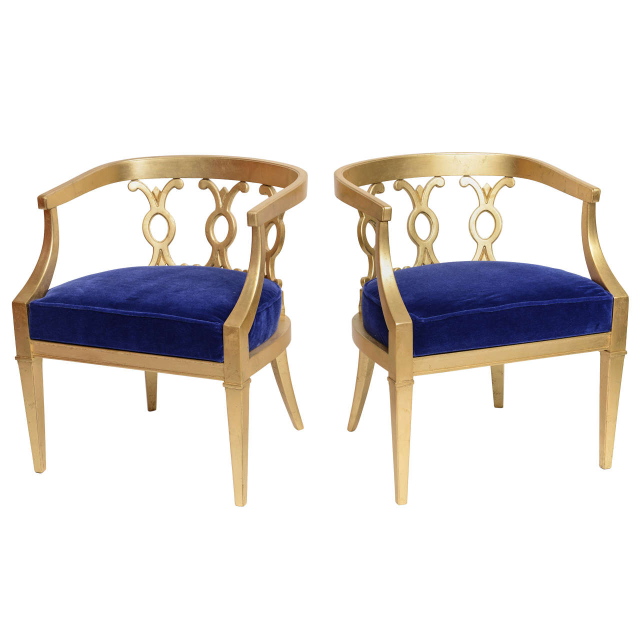  Perhaps most famously she designed the interiors of the former seat of the post-apocalyptic shadow government, the Greenbrier Hotel /cdn0.vox-cdn.com/uploads/chorus_image/image/47902035/mezzstaircasebwfloor.0.jpg)  Doesn't that striped wallpaper remind you of every issue of Real Simple published in the 2010s?   Dorothy Draper freed home decorators from the rigid idea that everything in a room should match in color, period, or style. She came into vogue during the explosion of the American middle class, when a lot of first-time home buyers felt compelled to buy complete suites of furniture, ideally as antique and "oh this has always been in the family" looking as possible. She popularized the ideas that seem obvious to us now: Buy one piece at a time, suit your own needs and tastes, and approach rooms like collages, where disparate pieces pull together to say something about you as an individual.  A lot of her designs surely look dated to you now, but something of Draper's is currently back in a big way: Her Martinique and Brazilliance prints. On wallpaper, on textiles, novelty paper goods - maximalist palm leaves are found wherever your modern Instagram addict hangs her hat. Brazilliance  Martinique  I don't think I'll take Dorothy's decorating advice anytime soon, but this bit of entertaining advice rings in my ears every time I consider canceling plans: Dorothy Draper posted:'The Will to Be Dreary� is a morose little imp which whispers to us that something which we know would be fun would be too much trouble, will take too much time, is too expensive and probably wouldn�t be as amusing after all as just now you think it would be. Now don�t listen to that voice. Tune it out. Tiny Brontosaurus fucked around with this message at 20:27 on May 15, 2017 |
|
#
¿
May 15, 2017 20:24
|
|
|
ulmont posted:Huh - I only knew the Greenbrier as the training camp for the Saints football team for the last 3 years. Sure, they SAID they were practicing football. Anne Whateley posted:shiny things  Yeah what I lift from Draper is the high-gloss lacquered stuff and shiny brass fixtures. I guess I like her color theory too, just not her palette. Magenta is somehow too much for me but neon yellow is just fine.
|
|
#
¿
May 15, 2017 21:17
|
|
|
cheese eats mouse posted:I have a red leather chesterfield couch and I'd totally do a brazilliance wallpaper behind it if I was in my own home. Removable wallpaper! It's not cheap but it is fun. Be sure to prep your walls carefully before installing though, as clean and bump-free as possible. Partial to this one personally: 
|
|
#
¿
May 15, 2017 21:49
|
|
|
WrenP-Complete posted:Do you happen to know if you can use this on cabinets? Hell yeah you can They use a rubber spatula for making crisp corners, but I've had great results with a plastic bench scraper. A thin-edged ruler could work too, as long as it's not too sharp. The trick to working with wallpaper and contact paper is to clean your surface perfectly first, especially if there's kitchen grease that could mess up the stickiness of your paper. If you're nervous about damaging your cabinets and only want to decorate the back wall, you could take cardboard or thin panels of wood and make covered inserts to pop in between your shelves
|
|
#
¿
May 15, 2017 22:00
|
|
|
I want that exact bedroom but with this toile:
|
|
#
¿
May 16, 2017 04:21
|
|
|
Baronjutter posted:Don't you dare put any wallpaper on my raw concrete. Doesn't it get clammy? Brutalist buildings always feel clammy inside to me. I realized a while back that what I was responding to with brutalist architecture was really better done with stone. Concrete's very human-unfriendly.
|
|
#
¿
May 16, 2017 04:31
|
|
|
underage at the vape shop posted:https://theartifox.com/products/desk-02-walnut?variant=30724558545 When you say "like that" what all do you mean? The walnut? The sawhorse design? You won't find those exact dock/cord management features anywhere else probably, since they look proprietary, but there are aftermarket cable management options that work on the same principle. Ikea has a fairly ugly but effective option. TBH this looks a little kickstarter-y to me, where there's a lot of buzzwords that might be distracting from subpar construction or materials and hyper-specialized features that might not age well. How do you clean/replace those little felt spacers once you knock your coffee over? Are you really going to use the pegs? More than you'd use a $2 hook you could attach to any other desk? If you want a nice flat drawer-free workspace and some attractive cable management I think you'd be way better off rolling your own.
|
|
#
¿
May 16, 2017 06:16
|
|
|
underage at the vape shop posted:I want to make my own desk more than anything but my current arrangements make it impossible/overly expensive. I like the clean design, and the solid top. I hate this piece of poo poo ikea desk that I have now, it's a big laminate box filled with cardboard. I don't need or want draws or shelves, but I do want a fat desk, the width is good. I mean, width in the direction you are looking in when you sit at the desk, I hate the monitor being up close. My main monitor right now is half off the back off the desk, touching the wall. The desks like this at physical stores near where i work are all real skinny. The cable management is really cool, I wouldn't use the felt things, I just like the slot and how it's not just a straight hole. Ok, that's doable. What's your budget and your ability to get things delivered? What about this dining table set? The legs just screw into those cleats, which you can attach to the tabletop with a regular screwdriver. $229 for the clear-coat version, which I'd recommend so you don't have to mess around with staining. It even comes in walnut! And look at all the options for tops I know you said you didn't want to build anything but tbh anything you buy online is going to come about this disassembled anyway. It doesn't have the cable management slot you wanted, but they offer all kinds of notching and mortising services so I bet if you emailed them they'd be happy to run a router in a straight line for a few extra bucks. Edit: They offer international shipping!
|
|
#
¿
May 16, 2017 06:45
|
|
|
PRADA SLUT posted:Get a baller-rear end T90 for $3600. You can ever store your crown on it. Yeah but - and I don't think this should become a class warfare thread because everybody's got a different income level and has the right to enjoy life to the extent that they can afford - when I was younger $1400 was like my spending money for an entire year.
|
|
#
¿
May 16, 2017 18:01
|
|
|
Baronjutter posted:The most expensive thing I ever bought was my sofa for about $900. Yeah! Tell me more about that chair on the left, and those little buildings on the top of your bookshelf
|
|
#
¿
May 16, 2017 19:09
|
|

|
Elendil004 posted:I'm looking to remodel both my bathrooms. My house is a modular, 1983-build and it's just dated. I have a decent idea what I want to do but really looking for clever ideas, things I haven't thought of, pitfalls, etc. I'll be doing most of the work with a family friend who has been building for his entire adult life so the work will be overdone, no code issues, no I-beams to saw through, etc. That said, if you see something, say something. Sorry, didn't mean to ignore you! Everything I know about heated floors comes from watching Holmes on Homes (notably an episode where he made a big deal out of installing them in a Los Angeles remodel and the homeowners were like "uh we don't even have a furnace but... thanks?") but I think as long as you don't cut corners on material or skilled labor you should be fine. For a smaller shower space like yours I'd definitely want to minimize grout, if only because there's not much space to maneuver for hardcore scrubbing. Have you considered wall panels instead? I think they can look pretty cool and the big pitch from all the manufacturers seems to be effortless cleaning 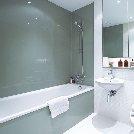 
|
|
#
¿
May 16, 2017 21:02
|
|


|
beep-beep car is go posted:You guys are in for a treat if you love model trains. Baronjutter has a boss trainset. What, that's so cool!
|
|
#
¿
May 16, 2017 21:58
|
|
|
Your trainset IS really cool. I especially love that your tiny city appears to have a tiny grafitti artist. drat tiny teens 
|
|
#
¿
May 16, 2017 22:39
|
|

|
Arachnamus posted:Is that bottom light behind the panels or is it just weird photography? The site doesn't say for sure but since it's circular I'm betting it's just a photography light. Lighted shower panels would be kinda cool in a tacky tech billionaire way though.
|
|
#
¿
May 16, 2017 22:55
|
|
|

|
| # ¿ Apr 28, 2024 05:28 |
|
|
PRADA SLUT posted:A Good Bathrooms Hell yeah, I might slightly tweak the color in the bathtub one but that room looks delightful to be in. Edit: Actually let's look at that one again, because it demonstrates good design theory I want to talk about : See the tile on the wall and the tile on the floor? Great example of how you can mix elements of different sizes in the same room, even if they're touching. Two things work to make the wall and floor feel unified that people often mess up when picking tile. First, the tiles are the same shape, both rectangles, both proportioned similarly. Secondly, and this is one I see bathroom designs screw up all the time, the floor tiles are sized so the grout lines match up with the wall tiles. You do this by making sure your big tiles come in dimensions that are evenly divisible by your small tiles. Always try to get physical samples of tiles you're considering so you can tetris them out and make sure they work together this way. The effect is subtle since it's white tile on white grout, but it makes the room subconsciously more orderly and therefore, to me, calming. Tiny Brontosaurus fucked around with this message at 23:46 on May 16, 2017 |
|
#
¿
May 16, 2017 23:41
|
|