


|
Slow getting drawing again in the new year. Here is a demon doodle.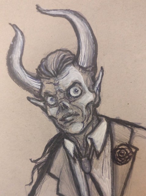
|
 #
¿
Jan 8, 2019 04:11
#
¿
Jan 8, 2019 04:11
|
|


|

|
| # ¿ May 12, 2024 05:32 |
|
|
GenJoe posted:I'm doing the photoshop trial for the week and it's going p well so far, the Kyle Brushes feel really good That's a really good one. Looks so much like traditional media.
|
|
#
¿
Jan 8, 2019 07:48
|
|

|
heavy liquid posted:Playing around with the sorceress sketch from this morning... I really like this one! This year is a slow start drawing wise. I just have too many 3d stuff taking up my time and the hard truth is 3d takes MUCH longer to create than 2d. That is why typically a 2d concept phase happens faster than the 3d production phase. *ugh*
|
|
#
¿
Jan 11, 2019 21:02
|
|


|
heavy liquid posted:Quick coloring for the witch... I seem to be liking it less and less the more I do with it, so I think I'm done with it. Don't give up on it. Looks great so far IMO.
|
|
#
¿
Jan 14, 2019 06:53
|
|

|
This might be useful for those of you who make moodboards / collect reference before working.
|
|
#
¿
Jan 15, 2019 02:40
|
|
|
sinc posted:Can�t tell anymore if this is working at all or not, turns out black-on-black is not the easiest color scheme to work with... It�s Behemoth the fat Russian demon cat. Good job.
|
|
#
¿
Feb 17, 2019 13:06
|
|

|
Haven't done daily drawings in far far too long. Anyways, here is a non daily drawing.
|
|
#
¿
Mar 26, 2019 06:48
|
|
|
Quick sketch I plan on doing a little more on. (from ref)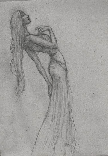 
sigma 6 fucked around with this message at 08:12 on Mar 30, 2019 |
|
#
¿
Mar 30, 2019 03:53
|
|
|
I haven't been drawing every day... (and it really shows)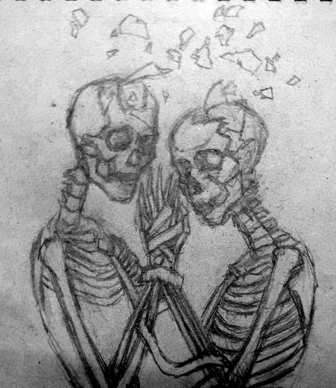 Also shows that I don't have a working scanner and an old point and shoot camera. 
sigma 6 fucked around with this message at 07:10 on Jun 3, 2019 |
|
#
¿
Jun 3, 2019 06:55
|
|
|
ThreeStep posted:I like this, you've got a grasp on the skeleton that I'm still trying to get and the photo quality's good; did you do any post-processing? Especially love the figure on the right, everything's got enough detail I can tell what part's what. Hey thanks. Generally I just desaturate and crush levels a bit. It's on toned paper so that accounts for the weird texture. Update:  To be listened to with Lorn. https://www.youtube.com/watch?v=ENNgSMVRmXw Well - pretty much any Lorn really.
|
|
#
¿
Jun 5, 2019 20:06
|
|

|
Quick mockup of the direction I was planning on going with it.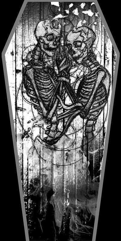
|
|
#
¿
Jun 6, 2019 00:19
|
|
|
Not quite a daily drawing. Rather an engraving of a daily drawing. Getting crafty with a local laser cutter. Engraved glass on the left and engraved paper on the right. Pokemon / wave image is not mine. My friend wanted me to try engraving glass and that was the image he wanted.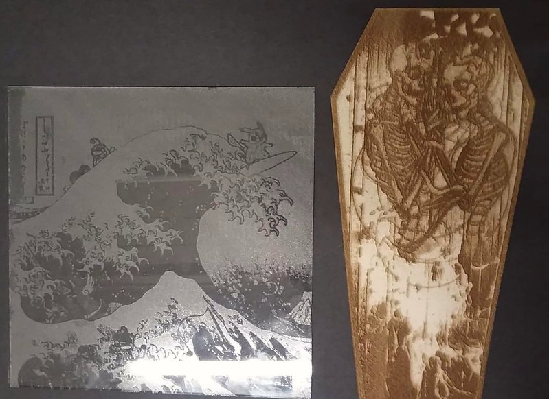
|
|
#
¿
Jun 9, 2019 17:03
|
|
|
Trying to make a bookmark but I am getting very frustrated with my results so far. Some C n C is very welcome. This is just not turning out as I well as I had hoped. Old drawing: 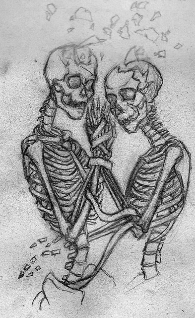 Old iteration: 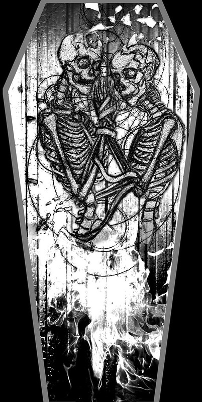 New drawing: 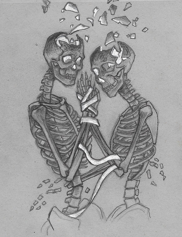 New iteration: 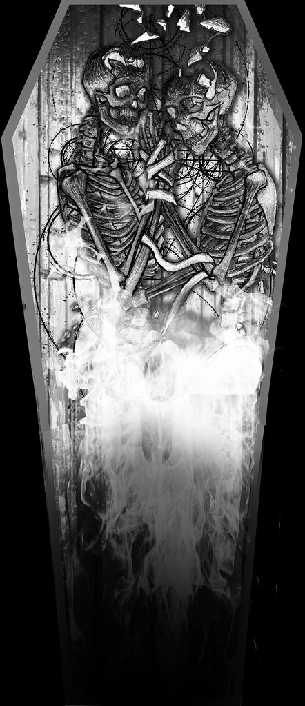 I was wanting the fire to light up the skeleton from below (and within) and the figures get darker / more scorched towards the top of the figures. However I am happier with the old iteration for some reason. The scale of the bookmark doesn't seem long enough. The fire is funky (should I just draw this instead of composting a photo?) and the figures are kind of lost now and don't pop as well against the background wood / coffin. Ugh. Please help. sigma 6 fucked around with this message at 09:18 on Jun 11, 2019 |
|
#
¿
Jun 11, 2019 09:15
|
|
|
lofi posted:Beyond what others have said, the background's too complex, imo - all the swirls are making it hard to pick out the important bits. You could cut them out, or do them in a lighter tone to help the figures pop. I'm really not a fan of the composited fire, I'd go for drawn - I don't like the look of photoreal mixed with drawing. Also, for balance, I'd shift the figures a touch to the left. Thanks. I am going to try and do another iteration tonight where I hand draw the wood for the coffin and try and draw the fire. I feel like the mix of drawing and photos may not be working. If I had time to paint the entire thing using photoshop or maybe acrylic maybe that would be different but I am kind of on a big time crunch here and I just want the elements to look good. Right now it just seems like it is too muddy because the elements aren't reading very well. I will center the figures as well. The designs behind the figures are meant to be arcane circles / sacred geometry. It might just be too much and serving to add too much noise. The wood grain and circles are competing against the figures. Something about the contrast / values just isn't working at all. A little off topic but Krita can animate like TV paint?!? Wow. https://www.youtube.com/watch?v=NOTY_421Qcg Krita is a free painting program and works MUCH better than photoshop on my surface book. I could never get pressure sensitivity to work on my surface book with photoshop unfortunately. sigma 6 fucked around with this message at 22:35 on Jun 12, 2019 |
|
#
¿
Jun 12, 2019 22:33
|
|
|
Tried to login to chat but kept getting some kind of socket error. Cool you are using Krita and playing Pink Floyd though. I approve!
|
|
#
¿
Jun 13, 2019 17:13
|
|
|
Al! posted:hi yall, the art dome just entered round 2 I may need to try this if it isn't too late. *** In the meantime thanks for the input. Thinking about taking it into Adobe Illustrator to clean it up and prep for laser engraving. 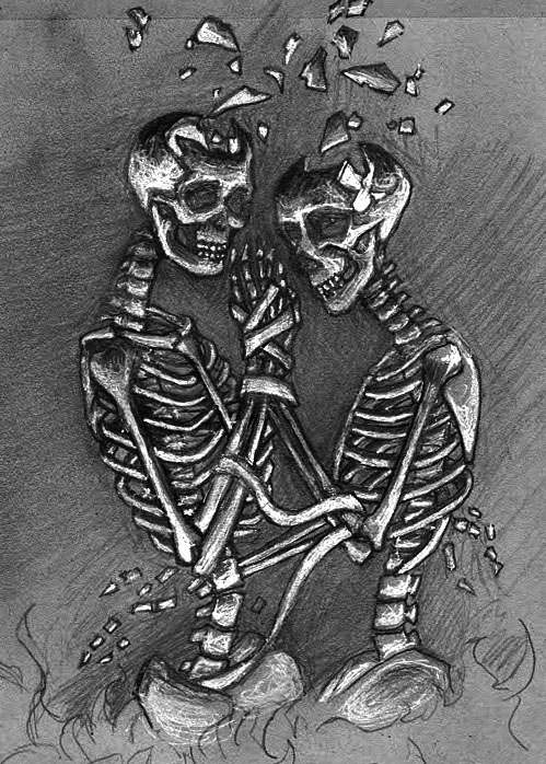 a hole-y ghost posted:real quick digital study before bed These are great.
|
|
#
¿
Jun 19, 2019 06:39
|
|


|
heavy liquid posted:178. Love this. lofi posted:
...and this. REALLY nice portraits / value studies. I have been itching to get back into painting but I am waiting on mural negotiations to be settled on. Making a mural feels like marathon painting sometimes and definitely tricky to get approval from all parties involved.
|
|
#
¿
Jun 29, 2019 22:02
|
|


|
This should probably be for the digital art thread but it's an art dome so I am hoping for critique before final submission. vs.  Kinda thinking handwriting in marker or something instead of the formal font. Really unsure about the cornea going all the way around the eye and giving it a beachball effect. Also the moon "fade" kind of competes with the eye texture although the original concept was a moon kind of turning into an eye....dunno if any of it works anymore. "That's no moon..." sigma 6 fucked around with this message at 18:26 on Jun 30, 2019 |
|
#
¿
Jun 30, 2019 06:39
|
|
|
gmc9987 posted:Do you have any thoughts in your mind about what sort of music the band Adequate Revelation plays? Because knowing that would probably influence my feedback. At the moment, the things that catch my attention are: Hmmmm - that last part is kind of interesting. I sort of thought of "Adequate Revelation" in terms of the image and name of the album. Hadn't really considered a different band name or that the name even referred to the band vs. the album. Here is another (last?) iteration. Not sure if the writing really feels like handwriting in sharpie or if the faded / damaged polaroid effect is working.  I do think the lack of cornea reflection works better and hopefully it is obvious the eye is pointing down towards the city in the valley.
|
|
#
¿
Jul 1, 2019 04:05
|
|
|
Shinmera posted:Hello everyone! I hope some of you can help me out with a colour problem. Use photo reference!! I imagine an icy tundra would not be near neon yellow. One is idea is to find a photo of an icy tundra that you like. Blur the crap out of it and then color pick 4 or 5 average colors from that as a color palette. Cool colors and less saturated color scheme would be my advice. The bright yellow and black scheme is like yellowjacket bees for the brain. Not pleasant and definitely not an icy tundra. lofi: Completely understandable.
|
|
#
¿
Jul 1, 2019 21:57
|
|
|
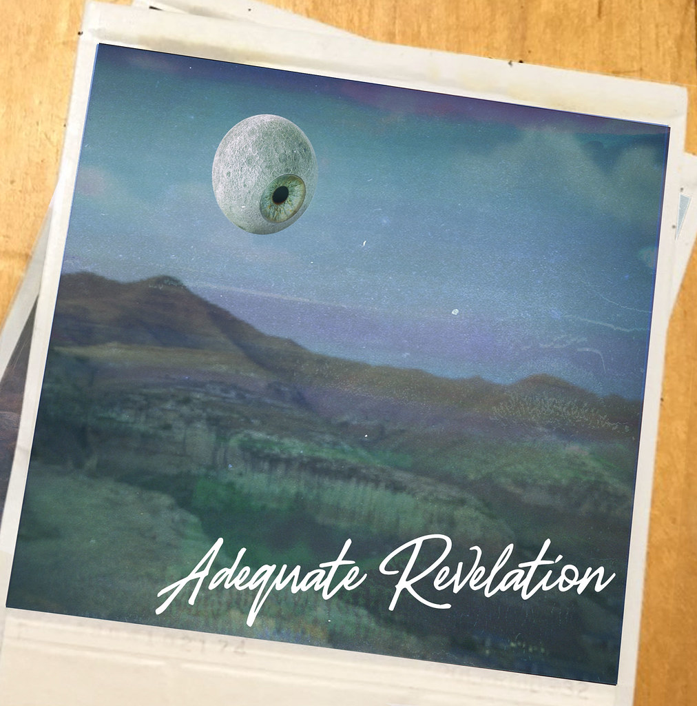 I think I like the last version's font a bit more. I also *think* the moon aspect looks better but now I am wondering if I should add any stars? A few at the very top? The city / town in the bottom right is impossible to see now. Also the damaged polaroid effect might be too heavy handed, I dunno. Really trying to make the moon / eye element look like it belongs in the background but it still pops a bit more than I would like ...even after adding some extra clouds.
|
|
#
¿
Jul 2, 2019 15:34
|
|
|
Al! posted:that's no moon.............. 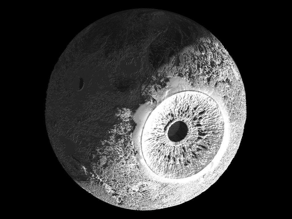 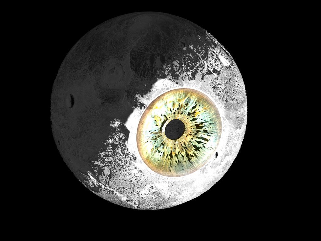 a hole-y ghost: Thank you for the input. I hate picking fonts. 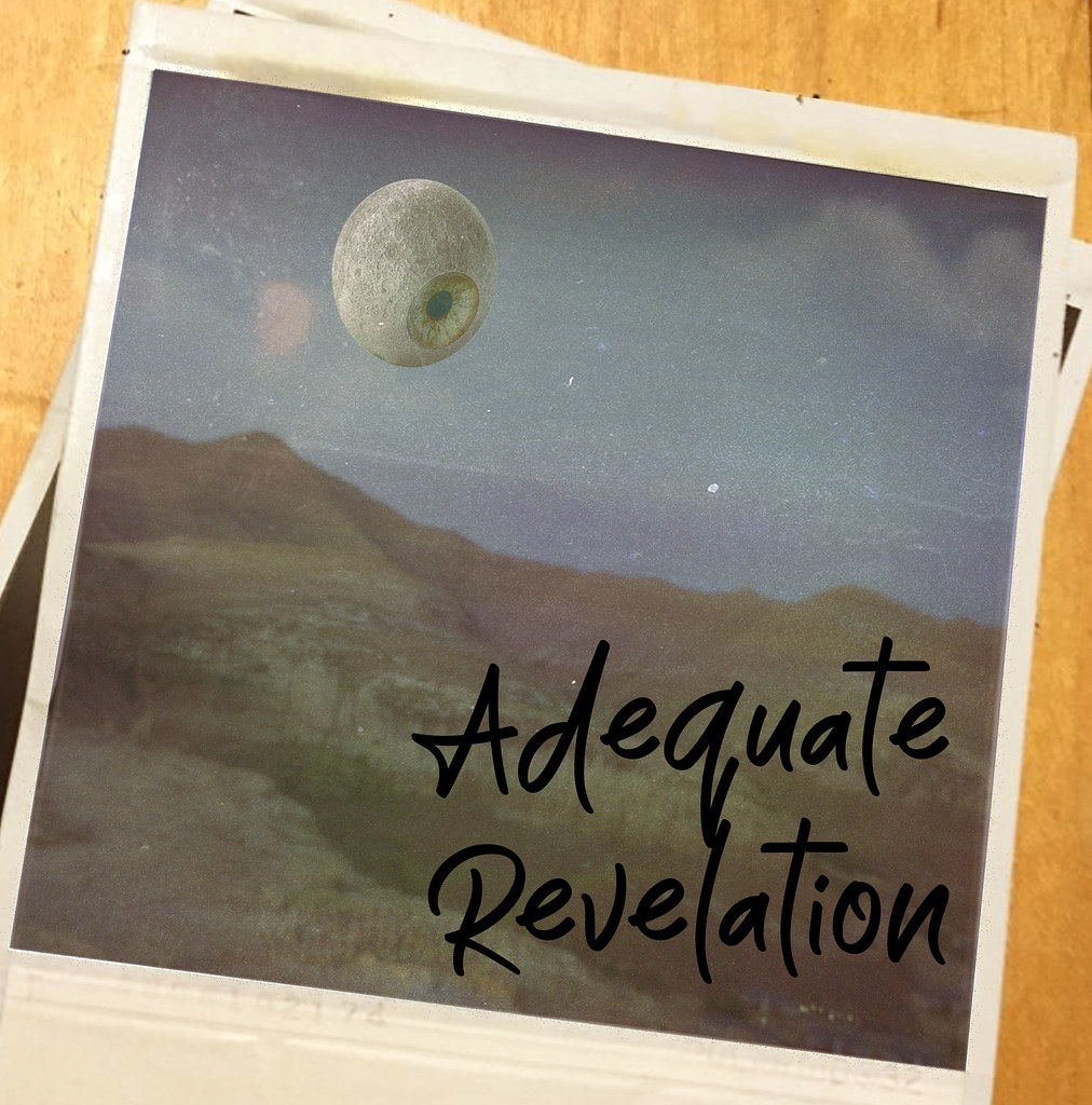 Black marker or white lettering? Time or date stamp? sigma 6 fucked around with this message at 07:26 on Jul 3, 2019 |
|
#
¿
Jul 3, 2019 03:48
|
|
|
I agree the white font pops more. Was thinking of time / date stamps like this. Interestingly the number you see on the bottom in the white is the number of the batch of the film manufactured.
|
|
#
¿
Jul 3, 2019 16:36
|
|
|
^^^ That's amazing. ^^^ Ever feel like you have officially overworked a project? Here is my Arnold render: 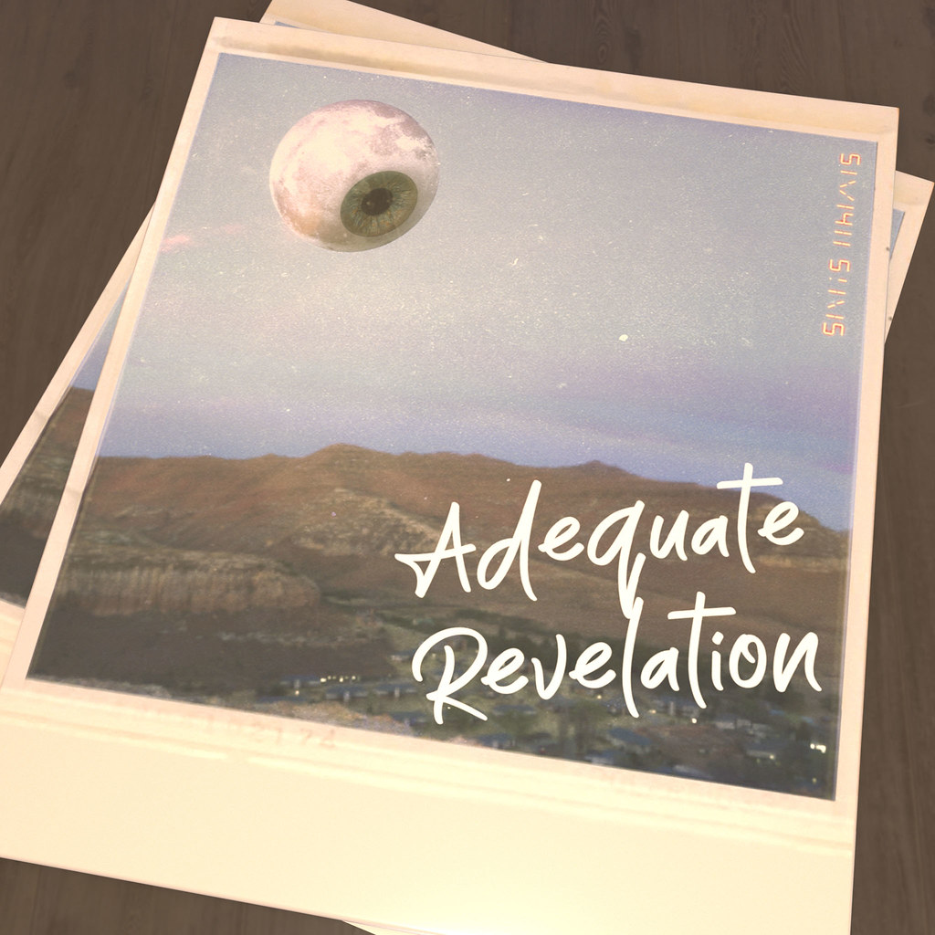 Here is my Keyshot render: 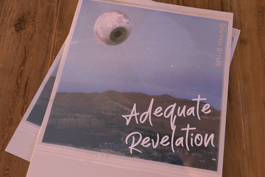 Which one is better? Earlier versions can be found here. In case you were wondering what was different. I modeled the polaroids and table in 3d and lit the scene in 3d. Also added the date stamp for the band name "Small Sins". Also the moon and font is different from the last version. That last part I am still unsure about since I like both the moons / fonts.
|
|
#
¿
Jul 12, 2019 09:06
|
|
|
WIP 1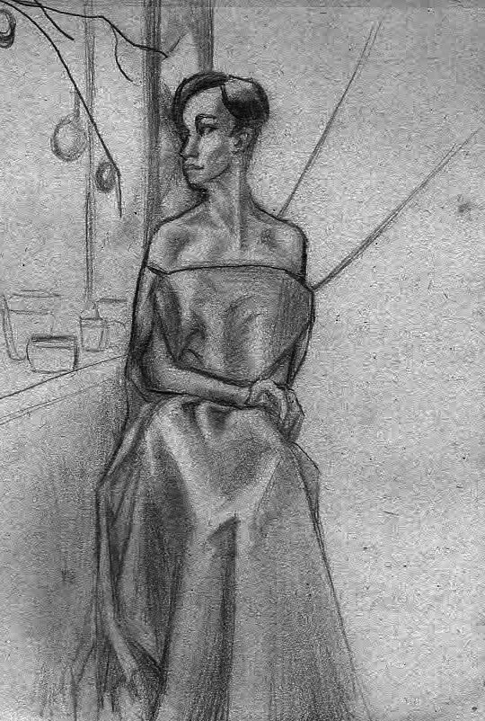 WIP2 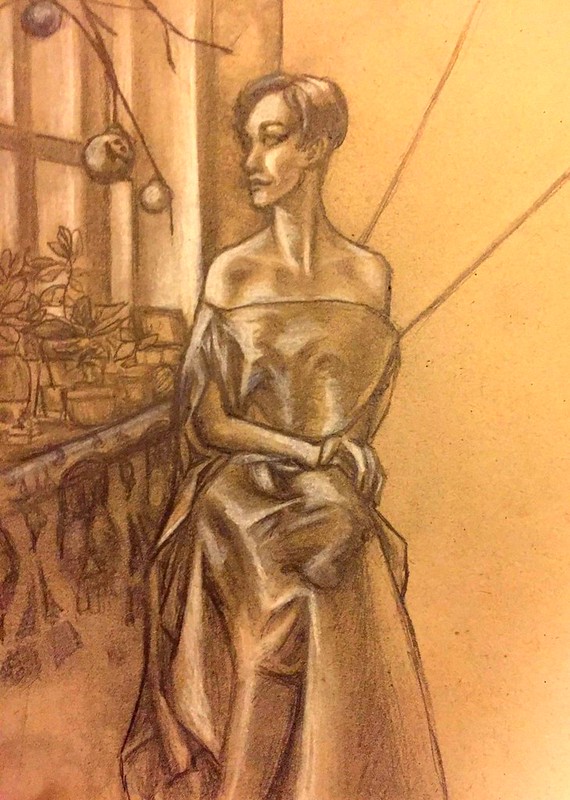
|
|
#
¿
Jul 28, 2019 00:48
|
|
|
Last artdome entry. From crappy concept painting. To 3d render. To finished photoshop comp.   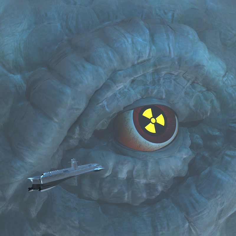  Really gotta practice photoshop painting more.
|
|
#
¿
Aug 5, 2019 20:24
|
|
|
Love this but it bears a very strong resemblance to your avatar. Not that that's a bad thing. Here is a quick sketch of an idea I might do for a mural. Face is a little too young and very clearly not drawn from reference. Still want to flesh out a few more ideas. May not go with this idea at all. Or I might go with some photo reference and an older model. Need to do more thumbnails. 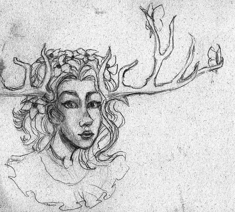
|
|
#
¿
Aug 6, 2019 13:27
|
|

|
Some daily stuff. 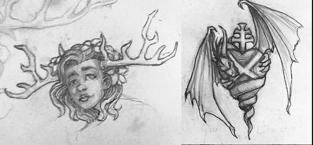
|
|
#
¿
Aug 13, 2019 03:46
|
|
|
I hated that freckle juice book as a kid. Don't let them lie to you. They never go away.  Dickbat at rest.
|
|
#
¿
Sep 5, 2019 10:38
|
|

|
Keetron posted:For all those who come here and think "I wanna be good at drawing too! But I have no talent and you guys are intimidatingly talented." That was pretty hilarious.
|
|
#
¿
Sep 6, 2019 18:18
|
|
|
Shinmera posted:This one's really nice! The brush strokes and colour give it a lot of intensity. When goons are inspiring. Before  After  This was a rough sketch for Atomic Leviathan artdome prompt. There is an artdome due today if anyone is game! Final (3D) version ended up being this. 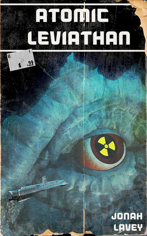 Artdome entry: (visual pun) 
sigma 6 fucked around with this message at 08:23 on Sep 9, 2019 |
|
#
¿
Sep 8, 2019 20:10
|
|
|
Cartyisme posted:Been a while. Gonna dump some stuff in the hopes I'll continue to post. Woah - it has been a while.
|
|
#
¿
Sep 15, 2019 07:14
|
|


|
Sketch of an artdome piece I am in the process of making.
|
|
#
¿
Sep 21, 2019 09:31
|
|
|
Inktober "mindless" Inktober "freeze" 
|
|
#
¿
Oct 7, 2019 19:33
|
|
|
Inktober "Enchanted"
|
|
#
¿
Oct 9, 2019 08:14
|
|
|
Heheh. Inktober "Build"  (The one who knocks... down) Inktober "Circle"  This is amazing. sigma 6 fucked around with this message at 09:48 on Oct 10, 2019 |
|
#
¿
Oct 10, 2019 05:03
|
|


|
Inktober "frail" The Monkey's Paw was the oldest horror I can remember. Written in 1902. What's the oldest horror story you can recall?
|
|
#
¿
Oct 11, 2019 10:54
|
|
|
lofi posted:Every fairytale ever? Beowulf? I'm not a historian, but people have always loved spooky stories and sticky ends. Oh come on. I meant the earliest / oldest horror story you ever heard of. Grimm fairy tales don't count. Beowulf is an epic more than a horror IMO. Granted - a lot of fairy tales could count as horror. 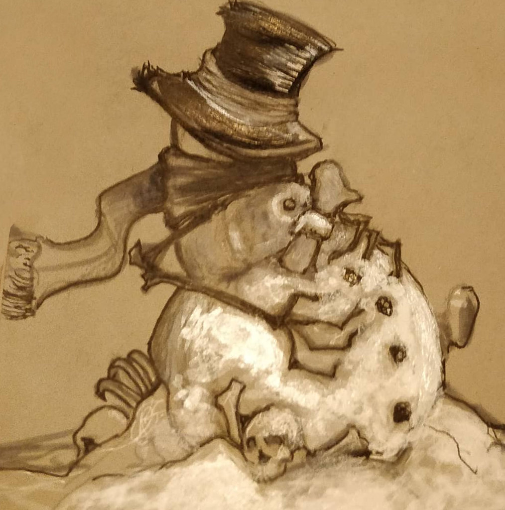 snow sigma 6 fucked around with this message at 15:13 on Oct 12, 2019 |
|
#
¿
Oct 12, 2019 02:55
|
|


|
gmc9987 posted:
Yeah.. this is really good.
|
|
#
¿
Oct 15, 2019 02:09
|
|

|

|
| # ¿ May 12, 2024 05:32 |
|
|
Love these. Inktober 2019 "Ash" 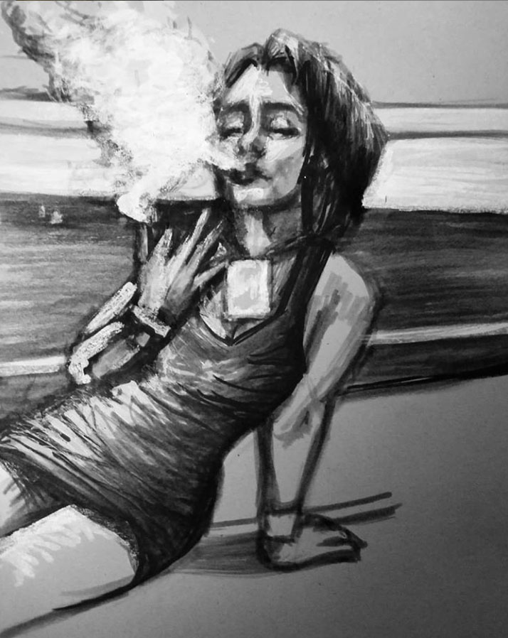 "Overgrown" 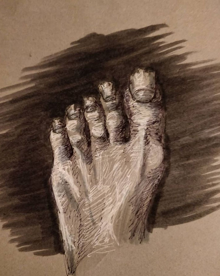
sigma 6 fucked around with this message at 04:03 on Oct 16, 2019 |
|
#
¿
Oct 16, 2019 00:02
|
|

