


|
LargeHadron posted:What the gently caress? I lived it CA for 23 years and I never saw a green hill like that. Everything was always dead. What part? Yeah you have. http://en.wikipedia.org/wiki/Bliss_(image) 
|
 #
?
Jul 8, 2012 01:15
#
?
Jul 8, 2012 01:15
|
|


|

|
| # ? May 21, 2024 18:55 |
|
|
Mr. Despair posted:Yeah you have. seriously this. LargeHadron posted:What the gently caress? I lived it CA for 23 years and I never saw a green hill like that. Everything was always dead. What part? Quantum of Phallus posted:Thanks for this! I've been dying to get into MF for a while now. like santa maria toward san luis obisbo and morro bay - cambria?
|
|
#
?
Jul 8, 2012 01:27
|
|


|
The intention here is great but the composition keeps pulling me towards centre frame in spite of the subject being frame left. I think it's how bright centre frame is. I think more of an angle, so that the lines crossed the entire frame may have helped this. Or waiting till the clouds crossed.  A snapshot. Too much toning? Too tighter crop?
|
|
#
?
Jul 8, 2012 03:33
|
|
|
Awkward Davies posted:I'm trying to salvage this photo: Maybe go with a square or 8x10 crop? I like it and agree it's worth salvaging, but I feel like you may be cutting too much by maintaining a 3:2 aspect ratio.
|
|
#
?
Jul 8, 2012 05:47
|
|


|
Wafflecopper posted:
Metalslug posted:
scotty posted:
 Ganglia by Sam Tellman, on Flickr I worked here to bring out the blue and tone down the red (which is still a little over saturated in the upper left-hand corner). Not sure if the blue wound up looking a little too electric or not, but I'm reasonably happy with it.  Thing by Sam Tellman, on Flickr I rather like the space in this one and the hint of the flower in the back, but it might have been better with a little more DOF. Also, there's that pesky black splotch in the corner.  Sun and Moon by Sam Tellman, on Flickr Shot a picture of the moon at the very start of a roll and got this rather awesome effect. moonduck fucked around with this message at 06:55 on Jul 8, 2012 |
|
#
?
Jul 8, 2012 06:52
|
|


|
guidoanselmi posted:like santa maria toward san luis obisbo and morro bay - cambria? YES, we passed through San Luis Obispo and Cambria, I think it was much closer to LA than SF. XTimmy posted:The intention here is great but the composition keeps pulling me towards centre frame in spite of the subject being frame left. I think it's how bright centre frame is. I think more of an angle, so that the lines crossed the entire frame may have helped this. Or waiting till the clouds crossed. For full disclosure, I shot this from a car moving at about 100km/hr  moonduck posted:
This is awesome.
|
|
#
?
Jul 8, 2012 12:15
|
|

|
XTimmy posted:
moonduck posted:
 IMG_9289 by like okay cool dude, on Flickr 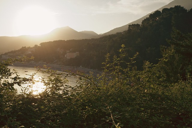 IMG_8284 by like okay cool dude, on Flickr 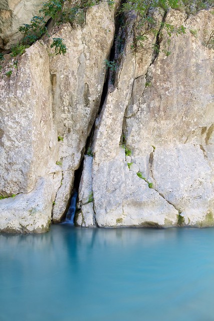 IMG_8713 by like okay cool dude, on Flickr
|
|
#
?
Jul 8, 2012 20:24
|
|

|
Quantum of Phallus posted:YES, we passed through San Luis Obispo and Cambria, I think it was much closer to LA than SF. If it's where I think it is (and it might be): http://guidoanselmi.deviantart.com/gallery/?offset=312#/d3k8cs7
|
|
#
?
Jul 8, 2012 21:45
|
|
|
sensy v2.0 posted:
The 2nd image has some nice tones and what looks like an interesting beach but the plants in the foreground take up way to much space and kind of block what I really want to see. With the last one I think you could have zoomed in a lot more on the waterfall. With nothing to give a sense of scale it would have had people trying to figure just how big/small it really is, which would have added more interest I think. ----  Foreground is a bit meh
|
|
#
?
Jul 8, 2012 23:36
|
|
|
moonduck posted:
This is a perfect example of how the coolest things can happen by complete accident. It would seem trite to critique an unintentional shot so I'll just leave it as is and say that I really like it. quote:
I love the tones in this shot and don't think that they are overprocessed at all. If anything I think a smaller aperture would have worked better to isolate the ganglia from the petals, as well as compliment your tonal choices. I'm looking at the shot at full resolution and the detail in the ganglia is fantastic; I just wish that this detail had more of a presence in the frame. A silhouette from a resent vacation- I'm not quite sure how to process this type of shot.  Bouillon Rube fucked around with this message at 04:41 on Jul 9, 2012 |
|
#
?
Jul 9, 2012 04:16
|
|


|
Hotwax Residue posted:
Something about this just doesn't scan properly to my eyes. The composition is conventional, but I think with the colour profile and, the (shall we settle for uninteresting?) foreground, there's a large area in the picture that doesn't really do much. Part of the reason the foreground fails to draw attention is that it's quite small and almost seems as if the beach-head was included as an afterthought. The mountains are the obvious focal point, and are great, but I'd like to see the framing either 2 feet forward (cutting out the end of the beach-head, and just making the picture the tide and mountains) or 2 feet back and a looser crop (giving more top space, but also introducing more foreground). At the moment it feels a little too tight at the top and bottom and with the cool blue shade being the prevailing colour it doesn't quite work for me. Augmented Dickey posted:A silhouette from a resent vacation- I'm not quite sure how to process this type of shot. You've got several interesting silhouettes there, and a gradual change in the depth of the shadow. The natural lack of colour in the image would lead me to process this in black and white and rely on tonality to convey the scene (additional exposures might help here). I'd also dodge/burn areas of the photo (eg. the highlights on the water to the mid and lower left) in order to increase the tonal range. My own stuff: 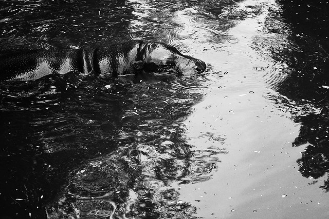 Water's Bovine by falamh, on Flickr  Pride of the Pantanal by falamh, on Flickr 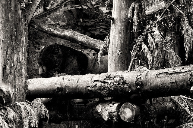 Melanistic by falamh, on Flickr
|
|
#
?
Jul 9, 2012 14:28
|
|

|
The Clit Avoider posted:
My feeling is that it looks claustrophobic for such a grand scene. The lack of foreground and almost telephoto-like compression leads me to think this is a crop from the original 25mm framing. Water and mountains would be the weaker option in my opinion. Getting lower to minimize the midground (while emphasizing the foreground) would be my default option. Opening up the shadows might serve this well, too. The contrast in the foreground and water adds a lot of heft, and blending some brightness into the shadows will help that. (I just noticed my work monitor is dark to begin with, so take this with a grain of salt. I'll review it on my calibrated monitor at home later.) (Yep, still dark.) Leviathor fucked around with this message at 01:23 on Jul 10, 2012 |
|
#
?
Jul 9, 2012 14:45
|
|
|
 Breathe In by Quantum of Phallus I really think I should have got the focus on the photograph.
|
|
#
?
Jul 9, 2012 14:51
|
|
|
Quantum of Phallus posted:
Agreed, it's the most human part of the picture. I also feel this would do well centred more, the extra space to the right isn't helping things. Oddly enough the off white balance is making the image seem more 'candid' to me, maybe because I'm so used to seeing snapshots taken in off lighting that it now triggers as a "intimate moment".  Enjoy Coca-Cola! by TimFPictures, on Flickr I liked the car and the sign. I don't like the picture enough to post it in Landscapes though.
|
|
#
?
Jul 9, 2012 17:27
|
|
|
Quick update on this one, an Irish photography magazine (I'm from Ireland) liked it and put it online, which is cool ") Quantum of Phallus fucked around with this message at 09:18 on Jul 10, 2012 |
|
#
?
Jul 9, 2012 20:30
|
|

|
Quantum of Phallus posted:
I hate to be that guy who ask this question.... Is it a table or a casket?
|
|
#
?
Jul 9, 2012 21:05
|
|

|
Niagalack posted:I hate to be that guy who ask this question.... Is it a table or a casket? The latter. Thankfully it's from a short film and she's still very much alive. I hope.
|
|
#
?
Jul 9, 2012 21:10
|
|
|
The Clit Avoider posted:Something about this just doesn't scan properly to my eyes. The composition is conventional, but I think with the colour profile and, the (shall we settle for uninteresting?) foreground, there's a large area in the picture that doesn't really do much. Part of the reason the foreground fails to draw attention is that it's quite small and almost seems as if the beach-head was included as an afterthought. The mountains are the obvious focal point, and are great, but I'd like to see the framing either 2 feet forward (cutting out the end of the beach-head, and just making the picture the tide and mountains) or 2 feet back and a looser crop (giving more top space, but also introducing more foreground). At the moment it feels a little too tight at the top and bottom and with the cool blue shade being the prevailing colour it doesn't quite work for me. Leviathor posted:My feeling is that it looks claustrophobic for such a grand scene. The lack of foreground and almost telephoto-like compression leads me to think this is a crop from the original 25mm framing. Thanks guys. I knew something wasn't right, aside from the boring foreground, but I couldn't put my finger on it. I think you're right about the claustrophobic feeling. The interesting thing is that it isn't a crop of the original shot and I was as low as my tripod will let me get. White balance has been difficult as well for some reason. Looks like I'll have to head back there for another go, which isn't very exciting because it was cold as gently caress ")
Hotwax Residue fucked around with this message at 21:20 on Jul 9, 2012 |
|
#
?
Jul 9, 2012 21:15
|
|
|
XTimmy posted:Agreed, it's the most human part of the picture. I also feel this would do well centred more, the extra space to the right isn't helping things. Oddly enough the off white balance is making the image seem more 'candid' to me, maybe because I'm so used to seeing snapshots taken in off lighting that it now triggers as a "intimate moment". Aside from that I like it. It felt a bit too tilted to the right for me but then I got you were keeping the buildings straight and it was just the curvature of the road giving me that impression, so excellent work getting that lined up right. Quantum of Phallus posted:Quick update on this one, an Irish photography magazine (I'm from Ireland) liked it and put it online, which is cool Some snapshots of my cousin's 6 month old baby.  IMG_5378 by Aidan R, on Flickr Him and his son.  IMG_5385 by Aidan R, on Flickr God drat I wish this wasn't at 1/25th of a second. It's just a tad blurry.   IMG_5406 by Aidan R, on Flickr With my aunt (the kid's grandmother).
|
|
#
?
Jul 10, 2012 01:53
|
|


|
The Clit Avoider posted:
I'm going to comment on the hippo picture first, because I like it the best out of the three posted. The black and white really gives the hippo's skin some nice definition. Also the crop is the most interesting, too as it indicates movement. But, I still find there's a bit of empty space at the bottom of the picture that could be cropped away. Also, I think your images (all three posted) are quite heavy on textures and fine detail, this combined with the nice inky blacks makes them hard to decode. This is especially true for the third picture, where my eyes are also being led away from the subject by the logs. Now this could be intentional but for this picture I don't feel it really works here. I'd try a tighter crop, or -- as there's no letters in the picture maybe also try flipping it horizontally and see if that helps. I think there is some promise in the picture, especially when viewing it larger, but I'm not seeing it fully realized. Lastly the second one seems to me to be the weakest of the three, the subject is disappearing into blackness and the foreground offers not much to lead the eye as the texture of the grass and shrubs is rather erratic and unsightly. I guess this is especially true in black and white. I usually try to avoid stuff that "sticks" into the picture without being visibly attached to anything.
|
|
#
?
Jul 10, 2012 15:46
|
|

|
Missed focus on that one a bit, shouldn't have rushed - he was completely absorbed in that book... untitled by polysynthesism, on Flickr I'm quite happy with how this one turned out, so tear me a new one I guess.  untitled by polysynthesism, on Flickr This is a re-shoot, the first time I shot this it was 6x6 format and also overcast. I think a taller format works better here.  untitled by polysynthesism, on Flickr
|
|
#
?
Jul 10, 2012 15:59
|
|
|
VomitOnLino posted:
I really like that one, you did great! I think it would have been an Ok photo if the background was blank but the person in the background brings a lot more to the picture for me! I've had a few minutes to play with a couple of shots I took last weekend:  IMG_9970 by avoyer, on Flickr  IMG_0076 by avoyer, on Flickr
|
|
#
?
Jul 10, 2012 16:33
|
|

|
VomitOnLino posted:I'm quite happy with how this one turned out, so tear me a new one I guess. This makes me want to buy some Portra right now.
|
|
#
?
Jul 10, 2012 16:43
|
|
|
This one is my favorite of the three. 6x7 works a lot better for this than the square frame you had before. I like how the red and blue buildings work to anchor the rest of the similarly-toned buildings.VomitOnLino posted:
 IMG_8982.jpg by Christopher.Wimbrow, on Flickr Probably could have focused better on this, but the barn was dark and the cow wasn't staying still.  IMG_9206.jpg by Christopher.Wimbrow, on Flickr Sky too bright/harsh in this one? Also not too sure on the composition, maybe should have included more of the lower portions of the buildings?  IMG_9337.jpg by Christopher.Wimbrow, on Flickr ohrwurm fucked around with this message at 20:00 on Jul 10, 2012 |
|
#
?
Jul 10, 2012 19:06
|
|
|
doctor 7 posted:I like it. Shame about the BMW and the white SUV in the background otherwise it would look like a pretty great retro shot. It's still good though and it was just something I noticed about it. Is there something you can do about the Coca-Cola sign to make it more red rather than purple? It's just a pretty iconic symbol so seeing it in an off-colour just seems weird to me. All three are great, and the last one is really sweet. The boy reminds me a little of my youngin'. 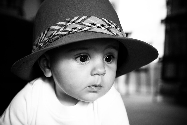 owen-hat6 by ralph-brewer, on Flickr
|
|
#
?
Jul 10, 2012 20:40
|
|
|
ohrwurm posted:
ohrwurm posted:Sky too bright/harsh in this one? Also not too sure on the composition, maybe should have included more of the lower portions of the buildings?
|
|
#
?
Jul 10, 2012 21:02
|
|

|
dowdy_pants posted:All three are great, and the last one is really sweet. The boy reminds me a little of my youngin'. Really like this shot. It's got this thousand yard stare going on, like the kids just realized how much live he's got left to live and it's blowing his mind. Guess you could straighten it a bit so that hard line in the background is straight up and down, but the rest of it really clicks for me. Here's something different. Close up shots of the screen of a Galaxy Nexus, at two different levels of zoom (40x and 200x?) 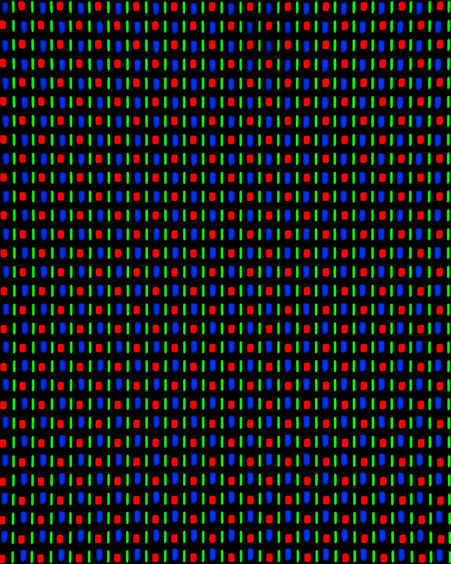 DSC_0019.jpg by MrDespair, on Flickr 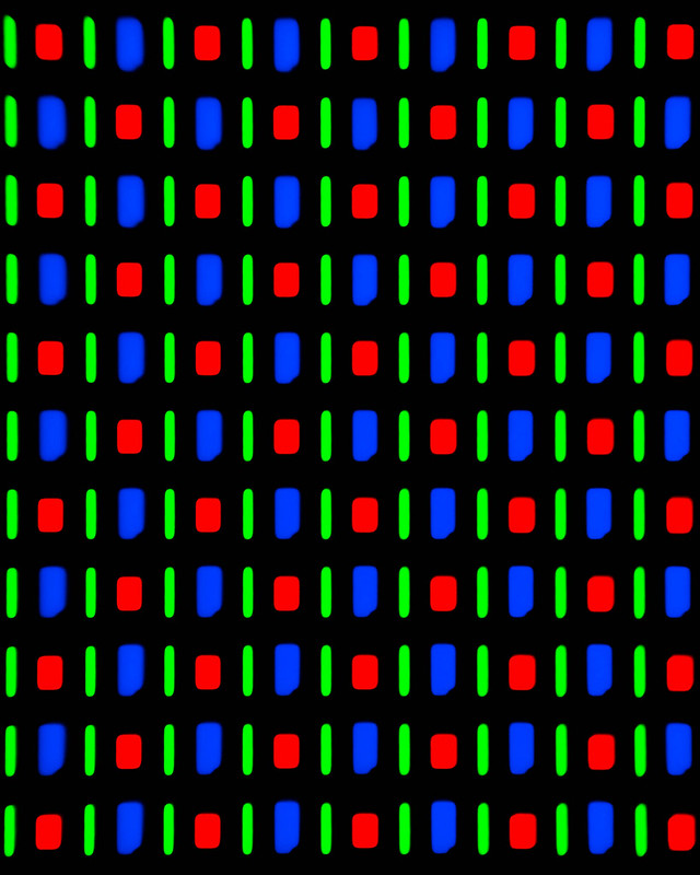 DSC_0020.jpg by MrDespair, on Flickr
|
|
#
?
Jul 10, 2012 23:54
|
|
|
I hope you don't mind me posting my thoughts on these, I don't have a new batch ready yet - but the first and especially the last one compelled me to write something.ohrwurm posted:
Like others have said, I really like the tonality on that one. The tones work well together and make a nice moody image. If there's anything I'd do to it I'd maybe try to crop a bit on the left where it gets quite dark - or maybe add some fill light. ohrwurm posted:Probably could have focused better on this, but the barn was dark and the cow wasn't staying still. Hm. In focus or not I don't really feel "it" with this one. Maybe because I have seen this kind of shot quite often. It seems to be more lighthearted than evocative. ohrwurm posted:Sky too bright/harsh in this one? Also not too sure on the composition, maybe should have included more of the lower portions of the buildings? Initially I liked this shot the best of the three, but after examining each shot in Flickr's light-box, I think I retract my vote and opt for the first shot instead. Why? Actually I don't mind the blown out sky, as it's only a small portion of the image and there's plenty of other detail to look at. But I feel that composition wise the image is kind of anticlimactic. Basically you have this cool red-vs-blue thing going and then we see the open sky. If I were you I'd maybe try a square crop to be rid of the sky and focus on what I perceive to be the main point of the image (geometry & color). Like such:  (On further consideration I'm not 100% sure anymore but I thought I'd still toss it out there.)
|
|
#
?
Jul 11, 2012 02:35
|
|
|
Mr. Despair posted:Here's something different. Close up shots of the screen of a Galaxy Nexus, at two different levels of zoom (40x and 200x?) I actually really like these. How did you get the zoom so close? I prefer the second photo, as the different shapes (particularly the awkward shape of the blue component) give me something to focus on apart from the pattern of colors. I am curious though - did you come up with this idea on your own? I haven't seen other photos like this, but I'm willing to bet there are many out there. It would be nice to be the guy who thought of doing it first, or to do it in a different way than others have. HEY I just got an idea. Take these same photos, but use a wide variety of smart phone screens and make a series out of it. I imagine there are noticeable differences in the pixels depending on the manufacturer. The result might be cool. I took some nighttime photos for the first time. I wasn't feeling too great about shooting at ISO 1600 on my A33, but the noise really isn't bad. 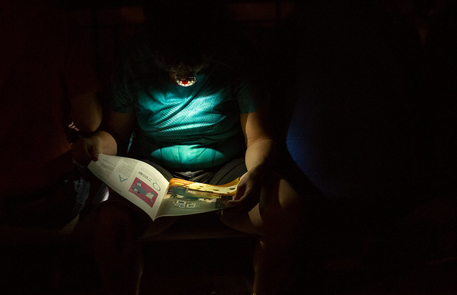 DSC01648 by Large Hadron, on Flickr  DSC01629 by Large Hadron, on Flickr I also like this picture a lot, from a different day. Crosspost from street photography thread:  DSC01717 by Large Hadron, on Flickr
|
|
#
?
Jul 11, 2012 04:09
|
|

|
I used a microscope for these shots. There's something about the OLED screen that really makes it pop, the other ones just seem soft in comparison. Probably part of the reason that OLED screens look so nice. This was from a low end laptop screen 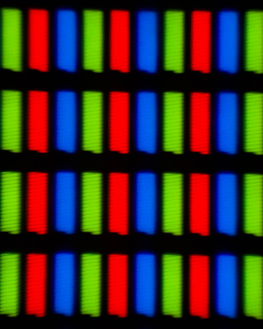 DSC_0542.jpg by MrDespair, on Flickr And the other screen I've tried this on has been a real pain. This was after some light processing, and I really haven't been happy with the processing on it. Lots of bleed through on the edges, everything is just kinda messy. 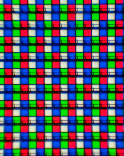 DSC_0541.jpg by MrDespair, on Flickr Just now I decided to try it again and managed to reach this, which I dunno. Seems like it might be a little heavy on the processing, but I do like it better than having the really bad bleed through on the last version. 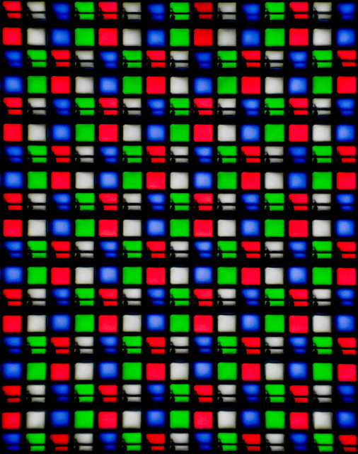 DSC_0541.jpg by MrDespair, on Flickr Then I wound up with this and realized that I should get some sleep. 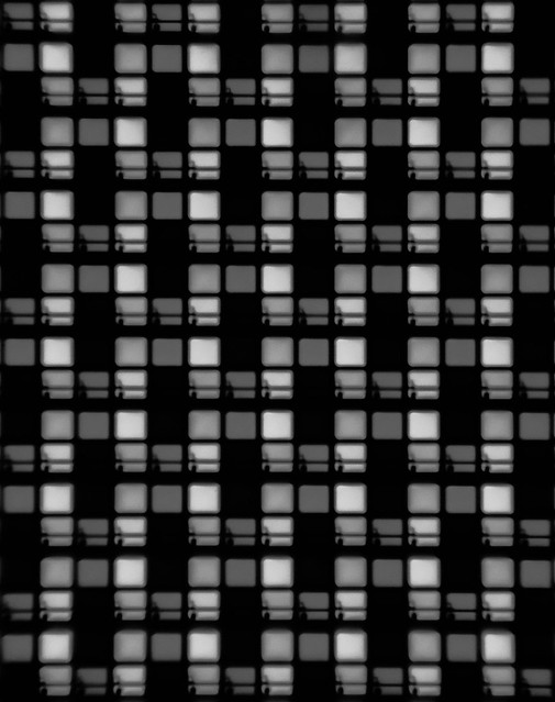 DSC_0541-2.jpg by MrDespair, on Flickr Dr. Despair fucked around with this message at 18:54 on Jul 11, 2012 |
|
#
?
Jul 11, 2012 08:00
|
|
|
LargeHadron posted:I actually really like these. How did you get the zoom so close? I prefer the second photo, as the different shapes (particularly the awkward shape of the blue component) give me something to focus on apart from the pattern of colors. I am curious though - did you come up with this idea on your own? I haven't seen other photos like this, but I'm willing to bet there are many out there. It would be nice to be the guy who thought of doing it first, or to do it in a different way than others have. HEY I just got an idea. Take these same photos, but use a wide variety of smart phone screens and make a series out of it. I imagine there are noticeable differences in the pixels depending on the manufacturer. The result might be cool. These rule, and don't seem noisy at all. The first two definitely tell me "yup, this is night time" and its awesome. e. Hey look at me double posting like someone who needs sleep.
|
|
#
?
Jul 11, 2012 08:07
|
|
|
VomitOnLino posted:I hope you don't mind me posting my thoughts on these, I don't have a new batch ready yet - but the first and especially the last one compelled me to write something. Putting in my 2c for the square crop. There's some interesting geometry in there, and when you try to take the sky out of the picture, it becomes about all the competing lines, which I think is really neat.
|
|
#
?
Jul 11, 2012 22:03
|
|
|
LargeHadron posted:I took some nighttime photos for the first time. I wasn't feeling too great about shooting at ISO 1600 on my A33, but the noise really isn't bad. The contrast between shadow and light on this one is stunning. Also, I basically don't believe you that it was shot in 1600 because it's clean as a sheet. Great work, seriously. Mr. Despair posted:Just now I decided to try it again and managed to reach this, which I dunno. Seems like it might be a little heavy on the processing, but I do like it better than having the really bad bleed through on the last version. Beyond the "whoa cool" factor of using a microscope to look at LEDs, I get a lot of drama from the contrasting colors and unflinching lines. I know the technology did a lot of the heavy lifting but this is a really well-crafted shot. Took the crit I got about making my subjects more clear and did a photo walk around Midtown Omaha.  Somehow in 2012 by lexingtondisoro, on Photobucket  Driven Up a Wall by lexingtondisoro, on Photobucket  Several Options by lexingtondisoro, on Photobucket
|
|
#
?
Jul 12, 2012 02:28
|
|


|
Christopher Irvine posted:
The first one doesn't really evoke anything for me at all. I like the simplicity of the latter two, but I feel like both are slightly tilted to the right. 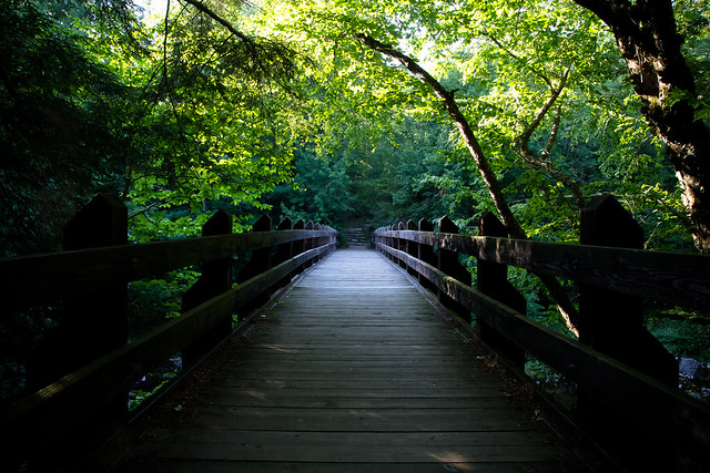  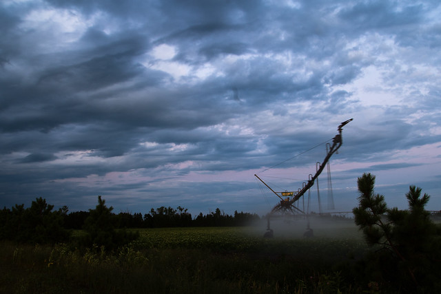
|
|
#
?
Jul 12, 2012 07:36
|
|

|
The love the tones in the 2nd one but I don't like how the irrigator exits the frame. It leads the eye out of the frame and just doesn't quite seem right. Apply the processing of the 2nd shot to the last one and I think you'd have a winner.
|
|
#
?
Jul 12, 2012 08:10
|
|
|
The first one is a nice, I like the contrasting colors of green from the mid-ground to the background. However, I think the darks of the bridge in the fore-ground are a little too dark which cuts out some detail, maybe a little fill light will help. For the second one my eyes are driven all over the place. I don't feel as though you set a clear subject in this shot as the following three elements blend too much. The bush on the right in the fore-ground is distracting from the machine in the mid-ground and the machine is then distracting from the sky in the background. The machine is also blurry as it comes towards the camera. Then there is that squiggly thing on the sky, possibly sensor dust? Post-processing won't save these problems so you'll have to try re-shooting it if you're inclined to. I do like the processing of the sky though. Here are a few more from my forest trip. I processed the black and white shots in Silver Efex Pro 2. The Lightroom attachment seems a little simple, maybe I'm overestimating it.   
|
|
#
?
Jul 12, 2012 08:11
|
|
|
I love your second and third shots. I wish there was a bit more contrast in the first one though. It feels too overwhelmed by the flat grey on the left. Edit: Thanks about the weird squiggly. I think there was some crap on the rear glass of my lens, since it's not showing up on shots taken with any other lenses. Casu Marzu fucked around with this message at 18:00 on Jul 12, 2012 |
|
#
?
Jul 12, 2012 17:51
|
|
|
Casu Marzu posted:The first one doesn't really evoke anything for me at all. It struck me as humorous and absurd that a physical copy of an album released 13 years ago (Eminem's Slim Shady LP) could be shattered on the sidewalk in the present day. Casu Marzu posted:I like the simplicity of the latter two, but I feel like both are slightly tilted to the right. You know I tried rotating them by a few degrees and everything else just looked off. I also am unsure about having the third one in B&W because there were some neat rust stains but it was in a shadow and I wanted it to feel more stark. I'll give it another go in GIMP and post it when done. Your first one is really haunting by the way. Makes me want to find some new locations like it.
|
|
#
?
Jul 12, 2012 22:30
|
|
|
Eclogite posted:The first one is a nice, I like the contrasting colors of green from the mid-ground to the background. However, I think the darks of the bridge in the fore-ground are a little too dark which cuts out some detail, maybe a little fill light will help. I like them a lot, though I'd be interested to see the whole series in black and white. I think if you're going to follow a theme like that it may be better to stick to it. The third image stands well on it's own though. I like that the first two sort of evoke a sense of lonliness. My husband and I both play roller derby. This shot has been sitting in my head for a long time just stewing and waiting for the right amount of rain and the right amount of light. Tonight it was perfect and came out better than I had expected it to, though I wish his skates had a bit more light to them. The second we got the shot it stopped raining. Would love some additional critique on this image. 
|
|
#
?
Jul 13, 2012 02:24
|
|
|

|
| # ? May 21, 2024 18:55 |
|
|
I like the effort you're putting into lighting, the idea is cool. I think you're right that the skates need more light on them. It's really confusing to look at without already knowing the context. When I first looked at it, I thought you were supposed to be in outer space and that was some weird space thing strapped to your back. For the record, I didn't think that hard about it.
|
|
#
?
Jul 13, 2012 02:43
|
|