


|
rio posted:
The first shot is a little too highlighted. It looks like a printed photo that's been sitting out in the sun for too long. I really like the composition of it, it just needs a little more depth to it. If you keep it the same lightness, then perhaps a very slight viginette would help deepen the feel of the image? However, if the faded retro look is what you're going for, then it's spot on. The second is excellent, not sure what to say about it. The third one I don't find anything particularly "wow" about it. If you cropped out some more of the sky I think it looks a little better, but still not really sure the direction of the photo. ----- Can I get some feedback on this? I took a photo of an amazing sky in the morning up in the Himalayas, but I'm not really sure if it's particularly good as a photo. I absolutely love the clouds, I think they looked so interesting and so many different textures. Does it wow anyone, or is it just a boring photo of some clouds and hills? (updated to a new shot without the roof in the bottom-left)  Clouds over Nagarkot by alangrainger, on Flickr And how is the cropping on this? I love the colour and feel, but I'm not sure if I should have cropped some more off the bottom: 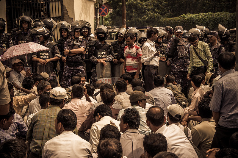 Teachers on strike in Kathmandu by alangrainger, on Flickr Metalslug fucked around with this message at 05:48 on Aug 31, 2012 |
 #
?
Aug 30, 2012 06:20
#
?
Aug 30, 2012 06:20
|
|


|

|
| # ? May 11, 2024 22:20 |
|
|
Metalslug posted:Can I get some feedback on this? I took a photo of an amazing sky in the morning up in the Himalayas, but I'm not really sure if it's particularly good as a photo. I absolutely love the clouds, I think they looked so interesting and so many different textures. Does it wow anyone, or is it just a boring photo of some clouds and hills? The first photo is well-composed. The intersection of the bright green hill on the left and the darker hill on the right is pleasing, and it balances well. I love the way the upper and lower levels of cloud are bridged. The only flaw is the terra-cotta/brick-colored roof in the lower left corner - it pulls my eye right to the edge of the photo because it's such a strong contrast against the green background. I don't know if you can crop it out or not, but it would strengthen the composition if you can. I'm really not a fan of the post-processing/effects on the second picture. It looks like it was taken in full sun, which does not work with the sepia/brown tone that you have going. It looks dirty and falsely gritty to me. If you like the tone, I'd convert to black and white first and then tone it. As it stands, it's competing with the colors of the picture and it distracts.
|
|
#
?
Aug 30, 2012 13:46
|
|


|
Metalslug posted:The first shot is a little too highlighted. It looks like a printed photo that's been sitting out in the sun for too long. I really like the composition of it, it just needs a little more depth to it. If you keep it the same lightness, then perhaps a very slight viginette would help deepen the feel of the image? However, if the faded retro look is what you're going for, then it's spot on. The first is definitely more than a boring photo. Other than the dramatic clouds, I really like the sky. The yellow and blue combo is more interesting than the usual orange/blue combo. I agree that the patio on the bottom left is very distracting though. I wouldn't crop anything off the bottom of the second. The multiple rows of people opposing the single row of police works well. Some photos to critique. The first seems to have too many similar colours in the yellow/orange range to make it pop.  IMG_1784 by puntweezy, on Flickr  IMG_1682 by puntweezy, on Flickr  IMG_1565 by puntweezy, on Flickr
|
|
#
?
Aug 31, 2012 05:36
|
|

|
Thanks for the feedbacks. Cloud photo: The spot removal tool in Lightroom is incredible!!! I literally just used a big size brush and one click, and the roof was gone! People on Flickr really seem to like it. Protest photo: TheJeffers, I really like your comment - you put a lot of thought into it. You are right about the full sunlight and you can obviously see better than me how the colours affect the photo (I'm colourblind). I think I will just drop the saturation almost to zero rather than remove the colouration entirely. I tried it just mono with a tone, and it looked a lot more boring to me. However, my colour sense is not to be trusted..... ") shark week posted:
You're right about the first photo. If you want to get down and dirty, open it up in photoshop and replace the background yellow flower with some of the surrounding green. As it stands, it really really distracts from the butterfly. I would like to see a bit more shadow on the yellow flowers in the foreground too. The second photo I don't know if you could do much with it as it is. It would work a lot better with a shallower depth of field to get more focus on the subject, especially if the background had been more brightly lit. The third one is either cropped far too tight, or should be cropped a lot more to focus on the extremely interesting textures of the shirt, mask, and headgear. If you work with it as is, then it's a bit backlit. If you want to go to the effort, try making a couple of layers, bring the subject up in brightness with a bit more contrast, and darken the background a bit. ---- Welcome to critique this photo if you want, I just didn't have anything else on hand and didn't want to post without a photo :P  Heard of goats? by alangrainger, on Flickr edit: vvvvv Thanks GazMachine, that makes a LOT of sense. Will definitely re-do it now. Metalslug fucked around with this message at 09:36 on Aug 31, 2012 |
|
#
?
Aug 31, 2012 06:50
|
|
|
Opals25 posted:I always found people working as a fascinating subject and love to take pictures of it when I can so I want to like it, and do like some of your shots of (I believe) game developers working but something about this just isn't clicking for me. The space to the left of the picture feels sort of wasted and inactive and the background behind his head feels way too bright and distracting while the subject himself looks a bit underexposed in comparison. The PlayStation logo straight above his head is a nice touch but I actually lost it in the background the first few times I looked at it so I wonder if the picture might be better served with a tighter crop towards his head. Thanks for this: it was one of those that was almost right and I felt good about it when I snapped it, but didn't have time to really review it until a week later. Then I sort of subconsciously tried to ignore all the problems with it. I have many, many shots from the week, so it's in my interest to only pick the best stuff, so cheers Metalslug posted:
I agree with the sentiment that less aggressive processing on this would make it better: it's a reportage piece, so personally I'd like to see less artificiality in it.
|
|
#
?
Aug 31, 2012 09:12
|
|

|
Gazmachine posted:I agree with the sentiment that less aggressive processing on this would make it better: it's a reportage piece, so personally I'd like to see less artificiality in it. I absolutely understand what you guys are saying. I'm not exactly sure how to approach it, but are either of these better?   For reference, here is the original:  ---- xenilk posted:As for me, I did a shoot with two people who never met to see how good I could get the chemistry by guiding them throughout the shoot. I would not have believed for a second that they just met. Excellent work. Metalslug fucked around with this message at 10:03 on Aug 31, 2012 |
|
#
?
Aug 31, 2012 10:01
|
|

|
Metalslug posted:For reference, here is the original: This is the best one. Just do a spot of curves tweaking, some conservative dodging and you're golden.
|
|
#
?
Aug 31, 2012 12:25
|
|
|
Metalslug posted:
The composition here is really stunning, not to mention that the colours are lovely. It's got a lot of depth to it that I really struggle to achieve in landscapes. My only issue is the hills to the right are looking way too vibrant, almost metallic. I'm not sure whether this is just a processing thing or maybe those hills really are neon - whatever the case, it's just a little too harsh and distracting. Seriously though that's a really nice shot. I figured I might as well pop my PAD cherry while I'm here - crossposted from street photography thread. I hung around at this big scramble crossing in Shibuya shooting wave after wave of pedestrians, but dodging cars and cyclists trying to sneak through as lights turned red made it really hard to time right. Very happy with this one, though. It's probably the first photo I've ever taken I've displayed with a deal of confidence. E: I forgot to mention that one of my major concerns shooting this was exposing the pedestrians as well as the crossing itself, which was bright as hell with the midday sun. It only took a little processing to fix, but I was wondering what I should aim for in situations like that? Prioritise exposure of whatever I want to be the focus of the photo, or find a nice middleground?  X箱 by DONT SLEEP, on Flickr Dick Danger fucked around with this message at 15:20 on Aug 31, 2012 |
|
#
?
Aug 31, 2012 14:39
|
|

|
Dick Danger posted:The composition here is really stunning, not to mention that the colours are lovely. It's got a lot of depth to it that I really struggle to achieve in landscapes. My only issue is the hills to the right are looking way too vibrant, almost metallic. I'm not sure whether this is just a processing thing or maybe those hills really are neon - whatever the case, it's just a little too harsh and distracting. For the difficult situation you were in, I think the photo came out really well. I've been in journalistic situations where I pretty much have to choose what is important, which is my subject. So it's either get what I can, or choose to get something else. If there is a photo you just HAVE to have you can always try another day or time, or staging it, otherwise you're kind of stuck with what you're given. But your composition is great, and I like how it is very graphic in the bottom front of the photograph. These are a few shots from a series I did with my husband a short while ago. I bought a prom dress at a yard sale and got some masks when I was in New Orleans a few months back. This shoot really didn't turn out as I planned because the logistics of it were difficult - it was just me and my husband taking the photos so we were limited to a tripod and the self timer, and my dress prevented good movement. I really didn't have the time to take everything I had wanted. It's actually been kind of a build up of frustration for me. My husband and I shoot a lot together, and lately it has been getting more and more complicated and involved, but there is only one of US so there is no one to hold the camera or press the shutter or hold the lights. Ugh. Running to beat the self timer is a pain in the butt. Whatever! They are what they are. Also I saw a snake before I went in the water, and now the dress smells like fish.   
|
|
#
?
Sep 1, 2012 02:35
|
|
|
I spot a tripod!
|
|
#
?
Sep 1, 2012 05:00
|
|


|
Is there a reason why nothing is sharp in the first photo? Is this part of the feeling you were trying to convey? How close did you get on this photo to the vision in your head when you shot this? I like the photo overall, but I can't help but this that this is a lucky coincidence. Photo number two I think is really well executed. I like how the left lane entry and the bridge across interact with one another. As well as the fog / clouds in the distance and how they create the mood. Contribution: 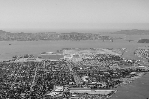 Alameda, SF in the background by bowbles, on Flickr 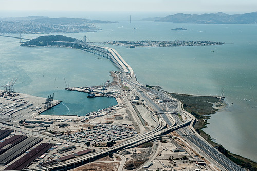 Bay Bridge - Oakland side by bowbles, on Flickr
|
|
#
?
Sep 1, 2012 05:33
|
|


|
Santa is strapped posted:I spot a tripod! Dang! Where is it? I can't see it and it's driving me nuts. Circle it for me or something.
|
|
#
?
Sep 1, 2012 15:00
|
|
|
Tamgerine posted:Dang! Where is it? I can't see it and it's driving me nuts. Circle it for me or something.  Evilkiksass posted:
The gentle colours in this work perfectly. Too many times I find myself looking at aerial landscapes and not knowing where to look, but this is very comfortable. Also the countour of the bridge moving off to the edge of the photo does a good job of guiding line of sight. What's the deal with that weirdly coloured triangle off to the right though? It doesn't exactly kill the shot or anything but it is kind of awkward looking. It might be worth trying to edit out. Dick Danger fucked around with this message at 17:28 on Sep 1, 2012 |
|
#
?
Sep 1, 2012 17:16
|
|
|
Tamgerine posted:
I really (really!) like the first one. The light, location and subjects are perfect. Good catch on the tripod, I was trying to see it myself but totally failed. The second one seems a bitch harsh, I would have opened her hand to cup her face and maybe have some sort of reflector on her right side to bounce the flash so it's not as harsh. Same goes for the 3rd one. As for me, shot a wedding  IMG_3564 by avoyer, on Flickr  IMG_3576 by avoyer, on Flickr  IMG_3628 by avoyer, on Flickr
|
|
#
?
Sep 2, 2012 03:33
|
|

|
I'm not experienced with wedding photography, but in the last one the straight up crotch shot is distracting. I don't know if it is the seam in the pants or what - and honestly maybe the is standard for a wedding photo - but having their hands anywhere else might have been better. I like the first the most, although I would like even a hint of detail or color from the sky since it was clearly not overcast. The second one seems fine technically but I think seeing the arch of her back rather than have her arm obscuring it would have been more flattering to her form and the dress. The pose and angle seems a little weird for some reason...might have fixed this by taking a step or two to the right to get that back issue as well as a less awkward arm angle from the bride Also, I don't understand why people get married on golf courses (this is a golf course, yes?)...I played a wedding gig in July on a golf course and there were people putting while the ceremony was going on just to the right of the ceremony (until the storm blew in and the giant umbrella protecting us musicians blew out of the ground and into the audience, nearly impaling someone). I am getting off track. p.s. I am sure that these folks will love the pictures - just mentioning the first things that came to mind rio fucked around with this message at 04:29 on Sep 2, 2012 |
|
#
?
Sep 2, 2012 04:25
|
|

|
I'm also getting a definite "balls" vibe from the last one. Maybe Xenlik was trying to keep the golf theme throughout all three shots? Ho ho ho. But yeah, if you have another hand holding detail shot, I'd go for that one instead.
|
|
#
?
Sep 2, 2012 08:41
|
|
|
Gazmachine posted:I'm also getting a definite "balls" vibe from the last one. Maybe Xenlik was trying to keep the golf theme throughout all three shots? I was right in there man! Hahah yeah I was looking forward the crotch comment, I have a few other ones that can work, otherwise I might just recrop
|
|
#
?
Sep 2, 2012 15:22
|
|
|
xenilk posted:
I think you gotta keep both rings in focus with these types of photos. It's not badly shot, it's just unsettling. Maybe it's the crotch. That said, they are lovely photos and I'm sure they are quite happy with them!  A Tired Pier by Paul Frederiksen, on Flickr vxsarin fucked around with this message at 17:36 on Sep 2, 2012 |
|
#
?
Sep 2, 2012 17:20
|
|

|
Pukestain Pal posted:
This is a nice shot, I like the detail of the rope a lot and the fog in the background. I'm not sure how I feel about the overall blue tint, I think it might look better in pure black and white, or at least make the shadows a little bit darker for more blacks. I haven't been around in quite a while, been out shipping for the past four months with no internet. Lots of really great photos to look at. That being said I did get a chance to shoot some stuff on the ship I was on: 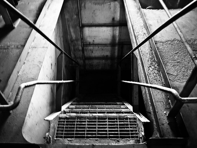 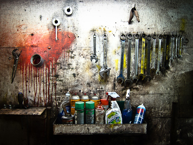
|
|
#
?
Sep 3, 2012 13:42
|
|
|
MythObstacleIV posted:This is a nice shot, I like the detail of the rope a lot and the fog in the background. I'm not sure how I feel about the overall blue tint, I think it might look better in pure black and white, or at least make the shadows a little bit darker for more blacks. The first shot is really cool, I like how the handrails all lead the eye towards the abyss in the center of the shot. You seem to have a bit of motion blur though- not enough to ruin the shot but it's still slightly distracting. Did you use a tripod? If not I would push the ISO sensitivity up to at least 400- your S95 should be able to handle it. I really like the second shot as well, but I feel like the label on the Fantastik bottle is way too colorful and attention-grabbing, despite being one of the least interesting objects in the frame. The paint on the wall is awesome though.  P9030497 by lwmyers, on Flickr  P9010276 by lwmyers, on Flickr  P9030427 by lwmyers, on Flickr
|
|
#
?
Sep 3, 2012 20:48
|
|


|
Augmented Dickey posted:
I really love the symmetry in the first picture, and think that the black and white really makes the shot. The one thing that is bugging me a little bit is the white in the bottom right corner, but that might just be me. I like this second shot a little bit less, I'm not sure if the it's off-center, or if that's just how my eyes are perceiving it, but that might be having something to do with it. That being said, I do really like the shadows on the wall from the blinds. This is such a simple shot, but I am absolutely loving the hell out of the textures.  Day break by Nomadic Photographer, on Flickr  Brewing Light by Nomadic Photographer, on Flickr
|
|
#
?
Sep 4, 2012 04:54
|
|

|
Overall I really like this and would love to see a higher res. My only criticism would be that the bottle of Fantastik and LPS jump out and sort of project onto the rest of the image - it's toeing the line of looking too processed. If you could tone down just those two bottles I think you'd have a truly great photo. Frankly, tools are awesome and used tools are even better. I'm making an effort to contribute more to the Dorkroom. It's been an incredibly busy summer and I've only really managed to get around to submitting the odd photo to the genre-specific threads.  IMG_8660.jpg by Brian.M.K, on Flickr  IMG_8464.jpg by Brian.M.K, on Flickr I'm torn on the photo below. On one hand, it worked out how I imagined (and directed the pilot) and I'm a bit proud of myself for getting the look I wanted. But at the same time: no real background = boring? But maybe blue sky with clouds would be too distracting? I really like it and then I look at it longer and start nitpicking. What will the Dorkroom have to say?   IMG_8563.jpg by Brian.M.K, on Flickr
|
|
#
?
Sep 4, 2012 21:35
|
|

|
I think blue is preferable to white but only because we associate solid blue with sky better than solid white. Scattered clouds seem to be the most effective because they can create a better sense of depth. The helicopter itself does look quite nice though.. it's a nice exposure.
|
|
#
?
Sep 4, 2012 22:41
|
|

|
xzzy posted:I think blue is preferable to white but only because we associate solid blue with sky better than solid white. Scattered clouds seem to be the most effective because they can create a better sense of depth. Are we allowed to explain our thought process here? I'm not trying to "roll with the punches" or get bent out of shape, honest. I'm only discussing the image because it's one that I had in my mind from the start...and I'm thrilled to bits to see that it worked. After spending most of my summer under these conditions, I noticed that the uniform cloud cover basically made the sky into the largest light tent possible. Our normally glossy machines now had this great subdued look about them. And that was what I was trying to capture. The flipside: boring background. As opposed to this:  IMG_9153.jpg by Brian.M.K, on Flickr Which I also kinda like due to the disorientating angle (maybe only to my mind, I was the only person there after all) but to me is also a lot more typical: helicopter flying through the sky...it's nice and shiny and clean! Of course it's shiny and clean: it's a (somewhat) precise machine and taken care of. Artchat: how do you remove "yourself" from the image you create? EDIT: I feel another critique is appropriate. Brewing Light by Nomadic Photographer, on Flickr [/quote] I don't know, but for some reason I feel this is slightly under-exposed. It's like I'm left searching for more information but it's just not there. Am I stupid? Maybe employing a hyper-focal technique would fill in those gaps? Rot fucked around with this message at 23:22 on Sep 4, 2012 |
|
#
?
Sep 4, 2012 23:12
|
|
|
Rot posted:
Rot posted:
I think the first shot is much more interesting because the angle of the helicopter gives a sense of motion and velocity. The second shot, while having a nicer looking background, just looks very stale and motionless. The helicopter just appears to be hanging in the sky, which isn't very interesting to look at. The first shot might work better in black and white- maybe that would make the sky seem less barren? Bouillon Rube fucked around with this message at 01:14 on Sep 5, 2012 |
|
#
?
Sep 5, 2012 01:09
|
|
|
Augmented Dickey posted:I think the first shot is much more interesting because the angle of the helicopter gives a sense of motion and velocity. The second shot, while having a nicer looking background, just looks very stale and motionless. The helicopter just appears to be hanging in the sky, which isn't very interesting to look at. I have to agree with this, it's the angle that makes it look more appealing. I'd be curious as to how it would look with the second background tho.
|
|
#
?
Sep 5, 2012 03:55
|
|
|
Rot posted:
This seems to be taken from above the helicopter, which I assume means that the white background is clouds below it. If you get a chance to re-take, could you perhaps find a situation with slightly less cloud cover below, so you could see the ground? A faint, washed-out ground far below might work well as backdrop, and give a better sense of "this thing is flying".
|
|
#
?
Sep 5, 2012 14:36
|
|


|
nielsm posted:This seems to be taken from above the helicopter, which I assume means that the white background is clouds below it. If you get a chance to re-take, could you perhaps find a situation with slightly less cloud cover below, so you could see the ground? A faint, washed-out ground far below might work well as backdrop, and give a better sense of "this thing is flying". It's probably just banking above the ground with clouds as a background.
|
|
#
?
Sep 5, 2012 14:57
|
|
|
Leviathor posted:It's probably just banking above the ground with clouds as a background. This. I got the pilot to bank hard while he passed, so I could get a good shot of the rotor disk.
|
|
#
?
Sep 5, 2012 19:22
|
|
|
Tamgerine posted:
http://www.dealextreme.com/p/rf-602-wireless-flash-trigger-for-canon-1d-1ds-d0s5d-40d-30d-20d-10d-dslr-cameras-28508 These work as a remote trigger too. All the time in the world to get where you need to be. I'm not sure the half-face light works here, it seems inconsistent with the otherwise peaceful atmosphere of the photo. I think the classical 45 degree would have worked a little better, I can't believe I'm saying that. Cinematography is a hard gig, but the photo opportunities are (if you can catch them) amazing. 
|
|
#
?
Sep 6, 2012 04:09
|
|
|
XTimmy posted:http://www.dealextreme.com/p/rf-602-wireless-flash-trigger-for-canon-1d-1ds-d0s5d-40d-30d-20d-10d-dslr-cameras-28508 I'm surprised no one commented on that. The scene is gorgeous and I think the softness is suiting for that picture, it almost makes it look like a painting, very cool.  IMG_5364 by avoyer, on Flickr 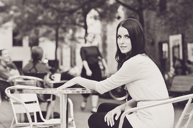 IMG_5298-Edit by avoyer, on Flickr
|
|
#
?
Sep 8, 2012 17:25
|
|
|
xenilk posted:
#1 - The lack of focus is distracting to me. I start looking at her face and then the lips, but your focus is not there, then I look to her low hanging necklace which seems to have the chain in focus but not the feathery part. It looks like the focus is right on the bottom of that pocket over her boob, and I look there but think there is not any reason to so it must have been unintentional. Where do you want the viewer to look and what were you hoping to do here? I do like the overall mood/atmosphere of the photo. Might be personal preference but I think I would like to see a bit more of the scene and have the shot not so tight. #2 - The pose is not really doing much for me and the hand is distracting. The lady strolling in the background made me smile. good luck kitten posted:
Nothing to add in terms of a critique, but drat! What a cool shot. ----- One standard question for all of these (in addition to the individual questions below - I still struggle with "this is interesting to me, but is it interesting to someone who was not there and does it have any merit". I don't know if it is a natural stage of learning, but I really second guess myself a lot these days. 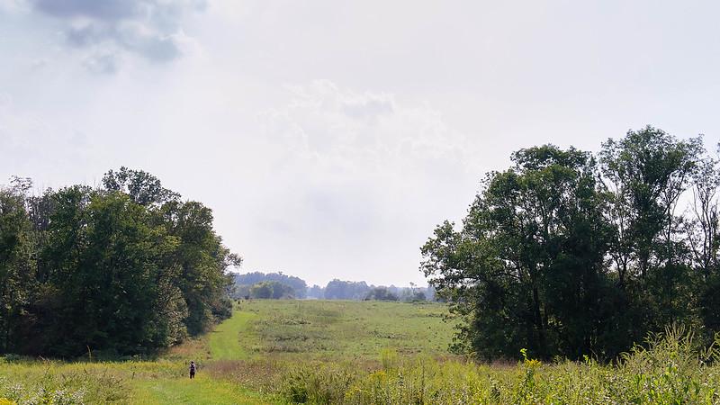 DSC08212-Edit-2.jpg by Paul Hofreiter, on Flickr It was very hazy when this was taken a couple days ago, and the sky reflected that. I still like it, but while in post I was wondering if I should have gone tighter with the crop. As it is now, it is only cropped from the top and bottom to go 16:9. 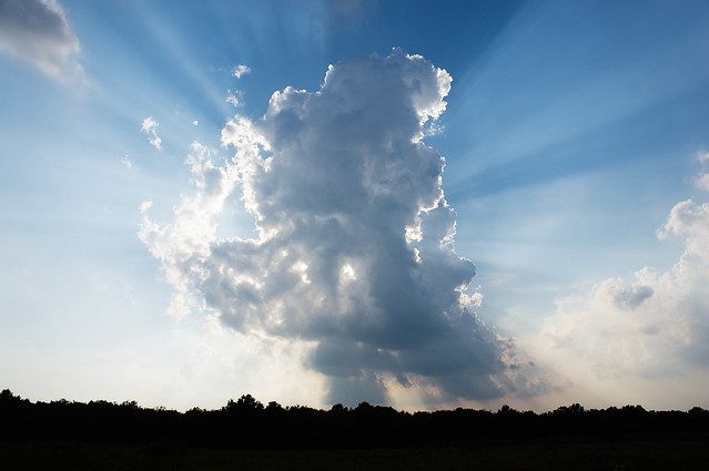 inspiration by Paul Hofreiter, on Flickr I always wonder with skies... is it worth showing other people? Like, sunsets for example might be pretty but they seem kind of cheap and not special photographically unless there is really something interesting going on.  the last of summer by Paul Hofreiter, on Flickr Is it too dark? I messed around with some post but every attempt to lighten it or lower contrast really killed the mood. In fact, most of the things I usually do in post just did not seem appropriate, so this is very minimally edited. Any advice would be appreciated, as I can usually think of 10 things I would do differently but this time I think I am pretty pleased (an am afraid that I am missing an important step in finishing this picture). Also, to pat my back briefly, I was proud of how I shot this one - saw these kids fishing and thought of the shot I wanted, walked past them and acted like I was shooting something else while metering and watching them from the side, then turned and took the shot when it presented itself and I don't think they knew that I even did it. I think I could have broken the mood if I was obvious about it so in that regard I was happy
|
|
#
?
Sep 10, 2012 04:33
|
|
|
rio posted:#1 - The lack of focus is distracting to me. I start looking at her face and then the lips, but your focus is not there, then I look to her low hanging necklace which seems to have the chain in focus but not the feathery part. It looks like the focus is right on the bottom of that pocket over her boob, and I look there but think there is not any reason to so it must have been unintentional. Where do you want the viewer to look and what were you hoping to do here? I do like the overall mood/atmosphere of the photo. Might be personal preference but I think I would like to see a bit more of the scene and have the shot not so tight. I understand where you're going with #1, the focus was off on most of my shots with this, my camera's AF seems to throw a fit when the sun is either on the side or behind the subject. I however liked the posture/ambiance of the shot... it's calm and soft. Ideally the focus would have been on her eye/nose. I have this shot:  IMG_5361 by avoyer, on Flickr But I feel like the focus is still an issue. #2 I found the lady quite fun to watch as well, I'll have to go in a setup around people more often, it was a really cool thing to do. --- As for your pictures, I like #2, the sun rays are really cool. I feel like most of the other cool shot in that genre that I end up liking have more of a field view tho. Like the field should be visible, not black so you kind of see where the sunbeams are hitting. Hopefully that makes sense. #3 is nice, I have to agree that the subjects are way too dark tho. The scene is cute nonetheless.
|
|
#
?
Sep 10, 2012 18:45
|
|
|
rio posted:
I think this is lovely. I don't have a problem with it being dark, and I think "too dark" is a very subjective idea sometimes. It's a tiny bit of a shame that the guy standing up partially obscures one of the people sitting down, because it would really add to it if they were all distinct entities. I would say keep this exposure / post style up, it has an original feel to it. Not to be overly dismissive, but I get nothing from the other two shots. I think you're right with the cloud / sky thing - unless you shoot it in a particularly unusual way, they can be fairly boring shots that you see everywhere. xenilk posted:
Can I ask what your main reason was behind going wide open with the 50 on these ones? I'm not one of those "never shoot wide open" guys (although nowadays I basically pretty much never shoot wide open) but it is pretty difficult to nail that focus at f/1.8
|
|
#
?
Sep 10, 2012 21:29
|
|
|
Gazmachine posted:Can I ask what your main reason was behind going wide open with the 50 on these ones? I'm not one of those "never shoot wide open" guys (although nowadays I basically pretty much never shoot wide open) but it is pretty difficult to nail that focus at f/1.8 Yes of course, the sun was quickly setting and I wanted the bokeh in the back. Seeing as it was taken at 1/200 on ISO 250 I'm sure I could have went 2.2/2.5... so yeah bad on my part. Also, I'm just not sure what was up with the auto focus since all the focus points are responsive on both axis but sometime it just like to screw around with me. I'll have to try it again, just for the sake of it.
|
|
#
?
Sep 10, 2012 21:38
|
|
|
rio posted:
#1. Like the idea but the sky is blown, and your exif data says 1/4000 at 1600 ISO. Looks a like a sunny day, you don't need that high an ISO at all, cause it's daytime. If you're starting out, google sunny f/16 and shoot that, then bracket -1 +1 and see what you get. #2. Yeah clouds and sunsets are overplayed imo, but there are some goons who can work with it. #3. Yeah its too dark. Again Flickr says 1/3200, for that scene, shoot with a slower shutter speed to capture more light. Regarding the "what is interesting" question, make the way you shoot something interesting. Try awkward,creative angles to shoot from. Just observe, detach yourself, and just look at things, and look at them in different light/angles. Best advice : keep shooting. I finally got some free time last week and went to the L.A. Zoo.  Strangers In The Night by DAMNNIGERIAN, on Flickr  Staying Along by DAMNNIGERIAN, on Flickr 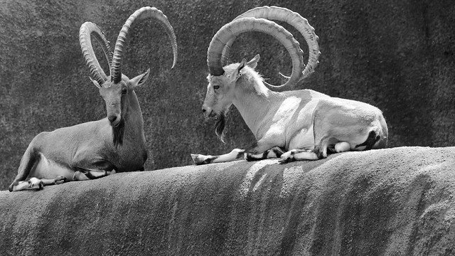 Complementing Imperfections by DAMNNIGERIAN, on Flickr
|
|
#
?
Sep 11, 2012 00:09
|
|

|
XTimmy posted:Cinematography is a hard gig, but the photo opportunities are (if you can catch them) amazing. The light is great, and the softness suits the scene! Nice shot. I've always wondered what it would be like to walk around a film set with my camera in a blimp box and take shots of the actors acting in the cine-light... rio posted:
I agree that it's too dark, however you don't need to up the brightness for the whole scene. Just bring it up slightly for the kids and the bright water behind them (that will separate them even more and add contrast) with a mask, that's all. drat NIGGA posted:
This one is great. -- 
bobmarleysghost fucked around with this message at 03:16 on Sep 11, 2012 |
|
#
?
Sep 11, 2012 03:14
|
|
|
Santa is strapped posted:The light is great, and the softness suits the scene! Nice shot. I've always wondered what it would be like to walk around a film set with my camera in a blimp box and take shots of the actors acting in the cine-light... I just crank dat clarity slider to the lefffftttttt. It'd be difficult, you'd have people like me inadvertently braining you with C-Stands. Luckily the rise of DSLRs as faux-cinema cameras means I just quietly slip the camera off its tripod and take a couple of shots. Or if you're on a RED set you don't even bother, up to 50 5K-res publicity stills per second of roll from one of those cameras! I like your photos, they convey a real sense of distance from the subject that I'm going to assume was intentional. The slightly muted colours sell the urban setting very well too. Placing them together works phenomenally as well, it's great to see both detail of subject and subject in context in 'one' image.
|
|
#
?
Sep 11, 2012 03:47
|
|
|
Yea I really want to see a RED in action. I want to visit a pro/semi-pro film set basically, ha. Thanks for the comment on the photos. The distance you sense was intentional (the theme of the series was ala escaping the city to daydream in the forest) but note that the girl said she doesn't know how to pose (same goes for me) and is evident in some other photos. I honestly paired them up because I liked how the lines of the wall in the right photo matched the lines of the left photo and kept my eye circling around both frames.
|
|
#
?
Sep 11, 2012 04:45
|
|
|

|
| # ? May 11, 2024 22:20 |
|
|
xenilk posted:I'm surprised no one commented on that. The scene is gorgeous and I think the softness is suiting for that picture, it almost makes it look like a painting, very cool. These both have the potential to be good shots but the pose is a little off in both of them. In the first one I wish her chin was up a bit more and I could see her eyes. Your light is really nice and it is overall a pretty good shot. It's definitely the stronger of the two shots. I don't mind the soft focus I think it fits the mood that I am getting from the shot pretty well. Again, I just wish her eyes and chin were up a little more. What in the hell is she doing with her hand in the second shot? It looks like she is scratching a record. And I know it's probably out of your country but the woman doing the haters gonna hate stroll in the background is very distracting. There's a potential for a nice kind of Parisian feeling but the pose and stroller in the background are distracting elements. Went into the studio to do some promo shots for my friend's Hemingway short film. The processing is supposed to be like an early 1920s wet plate. It's a bit more than what I would normally do processing wise but it works in context I think. 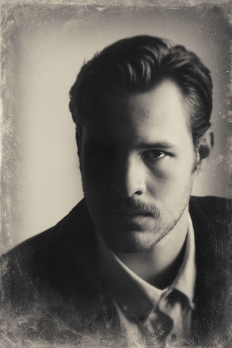 Hemingway - The Last Good Country by christopherpaulscott, on Flickr The last two are just a few quick shots from a trip to the museum my fiance and I took last week.  Cassie at the Field by christopherpaulscott, on Flickr 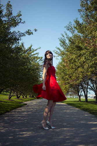 Cassie at the Field by christopherpaulscott, on Flickr
|
|
#
?
Sep 11, 2012 06:27
|
|
