


|
Mannequin posted:The fact that you're posting the first one up for criticism makes me wonder what the hell you are doing. It's a snapshot. A silly photo for fun or for yourself and has no meaning. Am I supposed to critique your composition here? Or would you prefer I say your white balance could be adjusted or something? It's a stupid photo. Keep your stupid photos to yourself. no, you're a stupid photo. e. Sovi3t posted:It's nice, the light is great, but something feels a little off. Almost as if the background is in some sort of "uncanny valley" of sharpness. Or maybe the water is too distracting. Overall it just feels a bit too contrasty. I agree with the last man standing on the 2nd photo, but the first one is cool but maybe try reversing it so it isn't obviously mirrored? It's pretty jarring having the shirt be backwards. Dr. Despair fucked around with this message at 04:01 on Sep 27, 2012 |
 #
?
Sep 27, 2012 03:56
#
?
Sep 27, 2012 03:56
|
|


|

|
| # ? May 11, 2024 17:52 |
|
|
Mr. Despair posted:no, you're a stupid photo. 
|
|
#
?
Sep 27, 2012 04:00
|
|


|
Mr. Despair posted:no, you're a stupid photo. -10 points, gently caress mannequin .  20120920-IMG_1444.jpg by SacktapDeluxe, on Flickr Crosspost from "Show Yourself". Still on the fence about this one. Let's talk about this photo. You have a clear intent here, good start! Now lets move on to composition. You like the style of image which presents distortion based on your choice of lens. The CDJ / turntable on the right, provide for an interesting deformed leading line, ensuring that the viewers eye is kept on target to the subject in the center. But what about on the other side? What are you trying to do with the mixer and amp you have? Also, what about the room in the background? Is it intended to communicate something? Did you consider adjusting what was back there for the sake of improving the shot? The positioning of the face results in my eye flowing to the empty portion of the photo on the left, and the lack of anything interesting there. As for facial expression, I get a strong feeling of you trying to imitate a Hunter S Thompson esque look. He had a certain style for himself, and trying to copy that style has it's ups and downs. Can you comment as to your intent here? More technical notes: Clean your lens / sensor? It looks like it is super dirty. Why did you leave the amount of noise you did in the photo? Lack of understanding of NR? Intentional choice for the look it adds? Something else? (USER WAS PUT ON PROBATION FOR THIS POST)
|
|
#
?
Sep 27, 2012 04:13
|
|

|
This one seems to have been missed. I really like the depth and drama of the shadows. They fit the overall mode of the the photo well, and all the important elements are well lit. The brightest part of the bath competes with her face a bit too much though. And those white doors in the background are a little distracting. All fixable though ----  Waves by Paul.Simpson, on Flickr And still playing around with star photos  Sunset Stars by Paul.Simpson, on Flickr
|
|
#
?
Sep 27, 2012 07:52
|
|

|
TheLastManStanding posted:Why isn't this a square crop? If you want to maintain the 3:2 then you should probably back off on the crop until it's split in thirds. As it is it feels off. You could also play with the contrast a bit since it's a little flat. Changing aspect ratios scares me. I tried to keep the aspect the same and use the golden ratio, but I think I may have failed there. As for contrast, I may have to play with curves because the bricks are difficult. Boosting contrast seemed to make the brick too dark. Mannequin posted:The fact that you're posting the first one up for criticism makes me wonder what the hell you are doing. It's a snapshot. A silly photo for fun or for yourself and has no meaning. Am I supposed to critique your composition here? Or would you prefer I say your white balance could be adjusted or something? It's a stupid photo. Keep your stupid photos to yourself. The first one was an experiment with light, color, and perspective. I used pink for my face, and blue for the background. It was a new challenge to me to balance two light sources and gel them. I did use a tripod, gave some thought to the composition, and took a few dozen shots, so a snapshot was the last I was aiming for (though I was trying to create as stupid of a look as possible). The second one I was definitely more unsure about. Initially, it was hard to tell (sitting at the stoplight) if it was a reflection or art of some sort. I was hoping to portray that bit of that uncertainty in the photo, but it seems you've seen right past! Good to know it's a decent start. Mr. Despair posted:I agree with the last man standing on the 2nd photo, but the first one is cool but maybe try reversing it so it isn't obviously mirrored? It's pretty jarring having the shirt be backwards. I did try reversing it, but the composition seemed less interesting. Then I hoped the shirt wouldn't be too distracting, and you've proved me wrong! Evilkiksass posted:
For the composition, I liked the way both my arms flowed into the curved lines, which I hoped would bring the viewer back to my face. I do agree the background is pretty dull, but I'm really unsure as to what would have made it more interesting (or less distracting.. so maybe a more plain background?). Same goes for the left side, though I was hoping the curved lines would be enough. Facial expression: the last thing I wanted was to look like a turntable douche (especially since I suck). Originally, I tried to hide the equipment, until I realized it was more interesting than anything else I have. So I tried for a surrealistic look to echo the crazy field of view. (I tried to play less myself and more the role of a model following "Scratch, monkey, scratch!") Tech: was worried this would be brought up first! I was shooting a clean metal sphere, but each tiny ding shows up as a huge mark. I vowed to buy a nicer one before attempting more of these shots (instead of dicking around in photoshop for what would take me a day). It gives well over 220 degrees of view, and that's what adds to the challenge of a clean foreground and background.
|
|
#
?
Sep 27, 2012 09:36
|
|
|
Sovi3t posted:I was shooting a clean metal sphere I was wondering, didn't look like a fisheye but I couldn't quite figure out why. Love the shot by the way, made me smirk ") Mannequin posted:Keep your stupid Fixed that for you. David Pratt fucked around with this message at 14:07 on Sep 27, 2012 |
|
#
?
Sep 27, 2012 14:04
|
|
|
Mannequin posted:The fact that you're posting the first one up for criticism makes me wonder what the hell you are doing. It's a snapshot. A silly photo for fun or for yourself and has no meaning. Am I supposed to critique your composition here? Or would you prefer I say your white balance could be adjusted or something? It's a stupid photo. Keep your stupid photos to yourself. It may look like a snapshot, it may be goofy, but a trip into the EXIF shows it was shot with 100mm macro and not some ridiculous fisheye. First impressions aside, I think it's a pretty clever way to get the shot. Plus the Technics pattern looks cool no matter what 
|
|
#
?
Sep 27, 2012 15:15
|
|

|
Hotwax Residue posted:This one seems to have been missed. I really like the depth and drama of the shadows. They fit the overall mode of the the photo well, and all the important elements are well lit. The brightest part of the bath competes with her face a bit too much though. And those white doors in the background are a little distracting. All fixable though Dang, I don't know how I missed those doors. Thanks for that. Proof that a 2nd look is always good! I love the colors, the contrast, the composition. It's all perfect. The only problem is that I think the horizon might be a TOUCH off. I really need to give some star photography a try soon.  Fenced In by Paul Frederiksen, on Flickr
|
|
#
?
Sep 27, 2012 16:54
|
|

|
Pukestain Pal posted:Dang, I don't know how I missed those doors. Thanks for that. Proof that a 2nd look is always good! I like this, composition is nice, exposure is fine. I like that her eyes aren't covered by the fence wires. The title and her pose are a little jarring though - "fenced in" suggests captivity, but she's casually brushing back her hair with one hand like it ain't no thing. I'd have though both hands on the fence or one by her side would have gotten the emotion over better. 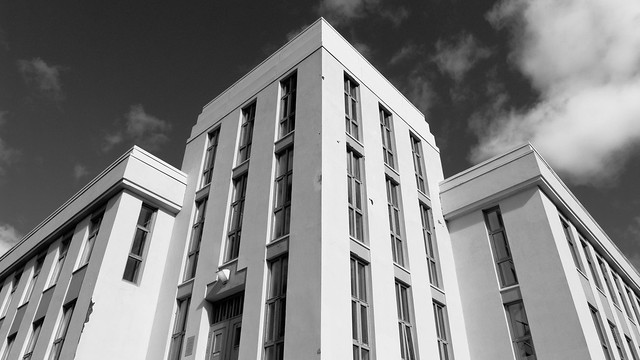 P1110456.jpg by fuglsnef, on Flickr 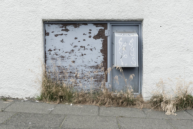 P1100957.jpg by fuglsnef, on Flickr
|
|
#
?
Sep 27, 2012 18:37
|
|
|
Evilkiksass posted:-10 points, gently caress mannequin . Don't do this.
|
|
#
?
Sep 27, 2012 18:37
|
|


|
Hotwax Residue posted:
The first feels a little weird to me. The distinct roll of the wave but because it was a slower shot the smoothness of the water rolling over really distracts me for some reason. I really love the color you got on the hills in the left and center. The second is well done, I just wish it was wider. I keep wanting to see more of the hills framing the background. ---  
|
|
#
?
Sep 27, 2012 18:44
|
|

|
Pukestain Pal posted:Dang, I don't know how I missed those doors. Thanks for that. Proof that a 2nd look is always good! This is really great, except the watermark. It actually ruined the feel completely for me, which felt more like an initimate street photograph, which was then interrupted by the idea that this is commercial. Other than that, it's awesome. Casu Marzu posted:The first feels a little weird to me. The distinct roll of the wave but because it was a slower shot the smoothness of the water rolling over really distracts me for some reason. I really love the color you got on the hills in the left and center. The first one here is quite nice, especially the lighting. I don't feel like the extra space at the "normal" crop adds much though, I think it would look quite nice with the top and bottom cut off a bit. The sense of movement is really nice. The second has a bit of an odd color cast that's throwing me off. The balance of elements in the photo is actually quite nice. My first thought was that it was kind of boring, but after I thought it about it a bit, I like the lines of the sky, treeline, ground, and grass, as well as the clear left-to-right eye movement. Very natural. I think the color's throwing that off though, and you could use that to bring out the lines of movement.
|
|
#
?
Sep 27, 2012 21:16
|
|


|
Sovi3t posted:It's nice, the light is great, but something feels a little off. Almost as if the background is in some sort of "uncanny valley" of sharpness. Or maybe the water is too distracting. Overall it just feels a bit too contrasty. Thanks a lot for the words, good advice and insights. Addressing the first, I am going to need to wait to see how the image actually turned out...that was a fairly minimal edit from a Target store scan of a roll of Portra 400...my scanner is pretty poo poo so I just used theirs for the time being figuring that when I get a dedicated film scanner I can do the real work. I'm not sure if they applied some sort of sharpening or not. I think you did call it, and I didn't even consciously realize it, that the vanishing point has been intriquing me lately. I will keep that in mid and see if I can work with it a bit better. David Pratt posted:. I am going to treat these like I took them (because I have ended up with some similar things and gone through this thought process). 1 - are the shapes interesting enough to do this kind of shot, and does it keep me wanting to look at the picture? I don't know, I don't think so in this case. The asymmetry seemss unfortunate - it almost seems like you were trying to portray it in a way that would have worked for a symmetrical building and were forcing that perspective instead of exploiting the asymmetry in an interesting way. I think that a crop in, losing the sky and dealing just with the shapes formed by the angles of the building and varied contrast from the light would be more interesting. Or, if you would like to try to work more with more of the building in the frame like you did here, see if you can do something more interesting with the shapes formed by the bright walls vs. the mid grey walls (perhaps bringing the whole thing to the left?). 2 - Doesn't seem that interesting, you might have caught something while you were there that drew you to this that you didn't capture in the picture itself. Were you interested by the angle of the ground vs. the wall, the plant stuff at the bottom, the paint chipping, or what was it that made you think to photograph this? -----  img078.jpg by Paul Hofreiter, on Flickr
|
|
#
?
Sep 27, 2012 21:58
|
|

|
Sovi3t posted:It's nice, the light is great, but something feels a little off. Almost as if the background is in some sort of "uncanny valley" of sharpness. Or maybe the water is too distracting. Overall it just feels a bit too contrasty. I agree with this, and it also feels a little bit warm for me. I know you're going for classic golden hour but I think it makes the skin a little too yellow. Also, in portraits I try never to have a line going right through someone's head.  Falling in love with macro.
|
|
#
?
Sep 27, 2012 22:08
|
|

|
David Pratt posted:
It looks menacing. At first I thought the cropping on the top edge was too tight, but I do like the way the building threatens to slice through the remaining bit of sky. This reminds me of Brazil; specifically, the Ministry of Information's logo and architecture. David Pratt posted:
This one is ok. I like the rectangles and their proportions are nice. The grass is dull, but I like the way it stops abruptly on the left, allowing the wall to touch the ground. This is a type of photo that needs context, I think. It could be effective if used as part of a set. ---  20120914-IMG_7116.jpg by SacktapDeluxe, on Flickr I cropped some black background off the top, left, and bottom. Framing still feels a little awkward, can't tell if it's just me.
|
|
#
?
Sep 28, 2012 03:34
|
|
|
Pukestain Pal posted:Dang, I don't know how I missed those doors. Thanks for that. Proof that a 2nd look is always good! for some weird reason I thought "Les miserables" when I saw this! She totally has the genre of that girl on the poster! As other pointed out I like the composition as well and it's a nice usage of fences, those things get used and abused as hell but you did good! Here are a few of mine  IMG_7431 by avoyer, on Flickr  IMG_7463 by avoyer, on Flickr and a doggggggg  IMG_7414 by avoyer, on Flickr (You can blame the DOF all you want... but it was ISO 1000, 1/80, 1.6 so I'm okay with it)
|
|
#
?
Sep 28, 2012 04:11
|
|

|
xenilk posted:
I think it's cool that her jeans pop as well as they do against the yellow-green colour palette, but it takes too much focus away from her face. Also, the way her shirt is falling gives her an unflattering silhouette.
|
|
#
?
Sep 28, 2012 04:15
|
|

|
rio posted:
I like the framing and the tones. The b/w works really well for this image. Can't say I find the subjects too interesting. If they had come closer and posed for the camera, maybe? If I'm critiquing this as a family shot, then awesome job! If not, then the message is a bit weak. Of the last few shots you posted, this is definitely my favorite. whereismyshoe posted:I agree with this, and it also feels a little bit warm for me. I know you're going for classic golden hour but I think it makes the skin a little too yellow. Also, in portraits I try never to have a line going right through someone's head. This could be a good shot but the lighting needs work! The central part of the flower is too dark, and I can't resolve much detail. It also casts a dark shadow below. The petals have a deep yellow shadow, which makes me think the overhead light was too harsh. Try lighting it more from the front, to bring out some detail in the dark regions. Try using a diffuser, or bring the light source closer to soften the shadows. Adding a second light source as a fill light will allow you to kill some shadows, and it should make it easier to blow out the background cleanly. What kind of light source are you using? fake edit: After seeing some of your photostream, I'm not sure how useful my suggestions are. For example, in this shot, you've nailed it. Great detail, soft light and shadows, perspective. So what went wrong with this shot?
|
|
#
?
Sep 28, 2012 04:18
|
|
|
Sovi3t posted:This could be a good shot but the lighting needs work! The central part of the flower is too dark, and I can't resolve much detail. It also casts a dark shadow below. The petals have a deep yellow shadow, which makes me think the overhead light was too harsh. Try lighting it more from the front, to bring out some detail in the dark regions. Try using a diffuser, or bring the light source closer to soften the shadows. Adding a second light source as a fill light will allow you to kill some shadows, and it should make it easier to blow out the background cleanly. Thank you! It's a makeshift seamless box, basically a cardboard box with the top and front cut off, with a ramp of white paper inside and a piece of white paper on top for diffusion. I intentionally turned the highlights waaay up on the flower one, to get the background as white as it could be. I could pull the shadows up a bit to get more detail in the center of the flower (this sounds like it would solve two of the problems you mentioned). It's the same exact exposure / setup as the one with the apple, but processed a little differently. whereismyshoe fucked around with this message at 04:48 on Sep 28, 2012 |
|
#
?
Sep 28, 2012 04:46
|
|
|
whereismyshoe posted:Thank you! It's a makeshift seamless box, basically a cardboard box with the top and front cut off, with a ramp of white paper inside and a piece of white paper on top for diffusion. I intentionally turned the highlights waaay up on the flower one, to get the background as white as it could be. I could pull the shadows up a bit to get more detail in the center of the flower (this sounds like it would solve two of the problems you mentioned). It's the same exact exposure / setup as the one with the apple, but processed a little differently. If you adjust the processing on this photo, please do share! Also, you might find these techniques relevant: http://www.photigy.com/mastering-jewelry-photography-my-experience-with-a-shooting-cone/ http://www.photigy.com/trash-can-as-a-tool-for-a-professional-photographer-the-end-result-all-that-matters/
|
|
#
?
Sep 28, 2012 05:23
|
|
|
Sovi3t posted:
Is this a puddle reflection or looking up through a tree? Either way I like it. I like the vibrance of the colors, which provide context as to when it was taken and are pleasing to look at. The interaction between the darkest blacks, the shadowed leaves and the highlights are interesting and I like how the dark branches extend from from the borders into the middle. --- e: may as well throw up another one. I was weeding through some summer shots tonight before summer gets too far away - was sitting on this one. The distortion from this e-mount 16mm is pretty hard to work with but I tried to correct what I could. I worry that there is too much going on in the picture. 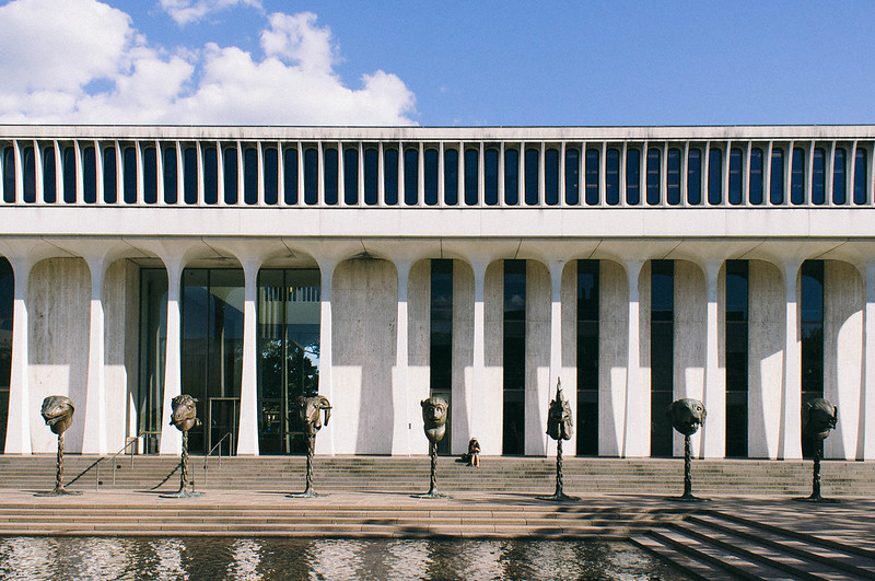 headphones girl by Paul Hofreiter, on Flickr rio fucked around with this message at 07:08 on Sep 28, 2012 |
|
#
?
Sep 28, 2012 07:00
|
|
|
KingColliwog posted:I like the second one, but I'd crop it on the left after the first spectator. So we see the first girl but not the two other ones. Main problem I have with the photo is that I don't understand what's going on at all. Who is this girl, is she kissing a spectator? Was she top less a couple of seconds before that and if so why? I like that it makes me wonder and think, but an additional shot or two that would give me some more context would be appreciated. It was part of a Mexican Wrestling and Burlesque night. She was a burlesque stripper and the girl in the crows is a spectator who she leaned over and started kissing. Here's some context: 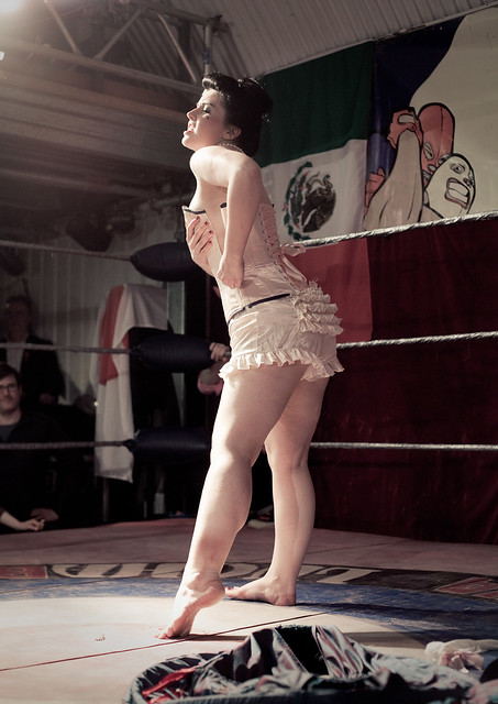 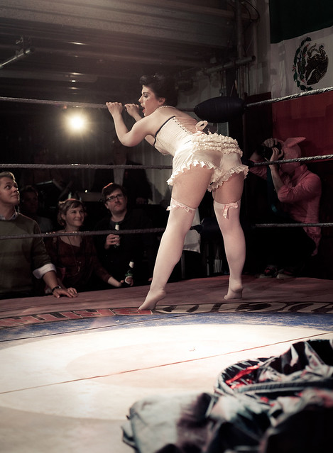 (not sure if those count as NWS) Pukestain Pal posted:
Absolutely agree with the logo complaints here. Get shut of it and just don't tag or name the file if you're worried about theft. Besides, people would just either crop that out or clone it over failry easily with the fence mesh. Personally, I'm not a fan of naming files. It's much better to just let us interpret feeling from it than saying "hey, this is meant to make you feel like this". I dunno, that's just something particular to me, but I hate it when photos have names. The things that work about that shot are: The focal length adds a bit of distance from the viewer to the girl. It adds to the sense of her being trapped in and unreachable. It feels voyeuristic in both directions, which is very captivating. Her expression adds to this, too. I like the pose. I think both hands on the fence would possibly have worked too, though, so long as it didn't feel a bit hammy and thespian. The sort of grainy, imperfect processing really adds to the mysterious feel. A massive nitpick, but maybe if you removed the paint line near her legs and the logo, it would be a lot stronger and removes that definite sense of location.
|
|
#
?
Sep 28, 2012 12:47
|
|

|
aliencowboy posted:I think it's cool that her jeans pop as well as they do against the yellow-green colour palette, but it takes too much focus away from her face. Also, the way her shirt is falling gives her an unflattering silhouette. I have to agree with you on that one. As much as I like the flowing clothes I think they often screw the silhouette when there's no belt or anything to define the waist when seated. When she's up I can use the hands to define it but I'll have to figure out a way to do it when seated! I guess it'll be my challenge for Fall!
|
|
#
?
Sep 28, 2012 17:32
|
|
|
xenilk posted:I have to agree with you on that one. As much as I like the flowing clothes I think they often screw the silhouette when there's no belt or anything to define the waist when seated. When she's up I can use the hands to define it but I'll have to figure out a way to do it when seated! I guess it'll be my challenge for Fall! Maybe try shooting your models in motion? It would give some added energy to the photos and highlight any flowing garments.
|
|
#
?
Sep 28, 2012 17:50
|
|
|
xenilk posted:I have to agree with you on that one. As much as I like the flowing clothes I think they often screw the silhouette when there's no belt or anything to define the waist when seated. When she's up I can use the hands to define it but I'll have to figure out a way to do it when seated! I guess it'll be my challenge for Fall! Binder clips. Stylists use lots of tools to get clothing to fall "just right" so don't be afraid to mess with things!
|
|
#
?
Sep 28, 2012 19:52
|
|
|
nonanone posted:
Is it?  I need a new monitor. I need a new monitor.
|
|
#
?
Sep 29, 2012 07:42
|
|
|
xzzy posted:Yeah, the grain/noise seems a little over the top on that guy. The other shot from the beach is pretty pleasing though, and has similar levels of noise. So maybe it's that barely visible hill in the background causing problems? It's like I want to focus on it to see what it is, but the noise makes it seem like I'm prevented from doing so. This is kind of old, but I really like the first one. The sky is done well, and the colours are great. Second one looks like you got close to the Canadian border! I was just in the Waterton area in August myself, it's mind-blowing there. More people should go and shoot the mountains in the area, the colours of the rock are just unbelievable. When you look at the red aragonite really closely, it's really shimmery. 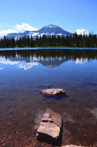 Hidden Lake by Trips in the Rockies, on Flickr 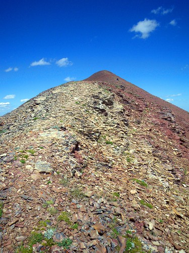 Approaching the end by Trips in the Rockies, on Flickr 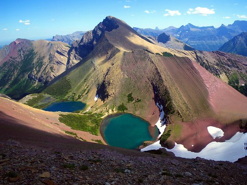 Mt. Alderson and Carthew Lakes by Trips in the Rockies, on Flickr 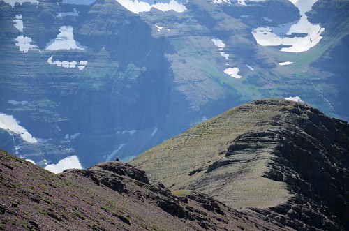 On the ridge by Trips in the Rockies, on Flickr I only recently picked up a DSLR. Two were taken with that, and a couple were with my trusty old point-and shoot. I want people to tear into me, since I'm completely self-taught. At least I don't shoot on auto.
|
|
#
?
Sep 29, 2012 07:52
|
|


|
Picnic Princess posted:This is kind of old, but I really like the first one. The sky is done well, and the colours are great. I would say the biggest problem with these photos is that they look to be taken in the middle of the day. When you are shooting landscapes or photos in general the light during the middle of the day is usually too harsh. If you shoot closer to sunrise/sunset (or an overcast day even) then the light will be softer and you will end up with nicer looking photos. Guess I might as well post a photo:  ] ]
|
|
#
?
Sep 29, 2012 20:04
|
|

|
rio posted:1) I like it, and I like where you were trying to go with it compositionally and conceptually. I think you are right about the sky not being great, though - if you could have caught a nice blue sky with hanging puffy clouds it would have helped add an almost surrealistic quality in both color and contrast and I think could have really elevated the picture. Are you close enough that you could head back on a day that has a better sky? Could it also perhaps stand to be bumped up in exposure? Maybe it is just the exposure of the sky not matching the rest of the photo. Might also want to shift towards magenta a tad. Thanks for the critique. Sadly there is an entire Atlantic's worth of ocean between me and it now. However, should anyone in Central Florida fancy having a go at it, here is the rough position on google street view. I knew I should have stopped the car when I first saw it, rather than waiting to come back. rio posted:
I like the concept, but perhaps the sky (and maybe water at the bottom) is unnecessary. The strong lines and harsh shadows give an impression of imprisonment, removing the sky enhances that feel quite a lot. Give it a go and see what you think. I think it may work in B&W too, if you can nail the levels. Oh, the horizontals aren't quite either, so a slight tilt is needed. Meanwhile, another from Florida:  Interlude by M Walts, on Flickr This was taken with the camera on my knees, while drinking a beer with the family. The two musicians had gone on a break. I like the amount of general musical clutter and other hints that the band has been playing, rather than waiting to come on. Technically, it feels a bit brown and I'm not sure what to do with that. Also, if I could take it again I'd move back slightly so the guitar wasn't cut off. Oh, and it would be good to have the open sign slightly less blown, but that's a compromise. Dalax fucked around with this message at 20:53 on Sep 29, 2012 |
|
#
?
Sep 29, 2012 20:30
|
|
|
Dread Head posted:I would say the biggest problem with these photos is that they look to be taken in the middle of the day. I can't imagine the pain of shooting sunrise/sunset in glacier. Most of the spots are 5-10 miles of hiking one way.. which means hours of tromping around bear infested hills in the dark. It's more than just getting up extra early because the trails tend to have hazards to deal with too. Snow drifts, waterfalls, roots.. it's gonna be a slow hike unless you know the trail well.
|
|
#
?
Sep 30, 2012 00:05
|
|

|
xzzy posted:I can't imagine the pain of shooting sunrise/sunset in glacier. Most of the spots are 5-10 miles of hiking one way.. which means hours of tromping around bear infested hills in the dark. It's more than just getting up extra early because the trails tend to have hazards to deal with too. Snow drifts, waterfalls, roots.. it's gonna be a slow hike unless you know the trail well. I spend a lot of time in the mountains so I understand, but unless it is overcast you are probably not going to get a good photo midday. It does not have to be at sunset or sunrise but you should try to avoid midday. If possibly try to camp closer to the location you want to shoot. It all comes down to what you are wanting to get out of a trip. If you goal is to get to a specific challenging destination and getting good pictures it rarely happens on the same trip. Edit some examples from a few weeks ago, while not at sunset they are from later in the day and I don't think the light is nearly as harsh which I feel makes for a better photo. 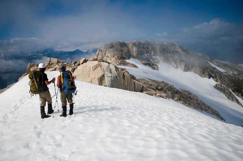 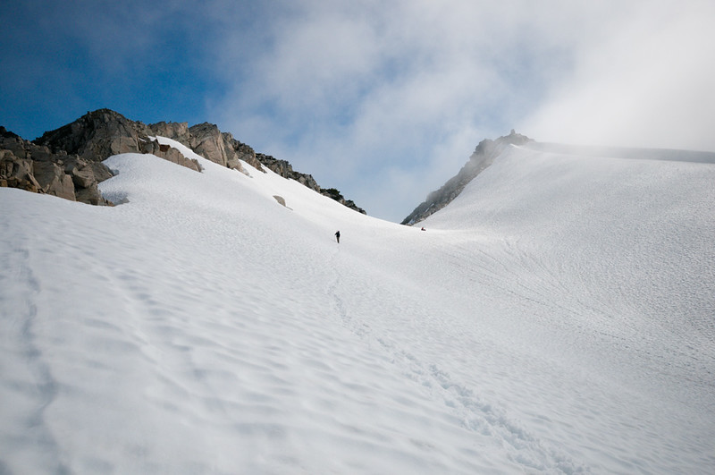
Dread Head fucked around with this message at 01:16 on Sep 30, 2012 |
|
#
?
Sep 30, 2012 01:13
|
|
|
Those two are so good dreadhead and quite different from what I remember you posting most of the time so it's nice to see your skills applied to different subjects. The colors are "true" and the images are so crisp and this is very hard to do with snow and extra hard in a mountain environment. Even with a good exposure I tend to not be good at making thing come out like that in post. The first one is the best of the two images, but I would have liked the two people to be slightly closer to the bottom of the frame. As it is now the bottom third of the image is mostly negative space. I really liked the second one when I first looked at it, but the out of focus snow in the bottom left corner make it less enjoyable when I look at it for any length of time. Mostly nit picking though since I like both of them quite a lot. I can't overstate how much I like the colors and general feel of the images. I'm not sure what it is exactly that do it for me though.
|
|
#
?
Sep 30, 2012 01:39
|
|

|
Dread Head posted:I would say the biggest problem with these photos is that they look to be taken in the middle of the day. When you are shooting landscapes or photos in general the light during the middle of the day is usually too harsh. If you shoot closer to sunrise/sunset (or an overcast day even) then the light will be softer and you will end up with nicer looking photos. Holy crap, that picture is full of awesome. I'd be very curious to see what kind of changes you did in post to come with that, anyways it's very nice and I don't consider myself a big fan of landscape pictures. Here are two pictures from me  IMG_7754 by avoyer, on Flickr  IMG_6557 by avoyer, on Flickr
|
|
#
?
Sep 30, 2012 20:20
|
|
|
xenilk posted:Holy crap, that picture is full of awesome. I'd be very curious to see what kind of changes you did in post to come with that, anyways it's very nice and I don't consider myself a big fan of landscape pictures. Did not do very much, sharpened a bit and tweaked the colour temperature. I did use 2 exposures, one for the sky and one for the foreground but only really because I had a boat go through the background.
|
|
#
?
Oct 1, 2012 00:04
|
|
|
rio posted:
There really is a lot going on in this photo, but it keeps me interested and peeking around. I do think it would work better with a less intensely bright blue sky. That building and plaza around it looks pretty cool. I'd love to shoot there. ---- Another weekend, another photodrive   
|
|
#
?
Oct 1, 2012 04:49
|
|
|
Woah, i love this. It reminds me of something that would come pre-loaded as a desktop on a computer. And that's not a bad thing More macro stuff.  
|
|
#
?
Oct 1, 2012 15:51
|
|
|
xenilk posted:Holy crap, that picture is full of awesome. I'd be very curious to see what kind of changes you did in post to come with that, anyways it's very nice and I don't consider myself a big fan of landscape pictures. I really like the first, but would like it more without the line of cars with their brake lights on. Maybe bring those down a little so they don't stand out? The bride is totally grabbing the groom's rear end in the second, but I get a "This is Mine and you know it" vibe from her posture that I kinda like. I've been trying to take pictures of the awesome foliage this fall, and am having a harder time than I expected. These are the only two I've liked so far, but there should be another week of great color before they go downhill.  There's a good mix of greens & yellow/orange/red right now that I'm having a hard time capturing. I remember there being much more green mixed into this tree when I was looking at it. I'm also not a fan of how it blends on the left and right with other trees - I want to find a more isolated example I think. I tried to take care of it with the crop but I don't think it quite succeeded. 
Spime Wrangler fucked around with this message at 21:19 on Oct 1, 2012 |
|
#
?
Oct 1, 2012 21:15
|
|


|
Spime Wrangler posted:I really like the first, but would like it more without the line of cars with their brake lights on. Maybe bring those down a little so they don't stand out? Hahah she totally is! I asked them to walk in front of me and she just went for it, it was a fun wedding in that sense! I'll see what I can do about toning down the read lights from the breaks, good point merci!
|
|
#
?
Oct 1, 2012 22:02
|
|
|
Spime Wrangler posted:There's a good mix of greens & yellow/orange/red right now that I'm having a hard time capturing. I remember there being much more green mixed into this tree when I was looking at it. I'm also not a fan of how it blends on the left and right with other trees - I want to find a more isolated example I think. I tried to take care of it with the crop but I don't think it quite succeeded. I like these colors, but you might be able to reclaim some green by lowering the temperature maybe? I like how dark the bottom strip of background is, but it might be a stronger photograph if you could see the trunk clearly with no brush/foliage in front of it. I can't immediately tell that there's trees on either side. The crop does feel slightly awkward, feels like it should be tighter on the left and right side, with more space on top?
|
|
#
?
Oct 2, 2012 04:19
|
|
|

|
| # ? May 11, 2024 17:52 |
|
|
Yeah, I usually end up in nice places in the middle of the day, because we drive for a couple hours to get there, then hike for a few more hours (or many), then drive home same day. I sometimes end up on the slopes at sunset, nut I'm usually hustling to get back to the car before nightfall. All my pictures are during long, hard hikes. In Waterton, I hiked up a vertical kilometer, then down a vertical kilometer and a half, on a 22km long linear trail. I usually don't plan to be at a certain place at the best time, and most of what I see is a complete surprise, because I've never been there before. Another thing that sucks is I'm just getting my driver's license now. I have to wait almost a year before I can legally drive on my own. But once I can, I will make plans to go places at better times! I really like the colours in this.
|
|
#
?
Oct 2, 2012 04:47
|
|