|
Coal dipped in poo poo
|
 #
?
Apr 23, 2013 21:35
#
?
Apr 23, 2013 21:35
|
|


|

|
| # ? May 10, 2024 11:58 |
|
|
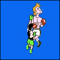
That would be a sweet helmet if it was all matte black or all gold. As it stands however, not so much. How much money do you think they paid to have that designed?
|
|
#
?
Apr 23, 2013 21:38
|
|


|
I feel like the awful color blend makes the Jaguar decal stand out really uncomfortably instead of blending into the helmet.
|
|
#
?
Apr 23, 2013 21:41
|
|
|
Boosh! posted:Close up of the gradient, if you even want to call it that. Needs more top hat and monocle.
|
|
#
?
Apr 23, 2013 21:43
|
|


|
Febreeze posted:I feel like the awful color blend makes the Jaguar decal stand out really uncomfortably instead of blending into the helmet. never mind that the jaguar on the helmet is going into the shadows so
|
|
#
?
Apr 23, 2013 21:44
|
|


|
Boosh! posted:Close up of the gradient, if you even want to call it that. Wow, these do look like poo poo. The rest of the uni is pretty nice. I dig the numbering, it's so different than the rest of NFl that it's able to standout without looking too foolish. I like the Dolphins new whites but that font looks like 1980's Reebok typeface. I'm sorry, but I love those purple pants but I also unironically like this: 
|
|
#
?
Apr 23, 2013 21:45
|
|

|
For real, that patch looks almost exactly like the Brooklyn Nets logo  I dig the Vikings jerseys, those look pretty sweet. I also like the Dolphins jerseys (that all white looks so awesome) but I agree with the Dolfans here that there should be way more orange. The Jags jerseys are just...eeeehhhhhhhh. The black and teal ones look okay, but the helmet just ruins everything that could have been good about them.
|
|
#
?
Apr 23, 2013 22:01
|
|


|
Boosh! posted:Close up of the gradient, if you even want to call it that. Holy poo poo these can't be real, they are so loving bad
|
|
#
?
Apr 23, 2013 22:16
|
|


|
Boosh! posted:Close up of the gradient, if you even want to call it that. Needs ground effects.
|
|
#
?
Apr 23, 2013 22:25
|
|
|
Dolphins' unis could have used some orange stripes.
|
|
#
?
Apr 23, 2013 22:31
|
|

|
Yeah I might like the gradient if it wasn't so short.
|
|
#
?
Apr 23, 2013 22:39
|
|

|
Boosh! posted:Close up of the gradient, if you even want to call it that. This looks like someone forgot to adjust the helmet painting machine at the factory or something.
|
|
#
?
Apr 23, 2013 22:43
|
|


|
Man, they really needed to go with one or the other there. I'm the least picky guy there is about uni's, but drat that gradient is bad.
|
|
#
?
Apr 23, 2013 22:55
|
|

|
I concur. Calling that a gradient is being generous.
|
|
#
?
Apr 23, 2013 23:11
|
|
|
The Jags helmet would look a lot better if it was black fading into teal. As it is now the contrast is too jarring and the gold on the helmet blends too much with the logo. Also the Browns should make the orange pants brown jersey their full time home uni. Stick with the all whites away.
|
|
#
?
Apr 24, 2013 00:04
|
|

|
quote:I'll give this a little while, but... Yikes. Yikes. I hope Underarmour or whoever gets the NFL contract next have someone in the line of command that says "hey, uh... maybe not on this one." edit to be positive: The Dolphins one is pretty good and The Vikings one is a huge, huge improvement. ZopfaMania fucked around with this message at 01:19 on Apr 24, 2013 |
|
#
?
Apr 24, 2013 01:14
|
|
|
God, enough with the zany loving number fonts. Why can't they just be pro block?
|
|
#
?
Apr 24, 2013 01:15
|
|


|
Febreeze posted:If they are going to do something this stupid they might as well have put Jaguar spots on the helmet instead. That would have at least ironically owned. Ironically? It would have owned, period.
|
|
#
?
Apr 24, 2013 01:21
|
|

|
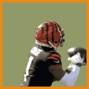
A.o.D. posted:Ironically? It would have owned, period. You like the Bengals helmets don't you
|
|
#
?
Apr 24, 2013 01:24
|
|

|
SteelAngel2000 posted:You like the Bengals helmets don't you Yes. And the eye of the tiger in Tiger Stadium.
|
|
#
?
Apr 24, 2013 01:24
|
|
|
Vikes are bland in a good way. Dolphins are bland in a bad way. the Jaguars unis... really suit the team. That was not meant to be a complement.
|
|
#
?
Apr 24, 2013 02:33
|
|
|
oldskool posted:https://twitter.com/jaguars/status/326753094954270720/photo/1 That looks a lot better than I thought it would. Though going mostly black is a little bit  in design, it's pretty snappy. in design, it's pretty snappy.EDIT: Just saw the helmet 
|
|
#
?
Apr 24, 2013 02:52
|
|


|
The Jaguars need a new logo and that helmet is terrible.
|
|
#
?
Apr 24, 2013 02:54
|
|
|
I love all the new jerseys except for the Jags helmet. It's going to look so stupid on tv
|
|
#
?
Apr 24, 2013 03:02
|
|

|
Neodoomium posted:God, enough with the zany loving number fonts. Why can't they just be pro block? The font was one of the better parts of the Jags uniform in my opinion.
|
|
#
?
Apr 24, 2013 03:03
|
|

|
Hopefully, the Jag helmets will never see the field out of sheer negative reaction, like these old fan-favorite 49er helmets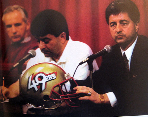
|
|
#
?
Apr 24, 2013 03:18
|
|
|
Silly Burrito posted:Needs more top hat and monocle.
|
|
#
?
Apr 24, 2013 03:40
|
|

|
Vaya con Dios!!! posted:The Jaguars need a new logo and that helmet is terrible. bro they just got a new logo this year
|
|
#
?
Apr 24, 2013 03:56
|
|


|
Why the hell didn't the Jags just go with a golden helmet or a black helmet with spots or a helmet where the face is surrounded by a terrifying jaguar maw or anything other than that?
|
|
#
?
Apr 24, 2013 04:11
|
|


|
You know that scene in that one Hitler movie where he's blathering on about something and everyone else is clearly coming to the realization that he's always been a nutjob? Yeah... That's how I see the helmet thing going down.
|
|
#
?
Apr 24, 2013 04:43
|
|
|
Dolphins all-whites own.
|
|
#
?
Apr 24, 2013 05:11
|
|
|
I like the Dolphins unis. The Vikings number font is weird. If they ditch the odd serifs and get the road stripes right they'd be back to being the Vikings. The Jacksonville one is awful. It looks like the result of a high school kid fooling around with some spray paint. The Navy has probably the best multi tone helmet. 
|
|
#
?
Apr 24, 2013 05:39
|
|


|
Daaaaamn, that's swanky. Edit: Can the LA team just steal those? LA: Longshoremen. http://www.nfl.com/news/story/0ap1000000162620/article/jacksonville-jaguars-unveil-their-new-team-uniforms They look slightly better in this video. Maybe they'll look OK in motion. Eifert Posting fucked around with this message at 06:01 on Apr 24, 2013 |
|
#
?
Apr 24, 2013 05:54
|
|
|
Toussaint Louverture posted:Daaaaamn, that's swanky. Huh. Richard Dawkins never struck me as an NFL guy.
|
|
#
?
Apr 24, 2013 06:22
|
|
|
Darth Brooks posted:The Navy has probably the best multi tone helmet.
|
|
#
?
Apr 24, 2013 07:58
|
|
|
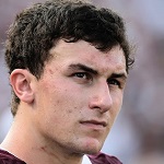
By the way here's Justin Blackmon posing, and, um, talking. All I can think is Justin Blackmon: Space Marine.
|
|
#
?
Apr 24, 2013 08:01
|
|
|
Ehud posted:bro they just got a new logo this year well it already looks dated as hell, and not in a classic way
|
|
#
?
Apr 24, 2013 08:06
|
|
|
Darth Brooks posted:I like the Dolphins unis. The Vikings number font is weird. If they ditch the odd serifs and get the road stripes right they'd be back to being the Vikings. The Jacksonville one is awful. It looks like the result of a high school kid fooling around with some spray paint. The current theory on the weird serifs on the numbers is that they're supposed to represent a longship sail. It seems like a prime case of a designer taking a theme too literally and Nike does have their awful thing where every team needs to have a unique number font. The new uniforms are still a big improvement, I just wish that Nike didn't try to get too cute with the numbers.
|
|
#
?
Apr 24, 2013 10:29
|
|

|
I found a nice thing to say about the Jags unis. I like the pants.
|
|
#
?
Apr 24, 2013 13:09
|
|
|

|
| # ? May 10, 2024 11:58 |
|
|
That Navy Helmet owns so much that I want every team to copy it's style.
|
|
#
?
Apr 24, 2013 16:27
|
|