


|
xzzy posted:Unless you can find a filter that removes all atmosphere between you and the mountain, there's nothing to be done about it. That and I personally don't see a problem with it, I think it adds depth to the photo.
|
 #
?
Jun 3, 2013 18:54
#
?
Jun 3, 2013 18:54
|
|

|

|
| # ? Jun 5, 2024 06:02 |
|
|
mAlfunkti0n posted:Not quite to the caliber (nowhere near it) of most of the lovely landscapes here .. however, I found it to be appealing. I like the color gradients and the textures of the old rotted wood. Why did you include the trees in the background?
|
|
#
?
Jun 3, 2013 19:32
|
|

|
David Pratt posted:Why did you include the trees in the background? Honestly, I am still not sure. I guess at first I liked the colors, but they don't have anything to do with what I found interesting with the subject. Edit : Here is a crop to fill the frame .. I should have kept the original like this.  IMG_0896.jpg by jarredsutherland, on Flickr mAlfunkti0n fucked around with this message at 20:04 on Jun 3, 2013 |
|
#
?
Jun 3, 2013 20:00
|
|
|
Now it's kind of cool because it's hard to tell if it's a close-up of a tree trunk or a long distance shot of a cliff.
|
|
#
?
Jun 3, 2013 20:23
|
|

|
xzzy posted:Now it's kind of cool because it's hard to tell if it's a close-up of a tree trunk or a long distance shot of a cliff. I agree. I love the critique too, it helps me to remember what I am doing when out there shooting. Probably one of the few I have taken so far that I actually like. Reading through Understanding Exposure is really helping as well. Gets better and better each time I go out.
|
|
#
?
Jun 3, 2013 20:27
|
|
|
mAlfunkti0n posted:Honestly, I am still not sure. I guess at first I liked the colors, but they don't have anything to do with what I found interesting with the subject. I like this tree but drat that is some loving boring as poo poo light on it. The tree is all gnarled and craggly and practically begging for some nice, hard, gridded oblique light to turn it into a badass texture shot but nope! It's covered in the softest, gentlest cloudy day light you've ever seen.
|
|
#
?
Jun 3, 2013 20:38
|
|

|
Dren posted:I like this tree but drat that is some loving boring as poo poo light on it. The tree is all gnarled and craggly and practically begging for some nice, hard, gridded oblique light to turn it into a badass texture shot but nope! It's covered in the softest, gentlest cloudy day light you've ever seen. The spot that it is in is extremely shaded, so either sun at early morning (I think sunrise hits it) or flash. What do you feel would give it the best look?
|
|
#
?
Jun 3, 2013 20:42
|
|
|
mAlfunkti0n posted:The spot that it is in is extremely shaded, so either sun at early morning (I think sunrise hits it) or flash. What do you feel would give it the best look? I'd play with off camera flash. I'm thinking hard, oblique light. I'd start by throwing on a grid and lighting from the top, going with the grain. Then I'd move the light around from there, watching the shadows to see if anything more interesting appeared. Being in the shade is actually an advantage if you decide to work with flashes.
|
|
#
?
Jun 3, 2013 21:07
|
|
|
Dren posted:I'd play with off camera flash. I'm thinking hard, oblique light. I'd start by throwing on a grid and lighting from the top, going with the grain. Then I'd move the light around from there, watching the shadows to see if anything more interesting appeared. Being in the shade is actually an advantage if you decide to work with flashes. BTW, I hate you guys .. you just made me buy off camera lighting (already had the flash ..) Actually I don't hate any of you .. you guys are awesome. ")
|
|
#
?
Jun 3, 2013 21:28
|
|
|
  burzum karaoke fucked around with this message at 22:53 on Jun 3, 2013 |
|
#
?
Jun 3, 2013 22:36
|
|

|
I can't decide which is better...  edit: vvv Hmm, you could be right. I've just been very deprived of greenery lately. vote_no fucked around with this message at 01:49 on Jun 4, 2013 |
|
#
?
Jun 3, 2013 22:58
|
|
|
I don't want to be a gloomy gus but I'd go with "neither". They're good images but they're nothing special compared to your other work.
|
|
#
?
Jun 4, 2013 00:58
|
|
|
 Summer by atomicthumbs, on Flickr
|
|
#
?
Jun 4, 2013 02:23
|
|

|

|
|
#
?
Jun 4, 2013 02:34
|
|

|
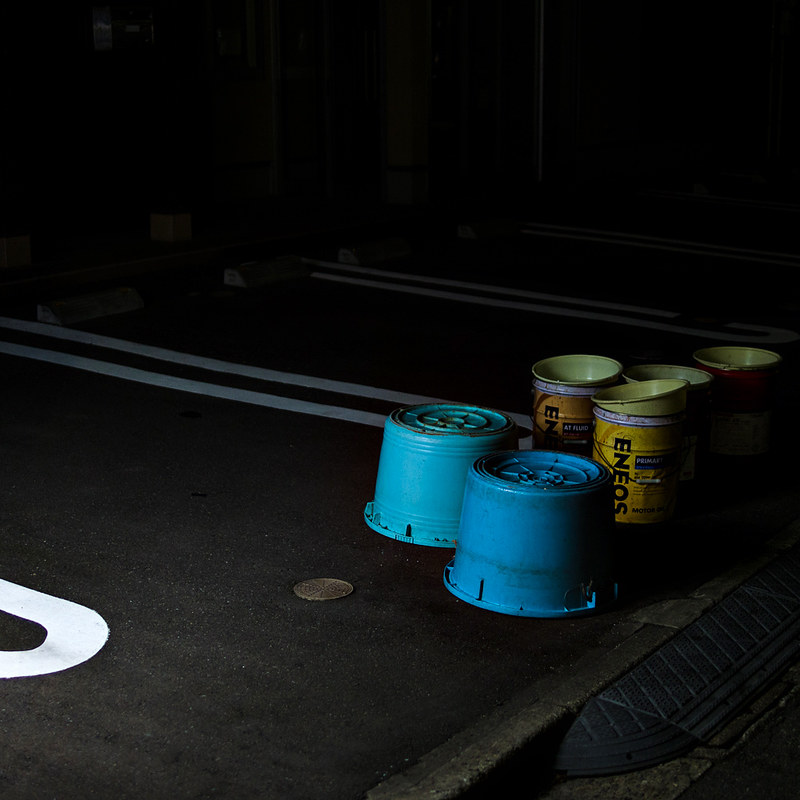 Curve and Buckets by alkanphel, on Flickr
|
|
#
?
Jun 4, 2013 03:46
|
|

|
Opals25 posted:These are stunning. I love Zion, easily one of the most beautiful places I've ever been and you really capture it perfectly. Thank you! Last three from Zion:   
|
|
#
?
Jun 4, 2013 03:54
|
|

|
Musket posted:
This is from pages back and I don't think anyone mentioned it, but I like this a lot. It feels like at any moment I'm going to have to defend myself with a crowbar. Basically, you have captured Ravenholm. I'll even let it off the lack of rocks.
|
|
#
?
Jun 4, 2013 13:17
|
|

|
atomicthumbs posted:
I love this one. It has so much feeling to it .. perhaps not all good feelings (more anger when trying to cut tall grass!) but there is just so much feeling in this shot.
|
|
#
?
Jun 4, 2013 13:34
|
|
|

|
|
#
?
Jun 4, 2013 14:40
|
|

|
Gambl0r posted:Thank you! Last three from Zion: This is the nicest one yet, but I could do without the brush in the bottom. The others are good too but the light could have been better in some of them. Looks like it was a great trip.  DSC_8432.jpg by scottch, on Flickr  DSC_8412.jpg by scottch, on Flickr
|
|
#
?
Jun 4, 2013 17:06
|
|
|
scottch posted:
Too much foreground. Crop it to bring more focus to the kid and put the breaking waves near the bottom third line:  You could even crop tighter and remove those couples.
|
|
#
?
Jun 4, 2013 17:20
|
|
|
Dren posted:Too much foreground. Crop it to bring more focus to the kid and put the breaking waves near the bottom third line: I don't think the tight crop works as well, you lose the sense of scale that the original had.
|
|
#
?
Jun 4, 2013 17:26
|
|


|
Mr. Despair posted:I don't think the tight crop works as well, you lose the sense of scale that the original had. That was my thought. It keeps it very balanced. For comparison, here's another cropped similar to his idea that I also liked.  DSC_8437.jpg by scottch, on Flickr
|
|
#
?
Jun 4, 2013 17:34
|
|
|
Mr. Despair posted:I don't think the tight crop works as well, you lose the sense of scale that the original had. A 16:9 keeps the sense of scale, and also coincidentally divides the photo up into three nearly perfect bands of colour. A 2.35:1 (with the horizon on the top third line) goes nicely too but that's just too wide for some tastes ")
|
|
#
?
Jun 4, 2013 17:46
|
|


|
I really like that cropped version. It highlights the much more interesting scale of the ocean vs. the kid and creates a stronger sense of distance between him and the adults.
|
|
#
?
Jun 4, 2013 17:53
|
|


|
Spime Wrangler posted:I really like that cropped version. It highlights the much more interesting scale of the ocean vs. the kid and creates a stronger sense of distance between him and the adults.
|
|
#
?
Jun 4, 2013 18:18
|
|
|
scottch posted:That was my thought. It keeps it very balanced. For comparison, here's another cropped similar to his idea that I also liked. I like this one much better! The 2.35:1 crop with the horizon on the top third line that NMN suggested is my absolute favorite though. My objection to the original was mainly that the wave/beach line was almost directly in the middle of the picture.
|
|
#
?
Jun 4, 2013 18:33
|
|
|
1st try. Sunset by HelloWorldEp1, on Flickr
|
|
#
?
Jun 4, 2013 23:13
|
|

|

|
|
#
?
Jun 5, 2013 01:11
|
|

|
Anyone have any tips for shooting star fields at night? I'm going out tonight on a mountain to try to capture some decent space landscapes. I've read all about stacking and I guess that's what I'm going to try. How does 8 second exposures at 100mm f/4 sound? I'll probably stack around 50 shots. Also, cross posting these from the pano thread because they're my first real attempt at landscapes. These were all panoramas shot at 1.8 for the kind of medium format depth of field effect.  IMG_0239_stitch by David Childers Photography, on Flickr  IMG_0231_stitch by David Childers Photography, on Flickr  IMG_0292_stitch by David Childers Photography, on Flickr I guess this one counts? I really liked the tableaux look of the scene and the light behind the house. Bottom Liner fucked around with this message at 02:03 on Jun 5, 2013 |
|
#
?
Jun 5, 2013 01:46
|
|

|
The appropriate shutter speed to not get star trails depends on you focal length. Read this http://photo.stackexchange.com/questions/30263/what-is-the-rule-of-600-in-astrophotography
|
|
#
?
Jun 5, 2013 02:25
|
|
|
Bottom Liner posted:
|
|
#
?
Jun 5, 2013 02:28
|
|

|
Yeah, it bugs me too. I tried fixing the distortion but had no luck.
|
|
#
?
Jun 5, 2013 03:04
|
|
|
  edit: \/\/ Thanks! I really need to get a lens hood for this thing. I think I'm going to get a tokina 12-24mm f/4 instead. copen fucked around with this message at 06:42 on Jun 9, 2013 |
|
#
?
Jun 5, 2013 04:20
|
|
|
^I like these and the soft, almost whimsical feeling they have, but the lens flaring feels really distracting to me. IMG_8054 by Opals25, on Flickr Took a walk through some local trails. Taking pictures their felt difficult. I thought I would find interesting things, but it was hard to delineate them from the rest of the background trees.
|
|
#
?
Jun 5, 2013 04:23
|
|

|
Bottom Liner posted:
This is really close to something special. You should have no trouble correcting the perspective if you're using Lightroom, just use vertical and horizontal to get it right. I just wish the distribution of people were move even, or something more eye-catching were happening. Should have hung around a bit.
|
|
#
?
Jun 5, 2013 13:45
|
|
|
Bottom Liner posted:
This is good, but I agree with scottch that it's almost really good. Use the free transform and warp tool in Photoshop. You'll probably lose some sharpness but sharpness is for weiners anyway. Also, I can see the stitching on the third pillar 
|
|
#
?
Jun 5, 2013 13:54
|
|
|
copen posted:
Dont let anyone tell you lensflare is poo poo. It has a time and a place. I like these. The black and white is the strongest and the flare, adds to it imo.
|
|
#
?
Jun 5, 2013 15:25
|
|

|
Johannesburg really doesn't have much in the way of anything natural.  IMG_9019 by sildargod, on Flickr  landscapes and sunsets (1 of 3) by sildargod, on Flickr
|
|
#
?
Jun 5, 2013 16:35
|
|

|

|
| # ? Jun 5, 2024 06:02 |
|
|
Musket posted:Dont let anyone tell you lensflare is poo poo. It has a time and a place. I like these. The black and white is the strongest and the flare, adds to it imo. Oh, word?  methinks this lens doth flare overmuch 1/2 by voodoorootbeer, on Flickr  methinks this lens doth flare overmuch 2/2 by voodoorootbeer, on Flickr
|
|
#
?
Jun 5, 2013 16:47
|
|
