


|
Marshmallow Blue posted:A couple form the Blackstone River in MA. The first one I don't really find it very interesting, it is not really telling me much and there is not really anything to draw me in. The 2nd one does a better job at drawing me to the subject but the angle is not really working for me. For wildlife photos most photos that really draw someone in is if you can make eye contact with the animal. When I look at a search for turtles (http://www.flickr.com/search/?saved=1&q=turtle) I tend to find the ones I can make eye contact the most appealing. It sounds like there are plenty of turtles at the location and they are usually pretty relaxed so it seems they would be a good subject to go back and try some different angles. If you do go back I would suggest trying to get down to the same level as the subject (usually the lower the better!). --- 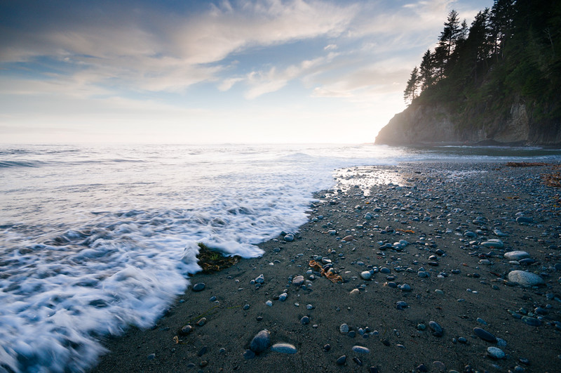
|
 #
?
Jul 16, 2013 05:52
#
?
Jul 16, 2013 05:52
|
|


|

|
| # ? May 22, 2024 03:57 |
|
|
Marshmallow Blue posted:I think it came out pretty well, I would clone out the bottom right as David Pratt says. The issues I've found with aquariums is that some of the fish (such as this lion fish, and clown fish) have really low light exhibits. On top of that you end up competing for a decent angle, people using their flashes over and over (and wondering why it isn't working), and the fish needs to sit still long enough. But overall its a good shot for what you probably had to work with. I am really curious as to what the machinery is in the first one
|
|
#
?
Jul 16, 2013 15:19
|
|
|
Boneitis posted:I am really curious as to what the machinery is in the first one Some kind of valve or adjustable dam to allow water to go where it needs to be.. probably for irrigation purposes. Or maybe flood control. edit - actually on a more careful look it seems as if the wood pylons may be the bit that move, in which case I'd guess it's a gate to let animals or boats through?
|
|
#
?
Jul 16, 2013 15:28
|
|

|
Boneitis posted:I am really curious as to what the machinery is in the first one It's a flood gate of some sort I believe, when the water level gets too high, it would be opened up. The Blackstone river (during the industrial revolution) was used was a waterway to transport goods from Mass through Rhode Island. The hike follows tow paths that horses would use to tow ferries up and down the river. The river actually used to be insanely polluted because all of the mills and factories during the industrial revolution just dumped a ton of poo poo in. @ Dread, unfortunately there were only 2 turtles on my side of the river the entire time. I think the other side had better sun. Even this guy jumped in the water right after my first shot of him (I think kids throw things at the turtles). I really wanted to get lower like your examples but its a steep 3 foot drop through heavy thorns, right into the drink.
|
|
#
?
Jul 16, 2013 15:30
|
|
|
David Pratt posted:
Quoting myself since I got caught at the end of the last page 
|
|
#
?
Jul 16, 2013 18:10
|
|


|
David Pratt posted:Quoting myself since I got caught at the end of the last page Okay so the first one I really like, it's a very cool perspective shot that makes me actually feel like I'm staring up at something, the lines give a good direction towards the center of attention (the cross) and it's well done. The other two, I'm not really feeling. I hope I don't sound like a dick but I will: it's a parking lot. The second photo does nothing for me, and the third one I like the lines along the wall and the rust runs but that's it. I can't tell you anything like what you should have done differently, I wasn't there. Were you trying to portray the starkness of the place? How devoid of color and life it was? In that case mission accomplished. I see parking lots like this all the time in the county and it's depressing. My turn: I got to go to the zoo! Here's the ones I like!  Gorilla poses by Middleshoes, on Flickr  reflection by Middleshoes, on Flickr  butterfly by Middleshoes, on Flickr As I mentioned in the general question thread, shooting through glass is a pain (heh) so I'm going to put a polarized filter on my shopping list after I get my 7D. Going midday gave me flat light for the places with skylights, so I did what I could. What do you guys think?
|
|
#
?
Jul 16, 2013 22:25
|
|
|
I am not much of a zootographer, what do you like about those shots you posted? They all have some technical issues that I don't think you intended.
|
|
#
?
Jul 16, 2013 22:48
|
|

|
Dren posted:I am not much of a zootographer, what do you like about those shots you posted? They all have some technical issues that I don't think you intended. Issues like what? I'm still a huge newb and would like to know, which is why I post here. Most of the time I'm happy if the shot turns out in some semblance of what I saw in my head, and lately I've just been trying to focus more on getting a correct exposure without blur, which I imagine is the first real baby steps anyone takes. I know they're nothing close to what other people post here.
|
|
#
?
Jul 16, 2013 22:51
|
|
|
The first one is a bit blurry. I'm guessing it's either the glass between you and the monkey or missed focus. The second one has a huge, obvious reflection. The third one has big blown out areas in the background that I find sort of distracting. Not to say that any of that stuff is wrong, just pointing it out so you're mindful of it in case it wasn't intentional. I was asking what you liked about those photos because I figured there had to be something about them that made them the ones you like and I was interested in what that was.
|
|
#
?
Jul 16, 2013 23:41
|
|
|
crime fighting hog posted:My turn: I got to go to the zoo! Here's the ones I like! 1st image: I really like the pose and the overall composition is fine. As is common with photographing through glass, some areas will lose contrast that you should address in post. 2nd image: You achieved a nice level of detail in the subject, ultimately ruined by the reflection. Judging by this reflection you had a bit of room below the camera, and so I would have tried to shoot from a lower perspective. This would remove reflective objects and also be ideal for a subject like a gorilla as shooting from below gives the subject an air of power and dominance. I'd also have asked the kid to move for a second (don't wait for them to do of their own volition, it won't happen and the animal will move and there is no more shot. I learned this last week when an old gently caress in his wheelie-chair spent 5 solid minutes posted at the only spot to get a good Tiger shot trying to figure out (asking his grandson) if the Tiger was in focus. He left when the Tiger did). 3rd image: I actually like this one the best as the subject and flower look nice together. I know the general rule is not to center the subject but on close ups I don't mind as much. One thing to keep in mind on shots like this is what color your out of focus background is going to be. Slightly shifting your position can keep the same composition while removing areas of bright white from the frame. Shooting in a zoo can be very challenging, but also you can get some amazing shots if you have the patience. These two shots are from a series I'm doing called Into Water, which is me dropping stuff into water to see how it splashes. Pretty entertaining to see the final product as well as to try to get the timing right.  Depth by m.clifford82, on Flickr  Lemon Lime by m.clifford82, on Flickr And a kitty:  Cougar by m.clifford82, on Flickr
|
|
#
?
Jul 17, 2013 00:24
|
|

|
Good call on the reflection guys, I dunno why I liked it, I have another of him without the kid, ill post it tomorrow. The butterfly I may have gone a bit too far in post and whites out the sky. I'll try to be more mindful of what's behind the subject next time.
|
|
#
?
Jul 17, 2013 01:02
|
|
|
David Pratt posted:
As usual, you have an eye for geometry and proportion. The repetition in the second seems to work better thanthe third. I also prefer the less pronounced diagonals of the parking lines in the second. Do you have to do any special kind of perspective correction beyond Lightroom's lens profile to get everything straight? I can see myself going kind of nuts trying to get everything to line up.  five oh by voodoorootbeer, on Flickr I'm not sure if it's flare on the pine or if I have an issue with old light seals.  Five Star Trail, Greensburg by voodoorootbeer, on Flickr
|
|
#
?
Jul 17, 2013 21:10
|
|

|
If you want your camera sensor to barf trying shooting a very yellow canola field against a bright orange sunset. I've made a ton of adjustments in post to try and correct all the colours to the best representation of how they appeared when I drove past. I need to start travelling with a wide angle and a tripod. David Pratt posted:
mclifford82 posted:
crime fighting hog posted:
|
|
#
?
Jul 18, 2013 01:40
|
|

|
InternetJunky posted:If you want your camera sensor to barf trying shooting a very yellow canola field against a bright orange sunset. I've made a ton of adjustments in post to try and correct all the colours to the best representation of how they appeared when I drove past. I need to start travelling with a wide angle and a tripod. I'm sure you realize, but there's some wierd posterization around the sun that I'm assuming is coming from blown something or other around the sun. What did you shoot with?
|
|
#
?
Jul 18, 2013 01:59
|
|
|
mclifford82 posted:
I like the first one better than the second one, it's a mix between the color and fact that the splash isn't cropped like someone else mentioned here. Otherwise it's pretty solid and I think it's a very good idea for a serie, I'm betting those kind of shot look even more impressing on big prints. InternetJunky posted:If you want your camera sensor to barf trying shooting a very yellow canola field against a bright orange sunset. I've made a ton of adjustments in post to try and correct all the colours to the best representation of how they appeared when I drove past. I need to start travelling with a wide angle and a tripod. Is it me or you shot this almost wide open and the focus is on the corn field? The DOF seems off for that type of picture.  IMG_5567 by avoyer, on Flickr  IMG_6412 by avoyer, on Flickr  IMG_6165 by avoyer, on Flickr xenilk fucked around with this message at 05:17 on Jul 18, 2013 |
|
#
?
Jul 18, 2013 05:15
|
|

|
voodoorootbeer posted:As usual, you have an eye for geometry and proportion. The repetition in the second seems to work better thanthe third. I also prefer the less pronounced diagonals of the parking lines in the second. Do you have to do any special kind of perspective correction beyond Lightroom's lens profile to get everything straight? I can see myself going kind of nuts trying to get everything to line up. voodoorootbeer posted:
 that composition with the zig-zags is perfect that composition with the zig-zags is perfect
|
|
#
?
Jul 18, 2013 11:51
|
|
|
I like this, looks like the surface of the sun to me. Its a shame tho thats its blurred on the bottom, I think it would look better if it were all in focus.  Parking by Mijaeus, on Flickr
|
|
#
?
Jul 18, 2013 15:49
|
|

|
El Laucha posted:I like this, looks like the surface of the sun to me. Its a shame tho thats its blurred on the bottom, I think it would look better if it were all in focus. I really like this; the coloring makes me really not want to park my car in that lot though ") I like the way the sign draws my eyes to the center of the image, then pulls them down along the bottom and then back up top. I like the way the sign draws my eyes to the center of the image, then pulls them down along the bottom and then back up top. I like this one too, but I feel like the sky is just a bit overexposed. It could just be me but I'd prefer seeing a little bit more of the sun and have the edge of those rocks a bit sharper. First time posting in this thread! 
GobiasIndustries fucked around with this message at 17:51 on Jul 18, 2013 |
|
#
?
Jul 18, 2013 17:26
|
|


|
 581112-R1-16-7Alco by zackaryattackary, on Flickr I wanted to do a portrait of my friend that was more candid than posed. He's not a fan of having his picture taken. I took the photo while we were just talking so he couldn't get too weird. I wish I had taken a step back so my buddy's cig was in frame and/or waited until he began to exhale. As it is, there's only a wisp of smoke so it makes his mouth look a lil goofy.
|
|
#
?
Jul 19, 2013 01:35
|
|

|
I like it a lot. Did you show it to him? If he doesn't like having his picture taken he might not like it but it looks good and real and honest and I like the light.
|
|
#
?
Jul 19, 2013 02:32
|
|

|
Watermelon City posted:
What was it shot with? I like it a lot too. I think you're spot on about the cigarette, I think it would have added to it so it might be something to keep in mind while you're doing your framing next time Bonus points for taking pictures of someone who looks like Vincent Cassel !Here's what I've been up to  IMG_8344 by avoyer, on Flickr
|
|
#
?
Jul 19, 2013 03:20
|
|
|
xenilk posted:What was it shot with? Leica IIIF and Ektar 100
|
|
#
?
Jul 19, 2013 21:44
|
|
|
xenilk posted:What was it shot with? I like it a lot too. I think you're spot on about the cigarette, I think it would have added to it so it might be something to keep in mind while you're doing your framing next time Ha, that dude does look like Vincent Cassel. I like everything about your shot except the falling veil. It just isn't working here. I normally like the falling veil, but it's got this weird half in the air, half droopy thing. It also creates a line that is at odds with the general line of motion through the photo, which may be what's really bothering me. You've got this nice arch line going through the couple's pose and then this awkward line shooting out of the side of it rather than flowing with it. Nice color and lighting, though. I did my first "themed" shoot ever yesterday. I was super excited that I managed to find a wrench laying around that was exactly like what I envisioned when we came up with this shoot idea last week.   
|
|
#
?
Jul 20, 2013 06:33
|
|


|
I really like those, but one thing is bothering me: Her make-up. Honestly, I don't think it works. It's really unnatural and looks like she's bruised rather than dirty. Combine that with the perfectly clean hands and it just looks weird. I know this probably isn't supposed to be a realistic shot, but having her with less and stronger spots of dirt in her face (like you actually get when you rub your face with your oil/grease soaked hands) and maybe adding some grime to her hands would make the shot more natural. Or maybe having a dirty shirt instead of a dirty face, I don't know, I'm not really used to make-up. Everything else is amazing though.
|
|
#
?
Jul 20, 2013 16:59
|
|
|
xenilk posted:What was it shot with? I like it a lot too. I think you're spot on about the cigarette, I think it would have added to it so it might be something to keep in mind while you're doing your framing next time I love this, but I want the photographer one full step to the left for the symmetry down the tunnel.
|
|
#
?
Jul 20, 2013 20:28
|
|

|
I'm digging 1 and 3 the most; in 2, she just looks kind of bored, and the blown-out windows keep trying to pull my eye away. Overall 1 is probably my favorite, and you could probably say something about how everything being tilted looks unusual to the viewer, just like seeing that girl ostensibly operating that wrench is often unusual or unexpected. 
|
|
#
?
Jul 21, 2013 19:42
|
|
|
David Pratt posted:
I dig your style, very distinct and in tune. If the first photo shared the tone and editing of the last two I would enjoy it as a set. The third is my favorite for just the sheer size and imposing, uniform nature; kind of Rothko-ish in the way it grabs me. I'm not a fan of the contrast of the first, but that's just taste. First time:  Took this today on the drive back from the nursing home my grandfathers at in Ohio. Stopped into some woods I've never been before to snap some shots but wasn't a fan of any. While pulling out of the trail and into the road I saw this. Ars Moriendi fucked around with this message at 16:27 on Jul 22, 2013 |
|
#
?
Jul 21, 2013 21:14
|
|
|
I love the colors, however I have some issues with the composition. I wish you had pulled back enough to get all of both poles in the picture. Additionally, the cylinders would look better without a cloud behind them. The cloud just distracts the eye from the subject. 582525-R1-04-33Acl by zackaryattackary, on Flickr
|
|
#
?
Jul 21, 2013 22:13
|
|
|
Watermelon City posted:I love the colors, however I have some issues with the composition. I wish you had pulled back enough to get all of both poles in the picture. Additionally, the cylinders would look better without a cloud behind them. The cloud just distracts the eye from the subject. This is crooked and it's tweaking me out.
|
|
#
?
Jul 22, 2013 01:16
|
|
|
Ars Moriendi posted:I dig your style, very distinct and in tune. If the first photo shared the tone and editing of the last two I would enjoy it as a set. The third is my favorite for just the sheer size and imposing, uniform nature; kind of Rothko-ish in the way it grabs me. I'm not a fan of the contrast of the first, but that's just taste. What's with the weird not quite bw, not quite color, not quite sepia toning going on here? voodoorootbeer posted:As usual, you have an eye for geometry and proportion. The repetition in the second seems to work better thanthe third. I also prefer the less pronounced diagonals of the parking lines in the second. Do you have to do any special kind of perspective correction beyond Lightroom's lens profile to get everything straight? I can see myself going kind of nuts trying to get everything to line up. God durn this is awesome. (Sorry for the double post)
|
|
#
?
Jul 22, 2013 01:19
|
|

|
The contrast between the rushing water and the motionless rocks works very well in this photo. The angles of the clouds, cliff, and rocks all draw my eye into the center of the photo. It would be nice to see something there to keep it there, like a hint of the sun peaking out. My experiments with a telephoto lens continue. This guy was at Cayucous Beach and had to have been a model in a previous life - he just kept strolling back and forth in front of me, but as soon as I put the camera away he flew off.  Summer 2013072013_3884 by LibbyCr, on Flickr
|
|
#
?
Jul 23, 2013 03:17
|
|

|
Ars Moriendi posted:First time: You may want to take another copy of this shot and try a less is more approach to post processing. Black and white could work for a higher contrast scene like this. I'm not really sure what's going on right now - there's a ton of detail in the sky but the shadows are completely flattened. It also looks like there's some haloing around the trees and the unnatural coloring doesn't really do anything for the shot. Watermelon City posted:
Ditto on the crookedness. What's up with the light trails? LibbyCr posted:
Maybe bump the whites a little - right now the highlights are looking kind of grey. Thanks for the encouragement on copshot - I was aggressively pursuing diagonals for a couple of rolls there.  Reamer St. by voodoorootbeer, on Flickr  somewhere near rt 31 by voodoorootbeer, on Flickr  VERY ICY by voodoorootbeer, on Flickr
|
|
#
?
Jul 23, 2013 09:43
|
|
|
voodoorootbeer posted:
I'm gonna sound stupid as hell, but I am not huge on most b-w photography but THIS I really like. Brings out a feeling of isolation and makes me think of the song Rooster. The other two photos don't really grab me, perhaps it's personal preference. So I shot a festival over the weekend and I'll be honest: I've never done much dusk/lowlight photography. Having to shoot airballoons glowing at night was new for me, but I knew to pack my tripod. Glad I did.  IMG_5807 by Middleshoes, on Flickr  IMG_5783 by Middleshoes, on Flickr And have a guitarist.  IMG_5498 by Middleshoes, on Flickr I hate how the balloon on the far left seems to be overblown but I can't think of what I could have done to fix it. What do you guys think?
|
|
#
?
Jul 24, 2013 00:42
|
|
|
crime fighting hog posted:And have a guitarist. That is a bassist (bass guitar)
|
|
#
?
Jul 24, 2013 01:34
|
|

|
voodoorootbeer posted:Ditto on the crookedness. What's up with the light trails?  You can see it here too. 
|
|
#
?
Jul 24, 2013 06:53
|
|
|
Is that what they call "the leica glow"?
|
|
#
?
Jul 24, 2013 14:44
|
|


|
voodoorootbeer posted:
Love the subdued colour in these. The composition with the diagonals in the first is pretty nice, but not quite as successful in the second. Verticals in the second are also off, but I don't know if it was on purpose or not... crime fighting hog posted:
The exposure looks fine to me, not sure what you think is "overblown". The first is stronger than the second, as the composition is better. It's straight on, and contains the balloons completely, whereas the second is at an angle and cuts into the balloon on the right. Composition in the bass player pic is pretty nice, good diagonal with the guitar, good framing, and nice expression.  DSCF2406.jpg by fuglsnef, on Flickr  DSCF2405.jpg by fuglsnef, on Flickr  DSCF2410.jpg by fuglsnef, on Flickr
|
|
#
?
Jul 24, 2013 16:09
|
|
|
David Pratt posted:
The third one is my favorite, I feel like the first two are victims to somewhat overcast, bleak lighting, as well I'm not certain what the significance of the buildings are and nothing really grabs my attention. They don't seem dramatic in their setting, and I find the greenery in front of the buildings to detract from what I assume is a study of the geometric shapes within the subjects. --- I definitely want critique on the third picture here. I'm not sure why it doesn't seem to work, my guess is the framing doesn't include the focal point of the lines formed by the concrete ridges which fan out from the right.  Parking by TCZPhotography, on Flickr  Sprinkler by TCZPhotography, on Flickr  Turpid by TCZPhotography, on Flickr
|
|
#
?
Jul 25, 2013 02:05
|
|

|
VelociBacon posted:I definitely want critique on the third picture here. I'm not sure why it doesn't seem to work, my guess is the framing doesn't include the focal point of the lines formed by the concrete ridges which fan out from the right. A square crop with the bottom right corner where the second-bottom underwater beam touches the frame turns the shot into an interesting A-shape of lines.  Lastly, the guy being so far to one side of the frame and facing out makes things a bit unbalanced, but that's nothing you can deal with. NoneMoreNegative fucked around with this message at 13:42 on Jul 25, 2013 |
|
#
?
Jul 25, 2013 12:53
|
|


|

|
| # ? May 22, 2024 03:57 |
|
|
VelociBacon posted:I feel like the first two are victims to somewhat overcast, bleak lighting, as well I'm not certain what the significance of the buildings are and nothing really grabs my attention. They don't seem dramatic in their setting, and I find the greenery in front of the buildings to detract from what I assume is a study of the geometric shapes within the subjects. It's funny that you've picked out the very things I did on purpose. I'm trying to keep all the photos like this in diffuse light so that they all look the same and don't have differently-angled shadows. And I chose buildings with greenery in front of them this time as a contrast to the bare walls I've been shooting so far. I can definitely see why they're not particularly striking to you on their own though, as the intention is to present them as a series. Hopefully the grinding repetition of exactly symmetrical walls with the odd bit of organic shape will be enough to stir something when they're all seen together. Who knows 
|
|
#
?
Jul 25, 2013 15:00
|
|