|
Rinkles posted:I don't understand the attraction to a card lay out. It gives a better sense of each post existing as a discrete unit.
|
 #
?
Dec 19, 2013 18:24
#
?
Dec 19, 2013 18:24
|
|


|

|
| # ? Jun 8, 2024 05:43 |
|
|
Never mind.
Dick Trauma fucked around with this message at 18:37 on Dec 19, 2013 |
|
#
?
Dec 19, 2013 18:33
|
|

|
Mason Dixon posted:Thanks for the clarification. I'm curious if the majority of people would object to a stickied bookmark of this thread, as I don't see that being nearly as big of a deal as you do. My main objections to the link being in Settings are that, well, a link is definitely not a setting, it isn't quickly accessible, and it's not at all intuitive to think that's where a user would look for it. Why do you want to force a bookmark onto people with no interest in this thread? A stickied bookmark is of dubious value even for those than frequent it. If someone wants to find the thread they'll manage, and bookmark if they want. I also don't think something of so marginal use for most deserves a separate spot in the slide menu. Like I said, anybody that cares enough will bookmark it themselves. The current link is useful for quickly finding the thread if you haven't already.
|
|
#
?
Dec 19, 2013 18:51
|
|

|
Mason Dixon posted:Thanks for the clarification. I'm curious if the majority of people would object to a stickied bookmark of this thread, as I don't see that being nearly as big of a deal as you do. That idea is truly something awful.
|
|
#
?
Dec 19, 2013 18:53
|
|

|
I can't get beyond the first group of my bookmarks. If I pull down to load more nothing happens.
|
|
#
?
Dec 19, 2013 18:58
|
|
|
I still strongly disagree, but looks like I'm in the minority, so guess I'll just continue pretending it doesn't exist in the settings page.
|
|
#
?
Dec 19, 2013 18:59
|
|


|
Dick Trauma posted:I can't get beyond the first group of my bookmarks. If I pull down to load more nothing happens. The Dave posted:Completely broke at the moment =/
|
|
#
?
Dec 19, 2013 19:01
|
|
|
Mason Dixon posted:it's not at all intuitive to think that's where a user would look for it. Actually I would think of a settings page to be a place to link to bug reporting. (Assuming support isn't in their top level nav.) The Dave fucked around with this message at 19:05 on Dec 19, 2013 |
|
#
?
Dec 19, 2013 19:02
|
|
|
Mason Dixon posted:Thanks for the clarification. I'm curious if the majority of people would object to a stickied bookmark of this thread, as I don't see that being nearly as big of a deal as you do. I would hate that and like it where it is in case I need it, which isn't usually that often.
|
|
#
?
Dec 19, 2013 19:12
|
|


|
I curate my bookmarks list like it's a fine art museum, if someone started tacking on mandatory threads to it I'd get so mad on the internet you wouldn't believe. Doesn't matter that I already have this thread bookmarked. 
|
|
#
?
Dec 19, 2013 20:50
|
|

|
I don't see what the deal is with it being in settings? It's out the way but you know where it is if you need it. What's the point in sticking it at the very top of your bookmarks when, chances are, you don't even use the thread that much. Ridiculous idea.
|
|
#
?
Dec 19, 2013 21:07
|
|

|
Here's a fun game Tap a person username from a quote, so that you bounce back to their original post from a different page Watch Awful try to figure out what's unread/read, and scroll to where the post is Try it yourself: Mahoning posted:I think the whole blue/black read/unread post thing has something to do with whether or not it's the last page of a thread. I could be wrong, but here's what I think I'm noticing.
|
|
#
?
Dec 19, 2013 21:43
|
|


|
death .cab for qt posted:Here's a fun game It worked fine for me.
|
|
#
?
Dec 19, 2013 21:52
|
|
|
Haggis Heed posted:It worked fine for me. It goes to the correct page, pauses with everything marked blue/read, stutters, then pops in the quoted post only halfway on screen with everything marked unread
|
|
#
?
Dec 19, 2013 21:53
|
|
|
death .cab for qt posted:It goes to the correct page, pauses with everything marked blue/read, stutters, then pops in the quoted post only halfway on screen with everything marked unread For me it jumped straight to the quoted post, however everything was white as if it were unread.
|
|
#
?
Dec 19, 2013 21:58
|
|
|
death .cab for qt posted:It goes to the correct page, pauses with everything marked blue/read, stutters, then pops in the quoted post only halfway on screen with everything marked unread This is what it did for me too.
|
|
#
?
Dec 19, 2013 21:59
|
|

|
Wow, I totally forgot to fix the later bookmark pages bug. Had it top of my list in my notes and everything. If 2.0.1 miraculously makes it in time, sorry to y'all big bookmarks folk.Mason Dixon posted:I still strongly disagree, but looks like I'm in the minority, so guess I'll just continue pretending it doesn't exist in the settings page. Yeah that's a no for a permanent bookmark. I agree it's incongruous for it to go in the Settings screen. I rationalize it to myself by saying "well, if someone has an issue, they'd check for a relevant setting to change, and then they'll see the link to the thread and know where to bring up the problem".
|
|
#
?
Dec 19, 2013 22:21
|
|


|
Dick Trauma posted:I can't get beyond the first group of my bookmarks. If I pull down to load more nothing happens. I just came to post the same thing. I can't seem to change any setting or reboot the app to make it work. iOS 7, iPad Air. The overall UI is nice, but it feels like more wasted space in landscape reading mode than before.
|
|
#
?
Dec 19, 2013 22:28
|
|

|
I'm sorry if a ton of people have already mentioned this, but I'm using the AwfulApp on the iPhone5 and any time I try to quite someone the app crashes. Is this common?
|
|
#
?
Dec 19, 2013 23:16
|
|

|
I think the "force a stickied bookmark to this thread" is a terrible idea, but you have plenty of room on the nav page to add a link.
|
|
#
?
Dec 19, 2013 23:44
|
|

|
Who What Now posted:I'm sorry if a ton of people have already mentioned this, but I'm using the AwfulApp on the iPhone5 and any time I try to quite someone the app crashes. Is this common? Does it happen immediately when you press quote? Or after the compose screen slides into view?
|
|
#
?
Dec 20, 2013 00:58
|
|
|
If I click a link in a thread to another thread, I can't get back to the original thread. Swipe to go back doesn't do anything and what looks like <> arrows up top just expands the pane with the thread to full screen. What am I missing?
|
|
#
?
Dec 20, 2013 01:07
|
|
|
Is there a trick to getting the Instapaper login to work? I was able to log into the site on Safari fine just now, so I know it's not just me forgetting the password.
|
|
#
?
Dec 20, 2013 03:44
|
|

|
I really like the look of the new update, so well done on that. However if I try to delete stuff from a quoted post the app crashes, as a few others have mentioned before (iphone 5S, 7.0.4), and just like another poster on page 102, my bookmarks page no longer refreshes/updates of its own accord, I have to pull down to force it. I also think it doesn't always go back to the bookmarks page after I've closed the app and gone back into it, even though that was where I left it when I exited, but I need to test that a bit more.
|
|
#
?
Dec 20, 2013 07:21
|
|

|
Did the networking stuff change at all? I've been getting a lot more timeouts since the update, both on LTE and two different wi-fi networks. If I hit the back button and retry manually the thread always loads properly. Little network spinner in the title keeps going, eventually the original network request times out and I get an error box (same one given if I just let it sit and spin at "Loading..."
|
|
#
?
Dec 20, 2013 08:19
|
|
|
 And then the app crashed.
|
|
#
?
Dec 20, 2013 10:25
|
|

|
In the midst of all these real bugs, here's a trivial one: something weird is going on with thread ratings in the bookmark view, maybe the thread view too but I don't know.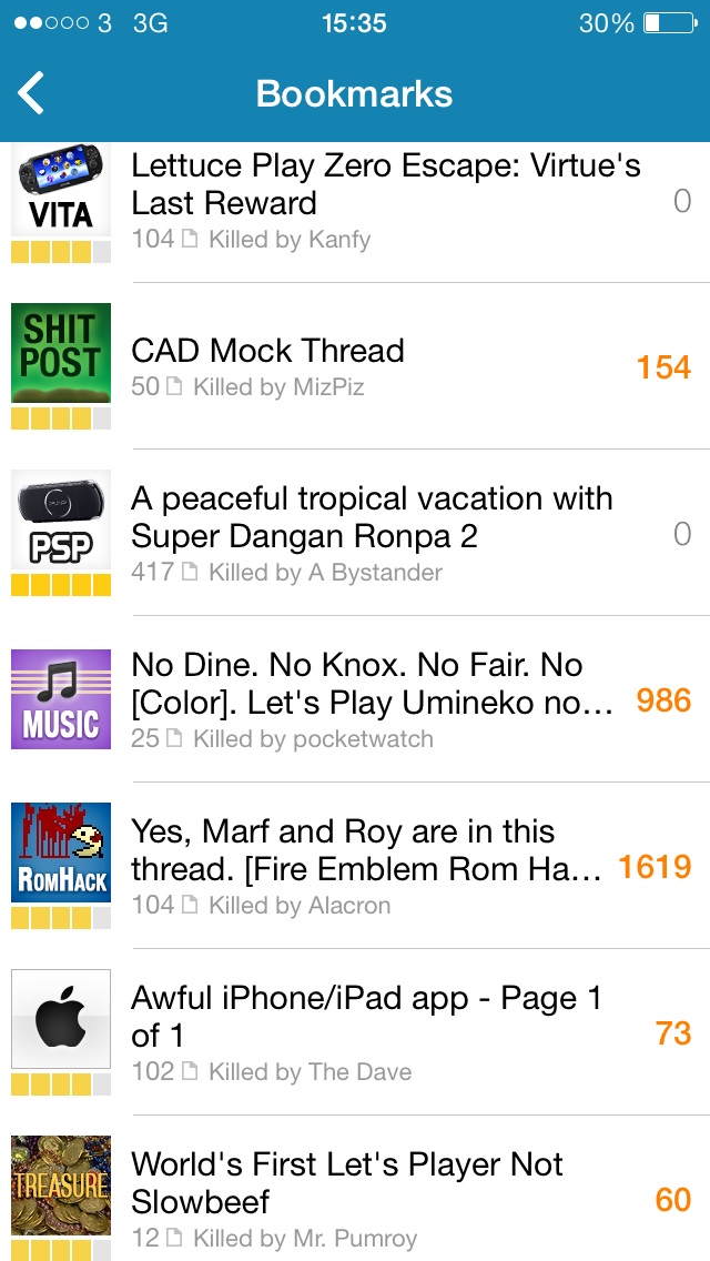 Pay attention to Virtue's Last Reward, Dangan Ronpa 2 and Awful. Now refresh:  They've changed!
|
|
#
?
Dec 20, 2013 12:20
|
|

|
Charge your phone, jeez. I have a bug report that I hope hasn't been said before. The post unread counter for threads seems to be stuck on one even after reading the thread all the way thru.
|
|
#
?
Dec 20, 2013 15:54
|
|
|
Not a bug report, but is there some way I'm missing to shrink the font size of posts?
|
|
#
?
Dec 20, 2013 17:07
|
|

|
Roadie posted:Not a bug report, but is there some way I'm missing to shrink the font size for posts? This build hooks into iOS7's global text size setting. You can access it in your phone settings.
|
|
#
?
Dec 20, 2013 17:08
|
|
|
The Dave posted:This build hooks into iOS7's global text size setting. You can access it in your phone settings. If you feel like changing the font size for everything else on your phone in order to adjust the app font.
|
|
#
?
Dec 20, 2013 17:12
|
|
|
Minor nitpick: on the bookmarks screen, when pulling down to refresh, I think there should be a separator between the top thread and the refresh/progress indicator.
|
|
#
?
Dec 20, 2013 17:14
|
|

|
Snowy posted:If you feel like changing the font size for everything else on your phone in order to adjust the app font. Well, in theory, doesn't that make some sense. If you prefer a font size for reading headlines and body text wouldn't you prefer that to be somewhat uniform across your apps. It doesn't just haphazardly change everything. List items in settings remain the same size if you reduce the size for example. Disclaimer: I totally understand wanting it back into the app itself though and think I prefer that way, I just don't think it's such a crazy idea.
|
|
#
?
Dec 20, 2013 17:16
|
|
|
Axiem posted:Minor nitpick: on the bookmarks screen, when pulling down to refresh, I think there should be a separator between the top thread and the refresh/progress indicator. Yeah I'm going crazy with little nitpicky things like this and trying to find what I think visually looks best. I do agree with the above and have worked that into the templates. I'm having a lot of internal debating now about the best way to handle last post / end of thread / refresh. Having a seen post last throws more of a wrench. TLDR: I agree with you and am currently working on getting the templates to tip top shape.
|
|
#
?
Dec 20, 2013 17:18
|
|
|
The Dave posted:Well, in theory, doesn't that make some sense. If you prefer a font size for reading headlines and body text wouldn't you prefer that to be somewhat uniform across your apps. It doesn't just haphazardly change everything. List items in settings remain the same size if you reduce the size for example. It's not crazy, if apps didn't also have the ability to further modify font size. That is, if the default text size in Notes looks good, and some other app decides to go a bit smaller it puts users in a bind. They can either make the second app look good and Notes look goofy big, or live with the small text. I think Apple's attempts to standardize text sizing is good, but it gets complicated fast as more apps tap into it.
|
|
#
?
Dec 20, 2013 17:22
|
|
|
Hey guys big thanks for the update, and the low low price of nothing, really mega thanks and congratulations. But i have to agree with the previous few pages and say that the app has some things i dont like. The navigation is needlessly buried inside a sidebar menu. I think the swipe back feature is awesome and much needed though. Overall I prefer the old app not because i am a luddite you just kinda nailed the whole experience. Navigation was easy and intuitive, font sizing could be done on the fly and it was far easier to read. Maybe just a reskin and some peripheral features like better in post coding and smilies were needed. Also swap reg date with post date and move the ... back up top right. But really dudes bring back the fundamentals of the bottom bar layout both on the home screen and in threads, the difference just uninstalling the app and redownloading to check i wasnt rose tinting the old app is staggering. You could move through the forums like lightning. Thanks anyway that is just my feedback on the issue and if you stick to your guns i can easily live with it. Bow-street Bastard fucked around with this message at 19:51 on Dec 20, 2013 |
|
#
?
Dec 20, 2013 18:26
|
|

|
The Dave posted:If you prefer a font size for reading headlines and body text wouldn't you prefer that to be somewhat uniform across your apps. Presumably people have already set their phone's font size how they like it, so having to change that to fit one app is a problem. I don't really see font consistency across apps as being something very desirable but maybe that's just me. For text messages I like big bold text but when I'm reading paragraphs that doesn't work as well. Choice is key.
|
|
#
?
Dec 20, 2013 18:40
|
|
|
The Dave posted:Well, in theory, doesn't that make some sense. If you prefer a font size for reading headlines and body text wouldn't you prefer that to be somewhat uniform across your apps. It doesn't just haphazardly change everything. List items in settings remain the same size if you reduce the size for example. Another app that I use handles it like this:  I can pick individually if I switch off the setting. This is the ideal; the default is much too large for Awful, but fine for other apps. Bow-street Bastard posted:But really dudes bring back the fundamentals of the bottom bar layout both on the home screen and in threads, the difference just uninstalling the app and redownloading to check i wasnt rose tinting the old app is staggering. You could move through the forums like lightning. Is it possible to have some kind of swipe to reveal the bottom bar? Even if it only appeared on reaching the end of a thread page that would be a lot more usable.
|
|
#
?
Dec 20, 2013 20:07
|
|


|
To be fair to you dudes now I have re-updated the swipe system is pretty legit and probs just as quick while browsing, I just like the buttons better on the home screen. The icons at the bottom while browsing just need to be streamlined a bit more, and while i can see why avatars and images are toggles due to mobile data it is maybe a 50/50 I leave to you as to whether or not to move them to a settings menu. Basically guys you are still on top. Just add buttons to the home screen and a home screen option like the old version, sort out the text sizing and make it easier to read like the tempates you have posted with some better colours and I will take you out for some lobsters and cognac. Also when I back out of a draft post just do what it did with the old app and keep it there without asking if i want to save or delete, it is kinda jarring and its the work of 1/2 of a second to double tap select all and delete. But seriously move that ... back and scrub the reg date ASAP it is just wasted space otherwise. Edit : I realise my two posts maybe cover the same ground I just use and like your app a lot and wanted to give you honest and hopefully helpful feedback as in all truth I will probably never post here again having said my piece. Plus I get the bug when quoting and deleting or selecting the app just crashes out - up to date iOS 7 on a 4S phone. Bow-street Bastard fucked around with this message at 21:23 on Dec 20, 2013 |
|
#
?
Dec 20, 2013 20:48
|
|
|

|
| # ? Jun 8, 2024 05:43 |
|
|
I went back five pages and found another poster with this issue but couldn't find an actual answer, is there any way to hide the nav bar in portrait mode on an iPad? Swiping doesn't work and the setting to hide it seems to have been removed. Half the screen is the nav bar which is kind of horrible and ridiculous feeling, so I feel like there must be a way to hide it and I just can't figure it out. At least I hope? E: nvm figured it out, if any one else has this problem it's the < > symbol at the top. my bad some kind of bug fucked around with this message at 00:34 on Dec 21, 2013 |
|
#
?
Dec 21, 2013 00:09
|
|