|
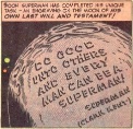
I'm sorry, but Fist of Jesus is so much better than the shitpile known as JC:Vampire Hunter. Jesus doing what he does best...killin' fools. It gets bonus points for realism. Drifter fucked around with this message at 04:32 on Apr 20, 2014 |
 #
?
Apr 20, 2014 04:27
#
?
Apr 20, 2014 04:27
|
|


|

|
| # ? May 25, 2024 14:39 |
|
|
Hakkesshu posted:Should I be reading Bedlam? 'Cause those make me want to read Bedlam. Yes, you should. It's basically "What would happen if the Joker was cured of violent tendencies but not made sane, and he wanted to fight crime?", all told from the perspective of the Joker.
|
|
#
?
Apr 20, 2014 09:21
|
|


|
More art by Grzegorz Rosiński, from The Revenge Of Count Skarbek: 
|
|
#
?
Apr 20, 2014 23:48
|
|


|
Looking back at this thread pre-Jesus posts. Of all the 90's art to pick on, picking on Bachalo's Gen X or Terry Dodson is pretty out there. There's tons of way worse stuff, both in the 90's and today.Irish Joe posted:Fantastic Four Annual #16 This is Steve Ditko art, y'all. No idea why it looks like his only reference work for Kirby characters is Dan DeCarlo and Marie Severin, though. Still makes me sad to see it getting picked on. itskage posted:This must be where Ramos got his inspiration from. I mean, probably? Steve Ditko did create Spider-Man, after all.
|
|
#
?
Apr 21, 2014 01:10
|
|


|
laz0rbeak posted:This is Steve Ditko art, y'all. No idea why it looks like his only reference work for Kirby characters is Dan DeCarlo and Marie Severin, though. Still makes me sad to see it getting picked on. Unfortunately, it's from the period when he deliberately decided to hack out his mainstream comics work so he could devote his time and energy to spreading the gospel of Objectivism to the masses. The fact that he chose to do that is what's really sad.
|
|
#
?
Apr 21, 2014 21:58
|
|
|
Drifter posted:What's the point of editors and poo poo when they let stuff like this into their products? Are they too afraid to go to an artist and say "Hey, uh, hey there, Bob. You know, we're gonna need you to redraw those pictures for us. They suck. Really, really poor quality." The people who publish superhero comics know how discerning their audience is.
|
|
#
?
Apr 21, 2014 23:24
|
|
|
4 years ago there was a Wu Tang collab album, that's pretty good, but nothing amazingly special. Except for the 3 album covers which were drawn by Chris Bachalo. I have the album on vinyl and it's pretty rad, but the coolest part is the inserts of Bachalo's art. Method Man 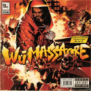 Ghostface Killah  Raekwon 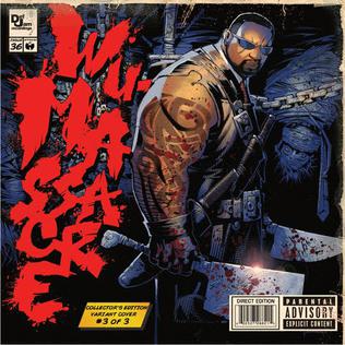
|
|
#
?
Apr 22, 2014 23:57
|
|


|
Fritzler posted:4 years ago there was a Wu Tang collab album, that's pretty good, but nothing amazingly special. Except for the 3 album covers which were drawn by Chris Bachalo. I have the album on vinyl and it's pretty rad, but the coolest part is the inserts of Bachalo's art. Tim Townsend has alot of hi-res Bachalo's cover work that they collaborated on together; here's a 3-step process for the Wu-Tang spread that they did:  For new art, here's cover art for Moon Knight #3 by Declan Shalvey, Deadpool/Winter Soldier/Venom artist: 
|
|
#
?
Apr 23, 2014 04:49
|
|
|
Fritzler posted:Raekwon  
Baron Bifford fucked around with this message at 07:56 on Apr 23, 2014 |
|
#
?
Apr 23, 2014 07:53
|
|

|
Steampunk-era Bachalo had problems, I'll give that, but the first image is pretty clear and that storyarc ruled. Modern Bachalo, starting from his work on Sinister Spider-Man and "Shed", is amazing, he constantly taps into his crazy imagery and composition from Shade: The Changing Man.
|
|
#
?
Apr 23, 2014 08:04
|
|

|
Yeah I can understand some Bachalo complaints depending on the inking but both of those images are clearly a bunch of dudes fighting and jumping on top of each other and are supposed to be a mess of people.
|
|
#
?
Apr 23, 2014 08:25
|
|

|
Follow-up:     
|
|
#
?
Apr 23, 2014 17:28
|
|


|
Jesus H. Who's the artist for Elektra? Whatever they're paying him, it's not enough.
|
|
#
?
Apr 23, 2014 23:28
|
|


|
Superstring posted:Jesus H. Who's the artist for Elektra? Whatever they're paying him, it's not enough. Say what you will about Marvel, but I can't remember the last time there's been this many interesting, unique art styles on their books at once. DC's house style looks so boring in comparison to stuff like Ghost Rider, Elektra, Silver Surfer, Moon knight, etc.
|
|
#
?
Apr 24, 2014 00:19
|
|

|
Superstring posted:Jesus H. Who's the artist for Elektra? Whatever they're paying him, it's not enough. Mike Del Mundo who's covers for Si Spurrier's X-Men Legend were just one of the highlights of that run.
|
|
#
?
Apr 24, 2014 00:35
|
|


|
Criterion Collection frequently hires comic book artists to do covers (and whole packages) for their releases, the latest one is Connor Willumsen with absolutely stunning take on Scanners: 
|
|
#
?
Apr 24, 2014 17:27
|
|
|
Dacap posted:Say what you will about Marvel, but I can't remember the last time there's been this many interesting, unique art styles on their books at once. DC's house style looks so boring in comparison to stuff like Ghost Rider, Elektra, Silver Surfer, Moon knight, etc. I feel DC gets a bad rap but when you look at the stuff Manapul, Foreman, Sorrentino, Cappulo, Jae Lee etc put out it really isn't that bad.
|
|
#
?
Apr 24, 2014 18:04
|
|

|
Madkal posted:I feel DC gets a bad rap but when you look at the stuff Manapul, Foreman, Sorrentino, Cappulo, Jae Lee etc put out it really isn't that bad. They seem less strike about it then in the beginning of Nu52 at least. Maybe they heard enough of the backlash to let their talent breath.
|
|
#
?
Apr 24, 2014 18:07
|
|


|
Madkal posted:I feel DC gets a bad rap but when you look at the stuff Manapul, Foreman, Sorrentino, Cappulo, Jae Lee etc put out it really isn't that bad. There are some really talented artists working for DC, but I feel like it's half-negated by the way that the rest of their books seem to fall into a standard "house style;" if you're working for DC you're either doing something wonderfully idiosyncratic, or you're looking like everyone else, with no in-between. Marvel seems more willing, at present, to let an artist do their thing, even if it's only a little different from what we see from everyone else.
|
|
#
?
Apr 24, 2014 23:42
|
|


|
This is everything I hate about mainstream comic art and the influence the editors can have on the final product. Gabriele Dell'Otto original  And the actual cover  Need to spice up your cover for the magazine racks? Have some intern run the Photoshop smooth tool over it.
|
|
#
?
Apr 25, 2014 00:08
|
|


|
al-azad posted:This is everything I hate about mainstream comic art and the influence the editors can have on the final product. I suspect that may be more of an issue with the physical demands of actual mass paper printing than a conscious choice.
|
|
#
?
Apr 25, 2014 01:06
|
|
|
ryonguy posted:I suspect that may be more of an issue with the physical demands of actual mass paper printing than a conscious choice. The original untouched art was used in Marvel's Previews so *shrugs*
|
|
#
?
Apr 25, 2014 01:09
|
|
|
RevKrule posted:Mike Del Mundo. Thanks for making Google this name and learn about Mike Del Mundo. This guy's stuff is really great.
|
|
#
?
Apr 25, 2014 18:08
|
|

|
DivineCoffeeBinge posted:There are some really talented artists working for DC, but I feel like it's half-negated by the way that the rest of their books seem to fall into a standard "house style;" if you're working for DC you're either doing something wonderfully idiosyncratic, or you're looking like everyone else, with no in-between.
|
|
#
?
Apr 25, 2014 20:40
|
|

|
Aw man, I always hoped Thanos secretly had a cock rock poodle mullet under that headwear he always has on. Disappointed/10
|
|
#
?
Apr 25, 2014 23:33
|
|
|
Standin' on the panels. Artemis: Requiem Ed Benes
|
|
#
?
Apr 29, 2014 16:44
|
|

|
Irish Joe posted:Standin' on the panels. I think it's pretty cool when artists have characters interacting with the panel edges, but I think she's actually got her foot on a wooden chair. Edit: And the outline of her foot extends down into the baseball cap on the panel below? 
|
|
#
?
Apr 29, 2014 16:47
|
|


|
I love that their pupils just disappear in the second-to-last panel. Quality work. Also, love the title. Requiem: Revelations: Revolutions: Reloaded: Legends: Origins: Bloodsport: This Blood's For You.
|
|
#
?
Apr 29, 2014 16:48
|
|

|
prefect posted:I think it's pretty cool when artists have characters interacting with the panel edges, but I think she's actually got her foot on a wooden chair. Holy poo poo, you're right. There's a chair in her panel that's cut off but her foot extends through 3 other panels what the hell? Also the tangents are killing me. At no point is a character not butting up against or overlapping another character. Baseball cap girls' brim is like 1" long.
|
|
#
?
Apr 29, 2014 20:56
|
|
|
A lot of people really love Jae Lee's art so this might be heresy but I really hate it. So have a doofy looking Power Girl he drew from Batman/Superman #9: Also from the same crossover, in World's Finest #21, Superman, what's wrong with your faaaace? 
|
|
#
?
Apr 29, 2014 22:22
|
|

|
There's nothing wrong with his face. That's Mark Hamill, right? The better question is, what's wrong with his rear end? 
|
|
#
?
Apr 30, 2014 02:08
|
|


|
Solomon Grundy dyed his hair, hit the tanning bed and raided Superman's closet.
|
|
#
?
Apr 30, 2014 20:32
|
|
|
Irish Joe posted:Standin' on the panels. I happen to be sitting here at my desk with my legs crossed, so all I can see are those thigh and knee spikes. Guess she always sits like a dude taking up too much room on a bus? (Is it telling, or just bad, that I, as a woman who digs comics, don't even notice the impossibly always-in-motion ponytail, or even the thong surgically imbedded into her coccyx at first glance anymore?)
|
|
#
?
Apr 30, 2014 22:15
|
|


|
TwoPair posted:A lot of people really love Jae Lee's art so this might be heresy but I really hate it. So have a doofy looking Power Girl he drew from Batman/Superman #9: Superman as played by Peter Dinklage. Also yeah that Jae Lee art there is just not doing it for me. But it is certainly not some generic 90's style either so I appreciate that.
|
|
#
?
May 1, 2014 18:20
|
|
|
Looking at so much of this stuff, especially the modern poo poo, so much of really great penciling and subtle, tricky ink and line work is just absolutely ruined by the coloring. I guess overall it's better than the old "poorly registered four color process on newsprint approach" that looks laughably dated at this stage of the game and certainly looked like garbage a lot of the time, but with modern colorists so many of them take it too far and try and pull out every Photoshop trick in the book. I'm not sure what I'm trying to say and maybe am having a hard time expressing it, but so much of the modern coloring approach looks like candy. It's too slick, blended and juicy I guess, for lack of better terminology. Too "hot" and vibrant or something like it would be better suited on a pack of chewing gum or a point of purchase display than adding anything to the art. I look back at the coloring on something like Ronin, for instance, and really miss that earthy, organic feel.
|
|
#
?
May 2, 2014 00:07
|
|
|
BiggerBoat posted:Looking at so much of this stuff, especially the modern poo poo, so much of really great penciling and subtle, tricky ink and line work is just absolutely ruined by the coloring. I guess overall it's better than the old "poorly registered four color process on newsprint approach" that looks laughably dated at this stage of the game and certainly looked like garbage a lot of the time, but with modern colorists so many of them take it too far and try and pull out every Photoshop trick in the book. I think I asked this already in this thread, but never got an answer. Are there some good websites or books that talk about coloring? As an artist, I'm sorta stuck in looking at good vs bad coloring like the old "porn vs art" NEA political debates of the 80's: "I can't define it, but I know it when I see it." I'd really like to learn more from a studied, theoretical standpoint. (BTW, not arguing against you, BiggerBoat; I agree entirely. I just don't know why.)
|
|
#
?
May 2, 2014 00:31
|
|
|
JacquelineDempsey posted:I think I asked this already in this thread, but never got an answer. Are there some good websites or books that talk about coloring? As an artist, I'm sorta stuck in looking at good vs bad coloring like the old "porn vs art" NEA political debates of the 80's: "I can't define it, but I know it when I see it." I'd really like to learn more from a studied, theoretical standpoint. You should follow some current-working colorists on their blogs or deviantarts, they routinely go through their process. Interviews are good too, currently there is no shortage with them because of the "royalties for colorists" talks and ever-rising attention to the craft from big sites. Here is coloring veteran Steve Oliff talking about his work: http://www.comicscomicsmag.com/posts/2009-06-20-steve-oliff-riff.html Usually, the good/bad coloring debate erupts with the publication of some lousy reprint of a classic comic, see the criticism on the awful, awful Incal "remasters": http://joglikescomics.blogspot.com/2009/04/desastre-hurlant-t4-is-man-good.html http://funnybookbabylon.com/2008/10/20/re-coloring-moebius/ or Tom Scioli examining the butchering of Barry-Windsor Smith's Conan: http://comicsalliance.com/whatever-happened-to-barry-windsor-smith-in-the-comics-conversation/ And of course, every reviewer/critic worth a drat should write about color when they write about comics. I love the writing of Sarah Horrocks because of that, she always dives into it: http://mercurialblonde.wordpress.com/2013/10/02/the-labyrinthian-colors-of-brendan-mccarthy-in-freakwave-rogan-josh-and-paradax/ http://mercurialblonde.wordpress.com/2013/07/22/kvlt-and-a-bunch-of-other-words-you-wouldnt-use-to-describe-red-sonja-1/
|
|
#
?
May 2, 2014 01:17
|
|
|
fatherboxx posted:Usually, the good/bad coloring debate erupts with the publication of some lousy reprint of a classic comic Yeah, as a big Sandman fan, that was a big thing that awakened me to coloring's influence, the re-prints of that. Thanks for the tips (and sorry for any derail)!
|
|
#
?
May 2, 2014 04:17
|
|
|
JacquelineDempsey posted:(and sorry for any derail)! Bad coloring is bad art so the derail re-railed itself. ") fatherboxx's links were enlightening but also horrifying. Why would someone 'update' the colouring on Moebius' comics?   Oh hey now that ethereal fairytale-esque alien world looks shiny and new like a scene out of the Star Wars prequels, that's surely what it was crying out for. 
|
|
#
?
May 2, 2014 06:33
|
|
|

|
| # ? May 25, 2024 14:39 |
|
|
I have the original Incal books, and saw the updated edition a few years ago. Holy poo poo, it's really really bad, like, the Technofathers bad. Everything is gradient shiny and weird.
|
|
#
?
May 2, 2014 14:16
|
|