

|
Yeah, they're kinda struggling with that hair.  I don't think I mind it too much, though, not when it's moving, anyway. When it's just sort of sticking up in the air that's a bit weird, but whatever I guess. I don't think I mind it too much, though, not when it's moving, anyway. When it's just sort of sticking up in the air that's a bit weird, but whatever I guess.
|
 #
?
Jun 5, 2014 22:56
#
?
Jun 5, 2014 22:56
|
|


|

|
| # ? Jun 3, 2024 16:42 |
|
|
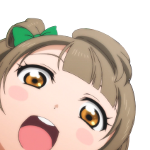
It's really messing with me how colorful it is. Usagi is just so blonde. I'm definitely too used to the dulled down and grainy color of the 90s show and the gray tones of the manga... It looks gorgeous, but it's setting off all sorts of weird sensors in my head. Everything is moving! Don't they know you're only allowed to move the mouths and maybe a hand or two? 
|
|
#
?
Jun 5, 2014 22:58
|
|


|
Actually, yeah, now that you mention it, I definitely think it's as much the colours that are getting to me. I'm pretty sure I like it, but wow, that yellow pops so much it's kind of distracting.
|
|
#
?
Jun 5, 2014 23:01
|
|
|
Does anyone happen to have a list of the essential episodes, I know there was one in the early pages of the thread but the link no longer works.
|
|
#
?
Jun 5, 2014 23:06
|
|

|
Spoilers Below posted:It's really messing with me how colorful it is. Usagi is just so blonde. I'm definitely too used to the dulled down and grainy color of the 90s show and the gray tones of the manga... I think I'm having the same feelings - it looks TOO good to be Sailor Moon. Where's the pops and jumpy still scenes? The style reminds me of that Pretty Cure show somewhat which isn't surprising I guess? Edit: I totally forgot Luna has a new VA, it sounded close enough to her old one. KariOhki fucked around with this message at 23:19 on Jun 5, 2014 |
|
#
?
Jun 5, 2014 23:17
|
|

|
Nostalgia is a powerful thing. I've watched the old episodes and had at least a little of that old feeling I used to have when I watched it as a kid. Of course there's none of that familiarity when I'm watching that clip, but it's amazing how much it's impacted my impression of it. It's good, but I'm just so used to the older episodes I spent more time feeling confused than excited. That said, it does look closer to the manga art, I just hope it's close to the manga writing and manages to get all of those little moments with Sailor Moon acting badass and ready to save the day.
|
|
#
?
Jun 5, 2014 23:35
|
|
|
I dunno, having recently re-watched the first episode of the old anime, I do get a bit of that familiarity-- less in the style and more in the blocking. The first episode always being the same, I think, will help ease into that. At least, I assume it will be the same, but a Sailor Moon that doesn't start with the jewelry shop bit isn't a Sailor Moon I want a part of. 
|
|
#
?
Jun 5, 2014 23:47
|
|
|
The OP is the only thing that doesn't sound quite right to me. I'm too used to the old OP, I guess.
|
|
#
?
Jun 5, 2014 23:56
|
|


|
Violet_Sky posted:The OP is the only thing that doesn't sound quite right to me. I'm too used to the old OP, I guess. The positive thing to look forward to with the OP is that its being composed by Revo of Attack on Titan and Bravely Default fame.
|
|
#
?
Jun 6, 2014 00:45
|
|

|
The thing that bothered me about the trailer, or rather the footage chosen for the trailer, is that Usagi's face was so inexpressive. She's Usagi. She emotes. It seemed as if the animators were so concerned with making her look pretty that they didn't really let her do anything except hang her mouth open to express varying degrees of surprise and shock.
|
|
#
?
Jun 6, 2014 01:05
|
|
|
CherryCat posted:Does anyone happen to have a list of the essential episodes, I know there was one in the early pages of the thread but the link no longer works. Thank god for the wayback machine.
|
|
#
?
Jun 6, 2014 01:10
|
|


|
Ah fantastic, thanks for that ")
|
|
#
?
Jun 6, 2014 01:15
|
|
|
Dove from Above posted:The thing that bothered me about the trailer, or rather the footage chosen for the trailer, is that Usagi's face was so inexpressive. She's Usagi. She emotes. It seemed as if the animators were so concerned with making her look pretty that they didn't really let her do anything except hang her mouth open to express varying degrees of surprise and shock. Thanks for this post. I was trying to figure out what felt so off to me and I was starting to think maybe it was the older/taller looking designs. But no, you're right, it's the lack of expressiveness.
|
|
#
?
Jun 6, 2014 01:53
|
|

|
Looking at the production credits, we're not even dealing with the usual Precure animation team. Only the director and the person in charge of series composition have much Precure experience. On the animation side, one of the art directors has a single Precure credit... for DokiDoki. I wish we had the animation staff from Heartcatch, or even Smile. They pulled off some good faces.
|
|
#
?
Jun 6, 2014 02:09
|
|
|
MagicalDuck posted:Looking at the production credits, we're not even dealing with the usual Precure animation team. Only the director and the person in charge of series composition have much Precure experience. On the animation side, one of the art directors has a single Precure credit... for DokiDoki. I wish we had the animation staff from Heartcatch, or even Smile. They pulled off some good faces. Out of curiosity then, where did the Precure animation team go? They don't seem to be animating PreCure anymore and I had figured that was because they were working on this.
|
|
#
?
Jun 6, 2014 02:12
|
|
|
That style in motion looked really generic and cheap. That hair was awful, but putting that, and the lack of any real animation aside, it just doesn't look good. And that opening is terrible.
|
|
#
?
Jun 6, 2014 02:28
|
|
|
Potsticker posted:Out of curiosity then, where did the Precure animation team go? They don't seem to be animating PreCure anymore and I had figured that was because they were working on this. I don't know, but I think the animation on the current Precure series, Happiness Charge, is pretty good. Hime/Cure Princess is certainly an expressive character (although they're visibly cribbing from Erika/Cure Marine). Smile was definitely a high point in the animation of Precure. The girls' powderpuff transformation sequences are absolutely gorgeous and each one has variations that express the character's personality perfectly. I'd give someone's left nut for the Sailor Guardians' transformation sequences to look that good. (I don't have any nuts of my own.)
|
|
#
?
Jun 6, 2014 03:58
|
|
|
Potsticker posted:Out of curiosity then, where did the Precure animation team go? They don't seem to be animating PreCure anymore and I had figured that was because they were working on this. I noticed that a lot of credit lists include several Precure series, then stop after either Smile or DokiDoki. We've definitely got new animators this year. Toriko seems to be the most common Toei title that pops up among older Precure animators. Heartcatch also had a lot of freelancers, such as Umakoshi and Sushio. Try looking for staff in Mushishi and Kill la Kill.
|
|
#
?
Jun 6, 2014 04:01
|
|
|
The hair and some of the movement is actually the best animated thing in the PV. The faces are basically static and looks like they forgot to make them move. Its pretty weird. There's really no such thing as a "precure animation team". Many of the ADs working on HaCha are still Precure regulars, they just happen to all be the bad ones. The fact that HaCha is as good as it is while looking really awful is probably because of Nagamine's direction style. Heartcatch is what it is because Umakoshi corrects more than the vast majority of ADs and also has a ton of friends to call in. We know 0 of the ADs working on Crystal and the only animator that is confirmed is Shida, so its kind of early to talk about animation staff. The art directors are really good though.
|
|
#
?
Jun 6, 2014 07:19
|
|

|
This might be old news but I came across a few interesting posts on tumblr about the animation style: This one (and its second part is here) picks apart the anatomical mistakes and makes a lot of good points overall. A lot of folks are defending the new show's style on the basis of it being faithful to Naoko's original artwork, but as those posts point out, it is missing a key component: energy. In the second link, she compares it to some of the manga art and man, it really is lifeless in comparison. It just doesn't have any personality to it. Also, some smart person on Twitter made a few quick adjustments to a screencap to show how just a bit of tweaking could improve it (edited version on top, Naoko's art in the middle, original on the bottom):  I really, really wish we had THAT show instead. Usagi looks like a glassy-eyed fish in the new series.
|
|
#
?
Jun 8, 2014 15:28
|
|
|
delirious pancake posted:
While I can't find any argument against what those posts show (especially the corrected version in the picture), I'm not ready to start freaking out too hard about 1 minute of animation from a series that hasn't aired yet. Maybe they'll get it sorted out. v  v v
|
|
#
?
Jun 8, 2014 15:56
|
|

|
Sailor Moon is well known for its strict adherence to proper anatomy, after all. Someone tweeted that image at the director, writer, and character designer for Crystal and that's about when I gave up on the fandom completely. Beyond rude.
|
|
#
?
Jun 8, 2014 16:30
|
|
|
There's always the possibility that some animation will be corrected for DVD releases, since they're probably on a tight schedule for animation? At least that's something that happened with AoT.aers posted:Sailor Moon is well known for its strict adherence to proper anatomy, after all. I don't see why they can't improve where the older show slacked, especially since this is a fan favorite with a lot of anticipation. But yes, the Sailor Moon fandom isn't the classiest.
|
|
#
?
Jun 8, 2014 16:39
|
|

|
aers posted:Someone tweeted that image at the director, writer, and character designer for Crystal and that's about when I gave up on the fandom completely. Beyond rude. Oh, Good. Because starting poo poo with a known hard-rear end like Naoko Takeuchi is a fantastic idea.
|
|
#
?
Jun 8, 2014 16:46
|
|

|
 Mamoru cdesign.
|
|
#
?
Jun 8, 2014 16:59
|
|
|
ConanThe3rd posted:Oh, Good. Because starting poo poo with a known hard-rear end like Naoko Takeuchi is a fantastic idea.  Naoko is seriously hardcore.
|
|
#
?
Jun 8, 2014 17:19
|
|
|
ashweh posted:There's always the possibility that some animation will be corrected for DVD releases, since they're probably on a tight schedule for animation? At least that's something that happened with AoT. That's something that commonly happens nowadays. But I'm not sure if Toei would push for that considering they already have a more lax schedule than most anime.
|
|
#
?
Jun 8, 2014 17:23
|
|
|
aers posted:
Yeah, that's about right.
|
|
#
?
Jun 8, 2014 17:23
|
|
|
boredsatellite posted:
Is the new series gonna follow the manga or Naoko's original vision for the series? I keep hearing she has much tighter control over this than the previous anime series, anyway. Also, is there more of this because that's pretty great.
|
|
#
?
Jun 8, 2014 17:49
|
|
|
Seriously! Are those in any of the new volumes? I don't remember that from the main series at all. Which could mean any of the following: 1)I forgot, because brains are weird. 2)It's just plain not in the new releases. 3)It's from the short story collection(s) that I haven't picked up yet.
|
|
#
?
Jun 8, 2014 18:36
|
|
|
Not gonna lie, I would read Naoko's original Sailor Moon manga. That sounds as cool as poo poo. 
|
|
#
?
Jun 8, 2014 18:42
|
|
|
a cartoon duck posted:Is the new series gonna follow the manga or Naoko's original vision for the series? I keep hearing she has much tighter control over this than the previous anime series, anyway. It'll follow the manga which is pretty drat hardcore in of itself.
|
|
#
?
Jun 8, 2014 18:46
|
|
|
a kitten posted:Seriously! Are those in any of the new volumes? I don't remember that from the main series at all. They are from the re-issued Japanese manga (the 2003 edition) that our new English re-release is based on, but they aren't included in the English release. This one in particular is from volume 3. Naoko drew them as additions while she was touching up the manga for the re-release.
|
|
#
?
Jun 8, 2014 18:47
|
|
|
delirious pancake posted:This might be old news but I came across a few interesting posts on tumblr about the animation style: This one (and its second part is here) picks apart the anatomical mistakes and makes a lot of good points overall. A lot of folks are defending the new show's style on the basis of it being faithful to Naoko's original artwork, but as those posts point out, it is missing a key component: energy. In the second link, she compares it to some of the manga art and man, it really is lifeless in comparison. It just doesn't have any personality to it. Gotta say that the "corrections" at those first two links don't make any sense to me. The author keeps pointing out how the yes are misplaced, but their correction looks worse, and seems to miss the fact that her head is slightly tilted instead of fully-upright, so her eyes are placed just fine in the original and look like poo poo in the correction in the second link. I get not liking the art style, everyone has their taste, but the author's arguments legit make no sense to me. There's nothing "wrong" in the art, just the usual differences in art that come with being an animated and art direction/design for animation. In an ideal world it'd look like a moving version of the manga, but realistically that's not going to happen, and the designs reflect whatever tweeks have to be made to have it actually be animated and released on schedule while looking good. Also, while I loooooove Takeuchi's art, having dead-on accurate anatomy was never a part of her style. Legs are hella long and I won't even get started on the size of heads and eye placement. But, it all looks gorgeous, and that's really what matters, not redlining professional artist's work and saying why it looks "wrong".
|
|
#
?
Jun 8, 2014 20:01
|
|
|
The biggest problem with the trailer is that the character animation is extremely stiff for some reason. Like, abnormally so. The hair and clothes are animated yet there's very little character acting (pretty noticeable in the facial expressions and that scene where she's entering OSA-P). I guess it might make more sense in the context of the episode but the cuts in the trailer look weird.
|
|
#
?
Jun 8, 2014 20:04
|
|
|
delirious pancake posted:
The top image does look better. The head is smaller and more proportional, there's less hair to distract from the character's face, and the mouth being larger and the eyes being brighter make the art express emotion much better.
|
|
#
?
Jun 8, 2014 20:08
|
|

|
The art corrections make sense to be if only because the bottom image looks like a blowup doll.
|
|
#
?
Jun 8, 2014 20:31
|
|
|
Meh, it's still too soon to tell. To me the only weird thing is that Jupiter has pretty much the same height as the other girls.
trucutru fucked around with this message at 21:12 on Jun 8, 2014 |
|
#
?
Jun 8, 2014 21:10
|
|

|
trucutru posted:Meh, it's still too soon to tell. To me the only weird thing is that Jupiter has pretty much the same height as the other girls. But we really havent seen all the girls in one image standing together? Just individually.
|
|
#
?
Jun 8, 2014 21:24
|
|
|

|
| # ? Jun 3, 2024 16:42 |
|
|
RMZXAnarchy posted:But we really havent seen all the girls in one image standing together? Just individually. Pffffft, the image with all of them together I saw was a mash-up. I feel betrayed, betrayed. Still, she better be a head taller than those midgets.
|
|
#
?
Jun 8, 2014 21:51
|
|