


|
Cicadas! posted:Hey, that's really slick. But you're right, the ramp does look off. Not sure what you'd need to do to fix it, though. It needs to be in shadow, not to have a lighter patch on it. Sort of like this, except less of a quick and messy mockup: 
|
 #
?
Dec 4, 2014 00:27
#
?
Dec 4, 2014 00:27
|
|


|

|
| # ? May 12, 2024 13:51 |
|
|
Fuego Fish posted:It needs to be in shadow, not to have a lighter patch on it. The gradient could help, but the top part of the image appears to be higher up, making the ramp face more towards the implied lightsource - If it were straight top down lighting or sloped the other way I'd agree with you, but this way it should be lighter (it just feels a bit strong/steep as is), not in shadows.
|
|
#
?
Dec 4, 2014 01:04
|
|

|
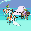
BUGS OF SPRING posted:I've hired an artist to make some pixel art for a game I'm making. I'm so blown away and excited by what he's given me it's hard to offer much critique. So I figured i'd reach out the others. Larger versions are thumbnailed beside it, the game currently defaults to this sort of scale. The stairs' perspective is totally off, I didn't even realize they were stairs until I saw you mentioned "stairs." When you look down at a set of stairs from above, the top one looks smallest and the bottom looks biggest. As far as the ramp, exactly as Fuego Fish said - it's missing shadow and varying light. He needs to look at an actual physical ramp and see what happens to light/shadow as you move around the light source. westborn posted:The gradient could help, but the top part of the image appears to be higher up, making the ramp face more towards the implied lightsource - If it were straight top down lighting or sloped the other way I'd agree with you, but this way it should be lighter (it just feels a bit strong/steep as is), not in shadows. Not exactly - we're looking at grass, which is a non-glossy surface, such as grass. If you look at a ramp like that with the light source coming from the top, you'll still get shadows - from the sides. If you bend a piece of cardboard, the sloping cardboard doesn't get lighter, it's the same color. The shadows are what make it look like a ramp, not the color. jbone fucked around with this message at 01:25 on Dec 4, 2014 |
|
#
?
Dec 4, 2014 01:20
|
|


|
jbone posted:Not exactly - we're looking at grass, which is a non-glossy surface, such as grass. If you look at a ramp like that with the light source coming from the top, you'll still get shadows - from the sides. /Just to make myself even more clear, here's a quick render of a similar setup (diffuse, non-glossy) with the sun at a 25� angle to mimic the lighting I'm seeing in that image (with added contrast on the right to highlight the lighting):  For comparison, here's what it looks like with 0� top down sun. That's just not what I agree the lighting setup of that scene is. Here you get the shadows from the angle and actually some light spilling from the walls. 
westborn fucked around with this message at 02:26 on Dec 4, 2014 |
|
#
?
Dec 4, 2014 01:48
|
|
|
jbone posted:The stairs' perspective is totally off, I didn't even realize they were stairs until I saw you mentioned "stairs." When you look down at a set of stairs from above, the top one looks smallest and the bottom looks biggest.  Looking at some maps from Zelda might give some ideas on how to handle the ramp, for example the SNES one uses the terrain:  The ramp is implied by the walls gradually becoming shorter in height.
|
|
#
?
Dec 4, 2014 01:53
|
|
|
The minish cap one is very similar. Its what I based my stuff on though your artist did it a lot better!
|
|
#
?
Dec 4, 2014 01:58
|
|

New 8-colour PC-9801 sprite! This one's animated:
|
|
|
#
?
Dec 4, 2014 08:40
|
|

|
jbone posted:The stairs' perspective is totally off, I didn't even realize they were stairs until I saw you mentioned "stairs." When you look down at a set of stairs from above, the top one looks smallest and the bottom looks biggest. This is the exact opposite of the way perspective works.
|
|
#
?
Dec 4, 2014 11:09
|
|


|
In any case, perspective isn't all that relevant in this case; it's a perspectiveless projection and shoehorning it in for the stairs just confuses the eye.
|
|
#
?
Dec 4, 2014 11:15
|
|


|
I'm just going to say this, and maybe it's just me, but is anyone else weirded out that that tree looks *AMAZING* and the rest of it looks *pretty good*? That tree- not a single stray pixel, no pillow shading, AA at the right spots, depth layering. Then I look at the rock walls- lots of stray pixels, very noisy, no proper shading compared to the tree, no depth layering whatsoever, no AA whatsoever. Not trying to call shenanigans or anything, but I would tell that artist to do a second pass of those tiles and apply the rules they applied to the tree because dang. mutata posted:This is the exact opposite of the way perspective works. I was thinking the same thing, that comment threw me the heck off. MikeJF posted:In any case, perspective isn't all that relevant in this case; it's a perspectiveless projection and shoehorning it in for the stairs just confuses the eye. True, but Minish Cap uses depth perspective everywhere. Pillars, doors, stairs- everything is angled to get darker and smaller at the bottom.
|
|
#
?
Dec 4, 2014 13:16
|
|

|
the chaos engine posted:True, but Minish Cap uses depth perspective everywhere. Pillars, doors, stairs- everything is angled to get darker and smaller at the bottom. True, but it tends to use it for standalone constructions; as far as I can tell it doesn't use it for landscape elements that merge into others. Then again I'm just glancing at screenshots.
|
|
#
?
Dec 4, 2014 14:28
|
|
|
Wow that's much more response than I expected. I wanna reply to everyone but that would be an huge post, drat. Thanks everyone! I'll pass long to the artist those comments. The stairs need more definition. I like the sample Can of Worms did, thanks. The notes on the ramp shading are great as well. Those who mentioned the Minish Cap are really close. I know the artist is drawing a lot of inspiration from that game. One of the reasons I wen't with him is because he had a lot of fan work from the game in his portfolio, and that's the sort of style I want. the chaos engine posted:I'm just going to say this, and maybe it's just me, but is anyone else weirded out that that tree looks *AMAZING* and the rest of it looks *pretty good*? That tree- not a single stray pixel, no pillow shading, AA at the right spots, depth layering. Then I look at the rock walls- lots of stray pixels, very noisy, no proper shading compared to the tree, no depth layering whatsoever, no AA whatsoever. Oh man I really hope he's not taking me for a ride here. I'm just trusting his work is genuine. Nothing has given me any indication he's ripping off work, but I can agree the tree just looks way better than anything else so far. I hope he's just still fine tuning the other parts to look as good. It's a part time project so we're both working pretty incrementally. Here is a first pass he sent me at some buildings. This is a huge WIP still as the roof isn't textured and he's mentioned he doesn't like the doors and wants to redo them. So I wouldn't bother critiquing it too harshly, but that said any comments are welcome.   I already mentioned the path/stones look really odd. But I imagine they are also still a WIP as he just sent me this as I requested an update over the weekend.
|
|
#
?
Dec 4, 2014 16:48
|
|


|
BUGS OF SPRING posted:
Nah your artist is not ripping anything off, no worries! Someone pointed out to me that the tree references a game called Midora heavily. Which is funny too because that game itself was criticised by people who thought the art ripped off Minish Cap and they had to post comparison pics to show that yes, they were influenced by that style but no, nothing was directly ripped. If all that stuff is WIP I wouldn't worry about it anyway, let your artist finish some assets they're happy with and post again then ")
|
|
#
?
Dec 4, 2014 17:07
|
|
|
Ah good. The art is definitely minish cap/lttp inspired. The game is hopefully going to feel similar to that if all goes well. With my own twists in gameplay of course. I'll refrain from posting much WIP stuff. I just wanted to give him some quality feedback early in the process and wanted a second opinion. Thanks everyone 
|
|
#
?
Dec 4, 2014 17:17
|
|
|
Chipp Zanuff posted:I haven't really been doing much lately, been sort of busy with work commitments and other stuff, but i have tried to go back to the smaller units i created earlier and re-do them and basically make them better: As has been pointed out, you seem to be struggling with arms among other things. If it helps, there is a general rule for proportions of arms that is true most of the time. If your arm is hanging down along your side, the elbow should reach the bottom of the side of the ribcage roughly. Once you have that measurement, your lower arm (elbow to wrist) is about 2/3 the length of your upper arm. Following that your hand is roughly 2/3 the length of your lower arm. So this means that normally the upper arm will always be longer than the lower arm. In your pieces, the lower arm looks to be the same size or even longer than the upper in a few of them which is one of the reasons why it looks really weird. This is especially egregious with your staff holding characters. So I think if you kept that in mind, it would help. Find a measuring system and use it religiously (at least for now). That will help you get a good eye for proportions. Just eyeballing and settling without measuring at this point will cause you to get used to bad proportions and make it even harder for you to spot problems with it in the future. Though your shading is getting better compared to the first go around. Your heads now actually have sides now compared to the original ones which are completely flat. Your designs are also more varied and more interesting compared to the first iteration. So you have made progress for sure, you just need to be more rigorous about your weak areas to get over that plateau as far as anatomy goes. JuniperCake fucked around with this message at 12:53 on Dec 5, 2014 |
|
#
?
Dec 5, 2014 12:27
|
|

I made an avatar for forums user Fluo today in the same style as my previous animation (but with a 16 colour limitation instead):
|
|
|
#
?
Dec 6, 2014 01:19
|
|
|
Now make a pixel homage to Tom of Finland!
|
|
#
?
Dec 6, 2014 04:42
|
|

|
Work!  For a friend's space shooter, which I think was called "space shooter" first. I'm looking forward to seeing it with all the glowy effects on 'em!
|
|
#
?
Dec 6, 2014 11:53
|
|
|
BUGS OF SPRING posted:Here is a first pass he sent me at some buildings. This is a huge WIP still as the roof isn't textured and he's mentioned he doesn't like the doors and wants to redo them. I'd have to say that your artist is doing a pretty bang-up job, even though the roof does bother me a bit. Could use a bit of shading in several spots, but other than that, I like it.
|
|
#
?
Dec 6, 2014 16:34
|
|

|
Did some work on interiors today while taking a break.. Yes I took a break from work today to do...more work!
|
|
#
?
Dec 7, 2014 02:40
|
|
|
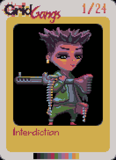
Looking good Shoehead! Hey y'all it's Screenshot Saturday so post up your unmentionables and unfinished pieces! I'm offering up drone sprites for Temporus and a new Grid Ganger. Her nickname is "Interdiction" and she uses her MG to pin down targets so that her partner "Harassment" can paste 'em with a mortar shell. The drone sprites towards the top I realized were too high in shading depth when compared to the player character so I dialed em back as you can see on the lower sets. 
|
|
#
?
Dec 7, 2014 03:19
|
|
|
Today i am working on the entrance to the first dungeon
|
|
#
?
Dec 7, 2014 04:43
|
|


|
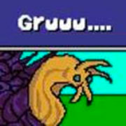
Scut posted:Hey y'all it's Screenshot Saturday so post up your unmentionables and unfinished pieces! I have missed the deadline but hopefully I can get partial credit. This tall, portly fellow lives in briars and typically waits under lantern plants to steal their prey. 
|
|
#
?
Dec 8, 2014 06:26
|
|
|
|
|
#
?
Dec 9, 2014 01:34
|
|
|
First timer to the thread - gif's are cool, aye? Starting to get somewhere with the Christmas update for Jack B. Nimble. Feedback is welcome (and encouraged). Aneurexorcyst fucked around with this message at 09:10 on Dec 10, 2014 |
|
#
?
Dec 10, 2014 09:07
|
|
|
Aneurexorcyst posted:First timer to the thread - gif's are cool, aye? I'm guessing you have to jump over the snow, and use that last bit of ground to jump again? Looks pretty cool.
|
|
#
?
Dec 10, 2014 10:39
|
|

|
Aneurexorcyst posted:First timer to the thread - gif's are cool, aye? What the heck I know you from twitter! Also that's p clever to give a GB palette game a wintery version, nice
|
|
#
?
Dec 10, 2014 11:33
|
|
|
Aneurexorcyst posted:First timer to the thread - gif's are cool, aye?
|
|
#
?
Dec 10, 2014 21:14
|
|
|
Kmlkmljkl posted:I'm guessing you have to jump over the snow, and use that last bit of ground to jump again? the chaos engine posted:What the heck I know you from twitter! Can Of Worms posted:The background seems to blend it too much with the foreground for me, I didn't notice the snow patch the first few times I saw it. Try making the background darker, or make the foreground elements pop out more (thicker outlines?) Thanks for the feedback, everyone - will be sure to check back
|
|
#
?
Dec 11, 2014 07:50
|
|
|
Aneurexorcyst posted:@SeanNoonan in the flesh - which twitter dude are you (I really should pay to change my name on here - been a long time since I posted). I'm @folmerkelly. Also I wouldn't change anything about the colours, if you're going to darken the third one it gets too close to the outline colour. There's a level of "pay close attention" to GB palette games, just gotta roll with it. Also I'm freaking the heck out, I just landed a pixel gig w RGCD / RetroGamerCD. The other artists they're working with are loving Ptoing and IlLke AAAAHHHH high on life and meth fucked around with this message at 13:10 on Dec 11, 2014 |
|
#
?
Dec 11, 2014 13:07
|
|
|
Is it that top-down shooter? I saw some teasers of it and then swooned out of my chair.
|
|
#
?
Dec 11, 2014 14:32
|
|
|
Scut posted:Is it that top-down shooter? I saw some teasers of it and then swooned out of my chair. Nah I'm on another project, I think it's unannounced. I guess I'm the lead artist!
|
|
#
?
Dec 11, 2014 15:45
|
|
|
the chaos engine posted:Nah I'm on another project, I think it's unannounced. I guess I'm the lead artist! W-w-what about Trestle? 
|
|
#
?
Dec 11, 2014 16:18
|
|

|
HiriseSoftware posted:W-w-what about Trestle? Still working on it I promise! Gotta do the contract work to pay the bills to make the games.
|
|
#
?
Dec 11, 2014 16:43
|
|
|
Woah! Well done!
|
|
#
?
Dec 11, 2014 18:03
|
|
|
 Finished this last night during Gaspy Conana's livestream of Dropsy background art. I gotta get multiple monitors so that I can work and watch properly.
|
|
#
?
Dec 11, 2014 18:46
|
|
|
Aneurexorcyst posted:There's only so much I can do sticking with the 4 colour scheme, however I can definitely make the outline colour darker, and maybe slightly raise the brightness value of the 2nd darkest colour. I tried thicker outlines, but they looked super heavy/messy on the iPhone 5 screen (target platform). You may want to consider moving the darker mountain background layer up more, or adding in a secondary layer behind that. The snow tends to blend in with the lighter mountains, otherwise.
|
|
#
?
Dec 12, 2014 01:13
|
|


|
I've not messed with the layer positions too much, but made the lines darker and followed some sprite advice from some people over on TIG. I think it's a lot more readable now.
|
|
#
?
Dec 13, 2014 10:15
|
|
|
Aneurexorcyst posted:I've not messed with the layer positions too much, but made the lines darker and followed some sprite advice from some people over on TIG. I think it's a lot more readable now. I think it's more readable, but I can also see the layer position argument for allowing the darker mountains to create even more contrast. Looks really good though. I've been working on animation recently and jesus christ do I have an incredible amount of respect for all the smooth-looking gifs posted in this thread. This took me like a day and a half and it's still choppy. 
|
|
#
?
Dec 15, 2014 02:22
|
|
|
|
| # ? May 12, 2024 13:51 |
|
|
It looks pretty cool. Two things: You might do well with more frames of even timing. By that I mean fill up the idle part of its animation with lots of gooey jiggly frames. There's nice windup for the attack, and you might still be able to emphasize that by filling in what seems like empty frames. Second thing is having some motion lines for the super fast movement might work out well, too. Check out some King of Fighters attacking animations. http://www.fightersgeneration.com/characters4/vice-a2.html http://www.fightersgeneration.com/characters4/yamazaki-a2.html Check out the Yamazaki still animations (page 1) compared to his attack animations. There's so much pixel by pixel movement in his still animations, but his attacks are so accurate (specifically check on the far right grab on the second row) that only the completely necessary parts of him move while everything else is a blur. It conveys a lot of character that he's so incredibly wild naturally, but his attacks are viciously precise.
|
|
|
#
?
Dec 15, 2014 16:33
|
|