|
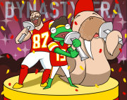
Nostalgia4Butts posted:http://www.foxsports.com/nfl/laces-out/super-bowl-2015-patriots-seahawks-bill-belichick-dont-tread-on-me-shirt-020115 I'm pretty sure this was just some custom stuff for Bill. Nothing else suggests a change, and the Pats just changed to a new wordmark.
|
 #
?
Feb 4, 2015 15:12
#
?
Feb 4, 2015 15:12
|
|


|

|
| # ? May 14, 2024 14:32 |
|
|
How the Patriots don't have more Revolutionary War homages is beyond me. It's like a goldmine of war=sports imagery. The "Join or Die" cartoon/flag by Ben Franklin is relevant. Especially because it actually refers to New England rather than its individual states. Then again, the NFL is lame and not fun at all so what the hell would I expect.
|
|
#
?
Feb 4, 2015 18:28
|
|
Mahoning posted:How the Patriots don't have more Revolutionary War homages is beyond me. It's like a goldmine of war=sports imagery. reportedly (radio) Belichick was wearing it on a T-shirt at the team hotel on sunday.
|
|
|
#
?
Feb 4, 2015 18:39
|
|
|
GaussianCopula posted:reportedly (radio) Belichick was wearing it on a T-shirt at the team hotel on sunday. You sure its not the "Don't Tread on Me" flag like in the story linked on the last page?
|
|
#
?
Feb 4, 2015 18:40
|
|
Mahoning posted:You sure its not the "Don't Tread on Me" flag like in the story linked on the last page? right, brainfart on my side.
|
|
|
#
?
Feb 4, 2015 18:43
|
|
|
No Inflation Without Representation
|
|
#
?
Feb 4, 2015 18:58
|
|
|
The Patriots should go back to their throwbacks, since their current uniforms are pretty terrible.
|
|
#
?
Feb 4, 2015 19:01
|
|

|
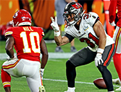
Aniki posted:The Patriots should go back to their throwbacks, since their current uniforms are pretty terrible. The current Pats uniforms are probably in my top 5 around the league. They are absolutely fantastic and I love the move to that metallic grey instead of using the boring as gently caress red, white, and blue that is inexplicably popular in America. The design and cut is perfect and it makes everyone on the team (excluding Wilfork) look like a 90s era comic book hero.
|
|
#
?
Feb 4, 2015 19:10
|
|
|
The jerseys are nice, the logo is awful.
|
|
#
?
Feb 4, 2015 19:18
|
|

|
Kevyn posted:The jerseys are nice, the logo is awful. I will second that. I dislike the new logo. I disliked the old one too.
|
|
#
?
Feb 4, 2015 19:22
|
|
|
Mahoning posted:How the Patriots don't have more Revolutionary War homages is beyond me. It's like a goldmine of war=sports imagery. The Philadelphia Union use this in MLS. It's very nice.
|
|
#
?
Feb 4, 2015 19:25
|
|

|
Chichevache posted:The current Pats uniforms are probably in my top 5 around the league. They are absolutely fantastic and I love the move to that metallic grey instead of using the boring as gently caress red, white, and blue that is inexplicably popular in America. The design and cut is perfect and it makes everyone on the team (excluding Wilfork) look like a 90s era comic book hero. Yeah how boring for a team nicknamed the Patriots to actually use the colors of the country they're patriotic to. 
|
|
#
?
Feb 4, 2015 19:26
|
|
|
Mahoning posted:Yeah how boring for a team nicknamed the Patriots to actually use the colors of the country they're patriotic to.  But for real, red white and blue is a hideous combination and way too many teams use it. Adding the silver and minimizing the red is a great way of keeping the "spirit" (  ) without having to work around three terribly uncomplementary colors. ) without having to work around three terribly uncomplementary colors.
|
|
#
?
Feb 4, 2015 19:35
|
|
|
Chichevache posted:
Look at this commie pinko poo poo
|
|
#
?
Feb 4, 2015 20:02
|
|

|
Gray and Blue is boring. I don't hate the Patriots uniforms but I liked the Red uni's better. They look so good in-game. The current logo is dull but it's not that bad. I like it better than Pat Patriot. Pat Patriot was too complicated and kind of ugly. speaking of gray and blue goddamnit Giants go back to the white pants you retards. At least in tandem with the Blue home colors. You can keep the gray poo poo for away games. Febreeze fucked around with this message at 20:38 on Feb 4, 2015 |
|
#
?
Feb 4, 2015 20:32
|
|
|
Chichevache posted:
Are you color blind or is this another "joke"? Red White and Blue look great together.
|
|
#
?
Feb 4, 2015 21:08
|
|

|
Bring back the red Bills helmets like goddamn
|
|
#
?
Feb 4, 2015 21:09
|
|


|
Chichevache posted:
yes i would much rather have dark blue and the color green previously only seen under a blacklight at a rave
|
|
#
?
Feb 4, 2015 21:10
|
|

|
Febreeze posted:Gray and Blue is boring. I don't hate the Patriots uniforms but I liked the Red uni's better. They look so good in-game. The current logo is dull but it's not that bad. I like it better than Pat Patriot. Pat Patriot was too complicated and kind of ugly. The Giants need to go back to the LT-era uniforms in general. A team named "Giants" should not have a logo made of frilly lowercase letters. And the away jerseys just look wrong.
|
|
#
?
Feb 4, 2015 22:14
|
|
|
Kevyn posted:The Giants need to go back to the LT-era uniforms in general. A team named "Giants" should not have a logo made of frilly lowercase letters. And the away jerseys just look wrong. The LT late 80's era looked great then but I'm not sold on the stripes on the sleeves. They'd look to much like the Bills. They need to put some blue on the away jerseys, though. Also the Bills should go back to the Jim Kelly era bright red helmets.
|
|
#
?
Feb 4, 2015 22:26
|
|
|
Febreeze posted:Also the Bills should go back to the Jim Kelly era bright red helmets. oh god yes, those were great
|
|
#
?
Feb 4, 2015 22:30
|
|


|
Febreeze posted:The LT late 80's era looked great then but I'm not sold on the stripes on the sleeves. They'd look to much like the Bills. They need to put some blue on the away jerseys, though. I just want them to do this as a throwback. They won't wear the reds. It's been 15 years since the switch, that's long enough to bring out an 80s/90s jersey. Or drop back to the 70s even. Also, please bring back the GIANTS on the helmet. I will never not love GIANTS. It's what I grew up with.
|
|
#
?
Feb 5, 2015 00:26
|
|


|
 so good
|
|
#
?
Feb 5, 2015 00:42
|
|
|
Oh sick! That uniform has red in it! And blue! And oh poo poo - is that white tying it all together? Agreed fellas, those are some sharp kits.
|
|
#
?
Feb 5, 2015 00:54
|
|


|
The Bills' unis after those are a good reminder of why deviating from the predictable red/white/blue is not always a good idea. They had some really lovely ones for a while there with the three kinds of blue and poo poo
|
|
#
?
Feb 5, 2015 00:56
|
|
|
Looking back I think I'd take any Bills uniform in history over the Seattle Seahawks look. That loving neon green, blahh. Red/white/blue forever.
|
|
#
?
Feb 5, 2015 00:58
|
|
|
I'm more shocked that the Broncos are still using those 90's as gently caress uniforms and stupid color scheme.
|
|
#
?
Feb 5, 2015 01:01
|
|
|
Smiling Mandrill posted:Are you color blind or is this another "joke"? Red White and Blue look great together. No, they do not. At least not in the garish shades of the old Pats colors. Too bright. They look like one of those post WW2 illustrations where something is "not quite right" about all the people.
|
|
#
?
Feb 5, 2015 01:38
|
|
|
Mahoning posted:I'm more shocked that the Broncos are still using those 90's as gently caress uniforms and stupid color scheme. This, it's so terrible. At least the Vikings ditched theirs a couple years ago because that one was pretty bad as well.
|
|
#
?
Feb 5, 2015 02:02
|
|
|
Raku posted:Looking back I think I'd take any Bills uniform in history over the Seattle Seahawks look. That loving neon green, blahh. Red/white/blue forever. The Seahawks current uniforms are great and way better than anything they had in the decade leading up to it. Go back to the beastquake game uniforms, that poo poo is dull, drab garbage. Though the 90's era silver helmets with sad seahawk were pretty good. The current unis are kind of goofy (I hate the weird green pattern up the leg) but the rest is fine. The green highlights are nice and the uniform is very distinct in a good way. The Bucs are poo poo. Does anyone actually like the new Bucs uniforms? Febreeze fucked around with this message at 02:18 on Feb 5, 2015 |
|
#
?
Feb 5, 2015 02:14
|
|
|
I loving hate the Chargers' current uniforms and want so badly to go back to the Coryell era uniforms or, failing that, the Seau era uniforms.
|
|
#
?
Feb 5, 2015 02:26
|
|
|
Febreeze posted:The Seahawks current uniforms are great and way better than anything they had in the decade leading up to it. Go back to the beastquake game uniforms, that poo poo is dull, drab garbage. Yeah, I loved the previous unis at the time, but looking back those are the most hideous. Just nothing going for them at all.
|
|
#
?
Feb 5, 2015 02:29
|
|
I like the Hawks current uniforms a lot, but I'd like to see a return of silver pants and helmets to go with the dark blue tops; unlike most people I think our grey looks pretty good, but silver would be better. The white tops/grey pants look they wore in SB49 was sharp as hell too. It'd also be nice to see some throwbacks once in a while to the Largent era jerseys, the colors on those were so good and sadhawk is way better than smughawk 
|
|
|
#
?
Feb 5, 2015 02:50
|
|
|
EVGA Longoria posted:Also, please bring back the GIANTS on the helmet. I will never not love GIANTS. It's what I grew up with.  I thought I was the only one and I'm curious what Febreeze thinks. I thought I was the only one and I'm curious what Febreeze thinks.
|
|
#
?
Feb 5, 2015 05:33
|
|


|
I still wish the Lions would go back to the Barry Sanders era look.
|
|
#
?
Feb 5, 2015 05:52
|
|


|
I hated the NY when they first went back to it but it's grown on me, it's a simple sort of square shape and it looks nice. I do think GIANTS looked drat good though. I think they should at least capitalize the NY because I like the two letter look better than the full word, but I hate that it's lowercase when it should be prouder. I don't think GIANTS would look quite as good on the more modern shiny helmets than they did on the darker blue old helmets. The Old helmets were darker blue, and they had white facemasks, the modern ones are shinier and have grey facemasks. If I had to design the things I'd actually really only change the pants to white. Maybe change the facemask back to white. I honestly like our uniforms, plus there isn't much you can change without looking like one of the other teams that use similar colors. I'm also one of the few people who likes the red on white away look, I'm not bothered by the lack of blue and the red on white looks better. As long as they dont bring back the bright red alternate unis. Ugh
|
|
#
?
Feb 5, 2015 06:19
|
|
|
Smiling Mandrill posted:Are you color blind or is this another "joke"? Red White and Blue look great together. Realtalk the Bills went to a Red helmet because their QB was colorblind, and everyone in the AFC East at the time had white helmets. (Pats, Dolphins, Bills, Colts) So because Joe Ferguson was colorblind, we got some sweet as gently caress looking helmets for a while. Also I miss the Oilers uniforms. I hated them so much growing up but it was pretty cool how Warren Moon could rock the baby blue pants.
|
|
#
?
Feb 5, 2015 06:36
|
|
|
As a whole I'd like to see the NFL put the late 90s early 2000s era trend of making everything darker out of its misery. Denver needs to go back to sky blue and a lighter orange. The Eagles need to bring back the kelly green. The Falcons need to rock the red helmet and black jerseys again. The Rams need to bring back the blue and yellow. The Titains need an entire overhaul as do the Bucs, Jags, and Panthers (the one team I would be fine with adding a black helmet). My perfect Browns uniforms would be the Sipe era brown jersey, and orange pants at home and the Kosar era all whites away.
|
|
#
?
Feb 5, 2015 12:47
|
|
|
Smiling Mandrill posted:As a whole I'd like to see the NFL put the late 90s early 2000s era trend of making everything darker out of its misery. Denver needs to go back to sky blue and a lighter orange. The Eagles need to bring back the kelly green. The Falcons need to rock the red helmet and black jerseys again. The Rams need to bring back the blue and yellow. The Titains need an entire overhaul as do the Bucs, Jags, and Panthers (the one team I would be fine with adding a black helmet). My perfect Browns uniforms would be the Sipe era brown jersey, and orange pants at home and the Kosar era all whites away. Yeah, this.
|
|
#
?
Feb 5, 2015 16:37
|
|
|

|
| # ? May 14, 2024 14:32 |
|
|
I'd love an "All Throwback" season, where every team is rocking one throwback for home games and a different one for away. I'd love to see a full season of Big Ben and the Bees.
|
|
#
?
Feb 5, 2015 18:28
|
|