


|
threnody posted:I would totally normally agree with this, but for some reason I really love it cranked when it's architecture. As someone who used to do HDR photography when first starting out, I have to say that HDR shots like those are at best a really boring lovely gimmick, and at worst a crime against humanity.
|
 #
?
Mar 25, 2015 23:25
#
?
Mar 25, 2015 23:25
|
|


|

|
| # ? May 21, 2024 21:23 |
|
|
threnody posted:I would totally normally agree with this, but for some reason I really love it cranked when it's architecture. You love it like a crack junky loves his next hit. e. 
|
|
#
?
Mar 26, 2015 01:20
|
|


|
threnody posted:Un-HDR-'d, I don't think either of these are that remarkable. Composition on the first one is good, but I hate that I had to crop out the very front of the castle because it had all kinds of scaffolding and poo poo all over it. I think composition on the first one is kind of butt, it's just a snapshot with HDR. Absolutely nothing draws the eye. The second one is a marginally better composition but you really need to fix your verticals (on both images). You don't want landmarks to look like they're falling over.
|
|
#
?
Mar 26, 2015 01:53
|
|

|
threnody posted:I would totally normally agree with this, but for some reason I really love it cranked when it's architecture. You can tell these where shot on a Fuji.
|
|
#
?
Mar 26, 2015 06:02
|
|

|
threnody posted:I would totally normally agree with this, but for some reason I really love it cranked when it's architecture. winning submission for the march contest thread lookin' good
|
|
#
?
Mar 26, 2015 21:04
|
|

|
Dread Head posted:You can tell these where shot on a Fuji. 
|
|
#
?
Mar 26, 2015 22:09
|
|
|
Skizzzer posted:
I like the second one, I think the aspect ratio on the first one and the squat, almost skewed look of the flowers don't particularly work for it. I had something written up about how I was concerned with the depth of field, but as I looked more at the photos I realised it has quite an unsettling effect which actually plays into the alien/foreign aspect you've put across, especially in the second, with the flower in focus. The out of focus but not too out of focus effect with the other flowers in the second photo makes them all seem part of the same "whole" (apart from our own understanding.) While the various stages of flowering in view make it seem like the whole entity is still developing, and getting ready, and poised. The warm tone and softness add to the calm effect of something that still manages to come across quite threatening, with the main in focus flower looking just-about-ready to leap. The third image I didn't comment on because I don't feel it works with the first two, and of those the second is far better. It's definitely different from a pretty flower picture, showing them as alien and possible even encroaching. And this is the second photo to get me feeling all Day of the Triffids today. This is my photo. I would like it to be critiqued.  0.00001 by Niamh O'Donovan, on Flickr
|
|
#
?
Mar 27, 2015 04:08
|
|


|
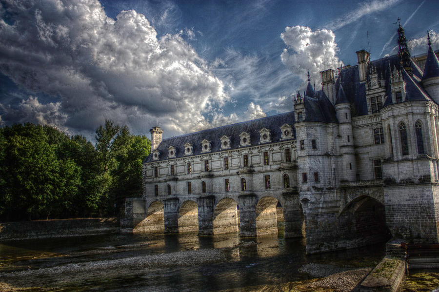
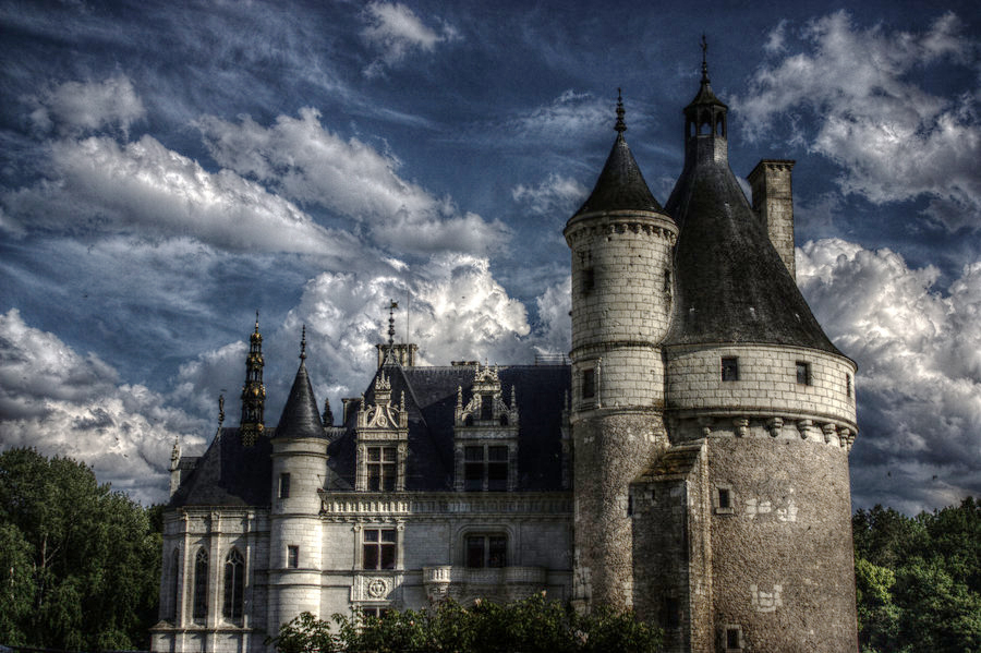
 bask by DepthAfield, on Flickr bask by DepthAfield, on FlickrOut of just over a hundred images from a Timpanogos hike this morning, this is probably the only one not taken by hundreds of tourists. I am not completely content with it but in the back of my mind was the cliff face I had barely a toe-hold on. IIRC it was taken with my Nikkor 85mm 1.4 mounted on D700. All I use are fixed focals, so crawling along a cliff face to get a decent framing is a challenge... that I enjoy mind you. I actually love the HDR on this one. I do however really wish there was more of the base and such of the castle. Framing kind of feels really chopped at the bottom. Feels a little over polarized as well. Still, beautiful effect.
|
|
#
?
Mar 28, 2015 23:53
|
|

|
Mrenda posted:This is my photo. I would like it to be critiqued. Fog Tripper posted:
These are from a roll I shot last September and have been super excited to see the results of. There's more to the series, but I've been thinking about it for so long I need someone else to take a look and tell me if it's idiot piss garbage.   
|
|
#
?
Mar 29, 2015 06:38
|
|

|
big scary monsters posted:It's pretty and the plant in the middle is a nice focal point. Not really keen on the big OOF area dominating the right hand side though, that and the dark rocks at the bottom make it feel a bit unbalanced. Could maybe have used something a little wider. Also, not a criticism but the angle is super disorienting, I think you're looking down over the edge? In regard to the orientation, I am sorely tempted to rotate it clockwise 90�. Really feels alien that way. I'll have to play around with the DOF a bit next time up (conditions permitting, or at least the presence of someone below to acknowledge my corpse). I wanted to isolate the plant along the cliff face and take advantage of the lens' incredible bokeh with the water droplets. Phummus posted:
This is one of those shots where I personally would have been bemoaning a lack of extreme telephoto in my pack. Would have been cool to focus more on a small section of the branches reaching toward the moon. Fog Tripper fucked around with this message at 15:47 on Mar 29, 2015 |
|
#
?
Mar 29, 2015 15:40
|
|

|
Fog Tripper posted:In regard to the orientation, I am sorely tempted to rotate it clockwise 90�. Really feels alien that way. I think the DOF is fine, it's the composition - the large OOF area really attracts the eye but obviously it isn't what you want the viewer looking at. Although now I look at it again after some sleep it doesn't bother me so much any more. 
|
|
#
?
Mar 29, 2015 16:58
|
|
|
The first and third match subject with colour and tone, the second clashes a bit, the scenery is too lush to work with the post apocalyptic palette. Your composition also needs a bit of work. You've got the rule of thirds down, which is good, now start looking towards using triangles, leading lines and other geometric devices to give your images some depth. At the moment my eye isn't drawn across the images at all, it just meanders. After some positive responses in the MF thread I thought I'd post these here.  The Lit Path by TimFPictures, on Flickr The Lit Path by TimFPictures, on Flickr Moving Foward by TimFPictures, on Flickr Moving Foward by TimFPictures, on FlickrBonus "Bored On Sunday Night" photo.  Scanner by TimFPictures, on Flickr Scanner by TimFPictures, on Flickr
|
|
#
?
Mar 30, 2015 06:32
|
|
|
XTimmy posted:The first and third match subject with colour and tone, the second clashes a bit, the scenery is too lush to work with the post apocalyptic palette. Yeah the second might be a bit red, I didn't want to completely lose the colour of the algae on the loch but possibly I ought to either commit to making it a defining point or just let it go and match the palette of the others. I'm a bit surprised by the comment on lacking leading lines and focus, while the images don't necessarily have a single clear subject I'd have thought they are pretty well defined in terms of guiding the eye. Although I've just now realised they all have a somewhat distracting tree on the right frame edge. I'm going back there in a few weeks and want to try some more stuff, not sure what the vegetation will be like at this time of year though. Your first photo is extremely dope, but please spot your negs.
|
|
#
?
Mar 31, 2015 00:07
|
|
|
I'd like to post photos for critique and offer my own observations in this thread. I'm definitely a novice when it comes to serious artistic photography, but I'll try to make some coherent points. And please call me out if I screw up any terminology. Skizzzer posted:Not sure about the editing but for your third shot you can try a longer exposure and lowering your iso. I believe you'd get more detail (aka stars) that way. I know these have been covered for a page already, but I just want to add two things. I actually really like the color palette of the first one, and the soft diagonal lines in the background puts the subject in good relief. But even so, the flowers look a little indistinct. And the wide shape of the orchids combined with the wide framing make them look a little squished. Maybe square up the composition a bit? There's a place where the upper edge of the left main petal on the middle blossom appears to blend into the background, overlapping with a parallel line, and it contributes to the indistinctness. Maybe try from a very slightly different angle, so that the outer lines of the flowers either run perpendicular to a background line or are in good contrast against the color of the background. And it looks like you're going for the same sort of effect in the second one, but it doesn't work as well. The middle string of the blind lines up too closely with the right side of the orchid, and makes it look too busy. I agree with others that there's too little in focus. But overall I like the subtle colors. And here are a few of mine.  20150319-DSC00930 by napping captain, on Flickr 20150319-DSC00930 by napping captain, on FlickrFoggy and diffuse light here. I see that I hosed with the highlights too much, because the version flickr produced has all sorts of artifacts in the white space. They aren't there in the Lightroom version.  20150326-DSC01826 by napping captain, on Flickr 20150326-DSC01826 by napping captain, on Flickr(edit: looks like there was a bit of dust on the lens, in the upper right) I've been trying to shoot in black and white to force myself to concentrate more on subject outlines and basic shapes. That obviously flew out the window here, but is there anything good about this photo at all? I like it, but I can't say why. Maybe I'm just happy that I finally own a camera that can consistently capture this level of detail.  little house-1 by napping captain, on Flickr little house-1 by napping captain, on FlickrGetting closer? If there's a single skill I really want to develop, it's landscape photography, of nature and of urban spaces. One thing I seem to struggle with a lot is that I get engrossed in trying to capture very fine and dense detail in my nature landscapes - colorful patches of foliage, dense patterns and complex lighting all appeal to me when I'm sighting in real life, but the photos I capture of these striking details often come out looking directionless and without subjective focus. I'm also just scratching the surface of post-processing techniques. I started off just messing with the sliders until I got a result I liked, but I'm worried that I'm getting into some bad habits as a result.
|
|
#
?
Mar 31, 2015 04:19
|
|

|
SMERSH Mouth posted:
I really like the soft colors here, especially the blue of the river, but your self-critique is correct that your photos for the most part lack a clear focus. I think what's missing is any sort of line leading the eye further into the frame - what if we were able to see all the way down the river?  Columns by Nick Bremer Korb, on Flickr Columns by Nick Bremer Korb, on Flickr Garage by Nick Bremer Korb, on Flickr Garage by Nick Bremer Korb, on Flickr
|
|
#
?
Apr 1, 2015 02:07
|
|

|
XTimmy posted:After some positive responses in the MF thread I thought I'd post these here. I really enjoy the feeling and tonality of these. They have that filmy color cast to them, and it works for them. They feel very remote and impersonal. Chitin posted:
The first photo here has some interesting geometry and strong shadows. I'm left empty by the second one, however. What were you going for? I've been looking at the shapes of the BQE.  Shapes of the BQE 2 by thetzar, on Flickr  Shapes of the BQE 1 by thetzar, on Flickr  Stop by thetzar, on Flickr
|
|
#
?
Apr 5, 2015 04:35
|
|

|
SMERSH Mouth posted:
In the first photograph, I think the most interesting object is the downed tree and its reflection, maybe use a longer focal length to make that a bigger aspect of the composition? You are right about the highlights being blown- to avoid that, you can use a tripod to bracket your shots then either use HDR or crop and paste the sky. I think you like the second picture because of the sharpness and texture. The texture is good- but to make the picture more interesting, add contrast (a person standing in front of the richly textured foliage, for example.) Otherwise, there's not too much going on in this picture, in my opinion. The third picture is my favorite. The tone is dark- which creates a sense of mystery- we are deep in the woods and that old house in the middle is suspenseful- what is inside of it? Also, the shack is in a patch of lighting surrounded by darker trees and grass, which is a good use of framing. Just got back from a trip to Key west.  Wise Words by kgao1989, on Flickr Wise Words by kgao1989, on FlickrObviously the picture could be sharper, but I thought the quote was an interesting punch line to the picture Which of the following shots of the same scene do you all like more, this one  IMG_7774.jpg by kgao1989, on Flickr IMG_7774.jpg by kgao1989, on Flickror this one?  IMG_7769.jpg by kgao1989, on Flickr IMG_7769.jpg by kgao1989, on Flickr
|
|
#
?
Apr 6, 2015 05:30
|
|
|
lollybo posted:Which of the following shots of the same scene do you all like more, this one I prefer the first one, the lineup of seagulls contrasts well with the poles in the water, they form a better continuity. In the second, the water crashing against the concrete steals my attention from the gulls.
|
|
#
?
Apr 6, 2015 09:15
|
|


|
nielsm posted:I prefer the first one, the lineup of seagulls contrasts well with the poles in the water, they form a better continuity. In the second, the water crashing against the concrete steals my attention from the gulls. Echoing this, the wave came out really pretty, but you end up with a bunch of nothing in the lower right, and you lose the neat composition on the first one. thetzar posted:I've been looking at the shapes of the BQE. Both pictures of the bridge are tilted and it's driving me nuts. I like the first one better, the balance between bridge and city is better, in the second one you have a whole lof of (to me) uninteresting underside and it lacks the lighting in the support pillar which adds a touch of colour. I think you could be onto something with the third one, but as it is I'm not sure what the subject is. There's some interesting geometry with the girders, but the traffic light keeps dragging the eye towards it and the bridge is kinda... there. It may work with just the bridge and the sky (nice diagonal), or just the girders and the light, I feel it has too much going on right now. Edmond Dantes fucked around with this message at 13:37 on Apr 6, 2015 |
|
#
?
Apr 6, 2015 13:25
|
|

|
lollybo posted:Which of the following shots of the same scene do you all like more, this one I think I'm going to go with the flow on this one and lean towards the first. It's cool that the second has a frozen wave and everything, but the first is just so simple and geometric. The repetition of the birds matches thatof the posts behind them in a clear, pleasing way. I dig it. Edmond Dantes posted:Both pictures of the bridge are tilted and it's driving me nuts. With the overpasses, there's a lot of stuff that's just slightly off kilter from each other; I straightened to the trusses instead of the ground. Might not have been the right call, but I'll stick with it. You're right that there might not be a lot of there there. I've just spent years driving along this thing, and always thought there were photos here. I don't think I've really found them yet, though. Yesterday I was bored and played with kneaded rubber erasers.  Untitled by thetzar, on Flickr  Untitled by thetzar, on Flickr  Untitled by thetzar, on Flickr
|
|
#
?
Apr 6, 2015 13:51
|
|
|
thetzar posted:With the overpasses, there's a lot of stuff that's just slightly off kilter from each other; I straightened to the trusses instead of the ground. Might not have been the right call, but I'll stick with it. Fair enough; I notice what you mean on the second picture (the trusses are straight), but on the first one the parking sign pole kept throwing me off. I like the eraser "series". Maybe try a square crop on the second one? While I'm here, does anyone have any critique on the pics I posted last page? They got buried under the HDR discussion. 
|
|
#
?
Apr 6, 2015 14:24
|
|
|
lollybo posted:Which of the following shots of the same scene do you all like more, this one I like the one with the wave better, the one without the wave is a little dull.
|
|
#
?
Apr 6, 2015 23:31
|
|
|
thetzar posted:
I think these came out pretty cool. I actually thought that it was wood until I read the description. The second one could use some tighter cropping I think, I'm also finding the bottom right part of the eraser sort of distracting. It's very bland and boring compared to the rest of the shot, and for some reason it keeps grabbing my eye. Perhaps if it were out of focus it may help. I think that the third one would look better if the light were hitting the eraser from the other side, or even if the eraser was just turned slightly so that some light hit the middle part.  Candlepin by cha_reckoning, on Flickr This one I know is out of focus, I'm hoping there may be a way to save it.  Daisy by cha_reckoning, on Flickr
|
|
#
?
Apr 7, 2015 03:22
|
|

|
thetzar posted:The first photo here has some interesting geometry and strong shadows. I'm left empty by the second one, however. What were you going for? I'm in the experimental stage with black and white, and still a bit enamored by its ability to create strong geometry out of deep shadows and trying to figure out what works and what doesn't. I know there's no real subject, but I was essentially trying to see if the strong geometry created by the hard shadows would carry it. Thank you for the feedback!
|
|
#
?
Apr 7, 2015 17:08
|
|
|
-CHA posted:I think these came out pretty cool. I actually thought that it was wood until I read the description. I really like the bowling alley pick, good drama, solidly "american" i think i would have preferred if it were composed a little differently. maybe if the action was justified over to the left instead, with other lanes filling the rest of the frame here is a shot i got yesterday of a wonderful federalist i know that there is some barrel distortion, but i think it actually enhances the looming effect of the shadow  10407914_10204328465711986_4624854179913872921_n (1) by kidkissinger, on Flickr 10407914_10204328465711986_4624854179913872921_n (1) by kidkissinger, on Flickr
|
|
#
?
Apr 7, 2015 18:56
|
|

|
bencreateddisco posted:i know that there is some barrel distortion, but i think it actually enhances the looming effect of the shadow The shadow is cool, and it does feel like it's looming with the branches stretching out and over the side of the building. I don't like how the railing is barely in the frame. I think it should have been a bigger element of the photo or not at all. I also would like a little bit more room on the left of the shadow, it feels really tight there. Did you mean to post another picture? I only see the one. I don't know what a federalist is so are you referring to the building? lollybo posted:Just got back from a trip to Key west. I know you already have like 3 critiques on these but I wanted to say that I like the second one better. It's dynamic and there's a sense of motion to it, and lots of interesting elements to look at, from the wave to the water to the seawall and the seagulls. The first one is an attempt at a very clean composition, the problem is imo that it's not clean enough. The motorboat is too hard to make out and not needed I think, and there's distracting stuff on the left of the photo. I don't think it was executed well, but I like the idea.  DSCF7850.jpg by badmountain, on Flickr DSCF7850.jpg by badmountain, on Flickr DSCF7872.jpg by badmountain, on Flickr DSCF7872.jpg by badmountain, on Flickr DSCF7935.jpg by badmountain, on Flickr DSCF7935.jpg by badmountain, on Flickr
|
|
#
?
Apr 9, 2015 04:49
|
|

|
I only posted the single photo, and the building falls into the federalist style.
|
|
#
?
Apr 9, 2015 06:44
|
|
|
Skizzzer posted:
What was the aperture and focal length of the lens you used here, if you don't mind my asking? I been struggling to get landscapes with consistent and sharp focus throughout, Ansel Adams - style. I'm looking at it on a smartphone, but the dog seems passably sharp in your photo. That's why I ask. The only thing I can think to critique about the composition is that the truck is fairly small relative to everything else, and the (apparently) huge dog in the foreground with the big mountains in the background leave the truck in the middle seeming like an afterthought or accident. Were you going for a forced perspective effect? Here are two of mine:  Devil's Backbone by napping captain, on Flickr Devil's Backbone by napping captain, on Flickr 20150327-DSC03314 by napping captain, on Flickr 20150327-DSC03314 by napping captain, on Flickr
|
|
#
?
Apr 13, 2015 01:45
|
|
|
SMERSH Mouth posted:What was the aperture and focal length of the lens you used here, if you don't mind my asking? I been struggling to get landscapes with consistent and sharp focus throughout, Ansel Adams - style. I'm looking at it on a smartphone, but the dog seems passably sharp in your photo. That's why I ask.
|
|
#
?
Apr 13, 2015 14:01
|
|


|
SMERSH Mouth posted:
Everything seems to blend together here making it really difficult to discern the depths of the different layers. I want to like it as a "there ain't poo poo here" wilderness photo, but without depth I don't really know what to look at. SMERSH Mouth posted:
I'm poo poo at expressing my feelings well, which is why I like participating here, but I feel like I would like this image more if I could get more context out of it than I am currently able to. There's obviously some construction going on, and that's why the post is blue, presumably, but why is that wall an awesome green behind the metal framing? I guess I just want to be able to look deeper at a photo like this and figure out what's going on, but was unable to. Here's one I took recently that I'm pretty happy with the composition and processing of (in that it feels creepy as poo poo, which was my goal):  Watching by boostphoto, on Flickr And here's an over-saturated-and-overly-sharp one I took of an otter at the aquarium a couple of months ago. I definitely went overboard, but wanted to get a better feel of how taking things too far would turn out. Shot it through glass and had to touch out a bit of reflection flare:  Otter by boostphoto, on Flickr POKEMAN SAM fucked around with this message at 19:23 on Apr 13, 2015 |
|
#
?
Apr 13, 2015 19:21
|
|

|
Claw Massage posted:
Love verything about this photo. Specially the little kid covering up his face. 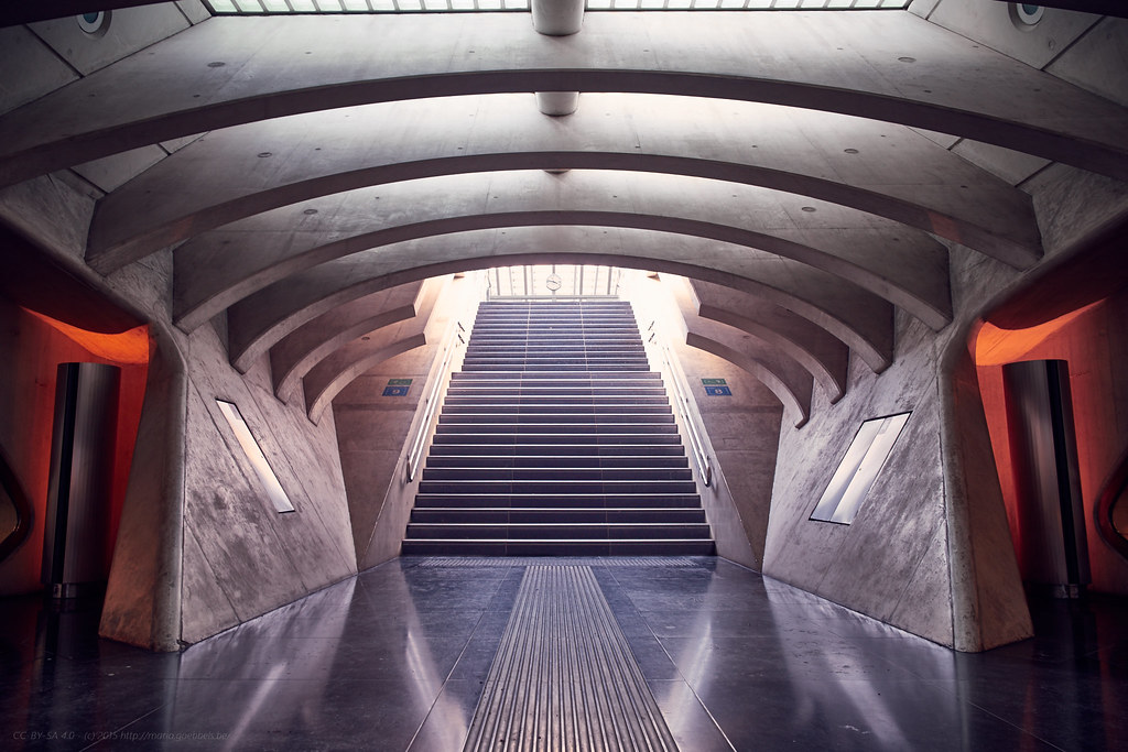 Li�ge Guillemins by cerealbawx, on Flickr Very nice, love simmetrical stuff. It does look a little bit crooked to me, but just a little (the top windows are bigger on the left). Its a minor detail, but otherwise its great.  Manos a la obra by Mijaeus, on Flickr Manos a la obra by Mijaeus, on Flickr Tome asiento by Mijaeus, on Flickr Tome asiento by Mijaeus, on Flickr
|
|
#
?
Apr 13, 2015 20:02
|
|


|
El Laucha posted:
I really like that this photo is a little underexposed to contrast with all the colors, but I feel like the stuff on the table gets a little too camouflaged. Got a few new lenses, and spent more time behind my camera. Hours at work just got cut (which is a good thing!) so I hope I can get out and shoot more often!  Death in obsolescence by alexmthorpe, on Flickr Death in obsolescence by alexmthorpe, on Flickr DOOM4207.jpg by alexmthorpe, on Flickr DOOM4207.jpg by alexmthorpe, on Flickr DOOM3845.jpg by alexmthorpe, on Flickr DOOM3845.jpg by alexmthorpe, on Flickr
|
|
#
?
Apr 13, 2015 22:55
|
|
|
SMERSH Mouth posted:What was the aperture and focal length of the lens you used here, if you don't mind my asking? I been struggling to get landscapes with consistent and sharp focus throughout, Ansel Adams - style. I'm looking at it on a smartphone, but the dog seems passably sharp in your photo. That's why I ask. Details are all on the flickr page, you can just click through. f/16, 18mm on my Fuji X-E1 18-55mm kit lens, and I had the focus on Sandy there. Pretty much an accident, I was shooting something else when I noticed Sandy was doing something interesting beside me, doubt I could replicate it as she's not good at posing :p She's pretty small!
|
|
#
?
Apr 13, 2015 23:01
|
|
|
Thorpe posted:
I like this conceptually, and I think the leading line from the unspooled tape is good, but I can't help but feel it would be stronger if you'd have gotten in a little closer so the cassette was larger in the frame. As it stands it gets a little lost. quote:
Neat silhouette and excellent framing. Think it would have been better with just a tad more depth of field though, I'd like it more if all of the branches were in focus. quote:
Love the clouds and the color, but the composition doesn't do much for me. It's just sort of an empty shot of a tree. Here's a couple recent shots:  _DSC4324.jpg by jxav01, on Flickr _DSC4324.jpg by jxav01, on Flickr _DSC4088.jpg by jxav01, on Flickr _DSC4088.jpg by jxav01, on Flickr
|
|
#
?
Apr 13, 2015 23:15
|
|


|
Baby Babbeh posted:Here's a couple recent shots: The focus on the plant is throwing me. Focus appears to be on the middle of the frond, but even that isn't sharp. Did you hand-hold? Risky at 1/50th. You didn't open the lens up as wide as you could, which says to me you weren't really going for a razor-thin line of focus, and it's not what you got. the rest of the frond is out of focus, but not REALLY out of focus. How dark was it when you shot this? Your iso was cranked way up. The second shot is a bit more interesting. Again, there seems to be some middling, though. It looks like you blew the highlights in the background, but it looks accidental � they're not REALLY blown, as if you wants a white, glowy backdrop. I like that you kept the entire post and wire in focus and crisp, but let the background drop. For some reason the two locks together remind me of love locks on bridges. My brother and I went to the desert for his birthday. Here's the full set. (with deeply inexpert landscapes)  Untitled by thetzar, on Flickr  Untitled by thetzar, on Flickr  Untitled by thetzar, on Flickr Again, there's more here. thetzar fucked around with this message at 02:27 on Apr 15, 2015 |
|
#
?
Apr 14, 2015 04:03
|
|
|
Woah, thanks for pointing out the ISO, not sure how that happened, as I think I shot most of the exposures in that series at about 400. I must have thumbed ISO auto for that shot and it did something weird. I had thought it had an unusual amount of grain when I was working with it in Lightroom, but I didn't notice that the ISO was cranked way up.
|
|
#
?
Apr 14, 2015 18:18
|
|
|
thetzar posted:The focus on the plant is throwing me. Focus appears to be on the middle of the frond, but even that isn't sharp. Did you hand-hold? Risky at 1/50th. You didn't open the lens up as wide as you could, which says to me you weren't really going for a razor-thin line of focus, and it's not what you got. the rest of the frond is out of focus, but not REALLY out of focus. How dark was it when you shot this? Your iso was cranked way up. By far the best, really nailed what you were going for here. The 3rd feels a little forced to me. I enjoyed the colored landscapes in the link, especially https://thetzar.exposure.co/desert-noir#view:wsq4dxf1heg0h83cor5hban0k2aoeihubb94  Gerry by jksonnen, on Flickr Erostratus fucked around with this message at 21:28 on Apr 16, 2015 |
|
#
?
Apr 16, 2015 16:52
|
|
|
Nameless Dread posted:
my critique is that your photograph is too blurry
|
|
#
?
Apr 16, 2015 18:16
|
|
|
RangerScum posted:my critique is that your photograph is too blurry Who gives a gently caress because that's dope as hell
|
|
#
?
Apr 17, 2015 01:30
|
|

|

|
| # ? May 21, 2024 21:23 |
|
|
ansel autisms posted:Who gives a gently caress because that's dope as hell just because you don't shoot charts like i do and actually give a crap about sharpness doesn't mean you need to be an a$$hole
|
|
#
?
Apr 17, 2015 03:09
|
|