|
Pierson posted:Going way back to the very first page: So how was Jaco related to DBZ? I think he's buddies with Bulma's big sister or something.
|
|
|
|

|
| # ? Jun 5, 2024 23:57 |
|
XboxPants posted:I think he's buddies with Bulma's big sister or something. Yup, Tights, who goes on to be a novelist or mangaka.
|
|
|
|
Recently started working at an office with a very loose interpretation of "business casual". So tempted to buy this, but ThinkGeek shirts are often too short for me. http://www.thinkgeek.com/product/1f0d/
|
|
|
|
I want a Pilaf hat.
|
|
|
|
Aurain posted:Are you guys being serious about the animation looking good? Because it just kinda really doesn't. The environmental stuff is pretty good, but the character stuff is atrocious. I like it a lot it's really fluid
|
|
|
|
Aurain posted:Are you guys being serious about the animation looking good? Because it just kinda really doesn't. The environmental stuff is pretty good, but the character stuff is atrocious. I agree. The animation is really cheap and I absolutely hate when cartoons substitute drawing for CG on scenes that would take any effort to draw just to cut down costs. I also hate in the newest media where they've made the lines in SSj hair just a darker shade of yellow. It was more striking with black outer and inner lines, now it doesn't have the same visual impact. Also, their new colorists have a hardon for white highlights and any artist worth his salt can tell you that white highlights work best when they're subtle. These guys just put a giant white streak across a characters face and it looks awful. Honestly, I could go on and on about how disappointed I am in the artwork for the new stuff. But I should just be happy there there is new stuff, so I'll spare you.
|
|
|
|
I like the artwork for the new stuff because it does a good job at making the fights feel big and over the top
|
|
|
|
Esroc posted:I agree. The animation is really cheap and I absolutely hate when cartoons substitute drawing for CG on scenes that would take any effort to draw just to cut down costs. I also hate in the newest media where they've made the lines in SSj hair just a darker shade of yellow. It was more striking with black outer and inner lines, now it doesn't have the same visual impact. Nah, this is actually really interesting. A breakdown of what you think works and doesn't would be really cool, especially in contrast to the current discussions about Toriyama's art in the manga.
|
|
|
|
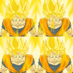
Oh goodie, another excuse to effort post. I don't have my DVD's handy so I'll have to make due with google images. There's a lot I dislike about the new animation, and while some of it stems from the very obvious effort from Toei to push the new media as cheaply as possible, even moreso is the result of animators that are sadly lacking in their knowledge of artistic theories. First and foremost the newest media suffers from a severe absence of contrast. The colors used by the animators are almost pastel in appearance and as a result all blur together visually. The best example of this is, as I touched on earlier, is the Super Saiyan hair. They've substituted the black lines in the hair for either darker yellow or if they use black they use super thin lineweights. Compare below:   This turns the hair into a giant indistinct yellow mass, as seen in the Battle of the Gods screenshot above. As opposed to the bottom, where the hair is thicker, almost highlighted by the black. It is its own object in its own right. It has weight and distinction. I chose these two screenshots to also show the difference in lineweight between the original series and the new media. Battle of Gods has incredibly thin lineweights, causing the colors to overpower the linework. This is fine if your intention is to create a figure that appears delicate and clean. But this is a punchman's anime filled with muscles and testosterone. Thus the thicker black lines in the original series lend themselves to create a harder appearance, and is thus are more visually striking. In association with this is the original series use of contrast in their color versus Battle of Gods. Compare below:   Battle of Gods looks very clean, I'll give it that. But in my opinion the original series trumps it due to their use of contrast. The original series isn't afraid of black and utilizes three or more shades in each color throughout the figure. Whereas Battle of Gods only uses exactly two shades of each color and zero black. The reason for this is, of course, money. Two colors are cheaper. But even acknowledging that, a good artist could still take those colors and create more contrast between them, so the excuse that animators are shackled by how many colors they can use only goes so far. On top of this, as you can see in the BoG SSj3 screenshot, the colorists just love to slap giant white highlights throughout the figure, as seen on Goku's arms and face, where a lighter shade of the surrounding color would have sufficed. As opposed to the original series shot where the white highlights are used very sparingly, usually along the very edge of a shape, which creates a more lifelike stark edge between the highest contrasts and the lowest. The colorists for BoG prefer to mark out large, expansive shapes with their color (due to the fact that they can only use two shades for each) and they use the white to fill in the leftover open spots. As opposed to the original series use of color to sculpt smaller, more detailed shapes creating a more visually distinct image with more depth. The original series use of highly saturated colors and blacks also makes the characters dominate the scenes they appear in. Whereas BoG's use of desaturated pastel-esque colors cause them to almost blend in with the backgrounds. The result of BoG's color and line choices creates characters that appear plastic and weak. They have no weight to them and the various details all blend together. Try looking at each screenshot with your eyes squinted. The BoG screenshots become a mass of color. A giant rainbow bruise. Whereas the original series screens still hold together, you can see exactly where the lightsource resides and the darkest shapes help to keep the figure solid. There isn't much to be said of their use of CG for some scenes. It's a blatant attempt to keep costs down. Animating the aura's and mechanical objects are time consuming and difficult. So in order to save money they instead throw in a CG model that can be created for half the effort and time. Also Goku's CG aura after receiving God Ki is horrible, especially when compared to the similarly red aura of the Kaoiken. The God aura looks subdued, weak. It's too delicate in appearance and not visually striking. Whereas the Kaioken aura frames the character, draws your eye in, and does it all while being visually powerful. Notice that weakness is a recurring theme in the new animation.   On top of all this the actual movement of the characters is also less fluid than the original series. Why? Fewer frames. The less they have to animate, the more money they save. So characters make precise, short movements and spend a lot of time standing still or going from one pose to another very similar pose because its cheaper to animate someone moving slightly to the left as opposed to animating someone dropping down into a crouch, or displaying a flurry of limbs in combat. We will never again see something like Trunks' Burning Attack from his fight with Freeza. Because things like that cost money. The best we'll get is "arms at sides, arms move straight up". Because that's a hell of a lot cheaper. Esroc fucked around with this message at 22:21 on Apr 18, 2015 |
|
|
|
What do you think about the glowing comparison? When old SS3 Goku was animated, especially in that shot, it looks like his hair is actually glowing; the way there's shade and shadows on his front while the spaces where his hair is directly next to it glow a lot brighter. In BotG literally every part of Goku, even his front, looks like he's glowing. He looks like a giant fluorescent light tube, almost.
|
|
|
|
Esroc posted:effort post Despite everything you said, the BoG stuff looks way, way more pleasing to me than the old stuff. Matter of taste, I suppose. I really like the lighter linework, and I think the contrast in colors is far too extreme in a lot of places in the original series. I wouldn't mind losing some of the CG stuff they did but I don't hate it either.
|
|
|
|
Stallion Cabana posted:What do you think about the glowing comparison? When old SS3 Goku was animated, especially in that shot, it looks like his hair is actually glowing; the way there's shade and shadows on his front while the spaces where his hair is directly next to it glow a lot brighter. That is mostly due to the contrast. The hair between the two is similarly shaded, with the original series shot only being more saturated. But the contrast between the hair and the darker body to its right gives it that glowing appearance. The BoG shot as that glowing aspect throughout the entire character because the entire figure is colored with almost the same value of each color, which are already desaturated and light, making it appear washed out. Just throwing in some blacks would give the shot much more depth, and even add to the glow. As it would appear the aura is creating stark shadows as it reflects off his skin and clothes.
|
|
|
|
I figured the God aura being CG was a deliberate stylistic choice. Its 'weird' and doesn't fit in with the other auras in the show, emphasizing its 'otherness'. God ki is apparently incompatible with regular ki, it stands to reason that a god ki aura looks radically different from a regular ki one.
|
|
|
|
jivjov posted:I figured the God aura being CG was a deliberate stylistic choice. Its 'weird' and doesn't fit in with the other auras in the show, emphasizing its 'otherness'. God ki is apparently incompatible with regular ki, it stands to reason that a god ki aura looks radically different from a regular ki one. Certainly. But that doesn't make their choice of digitally rendering it look any less like cheap rear end. Imagine that same "otherworldly" aura but hand drawn instead of digital. It would look a thousand times better in my opinion.
|
|
|
|
Lumberjack Bonanza posted:Despite everything you said, the BoG stuff looks way, way more pleasing to me than the old stuff. Matter of taste, I suppose. I really like the lighter linework, and I think the contrast in colors is far too extreme in a lot of places in the original series. I wouldn't mind losing some of the CG stuff they did but I don't hate it either. The old stuff always looks really over saturated. That plus the dark heavy lining makes it look kind of..blobby for lack of another word. Everything just one big mushed up ball of colorful clay.
|
|
|
|
Esroc posted:Certainly. But that doesn't make their choice of digitally rendering it look any less like cheap rear end. Imagine that same "otherworldly" aura but hand drawn instead of digital. It would look a thousand times better in my opinion. I dunno...the style of the aura being literally completely different from everything else around it (including the character it surrounds) is part of the effect for me. I don't see how it looks cheap; its just different.
|
|
|
|
ZenMasterBullshit posted:The old stuff always looks really over saturated. That plus the dark heavy lining makes it look kind of..blobby for lack of another word. Everything just one big mushed up ball of colorful clay. Yeah, totally. I don't get the accusation that the newer stuff doesn't have enough contrast when really the color work is pretty drat nice. Again, it's probably a matter of tastes, but I actually cringed seeing old Super Vegeta compared to new Super Vegeta. BoG Super Vegeta looks so goddamn cool to me whereas the old one looks like some amateur poo poo.
|
|
|
|
Man, I dislike CG in a completely different way than some of you, apparently. I hate when they use models up close that become very obvious that are 3D models with faces drawn on them, but I don't mind when used for far-off shots to save time and provide a lot of flowing detail, but it's important to note that not everything is appropriate. The old style of animation only exists because there was no real alternative.
|
|
|
|
I like the old stuff and I don't think the new stuff is horrible. However I do think they add way too many highlights on in the new material, making poo poo look like plastic at times and the CGI stuff is just bad all around. I'd be happy if they dropped the CGI stuff but that's not going to happen 
|
|
|
|
Hi Esroc, thanks for your animation effort post! I have some thoughts on the animation as well (I agree and disagree on certain points), but I will follow up with them after this, for this post is the next part of my effort post series. Yay! Toriyama's Art Is loving Great, the series Part 1.1: Required Reading Part 1.2: The importance of clarity Today, I present Part 2: Composition and Flow Composition is basically what makes a picture "look right," or as a smart professional would put it, "composition means the distribution and placement of forms, shapes, colors, and values to produce a unified and harmonious whole." Fritz Henning, Concept and Composition posted:Once the basic size and proportion of the picture are decided, a whole series of decisions must be made. Right at the outset, if you hope to present a realistic picture, you must determine the point of view of the scene. Next you establish the size and scale of the most important elements...Because we live and operate in a three-dimensional world we are prone to see, within the limits of a flat surface, illusionary implications of depth and space. Such illusions are fundamental to creating a believable picture. Scale and size of relationships of elements within the picture, overlapping, and use of values and color are crucial to this process. Let's have a look at some object placement schemes that are generally considered to be good ideas:  (image photographed out of Concept and Composition)  Composition is particularly important to a comic because it doesn't just helps us parse what is happening -- it ensures that we read the scene in the correct order and focus on what is necessary for us to notice in order to understand the story. However, the comic book artist has some unique considerations. He or she does have to make sure the image in a panel has good composition, but he or she must also consider the composition of the entire page, which is made up of several panels stacked together. For everything to work, the artist must also direct the flow of the reader's eye. In this entry I'll be discussing how flow clarifies the sequence of events in a comic and directs the reader to the next important element, but the artist can also deliberately create a certain flow in order to manipulate the reader's perception of the passage of time. That topic, however, will be discussed in part three. With that in mind, let's have a look at some stuff from Dragonball chapter 30.  This panel has some features that you'll see Toriyama use a lot. Notice how the background elements all point you to where you need to go. Objects that touch the border of a painting or panel or that have a tangent line tend to draw attention to themselves (and often slide the eye off the image). This is bad when done unintentionally, but it can be very useful when used correctly. The smoke from the volcano takes you to the horizon line and straight into Roshi. The rolling hills take you from Roshi to the palm tree, and then straight down to Krillin. The sloped roof of the house and its foundation then carry you right off the page in the direction of the panel sequence. A comic book artist also has the advantage of using word balloons -- you can use their tails to literally point at things you want the reader to see. You'll often see that a drawing element doesn't point to a balloon, but the eye will go there anyway to read the dialog, and then the balloon itself will point to the next element. Of note here, you will notice in this panel and several others that Toriyama uses Goku's hair to point to the next element in sequence. In fact his hair can get some slightly different curves just to serve this purpose.  When an object is smack dab in the middle of an image or a composition is symmetrical, all of the elements surrounding the center point are given equal importance and weight. Here in panel one, Roshi's face is clearly the focus and nothing else in the panel particularly matters. Interestingly there are still some background elements, all of which point to Roshi as the central figure, even though Toriyama could have gotten away with not including any background elements at all. In panel two, the curves of Roshi's body (the fact that he's facing left) guide our eyes leftward. In panel 3 I want to draw your attention to the fact that the panel can be split in half without dividing any art. In paintings this is a big no-no because being able to draw a straight line uninterrupted through the important elements of a painting basically means there's a gutter that draws the viewer's eye right out of the painting (bad.) However this is not necessarily a bad thing here, since it takes the eye down in the direction it ought to be traveling in in order to keep reading. You'll notice also that Roshi's back slopes to his speech bubble but his straight front-side also takes the reader down. Goku's speech bubble also points straight down, so you see him as you go down. Also notice how Roshi dominates this panel. He occupies more space both literally and in the sense that he's the dominant character of this scene. In panel four we have more clever use of scenery and Goku's hair. Notice also how Goku's body points to Krillin! Toriyama has basically intentionally created a "gutter" of blank space here to draw your eye to the next element. The palm tree then ensures that the first thing you eye goes over in panel five is Roshi's dialog. Panel five is quite powerful, drawing us straight to Roshi again. He's practically star-shaped here. Panel six has something interesting going on. It essentially has two separate focal points, like two paintings stuck together. What's going on here is that all of this is in the same panel to show Goku and Krillin looking on as Roshi jogs away, but Roshi and the boys have equal importance. Krillin and Goku are grouped because neither is more dominant than the other (thematically speaking). I'll discuss more in my post about the passage of time as communicated by comics, but we're supposed to parse this as Roshi beginning to run as one beat, and then the boys' reaction as another beat. Weirdly enough if these were two separate panels, this would read as a faster, more simultaneous event. Here's an example just to show I'm not making this up:   Now that I've discussed my markup, you can probably see what I'm getting at here without too much commentary. I do want to point how how Toriyama very cleverly uses roads in panel 3 to form gutters to guide the eye. The road that goes toward the sea is visually blocked, whereas the road going off-panel to the left is not. Also note the use of Goku's hair in panel 6 to direct you off-page.   And so on. Note in the last panel where Goku talks to Roshi that the smoke rings prevent there from being a gutter straight down the middle of the page. Characterization + composition. Toriyama's fuckin' awesome.
|
|
|
|
Esroc posted:Battle of Gods looks very clean, I'll give it that. But in my opinion the original series trumps it due to their use of contrast. The original series isn't afraid of black and utilizes three or more shades in each color throughout the figure. Whereas Battle of Gods only uses exactly two shades of each color and zero black. The reason for this is, of course, money. Two colors are cheaper. But even acknowledging that, a good artist could still take those colors and create more contrast between them, so the excuse that animators are shackled by how many colors they can use only goes so far. Now, I'm not exactly an expert in animation, but I'm pretty sure this is bull. Even back when they were doing everything by hand, colours were not expensive to buy or to have somebody fill in. Esroc posted:On top of all this the actual movement of the characters is also less fluid than the original series. Why? Fewer frames. The less they have to animate, the more money they save. So characters make precise, short movements and spend a lot of time standing still or going from one pose to another very similar pose because its cheaper to animate someone moving slightly to the left as opposed to animating someone dropping down into a crouch, or displaying a flurry of limbs in combat. We will never again see something like Trunks' Burning Attack from his fight with Freeza. Because things like that cost money. The best we'll get is "arms at sides, arms move straight up". Because that's a hell of a lot cheaper. This is also bull. There's no way you're gonna convince me the original series was either better animated or better funded. Better artists, maybe, but that totally depends on which studio's work you decide to show.
|
|
|
|
SatansBestBuddy posted:Now, I'm not exactly an expert in animation, but I'm pretty sure this is bull. Even back when they were doing everything by hand, colours were not expensive to buy or to have somebody fill in. He means it's easier to do, therefore faster, therefore cheaper.
|
|
|
|
e X posted:No idea what you are talking about, a Frasier anime would be rad as hell! Well I mean Niles Crane already looks like an anime character so it wouldn't be too far of a stretch
|
|
|
|
Petiso posted:He means it's easier to do, therefore faster, therefore cheaper. Is the price difference between two and three colors really appreciable, though? In time or in money. How many more colors do you have to add for that to be a huge deal, especially considering how easy it is with modern software? It's an especially bad comparison, because the BoG screenshot has more colors than the one from the original series. The main difference is those super thick black lines, which I think look lovely.
|
|
|
|
Addendum: I mentioned tangents above. If you're not familiar with the word as it applies to art (since it's also a mathematical term) you can read up on it here: http://schweizercomics.tumblr.com/post/11966164633/the-schweizer-guide-to-spotting-tangents tl;dr, tangents are usually bad unless being used deliberately. For a real-world example of lovely tangents, well, I'm really at a loss.     
|
|
|
|
With regards to BOG art chat, I'd like to mention that the bit about the harsh lines in the original series' hair really rang false for me. I actually thought the Super Saiyan hair looked way, way better in BoG - the lighter shading and less pronounced outlines made it look way more like something that actually belonged growing out of the back of someone's head. In the original series, especially later on, I always thought the harsh edges and bold outlines made the Super Saiyan hair look way more like metal than actual hair.
|
|
|
|
I think the colors in the new movies are fine - they look cartoony and somewhat plastic but that is a valid design choice. The main issue I have with the animation is that it's pretty choppy in a lot of the fights, revealing a low-ish frame rate. It's better than the animation of the TV show but it's worse than the animation of Avatar: The Last Airbender, for example. Later I'll have to rip some scenes and show a frame-by-frame comparison. I didn't dig the cg flight through the city in BOG but I thought the cg aura effects were fine.
|
|
|
|
One thing I didn't like in BoG was how they portrayed beam attacks. Vegeta's blast against Beerus, for example, looked really flaccid and low effort compared to the anime where he's always had a thing for really stark poses and dramatic camera shots even when they've not been supercharged focal points of the battle, like his Gallick Gun against Frieza. Goku and Beerus's final exchange looked really weak too and one of the places I'd agree the CG really felt like a cheap shortcut, Beerus's Death Ball attack in particular looked insubstantial and undefined compared to Frieza's which had an incredibly distinct presence and visual effect. DBZ has probably leant on them a bit too much as time has gone on but they can still look really good when done well (Goku and Vegeta's original beam clash is still my of my favourite scenes from the whole series!) so it would be cool to see them done justice at some point in this new set of films No Dignity fucked around with this message at 00:09 on Apr 19, 2015 |
|
|
|
Vegeta is a dude in his mid forties at this point, his beam isn't going to be as erect and full of vigor as the ones he was pumping out in his younger days He probably just wants to blast one that's good enough and take a nap afterwards
|
|
|
|
Xibanya posted:Toriyama's fuckin' awesome. Obviously I don't have the same eye for these things as you - even with your assistance, reading the "Flow" still kind of escapes me - but comparing panel composition and clarity of forms has proven pretty interesting.
|
|
|
|
Bad Seafood posted:After reading this and your other post, I ended up cracking open a couple of my own series to see how well they measured up. Let me know what specifically isn't clear and I'd be more than happy to elaborate! Right now I'm actually reading through my old Shonen Jump collection to see if I can find a "bad" or mediocre example to use for compare/contrast. Suggestions are also welcome. Xibanya fucked around with this message at 00:27 on Apr 19, 2015 |
|
|
|
You were plenty clear, it's more just a the way I read comics (which itself is a remnant of how I learned to read as a kid). Rather than allowing my eyes to trace individual objects within a panel, I tend to view the panel itself as one giant block of information to take in all at once. The flipside of this though is that it's given me an easier read on composition.
|
|
|
|
Parrotine posted:Vegeta is a dude in his mid forties at this point, his beam isn't going to be as erect and full of vigor as the ones he was pumping out in his younger days Except in Saiyan years he's like 30.
|
|
|
|
Bad Seafood posted:You were plenty clear, it's more just a the way I read comics (which itself is a remnant of how I learned to read as a kid). Rather than allowing my eyes to trace individual objects within a panel, I tend to view the panel itself as one giant block of information to take in all at once. Well, nobody consciously follows the lines I drew, "flow" is sort of a thing that you only notice when it's missing - like you look at a page of a comic book and it's almost like your brain is rejecting it, going "the gently caress is goin' on here?!" A page where you feel like you have to really pay attention just to figure out what's actually going on. I remember I had a comic book where I only realized on a third reading that there were a few speech bubbles I missed because they were poorly placed on a cluttered page. I do agree though that actually puzzling it out can seem unintuitive at times. I actually took a shortcut for the sake of clarity! If I were really showing the flow of the eye on the page, I would have zig-zagged up and down the word balloons! But that would have made the page so cluttered that people would start skimming instead of actually following - exactly what happens in a cluttered poorly conceived comics page. Scott McCloud writes that every comic book artist has to wrestle with balancing clarity with intensity. This chapter doesn't feature much intensity, so I'll have to highlight some of his fight scenes later - but in general Toriyama leans very very heavily on the clarity side of things.
|
|
|
|
An expanded universe would be pretty great for DBZ. There's a lot of stories that can be told in that setting that don't involve Goku and Friends. Maybe even something involving a timejump like what Dragon Ball Online does. Some new adventures of a crew of young kids; some saiyan, some human, and a few wacky offbeat characters.
-Fish- fucked around with this message at 02:06 on Apr 19, 2015 |
|
|
|
-Fish- posted:An expanded universe would be pretty great for DBZ. There's a lot of stories that can be told in that setting that don't involve Goku and Friends. Maybe even something involving a timejump like what Dragon Ball Online does. Some new adventures of a crew of young kids; some saiyan, some human, and a few wacky offbeat characters. Except that they've gone out of their way to establish that Saiyan blood becomes diluted through the generations. Which is a shame, because as you've said it would've opened up a lot of possibilities for future media. Of course they can always just ignore/retcon that little detail. Every other media franchise does that when it suits them.
|
|
|
|
Esroc posted:Except that they've gone out of their way to establish that Saiyan blood becomes diluted through the generations. Which is a shame, because as you've said it would've opened up a lot of possibilities for future media. Of course they can always just ignore/retcon that little detail. Every other media franchise does that when it suits them. They could fix that by just establishing that more baby Saiyans like Goku were off planet when Planet Vegeta was destroyed. All they'd have to do is say it turns out Raditz, Nappa, and Vegeta were wrong about them and Goku being the last Saiyans.
|
|
|
|
There's a crapload of nameless saiyans in the first Broly movie but I think they all died by the end of it.
|
|
|
|
Xibanya posted:Well, nobody consciously follows the lines I drew, "flow" is sort of a thing that you only notice when it's missing - like you look at a page of a comic book and it's almost like your brain is rejecting it, going "the gently caress is goin' on here?!" A page where you feel like you have to really pay attention just to figure out what's actually going on. Probably didn't help I was comparing Toriyama's crisp and simple style with some comparably more elaborate artists. Looking forward to the rest of your effort posts.
|
|
|
|
|
| # ? Jun 5, 2024 23:57 |
|
Yes that is what Dragonball needs, more saiyans.
|
|
|


