|
Maybe now I should repost my poll
|
 #
?
May 21, 2015 21:25
#
?
May 21, 2015 21:25
|
|


|

|
| # ? May 17, 2024 15:23 |
|
|
wandler20 posted:I'm bored so I did my own rankings. Indy is weird because their logo and uniforms are so bland but I can't think of any changes that would work.
|
|
#
?
May 22, 2015 04:59
|
|

|
JRizzle posted:Maybe now I should repost my poll Ranking all of them at once was too difficult. You should see if you can set up some head-to-head thing, like Facemash.
|
|
#
?
May 22, 2015 05:07
|
|
|
Keith Atherton posted:Indy is weird because their logo and uniforms are so bland but I can't think of any changes that would work.
|
|
#
?
May 22, 2015 05:18
|
|


|
Keith Atherton posted:Indy is weird because their logo and uniforms are so bland but I can't think of any changes that would work. 
|
|
#
?
May 22, 2015 05:52
|
|


|
I may be an old codger but that stuff works in college football but I don't want it in the NFL. The Seahawks, Buccaneers, and Jaguars all had major redesigns to their logos and uniforms in the last few years and the Seahawks redesign is the only one that was an improvement.
|
|
#
?
May 22, 2015 06:50
|
|
|
the Seahawks change was a lot more than a few years ago
|
|
#
?
May 22, 2015 06:56
|
|

|
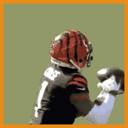
The colts helmet was done as a request for an April Fools joke. I think the colts uni is classy. However close you can keep it close to what John Unitas wore the better off you are.
|
|
#
?
May 22, 2015 07:02
|
|
|
Darth Brooks posted:The colts helmet was done as a request for an April Fools joke. I think the colts uni is classy. However close you can keep it close to what John Unitas wore the better off you are. indeed put them back in baltimore then ravens back in clevenland and the browns can go to indy
|
|
#
?
May 22, 2015 07:06
|
|

Ross Angeles posted:the Seahawks change was a lot more than a few years ago what. it was 2012 like the thread title. if you mean the unis before that those were the same from 1974 to 2012 and they were awesome. there was nothing in between
|
|
|
#
?
May 22, 2015 07:13
|
|
|
wheez the roux posted:what. it was 2012 like the thread title. if you mean the unis before that those were the same from 1974 to 2012 and they were awesome. there was nothing in between the ones before these new ones were ZZZZZZZZZZZZZZZZZZZZZZZZZZZZZZ city
|
|
#
?
May 22, 2015 13:44
|
|
|
Love the seahawks unis. Those were brilliant work by Nike. The Bucs and Jags however, p awful. Maybe they just hate the state of Florida or something up there at Nike HQ.
|
|
#
?
May 22, 2015 17:20
|
|

|
The Notorious ZSB posted:Love the seahawks unis. Those were brilliant work by Nike. The Bucs and Jags however, p awful. Maybe they just hate the state of Florida or something up there at Nike HQ. The only commonly complained about downside for the Jags is their helmets. Everyone else seems to love the uniforms themselves. Myself? I like the helmets. They grew on me. The "logic" behind the black in front and gold in back is weak and oft mocked in these parts, but personally I'm not bothered by that.
|
|
#
?
May 23, 2015 04:17
|
|
|
Chichevache posted:Myself? I like the helmets. They grew on me. You should get that checked out, if you let that opinion fester you'll go terminal
|
|
#
?
May 23, 2015 04:48
|
|

|
the best thing about the jags uni is the crest thing and more teams should have one
|
|
#
?
May 23, 2015 04:50
|
|

|
I don't dislike the reason or whatever, I don't know what it is, I think the Jaguars helmets look like trash, very much big time
|
|
#
?
May 23, 2015 04:52
|
|
|
Uni Watch is correct. The Lions uniforms used to be good. This is Matt Millen's fault.
|
|
#
?
May 23, 2015 05:31
|
|


|
Febreeze posted:You should get that checked out, if you let that opinion fester you'll go terminal I think they should take the Jag off the side and find some kind of Rams/Eagles style heraldric poo poo or whatever down the center. Go all out with the medieval styling.
|
|
#
?
May 23, 2015 05:33
|
|
|
Uni Watch Guy has some dumb and bad opinions imo
|
|
#
?
May 23, 2015 20:24
|
|

|
I agree with him most of the time, especially about ~95% of black alternates and monochrome pant/jersey combinations being total garbage.
|
|
#
?
May 23, 2015 20:36
|
|
|
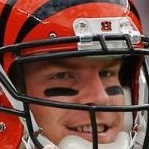
gently caress him, go Bengals. Uniforms aren't a fashion statement. They're meant to be iconic. The Bengals jerseys succeed at that way better than generic dark blue primary #6.
|
|
#
?
May 23, 2015 23:54
|
|
|
Neodoomium posted:Uni Watch is correct. The Lions uniforms used to be good. This is Matt Millen's fault. I like the color for the logo but for absolutely nothing else.
|
|
#
?
May 24, 2015 02:37
|
|

|
computer parts posted:I like the color for the logo but for absolutely nothing else. I thought it was a good decision to update the logo as well, but you can take the black piping and goofy lettering and numerals and get the gently caress out of here.
|
|
#
?
May 24, 2015 06:12
|
|
|
if the Jaguars had solid gold helmets and accents that played off the Aqua, black, and white, they'd have some of the best unis in the league. also, I'm a big fan of matching jerseys and pants, but with off colored helmets (like the Jets, all brown/white Browns, or Also, I'm a Patriots fan and their uniforms loving suck a fat dick. I would prefer, aesthetically, to wear the jersey of any other team in the division. Wow. I truly feel liberated sharing this with the rest of you all. Thank you fellow members of U.A.for listening.
|
|
#
?
May 24, 2015 10:49
|
|
|
Eifert Posting posted:gently caress him, go Bengals. This. The Bengals jerseys are awful to wear and are in no way "classic" but they work as cool football uniforms. That said, I like the old, classic, ones a lot better.
|
|
#
?
May 24, 2015 12:41
|
|
|
the Bengals would look a lot better if they got rid of the dumb white vertical armpit stripe thing <<<<<< another design choice where I and Uni Watch guy are kindred spirits.
|
|
#
?
May 24, 2015 19:09
|
|
|
I wish the Bengals made the alternate orange jerseys their main home jerseys and did literally anything else for their aways
|
|
#
?
May 24, 2015 20:25
|
|
|
Almost anything would be better than their current uniforms but the Bengals should return to the 1981 uniforms with the exception of removing the awful tiger stripe pattern from the orange lines on the pants and the jersey.
|
|
#
?
May 24, 2015 21:05
|
|

|
Stripes on the Bengals helmet are cool, stripes anywhere else on the jersey are poo poo
|
|
#
?
May 24, 2015 21:24
|
|
|
As long as they never change the helmets the bengals can do whatever. But never touch those helmets they are glorious.
|
|
#
?
May 24, 2015 21:30
|
|
|
Cincy should make their unis a mirror of the browns again
|
|
#
?
May 24, 2015 21:30
|
|
|
I like the Jets unis most of all in the league. They're so loving simple but look so good.
|
|
#
?
May 25, 2015 02:32
|
|

|
BlindSite posted:I like the Jets unis most of all in the league. They're so loving simple but look so good. I really like the Jets but really don't care for the Colts. Weird.
|
|
#
?
May 25, 2015 02:35
|
|


|
the jets are pretty good. Classic color scheme, not too busy, not too simple. the logo looks kind of dumb though, if they did a color swap on the old green helmet it'd be a solid setup.
|
|
#
?
May 25, 2015 02:40
|
|

|
nerve posted:I really like the Jets but really don't care for the Colts. Weird. Same. Maybe it is because half the league uses a similar shade of blue to the Colts while green is pretty rare?
|
|
#
?
May 25, 2015 03:01
|
|
|
Just gonna leave this here and backflip out of the thread.
|
|
#
?
May 25, 2015 09:03
|
|


|
warcrimes posted:Just gonna leave this here and backflip out of the thread. classic so inevitably it'll be on the NIKE COMBAT FUCKNUT PRO FUTUREBALL INNOVATION chopping block
|
|
#
?
May 25, 2015 18:54
|
|
|
Yea, it's hard to beat the Raiders jerseys straight up. The colors, the iconic logo, they kick rear end. They deserve better...
|
|
#
?
May 25, 2015 19:14
|
|

|
Shath Hole posted:Yea, it's hard to beat the Raiders jerseys straight up. The colors, the iconic logo, they kick rear end. They deserve better... They had their time and now deserve everything they get
|
|
#
?
May 25, 2015 19:22
|
|
|

|
| # ? May 17, 2024 15:23 |
|
|
Tell me what that jersey meant to an 8 year old SA2K.
|
|
#
?
May 25, 2015 19:27
|
|