


|
The benthic zone of a water body is the lowest part of the water body and had the least amount of light, dissolved oxygen and nutrients.
|
 #
?
Feb 10, 2017 19:24
#
?
Feb 10, 2017 19:24
|
|

|

|
| # ? Jun 6, 2024 05:58 |
|
|
HUNDU THE BEAST GOD posted:TY. First time I'm seeing that one. 99% sure the first time I saw it I thought it was a typo, too.
|
|
#
?
Feb 10, 2017 19:27
|
|


|
I've seen the less used term "bathos" too, and didn't put two and two together.
|
|
#
?
Feb 10, 2017 19:32
|
|

|
Don't get me wrong, this poster is still laughable, but I gotta think that putting one of the faceless, emotionless Power Rangers in the position of "hero looking up at the stars full of emotion/wonder/worry/whatever" is purposeful.
|
|
#
?
Feb 10, 2017 20:23
|
|


|
DC Murderverse posted:Don't get me wrong, this poster is still laughable, but I gotta think that putting one of the faceless, emotionless Power Rangers in the position of "hero looking up at the stars full of emotion/wonder/worry/whatever" is purposeful. Yeah that is pretty funny.
|
|
#
?
Feb 10, 2017 20:30
|
|
|
The new costumes and the lips are giving me serious "I can put my arm back on, you can't" vibes. https://www.youtube.com/watch?v=hp3GHAJNjmA
|
|
#
?
Feb 10, 2017 20:46
|
|


|
The cover of Mondo's Ghost in the Shell steelbook coming out in March, based on a poster they made in 2014. Not bad, really. I've heard some iffy things about the 25th Anniversary Blu-Ray release, particularly the subtitles, so if this release fixes that, I'll probably pick it up.
|
|
#
?
Feb 10, 2017 20:47
|
|

|
tiny head
|
|
#
?
Feb 10, 2017 20:51
|
|

|
That's anime for you.
|
|
#
?
Feb 10, 2017 21:12
|
|


|
Guy Goodbody posted:tiny head
|
|
#
?
Feb 10, 2017 21:25
|
|


|
"Seeing what's coming" is kind of a staple of noir anyway. So I can't fault BRICK for that. It's always about bad women, double crosses, and people making bad decisions.
|
|
#
?
Feb 10, 2017 21:33
|
|
|
Yeah noir is all about fatalism. Bad things happen even if you see them from a mile away and try to stop them.
|
|
#
?
Feb 10, 2017 22:18
|
|

|
You guys are harsh so I thought this was a good place to show off this Blade Runner poster I've been working on. I cribbed the title design from an old poster, haven't decided what I wanna do with it yet.
|
|
#
?
Feb 10, 2017 23:27
|
|


|
Never saw the movie but I like everything except for double ford.
|
|
#
?
Feb 10, 2017 23:34
|
|
|
I could stand a triple-Ford.
|
|
#
?
Feb 10, 2017 23:49
|
|
|
Just keep Fording me, I'll tell you when to stop.
|
|
#
?
Feb 11, 2017 00:34
|
|


|
Mr. Squishy posted:I could stand a triple-Ford. So just add Han Solo and Indiana Jones to the picture?
|
|
#
?
Feb 11, 2017 00:39
|
|

|
ravenkult posted:You guys are harsh so I thought this was a good place to show off this Blade Runner poster I've been working on. I cribbed the title design from an old poster, haven't decided what I wanna do with it yet. The inclusion of the chess pattern, and the layers of detail you've got going on in the upper left look really good. It captures the film's dreamlike atmosphere without being too cluttered. The font just isn't doing it for me, though. Makes it look like Watchmen. It doesn't mesh well with the translucent look of the poster, either.
|
|
#
?
Feb 11, 2017 00:44
|
|
|
He's not a replicant dammit.
|
|
#
?
Feb 11, 2017 01:25
|
|

|
I don't particularly care for the typeset. I also think the text may be too brightly colored. What if you made it paler, to match the yellow of the half-halo? Alternatively, you could leave the text as it is and try upping the saturation of the rest of the poster. Edit: here's a very rough example of what I meant. 
Schwarzwald fucked around with this message at 01:54 on Feb 11, 2017 |
|
#
?
Feb 11, 2017 01:47
|
|

|
kiimo posted:He's not a replicant dammit. Explain the drat unicorn
|
|
#
?
Feb 11, 2017 02:00
|
|
|
He doesn't actually go to mars in total recall.
|
|
#
?
Feb 11, 2017 02:01
|
|
|
ravenkult posted:You guys are harsh so I thought this was a good place to show off this Blade Runner poster I've been working on. I cribbed the title design from an old poster, haven't decided what I wanna do with it yet. Schwarzwald posted:I don't particularly care for the typeset. I also think the text may be too brightly colored. What if you made it paler, to match the yellow of the half-halo? Alternatively, you could leave the text as it is and try upping the saturation of the rest of the poster.
|
|
#
?
Feb 11, 2017 02:03
|
|

|
Palpek posted:...and thick neck. Also the perspective of the body and head don't match. They always gently caress something up. Oshii Kusanagi is fairly androgynous. That version has always had some big shoulders and thick neck.
|
|
#
?
Feb 11, 2017 02:18
|
|

|
    
|
|
#
?
Feb 11, 2017 02:47
|
|
|
Good things come on horses
|
|
#
?
Feb 11, 2017 02:51
|
|
|
I really, genuinely like this. It's terrible. It's goofy. It goes all in on the Imaginext/Fisher Price aesthetic.
|
|
#
?
Feb 11, 2017 03:12
|
|
|
Kiki has better lips than the power rangers
|
|
#
?
Feb 11, 2017 03:23
|
|
|
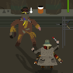
Why do none of the Zords have eyes?
|
|
#
?
Feb 11, 2017 04:17
|
|
|
their suits also look super different and far less busy (and frankly, more like they do in the tv show) here. Do you think this is some "final form" for them, or merely a simplification so they'll love better as small figures on the poster? Because I much prefer these designs. Brighter and simpler, definitely redesigned, but still read as "power rangers."
|
|
#
?
Feb 11, 2017 04:27
|
|
|
POWER & saban's RANGERS
|
|
#
?
Feb 11, 2017 04:59
|
|
|
Rita looks sooo bad. And the suits look like they're made of whatever bowling balls are made of.
|
|
#
?
Feb 11, 2017 05:07
|
|

|
I'm going to second Rageaholic Monkey and say the punched-up saturation really captures the aesthetic of the movie.
|
|
#
?
Feb 11, 2017 06:17
|
|


|
This poster doesn't make sense. Think about the evidence! That yeti is his papa and wants to protect him!
|
|
#
?
Feb 11, 2017 08:44
|
|
|
No matter if they're going for goofy toy-like look or not but this and the previous PR poster have both really bad color palettes and people responsible for that are hacks.ravenkult posted:You guys are harsh so I thought this was a good place to show off this Blade Runner poster I've been working on. I cribbed the title design from an old poster, haven't decided what I wanna do with it yet. Palpek fucked around with this message at 09:09 on Feb 11, 2017 |
|
#
?
Feb 11, 2017 09:04
|
|
|
Is Red floating an inch off the ground?
|
|
#
?
Feb 11, 2017 09:06
|
|


|
Why the long face?
|
|
#
?
Feb 11, 2017 13:23
|
|
|
CelticPredator posted:This poster doesn't make sense. Think about the evidence! That yeti is his papa and wants to protect him! My college roommate wanted to use that part of the movie in his anti-drug presentation.
|
|
#
?
Feb 11, 2017 13:29
|
|
|
I'm not sure how to phrase this, so I'll just come out and say it - Pink Ranger's right titty looks like it's just hanging there in front of her chest. Like she got some kind of magnetic hover titty.
|
|
#
?
Feb 11, 2017 16:29
|
|


|

|
| # ? Jun 6, 2024 05:58 |
|
|
ravenkult posted:You guys are harsh so I thought this was a good place to show off this Blade Runner poster I've been working on. I cribbed the title design from an old poster, haven't decided what I wanna do with it yet. The style is good, but the composition is off. The focal point of your poster is the big blank space in the middle where there's just a building and checkered tile. The eye leads down from Rachel to Deckard's eyeline into a void. If you were able to keep all the same elements and shift everything around into a stronger composition it would be a much stronger poster overall. Perhaps it might be interesting to put Roy on the left side to balance out ford, then Rachel being in the middle of them could have some thematic significance. I'd still move her down a touch in that case, though. Also, the type treatment doesn't work. I'd say either go for a stylized version of the film's actual font or take inspiration from some of the typesetting in the film. There's plenty of examples of print materials from the film out there that you could draw from. Might I suggest the film's actual font but in a glowing neon? feedmyleg fucked around with this message at 18:10 on Feb 11, 2017 |
|
#
?
Feb 11, 2017 17:06
|
|