


|
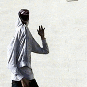
I drew a landscape for once! I think the grass came out okay (which is to say, it does resemble grass) but I definitely made a huge mess of the cliffs. eta: and i just noticed the layers on the castle got shuffled when I saved ... such is life. Otherwise I've just been doodling people to practise. The angles in it are all wrong but attempts were made. 
coolusername fucked around with this message at 14:22 on Jul 17, 2017 |
 #
?
Jul 17, 2017 14:13
#
?
Jul 17, 2017 14:13
|
|

|

|
| # ? May 11, 2024 06:02 |
|
|
Throw some more cross contour lines in there to help keep the angles correct and make the perspective easier to gronk
|
|
#
?
Jul 18, 2017 00:51
|
|

|
working on two pieces back to back, any feedback or critique?  deathbot posted:
I see you breaking down the figure into planes and that is excellent. Your going in the right direction, maybe try to exaggerate the angles more instead of playing it safe and see what happens
|
|
#
?
Jul 21, 2017 23:25
|
|

|
OmanyteJackson posted:working on two pieces back to back, any feedback or critique? Something about the legs in both of them seems off to me. The raised foreshortened leg in the second one isn't totally convincing, and also her foot on that leg looks tiny compared to the other leg. Turns out that working full time with a newborn in the house doesn't lead to much personal drawing time, but I'm slowly carving some time out for myself again. Maybe one day this drawing will be finished. 
|
|
#
?
Jul 22, 2017 02:15
|
|
|
I love those colors man. In related news I'm back on my bullshit:  
Neon Noodle fucked around with this message at 03:20 on Jul 24, 2017 |
|
#
?
Jul 23, 2017 18:02
|
|

|
Neon Noodle posted:I love those colors man. 
|
|
#
?
Jul 29, 2017 04:51
|
|

|
OmanyteJackson posted:working on two pieces back to back, any feedback or critique?  I tried to twist her so she was more facing the viewer and twisted a bit (the box layer is my very bottom layer, the next one up is what the pink one looks like). For the most part, using boxes helps me try and get my head around angles, buuut I'm having problems with not knowing how to draw breasts on figures from angles. At all. They come out looking like sad off-angled balloons. Any tips? I tried to twist her so she was more facing the viewer and twisted a bit (the box layer is my very bottom layer, the next one up is what the pink one looks like). For the most part, using boxes helps me try and get my head around angles, buuut I'm having problems with not knowing how to draw breasts on figures from angles. At all. They come out looking like sad off-angled balloons. Any tips?  And my giraffe Elezen headshot sketch. I've been working more on just very basic flat stuff so that I stop hiding all my mistakes behind rendering and get a more stable approach.
|
|
#
?
Jul 29, 2017 11:56
|
|
|
If you're going from a reference, just draw what you see, as many times as it takes. Also, that's why it's usual to learn from nude reference for learning bodies, since you can see + draw the body structures directly. And yeah, breaking down to simple values is a very good thing to do. e: typo a hole-y ghost fucked around with this message at 16:28 on Jul 29, 2017 |
|
#
?
Jul 29, 2017 16:22
|
|
|
You're underestimating how low the camera is in that image. It's much more extreme than what your sketches suggest.
|
|
#
?
Jul 29, 2017 23:06
|
|

|
Whoops I bought an iPad, still haven't gotten good at it but Procreate seems cool
|
|
#
?
Aug 6, 2017 18:23
|
|
|
So I'm finishing up an old piece. Working on the background now but I'm not too confident about the colors. Any suggestions?
|
|
#
?
Aug 8, 2017 20:07
|
|
|
OmanyteJackson posted:So I'm finishing up an old piece. Working on the background now but I'm not too confident about the colors. Any suggestions? I think the colors are fine but if I were you I'd check your values and push toward a more contrasting lighting scheme. As it is now, the figure doesn't stand out from the background enough and the silhouette doesn't read.
|
|
#
?
Aug 8, 2017 21:49
|
|
|
OmanyteJackson posted:So I'm finishing up an old piece. Working on the background now but I'm not too confident about the colors. Any suggestions? On top of what Neonnoodle said, I'd go for more cool tones in the background. The whole picture is very warm and although you've got a bit of blue-fade to the background, the grey rubble "reads" as a yellowish tone to me, and so does the purple of the background. All this brings the background "closer" to the foreground. I'd try straight up adding a semi-opaque layer of cold light blue on top of the entire background and see where that gets you. Or go super-dark, whatever works.
|
|
#
?
Aug 8, 2017 23:09
|
|

|
I can't figure out how to edit pics in the crappy imgur mobile app so here's some more giant Procreate doodles 
|
|
#
?
Aug 9, 2017 06:22
|
|
|
   I've been trying to increase my art practise output this month! One thing a day, even if the thing is just a box. Here's a summary of this week's "Stuff that isn't just a box." Will I ever learn how to integrate backgrounds?? no. the answer is no. For comparison, here's the same beach monster girl from July last year. 
|
|
#
?
Aug 9, 2017 13:06
|
|
|
This one is finally "finished"
|
|
#
?
Aug 9, 2017 20:30
|
|

|
hey quick question what the gently caress is wrong with widow's spine deathbot posted:
looking good! I'd say just work on defining things a little more- it seems like you're losing the edges of your shapes. the one with the girl in the clouds is the best one out of the lot, imo, because you've done a great job defining her shapes and she reads clearly.
|
|
#
?
Aug 9, 2017 22:20
|
|

|
probably a lot. I get mixed feedback about it.
|
|
#
?
Aug 10, 2017 08:04
|
|
|
Elsa posted:This one is finally "finished" Also I thought you were done posting pornos in here.
|
|
#
?
Aug 10, 2017 08:51
|
|

|
I don't think that's particularly porno, but there is one really, really big thing I noticed: Widow's arm (the one that she has extended) is way too long. I copied the pose and my hand hit midthigh max, but it looks like her hand (if the fingers weren't slightly curled) goes right to the back of her knee.
|
|
#
?
Aug 10, 2017 09:23
|
|
|
Does anyone here remember Legacy of Kain? Anyway here's a fan art for it.  Screenshot of the game was one of my references. http://imgur.com/Rmj9Oml Critiques? Neon Noodle posted:On that note, here's a really good tutorial about digital painting: This is an excellent video. I was wondering why my digital stuff looked so monotonous.
|
|
#
?
Aug 10, 2017 10:10
|
|
|
Ok let's try that again....
Dreadwroth fucked around with this message at 12:41 on Aug 10, 2017 |
|
#
?
Aug 10, 2017 11:18
|
|
|
Thanks for the feedback, those are some good points and I more or less agree with them
|
|
#
?
Aug 10, 2017 17:15
|
|
|
crosspost from dog thread in GBS.
|
|
#
?
Aug 11, 2017 03:22
|
|
|
a hole-y ghost posted:crosspost from dog thread in GBS. please continue to render this
|
|
#
?
Aug 11, 2017 04:07
|
|
|
I might. maybe it should be a diptych with the back side too.
|
|
#
?
Aug 11, 2017 04:34
|
|
|
a hole-y ghost posted:I might. maybe it should be a diptych with the back side too. I just think it's tied together well and would like to see more of it.
|
|
#
?
Aug 11, 2017 06:42
|
|
|
Yeah, I probably will end up continuing it, since it's bothering me how low detail the face is compared to the ring.
|
|
#
?
Aug 11, 2017 07:28
|
|
|
Thanks, pajama boner guy ")
|
|
#
?
Aug 11, 2017 07:28
|
|
|
a hole-y ghost posted:Thanks, pajama boner guy the wha- 
|
|
#
?
Aug 11, 2017 08:47
|
|
|
Elsa posted:the wha- 
|
|
#
?
Aug 11, 2017 15:41
|
|
|
Jake Snake posted:
I commend you on your taste in games and can't help noticing that went with the paler, Blood Omen 2 kind of look for the skin and the face (I approve). Having said that, all the surfaces sorta read the same. There's not much variation in texture or lighting between the skin, the metal and the cloth underneath. I'd leave the cloth and skin as they are, but make the light hitting the metal torso bits a lot harder. Don't smoothe it all out, let there be harsh edged highlights on it to show a bit of polish, like you've got on the edge details. I'm refraining from writing an essay on how much I loved the entire series and why it needs to continue, like, right now.
|
|
#
?
Aug 12, 2017 18:51
|
|
|
Still iPad still clueless 
|
|
#
?
Aug 13, 2017 01:29
|
|
|
Sharpest Crayon posted:I commend you on your taste in games and can't help noticing that went with the paler, Blood Omen 2 kind of look for the skin and the face (I approve). Having said that, all the surfaces sorta read the same. There's not much variation in texture or lighting between the skin, the metal and the cloth underneath. I'd leave the cloth and skin as they are, but make the light hitting the metal torso bits a lot harder. Don't smoothe it all out, let there be harsh edged highlights on it to show a bit of polish, like you've got on the edge details. Thanks! I had BO2 Kain in mind, but I didn't want to go full gothy emo steampunk, so I tried to find a happy medium between that and balding ps1 Kain (I think taking it easy on the eyeliner helped). I see what you mean about the texture and lighting, and I think those were the things bothering me the most about this piece (and my digital art in general). In the early stages they usually look great, but by the time I decide I'm "finished," everything just kind of falls flat and looks boring. Sharpest Crayon posted:I'm refraining from writing an essay on how much I loved the entire series and why it needs to continue, like, right now. Holy poo poo, do I ever feel your pain. I've been making my way through the series again, and I'm dreading the moment I get to the end of Defiance only to realize that it's been 14 years and there's no hope (for a sequel).
|
|
#
?
Aug 13, 2017 05:49
|
|
|
So not 100% sure this is kosher, since it's my partner's art, not mine. Worst case I'll buy her an account here. Anyways this is her latest digital piece, which she's actually selling in a gallery next month. Still, good feedback is hard to come by, both when it comes to the artistic merits as well as pricing. 
|
|
#
?
Aug 16, 2017 16:00
|
|

 Cat Army
|
That's really lovely- my advice would just be to really define the edges of things that need defined- I know that's not great advice on its own, but mainly I mean things like the fingers, which kinda blend into the arm. there's also very harsh black shadows under them, which doesn't really fit what she's going for imo. Tell her to try tinting her shadows next time- brown/red shadows for warm shadows, blue/purple/green shadows for cooler shadows. It'll lend a lot more realism to her shadows. Other than that, I really like how she's done the skin and hair- they look really nice.
|
|
#
?
Aug 16, 2017 16:28
|
|
|
Sociopastry posted:That's really lovely- my advice would just be to really define the edges of things that need defined- I know that's not great advice on its own, but mainly I mean things like the fingers, which kinda blend into the arm. there's also very harsh black shadows under them, which doesn't really fit what she's going for imo. Tell her to try tinting her shadows next time- brown/red shadows for warm shadows, blue/purple/green shadows for cooler shadows. It'll lend a lot more realism to her shadows. I passed along the advice! She definitely agrees with the fingers comments, that's something she tried to avoid when touching it up without making the borders too stark. Similarly, the tinted shadows is also a really interesting idea. She doesn't like it for this particular piece, mainly because the model is in direct bright light, but it's absolutely useful advice in general. She says thanks, that balancing light and shadow is a bitch but that's what value studies are before.
|
|
#
?
Aug 16, 2017 18:25
|
|
|
The quality of the paper (or cloth if you're getting it printed on canvas - there's real canvas and plastic, with differing textures), the quality of the print, the final size and how many prints you're gonna take, whether she signs them or not are all things you should consider when pricing the pieces. I hope this will be a smaller print rather than larger - it looks great as a small pic with the way the lighting is balanced, but some details are a bit rough when you look close up. I'd bring out the subtle colourfade to dark in the background out a bit more, personally. If asked to nitpick, I'd mention that the mouth is not quite in the right perspective, it's facing the viewer more than the jawline and hairline suggest, and the smaller eye should come up juuuuust a tad. Ask her to flip the image horizontally if she has trouble seeing these. I'd also either blend away the sketchy lines or outline them stronger and more confident, especially in the ear and the hand (and the hand does need more work anyway, like Socio said), they seem wispy and uncertain, which works great in the hair and eyebrow, but less so where they're supposed to define the whole form. I also like the colourchanges on the skin - they're blended so delicately.
|
|
#
?
Aug 16, 2017 23:46
|
|
|
It looks like an underpainting to me, a few passes away from being finished. Like you can still see the hint of the drawing in the hands and on the face, and areas like the underside of the arm looks like the value has been decided on but it needs more saturation.
|
|
#
?
Aug 17, 2017 00:36
|
|
|

|
| # ? May 11, 2024 06:02 |
|
|
Went back and worked on an old sketch again. I sometimes wonder how much 2d concept work is necessary before just jumping into 3d. Like... am I just reworking the 2d stuff when I know I should be spending time just doing it right in 3d?  When does prototyping become procrastinating? 
|
|
#
?
Aug 17, 2017 03:49
|
|

