|
GreenBuckanneer posted:
I mean yes you probably would find it easier over a brown but I would think that say Mephiston Red would cover well in 2-3 coats in this scenario. edit: added quote for new page
|
 #
?
Jul 12, 2023 05:49
#
?
Jul 12, 2023 05:49
|
|


|

|
| # ? May 10, 2024 05:09 |
|
|
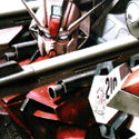
tangy yet delightful posted:What red paint are you using? How many coats did you do? the body is about 5 or 6? coats...I stopped counting though, so it might be 1-2 more. It's now at the level of "give up and move on" the rest are 2 coats minimum on everything else. it's ProAcryl red Edit this white has also been a struggle, at least four layers here 
GreenBuckanneer fucked around with this message at 05:57 on Jul 12, 2023 |
|
#
?
Jul 12, 2023 05:51
|
|

|
Brown or even a dark red is a fine undercoat for red. Brown is also a fine undercoat for a warm white. Dark blue is good for a cold white. You rarely want to just slam bright colours on top of black primer.
|
|
#
?
Jul 12, 2023 06:02
|
|
|
Yeah, you don't want to go straight for a bright paint, they usually cover quite poorly. For red, I mostly use Khorne Red or Mephiston Red as a base, they usually cover black in 1-2 layers. For cold white, Celestra Grey is a magic basecoat. Haven't found any white or grey that covers quite as nice as that one. For a warm white, I'd start with a sandy/beige color, something like Zandri Dust or Vallejo German Camouflage Beige WWII.
|
|
#
?
Jul 12, 2023 06:10
|
|

|
Winklebottom posted:Yeah, you don't want to go straight for a bright paint, they usually cover quite poorly. For red, I mostly use Khorne Red or Mephiston Red as a base, they usually cover black in 1-2 layers. I'll have to try that next time, not starting over but good to retain. That's the thing is while the color of some citadel paints is "bad" they're very opaque (usually) so I agree with you in that I probably should have done that first
|
|
#
?
Jul 12, 2023 06:13
|
|
|
The best undercoat under red Ive ever used was the old GW Scorched Brown. It made the reds layered over it look rich and luxurious. I guess the current equivalent would be Rhinox Hide?
|
|
#
?
Jul 12, 2023 06:53
|
|

|
Eej posted:This post just reminded me that I got my Badger 105 like 3 years ago now and maybe it's time to get a nice airbrush for myself and do more than just prime and zenithal. A 105 can do a lot more than just priming and zenithal. Down around 10psi appropriately thin paint (Vallejo Air) goes on easy, and you have a lot more control than you've been using for just priming and zenithal. I recommend going back to a piece of scrap cardboard and seeing how fine a line you can do with the 105. You might need to mask some bits, but you have a lot of room to expand your technique. Both of these 1/144 planes were painted with my 105.  The cammo colors on the biplane look much better in person.
|
|
#
?
Jul 12, 2023 07:14
|
|


|
It's too late I already sent my money to a children's hospital in Kyiv
|
|
#
?
Jul 12, 2023 07:20
|
|
|
Majkol posted:The best undercoat under red Ive ever used was the old GW Scorched Brown. It made the reds layered over it look rich and luxurious. I guess the current equivalent would be Rhinox Hide? Yep
|
|
#
?
Jul 12, 2023 07:39
|
|

|
Eej posted:It's too late I already sent my money to a children's hospital in Kyiv
|
|
#
?
Jul 12, 2023 08:31
|
|


|
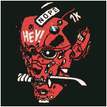
  Painted this total cutie
|
|
#
?
Jul 12, 2023 09:03
|
|

|
Lamuella posted:I love the fake names for these knockoffs. Weprintminiatures do a wide range of Arnold Schwarzeneggers from different movies and they're all called Barry Mcguffin. Welp now I have some more mens to paint..
|
|
#
?
Jul 12, 2023 10:45
|
|

|
Majkol posted:The best undercoat under red Ive ever used was the old GW Scorched Brown. It made the reds layered over it look rich and luxurious. I guess the current equivalent would be Rhinox Hide? Richard Grey starts almost everything with black primer followed by a scratchy coat of thinned Rhinox Hide. In other words, yes.
|
|
#
?
Jul 12, 2023 12:10
|
|
|
GreenBuckanneer posted:the body is about 5 or 6? coats...I stopped counting though, so it might be 1-2 more. It's now at the level of "give up and move on" That's too many coats dude. You could have saved a lot of time, effort, and brush work by just sponging on colors from dark to light. It would have made a much more interesting texture without brush lines. Or the same thing but with a brush https://www.youtube.com/watch?v=dogLPMCOr1c
|
|
#
?
Jul 12, 2023 13:26
|
|

|
Cease to Hope posted:okay like none of this is true Sorry, I think you're totally missing what I'm saying. I'm a professional artist and teach painting, I teach working from a limited palette of primaries, white, and black. I feel like you are essentially repeating what I'm saying but making it way more complicated and not really what people mean conversationally. You are correct that you can have a massive paint collection and still work from a limited palette, either by limiting hues within a project, or within your paint collection overall. However, if another artist and I talk about working from a limited palette, we most often mean working from your preferred primaries, plus of course white and black, mixing colors as you go, and importantly, that you almost exclusively work this way, generally not changing your palette project to project. It is a way artists add a visual signature to their work. As I said, in mini painting that is way less important, so moving away from my strict limited palette has been very freeing.
|
|
#
?
Jul 12, 2023 14:34
|
|


|
mllaneza posted:A 105 can do a lot more than just priming and zenithal. Down around 10psi appropriately thin paint (Vallejo Air) goes on easy, and you have a lot more control than you've been using for just priming and zenithal. I recommend going back to a piece of scrap cardboard and seeing how fine a line you can do with the 105. You might need to mask some bits, but you have a lot of room to expand your technique. It's true you can get great detail results with a 105, correct PSI/Paint combo and some practice, but i also recently sent my money to a Kiev hospital and the Infinity is so nice. I was afraid it would be difficult to clean and maintain but it's actually easier than my badgers.
|
|
#
?
Jul 12, 2023 14:38
|
|

|
Spanish Manlove posted:That's too many coats dude. Well it'll be good for later, I didn't think of applying it that way
|
|
#
?
Jul 12, 2023 16:23
|
|
|
I buy more paints than I'll probably ever need or use, mainly because I'm lazy and only mix when I absolutely can't find the exact shade I'm picturing in my mind, or if it's a one-off thing (like a mini for a D&D game) that isn't part of a larger army with a need for a cohesive look. This is not me pooh-poohing the idea or usefulness of using a limited palette by any means; just purely for the novelty of experimenting once, I painted a D&D monk (think like your traditional brown-robed monks, just with more hair) using nothing but various shades of brown to do basecoats and highlights and shades (with the only exception being a reddish flesh wash over the skin). If I can find a picture of it, I'll share it. It was an interesting experiment that I should try repeating one of these days.
|
|
#
?
Jul 12, 2023 17:11
|
|

|
Guys, I'm making a female space marine for my Deathwatch and I can't decide on what cool pose to use or if either look cool. Someone pipe in and help me decide? A.  or B. or B.  I'll probably replace the bolt pistol with a plasma pistol if I go with A.
|
|
#
?
Jul 12, 2023 17:16
|
|

|
I really like A, she looks purposeful and determined.
|
|
#
?
Jul 12, 2023 17:21
|
|
|
Majkol posted:I really like A, she looks purposeful and determined. I also like A better.
|
|
#
?
Jul 12, 2023 17:40
|
|


|
I prefer A because it make the neck look better, I think, though that could just be the photo angle.
|
|
#
?
Jul 12, 2023 17:40
|
|

|
I don't like A because her face is kind of small in-between shoulder plates, so it's blocked off
|
|
#
?
Jul 12, 2023 17:46
|
|
|
GreenBuckanneer posted:the body is about 5 or 6? coats...I stopped counting though, so it might be 1-2 more. It's now at the level of "give up and move on" I've painted a lot of white armor, so I figured I could throw in my two cents and what's worked for me - I'm a huge fan of Corax White from Citadel. It dries out really fast in the pot, but it goes on smoothly and you don't need a ton of basecoats. I usually apply it slightly thinned out.
|
|
#
?
Jul 12, 2023 17:54
|
|
|
Sydney Bottocks posted:I buy more paints than I'll probably ever need or use, mainly because I'm lazy and only mix when I absolutely can't find the exact shade I'm picturing in my mind, or if it's a one-off thing (like a mini for a D&D game) that isn't part of a larger army with a need for a cohesive look. this is why i dont really like mixing colours unless its for shading. gotta have that uniform look
|
|
#
?
Jul 12, 2023 18:30
|
|

|
tangy yet delightful posted:Please post an update after the battle. 3 Furisos, 3 DC Dreads and 3 Librarian Dreads was interesting. Struggled on the OBJs with the DC Dreads when the Chaplin got oneshoted by a Hammerhead, but Librarian Dreads did work on the Fire Warriors and Pathfinder teams. Stealth Suits did wreak them really hard, I had 2 Furisos and 1 Librarian Dreads at the end of the game. I might have lost in VP and CP, but I won a moral victory by nuking his Commander Farsight with Blood Talons and melta fire.
|
|
#
?
Jul 12, 2023 18:58
|
|

|
My Spirit Otter posted:this is why i dont really like mixing colours unless its for shading. gotta have that uniform look Yeah, I don't mind slight variations when it comes to certain armies, like if Termagant #4 is a shade lighter than the three preceding it, but overall I'd rather just reach for a color instead of mixing.
|
|
#
?
Jul 12, 2023 19:05
|
|
|
Shoehead posted:Welp now I have some more mens to paint.. The designer of that miniature, Papsikels, they do a lot of pop culture stuff. Aliens, Terminator, and a lot of Predator. They even have some bizzaro pin-up predator lady models. 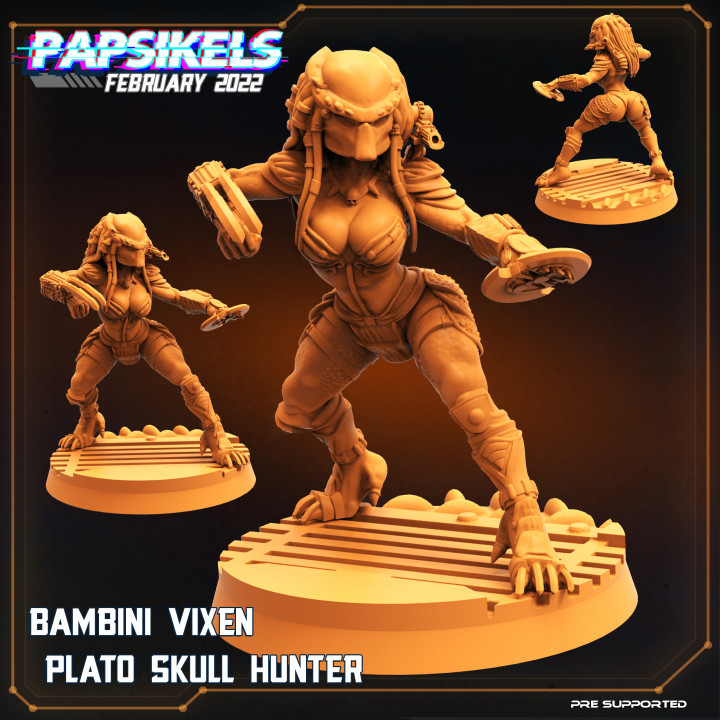
|
|
#
?
Jul 12, 2023 19:14
|
|


|
Does anyone have any tips on making these models pop a bit more? They are white undercoat with contrast paints on top. Generally I�m happy with the palette, although I think it could be blended better, but it just doesn�t seem to have the variation in tone I�m hoping for - it�s all a bit uniform: I�m pretty happy with highlighting, but I just don�t know how to make it work with contrast paints!?
|
|
#
?
Jul 12, 2023 19:48
|
|

|
IncredibleIgloo posted:The designer of that miniature, Papsikels, they do a lot of pop culture stuff. Aliens, Terminator, and a lot of Predator. They even have some bizzaro pin-up predator lady models. They were one of the first 3D makers I bought stuff from when I started resin printing. They used to primarily do "cyberpunk" minis, and then at some point they sort of leaned into the pop culture-type stuff that you mentioned, and apparently never looked back. It's been a while, I need to give them a look-see again sometime here.
|
|
#
?
Jul 12, 2023 19:53
|
|
|
Southern Heel posted:Does anyone have any tips on making these models pop a bit more? They are white undercoat with contrast paints on top. Generally I�m happy with the palette, although I think it could be blended better, but it just doesn�t seem to have the variation in tone I�m hoping for - it�s all a bit uniform: Try drybrushing or edge highlighting with an off-white/pale sand, then doing another coat of the contrasts on top.
|
|
#
?
Jul 12, 2023 19:56
|
|

|
Southern Heel posted:Does anyone have any tips on making these models pop a bit more? One of the things I like to do if I'm not sure a model 'pops' enough is throw it in GIMP to desaturate it; and see if the values of my colors are different or if it just looks flat.  If it looks flat, or if the mini sort-of blends into the base, it means that there's not enough contrast between your colors so nothing's really going to pop. In your case, I think I'd recommend a darker color on the base. Edit: This is also where careful edge highlighting can really help you define shapes and make them pop, too. Here's one of mine that uses similar colors, just for comparison. The value difference doesn't have to be huge, just enough to help the eye define what it's seeing.   It can also work in reverse, if the central focus (in this case, the Aboleth's eye) is darker than everything else. PoptartsNinja fucked around with this message at 20:07 on Jul 12, 2023 |
|
#
?
Jul 12, 2023 19:56
|
|


|
Termyie posted:3 Furisos, 3 DC Dreads and 3 Librarian Dreads was interesting. Struggled on the OBJs with the DC Dreads when the Chaplin got oneshoted by a Hammerhead, but Librarian Dreads did work on the Fire Warriors and Pathfinder teams. Stealth Suits did wreak them really hard, I had 2 Furisos and 1 Librarian Dreads at the end of the game. I might have lost in VP and CP, but I won a moral victory by nuking his Commander Farsight with Blood Talons and melta fire. Blood Angels always win when death is happening.
|
|
#
?
Jul 12, 2023 19:57
|
|
|
Sydney Bottocks posted:They were one of the first 3D makers I bought stuff from when I started resin printing. They used to primarily do "cyberpunk" minis, and then at some point they sort of leaned into the pop culture-type stuff that you mentioned, and apparently never looked back. It's been a while, I need to give them a look-see again sometime here. I have a bunch of their designs. Questionable taste in slapping books on random pop culture references aside, they actually do know how to make designs that are very functional once printed - all the details come through nicely and the figures are very well defined. Here's one I did a while back  PoptartsNinja posted:Edit: This is also where careful edge highlighting can really help you define shapes and make them pop, too. That's a  set of eyes. Where'd you get the inspiration? set of eyes. Where'd you get the inspiration?
|
|
#
?
Jul 12, 2023 20:09
|
|

|
Southern Heel posted:Does anyone have any tips on making these models pop a bit more? They are white undercoat with contrast paints on top. Generally I�m happy with the palette, although I think it could be blended better, but it just doesn�t seem to have the variation in tone I�m hoping for - it�s all a bit uniform: Something I've found that helped a ton with adding vibrancy and interest to contrast paints was selectively undercoating the model. It's also why the slapchop method is a lot better than using contrast paints over a flat basecoat. Basically you want to have a value sketch (black/white layout) before applying the contrast, which acts like a color filter. Then you can dial this up even more by adding hue to the value sketch which will interact with the contrast paint color filters to make fun effects. So for example, on these nurgle guys I was going to use plaguebearer flesh contrast paint over a majority of the models. It's a sickly yellow green color that's relatively transparent. When that color mixes with blue it becomes more greenish, and when it mixes with red it becomes more brown. Then because the contrast color filter dials down the vibrancy an intensely vibrant undercoat is needed Spanish Manlove posted:Its a lot of colors. And a lot of haphazard wet blending. You can punch up some of the highlights afterward but it's already so obnoxiously colored that I didn't think it needed any more Here's a final version of the tentacle guy to show how the undercoating is still kinda visible in spots like the armpits Spanish Manlove posted:WIP of the next group of gellerpox If you look at the butt cheeks and armpits on this last picture you'll see that the yellow green plaguebearer is over a bright blue which makes a bright green on the butt cheek, while the armpit is more brown because the plaguebearer is over bright magenta. Then on the main surfaces the skin is yellow-green because its applied over a white/offwhite So add some color vibrancy under your contrast paint. You can then also manually add highlights afterward but this is so much easier Spanish Manlove fucked around with this message at 21:02 on Jul 12, 2023 |
|
#
?
Jul 12, 2023 20:59
|
|


|
Virtual Russian posted:Sorry, I think you're totally missing what I'm saying. oh, fair. well, hopefully that post is useful to someone, anyhow.
|
|
#
?
Jul 12, 2023 21:15
|
|
|
Z the IVth posted:That's a Sheep eyes are creepy, but they're even creepier turned vertical like a snake. And when that didn't feel quite weird enough I added a geometric shape in the center (a diamond) to give a really alien sharp point to something that shouldn't normally have a sharp point.
|
|
#
?
Jul 12, 2023 21:26
|
|
|
IncredibleIgloo posted:The designer of that miniature, Papsikels, they do a lot of pop culture stuff. Aliens, Terminator, and a lot of Predator. They even have some bizzaro pin-up predator lady models. I got Cloud, Tifa, what I think is a Boomer from Bubblegum Panic? and 3 of their fake NCPD patrol men. Not for any real reason, I just wanna paint em all I'm not sure if it's the same sculptor but I did notice on that site there's female versions of hero quest models, dame poses and all and while female versions of classic models are cool they could probably do with wearing more clothes. That said I was this close to grabbing a legally distinct He-man so I could practice painting bare skin so can I really say anything? Shoehead fucked around with this message at 23:01 on Jul 12, 2023 |
|
#
?
Jul 12, 2023 22:58
|
|
|
Shoehead posted:I got Cloud, Tifa, what I think is a Boomer from Bubblegum Panic? and 3 of their fake NCPD patrol men. wepaintminiatures have a �10 random box where you get 3 minis a month. It's usually a way for them to use up spares on their print runs, but it can include some fun stuff, like the Kingdom Hearts Cloud where he has the one wing and the bandaged sword. They do sometimes run a bit... cheesecakey. I occasionally have to resort to kitbashing so that I don't have a woman in full plate who somehow has her arse hanging out.
|
|
#
?
Jul 12, 2023 23:10
|
|


|

|
| # ? May 10, 2024 05:09 |
|
|
Shoehead posted:I got Cloud, Tifa, what I think is a Boomer from Bubblegum Panic? and 3 of their fake NCPD patrol men. If you like painting fantasy minis too and want some non-cheesecake lady minis, I'd recommend D&D IS a Woman - it's a branch of The Printing Goes Ever On, and each month they put out a new mini. There's a bunch of different races, classes, and even cultural styles. The 28mm versions I feel need some up-scaling because some of the details are a bit fiddly - I usually do 120% I printed a 75mm version of their dwarf cleric over the weekend: 
|
|
#
?
Jul 12, 2023 23:37
|
|