


|
Pontius Pilate posted:Same, in appreciation and boredom, so here’s the official Blind Pineapple hierarchy of divisions: AFC West is clearly the best overall division as the only one with 3 A scores. Denver is of course loving things up and is reason #2,794 why the Broncos are horrible and should be contracted by the league.
|
 #
?
Nov 24, 2023 14:05
#
?
Nov 24, 2023 14:05
|
|


|

|
| # ? May 9, 2024 23:37 |
|
|
Quiet Feet posted:Realized the other night that this is why I can't bring myself to think of them as anything other than the WFT. Never mind how generic and uninspired the name "Commanders" is, they still just slap a "W" on the helmet and call it a day. There's no logo or mascot representing the name and if they can't be bothered to to go all-in on their stupid title then why should anyone? What even is a "Commander" in this instance? A "Commander" of what? they're so half-assed that their W logo doesn't even have transparency on most websites
|
|
#
?
Nov 24, 2023 14:13
|
|

|
Blind Pineapple posted:Alright, I'm bored. I'm having a hard time disagreeing with any of these.
|
|
#
?
Nov 24, 2023 15:06
|
|

|
It's the complete opposite of a lot of my takes, but I appreciate the effort and the knowledge that the Eagles current colors are "midnight green."
|
|
#
?
Nov 24, 2023 15:40
|
|
|
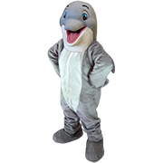
the best current unis are the Dolphins� all-whites and i shan�t take any questions on this
|
|
#
?
Nov 24, 2023 15:45
|
|
|
Alaois posted:they're so half-assed that their W logo doesn't even have transparency on most websites Perfect microcosm of a tepid, lovely franchise. Just the most anodyne, uninspiring poo poo imaginable. I grew up a Washington fan via family and have grown to hate them more than the Cowboys. Commanders?  Obviously better than the racist thing, but loving yikes what a poo poo name.
|
|
#
?
Nov 24, 2023 16:00
|
|


|
They barely even say Commanders on the radio when they're doing scores, in DC.
|
|
#
?
Nov 24, 2023 17:12
|
|


|
bears desperately need to go back to the all white away uniforms and burn the loving orange helmets
|
|
#
?
Nov 24, 2023 17:13
|
|


|
LeeMajors posted:Perfect microcosm of a tepid, lovely franchise. Just the most anodyne, uninspiring poo poo imaginable. That name isn�t going to last. It is but the last of the innumerable indignities that Dan Snyder inflicted on a fanbase that used to be loud and loyal. I don�t know what the future may hold but at least it won�t involve Dan Snyder..
|
|
#
?
Nov 24, 2023 20:07
|
|
|
predicto posted:That name isn�t going to last. It is but the last of the innumerable indignities that Dan Snyder inflicted on a fanbase that used to be loud and loyal. I�m happy that Washington managed to shake free of that rear end in a top hat but he so badly poisoned the well for me that I can�t go back. Outside of memories of watching the hogs road-grade for Riggins and Byner from my grandpas lap, there is no goodwill left. Maybe I�ll �heal� by adopting another team eventually but I�ve got nearly two decades of pure NFL apathy under my belt. /derail
|
|
#
?
Nov 24, 2023 20:13
|
|
|
LeeMajors posted:I�m happy that Washington managed to shake free of that rear end in a top hat but he so badly poisoned the well for me that I can�t go back. Yeah it�s brutal. I went to games at old RFK Stadium with my dad. I honestly have never seen a pro sports atmosphere that electric. And now, everyone feels the same way you do. .
|
|
#
?
Nov 24, 2023 20:35
|
|
|
Burgundy and gold seems like such a great color combo on paper but I can�t recall an uniform with that scheme that I actually liked. Anybody got good examples?
|
|
#
?
Nov 27, 2023 21:25
|
|

|
Ornery and Hornery posted:Burgundy and gold seems like such a great color combo on paper but I can�t recall an uniform with that scheme that I actually liked. https://sportpics.photoshelter.com/image/I0000Qt.ziPchY2w simple and beautiful (*and no i'm not suggesting bringing back the racist name) predicto fucked around with this message at 22:13 on Nov 27, 2023 |
|
#
?
Nov 27, 2023 22:11
|
|
|
WFT was honestly a really cool name and idea. They should have just stuck with it.
|
|
#
?
Nov 28, 2023 00:20
|
|


|
Kirios posted:WFT was honestly a really cool name and idea. They should have just stuck with it. Ya I originally ironically liked it, then it unironically grew on me until I thought it was a legitimately fantastic name
|
|
#
?
Nov 28, 2023 18:23
|
|
|
I got asked to do a bunch of concepts that I've thought about posting here or digging up the Farthouse and posting there. One of them was the Boston Redskins / Boston Braves that' seems relevant to this discussion. It was based on both the helmet from the 60's and the letterhead design they used back when the team was still in Boston. Edited to fix image Darth Brooks fucked around with this message at 06:19 on Dec 5, 2023 |
|
#
?
Dec 3, 2023 07:11
|
|
|
Darth Brooks posted:I got asked to do a bunch of concepts that I've thought about posting here or digging up the Farthouse and posting there. One of them was the Boston Redskins / Boston Braves that' seems relevant to this discussion. It was based on both the helmet from the 60's and the letterhead design they used back when the team was still in Boston. I would love to see more of your mock-ups. Although any new work I hope would be less� uh associated with non-slur team names. Do you have any other burgundy / yellow color scheme mock-ups?
|
|
#
?
Dec 4, 2023 22:31
|
|

|
Ornery and Hornery posted:I would love to see more of your mock-ups. Although any new work I hope would be less� uh associated with non-slur team names. Honestly, Washington could have avoided a whole lot of nonsense by just going with the 60's helmets and calling themselves the Arrows or something
|
|
#
?
Dec 4, 2023 22:46
|
|
|
There were a couple of people who saw what I had done with the defunct NFL teams and had requests for something similar they could use for their fantasy football leagues. I got quit a list. Pottsville Maroons, Rock Island Independents, Muncie Flyers, Duluth Eskimos, Racine Legion, Oorang Indians, Milwaukee Badgers, Hammond Pros, Newark Tornadoes, Miami Seahawks, Los Angeles Dons, Frankford Yellowjackets, New York Bulldogs, New York(Tonawanda) Kardex, Portsmouth Spartans, Los Angeles Dons, Decatur Staleys, Portsmouth Spartans and New York Yankees (football) were all ones I had done some stuff before. Some were real NFL teams in the same format, Houston Oilers, St. Louis Rams, Arizona Cardinals and Washington Redskins. That left Chicago Cardinals, Boston Redskins, Memphis Hound Dogs, Hartford Blues, Brooklyn Lions, Evansville Crimson Giants, Detroit Wolverines, Boston Bulldogs, Chicago Tigers, Detroit Panthers, Washington Senators and Cleveland Rams as new designs. I did get paid for this. One of the teams I used as a stealth concept for the local high school team. The high school uses a clip art tiger and I've wanted to replace it for a long time. The current helmet decal is a simple "C". The Chicago (and Carthage) Tigers is a rework of something I was going to use for the Brooklyn Tigers but abandoned.  Here are the NFL Variants, Cleveland Rams, Chicago Cardinals, Boston Redskins (although I prefer Boston Braves), Portsmouth Spartans and Decatur Staleys.     Two of the teams came from the AAFC, the league from the 40's where the Cleveland Browns and San Fransisco 49er's got started. The Miami Seahawks, Los Angeles Dons and New York Yankees.    New designs were Detroit Badgers (the design I like the least out of all of these), Washington Senators, Evansville Crimson Giants, Brooklyn Lions, Boston Bulldogs, Hartford Blues, Detroit Panthers and Memphis Hound Dogs, a potenial NFL expansion team that never got going.         By the time I got to the Bulldogs I was getting tired of drawing animals and just made the logo the initials. I will say that just making helmets made things easier this time. E: Size Darth Brooks fucked around with this message at 13:56 on Dec 5, 2023 |
|
#
?
Dec 5, 2023 07:52
|
|
|
Those are very pretty darth brooks and I hope you got the money you deserve and the sense of satisfaction that comes from a job well done ")
|
|
#
?
Dec 5, 2023 09:51
|
|
|
It's almost 2024 these should be tier lists you buncha olds 
|
|
#
?
Dec 5, 2023 11:31
|
|

|
that's freaking cool, Darth Brooks. thank you for sharing!
|
|
#
?
Dec 5, 2023 12:21
|
|
|
A) Hell yeah, go Evansville, but B) Even though it's "crimson," that's a brown that I think would look a lot better than the more yellowish browns we usually get. Like, that might be the difference-maker, add some red to those browns, make it look better.
|
|
#
?
Dec 5, 2023 16:01
|
|
|
The Steelers bumblebee uniforms are a great idea completely ruined by tan pants, the color rush blacked out look with yellow block letters and shoulder stripes is top tier though Dolphins A-, A+ if they put the helmet back on the dolphin Anything the Seahawks do is A- at least, highlighter uniforms are A+ Buccs Creamsicles are A Browns color rush from a few years ago were pretty good, B+
|
|
#
?
Dec 5, 2023 16:56
|
|

|
Those are nice designs but the New York Football Yankees helmet made me physically recoil
|
|
#
?
Dec 7, 2023 12:53
|
|

|
The Yankees were a real football team and they were owned by the guy who owned the MLB Yankees at the time. Both of these logos were designed at the same time.  
|
|
#
?
Dec 7, 2023 15:29
|
|
|
Darth Brooks posted:The Yankees were a real football team and they were owned by the guy who owned the MLB Yankees at the time. Doesn't make it any less cursed
|
|
#
?
Dec 7, 2023 15:31
|
|
|
I'd pick and choose some favorites in those helmets to praise, but they're all really good. Glad you got paid for doing that, lol.
|
|
#
?
Dec 7, 2023 18:44
|
|
|
Black Lighter posted:Doesn't make it any less cursed I used to post a lot on the sportslogo.net forum but it's gotten to the point were 90% of the posts are "Here's the logo from a basketball team but on a football uniform" or "Here is my Green Bay Packers concept" (looks exactly like the current Packers uniform) "I balanced the colors and unified the stripes."
|
|
#
?
Dec 7, 2023 22:19
|
|
|
Darth Brooks posted:I used to post a lot on the sportslogo.net forum adding to humblebrag.txt
|
|
#
?
Dec 8, 2023 00:54
|
|
|
It's not like there's a fee you have to pay to post there.
|
|
#
?
Dec 8, 2023 01:24
|
|
|
Darth Brooks posted:I got asked to do a bunch of concepts that I've thought about posting here or digging up the Farthouse and posting there. One of them was the Boston Redskins / Boston Braves that' seems relevant to this discussion. It was based on both the helmet from the 60's and the letterhead design they used back when the team was still in Boston. This is lovely. One minor suggestion - that color (with the slight brown undertone) maybe looks more maroon than burgundy. Burgundy has a slightly more purple undertone. https://www.thecolorency.com/maroon-vs-burgundy/ I admit that is some serious nit-picking by me, and my vision may be just off a little bit.
|
|
#
?
Dec 8, 2023 02:14
|
|
|
Here�s my uniform tiers. There�s something I like about every teams uniforms, with one notable exception.
biceps crimes fucked around with this message at 02:54 on Dec 8, 2023 |
|
#
?
Dec 8, 2023 02:45
|
|
|
Blind Pineapple posted:Alright, I'm bored. The Broncos need to go back to their old orange and blue colors. They were brighter and popped more than this muddy orange and navy combo. The helmet logo needs a "D" in it again, but the old horse on it was like a bad cartoon. I didn't hate the "Snowcapped" look, and the white bronco logo looked better on a white helmet.
|
|
#
?
Dec 11, 2023 07:02
|
|


|
The new horse logo looks more like a Xenomorph than an actual horse.
|
|
#
?
Dec 11, 2023 15:12
|
|
|
biceps crimes posted:Here’s my uniform tiers. There’s something I like about every teams uniforms, with one notable exception. Entire list is invalidated by having the Raiders uniform mid-tier somehow. Been in a car crash lately or something?
|
|
#
?
Dec 11, 2023 15:46
|
|
|
Raiders look cool in the all black but ruined by the aways
|
|
#
?
Dec 11, 2023 16:02
|
|
|
Raiders standard home unis are the best in the NFL by a country mile. I like that the Cowboys� home silver pants and road silver pants are nearly imperceptibly different, and that neither really matches the silver helmet.
|
|
#
?
Dec 11, 2023 16:53
|
|

|
General Dog posted:Raiders standard home unis are the best in the NFL by a country mile. The blue of the numbers doesn't match the blue of the star, and it annoys me every time I see it
|
|
#
?
Dec 11, 2023 16:55
|
|
|

|
| # ? May 9, 2024 23:37 |
|
|
Black Lighter posted:The blue of the numbers doesn't match the blue of the star, and it annoys me every time I see it But I forgive it all every time I think about the tiny Dymo tape label on the back of each player's helmet (which is also probably a slightly different blue than the other stuff).
|
|
#
?
Dec 11, 2023 17:03
|
|