


|
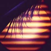
Bottom Liner posted:I like the wider better too but move your horizon either up or down and crop off the top or bottom. Yeah, I'd crop the top on that one but keep the wide view overall. But that's just, like, my opinion. I noticed that I tend to either have a lot of empty space in my shots or make them really tight. With the landscape shots I seem to end up having a lot of "nothing" in them, or crop so tight there's no e.g. no sky and just trees visible. It bothers me a bit when you get a "little bit" of something.  L1008723 by C M, on Flickr L1008723 by C M, on Flickr
|
 #
?
Dec 16, 2023 17:26
#
?
Dec 16, 2023 17:26
|
|


|

|
| # ? May 15, 2024 12:28 |
|
|
Because negative space is rad
|
|
#
?
Dec 16, 2023 18:01
|
|

|
Clayton Bigsby posted:
Hot. drat.
|
|
#
?
Dec 16, 2023 19:25
|
|


|
|
|
#
?
Dec 17, 2023 03:07
|
|

|
this is rad and i wouldn't change anything about it
|
|
#
?
Dec 17, 2023 03:53
|
|


|
ShoogaSlim posted:as i get used to Lr, i'm agonizing over minor details and wondering if my edits are any better than the original versions of photos or if i'm just making a big mess of things. after a while i can't even tell what looks good or not or better or worse staring at the same image too long lol. field balm posted:Honestly I think the colours are very nice in the original, and still fine in your edit - I kind of prefer the greenish tint on the headlights in the original but thats just a taste thing. I think the crop you made does the image a disservice though, the foreground is the more interesting part of the image compared to the empty blue sky at the top and you've cut it off part way through a car. Crushed blacks are dramatic but it would be interesting to see with some more exposure on the forground? Nice shot eitherway! took another crack at this keeping this feedback in mind. fixed the crop, and i resisted temptation to keep the shady parts shady so i could make things stand out and more visible (i actually went in and made it even brighter in the bottom portion after seeing it in the post preview bc it was still very dark). also, i still have a heavy tendency to lean more saturated and made the sky bluer than it probably needs to be? getting the hang of playing with masks and de-selecting sections and adding to sections to tweak things how i want. so it's still all a nice learning process ") overall i'm way happier with this edit than the previous. i suppose that probably might be true for all creative processes until you go crazy and start hating every edit you make. overall i'm way happier with this edit than the previous. i suppose that probably might be true for all creative processes until you go crazy and start hating every edit you make.
|
|
#
?
Dec 17, 2023 05:43
|
|


|
xzzy posted:Because negative space is rad Heck yeah it is! 
|
|
#
?
Dec 18, 2023 02:53
|
|

|
Ooo 😲
|
|
#
?
Dec 18, 2023 03:07
|
|
|

|
|
#
?
Dec 18, 2023 03:10
|
|
|
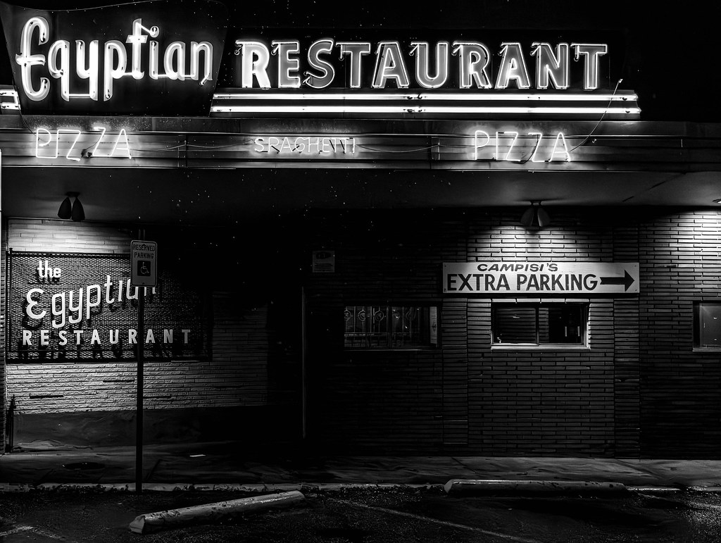
 IMG_7642.jpg by Iain Compton, on Flickr
|
|
#
?
Dec 18, 2023 15:19
|
|

|
 
|
|
#
?
Dec 18, 2023 16:57
|
|

|
pleasant things being posted
|
|
#
?
Dec 18, 2023 17:04
|
|


|
 313A3488 by Austin DeGroot, on Flickr 313A3488 by Austin DeGroot, on Flickr 313A3259 by Austin DeGroot, on Flickr 313A3259 by Austin DeGroot, on Flickr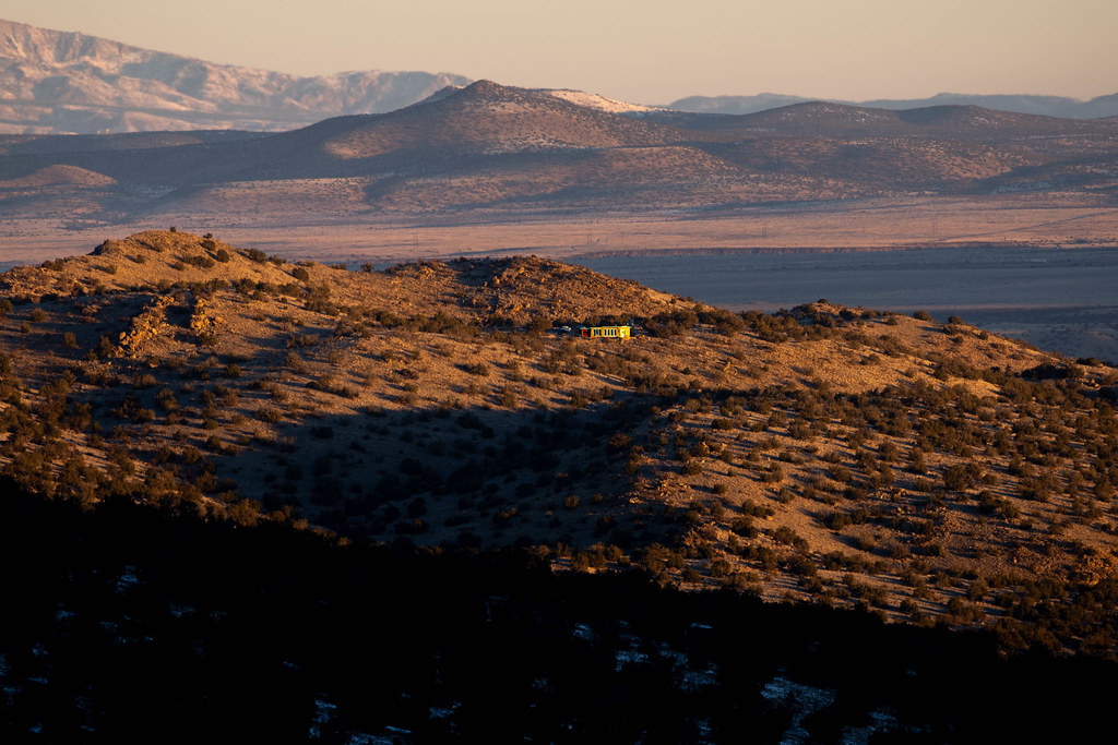 313A3176 by Austin DeGroot, on Flickr 313A3176 by Austin DeGroot, on Flickr 313A3329 by Austin DeGroot, on Flickr 313A3329 by Austin DeGroot, on Flickr 313A3350 by Austin DeGroot, on Flickr 313A3350 by Austin DeGroot, on Flickr 313A3425 by Austin DeGroot, on Flickr 313A3425 by Austin DeGroot, on FlickrNot sure who the people are in the last shot or what they are doing. Burying a hitchhiker they ran over, probably.
|
|
#
?
Dec 18, 2023 18:41
|
|
|
I just love it when you get the "layers" of mountains with some fog/mist/clouds/smog that make them look almost graphical. Not sure about the crop on this one, it feels unbalanced somehow, what do you guys think? Or is it just a blah shot and I should nuke it?  DSC_2599-2 by C M, on Flickr DSC_2599-2 by C M, on FlickrThese other two I am happier with:  DSC_2604 by C M, on Flickr DSC_2604 by C M, on Flickr DSC_2609-2 by C M, on Flickr DSC_2609-2 by C M, on Flickr
|
|
#
?
Dec 18, 2023 21:10
|
|
|
The first one definitely has a balance problem. But there's nothing you can crop out without making it worse. I think it mostly comes from the cascade on the left coming out of the corner. That third one is rad. I always make stuff like that a square crop so it's interesting when someone doesn't.
|
|
#
?
Dec 18, 2023 21:20
|
|
|
JAY ZERO SUM GAME posted:pleasant things being posted Some really cool stuff these last few pages! I really like the shadow contrast here - with the tree detail it almost feels like a microscopic photo. Speaking of trees, finally got myself outside and saw an absolutely ginormous fake one 
|
|
#
?
Dec 18, 2023 21:23
|
|

|
xzzy posted:The first one definitely has a balance problem. But there's nothing you can crop out without making it worse. I think it mostly comes from the cascade on the left coming out of the corner. Yeah, I kept fiddling with crops on the first one and just can't make it happen. I think it's the two similar cascades messing things up. I like the look of the area though so will have to go back and try some different angles of these falls.
|
|
#
?
Dec 18, 2023 21:29
|
|
|
A couple of shots from today. Z7 II, 24-70 f/4 S at 70mm, f/8, 1/1600, ISO 64  Z7II, FTZ + 70-300 AF-P at 210mm, f/8, 1/250, ISO 90. Heavily cropped.
|
|
#
?
Dec 18, 2023 21:43
|
|

|
Wibla posted:
Outstanding! What a stunning photograph. Love it! Clayton Bigsby posted:
Whoa! Rad. This demands to be printed as large as physically possible one more from me  313A3175 by Austin DeGroot, on Flickr 313A3175 by Austin DeGroot, on Flickr
|
|
#
?
Dec 18, 2023 23:20
|
|
|
blue squares posted:
absolutely crushing it lately mr squares! these 2 especially are great imo Wibla posted:A couple of shots from today. great shot, excellent framing!
|
|
#
?
Dec 18, 2023 23:30
|
|

|
i really like these two paired together
|
|
#
?
Dec 18, 2023 23:57
|
|

|
it's like a case study in color contrast.
|
|
#
?
Dec 19, 2023 00:45
|
|
|
Thanks for all the kind words! 😁
|
|
#
?
Dec 19, 2023 00:50
|
|
|
 dtla-1 by William S, on Flickr did some edits on this for a while and then dumped them all to walk away from the computer and start over again from scratch. pretty pleased with how this one came out the second time around. Wibla posted:A couple of shots from today. ^^ these are all way sick
|
|
#
?
Dec 19, 2023 09:58
|
|
|

|
|
#
?
Dec 19, 2023 23:57
|
|


|
Pulled out some old photos from trips before I owned a real camera and ran 'em through the ol' sepia toner IMG_5854 by Austin DeGroot, on Flickr IMG_5854 by Austin DeGroot, on Flickr IMG_5819 by Austin DeGroot, on Flickr IMG_5819 by Austin DeGroot, on Flickr IMG_5748 by Austin DeGroot, on Flickr IMG_5748 by Austin DeGroot, on Flickr IMG_5373 by Austin DeGroot, on Flickr IMG_5373 by Austin DeGroot, on Flickr IMG_4266 by Austin DeGroot, on Flickr IMG_4266 by Austin DeGroot, on Flickr IMG_4068 by Austin DeGroot, on Flickr IMG_4068 by Austin DeGroot, on Flickr IMG_0367 by Austin DeGroot, on Flickr IMG_0367 by Austin DeGroot, on Flickr
|
|
#
?
Dec 20, 2023 14:34
|
|
|
Looks like you had a good eye before you had a good camera.
|
|
#
?
Dec 20, 2023 20:33
|
|

|
Sepia doesn't really help any of them, IMO.
|
|
#
?
Dec 20, 2023 21:33
|
|
|
Here's one in B&W where I really loved the fog IMG_5853 by Austin DeGroot, on Flickr IMG_5853 by Austin DeGroot, on Flickr
|
|
#
?
Dec 20, 2023 22:19
|
|
|
That�s much better. I don�t think I have seen any use of sepia on digital files that ever looked good vs just B&W.
|
|
#
?
Dec 20, 2023 22:55
|
|

|
I'm not a huge fan of sepia in general, those look fairly good coloring wise. The shots themselves are fantastic 😍. But I may agree with just straight b+w over sepia, but I'm biased against sepia. I almost feel like maybe starting b+w and then color grading with wild colors might be better than b+w for digital.
|
|
#
?
Dec 20, 2023 22:58
|
|
|

|
|
#
?
Dec 21, 2023 03:09
|
|
|
That�s incredibly pleasant to look at
|
|
#
?
Dec 21, 2023 03:11
|
|
|
That's good stuff right there.
|
|
#
?
Dec 21, 2023 06:44
|
|
|
 313A4246-Enhanced-NR by Austin DeGroot, on Flickr 313A4246-Enhanced-NR by Austin DeGroot, on Flickr 313A4238 by Austin DeGroot, on Flickr 313A4238 by Austin DeGroot, on Flickr 313A3905 by Austin DeGroot, on Flickr 313A3905 by Austin DeGroot, on Flickr 313A4235 by Austin DeGroot, on Flickr 313A4235 by Austin DeGroot, on Flickr
|
|
#
?
Dec 22, 2023 17:21
|
|
|
Love the last one! 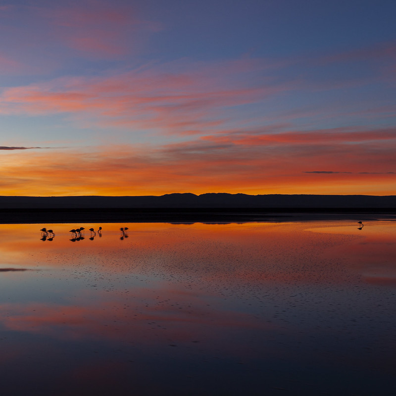 
|
|
#
?
Dec 22, 2023 20:34
|
|

|
Blue squares, you're on fire.
|
|
#
?
Dec 22, 2023 20:40
|
|
|
Yes. Viginti Septem posted:Blue squares, you're on fire. Concur. This page is killing it.
|
|
#
?
Dec 22, 2023 21:51
|
|
|
😍😍😍 Outstanding shot, composition and color contrast
|
|
#
?
Dec 22, 2023 23:14
|
|
|

|
| # ? May 15, 2024 12:28 |
|
|
Can only add to the love here. What a great, well balanced shot. I kind of miss the CCD on my Leica M9. It made for some fairly dramatic and a little overcooked shots but I did like it:  L1009130 by C M, on Flickr L1009130 by C M, on FlickrThe Canon 1D4 was with me on the same trip and it was more laid back:  DQ6J3580 by C M, on Flickr DQ6J3580 by C M, on Flickr DQ6J3525-2 by C M, on Flickr DQ6J3525-2 by C M, on Flickr
|
|
#
?
Dec 23, 2023 16:56
|
|