


|
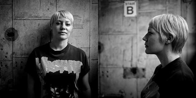
AnotherFreakboy posted:Sorry if that came across as smartass. I couldn't work out what was going on in the background till me wife pointed out to me that it was her shoes. What? gently caress that, smartass is good, not bad. Sheesh, and you call yourself a goon.
|
 #
¿
Sep 9, 2010 13:27
#
¿
Sep 9, 2010 13:27
|
|


|

|
| # ¿ May 21, 2024 06:50 |
|
|
Manny Calavera posted:Looking for advice... I only just got my first DSLR less than a week ago, along with lightroom. Before that I was using a Fujifilm S7000 for a year, with no post. The mirror shot, you have neither the girl, nor her reflection in focus. Pick one. The blown highlights are killer in a couple of these.
|
|
#
¿
Dec 6, 2010 01:13
|
|


|
Man_alive posted:I get the same feeling. This is an unflattering angle. Basically, you're key-stoning her hips. The same shot from beneath, shooting up would be much better.
|
|
#
¿
Jan 22, 2011 01:28
|
|

|
TheLastManStanding posted:Other way around. Shooting low will put the emphasis on the lower body. He handled it correctly by shooting high, he just needs to crop it because there is way way to much space in both those pictures. But...shooting low, with a wide angle lens, held portrait will elongate the woman, making her taller, right?
|
|
#
¿
Jan 22, 2011 02:06
|
|
|
AIIAZNSK8ER posted:Low wide angle will make legs look longer, but in this case it would've made beer hips even wider and possibly lost her neck if she was looking down. Using a longer focal length would've been better. Alright, I'm able to visualize it better now. The three responses have me back on track.
|
|
#
¿
Jan 22, 2011 04:14
|
|
|
AIIAZNSK8ER posted:Ok, how did I do with this one? Like the others said, the background distracts...unless she works at a car lot or manages a parking facility.
|
|
#
¿
Feb 23, 2011 01:38
|
|

|
Oprah Haza posted:All three are fine, the second one looks like you lost some detail in the highlights. But, I quoted this one for a reason. This is a shot where I think you've shown how beautiful she can be, without tricks or dodges. This is the photo that should convince her to be more comfortable posing with you. Very nice job.
|
|
#
¿
Mar 6, 2011 13:46
|
|

|
Elemeno^P posted:Truly amazing shot. Lovely, but I'd like to see some shots of her not looking directly at the camera. Do you have any 3/4 shots?
|
|
#
¿
Apr 18, 2011 09:58
|
|


|
TheAngryDrunk posted:I've heard several times that basically any digital photo needs some amount of sharpening applied. No. Many shots are fine, straight from camera, I find. Sharpening will help many, or most, photos, but I have plenty of sharp shots I've done zero sharpening on.
|
|
#
¿
Apr 29, 2011 01:19
|
|
|
Did some "draft" headshots for one of my guys. "Draft because, the third one shows the quality of light my lovely conference room fluorescents have. And, because I'm urging him to think about paying someone (not me, a pro) to do it if he wants to use them professionally (acting).  Devon2 by torgeaux, on Flickr  Devon1 by torgeaux, on Flickr  No Color Balance Devon by torgeaux, on Flickr
|
|
#
¿
May 14, 2011 01:50
|
|
|
Oprah Haza posted:
If you're gonna show skin, you have to give it time to rebound from the prior clothes/undergarments.
|
|
#
¿
Aug 12, 2011 18:25
|
|

|
thetzar posted:
this is the weakest. Good model, but direct profile shot is weakest one.
|
|
#
¿
Sep 19, 2011 01:30
|
|
|
thetzar posted:I'm curious as to why you say so. Is it the profile shot in general, or something in particular I've done here. She does seem kind of flat and unexpressive. It's not a good angle for the model, and it's unexceptional otherwise. The other shots have some zing, but the combination of "mug shot profile" and the fact that it's unflattering just kill it. Terrible lighting for this. I'm not sure I color corrected it properly. Thoughts?  Reyes Head Shot by torgeaux, on Flickr
|
|
#
¿
Sep 22, 2011 01:58
|
|
|
aliencowboy posted:It's pretty orange/yellow. 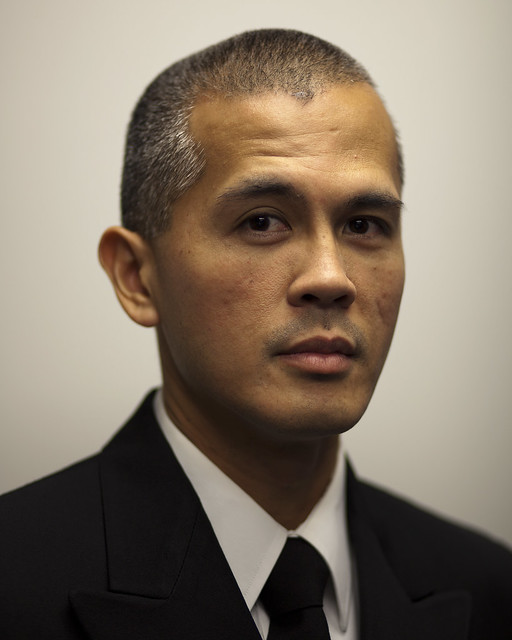 Reyes Head Shot3 by torgeaux, on Flickr
|
|
#
¿
Sep 22, 2011 11:09
|
|
|
Cyberbob posted:I have an oven. I is chef? I did some actor headshots to show him the difference in well lit shots with good camera (versus buddy's p&s), but told him to pay someone if appreciated the difference. He saw the benefit and paid a pro, even though he liked the test shots. if she's a friend, shooting her kids is kosher (for free). If not, point her elsewhere.
|
|
#
¿
Sep 23, 2011 00:35
|
|
|
McMadCow posted:Whether or not we can agree on the merits of the DOF used, his subject's eyes aren't lit and that's a big no-no in this sort of portrait. Instead of hitting all the (correct) critiques, let me broadly explain. This was a 'can you take a quick shot' photo, for use in a newspaper article. Only one room in my office allows cameras, no natural light, terrible fluorescents. I needed a reflector, but the butcher block paper I use for that was being used. I prefer shallow depth, and his jacket had no detail (navy blues) anyway. a flash or a reflector would have gone a long way. I'll link to the article when it goes live.
|
|
#
¿
Sep 23, 2011 22:43
|
|
|
http://www.miamiherald.com/2011/09/28/2429170/pentagon-launches-slick-war-court.html You have to scroll to the last picture in the little slide show. Kinda small, but hey, it looks better at that size/resolution than otherwise. edit: Third picture. I definitely did not take the last picture. edit: Ok, now it's the fourth. Sheesh. torgeaux fucked around with this message at 02:40 on Sep 29, 2011 |
|
#
¿
Sep 28, 2011 22:54
|
|
|
 Photo68(8x10) by torgeaux, on Flickr
|
|
#
¿
Dec 11, 2011 00:56
|
|
|
dakana posted:I'm doing school pictures for a preschool next week. Feed me your best stupid kid jokes. I'm doing volunteer shooting for my kids daycare. The oldest is the group of 5 year olds. I'm getting some mileage from "say cheese when I say now" and taking a shot on THAT now. Then looking confused and accusing them...after the second time that happens, you have a real smile. The two to three year olds are the killers.
|
|
#
¿
Dec 11, 2011 13:36
|
|
|
I was volunteered to shoot the photos at my son's daycare. I had a great time, and frankly liked my "outtakes" shots more than the "they posed correctly" shots. It helps that I didn't have to try to fix the backdrop issues in the "rejects." Outtakes30 by torgeaux, on Flickr  Outtakes29 by torgeaux, on Flickr  Outtakes1 by torgeaux, on Flickr  Outtakes15 by torgeaux, on Flickr
|
|
#
¿
Jan 6, 2012 01:10
|
|
|
tekopp posted:I took some pictures of my baby: AAAAAAAAAAA My Tables!!!!!!!!!!!!!!
|
|
#
¿
Jan 11, 2012 01:07
|
|


|
McMadCow posted:
I like the look of the 1/3 to 2/3 arrangement.  Photo108(6x4) by torgeaux, on Flickr
|
|
#
¿
Jan 28, 2012 00:47
|
|
 Dark area on the bottom right. WHY IS IT THERE?!
|
So, bouncing a flash, didn't look where I was standing, reflected off light fixture. Bad shot. Some harsh editing later, I actually like this in a sick, fauxtographer way.  Harsh J by torgeaux, on Flickr
|
|
#
¿
Mar 11, 2012 18:21
|
|
|
xenilk posted:hahah, do you like it tho? It's funny. This is the one in which she looks the prettiest, and so I think she'll like it best. I don't think it's the best photo in the series, but she's far and away the most attractive here.
|
|
#
¿
Mar 21, 2012 00:24
|
|
")

|
She looks 35 in this shot. That's not a good thing.
|
|
#
¿
Mar 22, 2012 00:29
|
|

|
Evilkiksass posted:DoF is controlled by 3 factors. Focal length, distance, and aperture. If your aperture results in poor IQ because it is wide open, you can control the other 2 factors to achieve what you want. This. Lenses are sharper stopped down. So, a 1.4 lens may be super sharp at 4.0. Adjust other factors as necessary for intended effect. If you have to have very shallow depth, you may have to sacrifice some sharpness, though.
|
|
#
¿
Apr 8, 2012 12:58
|
|
|
Cyberbob posted:Slightly different tones, crops, and poses. Can't decide which I like more. Thoughts? Number 3 is her most flattering, number one is best shot overall.
|
|
#
¿
Apr 29, 2012 16:01
|
|


|
dowdy_pants posted:My baby girl had her first communion this past weekend. The center framing is hurting these, but really the first one. The space to the left of your girl is useless. The frame should show the veil blowing to the right, maybe even with some more space to the right of the veil.
|
|
#
¿
May 4, 2012 23:19
|
|


|
Jiblet posted:All teeth and no tits, although she's doing a fine job of trying to show both. Wow, I think the thread can be closed now.
|
|
#
¿
Jul 7, 2012 00:21
|
|
|
TheAngryDrunk posted:
I think it's ok, but her smile is soooo forced, and the pose doesn't look at all natural, but rather, a 'pose.'
|
|
#
¿
Jul 7, 2012 00:27
|
|

|
Oprah Haza posted:
Only 4th really works. She has a vapid look in 2 and 3, and the blur in 1 does nothing good.
|
|
#
¿
Jul 19, 2012 23:35
|
|
|
xenilk posted:
This captures what these photos are supposed to capture. Very, very nice. My son is definitely going to be a photographer: 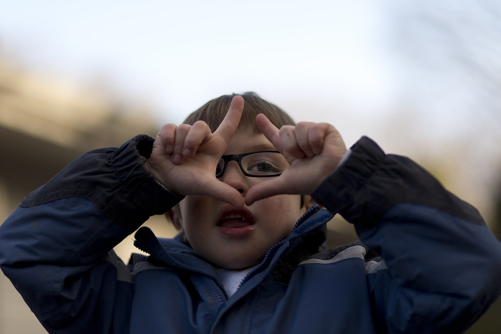 Framing the Shot by torgeaux, on Flickr
|
|
#
¿
Jan 22, 2013 03:21
|
|

|
The third one is money. Shooting kids is tough enough, but this has a lot of personality in a simple shot. Oprah Haza posted:Would recommend shopping out the wall corner off his head in the first photo and the vignette in the second. I'm not quite sure how I feel about the third but on first glance it looks cool. The first works great. The second seems good in concept, but only the small mirror in the bottom of the large mirror seems to really grab my attention. The third is just straight up her nose, no going back.
|
|
#
¿
Feb 18, 2013 19:21
|
|


|
Sludge Tank posted:poo poo you both have given me a lot. Thanks so much. I haven't given any thought to the 2D/3D effect thing, I've been really hungup on producing even light across the whole photo. I've been really intimidated by creating shadows up until now. I'll put your poo poo into action and see what I come up with. Thankyou seriously. Read up on Rembrandt lighting. It's a classic, it's use able in lots of situations, and you'll see it everywhere.
|
|
#
¿
Mar 15, 2013 23:52
|
|
|
Sludge Tank posted:Would these be considered Rembrandt? Yup. Note, Rembrandt is an easy go to, but for me it is just a jumping off point because it nicely demonstrates how shadow shapes the image.
|
|
#
¿
Mar 21, 2013 01:04
|
|


|
LargeHadron posted:
She has a prominent forehead, so shots from above are a bad idea. Also, I think she'd benefit from tilting her head a bit.
|
|
#
¿
May 18, 2013 10:13
|
|


|
Don't know why I like this so much, but I do like it. Arthur Woods by torgeaux, on Flickr
|
|
#
¿
Jun 5, 2013 01:42
|
|
|
Mannequin posted:Very nice! Good makeup, good lighting and great expression on her face. I like them, but 3 and 4 have issues. 3 is a bad facial expression for her, and she needs to pick where she's looking better. 4 screams "bondage glamour" because of her handcuffed hand look. It loses impact, without regard for the bondage issue because they appear too disconnected from each other and you.
|
|
#
¿
Jun 10, 2013 00:29
|
|
|
 Jonathon Cropped by torgeaux, on Flickr
|
|
#
¿
Jul 1, 2013 02:18
|
|
|

|
| # ¿ May 21, 2024 06:50 |
|
|
CB_Tube_Knight posted:It's been a long time since I've been around here. Welcome back. I Iove this.
|
|
#
¿
Aug 17, 2013 01:48
|
|
