|
Welcome to the Dorkroom Photo-a-Day thread. [ Mod Edit: Nearly entire post re-written so the rules are actually clear and concise. ] Hi, this is SoundMonkey, not LastManStanding, although thanks LMS for the awesome OP. This is a place to get constructive feedback on your work no matter what your skill level and to exercise your critique skills. Feel free to post images that are not your "best work" in order to get comments and suggestions. This is not a showcase thread, it's to improve your work. Some Form Of Critique Is Mandatory - If you are uncomfortable critiquing other peoples photos, then provide one on your own photo; state your intentions, say what you like/dislike, what worked and what didn't. This will give people a starting point when talking over photos and will help lead to discussions on how/why certain decisions are made. - Try to make all posts relevant to the discussion of someone's images - gear talk and general chattiness should be constructive or redirected to a more appropriate thread. - Avoid low-effort critiques. If you're not sure if your critique is low-effort, write a bit more and dodge a probation General Rules: * Please limit yourself to 3 photos per day. * Critique is mandatory. Please be constructive and provide reasoning for your observations. * Don't post pictures of your pets (unless they are awesome). * Maximum width or height of any image should not exceed 1024 pixels. The Following Things Will Get You Probated Instantly: - Zero critique. As in, you post images and critique neither yourself nor anyone else. Quoting another poster and only saying "I like this" is considered zero. [ See 'Buy Now, Pay Later' below ] - Breaking the above mentioned rules. - Telling anyone to either get out or go back to SAD. - Lamenting the demise of SAD. - Abusing someone who genuinely doesn't know better and is trying to improve. - Personal attacks / ripping on someone's entire body of work. "This is crap, just like everything else you post" will not end well. - Claiming someone "doesn't get it". Feel free to clarify your motivations to someone who doesn't understand them, but "you really just don't understand art" ain't gonna fly. - Angry responses to (valid) negative critique that goes beyond "I disagree because (x)". Take the crit and move on. If you think the person's an idiot, don't listen to their advice. If I think your reply is sarcastic/negative/ad-hominem/whatever, and is the sort of reply that discourages people from giving critique, I'll probate you. It's that simple. The Following Things Will Make Me Not Like You And Possibly Eventually End In Probation: - Consistently, over the course of weeks, critiquing only your own photographs. Help some other people out. - Excessive rolling with the punches and/or "that's how I wanted it to look" in response to valid negative critique. - Consistently being unable to accept negative criticism. Sometimes negative crit is needed, and if people can't deal with the fact that their work isn't perfect, they're not going to improve much. - Low-effort photo posting. I understand some people are new, we have varying skill levels, etc, but if you consistently post images with obvious and easily fixable glaring technical errors or something, I might decide eventually press buttons. - Posting the same photo over and over (with changes). It's great to act on suggestions and post a new version of something you posted before, but let's not repost the same photo more than five times. "Buy Now, Pay Later" Sometimes you want to crit someone else's photos, but you haven't finished processing yours yet, or you haven't picked which ones you want to post or something. It's fine to post crit-but-no-photos, then later that day post photos-without-crit. If your crit and photos are separated by like a day and a half, it's going to count as zero-crit posting again, so it might not hurt to give a few quick notes on another photo before you post your pictures. To be extra clear, you're quite welcome at any time to post crit with no photos, crit is always good, this only applies if you then later post photos without critique. The rules are, in fact, rules, and if you break them I'll do the stuff you'd expect me to do when a person breaks a rule. The last list of things is just things you probably shouldn't do because I think those things detract from the thread, and make me more likely to press buttons at you for what might otherwise be a minor infraction. I try to keep a pretty close eye on this thread, but please, if you see something that even MIGHT be against the rules, report it. It takes me about fifteen seconds to deal with a report, so it's not like you're bothering me or something. If ANY part of this is unclear, confusing, or if you'd like clarification on anything, or even if you just want to ask if your photos are suitable for PAD. I'm always happy to chat via AIM (sasoundmonkey) ideally, or PM otherwise. If you think any rule is total bullshit, please head on over to the rules thread to voice your opinion, as opposed to posting it here. Thanks! UPDATE This thread should be recommended reading for anyone posting here. Learn how to say what you want to say, and learn how to work out WHY you do or don't like something. Somebody fucked around with this message at 00:01 on Jan 25, 2013 |
 #
¿
Nov 19, 2011 00:57
#
¿
Nov 19, 2011 00:57
|
|

|

|
| # ¿ Apr 28, 2024 11:51 |
|
|
Feel free to post any helpful links and I'll put them here. Preferably they should focus on color, composition, or general photo taking rather than post processing. Click for Dorkroom flickr group Linking to Flickr: Link images back to their Flickr page. Flickr has made this pretty easy for everyone and now includes BB code to link your images, use it. If you are a Firefox user with Greasemonkey there is a script to make linking easy. If you don't have firefox, you can follow this simple format: code: code:Site for checking if your browser is color managed Other stuff If you're on a page where the same two or three photos have gotten all the critique, and there are a bunch that have not been commented on, give those without critique some. This does not mean give useless critique as previously mentioned, and you don't have to neglect photos that have already been commented on. Critiquing quote:How do I give another photographer a critique? TheLastManStanding fucked around with this message at 19:57 on May 11, 2012 |
|
#
¿
Nov 19, 2011 00:59
|
|
|
Trambopaline posted:
Maybe it's flickrs sharpening or compression, but the transition from ground to sky is a bit over sharpened (a common problem), there is banding in the sky, and the shadows (particularly the bottom right) are muddy. All are symptoms of bad compression though other things could cause them. If you are doing your own sharpening make sure you mask out the horizon. For cropping I think the left could be brought in a bit (to the small jagged part of the large rock) and the bottom could be lifted above the bright large rock on the bottom center left. It would get rid of some of the distracting elements while putting a bit more stress into the image. wins32767 posted:Careful with the saturation. You're running into gamut issues in the sky at the top and in the water. Either back off the the blue channel sat or just selectively add some desat in photoshop. It needs to be backed off until the red channel stops clipping. Since it was mentioned, I for one don't mind the grass in the foreground. It does cause some oddities, but since the focus is the mirror image the fact that your horizon is centered doesn't really matter. Cropping out the grass would get rid of the neat mirror effect and then you'd just have some pretty clouds and a town that can't really be seen. I also think your other nature photos are pretty awesome. -------------------------------------------------------------------------- Went out shooting for the first time in close to a month. First shot was somewhat planned. I never shoot black and white but for the subject matter I shot with it in mind. More than anything it was an experiment in post processing but I like the result. There are a ton of things I still want to nitpick over, but I'm more curious as to what stands out for other people.  This second one wasn't really planned, but I'd been there before. Since it was sunset and I was already downtown from taking the above shot I figured I'd make the most of my time. 
|
|
#
¿
Nov 19, 2011 01:06
|
|

|
robertdx posted:
|
|
#
¿
Nov 29, 2011 05:25
|
|

|
Axel Serenity posted:I get your intentions with the black and white, but that sky is way too perfect to not be in color.
|
|
#
¿
Dec 6, 2011 05:54
|
|
|
Gazmachine posted:
|
|
#
¿
Jan 6, 2012 22:44
|
|


|
RangerScum posted:You're fighting the whole room on that one: The dark vs light wall, that horribly placed ceiling light and the bright spot on the wall it causes, the bright windows, the plants/mirror/reflection/ball-rack, and the bright specular highlight on the table. If you shot at night and used all your own lights you could probably pull it off, but it just seems light finding another location would be easier. There's also way too much headroom. Edit: If you still want to shoot in this location, this is how I would approach it: Shoot it late so you aren't fighting the windows; keep the camera set up relatively the same, though try to get back further to minimize distortion; set up your ambient lighting, keep it diffuse to deal with the dark varnished table and floors; remove or lift the over table light if possible; Shoot each model separately, keep the one on the right where she is, move the middle one forward so she isn't tiny and try to keep her from intersecting poorly with the background, shoot the girl on the left with her to the right of the table and then mirror the entire right half of the room over the left; shift the antlers lower (in photoshop) and crop to the top of the square part of the windows. TheLastManStanding fucked around with this message at 03:04 on Jan 10, 2012 |
|
#
¿
Jan 10, 2012 02:49
|
|

|
quazi posted:What the hell am I doing? Is this any good? Hackneyed clich� bullshit? It's a pretty big departure from what I usually do. Tear it apart.
|
|
#
¿
Jan 17, 2012 01:59
|
|

|
Dradien posted:So, I wasn't going to post any of the photos I took today because I don't want to annoy people with posting over and over again, but when I got home, I particularly liked this one. No more for a little after this, I promise! You need to read the first post. This is the third time you've posted in here without a critique or any kind of discussion. Either follow the rules or go to the Snapshot a Day thread.
|
|
#
¿
Jan 31, 2012 01:19
|
|

|
drat NIGGA posted:
Mr. Despair posted:Use the tripod. -For the duck I think the exposure is fine, he really isn't too dark. However, I do think he's too small in the frame. You should probably try cropping it so that his body takes up roughly 2/3rds of any dimension. As it is right now he's only occupying 25% of the frame leaving a ton of empty space.
|
|
#
¿
Feb 7, 2012 23:56
|
|


|
Bob Socko posted:
|
|
#
¿
Mar 27, 2012 05:42
|
|
|
Chidona posted:-I like single photo triptychs, but I think this should have been shot head on from a lower level; as it is the floor boards don't seem to have much thought in them and the buildings are just clutter. -Aside from needing to cut back on the vibrancy slider, I really like the middle of the picture and the perspective meet nicely at an edge. The large negative space in the bottom left though doesn't contrast well with the cluttered tree in the top right, which throws the balance of the photo off. Try a 2:1 crop with the bottom just below the benches and the top just above the hut, it should mitigate the problem of space and get rid of that blown sky. Don't forget to cut back the green saturation by a lot. AIIAZNSK8ER posted:
Ambihelical Hexnut posted:I hate my processing on all of these but I just feel stuck. The dust and haze in the air makes a properly exposed picture occupy the central 1/4th of the histogram and nothing else, then trying to recover the contrast blows the detail out of the highs and lows. It's pretty challenging to maintain a realistic look that isn't also harsh and ugly, and that's what is frustrating me about processing landscapes lately, arrgh. ---------------------------------------------------- I went to the zoo a couple weeks ago but I've been so busy that I hadn't even seen the pictures until today. The trip really reinforced the fact that I really need a better zoom lens.  Tamron 75-300 Tamron 75-300  
|
|
#
¿
Apr 1, 2012 06:20
|
|


|
Bottom Liner posted:- Any time you're dealing with an increase in contrast it's best to add some desaturation (adding contrast increases saturation); this is especially true for skin tones where people can start looking like oompa loompas pretty quick. Her skin isn't that bad, but it's noticeable in the arm. I also somewhat question the color temperature of the first image; I can see that that palate is white, but everything else looks very warm. - Second photo is great. I agree with the previous person that you should spend the 30 seconds required to get rid of the blemishes. You should also have cropped the bottom (your reflector is in the shot). - The third photo is also really nice. I don't mind the large negative space much but I do think it could use a little less headroom. As a personal thing I would add some slight blur to the background and make sure to avoid sharpening it to try and tame the rough bokeh that the nifty fifty gives. You might also add some lens blur to the ground on either corner as that dead branch is a bit distracting.
|
|
#
¿
Apr 2, 2012 21:15
|
|


|
AIIAZNSK8ER posted:Thing I found interesting tonight: 8th-samurai posted:I like this. The negative space is too overbearing though. I think it would be a much stronger composition cropped square. Blank space really needs a reason to be there, in this photo it seems superfluous, like an afterthought.
|
|
#
¿
Apr 3, 2012 03:29
|
|
|
hepkitten posted:2 - The second image though needs help. It took me a few seconds to even notice the wind up key; it definitely needs something to bring it out. I'm also not enjoying the coloring; I understand that it was probably done for some dreamy effect, but the split tone on the hair looks sloppy and her complexion is pasty. Compositionally I think it's fine, it's just the post work that needs to be redone. 3 - You could take out that power line and the lens flare with 5 seconds of content aware fill, though some of it should be done manually to preserve the more iconic/noticeable buildings. The photo itself is okay; though as many people will tell you it's hard (nearly impossible) to take a good/unique photo of a monument from a well known location. There's probably at least one person every day that walks past the Starr King Open Space and takes this exact same picture. If you're going to take a photo of the giant pickle fork, try to be at least a little different and stand under it
|
|
#
¿
Apr 3, 2012 23:38
|
|


|
ButtMonkey posted:Snapshot a Day is that way, bud- Fun fact: Despite being nearly 1000 ft tall, Sutro Tower is still less than half the height of the tallest structure in the US, and is barely more than a third the height of the tallest building in the world.
|
|
#
¿
Apr 4, 2012 01:37
|
|

|
XTimmy posted:
You should title this "A Man and His Dog".
|
|
#
¿
Apr 6, 2012 06:43
|
|

|
quote:
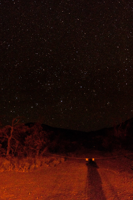
1) The processing on the shot is pretty; good green saturation without anything being too bold, and the light balance is good. Despite that though the subject doesn't stand out at all and I barely noticed it. The photo is okay as a snapshot without the subject, but the subjects lack of dominance really hurts the photo. 2) Stop shooting at 1600 iso. That white balance is also bad. Don't feel the need to keep foreground objects in star shots; mountainous horizons and silhouettes are just as good. 3) I like abstract shots. The convergence of lines in the bottom right is nice, but it bugs me that it doesn't line up quite right. You should also try burning the highlights to see if you can get anything out of that bright spot.
|
|
#
¿
Jun 7, 2012 05:32
|
|
|
1) Use the transform tool to straighten the verticals and level the horizon. I also think I would have liked it if you both were in focus. Your husband seems to be an important subject in the photo and there really isn't any reason for the shallow depth of field. 2) I don't know if it was intended, but having two subjects lit with opposing sources bugs the crap out of me. Maybe you wanted some type of playing between the shadows, but it comes off as cheap and artificial. There also doesn't seem to be a need for the flashes. 3) Shooting though bars is a bit cliche, but I'll give you credit for including yourself in the shot. It seems like you used a flash from the left, but it's not really apparent and probably wasn't needed. You should also straighten the verticals.
|
|
#
¿
Jun 19, 2012 06:49
|
|


|
 dead baby dead baby
|
|
#
¿
Jul 1, 2012 02:05
|
|
|
Desaturated sleeping babies never look good and are a common theme in the horrible photographers thread.
|
|
#
¿
Jul 1, 2012 02:45
|
|
|
Why isn't this a square crop? If you want to maintain the 3:2 then you should probably back off on the crop until it's split in thirds. As it is it feels off. You could also play with the contrast a bit since it's a little flat.
|
|
#
¿
Sep 27, 2012 01:39
|
|

|
David Pratt posted:
I have no idea what I'm looking at, but I kind of like it. I looked at your earlier tests in your flickr and while it's much more obvious how the effect was achieved they still make for a really cool experiment. I had actually been planning to do a similar thing, except with the camera moving perpendicular to the direction it's facing so that a somewhat normal photo would be achieved, but from an impossible perspective. Unfortunately my computer is way to old to be processing videos so I've been putting it off forever. ---------------------------- I kind of lost touch with digital and ended up shooting just film for probably 6 months or so. A week ago I started up again. It's nice to be back, but my ancient computer is reminding me why I left .Probably final version.  Alternate version Giant animated version Abstract version. 
|
|
#
¿
Oct 24, 2012 07:34
|
|
|
InternetJunky posted:This is gorgeous. I prefer this version to your alternate. It's too bad you can't get that warm yellow glow in the bottom left as well as that part of the image is so dark my eye heads right there when I look. 
|
|
#
¿
Oct 25, 2012 00:13
|
|
|
FACKER posted:I planned on taking pictures of the Statue of Liberty and the NYC skyline at dawn but it was super foggy all morning. Here are some photos I got that day: -The first photo is great. Nice gradient and a good use of negative space. The light on the top of the ship bugs me though, mostly because it is color in an otherwise naturally gray picture. I'm not sure if you want to clone it out (since you would also have to get rid of the reflection), but it should at least be desaturated. You should also clone out those spots floating on the water at the very bottom. -Second photo, really cool side lighting. It could use some perspective correction to straighten the verticals though. -The third is the best; the gold and gray melting into the fog is amazing. Again, though, my only complaint is that the spherical distortion of the lens is very apparent and it could use a tiny touch of vertical straightening. Luckily both of those are easy to do in LR/PS.
|
|
#
¿
Oct 25, 2012 00:22
|
|


|
David Pratt posted:Tried icing sugar this time, but it still looks like snow. Going to use straight-up cigarette smoke next time, kicking myself for not thinking of that when I had it all still set up.
|
|
#
¿
Oct 26, 2012 05:37
|
|
|
rio posted:
a foolish pianist posted:I actually think this one, in particular, is very beautiful. The riot of color and shape in the leaves makes me think about how such simple things can interact to form really impressive vistas. I'm a huge fan of watching leaves in wind though, and I suspect McMadCow isn't. 
|
|
#
¿
Nov 23, 2012 06:59
|
|

|

|
| # ¿ Apr 28, 2024 11:51 |
|
|
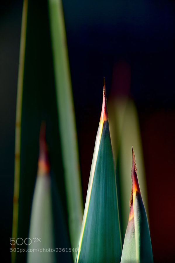
ShadeofBlue posted:Here's mine, an agave in my parents' yard. I'm not sure about the tip on the left, and think maybe I should clone it out.
|
|
#
¿
Jan 20, 2013 08:29
|
|