


|
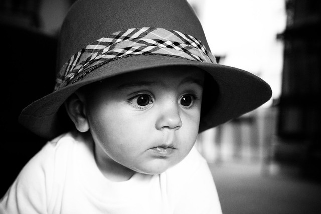
Bimtob posted:I'm just starting to learn about photography (light, composition, etc), so I don't have much to offer as far as critique. Anyway, I really like this. I kinda feel like I want the figures to be a tiny bit sharper to stand out against the haziness of the rest of the image, but overall a nice photo. I like this, but I wish the dog was exposed a bit more. Maybe use a mask or something to expose the bottom half of the picture more to even things out? Here's about the only picture I've taken in the past month that's not a bird. 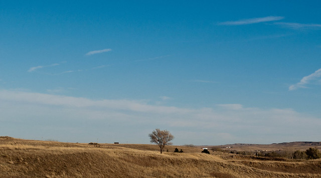 DSC_0966.jpg by MrDespair, on Flickr And here is a bird. 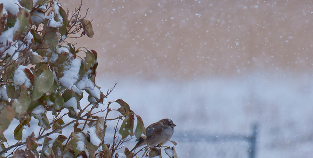 Settling In by MrDespair, on Flickr
|
 #
¿
Nov 29, 2011 22:56
#
¿
Nov 29, 2011 22:56
|
|


|

|
| # ¿ May 1, 2024 02:34 |
|
|
I should post in here more. First, what was originally a snapshot. I'm pretty happy with the overall look, but I'm really not that happy about the reflection cutting across the lens. My lighting was pretty bad (3200 iso + a flash), but I'm wondering especially what would be a good way to light this up to give it a good even fill without getting any glare in the lens. Probably just need to make a lightbox or use the tripod. I also need to stop it down at least 1 more stop, the top of the lettering seems to be going out of focus as well.  Old School by MrDespair, on Flickr This one I feel pretty good about too, but I think the bird might be a bit underexposed?  DSC_1486.jpg by MrDespair, on Flickr
|
|
#
¿
Feb 7, 2012 01:36
|
|
|
Bad Munki posted:
I think this could work pretty well if you got a straight on shot from the side, so that you could have a level horizon with the fence and hopefully get rid of some of the clutter from the picture, like the bushes. Maybe from a nice low angle, so the holes in the sides line up?
|
|
#
¿
Feb 7, 2012 23:15
|
|
|
Ambihelical Hexnut posted:Critiques a few posts up. Here are some more loving landscapes. Again. I really like these, although I think the sky is a bit blown out in the last one. Maybe a mask over the horizon to lower the highlights and bring the clouds/blue back out? Also there's a dust spot in the sky on the right half that's bugging me now that I've noticed it. This is a shot I took a few months ago in the evening as some snow flurries were coming in. I like how there's a nice split down the middle between the incoming snow and the blue skies. I'm not sure which of these crops work better, or if I should try something else with this. 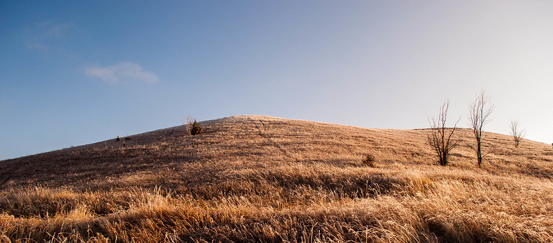 DSC_1259.jpg by MrDespair, on Flickr 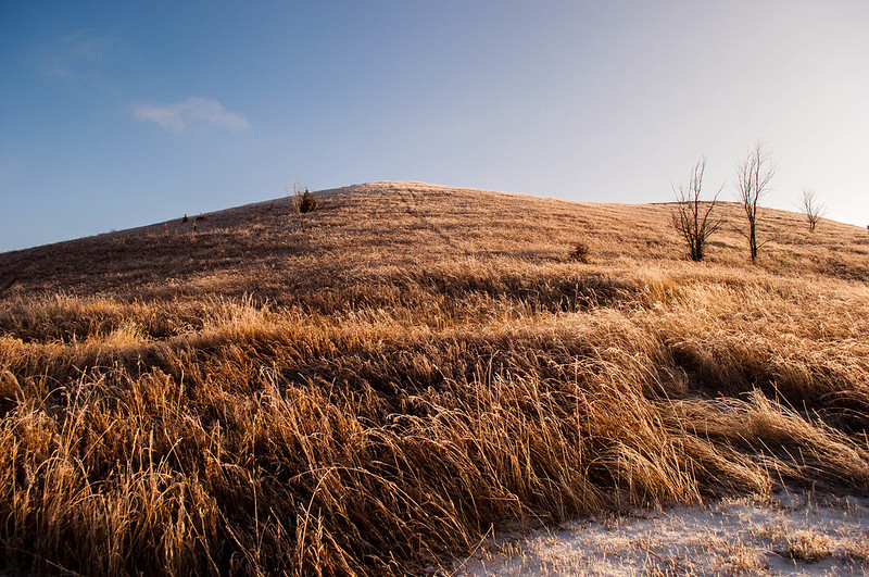 DSC_1259.jpg by MrDespair, on Flickr
|
|
#
¿
Apr 6, 2012 21:13
|
|
|
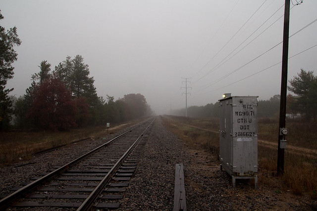
Cacator posted:Opinions on the framing with this? It was just a snapshot so he was originally centred and I cropped it, I feel he's still a little too in the middle but it was better to have the traffic lights be more centrally positioned. Also, should there be more space above his head? Below? I don't take a lot of portraits. I think it would look better with the subject in the center. The background is busy enough that the traffic lights don't need to be centered, I didn't even really notice them until you pointed it out. e. I guess I have taken a picture recently.  Ross Headframe by MrDespair, on Flickr Alternate title: Why the gently caress are there so many cables stretched across this valley? Dr. Despair fucked around with this message at 23:06 on Apr 15, 2012 |
|
#
¿
Apr 15, 2012 22:21
|
|

|
Hotwax Residue posted:
I really like all of these. The only issue I have with any of them is that the trees in the first one seem to be leaning just a little to the right. 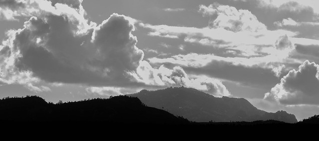 Harney Peak by MrDespair, on Flickr
|
|
#
¿
Apr 20, 2012 02:36
|
|


|
the nicker posted:I really like how the mountain in the background lines up perfectly with the one in the foreground, so that it looks like a single ridge splits into two. Was that intentional when you framed this? Not really, I was actually up on a ridge shooting some broadcast towers, and when I looked at Harney Peak everything sorta just lined up. nielsm posted:The clouds really dominate this, and they seem terribly flat to me. Half is medium gray, the other half is blown highlights. I know they are supposed to be clouds, but they just don't feel like that. They also blend with the rest of the sky which has almost the same shade of gray. Try adjusting the amount that blue takes part in the b/w conversion to change the sky's shade relative to the clouds. I'll try this, I've swapped hard drives recently so I need to copy my old lightroom folder over still. :/
|
|
#
¿
Apr 23, 2012 17:45
|
|
|
Gotta post a critique dude.
|
|
#
¿
Apr 23, 2012 18:22
|
|
|
Edmond Dantes posted:I did, a few posts up. My shame knows no bounds 
|
|
#
¿
Apr 23, 2012 18:36
|
|
|
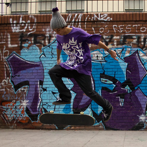
Edmond Dantes posted:I think I may have posted one of these in the previous snapshot a day thread (checked the current locked one and they're not there), so apologies in advance if you've seen them before: I like the concept here, but the background is so busy that it's hard to focus on the skateboarder. Maybe if he was wearing a different colored shirt and pants, something that popped out from a blue/purple backgrounds, but right now he gets lost in the clutter. I don't normally shoot portraits of any kind, but I like how this came out.  A wild hippie strikes. by MrDespair, on Flickr
|
|
#
¿
Apr 24, 2012 16:33
|
|
|
David Pratt posted:I like this a lot. I think the central composition actually works. We're losing a lot of detail on the torso though. Some fill light, or an adjustment brush to up the exposure there would help get some back. Also, maybe it's just me, but have you considered adding a bit of colour to the image? I rarely leave stuff purely greyscale, it's worth experimenting a bit with shadow split-toning in case there's a colour that better fits the mood of the image. It was shot with black and white film, so there isn't much color to find, and adding color with split toning just looks weird to me. Nothing I've tried before, but I tried messing around with it in light room and couldn't get anything that I liked. Here's a version with the levels tweaked a bit though. I still prefer the darker version myself, I think the bolder colors outweigh the detail in the sweatshirt (since there isn't much there).  
|
|
#
¿
Apr 25, 2012 01:50
|
|
|
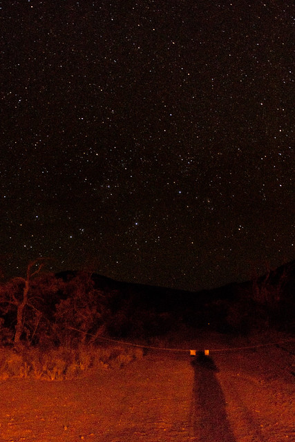
Kiri koli posted:
Maybe try dropping your iso down? It seems like you've got a ton of noise going on in that shot. Sure you'll lose some stars, but it'll probably look a bit more natural. The white balance can probably be tweaked to get rid of that reddish tint too.
|
|
#
¿
Jun 7, 2012 03:47
|
|
|
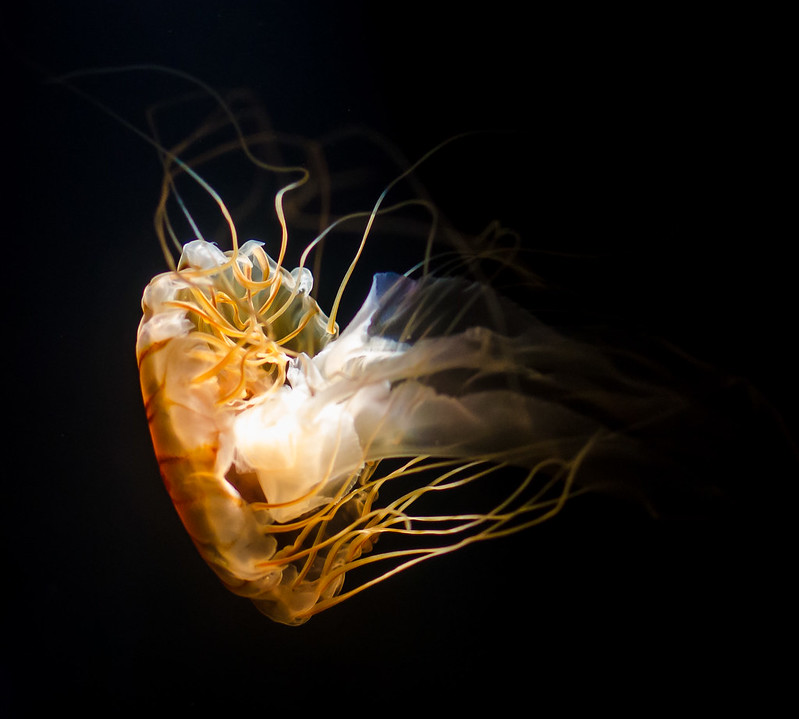
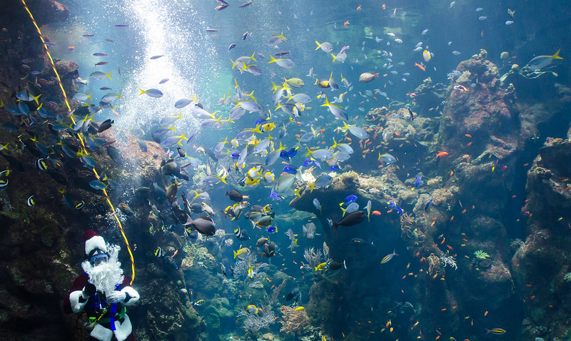
SeamusMcPhisticuffs posted:I've been going through some Lightroom tutorials since I just got LR4, and now I'm going back through some old photos to see what I can do. Here are a couple from the San Francisco Academy of Sciences aquarium. I think the jellyfish shot still works good. The jellyfish is already translucent and whatnot, so having a little bit of blur on the edges doesn't seem like that big of a deal, and with that solid black background I think it's awesome. As far as the second shot, maybe try a polarizer? Hard to tell if that would help or if the water really is that murky in real life though.  DSC_0225.jpg by MrDespair, on Flickr 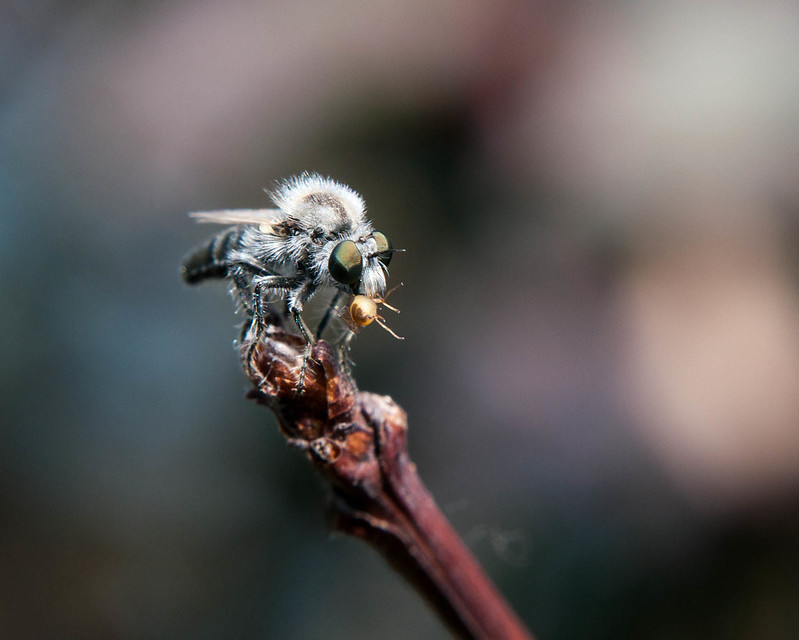 DSC_0236.jpg by MrDespair, on Flickr
|
|
#
¿
Jun 29, 2012 04:24
|
|
|
Yeah, I wasn't going to get much more DoF on those shots. I was already stopped down pretty far, and any further wound up hurting the shot more then helping it. As far as your shots, the big thing that jumps out to me is that the horizon doesn't seem straight. I think your processing in general is good tbh. (Lightroom4 has pretty good noise reduction too, if you want an easy way to get rid of it).
|
|
#
¿
Jun 30, 2012 07:46
|
|
|
It seems to me like there's some lens flare or something going on in the trees causing the green spots.
|
|
#
¿
Jul 3, 2012 06:51
|
|
|
LargeHadron posted:What the gently caress? I lived it CA for 23 years and I never saw a green hill like that. Everything was always dead. What part? Yeah you have. http://en.wikipedia.org/wiki/Bliss_(image) 
|
|
#
¿
Jul 8, 2012 01:15
|
|
|
dowdy_pants posted:All three are great, and the last one is really sweet. The boy reminds me a little of my youngin'. Really like this shot. It's got this thousand yard stare going on, like the kids just realized how much live he's got left to live and it's blowing his mind. Guess you could straighten it a bit so that hard line in the background is straight up and down, but the rest of it really clicks for me. Here's something different. Close up shots of the screen of a Galaxy Nexus, at two different levels of zoom (40x and 200x?)  DSC_0019.jpg by MrDespair, on Flickr 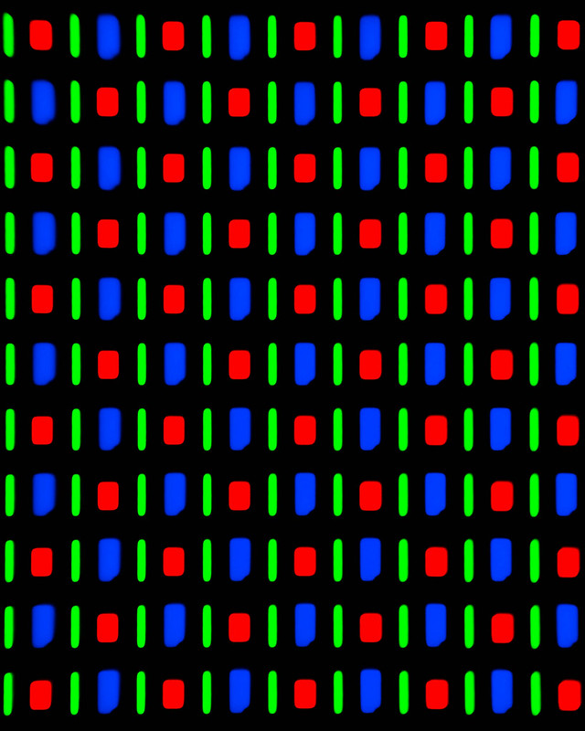 DSC_0020.jpg by MrDespair, on Flickr
|
|
#
¿
Jul 10, 2012 23:54
|
|
|
I used a microscope for these shots. There's something about the OLED screen that really makes it pop, the other ones just seem soft in comparison. Probably part of the reason that OLED screens look so nice. This was from a low end laptop screen 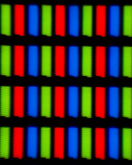 DSC_0542.jpg by MrDespair, on Flickr And the other screen I've tried this on has been a real pain. This was after some light processing, and I really haven't been happy with the processing on it. Lots of bleed through on the edges, everything is just kinda messy. 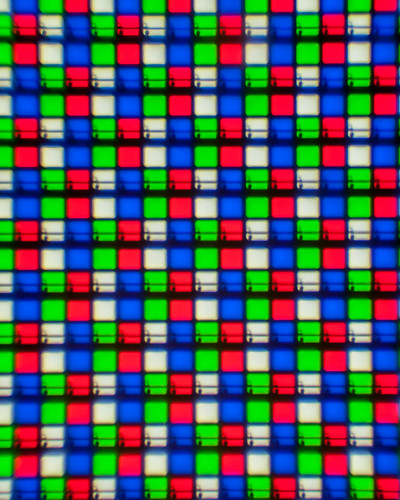 DSC_0541.jpg by MrDespair, on Flickr Just now I decided to try it again and managed to reach this, which I dunno. Seems like it might be a little heavy on the processing, but I do like it better than having the really bad bleed through on the last version. 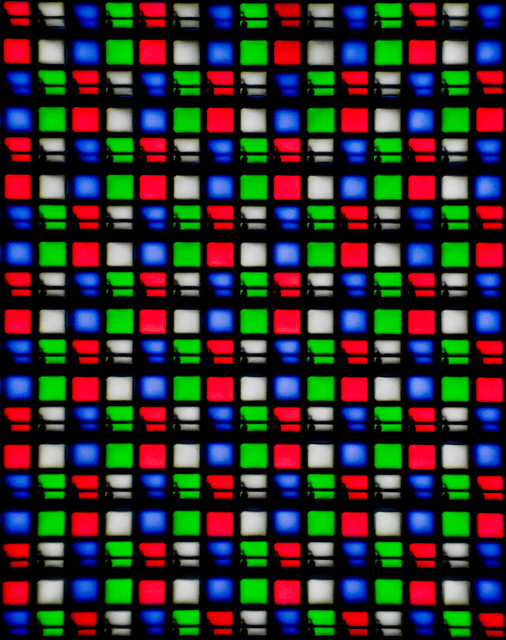 DSC_0541.jpg by MrDespair, on Flickr Then I wound up with this and realized that I should get some sleep.  DSC_0541-2.jpg by MrDespair, on Flickr Dr. Despair fucked around with this message at 18:54 on Jul 11, 2012 |
|
#
¿
Jul 11, 2012 08:00
|
|
|
LargeHadron posted:I actually really like these. How did you get the zoom so close? I prefer the second photo, as the different shapes (particularly the awkward shape of the blue component) give me something to focus on apart from the pattern of colors. I am curious though - did you come up with this idea on your own? I haven't seen other photos like this, but I'm willing to bet there are many out there. It would be nice to be the guy who thought of doing it first, or to do it in a different way than others have. HEY I just got an idea. Take these same photos, but use a wide variety of smart phone screens and make a series out of it. I imagine there are noticeable differences in the pixels depending on the manufacturer. The result might be cool. These rule, and don't seem noisy at all. The first two definitely tell me "yup, this is night time" and its awesome. e. Hey look at me double posting like someone who needs sleep.
|
|
#
¿
Jul 11, 2012 08:07
|
|
|
Wafflecopper posted:I really like this one. The subject is interesting and it's well composed. I agree with nielsm that the window light is fine. The contrast between the windows and the soft light over the rest of the shot is nice, as is the contrast between the blues and reds. I like this one, but the blown out sun is pretty distracting. Maybe try a crop to get rid of that and leave the focus on the road? Or at least kill the highlights a bit? It's the strongest picture of the three to me either way. I just shot some black and white film too.  40mm041.jpg by MrDespair, on Flickr  40mm019.jpg by MrDespair, on Flickr  img145.jpg by MrDespair, on Flickr (ok, the last one was actually Portra)
|
|
#
¿
Aug 29, 2012 06:44
|
|
|
BreakingDolphins posted:The car really stands out in the picture and that's also what I like about it, it seems that the horizon is a little bit of but that might just be me, also the bouncy houses in the background are still a little bit too much. Maybe you could even try to go completely wild and try a sin-city effect on the car? I think this is a bad idea.
|
|
#
¿
Sep 21, 2012 04:25
|
|
|
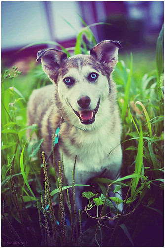
I'd straighten the horizons on both of them. And then I'd give that 2nd dog a treat and a pat on the head and tell him that he's a good dogge that doesn't need to look so sad. e. also you should never go outside with a camera again, I guess.
|
|
#
¿
Sep 24, 2012 07:38
|
|
|
Mannequin posted:The fact that you're posting the first one up for criticism makes me wonder what the hell you are doing. It's a snapshot. A silly photo for fun or for yourself and has no meaning. Am I supposed to critique your composition here? Or would you prefer I say your white balance could be adjusted or something? It's a stupid photo. Keep your stupid photos to yourself. no, you're a stupid photo. e. Sovi3t posted:It's nice, the light is great, but something feels a little off. Almost as if the background is in some sort of "uncanny valley" of sharpness. Or maybe the water is too distracting. Overall it just feels a bit too contrasty. I agree with the last man standing on the 2nd photo, but the first one is cool but maybe try reversing it so it isn't obviously mirrored? It's pretty jarring having the shirt be backwards. Dr. Despair fucked around with this message at 04:01 on Sep 27, 2012 |
|
#
¿
Sep 27, 2012 03:56
|
|


|
The Something Awful Forums > The Finer Arts > Creative Convention > The Dorkroom > Photo a Day: Wherein You Post a Photo, but only if it has a clear and preplanned point, or else.
|
|
#
¿
Oct 6, 2012 06:13
|
|
|
ruro posted:
I agree about the processing, you've got some haloing going on with the flower. Would have been nice to get a higher angle on it so you have more in focus grass too. A tighter crop to get rid of some of the blurry grass can probably help too. Like, maybe even really tight, just the hoverfly and the flower maybe. That said I really like the idea.
|
|
#
¿
Oct 10, 2012 05:13
|
|

|
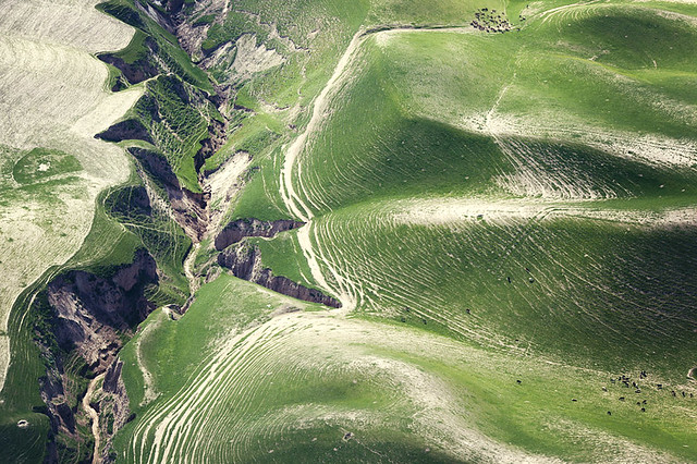
Casu Marzu posted:^^^ I really like both of those. Unlike a lot of landscape photos, there's a lot of little things going on that really make me want to blow the photos up and look around for a while. The vivid green from the seaweed in the first and the awesome texture you picked up on the rocks in the second really make the photos. Not a fan of the first one, seems darker than it needs to be to me. The second one is quite nice (although probably a bit clich�, but whatever, it works real nice with the fog). The third one really stands out of the three though. Very dark and foreboding. I like it. I shot some landscapes after my shift earlier this week. 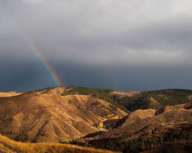 Double Rainbow by MrDespair, on Flickr 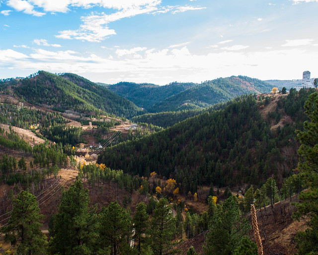 DSC_0454.jpg by MrDespair, on Flickr  DSC_0452.jpg by MrDespair, on Flickr
|
|
#
¿
Oct 18, 2012 16:43
|
|
")

|
krackmonkey posted:Of the 3, the last 2 are by far the strongest images. I can see why you may be unhappy with them, but I honestly feel like if you hadn't prefaced the pictures with your explanation, there would be a fair amount of people who would never guess that you weren't happy with the outcome. I second guess pretty much everything I do, and I am always surprised at what people like from my stuff versus the things I find strongest or better. It's tough to be critical of yourself, and the common approach is usually to be far less fair on yourself than you would be on others. I dig the first one. No complaints there. The second one I'm not as big of a fan of. The tree is just blocking too much of the buildings, and the buildings just seem more interesting to me.  hp5021.jpg by MrDespair, on Flickr  hp5036.jpg by MrDespair, on Flickr
|
|
#
¿
Oct 22, 2012 05:54
|
|

|
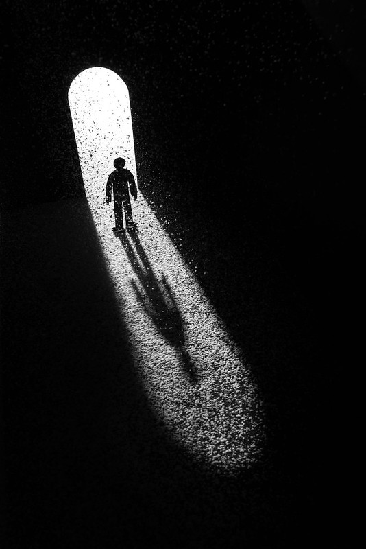
David Pratt posted:
This owns hard. If I did anything different it'd be to edit out the black area so it's completely black (specially in that top third).
|
|
#
¿
Oct 26, 2012 04:20
|
|
|
huskyjackal posted:I really like the effect you achieved, it is definitely surreal. What I'd like to see is more space above the head so the hair is not cut off and more space off to the left where she's reaching, I keep expecting to see more than just smoke above her hand, like an orb of light or something. I am definitely drawn to that side. On my screen her forehead looks slightly over-exposed, that's minor. I dig this shot a lot, the lighting is just great. Your dogge is green 
|
|
#
¿
Nov 13, 2012 00:18
|
|
|
89 posted:Just got my Nikon D5100 a few days ago. My first entry to DSLRs, I've always used just my iPhone before that (3GS all the way up to the 5). Everything is still new to me, and I have a lottttttt to learn. But, only one way to find out what I'm doing wrong, so I'm probably gonna be a new mainstay in this thread. Here's 3 shots I've recently taken so I don't overwhelm: Go read a copy of understanding exposure, it's really helpful! Then post a critic before you get probated for not posting critique. Otherwise I don't have much to add that wasn't already said in the other thread. I guess try and make sure your shutter speeds aren't too low and what you want is in focus, the only thing that seems sharp in any of those pictures is the guy in the third. dopaMEAN posted:That website is incredibly helpful, thank you so much! "I like the picture of the women" is pretty weak critique, but at least you did a little for yourself to make up for it. What lens were you using, and was it near dusk? I get the feeling that you either had the iso cranked way up, or you were using a short lens and wound up cropping heavily, and either way you wound up jacking up the noise reduction to compromise. One other thing, with the third pic you might want to consider setting your camera to spot meter, that way you can make sure it meters for the bird and not the sky. Also Go read a copy of understanding exposure, it's really helpful! Might as well post something since I'm here.  DSC_0686.jpg by MrDespair, on Flickr 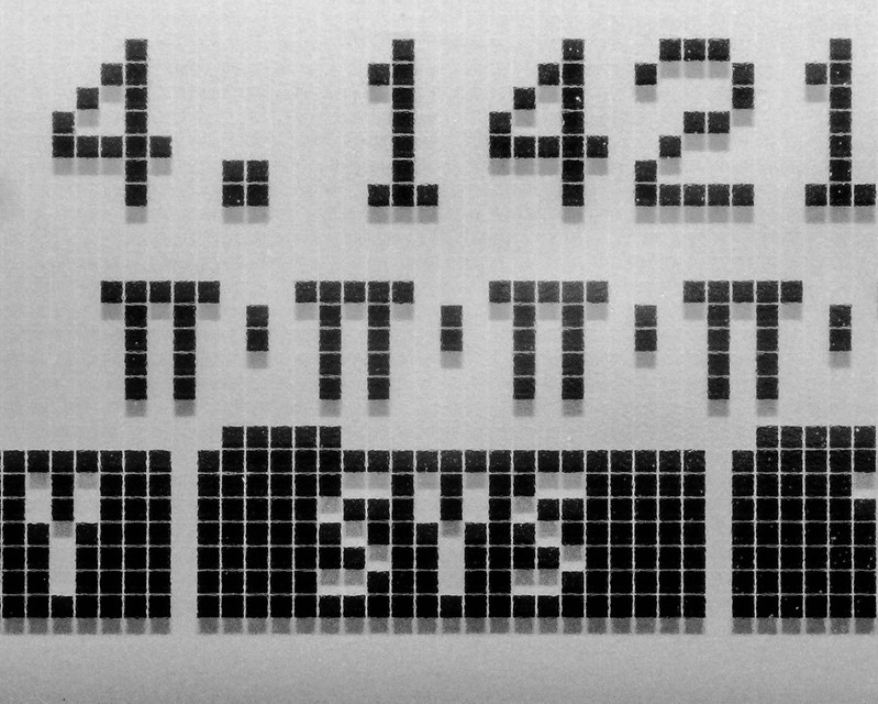 DSC_0307.jpg by MrDespair, on Flickr  acros100007.jpg by MrDespair, on Flickr
|
|
#
¿
Nov 28, 2012 16:53
|
|


|
Oh. My. Zeus. posted:I'm the same as you about being new, so my advice isn't worth much, but I have mixed feelings about this photo. I personally love big sweeping landscapes, but it's just a little too gray and dark, considering there's nothing to really grab attention. The light is interesting, and you caught it in the clouds at a really opportune time, but it needs something to focus on. I agree with nielsm that the town on the right could work. I think the first would work better with a focus on the skyline. The tram + tall buildings just seem interesting to me, more so than the crowd of people wandering about. Or maybe it's interesting because they tower over the people so well. Basically I just wish the top of that building wasn't cut off. The 2nd pic I think might pop better if you tried it with the light coming from the back, so the buildings were better lit. Or maybe just move up enough that the building on the right there is out of the way, seems like it might be hard to get both sides of the street well lit at the same time. 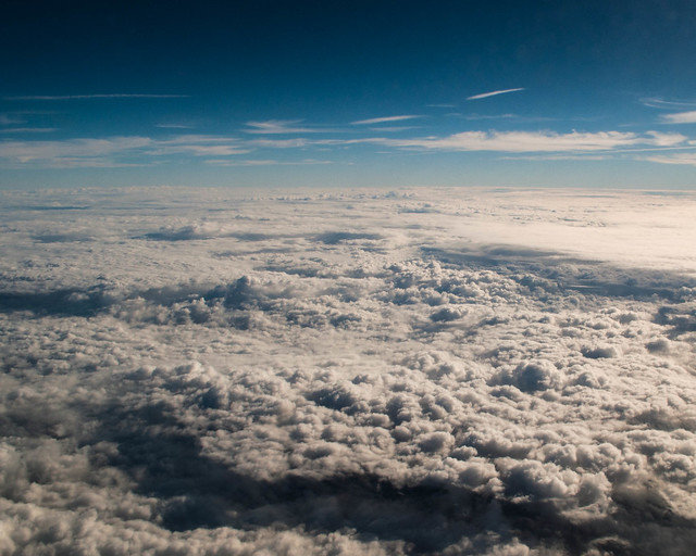 DSC_0046.jpg by MrDespair, on Flickr  DSC_0029.jpg by MrDespair, on Flickr 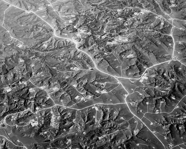 DSC_0112.jpg by MrDespair, on Flickr
|
|
#
¿
Dec 7, 2012 07:40
|
|


|
nielsm posted:Edit: Nope, just really white roads paired with some diffuse but harsh sun. Was also taken from the back of the plane so there's a bit if a haze from the jetwash too, that's a big reason why the "glow" is so strong in the center of the pic and not bottom, for example.
|
|
#
¿
Dec 7, 2012 17:14
|
|
|
The first one I just pushed the exposure and highlights a bit (maybe a lot) to wash out the sky. Here's a more "nature" version of the same thing to give you an idea of how far I pushed it. 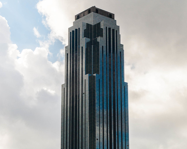 DSC_0029.jpg by MrDespair, on Flickr In the same manner here's an untouched shot that I took at the same time as the 2nd one above. Dropped exposure a bit, upped the contrast, and min/maxed the whites and blacks. 
|
|
#
¿
Dec 9, 2012 04:39
|
|
|
Have you already found a copy of Understanding Exposure to read through? It'll explain everything it sounds like you're trying to figure out by trial and error. Your local library should have a copy if you don't want to buy one.
|
|
#
¿
Jan 4, 2013 02:00
|
|
|
krooj posted:Thx, and TBH, I am also partial to the un-cropped version. The photo was shot using my X-E1. I'm too much of a cheapskate to go back into film (despite living above a photo shop that develops in house). "my x-e1" and "too much of a cheapskate for film" doesn't compute to me.
|
|
#
¿
Jan 8, 2013 18:31
|
|
|
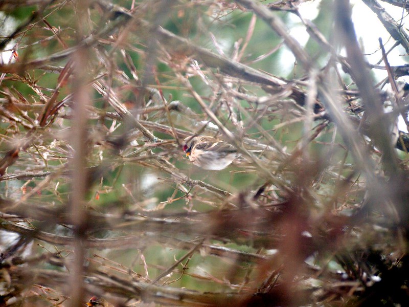
tijag posted:Sorry you got probated because you didn't read the rules, but I have to say this picture is really glorious. From where did you take this picture? It seems like it would be quite rare to be above a bird like this. You did a great job with whatever you did to get this image. This not be the case for him, but it looks to me like a bird landing at a lake of some sort which makes it a lot easier to get above them.
|
|
#
¿
Jan 8, 2013 23:33
|
|
|
Abbeh posted:I have to agree with InternetJunky here - with the wire running right under the eye like that, it's just too distracting. If you could have been a little higher or lower while taking the photo and had gotten the whole head in, that would have made a huge difference. If you could get rid of the wire with photoshop I bet that would really improve the picture. I think this would be a very nice photo if you spent a little bit more effort to clean up the light leak looking effects and cloned out the scratch.
|
|
#
¿
Jan 10, 2013 21:37
|
|
|
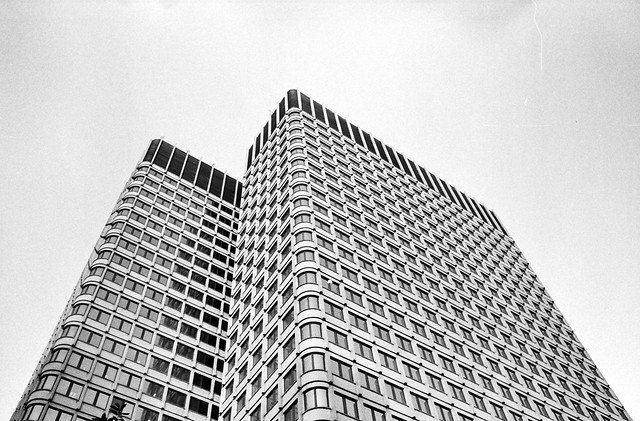
ShadeofBlue posted:I like the second better. The first one feels a little cramped, I would like to see a bit more space above the buildings. In the second one, the buildings also look taller somehow, I guess probably because of the extra room at the top and because they look better spaced out. Comparing the two images, the first looks like a photo you took from where you happened to be standing, and the second looks more planned out. The buildings line up in more pleasing ways, while in the first they kind of run together. I hope that makes sense. There is still a bit of a distracting hole in the second one, but I doubt there is anything you could have done about that. In the first photo it's not quite as bad, being off to the side. I think the tip on the left is fine, but a tighter crop might be worthwhile. The empty top just doesn't seem like it adds anything.
|
|
#
¿
Jan 20, 2013 07:39
|
|
|
Awkward Davies posted:
You also haven't posted critique since August. That said, the first crop looks nicest to me, but I'm not a fan of the whole dreamy look thing going on.
|
|
#
¿
Jan 21, 2013 02:38
|
|
|

|
| # ¿ May 1, 2024 02:34 |
|
|
I prefer the first one, but have you considered a more vertical crop, and just getting rid of the walls?
|
|
#
¿
Jan 30, 2013 17:22
|
|