


|
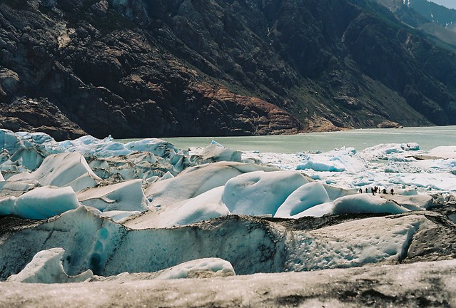
Primo Itch posted:Some from Patagonia I would crop the bottom out of this one, the oof foreground doesn't do much for me. A more panoramic crop just seems like it'll work better, and make it easier to notice the people.
|
 #
¿
Feb 12, 2013 03:07
#
¿
Feb 12, 2013 03:07
|
|


|

|
| # ¿ May 21, 2024 17:35 |
|
|
somnambulist posted:I like this but SOME detail in the black space would help. I like how dark and moody it is, but some context of the room (very subtle) would help this photo imo. My first thought was "cool" but then I looked at the other version you posted in SAD and I like the full color version more.
|
|
#
¿
Feb 23, 2013 07:18
|
|
")

|
Opals25 posted:
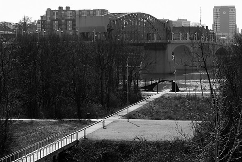
The first and the third don't really have a focus that draws me in. It's a nice overview of everything, but nothing that makes me interested. The 2nd one is close, but I get the feeling that you weren't quite centered on the bridge, and it throws everything off. Maybe if you can shoot it again back off a bit so that the whole walkway/bridge can be in view, and try to center yourself a bit more so that the left and right rails look the same. I'm crossposting these from SAD cause someone told me to. I think. probably. The sun was setting at the back/side of most of these, so the backgrounds pretty blown out. I might have to go back when I have access to photoshop and try using a mask to even that out.  P2250360.jpg by MrDespair, on Flickr  P2250358.jpg by MrDespair, on Flickr  P2250352.jpg by MrDespair, on Flickr
|
|
#
¿
Feb 26, 2013 05:47
|
|

|
RangerScum posted:It's part of Indiana Dunes State park, about a one hour drive from Chicago, which after looking at your avatar I am guessing is probably somewhat close to you. Yeah, this looks like you cropped in a nightime sky with a daytime smoke cloud and then added some balloons and it just feels really unnatural. MrBlandAverage posted:FYI, the Michigan City Generating Station uses coal and natural gas, so it's not nuclear Coal produces more nuclear waste in the atmosphere anyways, so maybe he's just making a really witty point about the downsides of coal power? 
|
|
#
¿
Feb 27, 2013 19:09
|
|

|
Baron Dirigible posted:
Looks like snow to me (a dirty sensor shouldn't ever show up as white dots).
|
|
#
¿
Mar 4, 2013 23:16
|
|
|
copen posted:Edit: I like the processing on the first, but cutting the top of the building off is pretty jarring. The 2nd one is nice too, but you could have stopped down some more to get the whole squirrel in focus. Messing with expired film.  1600superhg050.jpg by MrDespair, on Flickr  1600superhg051.jpg by MrDespair, on Flickr  1600superhg043.jpg by MrDespair, on Flickr
|
|
#
¿
Mar 11, 2013 04:06
|
|


|
404notfound posted:
Yo unless your lens was horrifically dirty those spots were probably on your sensor. It's really loving hard for stuff on the front of the lens to show up in the final picture.
|
|
#
¿
Mar 14, 2013 14:47
|
|

|
Dial M for MURDER posted:I really like the colors of this shot, but for some reason her limbs seem to be out of balance; like she has larger arms and legs than her body should allow. Something of the perspective looks off somehow. Your horizon is super crooked. Nice otherwise though. Matlock posted:
Don't have too much to say about these, but they are quite nice. Any particular reason you chose to shoot in B/W for a wildlife shot? Also remember to add in some critique in the future! Here's one of mine. I feel like I have a bit too much open space (there was a chair just below what I cropped).  _5130338-Edit.jpg by MrDespair, on Flickr And this is a cliche macro shot that I liked.  _5100500.jpg by MrDespair, on Flickr Dr. Despair fucked around with this message at 04:20 on May 17, 2013 |
|
#
¿
May 17, 2013 04:16
|
|


|
Edmond Dantes posted:Sorry, couldn't resist. Went full Sergio Leone (2.35:1). I like (and stole) this idea   _5130338-Edit.jpg by MrDespair, on Flickr
|
|
#
¿
May 17, 2013 17:07
|
|


|
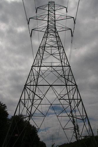
mAlfunkti0n posted:I live under power lines. I feel like it's underexposed a bit, but I'm not sure how to fix that without either blowing out the sky metering elsewhere or making it to dark like this while keeping the sky mostly in check. I agree, the sky is a bit dark, although I like how the tower/trees are nice and black, it helps with the monolithic feel of the picture. I would try pushing the whites and highlights a bit more, or raising exposure and lowering the blacks/shadows to keep the tower dark. It might be worth it to convert to black and white and up the contrast too, you could probably get away with making the sky a bit brighter (and honestly the blue sky poking out seems like more of a distraction than anything else). fake edit: looking at it full size I see that there is a bit of color in the shadows still, so you can either just increase the exposure a bit to make that clearer nad make the colors stand out more, or try going full on black and white. Or somewhere in between! I mean, if your sky was clear and blue and flat I would expose for the trees and tower, but the sky's got some texture and stuff, more so than the trees and tower do here. I am a fan of the blacked out foreground look for that sort of shot though:  _5250407.jpg by MrDespair, on Flickr  _5270451.jpg by MrDespair, on Flickr
|
|
#
¿
Jun 3, 2013 21:24
|
|
|
You can also invert by pressing ctrl-i . Cool experiment though!
|
|
#
¿
Jun 5, 2013 00:08
|
|
|
xzzy posted:I wouldn't say it was "hammered" but there is talk about it.. somewhere. I have no idea what thread it was in though. Probably the Photojournalism thread.
|
|
#
¿
Jun 5, 2013 17:33
|
|
|
Count Freebasie posted:Just got back into photography after a four/five year hiatus. Street has always been my favorite. First shots in a long time yesterday -- here's one: It's pretty hilarious seeing someone apologize for breaking a rule only to have the very next poster break the same rule.
|
|
#
¿
Jun 19, 2013 14:49
|
|

|
Count Freebasie posted:I'm pretty new to this, so if you want me to gently caress off with my criticism, feel free to let me know. Telling someone to gently caress off because of criticism is a probatable offense, so critique all you want. It's a good way to improve!
|
|
#
¿
Jun 20, 2013 01:46
|
|
|
Boneitis posted:I don't know, for some reason I kind of like the sign being in the picture. I can't really explain it but it seems like it's in a good position to draw the eye to both the chicken and the sign, but no where else distracting. And it also almost suggests of the danger that the chicken poses This shot's got some good potential, but definitely do some post work before rushing out to show everyone, it'll be worth it in the end. Clone out the dust, bring up the exposure, double check that your horizons are straight, and don't fret about the ice machine, it looks fine there. It's no more out of place in the picture than the boat is.  P6280062.jpg by MrDespair, on Flickr  P7030024.jpg by MrDespair, on Flickr  P7030074.jpg by MrDespair, on Flickr
|
|
#
¿
Jul 4, 2013 03:29
|
|

|
rio posted:What is that object with the It's a broken pot.
|
|
#
¿
Jul 4, 2013 04:03
|
|
 face at the bottom?
|
Marshmallow Blue posted:I agree, especially in regards to the part I bolded. Personally I like to catch moving water still, but this is kind of middle ground where maybe the light around you doesn't allow a shutter speed fast enough for that and its not slow enough to make the water more flowy. A cool part of this composition is how the river flows towards where the sun is busting through the trees. You have this nice scenic vista of a lake, and the only thing in focus is a sign 5 feet away. Shoulda stopped down to get everything interesting in focus, and I probably woulda ditched the sign too, I don't think it's a very strong focus. Might as well post some fireworks while I'm here.  P7041027.jpg by MrDespair, on Flickr  P7041028.jpg by MrDespair, on Flickr I call this one: Generic 70's Coor's Ad.  35img046.jpg by MrDespair, on Flickr
|
|
#
¿
Jul 11, 2013 18:29
|
|

|
Is that what they call "the leica glow"?
|
|
#
¿
Jul 24, 2013 14:44
|
|
|
SpaceGoatFarts posted:Aboard the USS Alabama. New here and just open to any criticism to help me get better at this. Thanks! Hey you should post some critique before you get double super banned or something for not reading the OP because there's a reason the thread title says to read the OP. Hurry, hurry! Before it's too late!
|
|
#
¿
Aug 1, 2013 23:32
|
|


|
InternetJunky posted:I'm interested in opinions on post-processing and crop choice for this image (since that's basically all that's in my control) I like the processing, I would go with a wider crop though. 8x10 or wider instead of a square crop. Mr Yuck posted:Millionth-ing that this doesn't feel exploitative. Had she been asleep and drooling, perhaps, but it's a complete story in one frame. I didn't immediately think that she had Alzheimer's. It just seemed like it was chronicling the realities of aging (which it still does, just in a different way). I like the first one, the second one I'm not a fan of though. The pier is just too obviously not in focus for me, I would have liked to see you get the pier in focus and then stopped down further to keep the focus pretty solid out to infinity. Soft clouds are hard to notice, soft edges on a hard silhouette not so much. When in rome~  P8150218.jpg by MrDespair, on Flickr  P8200806.jpg by MrDespair, on Flickr  P8200821.jpg by MrDespair, on Flickr
|
|
#
¿
Aug 25, 2013 17:45
|
|


|
Probably closer to f/16 or f/22. As far down as you can stop before diffraction makes everything too soft for your taste.
|
|
#
¿
Aug 25, 2013 18:17
|
|
|
grack posted:
GunForumMeme posted:
|
|
#
¿
Mar 11, 2014 16:22
|
|


|
mulls posted:This is really cool. I also notice that my eyes start at the bottom and move up and to the left, which is unusual. I think part of what makes this great is that the figure leans diagonally, which is a lot more interesting tracing a path straight upward. dust yo negs, man
|
|
#
¿
Dec 24, 2014 03:20
|
|

|
squirt the daisies posted:I like the colours on this photo but due to its fov i feel constrained on where my eyes can look. Also, with so many lines in the picture (shadows, trees), those light patterns under the bridge are hard to see. One other thing i like is that it gives me a HL 2 vibe find a copy of understanding exposure and read it, and then don't bother naming all your pictures cause man it's weird and if your picture needs a name to explain what's going on then it's probably not doing it's job your snow looks really blue on my screen too, might want to check your white balance  PC230055.jpg by MrDespair, on Flickr PC230055.jpg by MrDespair, on Flickr PB090156.jpg by MrDespair, on Flickr PB090156.jpg by MrDespair, on Flickr _MG_0757-Edit.jpg by MrDespair, on Flickr _MG_0757-Edit.jpg by MrDespair, on Flickr
|
|
#
¿
Jan 3, 2015 01:14
|
|
 ).
).


|
totalnewbie posted:A good rule of thumb is 1/60 or faster for hand-held shots. On the staircase photo, you're at 1/25, which will introduce some camera shake. This will all be explained in Understanding Exposure, but you'll either have to have a lower f-stop which sacrifices depth of field, or increase ISO, which adds noise. I think a more useful rule of thumb is 1/focal length, so if you're using a 300mm lens you want to shoot for 1/300, if you're shooting a 15mm lens you can probably get away with 1/15. That's assuming you're shooting 35mm, so on crop you might be a little worse off, but still, it's a good starting point.
|
|
#
¿
Jan 6, 2015 03:25
|
|
|
sajobi posted:drat, sorry, will post thumbnails from now on better post critique too 
|
|
#
¿
Feb 9, 2015 21:30
|
|
|
threnody posted:I would totally normally agree with this, but for some reason I really love it cranked when it's architecture. You love it like a crack junky loves his next hit. e. 
|
|
#
¿
Mar 26, 2015 01:20
|
|
|
Dread Head posted:You can tell these where shot on a Fuji. 
|
|
#
¿
Mar 26, 2015 22:09
|
|
|

|
|
#
¿
Jul 29, 2016 23:48
|
|
|
Karl Barks posted:I'm hoping to get some critique of some of my street shots. street photography is new to me, and I'm trying to get a feel for what makes a good photo. thanks! dust your loving negs
|
|
#
¿
Aug 5, 2016 05:51
|
|


|

|
| # ¿ May 21, 2024 17:35 |
|
|
InternetJunky posted:I know I desperately need to clean my sensor. Aside from that, I appreciate any input clean your loving sensor jesus loving christ it takes 5 minutes, do you show up at work with a shirt covered in cheeto dust too? or stinking of booze? then why would you post a picture online to show people without taking the time to do even the most basic cleaning to it? god loving damnit man have some pride in your work
|
|
#
¿
Oct 10, 2016 04:43
|
|
