


|
scotty posted:
scotty posted:
scotty posted:
--- Used real smoke this time instead of flour/icing sugar. Incense didn't really work, so resorted to cigarette smoke  If you want to try this out I'd recommend a smoke machine. If you want to try this out I'd recommend a smoke machine.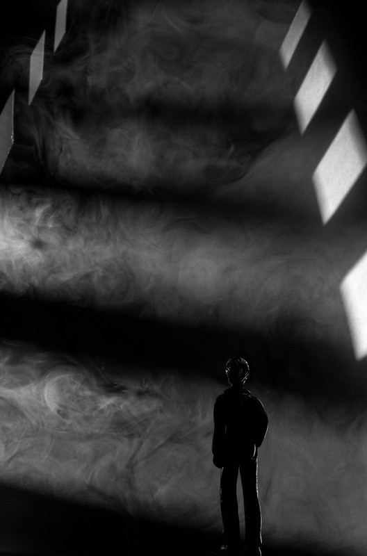 303/366 - Tower of Smoke by fuglsnef, on Flickr
|
 #
¿
Oct 30, 2012 19:40
#
¿
Oct 30, 2012 19:40
|
|


|

|
| # ¿ May 11, 2024 12:22 |
|
|
Do you mean the one with the little figure in the crack in the doorway? That was amazing. It won one of the monthly competitions didn't it?
|
|
#
¿
Oct 31, 2012 10:35
|
|
|
Ninja Woodchuck posted:The plastic-y highlights on the dude in this one bother me ... rio posted:This owns. It it an action figure? Yeah, it's a little white plastic dude painted black with a CD marker. Need to figure out a way to make him more matte, as the highlights are really giving away the scale and I wanted it to be as ambiguous as possible.
|
|
#
¿
Nov 2, 2012 12:13
|
|
|
sw1gger posted:My contribution (from an ongoing surreal-y series I'm working on): Shampoo posted:
 311/366 - Vortex by fuglsnef, on Flickr
|
|
#
¿
Nov 6, 2012 23:45
|
|


|
Arcology posted:The other issue I'm wondering about is whether I'm overdoing the post-production. If you'd like some more focused advice, why not post a before/after image in the post processing thread and we can give you some specific pointers. It's hard to know what post was done (unless it's heinous, which yours isn't) without seeing the original.
|
|
#
¿
Dec 5, 2012 12:10
|
|
|
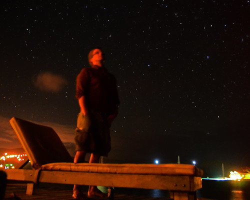
GratefulHume posted:I really love this. Have you considered cropping out the head in the lower left background? It would focus the attention on the man's face which I think are the better part of the photo versus the bubbles. The first one is super red, was this a conscious decision? The horizon isn't totally level, is slanting up to the left, and the stars look slightly elongated. The rule is something like 500/shutter speed for your maximum before getting trails. There's no EXIF on flickr - do you remember the settings? Second one is awesome, you really get a feel for what it would be like being outside that night, maybe quite cold because of the wind, maybe warmer due to the fact that palm trees grow there. Only criticism is the trunks don't look totally in focus, or maybe suffer from some camera shake.  DSCF0335.jpg by fuglsnef, on Flickr  DSCF0325.jpg by fuglsnef, on Flickr  360/366 - Football by fuglsnef, on Flickr
|
|
#
¿
Dec 30, 2012 03:05
|
|


|
Vlex posted:- the horizon has a slant For the horizon, press R to go into crop mode, then hold ctrl to get the ruler tool, and draw a straight line along the horizon to automatically rotate the image. For the bushes, try cropping them out. Maybe a square crop on the left part of the image or a panoramic crop of the pond taking the bushes out from the top?
|
|
#
¿
Dec 30, 2012 03:08
|
|
|
App13 posted:This photo was taken on a train moving slightly slower than the truck. I like how the fence post adds a bit of movement to the photo, but I'm not too sure how I like my conversion to B&W. It strikes me as being a little too constrasty. There are a lot of blacks and whites, and not much in between.
|
|
#
¿
Jan 10, 2013 12:43
|
|
|
InternetJunky posted:Trying a different take on some owl shots from yesterday: In the first one I think it would be nice if the subject was lighter. On the other hand, if a pure silhouette is what you're after it's too light. The angle the bird appears to be flying (and looking) is in the direction of the empty space, which is always good ") The second is lovely, although having the main subject right at the top of the frame creates a tension that makes you want to look back down the tree trunk. Maybe giving it some more headroom would ease this tension. Some portraits:  Elfa pure loves popcorn by fuglsnef, on Flickr  364/366 - Rory by fuglsnef, on Flickr
|
|
#
¿
Jan 13, 2013 17:12
|
|


|
Hypnotized posted:
All three of these feel very dark, especially the top-left of the second one, although they clearly go from white in the sky to black in the shadows. I don't think they're too suited for looking at on a monitor since they lack definite subjects. I'm imagining them printed really big on a wall, so you can stand close and see all the details and really feel the place. The third one's horizon seems slightly crooked. teethgrinder posted:
The lighting is nice on the first one, and his eyes being closed makes it feel nice and intimate. It would be better if the microphone and stand wasn't covering so much of hist face though. I wouldn't have realised the second one was in front of a backdrop if you hadn't mentioned it, I assumed it was an advertising photo since the composition really makes it look like she's in that plane. On closer look though, her face is in shadow and it's really grainy. Some flash might have helped, but then I guess the colour of the light wouldn't have matched the backdrop so well. slardel posted:
I think this would feel more balanced if it was cropped a little more on the bottom left. If the intention is to include the tracks going off into the distance in front of the train carriage I'd have gone a bit closer and panned left. Also, it might just be the train track, but it feels like the horizon isn't straight. This feels underexposed to me, there's little detail in most of the interesting bits like the buildings. I like the way your eye follows a zig-zag between the puddles but the empty ground as the main subject isn't very interesting and feels quite empty (not the good empty). Maybe it would have worked better in colour. quote:
This is the strongest of the three. The two signs are well-balanced and contrast nicely with the green in the rest of the image. It's a nitpick, but I'd have come in a little tighter on the right so the space between the signs and the telegraph pole line up perfectly in the centre of the frame.  Orion Over the Pond by fuglsnef, on Flickr  Museum Night - National Archives by fuglsnef, on Flickr  DSCF0707.jpg by fuglsnef, on Flickr
|
|
#
¿
Feb 16, 2013 21:15
|
|


|
Phummus posted:
J�kuls�rl�n?
|
|
#
¿
Feb 20, 2013 16:51
|
|
|
cory ad portas posted:
The first one is pretty lol. I think the lighting's fine on it, a bit flat, but better than harsh contrasty direct sunlight any day. The second one would have a better flow to it if the chichen had turned its head to the right of the frame. As it is, it feels a bit weird having its face so directly pointing out, and it feels very centred overall. If you want to make the green less distracting, try desaturating just the green. This is really easy in lightroom and should be easy enough to figure out in Photoshop or GIMP. For what it's worth, I like the contrast of the green and red as it is.  DSCF1007.jpg by fuglsnef, on Flickr  DSCF1008.jpg by fuglsnef, on Flickr  DSCF1009.jpg by fuglsnef, on Flickr
|
|
#
¿
Mar 13, 2013 00:22
|
|


|
Opals25 posted:Here's one from an evening walk around my own neighborhood. These are pretty nice. I like that the verticals are... vertical First one, not much to say - nice colours, nice light. Second one seems underexposed, and the cropping is very tight at the top, if you're including the statue it feels like it needs some headroom. Even though the sky is blown (which isn't that much of a problem because there isn't very much of it), the underside of the bridge is still underexposed. If you're losing the sky anyway, expose for the main subject of the photograph. Echoing Magic Hate Ball - it would be a cool location for a portrait shoot, but without some foreground interest it's a bit boring on its own. I've been lugging around a mirror recently. I don't think the out of focus foreground is working, and I probably should have tried to get back and foreground in focus:  DSCF1040.jpg by fuglsnef, on Flickr  DSCF1044.jpg by fuglsnef, on Flickr
|
|
#
¿
Mar 18, 2013 13:58
|
|


|
Casu Marzu posted:I really like the idea of what you're doing, but with background completely obliterated, it's just kind of confusing to look at. Also, did you go in and selectively blur around the mirror? The edges seem really jarringly out of focus. The edges of the mirror really came out like that, I was pretty surprised how fake it looked too. Those first two are great, the first especially. Composition is spot on in both of them, the slow shutter works really nicely for the snow. The third seems a bit underexposed, and the trees on the left aren't really balanced well by the open space on the right. I think a square crop, removing the trees, or panning the camera right may have worked better.
|
|
#
¿
Mar 21, 2013 11:43
|
|


|
The Monk posted:
It seems like you already suspect you've overdone it and that's usually a good sign that you have. It's a great shot otherwise, the high contrast giving it a gritty, movie-like feel. The vignette is too much, especially in the top left - instead of focusing my attention to the centre the vignette itself draws my eye.   Firestarters and Searching for the firestarters by fuglsnef, on Flickr
|
|
#
¿
Mar 24, 2013 23:19
|
|

|
The main elements of any photograph are shape (2D), form (3D), texture, and colour. If you make it monochrome you remove colour from that list and are working with the other three. What that means really depends on the photograph.
|
|
#
¿
Mar 26, 2013 11:39
|
|
|
LargeHadron posted:
No real critique really, just wanted to say this loving rocks. This is great apart from it feels like it's tilting slightly to the right. Dr. Garbanzo posted:
rio posted:
The second one I had to look at fullscreen to really get. I think it would be awesome printed out huge. Bobsledboy posted:
Speaking of which, I've just been roughly following that tutorial for the past few hours on some wildlife pics I took when I was back in the UK the other week. How did I do?  DSCF1561.jpg by fuglsnef, on Flickr  DSCF1656.jpg by fuglsnef, on Flickr  DSCF1553.jpg by fuglsnef, on Flickr
|
|
#
¿
Apr 29, 2013 23:08
|
|


|
Better.
|
|
#
¿
May 3, 2013 01:18
|
|
|
Drop Database posted:
Drop Database posted:
Drop Database posted:
 The Shard by fuglsnef, on Flickr  DSCF1875.jpg by fuglsnef, on Flickr  DSCF1867.jpg by fuglsnef, on Flickr
|
|
#
¿
May 8, 2013 17:45
|
|

|
Primo Itch posted:
The first one is brilliant, as KRock said the light and shadow is lovely, especially the reflection of the sunlit part on the tiles. The second is a bit too contrasty for my tastes, and there isn't a strong enough figure/ground relationship to make the people stand out. Perhaps if it had been framed more to the right and taken a second earlier to get them against the lighter-coloured background. The third feels quite snapshotty to me. I see what you're going for with the contrast of old and new, but the composition feels rushed. How about going for something less conventional like getting the shard to poke up between the spires of the church? I think a subject as iconic as that needs something more brought to it, since everyone's going to be taking the straightforward pictures of it. When I was in London recently I saw it through the plastic covering of an outdoor car park at Bourough Market, and I think it added a bit of atmosphere. Fake Ken Rockwell posted:
The light in that first one is gorgeous  The tone curve does seem a little too much to me, especially the dudes standing against the wall. The contrast between dark skin/white shirts and the dark wall/light pavement is the strongest part of this picture, and it's been de-emphasised by the tone curve.  DSCF2054.jpg by fuglsnef, on Flickr  DSCF1973.jpg by fuglsnef, on Flickr  DSCF1947.jpg by fuglsnef, on Flickr
|
|
#
¿
May 19, 2013 16:31
|
|


|
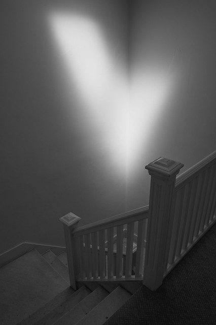
The light on the eyes reminds me of a black and white noir movie, very nice. The rest feels a little underexposed, but maybe it has to be to make the contrast with the eyes work... The figure/ground relationship here is excellent, the bright trees behind her upper body framed by the dark leaves, and the bright patches of sunlight on the ground making her dark legs stand out. The contrast does seem a little harsh though - the aforementioned figure/ground is strong enough naturally that it doesn't need to be overly accentuated. Again, the figure/ground is great. And I like that you can't see his eyes in this, makes it more mysterious. INTJ Mastermind posted:
KingColliwog posted:
KingColliwog posted:
KingColliwog posted:
That's great. The off-centre composition is just right, and the natural light is beautiful. I'd have rotated the camera a little to the right to get the horizontals to line up just right, though. It feels like the bottom of the staircase diagonal should intersect at the same distance from the edge of the frame as the top part. I also think there's something in what the previous poster said about taking a step back with this one. Lovely, great texture and a nice balanced composition. Did you try it in colour first, or was it always going to be a black & white?  DSCF1952.jpg by fuglsnef, on Flickr  DSCF1902.jpg by fuglsnef, on Flickr  DSCF2125.jpg by fuglsnef, on Flickr
|
|
#
¿
May 23, 2013 14:58
|
|


|
The Sheriff Jake posted:Did you crop your photographs to a custom aspect ratio? I was doing that a lot when I first started making photos and it and once I stopped and focused more on composition and framing the photos started coming out a lot better. I used to do the exact same thing. I realised I needed to stop when I tried to get some prints made.
|
|
#
¿
Jun 3, 2013 00:36
|
|
|
Casu Marzu posted:Looks like you shot in the middle of the day. That's gonna make things flat as hell regardless what you do. That's true, but as William T Hornaday has shown in his making-zoo-animals-look-loving-amazing tutorial, flat light can actually be a Good Thing if you're willing to put the time in afterwards to make your own light via dodging and burning. In that shot I'd darken the gently caress out of the crowd to highlight the rider, then maybe do some more selective darkening to add a bit more depth to the horse.
|
|
#
¿
Jun 4, 2013 21:06
|
|
|
Two experiments. Posting here not because they're amazing, but because I'd rather have some feedback and that's not allowed in the low-effort thread. Also I already posted some critique earlier  I recently got a Canon Selphy dye-sub printer, and after the ink spool was done I took it apart. You're left with the bits of ink that weren't printed, so if you overlay the cyan, magenta and yellow you end up with a colour negative of the print. Tried to project it onto the wall but that didn't work (I guess you need a lens to focus the image). Eventually got something working by using baking paper as a diffuser. The first is flash -> diffuser -> negative, the second is flash -> negative -> diffuser. In the process I learned you can invert colours in Lightroom by inverting the tone curve   Colour Negative - test one by fuglsnef, on Flickr  Colour Negative - test two by fuglsnef, on Flickr
|
|
#
¿
Jun 5, 2013 00:05
|
|
|
Samolety posted:
It looks like you've totally smashed the highlights in this one. Check your histogram, there will probably be a big spike on the right hand side. In digital photography it's wise to "expose to the left" - go for the brightest exposure you can without clipping your highlights. It's relatively easy (in RAW) to recover shadow details, but if your pixels are so bright they're > 1.0, there's no information left to recover.
|
|
#
¿
Jun 10, 2013 16:07
|
|
|
wanghammer posted:
I would have panned this over to the right, so the butterfly is in the left of the frame. The light's pretty harsh, for close up bug photos it's sometimes good to use a flash to get more even light. If you're going for a purely documentary style, showing the event as it happened, then I guess you've nailed it I see you shot it around sunset, seems like a good idea since it's given you nice diffuse light. Can't really find anything to complain about on this one, sorry! DSCF2184.jpg by fuglsnef, on Flickr  DSCF2186.jpg by fuglsnef, on Flickr  DSCF2187.jpg by fuglsnef, on Flickr
|
|
#
¿
Jun 16, 2013 03:11
|
|


|
It's not required, but it's better if you critique someone else's work. No one is going to give you a hard time because you're inexperienced, we're all here to learn from each other.
|
|
#
¿
Jun 19, 2013 21:47
|
|
|
Huntersoninski posted:Last one: This would have been better if the birds were more isolated. As it is, the one on the left sort of blobs onto the hay bale in the background. I'd have been tempted to keep the composition very similar - the fence aligned to the bottom works really well - but crouch down so the background is the sky.
|
|
#
¿
Jul 1, 2013 11:22
|
|

|
tropical posted:
Brighten by 2/3-1 stops, and lose the vignette. If it was centred on the subject then maybe, but it just looks off at the moment.
|
|
#
¿
Jul 2, 2013 12:10
|
|

|
Definitely an improvement!
|
|
#
¿
Jul 3, 2013 11:35
|
|
|
Marshmallow Blue posted:AF is "cheating" It sounds like you're going through the I-must-do-everything-for-myself phase. Which is good. But only as a means to learn how everything works, and to realise when is the best time to use certain things. Manual focus is great when you're shooting something that your AF can't handle, or like a previous poster said, when everything's nice and still. For moving objects like that frog you would have been much better served by autofocus. It's the same with manual exposure, perfect for certain things like night time long-exposures, but 99% of the time aperture or shutter priority is what you really need.
|
|
#
¿
Jul 11, 2013 17:52
|
|
|
rcman50166 posted:
rcman50166 posted:
rcman50166 posted:
 DSCF2386.jpg by fuglsnef, on Flickr  DSCF2369.jpg by fuglsnef, on Flickr  DSCF2368.jpg by fuglsnef, on Flickr
|
|
#
¿
Jul 15, 2013 13:55
|
|


|
David Pratt posted:
Quoting myself since I got caught at the end of the last page 
|
|
#
¿
Jul 16, 2013 18:10
|
|
|
voodoorootbeer posted:As usual, you have an eye for geometry and proportion. The repetition in the second seems to work better thanthe third. I also prefer the less pronounced diagonals of the parking lines in the second. Do you have to do any special kind of perspective correction beyond Lightroom's lens profile to get everything straight? I can see myself going kind of nuts trying to get everything to line up. voodoorootbeer posted:
 that composition with the zig-zags is perfect that composition with the zig-zags is perfect
|
|
#
¿
Jul 18, 2013 11:51
|
|

|
voodoorootbeer posted:
Love the subdued colour in these. The composition with the diagonals in the first is pretty nice, but not quite as successful in the second. Verticals in the second are also off, but I don't know if it was on purpose or not... crime fighting hog posted:
The exposure looks fine to me, not sure what you think is "overblown". The first is stronger than the second, as the composition is better. It's straight on, and contains the balloons completely, whereas the second is at an angle and cuts into the balloon on the right. Composition in the bass player pic is pretty nice, good diagonal with the guitar, good framing, and nice expression.  DSCF2406.jpg by fuglsnef, on Flickr  DSCF2405.jpg by fuglsnef, on Flickr  DSCF2410.jpg by fuglsnef, on Flickr
|
|
#
¿
Jul 24, 2013 16:09
|
|


|
VelociBacon posted:I feel like the first two are victims to somewhat overcast, bleak lighting, as well I'm not certain what the significance of the buildings are and nothing really grabs my attention. They don't seem dramatic in their setting, and I find the greenery in front of the buildings to detract from what I assume is a study of the geometric shapes within the subjects. It's funny that you've picked out the very things I did on purpose. I'm trying to keep all the photos like this in diffuse light so that they all look the same and don't have differently-angled shadows. And I chose buildings with greenery in front of them this time as a contrast to the bare walls I've been shooting so far. I can definitely see why they're not particularly striking to you on their own though, as the intention is to present them as a series. Hopefully the grinding repetition of exactly symmetrical walls with the odd bit of organic shape will be enough to stir something when they're all seen together. Who knows
|
|
#
¿
Jul 25, 2013 15:00
|
|
|
Putrid Grin posted:The girl seems a bit squished at the bottom of the picture. I would play with the crop to see if you can get a bit more balanced composition. CONTRARY OPINION: It gives a good sensation of space and has a kind of asymmetrical balance.
|
|
#
¿
Aug 9, 2013 12:28
|
|
|
Ars Moriendi posted:
I knew it was going to be her younger self before you mentioned it. This is telling a story with the minimum amount of information necessary and it's bloody fantastic. I don't think it's exploitative at all, but then she's not my gran.
|
|
#
¿
Aug 21, 2013 19:03
|
|

|
notlodar posted:Anyway here's some still life stuff I've been working on. How did you get no shadows? Are the objects sitting on something transparent and being lit from below?
|
|
#
¿
Aug 22, 2013 13:01
|
|


|

|
| # ¿ May 11, 2024 12:22 |
|
|
Drop Database posted:
It's certainly better than direct, undiffused flash, but since it's still straight-on it casts no shadows meaning the image lacks depth. If you only have your on-board flash, try putting a white card in front of it to bounce the light off the ceiling (or a nearby wall). This way you still get a diffuse light, but it's coming from a direction which will cast some (soft) shadows.
|
|
#
¿
Aug 26, 2013 13:56
|
|

