


|
 I have the blu ray 3 disc edition of Apocalypse Now, but I'd hate to get rid of this version which I have on DVD. I don't know if I've spent more money on copies of Army of Darkness or Apocalypse Now. No idea what that says about me (it says I am an idiot).
|
 #
?
Aug 12, 2013 15:57
#
?
Aug 12, 2013 15:57
|
|

|

|
| # ? May 30, 2024 12:55 |
|
|
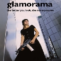
Glamorama26 posted:
I know how you feel, I'll also add the Alien movies and Romero's living dead trilogy to that list.
|
|
#
?
Aug 12, 2013 16:25
|
|


|
I have four copies of Jurassic Park: from VHS and DVD to Blu-Ray and Digital. Goes for The Lost World, too really. Whatever the next format is, that's mine too. 
|
|
#
?
Aug 12, 2013 16:32
|
|

|
kjetting posted:I know how you feel, I'll also add the Alien movies and Romero's living dead trilogy to that list. Same here on the Romero thing. And guess what! This September, Shout's Scream Factory is releasing a special edition of Day of the Dead and yes, I will take 5.
|
|
#
?
Aug 12, 2013 16:56
|
|
|
The Dyatlov Pass Incident has decent covers although I hate when they have quotes and don't give a source.  
|
|
#
?
Aug 12, 2013 18:23
|
|
|
 These are my favorite DVD covers because they accurately represent the tones of both movies, just with the designs of the necronomicon.
|
|
#
?
Aug 12, 2013 21:08
|
|

|
Slasherfan posted:The Dyatlov Pass Incident has decent covers although I hate when they have quotes and don't give a source. I love this one.
|
|
#
?
Aug 12, 2013 21:13
|
|

|
a kitten posted:
a kitten posted:It really does lose something as just a silhouette doesn't it? Just goes to show that bluray covers are bad all over the world. Nope, it rules. Let's look at the rest in the series:    Clean, simple, elegant. And it looks great in a set:  [/url] [/url]Too bad they're so expensive because  . Let's see what their US counterparts look like! . Let's see what their US counterparts look like! vs vs  
|
|
#
?
Aug 12, 2013 21:14
|
|


|
Holy poo poo, awesome!
|
|
#
?
Aug 12, 2013 21:21
|
|

|
Sirotan posted:Let's see what their US counterparts look like! I actually like that American cover. I just wish it didn't have so many words. Kind of interesting how minimalism is appreciated when it's a Japanese anime. Would people prefer this? 
|
|
#
?
Aug 12, 2013 21:43
|
|

|
Sirotan posted:Nope, it rules. Let's look at the rest in the series:  castle. castle.
|
|
#
?
Aug 12, 2013 21:49
|
|

|
Paper Jam Dipper posted:Kind of interesting how minimalism is appreciated when it's a Japanese anime. Would people prefer this? I appreciate them for the aesthetic, it being anime has nothing to do with it. The fact that they maintain a consistent theme is probably why it works so well. Is the Fight Club cover even real? Because all I see is artifact city.
|
|
#
?
Aug 12, 2013 21:52
|
|
|
Sirotan posted:Is the Fight Club cover even real? Because all I see is artifact city. Nah, whipped it up super quick to compare.
|
|
#
?
Aug 12, 2013 21:53
|
|
|
scary ghost dog posted:
I have the second and let someone borrow the first and never got it back. It stinks because those aren't in print any more and go for quite a bit online.
|
|
#
?
Aug 12, 2013 21:56
|
|


|
This is awesome and should be posted in reply any time someone posts that minimalist posters are inherently bad.
|
|
#
?
Aug 12, 2013 21:59
|
|
|
Paper Jam Dipper posted:Nah, whipped it up super quick to compare. So basically you were asking me if I preferred bluray covers produced by the studio that made Princess Mononoke and Grave of the Fireflies to something you whipped up in a minute without much thought to composition, while also adding a little dig against anime? Minimalism isn't a dirty word you know. It's a fad right now, sure, but I've seen plenty examples of it (in this very thread) where it's been used well. Edit: Now, if you'd like to see some bad minimalism, I present to you this hot off the presses Mondo poster:  Clearly apeing the Saul Bass classic, which makes the entire exercise of creating this new one totally pointless. Sirotan fucked around with this message at 22:06 on Aug 12, 2013 |
|
#
?
Aug 12, 2013 22:02
|
|
|
Optimist with doubt posted:I have the second and let someone borrow the first and never got it back. It stinks because those aren't in print any more and go for quite a bit online. That sucks hard. This is why I now use that lifehack tip of taking a photo of a person holding anything they borrow from me with my phone camera so I never lose track. Plus they tend to feel more obligated to return that way.
|
|
#
?
Aug 12, 2013 22:03
|
|
|
Slasherfan posted:The Dyatlov Pass Incident has decent covers although I hate when they have quotes and don't give a source. The American cover is the dullest. 
|
|
#
?
Aug 12, 2013 22:11
|
|
|
Sirotan posted:Nope, it rules. Let's look at the rest in the series: I know I love Crazy Walking Mechanical Egg, Dragons Flying Away, and Little Boy Shoots Rocket at Flying Girl.
|
|
#
?
Aug 12, 2013 22:32
|
|

|
Sheldrake posted:I know I love Crazy Walking Mechanical Egg, Dragons Flying Away, and Little Boy Shoots Rocket at Flying Girl. Yeah, those covers are tantamount to the worst offenders of lovely minimalist posters.
|
|
#
?
Aug 12, 2013 22:37
|
|


|
I think those Miyazaki minalimist posters have one thing going for them over like 90% of the other minamilist posters; They use well defined and interesting outlined objects and fill in gaps in the image with the background color to better provide fine detail. Most minimalist schlock relies on strong, straight lines with little fine detail and as a result look cheap and geometric. Its like HAL 9000 was tasked with making box art. Edit: That hair for example or the broom tail have more definition to them using only two colors than even the fully colored minamilist messes from earlier in the thread.
|
|
#
?
Aug 12, 2013 22:40
|
|
|
kjetting posted:This is awesome and should be posted in reply any time someone posts that minimalist posters are inherently bad. It is the fan made minimalists posters that are inherently bad. Minimalism done by someone with talent is a case by case.
|
|
#
?
Aug 12, 2013 22:40
|
|

|
Sirotan posted:Nope, it rules. Let's look at the rest in the series: These work because the imagery is so iconic. Nausicaa and her windboard, Totoro, Kiki on her broom, the titular moving castle, Sheeta and Pazu kissing in mid-air. The only one that doesn't work is probably the Tales Of Earthsea and that yellow-boxed one (which I have no idea what it is, because I've just gone through a list of Ghibli titles and couldn't find the hirigana to match). Minimalist design exploiting a well-known idea or theme of the film isn't bad. I think that joke Fight Club cover works as well, because that first fight scene, from the iconic line "I want you to hit me as hard as you can", is probably one of the most memorable scenes in the film. It's much better than the "Space Monkey" cover that actually got printed that only appeals to the hardcore fans of the film.
|
|
#
?
Aug 12, 2013 22:46
|
|

|
Yellow box is Only Yesterday. It's another instance of a movie unsuited for silhouette covers.
|
|
#
?
Aug 12, 2013 22:48
|
|
|
HUNDU THE BEAST GOD posted:I could do without the quote, but yeah. I like the alt cover with the head in the street, too. Why do so many dvd covers have some lovely review quote on them? Ruins the picture.
|
|
#
?
Aug 12, 2013 22:52
|
|
|
Vegetable posted:Yellow box is Only Yesterday. It's another instance of a movie unsuited for silhouette covers. Okay, I knew it wasn't a Miyazaki film, so I figured it was an Isao Takahata film. I also see that they simple copied the movie poster, which is the main character at 27 and at 6. I thought it may have been Grave of the Fireflies or something, because of the two of them and what I thought was ill-fitting clothing on one of them.
|
|
#
?
Aug 12, 2013 22:53
|
|
|
effectual posted:Why do so many dvd covers have some lovely review quote on them? Ruins the picture. Same reason why posters get them too: to get people to buy it.
|
|
#
?
Aug 12, 2013 23:03
|
|
|
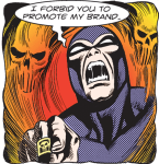
scary ghost dog posted:
Did someone say "Necronomicon?" 
|
|
#
?
Aug 12, 2013 23:11
|
|


|
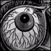
Sirotan posted:So basically you were asking me if I preferred bluray covers produced by the studio that made Princess Mononoke and Grave of the Fireflies to something you whipped up in a minute without much thought to composition, while also adding a little dig against anime? There's a decent idea in that design, but the colors make no sense and why is he hanging from a big eyeball?
|
|
#
?
Aug 12, 2013 23:13
|
|
|
effectual posted:There's a decent idea in that design, but the colors make no sense and why is he hanging from a big eyeball? The colours are like that because they're the colours of the original Saul Bass poster, one of the most iconic postero in cinema. 
|
|
#
?
Aug 12, 2013 23:18
|
|


|
Because his fear of heights is irrational, down to his perception rather than anything external.
Mr. Squishy fucked around with this message at 23:21 on Aug 12, 2013 |
|
#
?
Aug 12, 2013 23:19
|
|

|
Noxville posted:The colours are like that because they're the colours of the original Saul Bass poster, one of the most iconic postero in cinema. Man, that Saul Bass just don't know colors. I mean, ORANGE, it doesn't even rhyme with anything, so how can that be a real color.
|
|
#
?
Aug 13, 2013 00:12
|
|

|
Sirotan posted:So basically you were asking me if I preferred bluray covers produced by the studio that made Princess Mononoke and Grave of the Fireflies to something you whipped up in a minute without much thought to composition, while also adding a little dig against anime? Hey now, Mondo's other Vertigo poster is much better. 
Improbable Lobster fucked around with this message at 00:47 on Aug 13, 2013 |
|
#
?
Aug 13, 2013 00:21
|
|

|
Improbable Lobster posted:He now, Mondo's other Vertigo poster is much better. Oh man, that's killer. It would've been better if they went with an orange color scheme than green, at least to offset all the gray, but what the hey?
|
|
#
?
Aug 13, 2013 00:25
|
|
|
King Vidiot posted:So the movie poster has a small advertisement for the book the movie was based on, the cover of which is the movie poster that you're looking at. Nowadays you just have to put a QR code that will take you to a website where you can buy and download the book.
|
|
#
?
Aug 13, 2013 00:37
|
|
|
scary ghost dog posted:
The best part of these is that the case for 2 screams when you poke it in the eye.
|
|
#
?
Aug 13, 2013 02:34
|
|


|
scary ghost dog posted:
I have these and my book for 2 is just totally rotting. The latex they used just fell right apart.
|
|
#
?
Aug 13, 2013 05:18
|
|

|
Baron von Eevl posted:I have these and my book for 2 is just totally rotting. The latex they used just fell right apart. Somehow that feels just right for Evil Dead 2.
|
|
#
?
Aug 13, 2013 05:31
|
|


|
Pascallion posted:New mission, thread: Post GOOD Blu Ray covers that are not Criterion or Special Edition. 
|
|
#
?
Aug 13, 2013 05:40
|
|
|

|
| # ? May 30, 2024 12:55 |
|
|
Slasherfan posted:The American cover is the dullest. Is there a reason why she's not wearing a shirt?
|
|
#
?
Aug 13, 2013 05:47
|
|
