


|
brad industry posted:I mean this in the nicest way possible, but it would be amazing to me if anyone could keep all these rules and guidelines straight in their head during a shoot. Jesus. At first, I was thinking the same thing, but then realized that it's simply a cumulative learning process. You don't have to keep all of the rules straight all of the time; rather, the more you shoot while trying to think about them, the more you know when to follow them. It's the same thing as juggling shutter speed, aperture, flash power, light size, background visual noise, composition, colors, etc. You continually gain more control of each photographic element, and add it in as you learn. At least, that's my take on it.
|
 #
¿
Jul 17, 2009 23:20
#
¿
Jul 17, 2009 23:20
|
|

|

|
| # ¿ Apr 30, 2024 15:41 |
|
|
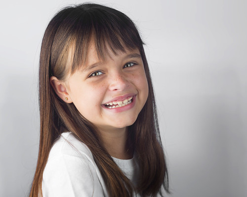
 Arts & Life writer did a column about smoking, quitting, and general struggles with the habit. We wanted to do something other than a traditional columnist headshot. dakana fucked around with this message at 20:06 on Sep 26, 2009 |
|
#
¿
Sep 26, 2009 20:04
|
|
|
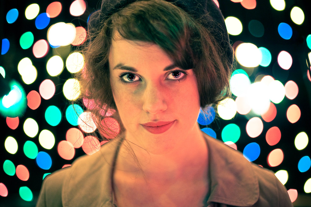
Penpal posted:
Those catchlights in the eyes are awesome. It makes me want to replicate it without the lights in the background -- though I like those as well.
|
|
#
¿
Nov 28, 2009 20:26
|
|
|
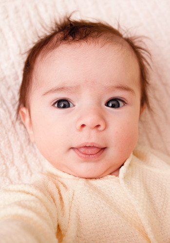
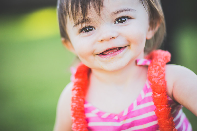
Whitezombi posted:Since you guys are liking these I'll post a few more. I can't stop imagining that the baby took this herself as a profile picture for Facebook or something, and it makes me laugh.
|
|
#
¿
Dec 30, 2009 18:57
|
|
|
well, that's the thing about photography "rules" -- once you know them, you get to break them.
|
|
#
¿
Jun 26, 2010 03:49
|
|
|
Photo illustration for a story on 3D movies
|
|
#
¿
Sep 14, 2010 20:28
|
|
|
Paragon8 posted:Crossposting from SAD- I like where you took the processing with these. I think the first one falls a little flat, though. I'm not sure what exactly it is, but I think it might have to do with a combination of the framing and the way her hair occludes most of her face. The head chef at one of our dorm cafeterias is writing a column for us called "Guerrilla Kitchen Tactics." 
|
|
#
¿
Oct 15, 2010 17:59
|
|


|
We're doing a feature on religion; I went with a writer to interview a pastor who is also a student for a human interest piece. We showed up at the tiny, tiny church in the downtown suburb he pastors at. He was a really, really weird dude. This one might be a bit dark  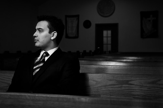 I don't think I could quite balance the color temperatures in this one   Overall, I was a bit frustrated because I wasn't given any idea as to what the main focus of the story was going to be (probably because we did these photos _before_ the interview; regardless, I feel I could have been a bit more creative with working with the space. I need more environmental portrait practice, for sure.
|
|
#
¿
Jan 26, 2011 18:59
|
|
|
I'd either crop tighter, or get all of the hair in frame. The way it is now, especially on the second, it looks like a framing mistake.
|
|
#
¿
May 19, 2011 06:36
|
|
|
Took some headshots for a friend in my living room.  [/url [/url[url=http://www.flickr.com/photos/nickkneer/5748445186/] 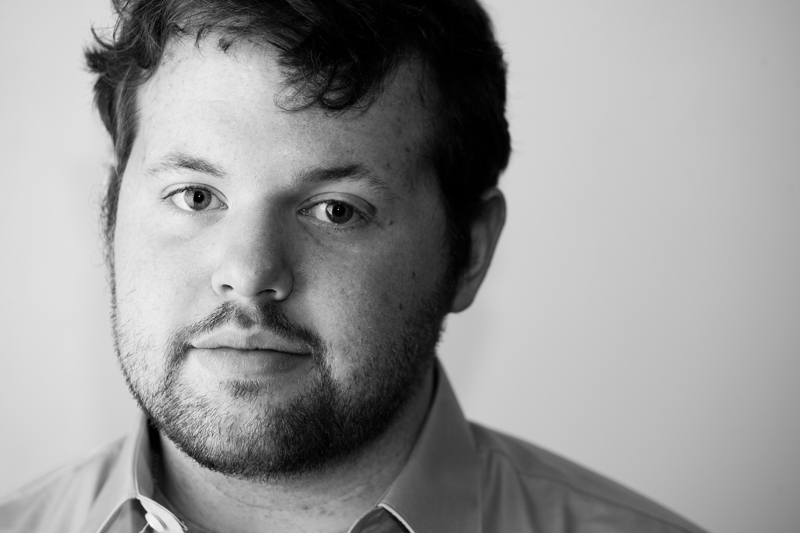 
dakana fucked around with this message at 23:08 on May 22, 2011 |
|
#
¿
May 22, 2011 23:03
|
|
|
Messing around with some friends last night. flickr      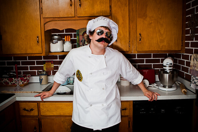  I have no idea.
|
|
#
¿
Jun 1, 2011 20:02
|
|
|
The other problem is that it's a direct flash. That's going to give you harsh shadows. You could fill in the shadows with ambient or reflector or something, but another way to do it would be to just use a bigger and more diffuse light source -- umbrella, soft box, etc. That'll give you a smoother transition to shadows, so it'll look nicer.
|
|
#
¿
Jun 6, 2011 21:05
|
|
|
Did some senior portraits for my neighbor.   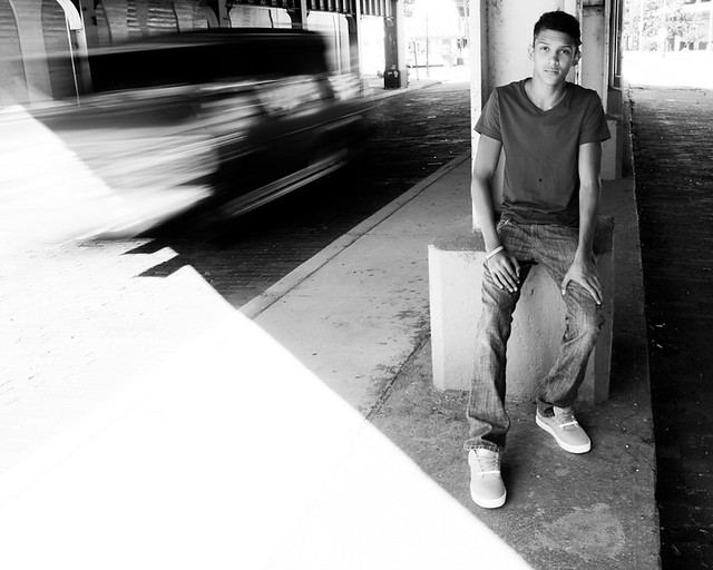 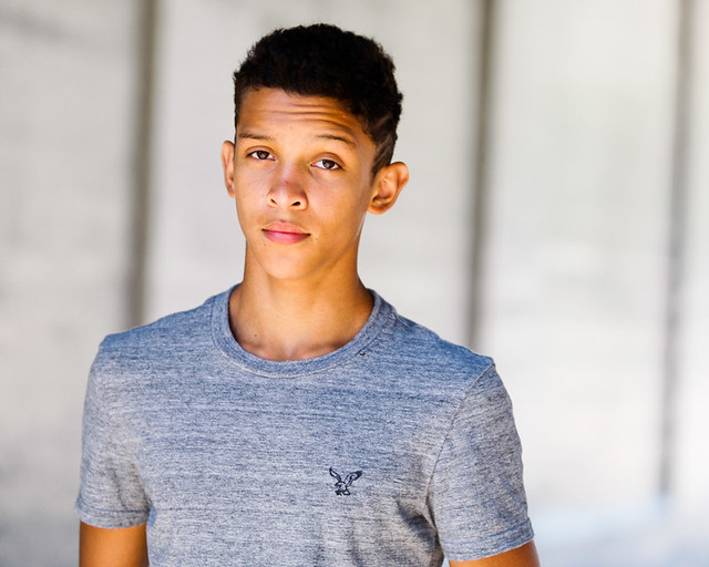
|
|
#
¿
Sep 8, 2011 23:21
|
|
|
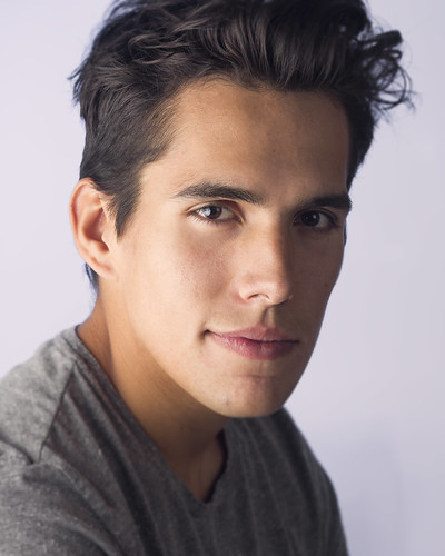
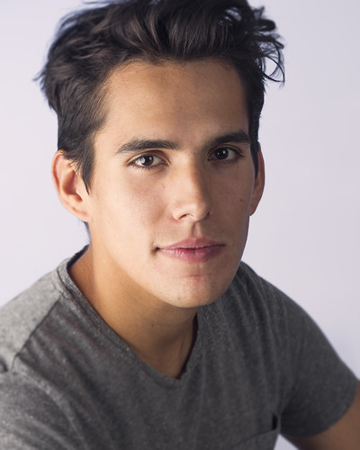
friend needed some headshots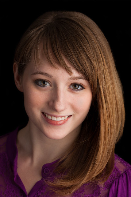 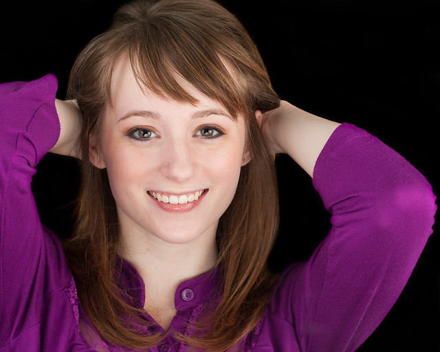 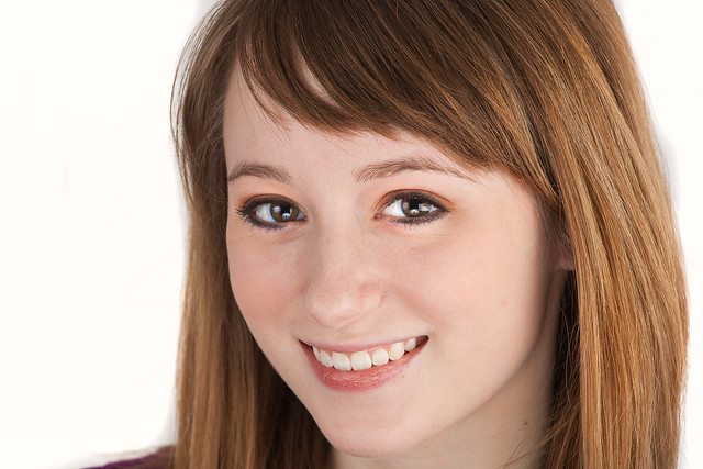
|
|
#
¿
Nov 29, 2011 01:57
|
|
|
Cross_ posted:What's more important, a blurred wallpaper or the subject being sharp? Look at how wrong you are. At any shutter speed you actually need a tripod for, the subject will move enough from breathing and generally being a human that it's going to offset any marginal sharpness increase from stopping down. Also, the DoF at that distance will be more than enough to keep the subject in the focal plane. Open up the aperture (and/or get closer and get rid of the hands entirely) because the dirty / textured wall is more distracting than anything else. As it is now there's a line going through his head. Also, you don't understand how light works. Light coming in through a window, except in cases of a rising or setting sun coming through an east or west-facing window, it never going to be a point source. It's an aggregate of all the sunlight bounced off the ground, trees, walls, the sky, clouds, etc and ends up being as large as the window is. You don't need "diffusion" when the light source is that large. Diffusion is necessary in a softbox because it takes a bare flash bulb -- essentially a point source -- and spreads it out. The sun's light has already been spread out.
|
|
#
¿
Dec 2, 2011 20:19
|
|
|
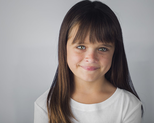
I'm doing school pictures for a preschool next week. Feed me your best stupid kid jokes. Here's one: What has antlers and sucks blood? A moose-quito.
|
|
#
¿
Dec 11, 2011 03:29
|
|
|
I'd say it looks very solid. Good consistent color palette, the dof is great, catchlights are interesting. The one thing I'd warn you about is taking care of your highlights. Looks like you've either blown or are extremely close to blowing them on the wig right near her eyes, and it also gets lost in the background there too. That's what jumps out at me.
|
|
#
¿
Jan 3, 2012 07:41
|
|
|
   Thoughts?
|
|
#
¿
Sep 12, 2012 03:52
|
|
|
somnambulist posted:I like them, but that watermark I know... I know.  It's on there for Facebook marketing purposes. I'm trying to get in contact with a graphic designer to overhaul my "brand" and website. It's on there for Facebook marketing purposes. I'm trying to get in contact with a graphic designer to overhaul my "brand" and website.edit: few more, this time from flickr and so no watermark 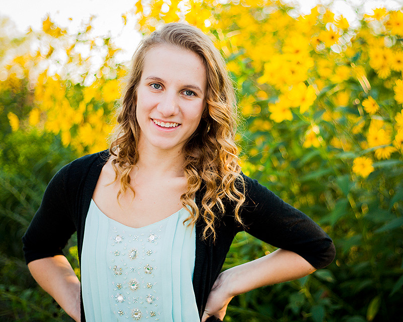 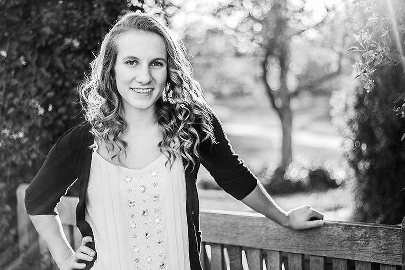 flickr dakana fucked around with this message at 05:47 on Sep 12, 2012 |
|
#
¿
Sep 12, 2012 05:26
|
|

|
xenilk posted:I like them, first one the posture makes her seem a little stiff / uncomfortable tho, especially because of her shoulders going way up. Ah, I definitely see what you mean. The railing was a bit high, for sure. Also, word? I'm not married to the idea of branding Facebook photos. I mean, I guess I don't REALLY need to since I'm posting them from my photography Facebook page. People'll still see "so and so shared Kneer Photography's photo". The only time I wouldn't be as visible would be when people make something their profile picture. I'm still kicking it around. Maybe if I get a mark that isn't hideous it'd be better. I am not a designer.
|
|
#
¿
Sep 12, 2012 06:41
|
|
|
somnambulist posted:I'm sad this thread is on page 2. Bumping this with some portraits I always enjoy your portraits. Is that some subtle split toning? It looks very nice. To nitpick, the background on the second looks like it is gradienting, most obviously with a line about eye level. Great expressions, though.
|
|
#
¿
Sep 23, 2012 03:25
|
|

|
Chiming in to say that I really like this project. Excellent idea, and great execution.
|
|
#
¿
Dec 11, 2012 03:07
|
|
|
thetzar posted:Down by the waterside. I like this a lot -- it's very well-lit and the color palette is nice. My one complaint is that I'm not sure I care for how the bridge runs right through her head. I can't immediately say how that would have been fixed, but I wonder if there would have been a composition where that could have been avoided while still keeping that cool background. Altogether, though, very well done. edit: also, looking at the large size, you might want to burn around her chest a bit to minimize the way her bra is showing through the dress.
|
|
#
¿
Dec 27, 2012 02:57
|
|

|
baby-assisted portrait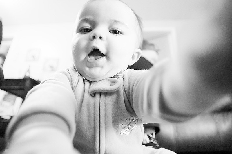 0O3O0355 by nick.kneer, on Flickr 
|
|
#
¿
Jan 1, 2013 00:47
|
|
|
Jesus... I don't envy that post job. I hope you were paid well for that.
|
|
#
¿
Jan 13, 2013 21:17
|
|
|
I think it's quite nice as it is 
|
|
#
¿
Jan 14, 2013 01:25
|
|
|
Very cool. It kind of mirrors the feeling I sometimes get in shopping centers -- they're so artificially uniform, sterile, and carefully crafted.
|
|
#
¿
Feb 23, 2013 16:17
|
|
|
Honestly the best way to get gritty is to do it before you hit post processing. Hard rake lighting often suits that style well. Ideally you'd use a small light source (like a beam of sunlight, a bare flash or a flash with a small modifier, etc) and angle it so that it "rakes" the side of the model so you get hard shadows from pores, facial features, stubble, etc -- it adds a lot of texture to the face. It's usually unflattering unless it's intentional and done well. Most "gritty" portraits use rim lights -- lights from the back that light up only a small portion of the face.
|
|
#
¿
Apr 10, 2013 01:22
|
|
|
smallmouth posted:I got my first hot shoe flash today. I have no idea what I'm doing. But I do it anyways! Bouncing the flash will soften the shadows, because you're increasing the size of the light source.
|
|
#
¿
Apr 10, 2013 02:59
|
|
|
I always think the Lightroom sharpening tools look like garbage. Whenever I actually need to sharpen I feel like the output sharpening or taking it into Photoshop and unsharp masking it works better.
|
|
#
¿
Apr 10, 2013 21:45
|
|
|
|
|
#
¿
Aug 26, 2013 22:44
|
|
|
Cru Jones posted:What's the setup on that shot? Looks like there's some distortion happening from a short focal length. I just had something similar just yesterday where a girl with slightly chubby cheeks turned into a bit of a melon head. Nah, she's just got a big head. This was at 85mm
|
|
#
¿
Aug 27, 2013 15:53
|
|
|
How to shrub people and make them like it:
|
|
#
¿
Sep 20, 2013 03:32
|
|
|
Friend wanted some familyish photos done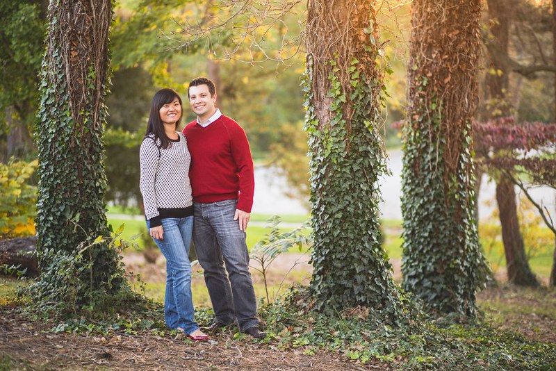 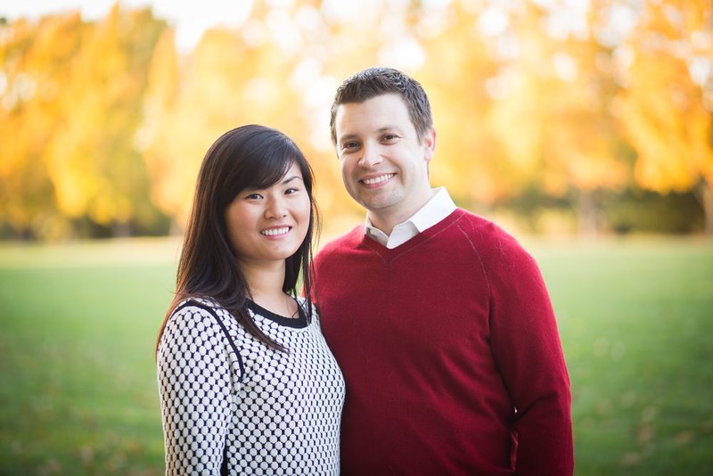 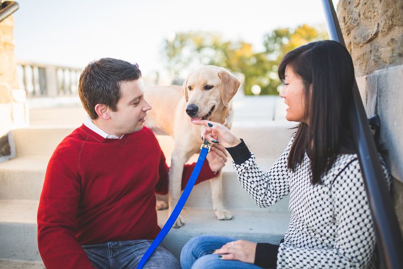 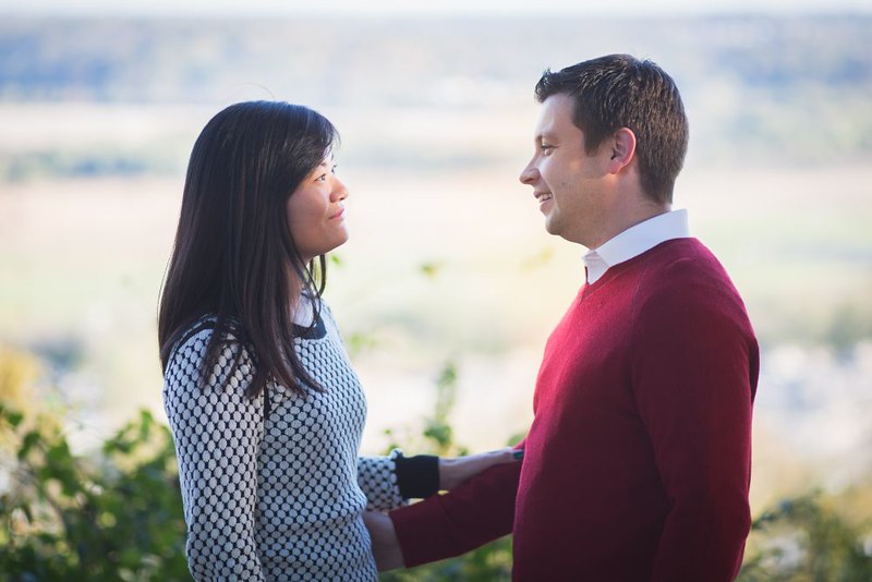
|
|
#
¿
Oct 30, 2013 21:29
|
|
|
Have some poortraits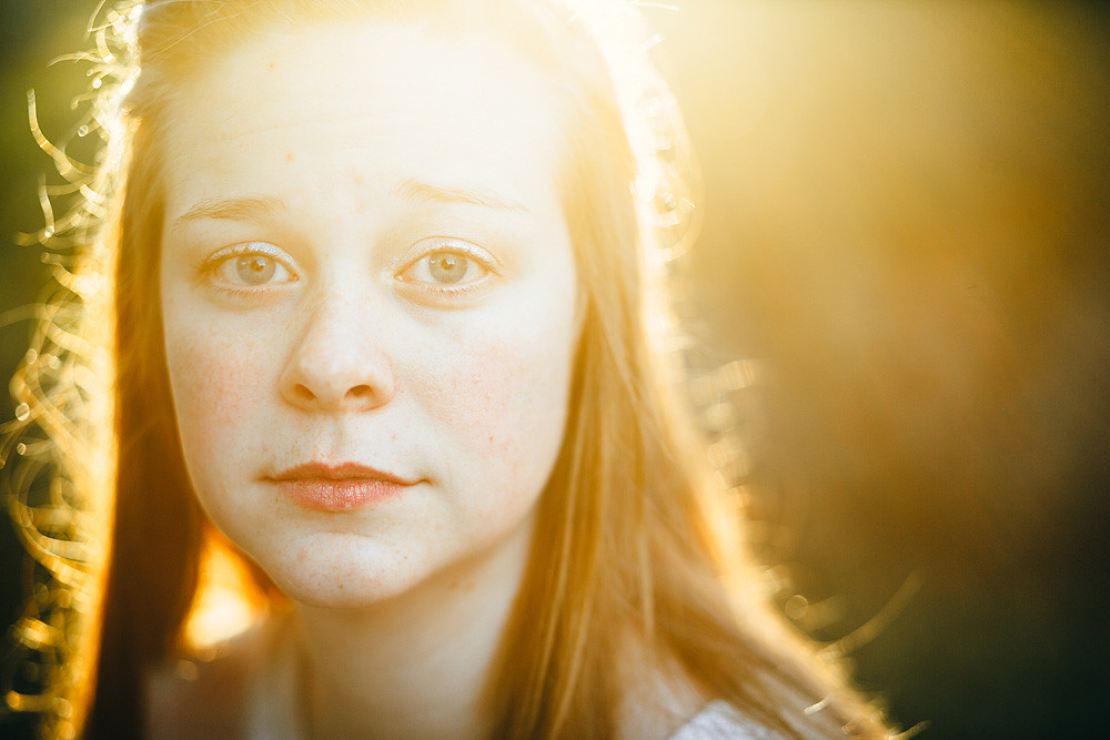 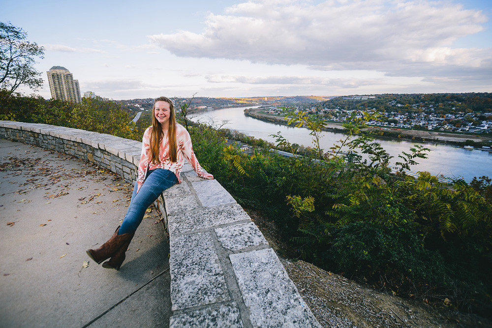 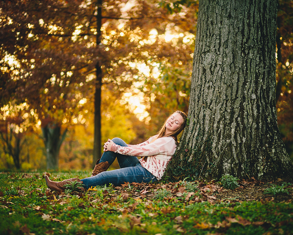 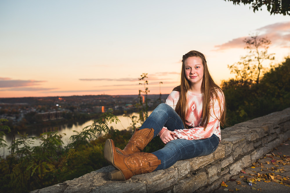 flickr
|
|
#
¿
Nov 8, 2013 01:54
|
|
|
McMadCow posted:These are all technically competent, but are also completely forgettable. Especially the first one, which is essentially flickrexplore.jpg. Unless you had a client that specifically asked for this sort of thing and paid well enough for it, these are all far too safe. I'd really encourage you to take more chances if this is personal work. I really appreciate this. You're absolutely right in that they're very safe but very forgettable. They're senior portraits, so it is a paid gig. I think they definitely want and expect some safe photos, but I also think that if I want to differentiate and grow I need to take some risks and step things up. Get some safe shots, but then take more risks. I think I've definitely been focusing a bit too much on keeping everything technically sound.
|
|
#
¿
Nov 8, 2013 16:25
|
|
|
David Pratt posted:I agree with the comments about the colour. Here's a more neutral edit (hope you don't mind, will take it down if you do): bisticles posted:Definitely like that version better. Seems like it was a good shoot, maybe just got sucked a little deeply down the editing hole. I'd like to see it taken down even a little more, just to tame the hotspot on his cheek and teeth. I do really like the interaction between the background hue and the muted skintones, though. Totally disagree here. The neutral edit makes him look like a zombie. The originals might be touch too contrasty but they're not horrible. The catchlights are interesting and it's a nice change of pace. Could've used a touch more light on the eyes for the girl. But I wouldn't call this level of hard light unflattering at all. It's harder light done well. If anything the white balancing may be off a bit. I'd revisit the editing but the light itself isn't bad.
|
|
#
¿
May 20, 2014 22:10
|
|

|
somnambulist posted:I was trying something new, I dont think its quite there but its a good start. I'm getting a horror movie / this child has seen some poo poo vibe from it.
|
|
#
¿
May 31, 2014 15:03
|
|

|
Posted these in the wedding thread but I'd really like some critique on them. Engagement session: 2014-09-13_Lilly-and-Tyler_Engaged-136 by nick.kneer, on Flickr 2014-09-13_Lilly-and-Tyler_Engaged-136 by nick.kneer, on Flickr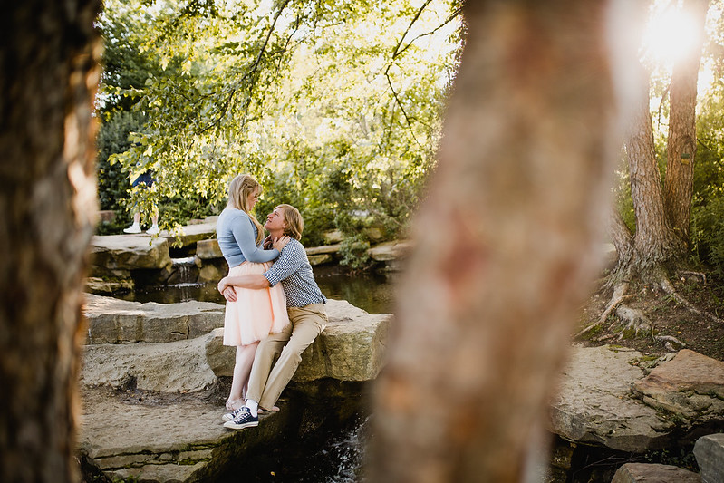 2014-09-13_Lilly-and-Tyler_Engaged-141 by nick.kneer, on Flickr 2014-09-13_Lilly-and-Tyler_Engaged-141 by nick.kneer, on Flickr 2014-09-13_Lilly-and-Tyler_Engaged-100 by nick.kneer, on Flickr 2014-09-13_Lilly-and-Tyler_Engaged-100 by nick.kneer, on Flickr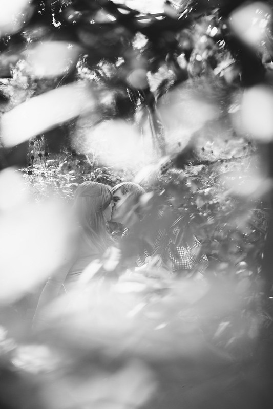 2014-09-13_Lilly-and-Tyler_Engaged-85 by nick.kneer, on Flickr 2014-09-13_Lilly-and-Tyler_Engaged-85 by nick.kneer, on Flickr 2014-09-13_Lilly-and-Tyler_Engaged-89 by nick.kneer, on Flickr 2014-09-13_Lilly-and-Tyler_Engaged-89 by nick.kneer, on Flickr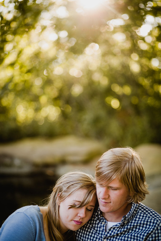 2014-09-13_Lilly-and-Tyler_Engaged-144 by nick.kneer, on Flickr 2014-09-13_Lilly-and-Tyler_Engaged-144 by nick.kneer, on Flickr
|
|
#
¿
Oct 11, 2014 15:15
|
|
|

|
| # ¿ Apr 30, 2024 15:41 |
|
|
8th-snype posted:I think it's great that we have had two lesbian engagement shoots posted in a row. don't be jealous of them luscious locks
|
|
#
¿
Oct 11, 2014 17:05
|
|