|
krackmonkey posted:I think alone it's a pretty pedestrian image, other than in a "people with tons of bumper stickers are so wacky" kind of way. Where this Image would gain strength would be in a series of similar interestingly decorated vehicles - if you're up for the challenge, you could take this photo and make it better by making it part of a greater sum, but if you're only looking for what this photo does, it really doesn't do much. There's not much left to the imagination, and it doesn't say much, despite the abundance of words. On a positive note for the third image - I can see that you're striving towards a particular kind of candid image, but this doesn't quite make it. Good candid is actually really, really, really hard, in my opinion. I have impossibly high standards for a good candid, both in my own and others' work. I think there are a ton of pitfalls in candid stuff. First, it's a very popular area of photography, so cliches are hard to avoid. You don't want too much of yourself to come through in the image and I feel like your influence is too prevalent and obvious in this image. For example, the person in coat framing the right side of the image feels too deliberate, and I can see you framing the shot so it could be included to add interest to the image. So now I'm not thinking about the people in the picture or the story that you're trying to tell. I also think this is bolstered by naming the image so heavily. The title of the image is arguably more evocative than the image itself. Also, the fact you had to describe what you saw in taking the image to us shows us another weakness to the image. As QPZIL said in the Portraits thread, every picture HAS a story, but a good picture TELLS a story. Does that all make sense? Or am I gibbering somewhat? I don't really know what to say about the first one by way of critique. I can tell you my initial reactions to it, though, if you like. I was drawn to it initially for its colour but, after looking more closely, the potential magic of it as an abstract shot sort of fades. I usually can't take a photo without a human interest in it, as I'm a portrait guy, but I really think this shot would've been a lot better with nobody in it, or, looking again, with just the reflection of someone in it on that left hand wall. Saving the best for last, I really like the second one. I don't know how good you are with Photoshop, but your shoe in the photo is the one thing spoiling it. If your foot wasn't in that image, I would absolutely love it, because I really like everything else about it but all I can see is your foot. Please get rid of your foot ") OK, so three from me. I'm exclusively a portraits man, so I thought I'd bring you some of my horrible landscape / architecture / whatever work for you to rip to bits, seeing as this is thread in which to improve. I took these in a (currently rare, due to having a baby daughter person) visit to our local park. I've got five I want to show, but the rules only allow three, so maybe I'll post the other two tomorrow.  Weird and overprocessed?  Massive cliche.  Kinda dull. So I'm feeling positive about them. Anyway, yes, further deconstruction / destruction and tips would be great. The problem is, I find classic landscape quite boring and I always try too hard to do something different. Except none of these are particularly different.
|
 #
¿
Jan 5, 2012 20:56
#
¿
Jan 5, 2012 20:56
|
|


|

|
| # ¿ May 1, 2024 06:45 |
|
|
CarrotFlowers posted:---------------------- I like the new post on these. I think it doesn't quite work on the second, close up image, but the lower contrast and sat work great on the other two. I think it looks more artificial on the second one, especially at the point where the hair ends and the background begins. I don't think you need any more desat, but you might want to try taking some of the yellowish tint out of the snow (but not all), just to see if it adds to that isolated feeling. Might not work, but worth a go, I reckon. I'm guessing that no crit from yesterday means what I feared - that the shots are neither here nor there. I have the last two I was to put up, just in case someone has anything to say about them. I want to feel like I can make an exciting image out of any scene and that it shouldn't have to be rolling hills and impressive vistas. Obviously it's not something that comes overnight and landscape isn't my area, but I would like to get at least a little better in it, because it is fun. I just end up bored of a landscape shot 24 hours after I've taken it. Here are the last two for your perusal:  
|
|
#
¿
Jan 6, 2012 11:37
|
|


|
Agreed on removing the people - they don't really stand out properly, do they? I think the main concern I have with those pics otherwise is that they have no point of focus. As for the processing, I'm actually shooting into a low sun to camera right which is where most of the lighting is coming from. I used one of my own presets I usually use for studio model shots and altered some of the settings. So there's a touch of yellow/blue split toning in there, some lowered contrast, some careful sharpening and some shadow burn-in, from what I can remember. I like shooting into the light a little, but I need some bloody composition or points of interest. It's not like I don't know how to compose an image, I just never find anything interesting about the ones I take, which is why I keep trying to do something different, except I haven't shot enough "safe" landscape stuff to do that effectively. So I guess the answer is, do some safe stuff and take it from there.
|
|
#
¿
Jan 7, 2012 00:15
|
|
|
Dread Head posted:Before I crit this, I want to explain why I'm critting it. First, I would say that, out of the regular posters in the dorkroom, you would be considered the best landscape guy. Second, I personally don't get much out of landscape photography, both taking and viewing, so I am probably good source for a harsher crit. Third, as you are hitting a peak with your landscape, I figure you'd appreciate a harder crit to help you improve on what is already excellent work. Good stuff: From a technical point of view (composition, exposure) this is spot on - what I would expect from your work. The colour of the sea is really soft and beautiful. I'm a fan of a muted palette when done well like this and it feels like you can just sit and stare into this image for a long time. Bad Stuff: The long exposure of rocks in the sea with a moody sky is a very overdone subject, and it's something you personally do a lot. I think you have a marvellous eye for landscapes and it's a shame so many of them that you have posted feel quite samey. If this is the kind of landscape you love, which you clearly do, then that's cool and you do it very well. As someone who doesn't get much out of landscapes, this setup can wear on me quite quickly and I feel like I've seen a million of them in my lifetime. Sorry if that seems aggressive: it's not my intention. I want to set you a challenge, if you choose to accept it: make a landscape shot that excites me, as someone who doesn't get much out of landscape. I think your work is excellent but I think your next step would be to create something that can make someone like me go "wow, I love that. I would buy that". Hope that makes sense and helps and doesn't sound like I'm being horrible! pootiebigwang posted:I'll take a stab at this one. The color is a little too drab for me, and I feel like the image would be stronger if taken on a better day. I like the sense of motion from the waves, but without any context the image sort of falls flat. What about this spot interested you? I would take some of your crit of Dreadhead and apply it to your own image here: what was it about this spot that interested you? I also feel that the post work is a little too sharp and bright - what was your thinking behind processing it this way? Gazmachine fucked around with this message at 22:02 on Jan 13, 2012 |
|
#
¿
Jan 13, 2012 21:59
|
|

|
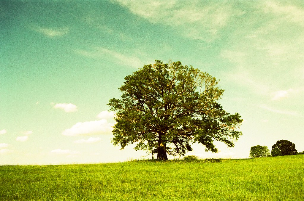
No no, don't get me wrong, that wasn't a "hey well why don't you take a look in the mirror punk before you start critting other dudes" sort of comment: I thought your crit was perfectly fine. No need to apologise. I would say, for me personally, the tree feels too far away to be inviting. In fact, I'm not sure you can show the isolation of something whilst making it inviting at the same time. I don't know. I reckon this tree could look inviting if you walked right over to it and tried a more "intimate" shot, for want of a better word.
|
|
#
¿
Jan 14, 2012 02:27
|
|
|
Dread Head posted:I like the rocks in the FG, I am not sure what extra context I could have added. Is there something in particular you feel is missing? I know without seeing the location that is kind of a hard question... I thought you'd take it the right way, I just wanted to make sure that it didn't come across as dickish. I figured you'd appreciate an aggressive critique but I wanted to make my intentions clear. I think your problem at the moment is you've worked yourself into a corner with regards to your style of shooting. Get out of your comfort zone, I officially ban you from long exposure sea shots with rocks in them. Go somewhere totally new and get shooting. Impress me!
|
|
#
¿
Jan 14, 2012 14:02
|
|
|
I'm starting to really like those, Quazi: you're almost getting me interested in landscape! What I think you should do next is composite elements from three very different images shot from a similar perspective / angle, so that they look more believable when composited, and make a really unusual fantasy scene. Nothing too 80s prog metal album cover, though - something like a skyscraper in the middle of a rural landscape surrounded by a river or something. I think if you spent a lot of time very carefully piecing it together so it doesn't look artificial, some urban buildings isolated within a breathtaking rural landscape could look really cool.
|
|
#
¿
Jan 20, 2012 12:56
|
|
|
William T. Hornaday posted:Here are a couple recent photos that I want some critique on, particularly the processing. It seems to be a direction I've been unconsciously going in lately with my photos and I'm really fighting myself as to whether I like it or hate it. I'd love a second and unbiased opinion. Does it look bad? Fake? Gimmicky? Good? I honestly can't decide whether I like them or not. I don't necessarily see anything wrong with the processing, but I wonder how exciting they would be if you just relied on your composition. I think that's the problem I have. I'd like to see you do a safari and come back with nicely processed animal stuff with more exciting backgrounds and a bit of action from the animals themselves. Whilst I love a tiger and I think they are utterly beautiful, it is just kinda sat there. I know you want comments on the processing, but it's the processing that makes me think of the composition, in that it's such a dramatic look for such an inactive animal. I feel like you've possibly pushed the lights and highlights too far with your dodging. For my tastes, at least. I'd quite like to see a more painterly look for these. Could be nice. I feel like the processing doesn't look right for the baboon in that photo. I think it's an interesting pp style, but I don't think it fits a photo with that background. It needs more drama to work. That all might be a load of horseshit so take it with a pinch of salt, but it's an accurate description of my first impressions of the shots.
|
|
#
¿
Jan 26, 2012 14:04
|
|


|
quazi posted:I like the transparency of the feet in Day 11. It makes me think that the subject of Day 10 could be slightly transparent, to connect the two. Oh poo poo David, please tell me you shot a shot of this without you in the water, so you can clone it in underneath yourself and then make yourself semi transparent in the water, because that would be rad.
|
|
#
¿
Jan 26, 2012 17:28
|
|
|
Bottom Liner posted:drat, that's a good idea. You'll need still water, though, if you're going to reshoot. I think. Who knows? I've never done it before.
|
|
#
¿
Jan 27, 2012 02:24
|
|
|
Bad Munki posted:I don't have any critique to offer other than I really, really like that pic. I grew up oceanside and that sort of weather pattern happened frequently, but never really showed up well in photos, and I think you nailed it. The eerily sharp and crisply contrasting above/below cloud lighting, the water in the sand flowing down to the water, fading into the sea, it's great. Well done. OK, you've totally ruined that picture for me.
|
|
#
¿
Jan 31, 2012 13:09
|
|

|
Bottom Liner posted:
You're going to hate me, because there's nothing you can actually do about it now, but I would like this if it weren't for her expression. If she had a super serious expression or something with an emotion other than "boy this is a goofy thing I'm doing" on her face, I would really like it. As it is, and as I know you're going for "movie style" shots with a lot of your images, this takes me out of the magic considerably. I think the reason the last one works the best is because you can see less of the workings. If I'm thinking "oh, that's some sparkly dust he's using as an effect" it takes me out of the magic, whereas the final shot has a little more mystery. I'm imagining a shot of her emerging from behind a tree with mist coming from various sources in the scene, maybe something like her emerging from the dust/smoke.
|
|
#
¿
Feb 26, 2012 15:35
|
|

|
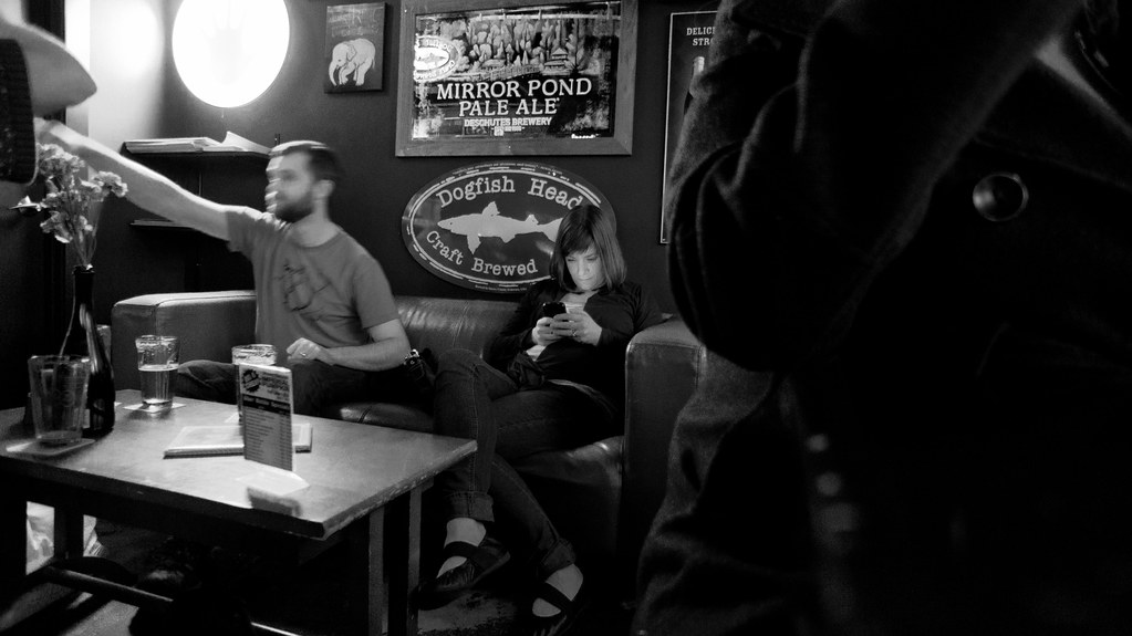
rcman50166 posted:
I think it looks quite warm and inviting - like it's cold outside and the warm tones suggest comfort and sanctuary. Everyone looks pretty chilled.
|
|
#
¿
Mar 4, 2012 11:47
|
|
|
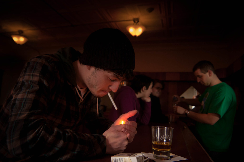
rcman50166 posted:Yea, I wasn't getting the right vibe either. Suggestions? I would alter the angle you've shot it at to show more of, at least, the face of the guy at the front. He needs to act a little more and look fed up or weary. I like the idea of set up shot but maybe try sketching how you want everyone in the scene first, or something like that. More of everyone's faces and more expressions. I'm seeing one guy with his head in one hand, fingers through hair, heel of the palm of the hand on the cheek, looking slumped, whiskey in front of him, him looking into it, like he's searching for an answer in its contents. That kind of poo poo. Also, cool it temperature-wise, too.
|
|
#
¿
Mar 4, 2012 14:25
|
|
|
Ferris Bueller posted:Trying to visualize what I want the finished product to look like when I'm finished with it, and this one actually turned out how I saw it. Just wondering what works with this, doesn't work, or if it's complete crap. Fire away. The ice structures themselves are interesting but the composition doesn't work for me. I'm not really sure which part of the image I should be looking at. It feels like you wanted to put the ice into an interesting part of the frame but then liked the detail in the ice so much that you decided to move in a little closer at the last minute. I think you either need to get right in there to show off the detail or pick an angle where the ice leads you through the image, as that bit of grass in the background is neither here nor there at the moment. (crossposted from portraits) Instead of finishing one of my many half-done personal side projects, I decided to start a whole new one! I'm looking to create some chiaroscuro, dramatic portraits with a feel somewhere between religious and fantasy film (although these are loose guidelines. I was dissatisfied with my first run at it, because I didn't think it through at all. After actually putting some effort in, I took another run up, and this is the first of the series:  Untitled by Gareth Dutton Photography, on Flickr I played with the composition in post for ages before coming to rest on this - when your image is all black you can stick bits of black wherever you like. I wanted a sort of "widescreen" feel to it. Anyway, yes, any feedback about any of it is most appreciated.
|
|
#
¿
Mar 11, 2012 22:31
|
|

|
rcman, you REALLY weren't "jumped on" here - all you've experienced here is an honest critique. You need to get a thicker skin about it. This place is good for you, if you want to improve. You should never worry about being "good", just about being better than you were last week. "good" is arbitrary, relative. If you can't see the value in being critically battered, stick to SAD. Just ask yourself, how important is it to you that you improve?
|
|
#
¿
Mar 30, 2012 23:06
|
|
|
rio posted:You and I cannot get complacent and have to constantly work to improve Great post, but I wanted to point out that "you and I cannot get complacent" should be changed to "nobody can get complacent".
|
|
#
¿
Mar 30, 2012 23:33
|
|
|
mr. mephistopheles posted:Again, though, I really do appreciate the feedback and it's nice to have to justify for myself why I shot this way instead of that. It makes me feel like I'm developing a style. Like if you'll look at my model shots I posted later, those are also really tightly framed, and the other people I shot with that day ended up with more photos like you're describing where the subject is more of an object in the middle of a scene rather than the entire focus of the photo. I like that sort of uncomfortable intimacy, though, where you feel like you're right in the subject's personal space (or that's what I'm going for at least) rather than viewing them from afar. I just wanted to add to this: I agree that it's good to develop a style, but for some reason these particular ones don't have that magic for me. Looking at your photostream, I think you have quite a few that nail that intimacy and the idea of the person being the whole image, which I am a fan of, but not in these ones. The composition is my problem with the first one: it's neither intimate nor environmental and the way you framed it looks like an accident. The second and third don't have anything that moves me in them for an intimate portrait. This one, for example... ...is far stronger, as are some others in your flickr. It's the combination of the intimacy of the crop, the shapes and lines involved and the abstraction of the environment. It adds a romance and a mystery to it, whereas the ones from the indie film don't grab me in the same way (I love the shot I quoted, by the way )Here I go again, making ill-advised ventures into landscape. I find it really hard to get something meaningful out of a landscape image: it's just not my strength. I do like to have a go though. Anyway, here are three attempts. I know what I like and dislike about them (mostly dislikes), but I'll leave the slate clean for you to make your own decisions. I've tried to go for different feelings in each image. Please click through for larger on black, if you would   
|
|
#
¿
Jun 14, 2012 20:22
|
|
|
Santa is strapped posted:This one is pretty good, the muted colours and the person in there. Seems serene in a way. My concern with that one was that she needed to be a bit more to the left than she is. Otherwise it was also my favourite. EDIT: My biggest concern is that they're basically boring and insignificant. I'm starting to think that a great landscape is a drat sight harder than a great portrait, because you have to pull drama and feelings out of a non-living subject (flora excepted ).
Gazmachine fucked around with this message at 09:15 on Jun 15, 2012 |
|
#
¿
Jun 15, 2012 08:39
|
|
|
Wayfaring Stranger posted:I lurk almost daily in the Dorkroom but often don't have the confidence to post anything. I snapped this two weekends ago at a living history siege camp and was really quite pleased with how it turned out, though I think my post processing needs a lot of work. It mostly consists of manipulating curves in GIMP, which is unacceptable, really. The post seems alright to me - maybe a little saturated, as others have said, but essentially fine. I would work on composition etc etc etc first and try not to put too much emphasis on processing. No amount of processing will make a badly framed or uninteresting shot exciting. He's decently framed - is this a crop? I quite like the way he looks pretty unhappy about having to dress up and stand there in the heat, so there's a bit of story to tell. What sort of story did you want this photo to tell? EDIT: Another landscape...thing. Does this do anything for anyone? 
|
|
#
¿
Jun 15, 2012 18:12
|
|


|
LargeHadron posted:It's good that you have foreground interest, but it's still not very interesting. Eh, the more I think about it the more I like it. Gloomy beach day, empty chairs, nobody in sight. Kind of cool sense of desolation. Still though it's the photo's concept that I like, not the photo itself. I can't really put my finger on what it is I don't like. Maybe the background elements (large pier, small pier, ocean, sky) feel too cluttered? Yeah, I can't figure it out either. Although, from what you've said, you may have touched on it - it may be that, for a scene that sort of is supposed to portray a slightly empty, desolate sort of feeling / showing us a long, empty view toward the horizon, it's actually sort of busy.
|
|
#
¿
Jun 15, 2012 19:12
|
|
|
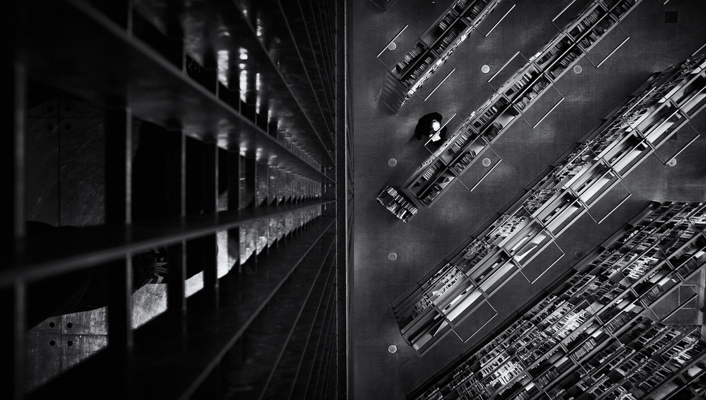
guidoanselmi posted:how did you get the colors on this one? really digging them. I went to a beach in England in Summer. That's how you get those colours. OK, so there's a bit of post. I actually started with a Lightroom custom filter I created for fashion portrait stuff and then messed around with it quite a lot. There's a tiny touch of yellow in the highlights and a tiny touch of blue in the shadows. Then I pulled some saturation out of an already gloomy day. The clouds were as they are. No post / burning or anything.  I've quoted my favourite ground and aerial shots in this collection. I like the balance of the first one, but I think I'd like to see a stronger relationship between the shapes and forms in the image to make it feel more intentionally an image with no single focus (which I understand is the idea). I like that aerial because it feels a bit more purposeful due to it being a little barer than the others. There's a definite, pleasing geometry and I like the way the blue sort of punches through and demands attention.
|
|
#
¿
Jun 17, 2012 12:14
|
|


|
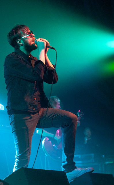
Opals25 posted:Thanks everyone for the crits though! Here's a few more shots for the day. I'm going to go ahead and jump into the two weaker shots you've posted here. Not to be an rear end in a top hat, you understand, just to give you some feedback The architectural one feels a little too busy to me. More importantly, it's the combination of the busyness and the composition that leaves me a little lost in the photo: I don't really know where to look. I think a very busy image can be cool and look good, but there needs to be an overall structure to the composition, a sort of framework in which we can view the busyness. The concert shot is nicely exposed and comped, but my problem would be that (and this may just be me and my personal opinion of music photos) it feels like any other concert shot like this - wait for guy to sing a word with a long vowel in it, get your settings right, take the shot. It's perfectly competent and done well, I just feel like it's a bit stale and I've seen it many times before. Nothing wrong with it technically, for sure. I come to the Dorkroomers with a question: here is a shot wot I did:  oof by Gareth Dutton Photography, on Flickr Ignore the fact that I need to straighten it slightly (just seen that). This is part of my photo project some of you might be aware of. I have about a thousand other shots from this week of shooting, so it's not the biggest deal, but I like the comp of this and something about it just makes me happy. The problem is, his face is a little bit too out of focus...I think. I've added some gentle sharpening to try and salvage it a little, but I can't decide whether it looks too lovely. What do people think? The other question is, is it worth saving in the first place? Am I doing that thing where you get a bit too attached to a photo which is actually not that great? Bear in mind it's part of a series that makes more sense as a whole, I'm mainly concerned about whether the composition is as pleasing as I think it is, as there is a significant chance I may be being somewhat deluded. TL:DR Is his face too out of focus? Is it a good enough shot to bother with in the first place (personally I find it pleasant). EDIT: For reference, the focus has landed on his shoulders. Gazmachine fucked around with this message at 10:52 on Aug 25, 2012 |
|
#
¿
Aug 25, 2012 10:48
|
|
|
mr. mephistopheles posted:I like the color and processing a lot, but I'm really not feeling the pose. It doesn't feel natural at all. Also her hand on the front of her leg there makes her hand look huge. I also kinda wish the composition had her more to the right of the frame instead of so centered. Cool location, though. The first one is my favourite by far. I have no problem with the white space as it's clearly a stylistic choice and I find it pleasant. I think the image would've been a lot stronger if you had removed the chairs and cropped out the two lampshades creeping into the top of the image. As it stands, the lampshades don't look intentional. The chairs add nothing to the image for me, either. If you removed those elements, you would have a very pleasing, minimalist image which put lots of emphasis on the basic lines and shapes running through the image. It would also make the white window space a more cohesive element in the shot as whole, it being another minimalist shape that makes sense with the others in the frame. As it stands, I would argue the chair and lampshades are the real distractions here. As for the other two, I don't really get anything from either of those. The side-lit self port seems oddly lit, with shiny bits on your head and hair that is half there, half missing. None of it feels intentional. Also the expression is a bit overcooked. As for the lift one, and I apologise for being so reductive here, it just looks like "saw a mirror on the ceiling, took a snap". The lines aren't geometrically pleasing nor is the comp as whole. Also, it's sort of what everyone does when they see a ceiling mirror: it's one step up from taking a photo of yourself in the mirror with your expensive kit and converting it to black and white, before making it your Flickr profile or website bio pic. So, as you can tell, that would be my least favourite of the three.
|
|
#
¿
Aug 27, 2012 10:16
|
|


|
Opals25 posted:I always found people working as a fascinating subject and love to take pictures of it when I can so I want to like it, and do like some of your shots of (I believe) game developers working but something about this just isn't clicking for me. The space to the left of the picture feels sort of wasted and inactive and the background behind his head feels way too bright and distracting while the subject himself looks a bit underexposed in comparison. The PlayStation logo straight above his head is a nice touch but I actually lost it in the background the first few times I looked at it so I wonder if the picture might be better served with a tighter crop towards his head. Thanks for this: it was one of those that was almost right and I felt good about it when I snapped it, but didn't have time to really review it until a week later. Then I sort of subconsciously tried to ignore all the problems with it. I have many, many shots from the week, so it's in my interest to only pick the best stuff, so cheers Metalslug posted:
I agree with the sentiment that less aggressive processing on this would make it better: it's a reportage piece, so personally I'd like to see less artificiality in it.
|
|
#
¿
Aug 31, 2012 09:12
|
|
|
Metalslug posted:For reference, here is the original: This is the best one. Just do a spot of curves tweaking, some conservative dodging and you're golden.
|
|
#
¿
Aug 31, 2012 12:25
|
|

|
I'm also getting a definite "balls" vibe from the last one. Maybe Xenlik was trying to keep the golf theme throughout all three shots? Ho ho ho. But yeah, if you have another hand holding detail shot, I'd go for that one instead.
|
|
#
¿
Sep 2, 2012 08:41
|
|
|
rio posted:
I think this is lovely. I don't have a problem with it being dark, and I think "too dark" is a very subjective idea sometimes. It's a tiny bit of a shame that the guy standing up partially obscures one of the people sitting down, because it would really add to it if they were all distinct entities. I would say keep this exposure / post style up, it has an original feel to it. Not to be overly dismissive, but I get nothing from the other two shots. I think you're right with the cloud / sky thing - unless you shoot it in a particularly unusual way, they can be fairly boring shots that you see everywhere. xenilk posted:
Can I ask what your main reason was behind going wide open with the 50 on these ones? I'm not one of those "never shoot wide open" guys (although nowadays I basically pretty much never shoot wide open) but it is pretty difficult to nail that focus at f/1.8
|
|
#
¿
Sep 10, 2012 21:29
|
|


|
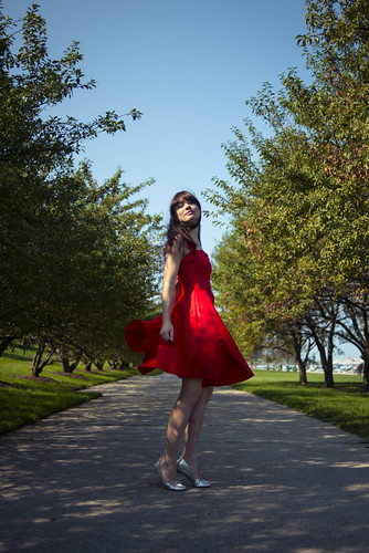
xenilk posted:Yes of course, the sun was quickly setting and I wanted the bokeh in the back. Seeing as it was taken at 1/200 on ISO 250 I'm sure I could have went 2.2/2.5... so yeah bad on my part. Also, I'm just not sure what was up with the auto focus since all the focus points are responsive on both axis but sometime it just like to screw around with me. Well I'm not saying "bad", per se, I just think you can get a bokeh effect from a smaller aperture. In this shot, for example:  I was on f/2.8 at 1/125, ISO 320, so you can go smaller and still get some bokeh effect going on. I guess it depends what you're after, though. Santa is strapped posted:Yea I really want to see a RED in action. I want to visit a pro/semi-pro film set basically, ha. I'm liking the feel of those shots, though - even if the pairing was slightly fortuitous, I think the way she poses and that distance is actually pretty cool and gives a weird sense of loneliness You should do more like this in various places with her: you may have uncovered a gem, there. Don't tell her, though, just let her carry on with the posing as usual. EDIT: Commenting on EVERYTHING ZoCrowes posted:These both have the potential to be good shots but the pose is a little off in both of them. I do like your 20s wet plate thing, and it's probably exactly what he's after, but I am personally never totally happy with those shots when I have a go at them, because you can always see the modern detail behind them. I think you almost have to purposefully make it look "worse" in terms of glass and sensor quality, like these pics of Jeanne Eagles from the 20s:  I'm absolutely dying to make some romantic portraits of both men and women in this style, but I want them to look indistinguishable from the wet plates - they would have to be spot on. I'm going to look into it a bit more and try and figure out a better way of doing it. Cassie shots are awesome as always - I love the red dress. She's such an awesome subject, you lucky sod. /creep comments I was actually trying to find a girl who has a very vivid red dress like that for the shots I took in the park recently, because I knew it would work and look great, but not found anyone so far. Gazmachine fucked around with this message at 10:30 on Sep 11, 2012 |
|
#
¿
Sep 11, 2012 10:07
|
|
|
David Pratt posted:
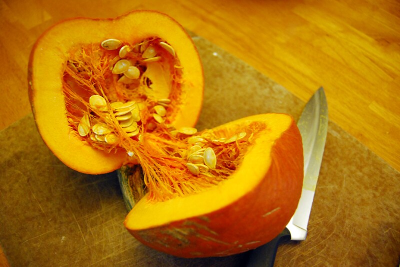
I know this is infuriatingly unhelpful, but I love these two shots. They're at absolute opposite ends of the photographic spectrum in many ways, which is what makes it cool to see them shot by one person (not that you have to pick one approach to photography and stick with it, but you know what I mean). The lines in the food shot are heaven.
|
|
#
¿
Sep 14, 2012 14:41
|
|

|
NoneMoreNegative posted:I'd clone out all the knifemarks from the red board to make it an almost-solid block of colour, otherwise looking good That's true, and the slight vignetting in the top corners.
|
|
#
¿
Sep 14, 2012 17:23
|
|
|
On the subject of David's mushroom, I think the processing is fine. It's not necessarily their fault, but people are so turned off by the quick filters of instagram that they have an immediate reaction to anything processed. There's nothing wrong with processing for effect - the image is strong on its own and the processing is good and done to serve the image, not to try and add drama to a poor shot. Processing doesn't always mean instantly bad.
|
|
#
¿
Sep 16, 2012 10:05
|
|
|
Sorry, I meant PROCESSING as opposed to processing, as in obviously processed images with split toning, tints or what have you. I'm just putting forward the theory that we all have such an emetic reaction to badly or heavily processed images, because so many of them are lazily or badly done and it's what we seem to be exposed to frequently, that it may be, to some extent, affecting our opinions of images that have a strong processing to them despite there being thought to the image. I just couldn't be bothered putting it more eloquently. Sorry.
|
|
#
¿
Sep 16, 2012 11:53
|
|
|
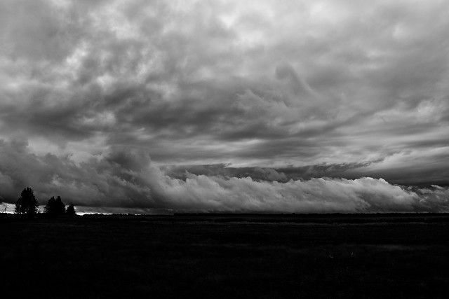
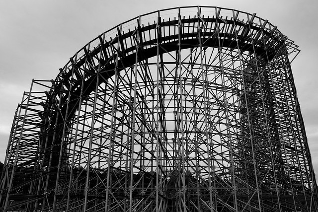
I like the aggressive processing on this: I get easily bored by landscape photos, even the very pretty ones, because I've seen so many of those classic landscape shots (foreground interest, slow shutter speed to make the water misty, sunsetty sky) that they're just completely dull to me. This feels a bit different and the blackened ground has a nice moody feel to it. I like the processing in this, but I feel like it fills too much of the frame somehow - I'd rather see a bit more negative space and have it work with the structure. Moving back a few metres (providing there wasn't anything distracting either side of it) would have made it more interesting to me. But that might just be personal taste. It feels a bit oppressive and like I can't focus on one bit at once. Went to a Lucha wrestling show for a laugh and took a few shots. Fun night but I broke my 50 when I got too close to the action and it cracked on the floor (well, the casing did). Rickety loving thing. 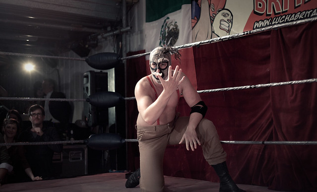 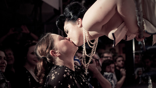
|
|
#
¿
Sep 23, 2012 20:38
|
|
|
KingColliwog posted:I like the second one, but I'd crop it on the left after the first spectator. So we see the first girl but not the two other ones. Main problem I have with the photo is that I don't understand what's going on at all. Who is this girl, is she kissing a spectator? Was she top less a couple of seconds before that and if so why? I like that it makes me wonder and think, but an additional shot or two that would give me some more context would be appreciated. It was part of a Mexican Wrestling and Burlesque night. She was a burlesque stripper and the girl in the crows is a spectator who she leaned over and started kissing. Here's some context: 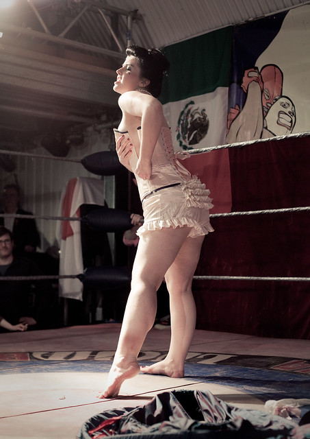 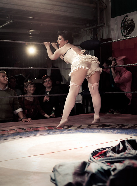 (not sure if those count as NWS) Pukestain Pal posted:
Absolutely agree with the logo complaints here. Get shut of it and just don't tag or name the file if you're worried about theft. Besides, people would just either crop that out or clone it over failry easily with the fence mesh. Personally, I'm not a fan of naming files. It's much better to just let us interpret feeling from it than saying "hey, this is meant to make you feel like this". I dunno, that's just something particular to me, but I hate it when photos have names. The things that work about that shot are: The focal length adds a bit of distance from the viewer to the girl. It adds to the sense of her being trapped in and unreachable. It feels voyeuristic in both directions, which is very captivating. Her expression adds to this, too. I like the pose. I think both hands on the fence would possibly have worked too, though, so long as it didn't feel a bit hammy and thespian. The sort of grainy, imperfect processing really adds to the mysterious feel. A massive nitpick, but maybe if you removed the paint line near her legs and the logo, it would be a lot stronger and removes that definite sense of location.
|
|
#
¿
Sep 28, 2012 12:47
|
|

|
David Pratt posted:Tried icing sugar this time, but it still looks like snow. Going to use straight-up cigarette smoke next time, kicking myself for not thinking of that when I had it all still set up. This is just great. I would agree, though, proper smoke in this could have been amazing. I'd also like to see one without any effects. Either way, I love the power in its simplicity: that is to say its clarity, not that it was simple or easy to produce. So a game called Hotline: Miami came out recently. I made some images for the hell of it. For context, it's basically Drive meets American Psycho (the book): The Game (sort of), where a man received coded messages on his answerphone tape to go and kill some mafia types. He can't remember why he's doing it and he's not in the best of health, mentally speaking. He dons a rubber animal mask and goes on a rampage. 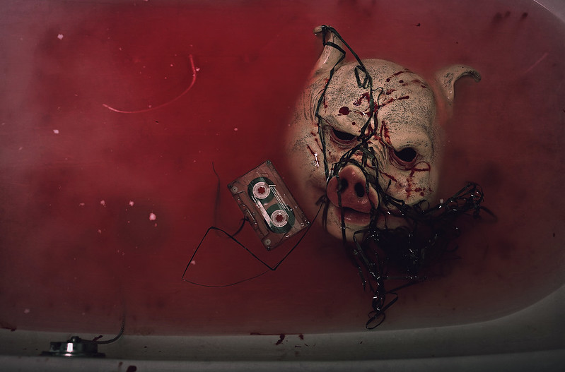  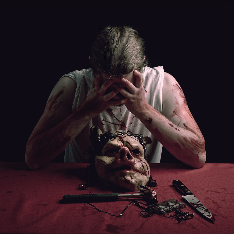
|
|
#
¿
Oct 27, 2012 10:05
|
|
|
Ninja Woodchuck posted:These are great. I love the lighting and I especially love the pig mask. The only thing that bothers me is the knife, how the blood is sort of spilled onto it in a neat pattern versus the messy, smeared blood on everything else. Great concept though and awesome series. Totally agree about the knife. It pretty much spoils it for me and is the one thing that I hate about the shot. I didn't do the "I like this, I hate this" thing on purpose to see if it was obvious. And it is. It's too neat, and it should really be red all over the tip to represent a stab. Ah well. As for yourself - what wb setting did you use? You probably want something like tungsten. Do you have lightroom and / or photoshop? Are you shooting in RAW? Your best bet is to shoot in RAW, then use a RAW processing program to alter the WB to exactly what you want. To take it further, you could use a selection tool to isolate the pumpkin in something like this and allow it to retain its warmth whilst cooling the rest of the image. Not too much, though, or it'll look too false. As for making it interesting, you need to think about arrangement of the objects in the scene. I'm not actually that happy with my placement of the objects in mine, as they look a little too deliberate, but I think some more careful placement in yours could make them more interesting. For example, the knife is sort of tucked under the pumpkin and doesn't look that exciting. I would pull back a bit, perhaps even stand on a chair (please be careful!) and do a top down shot, then arrange the items pleasingly, making it look clean and neat yet stylish. Think about lines through the images. You could do something like scatter a few of the pumpkin seeds to make a nice line through the less busy areas of the shot, something like that. Also I think you want it to look as bright and as clean as possible. You may need the help of an additional light. Is there any window light nearby?
|
|
#
¿
Oct 27, 2012 18:53
|
|
|
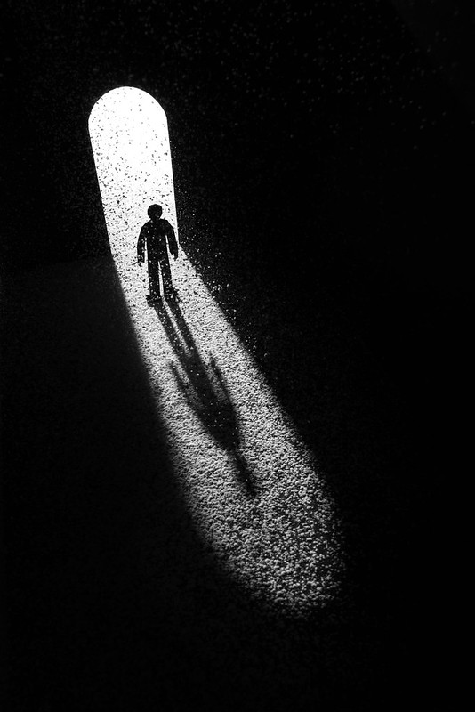
David Pratt posted:This is great, I love geometric/silhouettey stuff. The beam across the top is bugging me though - is it supposed to be horizontal? It's making it feel like the whole thing's listing to the left or on a slope. This is my favourite because it's really tricky to work out the perspective, and I don't want to know, either. Really magical looking. Hard to critique, really, and I would be doing it for the sake of it. Nice image.
|
|
#
¿
Oct 31, 2012 12:06
|
|
 If you want to try this out I'd recommend a smoke machine.
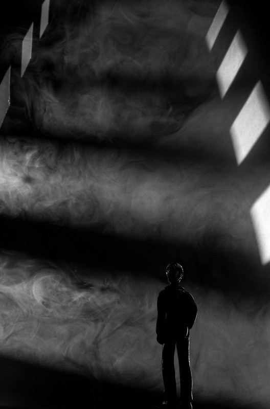
|
a foolish pianist posted:I actually think this one, in particular, is very beautiful. The riot of color and shape in the leaves makes me think about how such simple things can interact to form really impressive vistas. I'm a huge fan of watching leaves in wind though, and I suspect McMadCow isn't. I think the critique of the leaves photo is that, yes, there's a theme of all the colours of the season being in there, but it doesn't seem like a very strong theme and image if "three different colours" is the only thing going on here. There are very many of these images around and, yes, leaves are pretty, and if I were to be in the park this tree was in, I'd enjoy sitting under it for a long time and watching it. If I were to take a photograph, however, I would be mindful that nearly everyone who ever picked up a camera and made an attempt to create an image has attempted this shot before, and this is a bit too literal a representation of some leaves. Every time I walk through my local park there is someone stood underneath a tree, dslr pointed up through the leaves. There's nothing wrong with taking photos of pretty leaf patterns but when posted in a critique thread for review, a valid response would be that, from a critical P.O.V, there's not much going on here that is interesting or that grabs the viewer as different or exciting. I admit, I have no idea how to make an interesting shot from this subject - I'm sure it's possible, but it needs something else, something different, to elevate it above "leaves".
|
|
#
¿
Nov 23, 2012 08:44
|
|
|
|
| # ¿ May 1, 2024 06:45 |
|
|
Edmond Dantes posted:
loving hell fire alive. Brilliant. That probably counts as low effort critique. I'd like to hear the story behind it.
|
|
#
¿
Feb 20, 2013 22:43
|
|