


|
drat NIGGA posted:#1. Like the idea but the sky is blown, and your exif data says 1/4000 at 1600 ISO. Looks a like a sunny day, you don't need that high an ISO at all, cause it's daytime. If you're starting out, google sunny f/16 and shoot that, then bracket -1 +1 and see what you get. That was a dumb mistake - I realized that my wife was just about to walk a bit further down and be obscured, so I just shot it and didn't realize that I was still on ISO 1600 from the previous night. I didn't know about sunny 16 - thanks a lot for that. Very interesting and something I was able to try out a little bit today. Santa is strapped posted:I agree that it's too dark, however you don't need to up the brightness for the whole scene. Just bring it up slightly for the kids and the bright water behind them (that will separate them even more and add contrast) with a mask, that's all. I tried to selectively lighten it a bit and very subtly tweak a couple other little things - did I end up worse off, is it a step in the right direction or did it solve the issue entirely?  last day of summer (vacation) e2 by Paul Hofreiter, on Flickr Also a quick thank you to everyone, everything said was helpful and as always gives me a lot to consider. e: Sovi3t, thanks so much man for the great advice and words. Very quick impression of your photo (brain is shot and heading to bed) - I don't really like developments like that at all, so to want to spend time looking at that has to mean that the lighting and naturally high contrast is doing it for me regardless of the subject and any other composition that you are thinking of in retrospect. rio fucked around with this message at 05:20 on Sep 12, 2012 |
 #
¿
Sep 12, 2012 04:32
#
¿
Sep 12, 2012 04:32
|
|


|

|
| # ¿ May 13, 2024 22:44 |
|
|
Dalax posted:
1) I like it, and I like where you were trying to go with it compositionally and conceptually. I think you are right about the sky not being great, though - if you could have caught a nice blue sky with hanging puffy clouds it would have helped add an almost surrealistic quality in both color and contrast and I think could have really elevated the picture. Are you close enough that you could head back on a day that has a better sky? Could it also perhaps stand to be bumped up in exposure? Maybe it is just the exposure of the sky not matching the rest of the photo. Might also want to shift towards magenta a tad. 2) Not my thing, not doing much for me. 3) I also like this one but that darker area just does not seem to be doing much. If there were some more subtle contrast in that area, or maybe even across the photo, it might pop more. Then again maybe you don't want that, but I think that drawing attention to the industrial lines that are throughout the picture could help it. It is a cool idea and not something I would have recognized to be an engine, which I like. Kin posted:
A few comments from a musician on #1 and #2 - 1 is very stereotypical. I don't mean to bust your balls but so many pianists I know have some picture of a keyboard with the shallow dof like this on their webpage or whatever - are you trying to draw attention to the white key that is in focus? I want to see more of it; this is clearly not a normal piano and looks like some kind of period instrument (is it a clavicord or something?)...I want to look at it, not the massive amount of blur going on. The second one is better, but again that blur seems to not really function well. You have these cool lines from the strings on the left and they lead into blur, the lines underneath from the hammers or whatever, the lines from the keys...it just seems like it would be cool to exploit these lines in an interesting way somehow. I guess the angle you are going for is "old things" and the processing and shooting style is trying to reflect that? I might just be tired and tweaked from no sleep due to my darling baby, and the fact that I am a musician, but I just want to see the instrument and not so much blur and ambiguity. Also, in the second shot it would be nice if you could minimize the glare off the keys. Take that all for what it's worth - you clearly had your reasons for shooting how you did, just wanted to offer another opinion to think about ") geeves posted:
I like #2 more, because you can still get a sense of the hand shape while out of focus, and that + the face seems more interesting than the reverse in shot 1. While generally not into blown out skies, I also like the contrast a lot more in #2, and am digging the composition as well. ----------------  Sophie by sunset by Paul Hofreiter, on Flickr My daughter is adorable and I was very happy to get this. From a photographer's viewpoint, though, I can't help notice that I didn't get the horizon right (or it might be the curvature of the lake shore) and I was left with the decision of leaving it as-is or trying to straighten it and lose a bit off the top of the photo, which I feel might alter the ratios in the background too much? I went through nearly an entire roll of film that evening trying different shots, and I find that weighing the beauty of the subject vs. a pretty background was difficult for me.  next stop, autumn by Paul Hofreiter, on Flickr Sat on this one for a couple of weeks, just wasn't sure if I was into it. Came back to it tonight and started to feel it after reverting it and starting over. It was a slow shutter speed...could have been sharper. Not sure if it is too steroetypical either, I was driving and coming to an overpass near my house and the sunset was beautiful so I decided to try to get something.  crossing by Paul Hofreiter, on Flickr Quick and dirty shot through the windshield (and quick and dirty edit as well). Just trying to put some feelers out as to if it is interesting at all.
|
|
#
¿
Sep 25, 2012 08:15
|
|


|
Pukestain Pal posted:Do YOU think it's interesting? The composition is fine, but in my opinion the photo just isn't interesting at all. There are lots of lines, then there is a lovely minivan in the middle of it.
|
|
#
¿
Sep 26, 2012 17:26
|
|
|
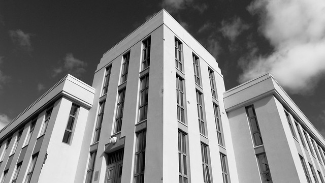
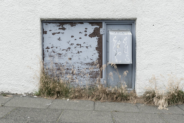
Sovi3t posted:It's nice, the light is great, but something feels a little off. Almost as if the background is in some sort of "uncanny valley" of sharpness. Or maybe the water is too distracting. Overall it just feels a bit too contrasty. Thanks a lot for the words, good advice and insights. Addressing the first, I am going to need to wait to see how the image actually turned out...that was a fairly minimal edit from a Target store scan of a roll of Portra 400...my scanner is pretty poo poo so I just used theirs for the time being figuring that when I get a dedicated film scanner I can do the real work. I'm not sure if they applied some sort of sharpening or not. I think you did call it, and I didn't even consciously realize it, that the vanishing point has been intriquing me lately. I will keep that in mid and see if I can work with it a bit better. David Pratt posted:. I am going to treat these like I took them (because I have ended up with some similar things and gone through this thought process). 1 - are the shapes interesting enough to do this kind of shot, and does it keep me wanting to look at the picture? I don't know, I don't think so in this case. The asymmetry seemss unfortunate - it almost seems like you were trying to portray it in a way that would have worked for a symmetrical building and were forcing that perspective instead of exploiting the asymmetry in an interesting way. I think that a crop in, losing the sky and dealing just with the shapes formed by the angles of the building and varied contrast from the light would be more interesting. Or, if you would like to try to work more with more of the building in the frame like you did here, see if you can do something more interesting with the shapes formed by the bright walls vs. the mid grey walls (perhaps bringing the whole thing to the left?). 2 - Doesn't seem that interesting, you might have caught something while you were there that drew you to this that you didn't capture in the picture itself. Were you interested by the angle of the ground vs. the wall, the plant stuff at the bottom, the paint chipping, or what was it that made you think to photograph this? -----  img078.jpg by Paul Hofreiter, on Flickr
|
|
#
¿
Sep 27, 2012 21:58
|
|
|
Sovi3t posted:
Is this a puddle reflection or looking up through a tree? Either way I like it. I like the vibrance of the colors, which provide context as to when it was taken and are pleasing to look at. The interaction between the darkest blacks, the shadowed leaves and the highlights are interesting and I like how the dark branches extend from from the borders into the middle. --- e: may as well throw up another one. I was weeding through some summer shots tonight before summer gets too far away - was sitting on this one. The distortion from this e-mount 16mm is pretty hard to work with but I tried to correct what I could. I worry that there is too much going on in the picture. 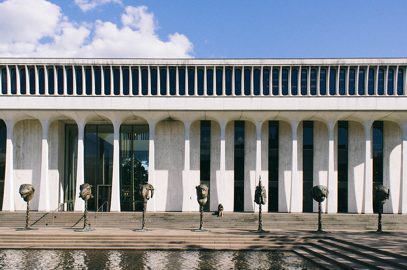 headphones girl by Paul Hofreiter, on Flickr rio fucked around with this message at 07:08 on Sep 28, 2012 |
|
#
¿
Sep 28, 2012 07:00
|
|

|
xenilk posted:and trying something different for a belly session: I think this works nicely, and I like your processing; after seeing so many poo poo bump shots in the bad photo thread and facebook this is a nice contrast. My wife saw this over my shoulder and was like "ooohh I wish we had done that" so you've got the mom POV vote as well. geeves posted:
Starting with the second photo, I think it's cool. What is going on there and what is up with the girl's glasses? I like that you are in the reflection, and the composition is simple and solid which works well to have the viewer looking all around the reflection. Part of me wishes that the dudes on the right weren't there blocking the screen thing but it's no biggie. The first photo - also wondering what this is, an art exhibit? I am not liking the shallow DoF and think that something else could have been done with all of that high contrast black and white, the repeating circular shapes and general strangeness/ambiguity of what it is that the view is looking at. As it is, the ball you have chosen to focus on doesn't really seem to have any special meaning or reason for being the sole in focus object, and although fun to look at in its own way I can't help but think that there is some other way to portray the scene that would be even more interesting. Agreed about the sky - it is a lot of negative space and doesn't really do anything for the scene. ------ Had a couple wedding gigs on the beach that I stayed afterwards to walk around and shoot, was hoping to get some feedback. I actually have about 6-7 I would like feedback on (it was so pretty there and I need to weigh in regarding if the pictures are good or if my memory is shading them) but will post the other batch later after there are some other pictures to critique. There are elements of each of these that I like but each also has something that makes me feel that it needs improvement, and I can't even put my finger on what it may be.  DSC09026.jpg by Paul Hofreiter, on Flickr  DSC09048.jpg by Paul Hofreiter, on Flickr  DSC09066.jpg by Paul Hofreiter, on Flickr
|
|
#
¿
Oct 5, 2012 03:18
|
|


|
AceClown posted:
I'd be curious to read that article if you wouldn't mind linking it. What was it that you were taking from the Rhine II into these pictures? I think that not knowing that all I can do is superficially compare and maybe guess - obviously the first picture is the easier to compare. I think I might like to see this bigger but as it is from imgur, the red object seems more like a curiosity than a contrasting feature from the landscape or subject of attention. In a minimal picture it is easy to nitpick, so it is also worth mentioning that the grass on the right doesn't really seem to help the image - that loss of the sharp line that is drawn across the frame is unfortunate. The sky is nice. I don't know if that elevates the photo though - the things that I like personally about pictures like Rhine II are interesting minimalistic patterns that emerge, movement and texture. I see the movement coming from the way that the clouds are framed, and the colors are pleasing but I'm not getting anything patternistic and the textures are one dimensional. I don't even know how much I would be nitpicking these things if you hadn't mentioned Rhine II. I like the second picture. Again I would have liked to see it bigger to really take it in, but based on what is here it has a lot more going on for it. The autumn colors are always an nice contrast vs. the blue sky - I don't know if I am calling this accurately but did you heavily squash the highlights of the trees? It kind of has that look but again at this size it is hard to tell. There is something wonky about the tones that I can't put my finger on; maybe I am imagining it. But I do like the picture. The one fluffy cloud is nice and serendipitous. David Pratt posted:
These all are great. What is going on with the second picture out of curiosity? Mr. Despair posted:
Like these a lot too, particularly the first one. I would print and hang it. Are these film? ----- I did a practice shoot with some friends of my wife and their new baby a couple days ago. I posted them all in the portrait thread with some questions and specifics but I wanted to post my 3 favorites here for any feedback you all might have judging them both as individual photos and if you were to view them as a product intended for a family who had hired a family photographer. 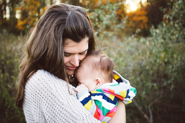 DSC09851-Edit by Paul Hofreiter, on Flickr  DSC09777-Edit by Paul Hofreiter, on Flickr  DSC09784-Edit by Paul Hofreiter, on Flickr
|
|
#
¿
Oct 24, 2012 02:56
|
|


|
David Pratt posted:
This owns. It it an action figure? scotty posted:Fantastic. This reminds me of The Master. Beautiful tone and composition. Was this a friend of yours/a staged shot? The pose looks pretty intense for being out on that jetty-ish type thing. These have been commented on but they have promise so I wanted to add something and also ask if you are using film software like the VSCO film sets? The tones are nice but I am just getting that film emulation vibe. I love the look the look of film, try to get that look from digital and shoot film since I suck/digital is really hard to get looking like proper film so this is something I generally look for. Straighten #1 and #3. #3 is weaker because you are forcing the symmetry (even after straightening it would look like that) and the dynamic range is working against you. #1 is a nice shot and just straighten it for success. #2 I really want to like this. I can't decide whether I am looking between the poles at the building in the landscape or at the poles. I think that the vignetting (which looks to be done in post but again I could stand to be corrected) draws my eyes to the building, so if you are intending to have the viewer look more at the poles then lose it. I think moving a bit more to the right might have paid off in terms of the perspective/composition, but it is still a nice shot to look at. Did you crop it?
|
|
#
¿
Nov 2, 2012 07:29
|
|


|
krooj posted:
Looks cool as a snapshot, but as something planned did you walk around and try to find the most interesting place to stand under the fixture to get an ideal composition? I have no idea what the fixture setup or size is, but just talking out of my rear end it would have been cool to try to exploit the the lines formed by the more sparse lights on the right, the higher density on the left or some balance between the two. Interplay of cool vs. warm colors could also be interesting. Right now it seems a little haphazard but fun to glance at. Captain Apollo posted:
Pretty loving cool to go flying to look for shots. I can't help but feel that the compositions are a little off though. I do like the colors in all of them though. The first one, did you frame it that way because the plane's shadow interested you? It makes the balance of the picture feel off, and the crooked horizon is doing you no favors. Judging by the lines in the flield in the background, did you crop this in post? The second one is better but I still wish it were framed differently as my eye is still not led through the picture in any kind of meaningful way. The third is interesting just to see all the random poo poo in there but I have to wonder if a different perspective (like looking at the wall straight on) might have been even more interesting, or looking at something in a more focused way rather than just present us with so much random clutter. ------ I have a poo poo ton of fall pictures to go through but have isolate a small group that I think are keepers, the first two here being a couple of them. The last picture was as I was leaving a building of sculptures and I only had my AE-1 on me so it was pretty quickly focused and shot, being that I wasn't sure if they were ok with photos in this building. I can think of some things I would have done differently now but would still like to submit it for critique.  DSC09630.jpg by Paul Hofreiter, on Flickr  DSC09642-Edit.jpg by Paul Hofreiter, on Flickr  012_26.jpg by Paul Hofreiter, on Flickr
|
|
#
¿
Nov 20, 2012 08:07
|
|


|
McMadCow posted:So what about these makes them keepers for you? I mean, what were you going for? To me these really don't have strong design language. So unless there's some sort of narrative or conceptual aspect to why these succeeded for you, I think they sort of fall flat. The exposure is good and the colors are nice, but I don't really see either of those qualities as a reason for taking the picture. Thanks a lot for the criticism. I have been trying to think more when shooting, and that is why I chose those two as keepers initially, as I tried to go into both of them with a composition and purpose in mind. The first featured a timeline of fall colors, green to yellow to brown, with each section becoming larger in the frame. I also liked how it turned out a bit abstract, and that the branches spiderwebbing around the frame supported that and also connected the colors. If it just looks like pretty colors then I eitherdidn't present it well, or that is just the default purpose that a viewer first thinks of when looking at a autumn canopy image and it is just hard to present something in that vein as anything different. The second one was the weaker of the two, but the illumination of the branch against the darker higher branches caught my eye and portrayed something that I hoped to find on that walk, a branch that looked to be on fire (which is the title which Flickr didn't put here for some reason). Anyway, I would rather hear criticism than "nice capture nice colors" etc. anyway, so I do appreciate it. rio fucked around with this message at 00:51 on Nov 22, 2012 |
|
#
¿
Nov 22, 2012 00:48
|
|
|
I feel that while well executed, the wood in the foreground is not as interesting as the location itself, and I wish I were just looking at a straight up landscape featuring less water, the mountains/treeline and more sky. I also think that if you want to include the elements on the left of the photo that they should be more prominent. As they are now, it seems to be more of a distraction than an integral part of the composition. -----  end of autumn by Paul Hofreiter, on Flickr
|
|
#
¿
Nov 28, 2012 07:17
|
|

|
dopaMEAN posted:
I am all about cat photos so let me just say that I want to pet that cat. It is good to keep the rule of 3rds in mind but do not do it to a fault where you try to make an image bend to its will so to speak. What you went for with the shot being divided in such a way did not work and you saw why, because of the background. Try being flexible and making it about the subject rather than the design if the image is not presenting itself. Get the cat's eyes in a nice place in the frame and draw attention to them and the background will not be an issue as much as it is here where the idea might have worked but the execution did not. I can kind of imagine a black and white shot without the clutter behind the cat and it ending up as a more interesting shot, but at the same time I use Instagram as a cat picture heaven so my critical eye concerning kitties might be skewed (cats are awesome, you see).
|
|
#
¿
Nov 30, 2012 07:15
|
|

|
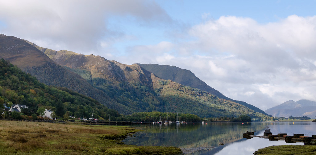
tijag posted:It's quite boring and 'generic' so I'm wondering if anyone has suggestions for processing or cropping that might make it less boring. If you feel that it is boring and generic then post will not save it and a crop might not save it either but it is at least possible. Anyway, it seems like you have the potential for two separate images here, one from the left with the buildings and layers of terrain behind them and one from the right with again the layers of terrain + reflections, the boats and the manmade stuff extending into the water. Unless some sort of post would help you portray what you are trying to more effectively, I think that part looks fine as is and is pleasing to look at nice and natural. Spime Wrangler posted:
The look here is great; Kodak Gold works great for stuff like this. The way you have the shot framed has my eye move around the frame - I think in part due to that little spot with the circular ripples around it in the lower right drawing my eye but then not having much to look at there it goes to surrounding areas. I'm pretty curious about what is going on in the upper left but not enough that I can't appreciate what I am looking at portrayed in this scene. TheJeffers posted:
----  Scan-121219-0026 by Paul Hofreiter, on Flickr 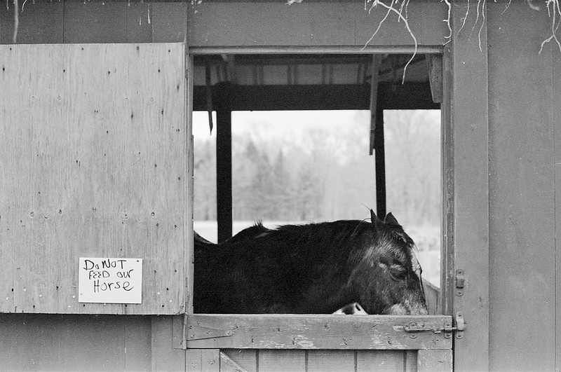 DO NOT FEED OUR HORSE by Paul Hofreiter, on Flickr  Scan-121219-0025 by Paul Hofreiter, on Flickr
|
|
#
¿
Dec 20, 2012 06:10
|
|


|
^ I like the 3rd one the most, the first I am having a hard time looking at because the focus seems to be the grass in the foreground and my brain is not sure what it is looking at it. To answer your questions, quote:Would like to see a wider shot of the first image if there is one. Not quite sure what you were going for here. quote:What do you do shoot on? Just got a Pentax ME Super and it was on T-MAX 400. I find it to be kind of flat sometimes too; it is not my first choice in b&w films but my wife got me a ton and I am trying to use it all. quote:The images seem kind of flat. Was it color that was scanned and converted? I am dealing with a pretty poo poo scanner (Epson Perfection 2580) and am also relatively inexperienced with scanning negatives so it might be that combined with the characteristics of TRI-X. Oh, and it was my second try at developing film so there is that too.
|
|
#
¿
Dec 20, 2012 06:51
|
|
|
InternetJunky posted:As you can see, I extended the canvas and reconstructed the missing wing tips. What I'm curious about is if it's noticeable? I only notices after I started looking for it - at first and second glance I did not see anything out of the ordinary but there are a couple of giveaways after actually looking for it. One is the horizontal line in the upper right. You should be able to take that out easily. The second is the tree branches on the upper left - I would take out one of those little crooks rather than having both. The horizontal line is much more noticeable. Great job and a very nice image.
|
|
#
¿
Dec 27, 2012 22:47
|
|
|
David Pratt posted:The first one is super red, was this a conscious decision? The horizon isn't totally level, is slanting up to the left, and the stars look slightly elongated. The rule is something like 500/shutter speed for your maximum before getting trails. There's no EXIF on flickr - do you remember the settings? 1 - It looks like at first glance that it is a seat looking away from the viewer towards the back but then I realized that it is a busted seat laying on its back. It changes the mood of the scene as well as the context and I think that you effectively shot it to portray the leisure of the view with the seat looking away and the unease of looking at an old spent item littered on the ground. I like this a lot. 2 - The guy walking into the distance with his dog is pretty classic. The tones of the walkway are nice, fading in towards its center and the highlights of the rail leading me towards the guy. I find myself wondering about the item that is in front of him/he is walking towards and the shape of the landscape in the distance is very interesting - part of me wonders if I would rather see those things more clearly by having shot closer to the guy but it is not enough to take away from the overall experience here. I wish the sky had something to it but I know it goes with overcast featureless days. I also like this image a lot. 3 - Not bad. Competently shot and everything but it is not grabbing me. A nice shot for the family. ---- I have been trying to clean up my haphazard slew of images since getting my camera 13 months ago. It was interesting to see some pictures I have not seen for a year that I gave up on and to see that even though I am still incredibly mediocre I am at least learning and slowly improving, I think. I took a couple photos that I had originally given up on and tried to see if they might be worth revisiting.  DSC02593-Edit by Paul Hofreiter, on Flickr 1) I had taken a number of the shots of the corner of this building and man, I am kicking myself now for the poor job I did. This was maybe 10 months ago. I cropped it and started from scratch with the processing. I am still tempted to take this b&w but ultimately decided on color for now. I was trying to force symmetry so much and I think that is what kept me from getting anything successful when I first shot and processed them. That still sticks with me so I hope I can get some fresh input here. 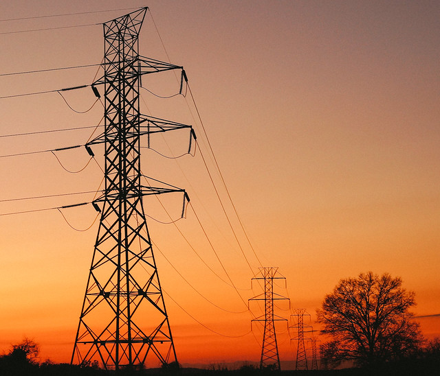 DSC00830 by Paul Hofreiter, on Flickr 2) From over a year ago, I had had my camera for maybe a couple weeks and was pretty haphazardly shooting. This also looked nice in b&w but it was hard to give up the sunset colors. Sunset + power lines, I don't know if I could choose any more cheap subjects but I like it and don't know if it is nostalgia or not.  dryad by Paul Hofreiter, on Flickr 3) Now that the contest is over, I wanted to get some input on this. The main substance of the trunk was shot lower to give ample room to the ascending branches. These apple trees are loving great to look at (to me) in that you can see all sorts of things in them - I saw a short haired woman (perhaps with laurels on her head) with her arms out and head down. The light leak or whatever developing mistake at the bottom was not intentional. I really like it here though and I wish I knew how to replicate it in the future, although I doubt I could.
|
|
#
¿
Dec 30, 2012 07:35
|
|


|
Thanks a lot for the input. Regarding the first shot, I had so many bad and forced shots of this corner of the building that it was hard for me to look at the image objectively (even with a fresh crop and processing) because I kept thinking of the bad ones and the inexperience that led to taking them. I think the further I get away from that association the easier it will be, so I appreciate your comment. I think you did a great job with that owl image - I was expecting something different when clicking the original image. I would not have guessed that you added the edges and there are no signs of it so great work. I might be tempted to dodge a few areas on the owl to bring out its features (subtle dodging in the face, perhaps around the legs to help bring them out) as the lighting is making the bird a bit flat overall. Also, "Knock, Knock" "Who's there?" "Who..." "Who who?" ... "Are you an owl?"
|
|
#
¿
Jan 1, 2013 19:33
|
|
|
It's better to put up something and get critique than put up nothing and get no critique - post your photos!
|
|
#
¿
Jan 5, 2013 19:51
|
|
|
Are you ok with doing some processing? If you aren't against it, you could mess with levels and curves to bring out some highlights , which could work well to really accent the interplay of lines that you have going on here. First of all, you have no reason not to post in this thread - be hard on yourself for the sake of improvement but not to the exclusion of presenting your work. I like how the lines play with and against each other here, and I think you've done we'll framing the shot. A bit of levels/curves might bring out the grid pattern on the floor, could help the lack of separation tonally between the bottom right of the frame and the floor itself, and generally make the image less flat if you we're to work it a bit. I wouldn't go too overboard with it, but subtely done it could help. I like the prescience of the family but if I were to pick exactly where I might want them, it would be below where they are in the frame, in the triangular section. Another option which might work or might not is a tripod and a longer exposure to create trails of people walking through, which could create some fluidity to play against all of the hard lines. e: one last thing - changing bags are pretty cheap and (for me) a lot easier than going under the sheets. Might want to pick one up if the sheets are an issue.
|
|
#
¿
Jan 5, 2013 22:39
|
|
|
Chill Callahan posted:. I would prefer to see it with the branches out. Pretty sweet shot
|
|
#
¿
Jan 8, 2013 04:09
|
|

|
T Fowl posted:
The "retro filter"? What program are you using? From experience, I can say that your time will be much, much better spent learning how to achieve the looks you want to go after by making them yourself in Photoshop, Lightroom, even plugins (something like Exposure which has a robust set of features to tweak) than clicking presets trying to find one that you think is good. Clicking around presets tires your eyes and makes them less critical, and also depersonalizes your image. Actually, after looking at your updated image are you using Nik's Color Efex plugin? I don't use it much but I do think I recognize it, or at least it seems familiar (the different colors on each corner). It does look better than the original post.
|
|
#
¿
Jan 19, 2013 06:03
|
|

|
TheJeffers posted:The strongest lines in this picture are the parking space lines against the asphalt in the bottom of the photo. My eye immediately goes to them and follows them out of the bottom right corner. There's simply no interesting forms in the upper 2/3rds of the photo that draw my eye to that part of the image to counter the visual weight of that contrast. For that reason, I would say that it is a poor fundamental composition. Personally, I don't care much for the second shot. I think the first one quoted here is pretty interesting but isn't quite there. All of the business on the bottom might have been fine without the text, but that really draws attention there and away from the top of the image - which seems like a focal point with the bottle. Looking back and forth is a conflict. I think that if there were more of the upper right negative space, and a little bit of headroom on the bottle that it might have been more equal. The lines leading to the right also seem to leave me hanging. I like the colors but it seems oversharpened - that might just be flickr though.
|
|
#
¿
Jan 20, 2013 09:00
|
|

|
xenilk posted:Worked out great for me, my eyes went straight to the crane arm mostly because of the color and maybe unconsciously because of the branches (not sure tho). I like the composition and the tones. Reminds me I have to get my rear end out there more often on foggy days. These are more of the work where you do a makeover for the person, correct? Quality wise they are both good but I don't know if the direction taken in the first one comes off the right way. Did she choose the dress? My eyes go right to her hips, and subjectively I think that she has more flattering features from the waist up. In addition to the dress, the pose and framing also really draw my eyes to the tops of the thighs and hips. She is also looking too orange on my monitor. I like the third one. I have really been trying to pay attention to baby photos - not just because I have one bu because it is a field that seems to have so much poo poo and it is nice to see well done pictures. Did you crop the dad's head in post or while shooting? With a baby photo it seems like faces are a given point of focus, and to start with my eyes on the baby and then up to the dad but being blocked by the frame is a little jarring. That's not to say that I don't like it but then I go on to see the baby's foot cut, the dad's elbow cut and really all I am left with to go back to is the baby's face which is at an odd spot in the frame. Does it ultimately work? I don't know but I do like looking at it, and the processing and other technical aspects are strong. RazalasSol posted:
Of the three, I like this the most. Can't really say too much other than that - I like looking at it more than the first because of its simplicity and ambiguity. ---- Speaking of babies, my wife and daughter came out with me today so that I could test a location for some headshots that I will be doing for a musician friend tomorrow. I am getting paid in beer, and as much of a joke as that seems to be it is the first time I will be "paid" anything for photos so I wanted to go out today to test the light during sunset and try to be as prepared as possible. I would also like to get into doing family pictures this year for others (it is a New Year's resolution), so everything like this I also consider to be practice and trying to get good enough to feel comfortable charging real life bucks.  DSC01468 by Paul Hofreiter, on Flickr  DSC01472 by Paul Hofreiter, on Flickr I feel like my landscapes are generally always a bit off, likely because a lot of my shooting is rushed due to having a 10 month old in tow all the time and I have to take what I can get. But still, any advice is appreciated.  DSC01450 by Paul Hofreiter, on Flickr rio fucked around with this message at 09:29 on Jan 21, 2013 |
|
#
¿
Jan 21, 2013 09:19
|
|


|
maxmars posted:Of the three, the first one is the one that speaks to me. Colors remind me of H.Bosch palettes, the subject is somewhat disquieting, it manages to instill a feeling without being very clear about what's on the pic. Purely as an image, I like it very much but didn't get sadness from it - more of a peacefulness and an ethereal quality. After seeing the spoiler, though, and paired with that concept it does come together nicely. I *might* have been tempted to take out the vignetting. --- This was a quick shot - it had some empty space on the top from a featureless sky that I cropped out. Wasn't completely sure about the decision... I ultimately decided that it was not as important as trying to strengthen the overall composition.  Scan-130122-0007-Recovered by Paul Hofreiter, on Flickr
|
|
#
¿
Jan 23, 2013 02:51
|
|

|
Awkward Davies posted:Sometimes I want to give critique like "You took a picture of something boring. Why did you do that?". Thanks - even just the first line (bolded) would have been enough to be very helpful but the rest is good advice too. It wasn't so much the symmetry I was looking for, but the different grades of grey that combine to form lines going from the left and expanding across and down through the frame. I think you are right and there just ended up being too much going on with the branches to make the lines I wanted to try to exploit really come out. fake edit: I always appreciate a simple "it's boring" critique. My eyes and head pay attention and dwell on to many little things to really see the big picture (hahaha) sometimes.
|
|
#
¿
Jan 24, 2013 02:19
|
|
|
Watermelon City posted:
It's a snapshot, right? There is a ton of poo poo going on to the point of excess and some cat grafitti; I'm not sure what you wanted to portray. At the least, look for a moment to capture rather than "I see item, I will press the shutter when that item is in focus". Look for a contrasting element to the cat picture. Frame it differently to get the posts out of the picture if you don't like them or try to incorporate them somehow if you like the cat thing enough that you are building a whole image on that. One idea - frame it better and do a long exposure with a nd filter to show people moving constantly around in the frame but the cat is just sitting there smiling. Primo Itch posted:Some from Patagonia Oh, and wow I didn't even see the people at first glance in that second photo. Great sense of scale but as Mr. Despair said it would be good to draw some more attention to them. Hypnotized posted:
I think this turned out well, although I don't know much about wildlife photography. The snow hanging in the air really makes it - all of the other elements are good such as your framing, background etc. but the sense of time being stopped is really nice to see with the snowfall. ---- I am still trying to get a handle on my new camera - had a very brief window to try to get some fog photos today during a break at work but unfortunately I lost the sun in 10 minutes. The first two are just two crops - I think I prefer the wider one but would like some outside input.  DSCF1245-Edit-3 by Paul Hofreiter, on Flickr 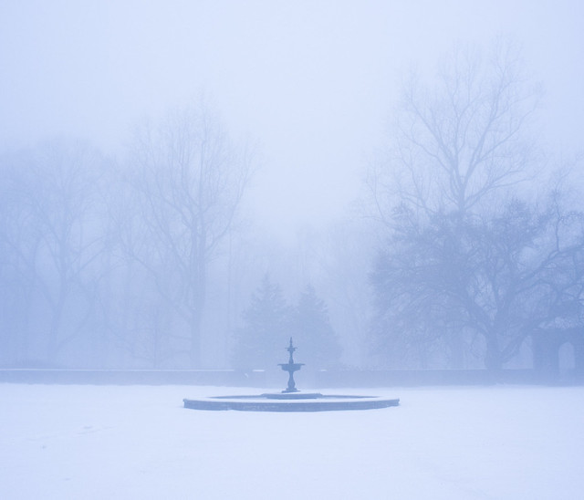 DSCF1245-Edit by Paul Hofreiter, on Flickr  DSCF1291 by Paul Hofreiter, on Flickr
|
|
#
¿
Feb 12, 2013 06:34
|
|


|
InternetJunky posted:Your first shot has a great effect with the gentle snow fall. The dark brush makes a great environment for the lighter deer. I really wish you had more room, especially on the bottom right. The deer feel a bit cramped in the shot. Man, the owl shots here are just great. I wish I had owls all over the place to shoot. I have no idea what was to the right, but if it was similar to the current background I would have preferred the bird to be further to the left in the frame and more of the space/snow on the right. It is still a very nice shot though. fake edit: also, if going to print I would dodge the owl a little.
|
|
#
¿
Feb 13, 2013 09:56
|
|

|
BANME.sh posted:This'll be my first post in this thread The background doesn't work as was said earlier, but also you could have at least tried to blur it (and you even said you wish it were blurred. You were shooting at f3.5 but doesn't that lens go to 1.8 wide open? What camera mode are you shooting with? torgeaux posted:I just posted this critique in the Portrait thread. I'm really digging your second shot (also seeing that funky halo and banding though). It is simple in a good way yet keeps me looking and the colors are nice. Part of me would actually like to see more dof here but it probably would have had a different vibe. The third shot I am not feeling. Based on the title I see what you are going for but the wind turbines seem almost too secondary with that radio tower thing next to them, and the oof fence in the foreground and oof bush are not doing anything. It seems like the fence around the gas tanks and the tanks themselves are interesting, though so I would be curious if you could get back out there what you might come up with after a second shoot. David Pratt posted:
Not much to say here except I really like it voodoorootbeer posted:
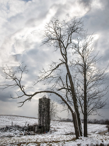
There is some real strangeness here. The sky vs. the rest is unnatural - my eyes want to see the landscape darker with that kind of sky exposure but then again I am not huge on unnatural looking hdr type stuff (even though this wasn't a multiple exposure hdr it does have that odd quality to it). However, the one thing that does help is the strangeness of the tree vs. the silo and the odd perspective. I just don't get what I am seeing, is that a big old silo next to a small tree, with another smallish tree up front but magnified due to the perspective? So that strangeness combined with the odd exposure makes it kind of work in a way? If you are not adverse to it, I would try to clone out that road on the right, though. -------- The first two I took Saturday before and during a gig. I had never been behind this place before and was struck by how much there was to potentially shoot. I am considering a 6x7 center crop cutting off the far left and right but have not decided.  DSCF1405 by Paul Hofreiter, on Flickr This one was taken while I was not playing (obviously) during a snare + laptop solo piece. I wanted to try to get the audience in the shot somehow and ended up with the back of the head + mirror combo. It was maybe a 4 minute piece so I didn't have much time but I did try to plan it in my head before shooting rather than snap away. I wish that I got the percussionist in more of a dynamic position - I I had a few where she was but the other elements were weaker in varying ways. 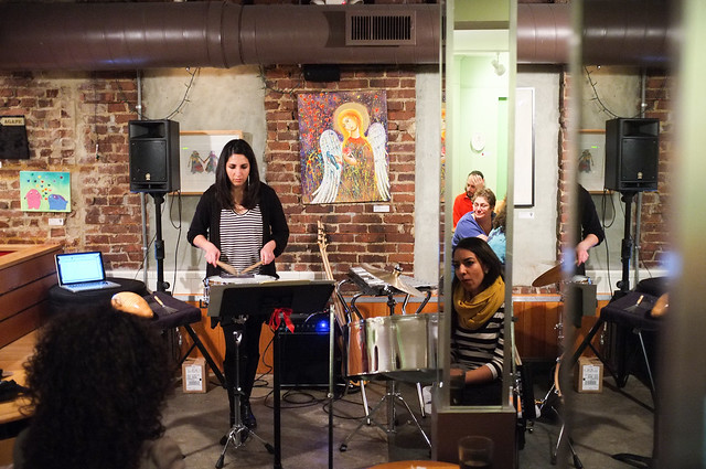 DSCF1429 by Paul Hofreiter, on Flickr Didn't have much freedom here due to it being out my front window but that is no excuse! I waited 15 minutes for that loving truck to drive by so I tried to make the most of it by planning the best view I could.  DSCF1075 by Paul Hofreiter, on Flickr
|
|
#
¿
Feb 19, 2013 08:37
|
|


|
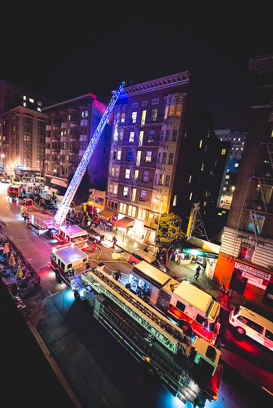
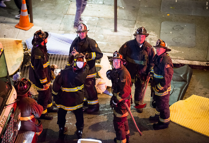
blackmanjew posted:Love the first one. The second doesn't do much for me. First one is fine. Second one seems like you reeeally wanted to make sure that we know the bike is the subject. Pull back a bit; we'll still focus on the bike. Doesn't need to be a lot but as is it is cramped. Third - seems snapshottish. Just that truck behind him screams that there wasn't thought involved - why would that be a background for this shot? (not trying to be a dick, just trying to be to the point) It just looks like "I am taking pictures of a buddy driving in a parking lot. Evilkiksass posted:Here are some from a fire across the street from me: Nitpick time: I wish the third shot had all three firemen looking at the camera! Where his face is placed in the frame brings me to him first and that look plus looking away is just not doing it for me. Not much to do about it but just saying. I really love the first. The colors, framing, choice of focal distance - it is all really nice. The heavier saturation almost gives a glamour to the shot which is visually appealing and a nice contradiction to what is actually going on (I assume some sort of non-glamorous emergency). --  DSCF1768 by Paul Hofreiter, on Flickr  DSCF1649 by Paul Hofreiter, on Flickr  DSCF1742-Edit by Paul Hofreiter, on Flickr For this last one, I have a question. I have been playing around with the 35mm focal length and of course the closer you get the more you get a visual distortion that is more apparent with faces. Do you think people would be offput by something like this? I have my first paid gig next weekend - which generally I am pretty confident about - but I am trying out some things before the shoot that are a little different than what I normally might do (like 85mm-ish for shoulfers and head and 45mmish for full body)
|
|
#
¿
Mar 3, 2013 08:03
|
|


|
Autofocus modes will do nothing to get more of your picture in focus - you are on the right track thinking of aperture but it is also the distance to your subject (macro distances etc.) You are shooting wide open - if you want more of the picture in focus then stop down.
|
|
#
¿
Mar 3, 2013 08:27
|
|
|
Wow man, love that first one.
|
|
#
¿
Mar 13, 2013 01:03
|
|
|
I like the concept but I wish you had tried to incorporate the umbrella/bag/belongings into the shot rather than hide them off to the side. I think just walking a little more to the left could have helped that and also bringing him just a little bit away from the edge of the frame. As is, there is all this movement going down to the left of the frame and it just abruptly cuts off.
|
|
#
¿
Mar 20, 2013 03:27
|
|
|
smallmouth posted:All of these are fantastic. I really like how in the second two the buildings on the horizon are sharp enough to make out. To answer your question very non-definitively - it only matters when it matters. If you think that the distortion detracts from what you are trying to do in the image then it is time to fix it. In your first picture, unfortunately I don't think it matters because it just looks like (based on your title) you decided to get these three things in the frame, measure off an approximate distance from each side of the frame and call it a day. There are so many interesting textures there from the looks of it, and I think your eye was on the right track looking for geometric shapes. It unfortunately does not work as you have presented it though (in my opinion).  DSCF2338 by Paul Hofreiter, on Flickr Without explanation I will post this and very much appreciate any insights. I might elaborate on what I am hoping to do with this kind of thing later on.
|
|
#
¿
Mar 31, 2013 08:06
|
|


|
Bilbo Baggins posted:
I would say you might want to add a crit because rules and all but since nothing has happened yet days later I am thinking that in addition to no occasional effort crits we are now not getting mod visitation. Gas thread etc. First one is fine technically - I don't like that branch in the middle of the frame since it draws attention and it is not that important or interesting vs. what else is going on in that setting. Might not feel the same way if it wasn't centered like it is. The second is fine - looks like a nice place. It is hard for me to judge anything sunset related anymore because I am hard on myself with those shots since they are kind of a "gimme" in terms of getting a nice looking image.  DSCF2446 by Paul Hofreiter, on Flickr  DSCF2443 by Paul Hofreiter, on Flickr  DSCF2274-Edit by Paul Hofreiter, on Flickr
|
|
#
¿
Apr 3, 2013 05:24
|
|


|
mclifford82 posted:My attention is drawn almost entirely to the drum in the bottom right and then the vertical mirrors in the crowd. I eventually get around to seeing the cellist, but I usually wind up looking to see what's in the mirrors or the reflections in the pan drum. Perhaps it's just a side effect of the DoF, but I really like how the people in focus are those looking at the cellist, while those in the back not paying attention are blurred out. The main reason the steel pan is so prominent is because he is the bandleader - the piece was a duet between him and the cellist. I am the bassist and often I will not be playing for a few pieces so I was thinking of starting a series of shots from a performer's viewpoint. In this one, I really liked how, due to space issues, she was out in the room among the audience and liked the mix of her expression while playing among the various reactions in the crowd. TheJeffers posted:What is this angle supposed to show us about the peacock? I don't feel like I'm seeing anything about it beyond "here was a pretty bird and I pointed the camera down and pressed the button." The way the tail is cut off feels careless, which really sticks out because it has the most visual weight in the photo by far. The blue/red contrast between the neck of the bird and the berry it's eating is really interesting/eye-catching, but it gets lost in the scene. There's also an interesting interaction in the curves of the wings and the feathers on its back, but there's just not a central idea that comes through. Thank you for the insight - I got this angle and framing because as the bird was milling about on the grey concrete I wanted to try to have the colors come suddenly into the frame in some way, narrowing until getting to the head making a shape on the pavement. The legs were to give it a sense of still being a creature and add some literal movement. I thought the small bit of color from the tic tac or whatever it was eating helped to tie it together adding some color at the end of the shape made my the bird. If it didn't work then I will try something else next time; I would like to eventually execute the idea effectively. If it comes off as being careless that is good to know.
|
|
#
¿
Apr 8, 2013 06:32
|
|
|
Dr. Garbanzo posted:Here's two that I took on new years of oddly enough the exact same sunset with the same lighting but just different apature and exposure settings. I like how both turned out but prefer the first one as it seems more dramatic. They both (perhaps coincidentally) have the same sort of composition, but the clouds do lead the eye differently in each shot. The first is too saturated for me, and I don't really like the sun where it is. It is hard to get a sunset that really says something because they are naturally beautiful and inspire us to point a camera at them; I respect that your composition might have been an attempt to do something different but I just don't know about the elements (as interesting as some might be like the horizontal lines of the clouds) supporting or justifying this composition. I like the second more - those kind of mountains and the tones varying between them are always nice. But again, with the comp, I don't know. Feels like you could have just gone 2x3 and got rid of the whole foliage thing on the right. Why did you choose the wide aspect ratio? Hotwax Residue posted:I've had this shot sitting around for a while, I'm not so sure about the sky or how dark the rest of the image is. ----  DSC02828-2 by Paul Hofreiter, on Flickr  DSCF2644 by Paul Hofreiter, on Flickr  DSCF2903-Edit by Paul Hofreiter, on Flickr
|
|
#
¿
Apr 29, 2013 03:41
|
|


|
David Pratt posted:I love the colours on the first one, and the not-quite-black blacks work really nicely. I wish there was more depth of field though, it feels like there's too much of the frame out of focus. Thanks for the words; always insightful. For that tree shot, I had a few others taken with varying dof's but ultimately went with this. I made the choice because the texture on the tree was so interesting but I felt like keeping too much in focus would have almost been an overload and wanted to draw attention to just a part of it with the rest implied. Thinking about it, though, I probably could have stopped down just a bit and achieved it without quite so much out of focus. Regarding your pictures, great work. Framing and composition are good, great colors and tones...vivid and lively without seeming fake (which is a hard line to walk). I think the second one is the only one that seems a little too burned around the edges and if it were let up just a bit would be right where it needs to be. Then again, my monitor's blacks are always a bit exaggerated so it might just be me.
|
|
#
¿
May 1, 2013 02:43
|
|


|
Tyorik posted:I love where you're going with the set, I just really wish that the woman in these two particular photos was better exposed. The way she contrasts to her surroundings in the other photos makes her the center of attention, and almost like she's gracing the surroundings with her presence. In these two she's getting somewhat sucked into the environment, and is less of a feature. In the first one is works better because she takes up a lot of the frame, the second one is really where the effect happens though. I looked through your flickr and enjoyed looking through your New York shots. The main overall thing that would apply to most is that they seem like pictures taken by someone who is not an amateur while on a trip, giving a snapshot-ish feel to everything. Like, if there were *just* a bit more time or thought or consideration of when to hit that shutter that some of them could really be pulled together nicely. I know that all of those shots are not submitted for critique here but wanted to mention it because I think that it applies to these two images as well. 1) Obviously not something you see everyday. You definitely captured a moment. As a statement, and in terms of total impact of the picture, a few things do not help. The guy smiling and the lady with the cell phone on the right are out of place (and not in a good way that provokes any thought), and the arm on the left makes me want to see more to the left. You might be able to crop and get something better, or while there waited just a little bit to frame it slightly differently or let those distractions pass. 2) My first thought was "why not wider and why is the camera raised up to show that much unremarkable sky". When I looked at it full screen, I enjoyed the detail of the landscape and it was very nice to look through - my initial thought about not going wider wasn't really an isssue at that point, but still - why so much sky? Given how interesting the city is to look at and it is the meat of this shot, it seems like you could have gone down some. -----  DSCF2689 by Paul Hofreiter, on Flickr  DSCF2700-2 by Paul Hofreiter, on Flickr
|
|
#
¿
May 1, 2013 19:54
|
|


|
XTimmy posted:Portrait thread is a little light on critique at the moment so I'm putting these up here. This is really nice. Seems a touch underexposed but at the point where you could either leave it if you want or boost it for a little more impact.
|
|
#
¿
May 22, 2013 04:51
|
|

|

|
| # ¿ May 13, 2024 22:44 |
|
|
Cru Jones posted:Awesome color/contrast in first shot. It's too bad that cable was dangling in the third shot, kinda messes up the hard angles and shadow/light a bit. The burning does not come across as natural - I would go back and try to redo it more subtly. Wafflecopper posted:
When you dodge the faces like that you have to watch out for unnatural skin tones. Your first photo is a good example of that - if you are in lightroom, drop the orange and red saturation to taste and boost the luminosity as well. You may need to add contrast or clarity back to the face after this as well. Don't overdo it. The second is overdone on the vignetting. It highlights your washed out processing, which without the vignette could maybe be something your clients might like but as makes it look artificial. Are you using presets? Your 3rd is the strongest. I might have cropped some of the sky, maybe going for a 5x6 crop or 8x10 if they need something standard for print to lose that empty space and accentuate your subjects. David Pratt posted:
Good stuff here. Love the first - took me a minute to see that great reflection If I had viewed it bigger I don't think it would have taken me as long. Second is good but maybe a bit cliche. Third I also really like and disagree about cropping the dandelions as posted earlier or them being the subject - I think you integrated them well and they are a nice contrast from all of the geometry. -------- 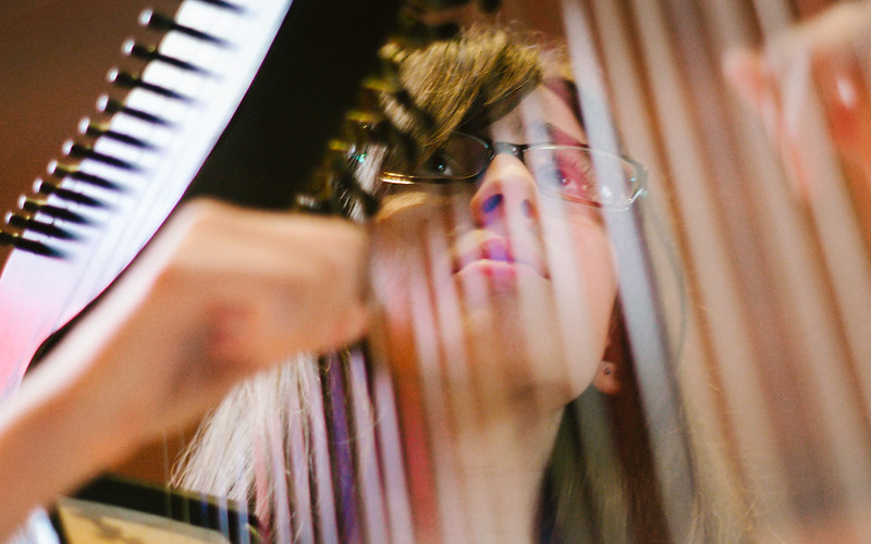 DSC03195-Edit by Paul Hofreiter, on Flickr  DSCF3130 by Paul Hofreiter, on Flickr  DSCF3222 by Paul Hofreiter, on Flickr
|
|
#
¿
May 24, 2013 07:18
|
|


