


|
Kin posted:Hopefully I'm not going overboard by providing a small album of photos instead of the maximum of 3, but I'm looking for an overall critique of my "style/intent" for lack of a better way of putting it. I've not really done any photography for over 2 years now so I'm very, very rusty. I think if you want people to look at your work as a whole it would be better if you posted a new thread dedicated to that. The other thing is it is better for you to select a reasonable number of shots that you think are best/ones you want opinions on. If you just provide a link to a gallery to a large number of photos you are making it harder for people to look at your work or tell what you are going for. I think one of the harder parts of doing a project or series is actually making the selection of photos since this can greatly change how the project is presented etc.
|
 #
¿
Jan 2, 2012 19:31
#
¿
Jan 2, 2012 19:31
|
|


|

|
| # ¿ May 1, 2024 09:53 |
|
|
Bottom Liner posted:I've been away from this thread for a while, but I will be happy to share my thoughts on others photos and any ideas I have for them. I think as your photos progress they get better. I think the first one is the weakest, there are a number of distracting elements and it looks like the drummer (you?) is floating as you can see his legs. The idea seems ok but I dont think shooting at night really working in this case. The bike image I think you already mentioned most of the stuff. I think if you played with the lighting some more you could get a cool shot. I really like the bright bold colours and how they compliment each other. Day 3 is diffidently the strongest in my mind. I love the floating particles, the one thing that bothers me is the magenta cast on the side of the face. I am not sure if this was something intentional and I am not sure it is bad I am just not sure if I like it. ---- 
|
|
#
¿
Jan 13, 2012 08:55
|
|


|
pootiebigwang posted:I'll take a stab at this one. The color is a little too drab for me, and I feel like the image would be stronger if taken on a better day. I like the sense of motion from the waves, but without any context the image sort of falls flat. What about this spot interested you? I like the rocks in the FG, I am not sure what extra context I could have added. Is there something in particular you feel is missing? I know without seeing the location that is kind of a hard question... Gazmachine posted:Before I crit this, I want to explain why I'm critting it. First, I would say that, out of the regular posters in the dorkroom, you would be considered the best landscape guy. Second, I personally don't get much out of landscape photography, both taking and viewing, so I am probably good source for a harsher crit. Third, as you are hitting a peak with your landscape, I figure you'd appreciate a harder crit to help you improve on what is already excellent work. I think I answered this above but I liked the jagged rocks along the shore line with the waves. I would rather people be awful than have useless praise. I have not been shooting as much as I used to because I feel my images are lacking, the big problem is I don't know what they are lacking... I am hoping posting in here someone will jolt something because right now I don't really know what to change or what I am doing wrong but I feel like something is not there. I would much rather get a crit of someone hating on an image because that is usually much more informative than "nice photo I love the light!" or something like that.
|
|
#
¿
Jan 14, 2012 03:55
|
|
|
miketh posted:I know this has been commented on quite a bit, but here's my input: I find these photos boring. The first photo is just some sunglasses on some ice, I kind of like the light coming through the lenses but there is not much interest there. I think if you wanted to show the texture of the ice you should have concentrated on that. The glasses distract and totally overwhelm what you said you where trying to show (the ice). Texture photos are pretty tough to pull off, usually lighting has a huge impact on them (like all photos I guess). The 2nd photo I think you already have pointed out the 2 main issue I see with the image, it was taken in broad daylight and the framing is off. The top right is distracting but so is how the water jets are positioned. I think if you want a shot of this fountain you should go back when it is darker out and try to include the whole thing instead of just a small corner of it. The 3rd photo is defiantly the strongest of the ones you posted. It looks like you maybe missed the focus a bit but that is pretty minor, I would probably not have centered the spider as much as you did but once again minor. I feel like this photo would have been more exciting if the light was a bit more interesting, it feels very flat which is nice for black/dark subjects but this also makes the image kind of boring. It would have been nice to be able to have a bit of light catching some of the web for example. ---- 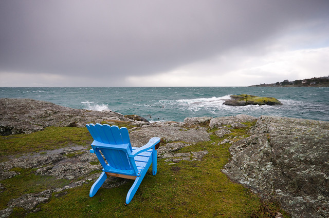
|
|
#
¿
Jan 22, 2012 00:14
|
|


|
whaam posted:The first one I'm not crazy about. Boat seems to be smack in the middle of the frame and not that interesting. The second on the other hand I am really a fan of. Despite what many say about the negative space I think it works perfectly in this image and wouldn't change a thing. I really like this photo but there are a few things that bother me. While I absolutely love the rocks that are isolated by the sand (I want a shot like this now!) the rocks in the lower right feel awkward and cut off. I am also not sure if I like the piece of land on the right. I am not sure if you included this on purpose or if that was the only way to really frame the rest of your photo. ---- 
|
|
#
¿
Feb 1, 2012 05:27
|
|

|
carcinofuck posted:
These are all really nice but you should read the rules 
|
|
#
¿
Feb 8, 2012 17:49
|
|


|
OOPRCT posted:I live in a housing cooperative and I'm shooting a project which is essentially a collection of pictures I take of the members. One thing I'm trying to do is to get a head shot of everybody. I have these so far: I am not really a portrait expert but there are a few things I can mention. The first thing I would look at changing is the backgrounds, seems like most of the are pretty distracting. A good background can make or break a photo. Usually you dont want something that is too busy (like your 1st and 2nd photos). The other problem is with how you are using your flash with them being so close to the BG which is why you end up with shadows (like in the 2nd photo). If you have to take them at night get them to stand out from a plain wall or something that is not going to be super distracting. Depending on the situation/location I would try to bounce the flash off the ceiling but this is really not my area of expertise. Edit: if this is a collection you may want to consider having all of them with the same BG, not exactly sure what you are aiming for. ---  
|
|
#
¿
Feb 28, 2012 08:48
|
|


|
EatinCake posted:The third one on here is by far the best, as the shadow allows us to see his face instead of obstructing it. I've run into this problem a lot going to out door events, and as long as you catch on early that it's happening, people usually don't mind re-positioning themselves in a better angle. True, you lose the instant capture of it, but if they're posing anyway you'll just end up with better captures. I think you need to play with the white balance in these specially the first one, it looks far to warm. The first one I feel like I want to be over to the left more and have the stair thing more centered or on the right. On the second one I find the branch in the upper right corner a little annoying, it is something I noticed and is all I can see now  I think I like the last the best due to the different light sources, not sure about the bus on the right but I think it still works. ---- 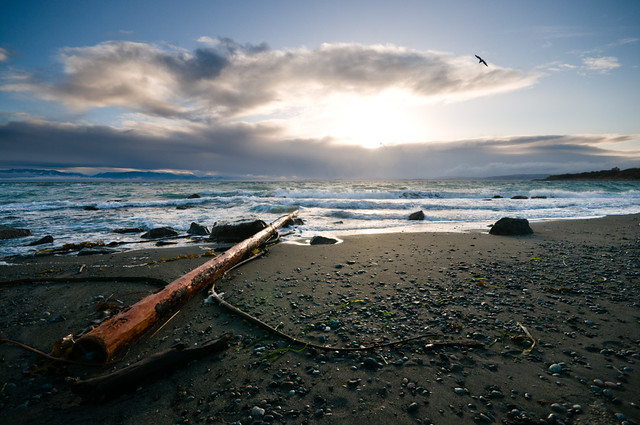 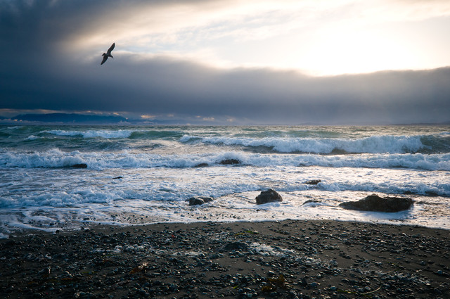
|
|
#
¿
Mar 4, 2012 18:19
|
|


|
MAkev posted:Use a neutral density filter instead of stopping down so much and I think your results will be more in line with what you want. All of the "soft water" shots you are thinking of were made with an ND filter, it will let you lengthen the shutter speed while maintaining a sane aperture. While this is true the most important thing you can do is wait for better (softer) light. These are take in direct sunlight and even if you can stop down enough you still will not get the photo you are looking for. Ideally it would be overcast, in the shade or around sunrise/sunset.
|
|
#
¿
Mar 21, 2012 02:54
|
|
|
Haggins posted:Here is one for today so far: I really like this and don't really have too much to say about it other than I think you did a good job. The only thing that bothers me about it is that there is a stick or something right near the patch of sun which I find a bit distracting. Looks like such a cool place.
|
|
#
¿
Apr 1, 2012 19:57
|
|

|
Augmented Dickey posted:drat, this is gorgeous. What do you like about the photo that makes it gorgeous?
|
|
#
¿
Apr 2, 2012 01:46
|
|
|
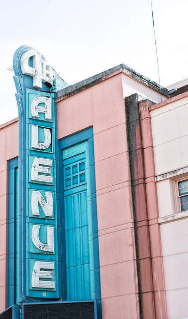
HeyEng posted:Two from this weekend. The light/shadows are nice on the first one but how you have cut off the top, especially the part running up the middle is really distracting. The 2nd one I find more problematic, while the sign is straight the rest of the building is not and this is kind of off putting. The other thing is the white sky, I know it can be a pain to deal with but it is pretty distracting in this photo. I think it is particularly so because it takes up a large enough portion of the photo but does not add anything. The last thing that bothers me is the antenna that is sticking up, with it being on the white sky it really stands out. ----- Two from the weekend. 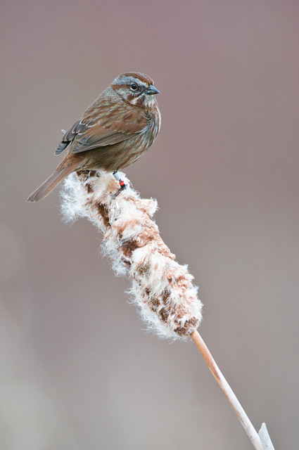 
|
|
#
¿
Apr 2, 2012 07:39
|
|

|
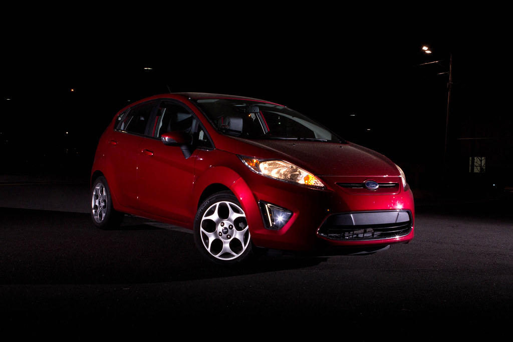
rcman50166 posted:Your photo is overall very good from a technical standpoint. The DoF is appropriate, you have a good lighting angle and your focus is pin sharp. As for post processing, you might want another poster to look at that, because I can't tell where or what you cloned. Also processing is difficult because I don't have an original to compare to. But again, it's a very good photo from a technical standpoint. And I only say technical because I'm not nearly as creative as I should be. I shooting cars with a single flash at night is going to be hard. One thing that you should try is to use something like a 30 second exposure, ISO 200 or something like that (assuming you have a tripod) and then walk around the car triggering the flash your self. This way you will get the effect of having multiple flashes with a single flash. One thing to remember about shooting at night is that lights in the background can be kind of distracting. In your photo they would be pretty easy to clone out but it is something to consider when you are selecting a location to do your shoot. --- From the other day at work, really would have preferred a better foreground or something but the sky was too cool to pass up. 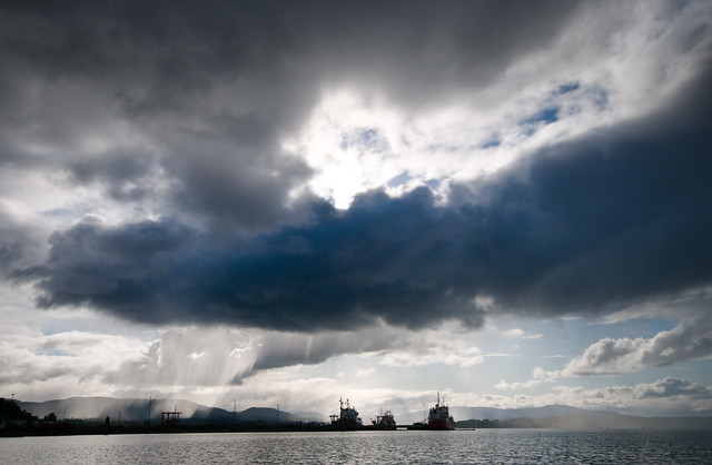
Dread Head fucked around with this message at 18:59 on Apr 21, 2012 |
|
#
¿
Apr 21, 2012 18:56
|
|
|
the posted:That was the post. I wanted to emphasize the bright light coming through the dark storm clouds. Too much contrast/saturation/etc? I think the original is better, if you want to make the sky a bit more dramatic then use a mask. I would not use as much contrast as you did though.
|
|
#
¿
May 24, 2012 05:04
|
|
|
Valdara posted:Can you say what makes that come across? I'm doing babby's first memory card and filling it up with a ton of poo poo photos, but I don't have an eye yet for "snapshot" vs "photograph".
|
|
#
¿
Jun 17, 2012 21:16
|
|
|
MrBlandAverage posted:I think that just going on a photowalk isn't per se enough to make the pictures snapshots. I think the problem is that they don't seem to have a particular subject; if you're just going to take a picture of how things are arranged, they had better be arranged in a compelling way. Nothing wrong with walking through a local park or something like that but as you say you really have to work hard (or be creative) to make an interesting photo of it.
|
|
#
¿
Jun 18, 2012 01:39
|
|
|
I would also hazard a guess it is a monitor/display issue to some extent too... (calibrate your displays people!)
|
|
#
¿
Jun 18, 2012 07:08
|
|
|
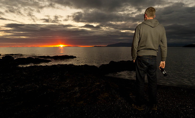
David Pratt posted:
I find that the person distracting in this case. It does not really add much to the photo and there does not seem to be enough separation from his legs (too dark). The other thing that bothers me is the beer bottle. I also find the contrast a bit much as it seems like the bottom 5th of the photo is nearly all black. I think if you had evened the light out on the person that it would have work a little better or dragged the shutter a bit to bright up the foreground (flash should freeze the person assuming they are not moving too much). --- My summer solstice. 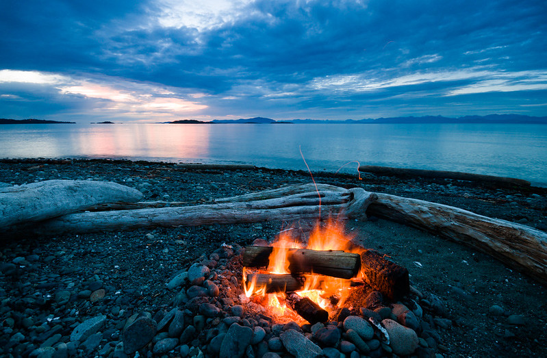
|
|
#
¿
Jun 23, 2012 05:44
|
|
")
|
lazer_chicken posted:Sorry for the confusion, eggsovereasy hit it on the head. It's an EOS 500 but it's badged as a Rebel XS. I'm not sure why they would reuse that name later for the digital one. You should also read the rules of this thread
|
|
#
¿
Jun 23, 2012 17:21
|
|
|
Picnic Princess posted:This is kind of old, but I really like the first one. The sky is done well, and the colours are great. I would say the biggest problem with these photos is that they look to be taken in the middle of the day. When you are shooting landscapes or photos in general the light during the middle of the day is usually too harsh. If you shoot closer to sunrise/sunset (or an overcast day even) then the light will be softer and you will end up with nicer looking photos. Guess I might as well post a photo:  ] ]
|
|
#
¿
Sep 29, 2012 20:04
|
|
|
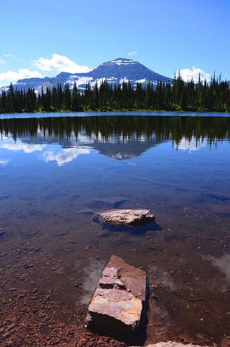
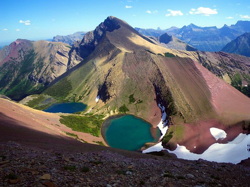
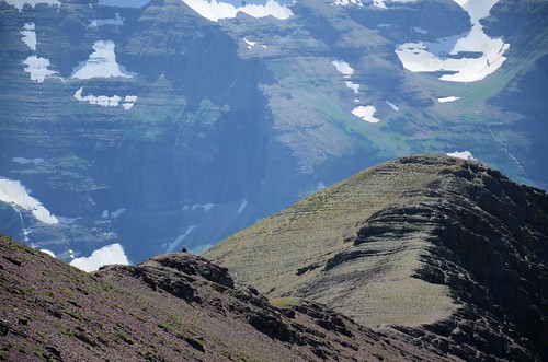
xzzy posted:I can't imagine the pain of shooting sunrise/sunset in glacier. Most of the spots are 5-10 miles of hiking one way.. which means hours of tromping around bear infested hills in the dark. It's more than just getting up extra early because the trails tend to have hazards to deal with too. Snow drifts, waterfalls, roots.. it's gonna be a slow hike unless you know the trail well. I spend a lot of time in the mountains so I understand, but unless it is overcast you are probably not going to get a good photo midday. It does not have to be at sunset or sunrise but you should try to avoid midday. If possibly try to camp closer to the location you want to shoot. It all comes down to what you are wanting to get out of a trip. If you goal is to get to a specific challenging destination and getting good pictures it rarely happens on the same trip. Edit some examples from a few weeks ago, while not at sunset they are from later in the day and I don't think the light is nearly as harsh which I feel makes for a better photo.  
Dread Head fucked around with this message at 01:16 on Sep 30, 2012 |
|
#
¿
Sep 30, 2012 01:13
|
|
|
xenilk posted:Holy crap, that picture is full of awesome. I'd be very curious to see what kind of changes you did in post to come with that, anyways it's very nice and I don't consider myself a big fan of landscape pictures. Did not do very much, sharpened a bit and tweaked the colour temperature. I did use 2 exposures, one for the sky and one for the foreground but only really because I had a boat go through the background.
|
|
#
¿
Oct 1, 2012 00:04
|
|
|
TheLastManStanding posted:I have no idea what I'm looking at, but I kind of like it. I looked at your earlier tests in your flickr and while it's much more obvious how the effect was achieved they still make for a really cool experiment. I had actually been planning to do a similar thing, except with the camera moving perpendicular to the direction it's facing so that a somewhat normal photo would be achieved, but from an impossible perspective. Unfortunately my computer is way to old to be processing videos so I've been putting it off forever. I like these, the thing that does bother me a bit is on the first one I wish the silhouette of the trees was more pronounced, that or the trees where lit up. Right now I feel like it blends in a little too much and just seems like an empty black space. ------  
|
|
#
¿
Oct 25, 2012 06:54
|
|
 .
.

|
Shampoo posted:I really enjoy the use of color here, and the angle really gives it a "big sky" feel. I'm not a fan of the power lines, but that might be an effect you're going for, but I do think that the bottom could have been darkened more so that the detail of the buildings and vehicles is obscured completely, to draw your eye upwards. I keep getting distracted by things I can just barely see in the bottom. Love that sky color though. It looks like you have a large dust spot in the sky, it should be pretty easy to fix.
|
|
#
¿
Nov 18, 2012 03:00
|
|
|
dopaMEAN posted:
Bird photography is one of the most difficult and frustrating things you can try. Leviathor had some good tips but I would like to add that one of the most important thing for "good" bird photos is having a nice background. Ideally you want some that will isolate the subject (the bird). Generally this is something that is plain so it is not distracting and try to avoid just a white sky background. Keep at it, while it is one of the most frustrating things I have tried when you get a good shot it is amazingly rewarding. ----- 
|
|
#
¿
Dec 3, 2012 08:38
|
|


|
tau posted:We had a disappointingly brief and sparse lightning storm last night. The only shot I got was the one I was able to take after jumping up and setting up the camera... And I left the TV on in my haste. I wish that the was higher up and instead of including some of the brick at the bottom I would have rather seen more of the window. I think while the tv reflection is not ideal it is not so over powering that it is the first thing you see.  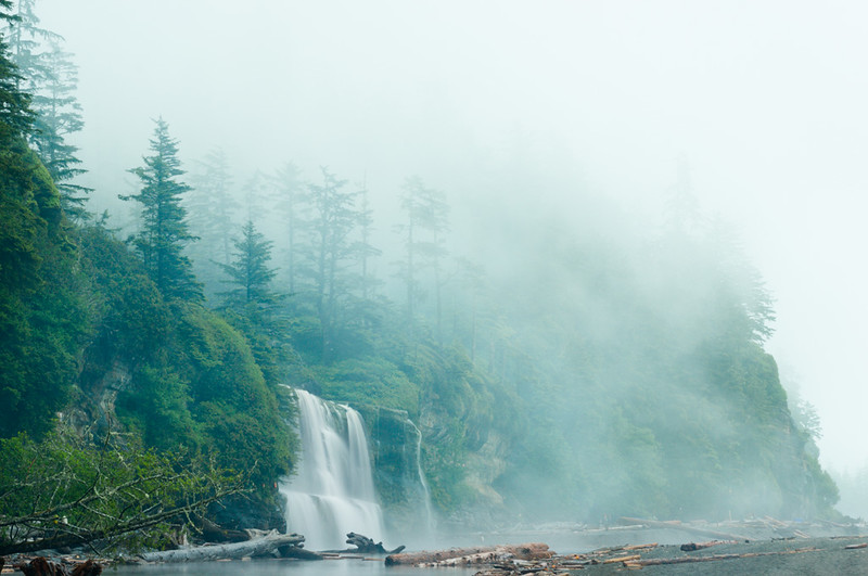
|
|
#
¿
Jun 26, 2013 16:56
|
|


|
Marshmallow Blue posted:A couple form the Blackstone River in MA. The first one I don't really find it very interesting, it is not really telling me much and there is not really anything to draw me in. The 2nd one does a better job at drawing me to the subject but the angle is not really working for me. For wildlife photos most photos that really draw someone in is if you can make eye contact with the animal. When I look at a search for turtles (http://www.flickr.com/search/?saved=1&q=turtle) I tend to find the ones I can make eye contact the most appealing. It sounds like there are plenty of turtles at the location and they are usually pretty relaxed so it seems they would be a good subject to go back and try some different angles. If you do go back I would suggest trying to get down to the same level as the subject (usually the lower the better!). --- 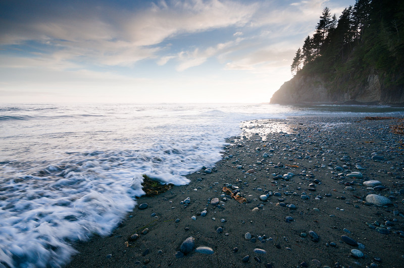
|
|
#
¿
Jul 16, 2013 05:52
|
|


|
A COMPUTER GUY posted:x-posted from low-effort (boy howdy) photo dump: I am curious to know what the subject it. Also the harsh shadow from the direct flash is very distracting.
|
|
#
¿
Feb 6, 2014 17:40
|
|
|
Entenzahn posted:Balance feels a little odd for this. With only the rock and the bigger stump as points of interest (and two thirds white fog) I think they should be more symmetrically arranged. It's a cool pic otherwise. I like your idea of a simple black-creme composition, the colors work well. The problem with all of these to me is that they are just things that where close by and "easy" to shoot. Unfortunately like most things when you are lazy it has a direct effect on the outcome of what you have done. In this case they all feel boring to me. The first one feels poorly composed with the lower right corner feeling way to cramped (you are nearly cutting off the "subject") and if feels there is too much empty space in the top left. The 2nd one is probably the strongest but once again feels a bit lacking, if you are going to do something with a shallow focus remember that the background is nearly as important as the object you are focusing on. You want to try and avoid an overly busy background, in the case of this photo it is the other flowers that I find overly distracting. The 3rd one is probably the weakest of the 3, if feels like you just just pointed a camera with a narrow depth of field at something. It does not really convey anything as there really is no subject. If that coke can is so interesting you need to show the viewer why it is so interesting and in this case I just can't seem to find that. ----- Might as well post a photo from tonight. 
|
|
#
¿
Aug 14, 2014 08:02
|
|


|
deaders posted:Reading this book should be mandatory before posting critiques: http://www.amazon.com/The-Nature-Photographs-Stephen-Shore/dp/071484585X Honestly people are probably not going read a book like that starting out. You don't really need to know much about photography in order to provide useful feedback, I think a lot of people get too caught up in the technical aspects. It could be as simple as saying what you do an do like about an image "I like how the duck stands out from the background, but I don't like how you can't see the feet". You don't need to know any "rules" to say why you do or do not like a photo, I mean understanding certain "rules" will make it easier to have an image that will likely come out "better" but I think of a lot of people that just comes over time and trying different things and is not something that is required to provide useful feedback on an image.
|
|
#
¿
Aug 19, 2014 02:34
|
|
|
ansel autisms posted:Clearly you haven't read the book because it's absolutely not about what makes a photo technically good or "rules" I have not read the book but I really dont think reading a book is a requirement to be able to provide some kind of useful feedback on a photo. I do agree that when you had a more diverse crowd of people posting in here I think it was a better environment for critiques.
|
|
#
¿
Aug 19, 2014 02:58
|
|
|
Skizzzer posted:Not sure about the editing but for your third shot you can try a longer exposure and lowering your iso. I believe you'd get more detail (aka stars) that way. I am not so sure on the processing of these, specially the first 2. The white balance seems a bit off to me but maybe that is what you are going for. While not immediately obvious the skewed angle of the first 2 also bothers me, they are also seemingly a bit underexposed which I find distracting. I feel like the only thing they really have going for them is maybe the colours but to due to being a bit dark you loose out on that. The focus on the 2nd does not work for me, it seems like you needed to go for something that had more depth of field or less, as it stands there is one flower that is in focus and the rest are nearly in focus. The 3rd is probably the strongest and has some nice light but flowers are kind of like cats, they are really hard to take an interesting photo of. I think all of these lack any real strong interest or subject. While taking photos around the house may be a good way to practice technique unless you have put some effort into setting something up they are probably going to be boring. ----  
|
|
#
¿
Mar 15, 2015 23:34
|
|


|
threnody posted:I would totally normally agree with this, but for some reason I really love it cranked when it's architecture. You can tell these where shot on a Fuji.
|
|
#
¿
Mar 26, 2015 06:02
|
|
|
Helen Highwater posted:I'm going to post some of my photos with a bit of self-critique. I'm interested to see what others think of them. Not really a fan of the first 2, the first one feel like a snapshot at best, the background is too busy and the light is uninspiring. The 2nd feels over processed and nothing feels like it is in focus. The last is by far the strongest, I like it for the most part I do feel like you went a little overboard on the sky (looks like you darkened/masked it a bit) I think if you toned that down a bit the image would be a bit stronger and would make the sky feel less cramped as it would be less of a focus. ------------------- Found this bug in my house and decided to emulate the meet your neighbours project style. 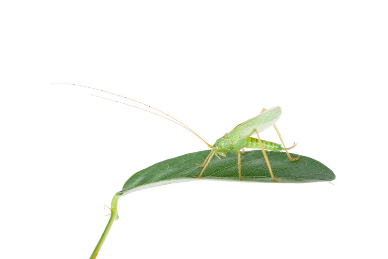
|
|
#
¿
Aug 12, 2015 07:11
|
|
|
thetzar posted:I'm going to guess it's a ban for not reading the rules. I see we both have the same guess!
|
|
#
¿
Sep 8, 2015 06:11
|
|
|
A Saucy Bratwurst posted:I hosed up oops. If its not too late, I've mentioned in another thread that I like it because it's such a weird looking group of switches, but I think it might need something to give it some scale as well as break it up a bit. I think it may be a bit underexposed but that may be a personal thing, the one thing that bothers what I think is otherwise a reasonable photo is the black bar in the upper right. There are some neat repeating patterns and if you got in a bit tighter or cropped it a bit I think it would show the repeating pattern off better.
|
|
#
¿
Sep 8, 2015 07:33
|
|
|
If you are hooting on a day that is overcast it seems likely that the lighting will not be changing much so manual mode may be a good bet in that situation.
|
|
#
¿
Oct 20, 2015 04:32
|
|
|
Judge Schnoopy posted:It's really, really hard for me to come up with an explanation for why I like this picture so much. There's nothing that really stands out about it, but the overall composition just seems ... surreal I guess? It's almost a little unsettling because of the contrast of textures, every element is so disjointed and different from the next and there's no subject to define what "normal" is supposed to be. I love the striking effect it creates. The first one feels under saturated and the last 2 (specially the 2nd) feel over saturated. I think the 2nd is the strongest as I feel the others are lacking an interesting subject. -----  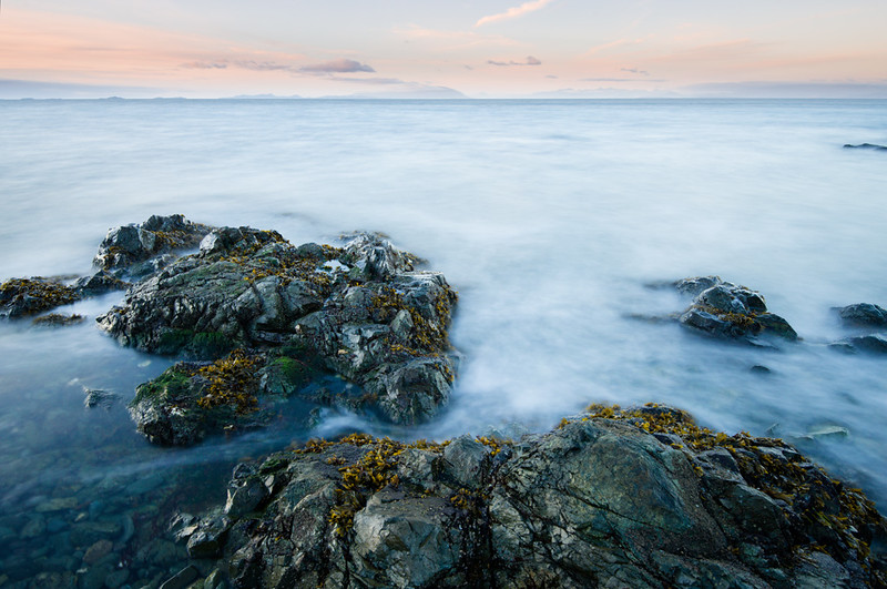
|
|
#
¿
Nov 4, 2015 06:53
|
|

|
thetzar posted:The way this composition works I know I'm supposed to be looking at the mirror - I'm drawn to it. But the subject int here is very small and indistinct. I get the impression that she's supposed to be interesting, supposed to be the subject, but I can't figure out why. These feel like something I would find on a stock photo site. Not sure if that is a bad thing or not...
|
|
#
¿
Dec 22, 2015 07:20
|
|

|

|
| # ¿ May 1, 2024 09:53 |
|
|
thetzar posted:
I think it is more so that it seems like an exaggeration/very deliberate situation more so than anything else. I think of a larger series that would be reduced but with just a few photos it feels a bit random I guess?
|
|
#
¿
Dec 26, 2015 09:28
|
|