


|
rcman50166 posted:
quote:
quote:
Which of these works better? How can I accentuate the hikers?  P1070090.jpg by fuglsnef, on Flickr 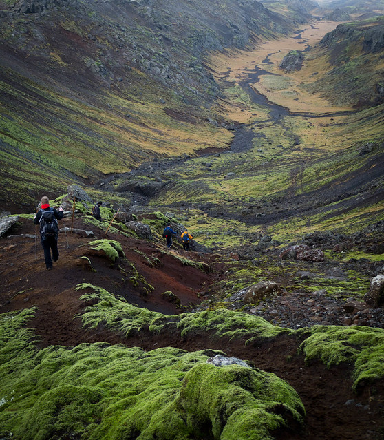 P1070087.jpg by fuglsnef, on Flickr
|
 #
¿
Nov 22, 2011 13:13
#
¿
Nov 22, 2011 13:13
|
|

|

|
| # ¿ Apr 28, 2024 08:32 |
|
|
Enigma89 posted:quote:quote:I'm not sure why you think B&W is clich�... when it feels like the right thing to do, go for it! Some images are much better in B&W than colour. I very rarely take portraits. This was done to commemerate this guy's Movember effort. I led him a merry dance through the office to try and find somewhere with decent light, but couldn't find anywhere without hard shadows.  Lemmy Purbrick 2 by fuglsnef, on Flickr
|
|
#
¿
Dec 3, 2011 20:30
|
|


|
IsaacNewton posted:The hand out of focus is a shame, but I bet he was moving it.
|
|
#
¿
Dec 3, 2011 21:47
|
|
|
TomR posted:
I like this a lot. It has a really grim and bleak feeling to it. Being towards the dark side of the value range helps with this I think. If I was processing it I'd have tried making the foreground a little bit lighter just to get some more detail in there, or perhaps making it even darker so it's a complete silhouette. Axel Serenity posted:On the first one the crop feels a little tight vertically, I'd like to see more empty space above her head. The second one I probably would have gone a bit higher, there's something off to me about seeing someone from that low an angle. Third one I wouldn't change, composition's great ") I tried doing the whole low-contrast vintage split-toned thing. How did I do? 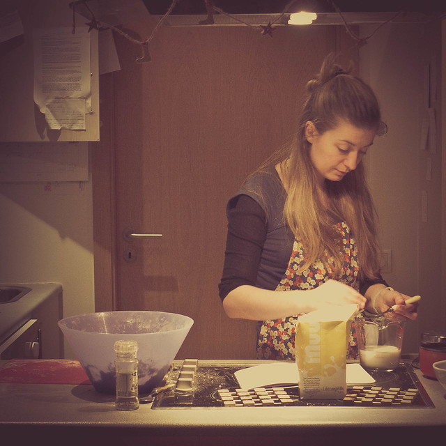 14/366 - Homemade Yoghurt Pizza by fuglsnef, on Flickr
|
|
#
¿
Jan 15, 2012 17:50
|
|
|
The first one is ok. I'd have tried looking down between the wheels for a symmetrical shot. The second one is great. The third one is a bit boring and doesn't have a strong subject. The grainy texture isn't enough to hold the eye - I'm more interested in the spring in the background but it's out of focus.
|
|
#
¿
Mar 9, 2012 23:13
|
|
|
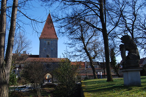
Soulex posted:#1: quote:#2: I'd consider making this a square crop, with the tree trunks framing the tower. You might have to take a few steps to the right for this though. The statue seems ancilliary to and distracting from the main subject. I just bought a speedlite and I have no idea what the gently caress I'm doing. Here's some test shots, tell me what I'm loving up! If I was going to do this properly, I'd use a plainer background, but is the lighting itself ok?  80/366 - Josie by fuglsnef, on Flickr Experimental  87/366 - Self Portrait by fuglsnef, on Flickr
|
|
#
¿
Mar 28, 2012 02:02
|
|

|
Thanks for the advice dudes, guess things are going to be a bit artificial until I figure out how it all works.
|
|
#
¿
Mar 28, 2012 22:00
|
|
|
This isn't Snapshot A Day, if you're going to post here and not give critique on other people's work (don't feel that you're not qualified, figuring out what you like and don't like about other photos makes you better at judging your own) then the least you can do is say what you think about the picture you're posting. Why you took it, what you think could be improved about it, and so on. That said, your photo is ok, but could do with tighter cropping. The empty space at the top isn't adding much to the composition, and the out-of-focus woman on the left, while helping frame the subject, is a little distracting. The contrast also feels too high to me. Hope you don't mind reposting your image, but I'd have cropped something like this: 
|
|
#
¿
Mar 31, 2012 18:31
|
|

|
Holistic Detective posted:I agree with your thought's on the foreground, even if it was a bit closer in so you could see a bit more details on the ships. That would mean sacrificing more of that sky though. The rain (I think) falling on the left really makes the shot though, seriously dramatic weather. I'd have put the third one in the middle. Since it doesn't have the texture of the other two I think it would be more balanced that way. quote:
This one needs more isolation of the subject, perhaps shooting it from a different angle getting it entirely against the sky or entirely against the wall. Having both in the background isn't working for me.  104/366 - Gratuitous Action Shot by fuglsnef, on Flickr  94/366 - Rory by fuglsnef, on Flickr  Kebabs by fuglsnef, on Flickr
|
|
#
¿
Apr 23, 2012 01:21
|
|

|
Mr. Despair posted:
I like this a lot. I think the central composition actually works. We're losing a lot of detail on the torso though. Some fill light, or an adjustment brush to up the exposure there would help get some back. Also, maybe it's just me, but have you considered adding a bit of colour to the image? I rarely leave stuff purely greyscale, it's worth experimenting a bit with shadow split-toning in case there's a colour that better fits the mood of the image. Since the cultural exchange is on the go I'm going to post some old stuff: 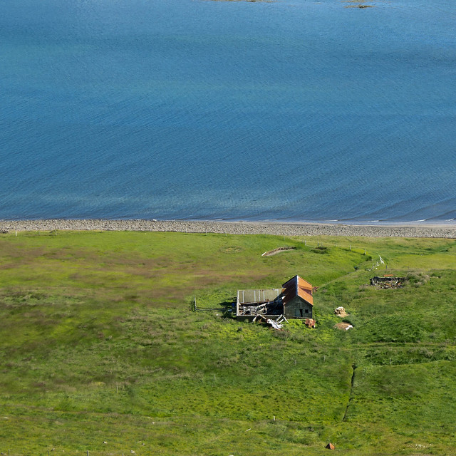 H�s by fuglsnef, on Flickr 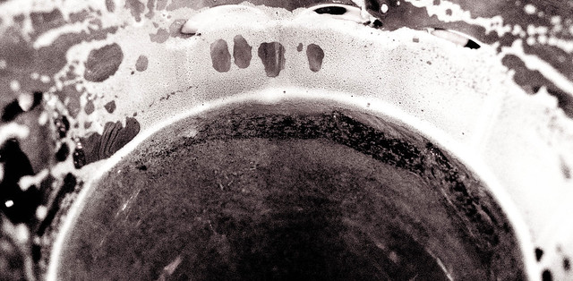 61/366 - The Cause of, and Solution to, All of Life's Problems by fuglsnef, on Flickr  53/366 - Church Bells by fuglsnef, on Flickr
|
|
#
¿
Apr 25, 2012 00:16
|
|

|
Mr. Despair posted:It was shot with black and white film, so there isn't much color to find, and adding color with split toning just looks weird to me. Nothing I've tried before, but I tried messing around with it in light room and couldn't get anything that I liked. In the edited version you've changed the image globally, so the contrast has suffered. I'd have made a mask of just the sweatshirt and reduced the contrast/upped the exposure on that, leaving the rest of the image alone because it already looks good.
|
|
#
¿
Apr 25, 2012 16:53
|
|


|
Waarg posted:Mine: quote:
Maker Of Shoes posted:Should I clone out the crude in the water? I think I'm done shooting birds for now. Lovely colours, but yeah I think you're right: cloning out the specs in the water would definitely improve it. I'd have preferred the duck to be closer to the top right so he's swimming into the frame more. I spent the last couple of hours mucking about with my flash, ended up using a one of those cardboard tubes whisky bottles come in as a snoot, worked a treat I can't tell which one of these is better, please make my decisions for me!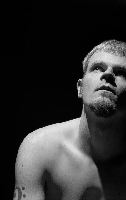 Lit from above self portrait #1 by fuglsnef, on Flickr  Lit from above self portrait #2 by fuglsnef, on Flickr
|
|
#
¿
Apr 28, 2012 22:37
|
|

|
Clone out that thing on the bottom right and the "63" on the top left, and it'll be much more symmetrical. quote:
Wow, these are both bang-on. Focus is sharp as gently caress and even though it's shallow it's on the right features so you don't notice it too much. On the second one I'd be tempted to increase the contrast on the fingerprint ridges, as at the moment that area is a featureless light blob and it doesn't sit well with the rest of the picture which has tons of detail. My last two 366 project photos:  120/366 - Shipyard by fuglsnef, on Flickr  121/366 - Waterfall by fuglsnef, on Flickr
|
|
#
¿
May 1, 2012 22:57
|
|


|
the posted:Interesting effect. However, are those lens flares added in post? They struck me as such which takes away from the photo. It looks like a lot of post was done on the photo in general, which isn't a bad thing necessarily, it's just that the water seems rather.. radioactive. While you're right about there being tons of post on this - I upped the blacks until the bath at the bottom was invisible - the flares actually appeared like that. I was pretty surprised at the shape of them.
|
|
#
¿
May 2, 2012 22:24
|
|
|
Cacator posted:
quote:
 131/366 - Sunset on the beach by fuglsnef, on Flickr
|
|
#
¿
May 11, 2012 23:31
|
|


|
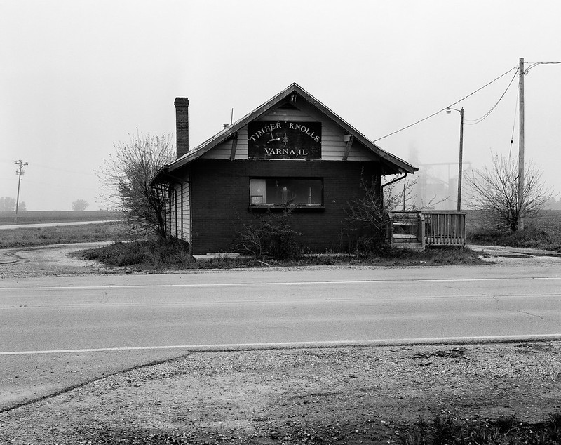
MrBlandAverage posted:Took a drive up a rural state highway on a foggy morning. Skies not very interesting, but I like the fog in the first one. Unusually, I like the central composition of these, they remind me of a kid's drawing of a house. And not in a bad way - little kids are loving masters of composition. I'd have considered taking the first one at a different angle - a bit round to the right to get the road horizontal. I'd also have cropped out the dark bit in the bottom right. I don't think the boring sky is a detriment to the second photo, as it does a really good job of framing the house and gives it a really nice sharp outline. quote:
Like MBA said, the exposure on this is fantastic - did you do much post? More from my 366: 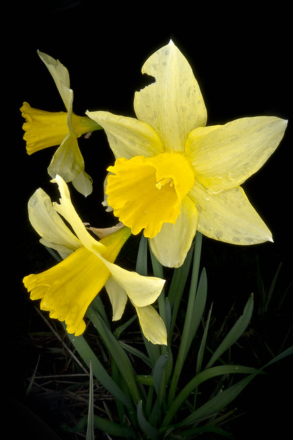 133/366 - Daffodils by fuglsnef, on Flickr  137/366 - Camera by fuglsnef, on Flickr Not totally happy with the exposure on this but I'm not sure what else I can do:  143/366 - Glass by fuglsnef, on Flickr
|
|
#
¿
May 22, 2012 21:09
|
|


|
nielsm posted:The exposure on the beads looks fine to me, I think it's the surface they are on that's the problem. It's a very sad gray here, either something lighter or darker would have worked better, I think. (Edit: Perhaps also the vignetting. See if you can decrease that.) Yeah I think you're right about the grey background. I was pressed for time and the big flat grey rock was the best thing to put them on. Next time I think I'll bring the beads back home and stick them on a black or white background. The vignetting was the only way I felt I could get any contrast but perhaps it's a little aggressive.
|
|
#
¿
May 23, 2012 12:53
|
|
|
I'd stick a gradient over the bottom-left of the image to darken it to the level of the background. It's so bright it's competing for my attention.
|
|
#
¿
May 26, 2012 19:15
|
|
|
krackmonkey posted:
quote:
quote:
I just got a loan of Light: Science and Magic, and I'm trying out the dark field glass lighting technique. 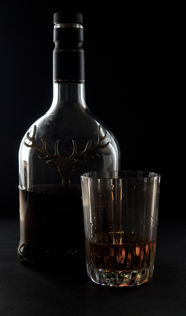 148/366 - Whisky by fuglsnef, on Flickr
|
|
#
¿
May 27, 2012 23:43
|
|


|
alkanphel posted:I think you're getting there but there's still a bit too much light spillage and the light accents on the glass body edges are a bit thick. Perhaps you can try adjusting the size/position of the black and white cards? More likely you'd have to make the black card much large I think. Thanks, that's exactly the sort of feedback I was after I had the black card standing on its short edge, so I'll try it on its long edge next time.
|
|
#
¿
May 28, 2012 14:40
|
|
|
The first one is pretty boring apart from the sign. I'd have gone for a close-up on just the sign. The second one is great though. Took me a while to realise what it was which is a cool thing to achieve in a photograph. I really like this series, but this one seems the weakest. It could do with being either a lot wider - as the composition's half-and-half - or a lot taller in a regular portrait orientation. As it is, it feels a bit squashed. HookShot posted:
I love the colours in this. It might have been nice to take some straight-on shots to exploit the symmetry of the windows. Perhaps a little more empty space on the right-hand side for balance (but these are nit-picks). Tried to get the sky looking like the Martian sky on this one: 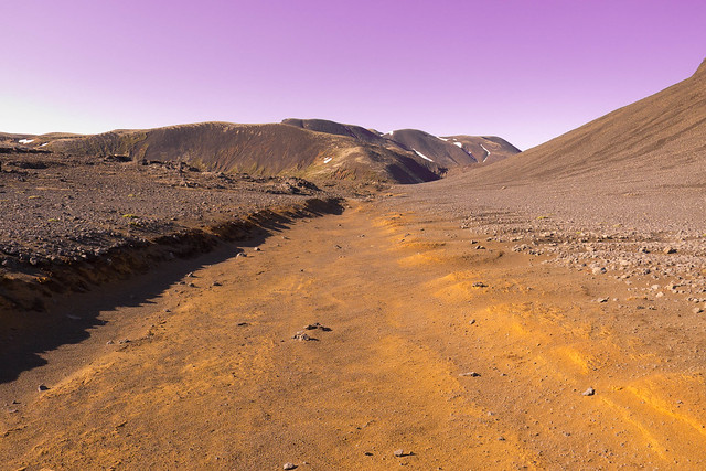 155/366 - The Martian Surface by fuglsnef, on Flickr 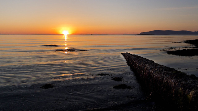 153/366 - Sunset Nine Billion by fuglsnef, on Flickr 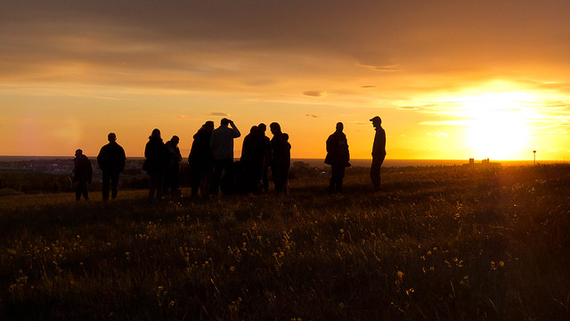 157/366 - Venus by fuglsnef, on Flickr
|
|
#
¿
Jun 6, 2012 02:17
|
|


|
Kiri koli posted:I find the purple sky distracting. I guess the sky could look like that sometimes with the right scattering, but most of the time Mars will have a yellowish/brown sky. That's extreme nitpicking, I know, but I just find that purple to be very artificial looking. The rest of the picture is good, though I get the sense that we've lost the scale of the mountains in the back. Where was it taken? It reminds me of Mauna Kea. Looking at more pictures from the surface you're right. I had it in my mind that it was really pink but it's definitely more muted. It was taken in �ingvellir national park in Iceland.
|
|
#
¿
Jun 7, 2012 10:50
|
|
|
QPZIL posted:
quote:
quote:
Happy summer solstice everyone  172/366 - Summer Solstice Sunset by fuglsnef, on Flickr
|
|
#
¿
Jun 21, 2012 14:51
|
|

|
Metalslug posted:
In contrast, the second feels very squashed. As a nitpick, I'd line up the wall at the bottom with the image border and have the person not centered. Wafflecopper posted:
quote:Typical scenes from around the outskirts of the cordoned-off "red zone". quote:
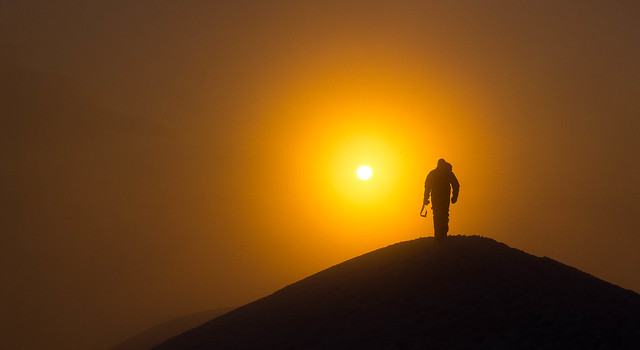 175/366 - Epic Alex Silhouette II by fuglsnef, on Flickr  176/366 - Another misty morning by fuglsnef, on Flickr  183/366 - Attic by fuglsnef, on Flickr
|
|
#
¿
Jul 6, 2012 01:42
|
|


|
Tone down the contrast/saturation a little, get rid of the vignette.
|
|
#
¿
Jul 30, 2012 11:59
|
|
|
fralbjabar posted:
gently caress tha hatahs, this is awesome. Although it is a little too vignetted.
|
|
#
¿
Aug 10, 2012 14:07
|
|
|
drat NIGGA posted:
1. The empty space on the left is a bit too much for me. It's a big, out-of-focus area with not much going on and it just feels too heavy. I'd be tempted to try a square crop. 2. The expression in this is great, he looks like a dude chilling out on a sofa. Not much to criticise technically. 3. Pretty good too. I wonder how it would have looked if you'd waited until the one on the left had turned its head so it was mirroring the one on the right? Looking at the title maybe that's not what you're going for. I do love symmetry a bit too much though Interesting double-up. She looks pretty forlorn on the left, and the shot on the bench makes you wonder if she's waiting for bad news, or to go into court or something weighty like that. The wall on the right almost lines up with the buildings in the background on the left - maybe stretch the left picture vertically a bit so they match up perfectly? </ocd> Sovi3t posted:
Yes. The shadow at the bottom isn't helping. If you'd taken a few more steps to the left you'd have had the road as a nice leading line with one-point-perspective leading to the bright/dark contrast at the top of the frame.  225/366 - I'll Knife Ye by fuglsnef, on Flickr 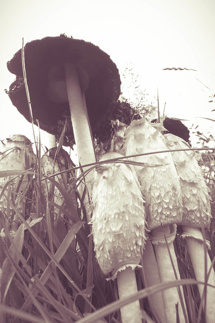 229/366 - Mushrooms by fuglsnef, on Flickr  246/366 - Elfa in the Mist by fuglsnef, on Flickr
|
|
#
¿
Sep 14, 2012 13:47
|
|


|
XTimmy posted:I'm a little exhausted so if this comes across as overly picky don't sweat it, but can you justify the split toning? To me it's just an afterthought to an interesting angle, and being one of those anti-instagram-assholes I can't help but call it out on the unnecessary post processing. I can't really justify it beyond I thought it looked nice. I have a print of it, and the purple is a lot less apparent than on the screen. The low contrast was deliberate so that you could see some detail on the inside of the big mushroom. Since a couple of people mentioned this, I uploaded the b&w version without the split toning or contrast adjustment:  mushrooms - less post by fuglsnef, on Flickr
|
|
#
¿
Sep 15, 2012 14:39
|
|
|
Hotwax Residue posted:Tried another night time landscape. I'm worried that it looks to much like day time. I tried making it darker and less blue, but it just didn't look right to my eyes and processing night photos isn't something I'm used to. Definitely looks like night as you can see the stars. If you want it to look more night-timey you could try making the sky/water a darker blue. It'd be nice to see a version with the sky balancing out the water a bit more, like from the same position but portrait orientation.
|
|
#
¿
Sep 15, 2012 20:28
|
|

|
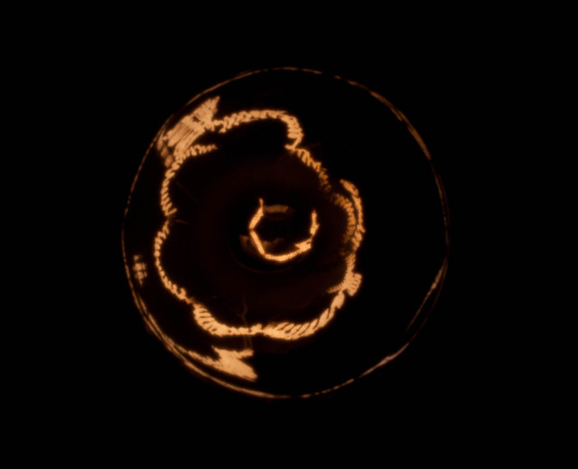
Sovi3t posted:I was shooting a clean metal sphere I was wondering, didn't look like a fisheye but I couldn't quite figure out why. Love the shot by the way, made me smirk Mannequin posted:Keep your stupid Fixed that for you. David Pratt fucked around with this message at 14:07 on Sep 27, 2012 |
|
#
¿
Sep 27, 2012 14:04
|
|
|
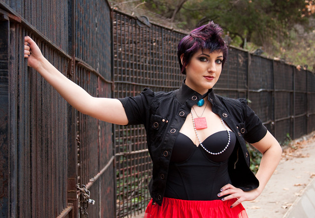
Pukestain Pal posted:Dang, I don't know how I missed those doors. Thanks for that. Proof that a 2nd look is always good! I like this, composition is nice, exposure is fine. I like that her eyes aren't covered by the fence wires. The title and her pose are a little jarring though - "fenced in" suggests captivity, but she's casually brushing back her hair with one hand like it ain't no thing. I'd have though both hands on the fence or one by her side would have gotten the emotion over better.  P1110456.jpg by fuglsnef, on Flickr  P1100957.jpg by fuglsnef, on Flickr
|
|
#
¿
Sep 27, 2012 18:37
|
|

|
rio posted:
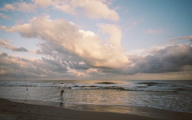
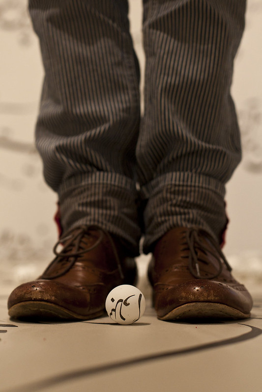
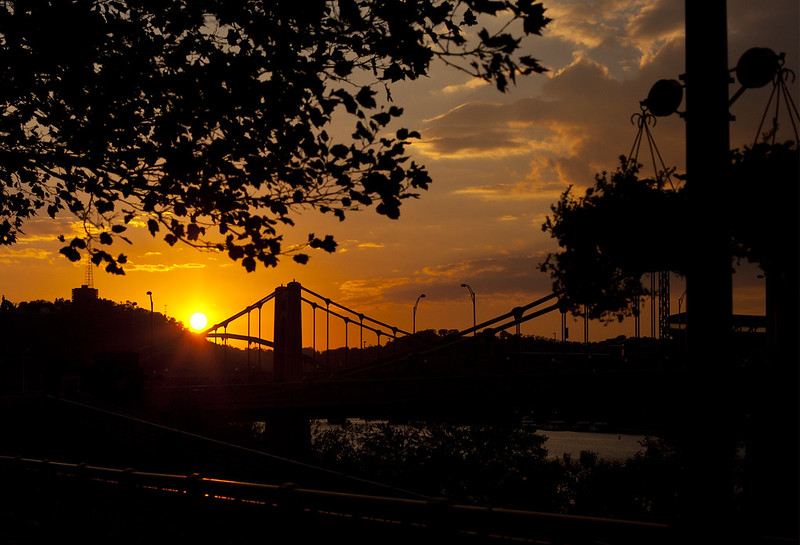
First one is awesome. The people, the god-rays, the buildings: the eye is just drawn along it very naturally. The second one, I wish the people were bigger, or above the horizon, although if this was printed up really big they'd probably be an ok size. Third - the dude fishing isn't really contrasting enough with his surroundings. If you'd taken it from a lower angle to have him mostly above the horizon it would be better. The clouds on this and the previous one are amazing looking and nicely exposed. geeves posted:
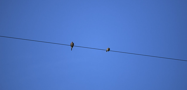
The first one is nicely composed, but I feel that it's using shallow-dof for the sake of it. Most of the picture is blurry with only the ball and the tips of the shoes in focus. This sort of composition would be better with everything in the foreground in focus. The second one I don't like at all. The sky is nice, but none of the foreground silhouetted stuff looks good - there's too much of it and no clear subject. The bridge merges with the planter and the trees in the background and doesn't pop out well. I think a lower angle to get more of the bridge against the sky would have been better.  275/366 - Hiver Nomade by fuglsnef, on Flickr 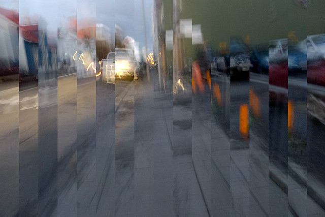 271/366 - Movement by fuglsnef, on Flickr  268/366 - Bird and Road by fuglsnef, on Flickr
|
|
#
¿
Oct 5, 2012 14:05
|
|


|
WildFoxMedia posted:
The contrast is pretty strong in the first one, maybe a little too strong. The composition is nice and it feels well balanced, but there isn't much of a subject that interests me. It feels like maybe this is part of a series on a town - is it? The second one also feels super contrasty, I'd like to see some more detail in the trees. Same feeling as the previous one regarding subject, it doesn't captivate me on its own but might make more sense as part of a larger whole.  278/366 - Geese by fuglsnef, on Flickr  P1110746.jpg by fuglsnef, on Flickr  P1110764.jpg by fuglsnef, on Flickr
|
|
#
¿
Oct 8, 2012 21:48
|
|


|
El Laucha posted:The idea seems so simple, but it looks very nice. It made me look up on how to do a double exposure using a Dslr, seems like I can't with my camera. Triple exposure  . If you want to do it after-the-fact, you can import the photos as layers in your image editor of choice and set the blend mode to screen I think. Or multiply. Something like that . If you want to do it after-the-fact, you can import the photos as layers in your image editor of choice and set the blend mode to screen I think. Or multiply. Something like that ")
|
|
#
¿
Oct 9, 2012 19:00
|
|
|
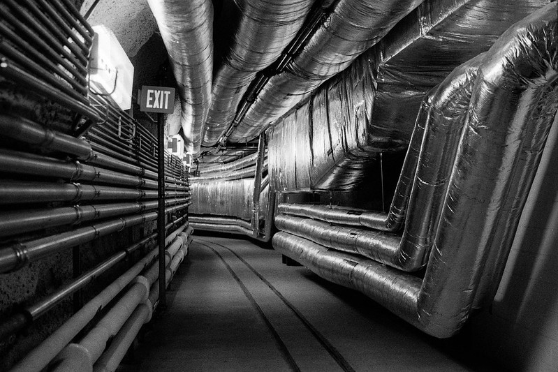
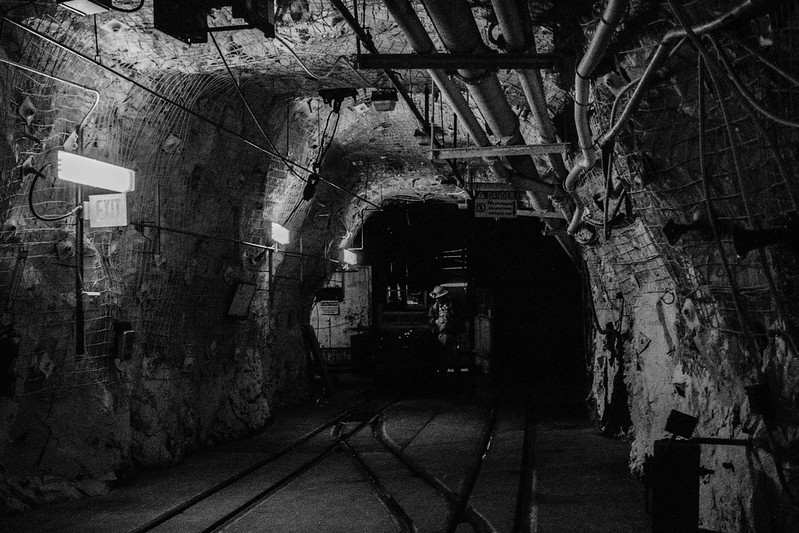
krackmonkey posted:
The first one's great, but the composition on the second one isn't very good. I'd have taken a couple of steps to the left to get the tree more to the right of the frame, or gone lower to make the branches frame the tops of the buildings. Mr. Despair posted:
These are fantastic, great composition, lovely tonal range especially in the first one. The first could do with a human subject, probably standing at the end of the tunnel, and the second could do with more empahsis on its subject, perhaps by using a well-concealed strobe up in the pipes. Shampoo posted:
The colours are nice. The composition is boring though - bridges are done to death and you really need to think about making it look interesting and fresh if they're going to be your subject. The vignette is a bit over done, and looks quite artificial (I'm guessing it is since you mentioned Lightroom). Speaking of Lightroom, Adobe have a fairly decent online tv station with a channel specific to Lightroom: http://tv.adobe.com/product/lightroom/ I recommend Julieanne Kost's videos, she usually says which keyboard shortcuts she's using as she goes through the tutorials which is really helpful. 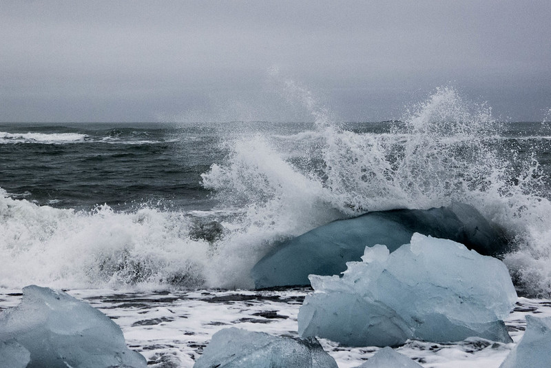 286/366 - Icebergs on the Beach by fuglsnef, on Flickr 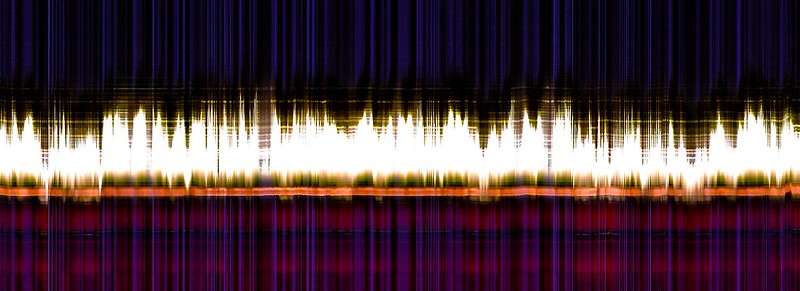 295/366 - Slitscan Experiment Five by fuglsnef, on Flickr 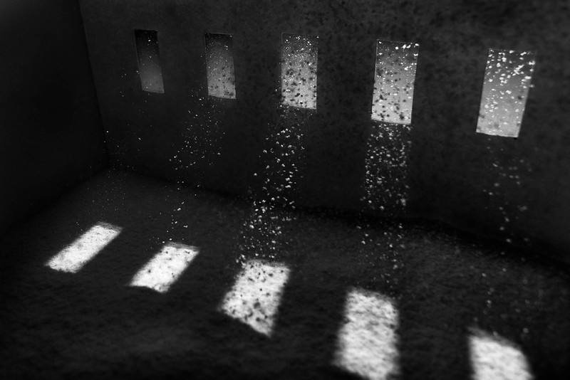 296/366 - Beams by fuglsnef, on Flickr
|
|
#
¿
Oct 23, 2012 00:15
|
|

|
TomR posted:I would like to see the structure continue out of frame left. Great concept. Good point. Next time I'm going to build a bigger model and use icing sugar instead of flour. Unless anyone knows a finer material?
|
|
#
¿
Oct 24, 2012 00:30
|
|
|
rio posted:These all are great. What is going on with the second picture out of curiosity? It's a candle flickering. You take a single column from each frame of the video and stack them left to right, so as you look across the frame you're looking across time instead of space.
|
|
#
¿
Oct 24, 2012 15:32
|
|
|
Both are pretty nice, technically well done, but also the kind of landscape shots you've seen a million times before. On the first one, are you using a grad filter? It looks like it's cutting into the cliff on the left making it look unnaturally dark. The second could do with more foreground interest. Or less foreground and more sea - in a similar ratio to the first one. Also, there isn't much contrast in the middle, the rocks just smear into a white blob. The little rock pool on the right looks interesting, I'd have gone for that as a larger foreground element. Pukestain Pal posted:
Love the symmetry on this one. There's something about the not-quite-half-and-half composition that's bugging me though. Perhaps having the trees fill 2/3rds of the frame might be better (you can always crop).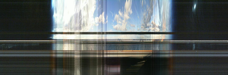 297/366 - Office Timelapse Slitscan by fuglsnef, on Flickr Tried icing sugar this time, but it still looks like snow. Going to use straight-up cigarette smoke next time, kicking myself for not thinking of that when I had it all still set up. 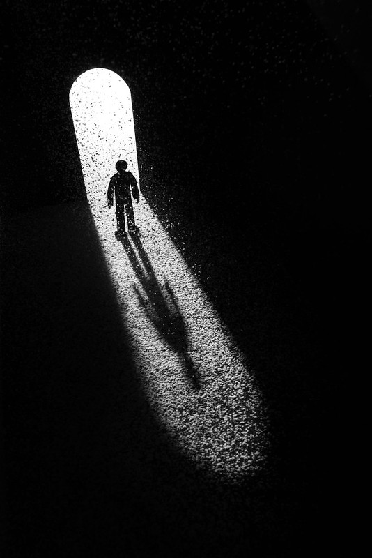 298/366 - The Doorway by fuglsnef, on Flickr
|
|
#
¿
Oct 25, 2012 22:56
|
|


|
Neither, trying to make it look like dust catching in sunlight. But now I know how to make snow
|
|
#
¿
Oct 26, 2012 09:59
|
|
|

|
| # ¿ Apr 28, 2024 08:32 |
|
|
Shannow posted:Incence burner, confined space and a small fan to diffuse the smoke so it can't form wisps. Genius, good excuse to get some incense too
|
|
#
¿
Oct 26, 2012 22:19
|
|