


|
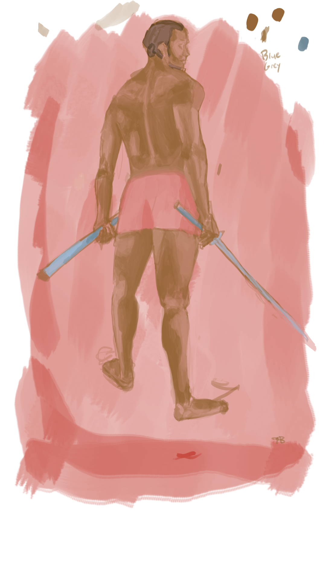
Arthil posted:Yes Colon's stuff is a little odd, but to be perfectly honest you were the only one who seemed to be outright offended or weirded out by the material. This has been quoted twice now, and is simply not true. I was also creeped out by the combination of a big-eyed childlike cutesy faces on mechas that otherwise impersonated grown-up anatomy, but I said nothing. I couldn't quite articulate why it was bothering me. I didn't mind the quadboob, though I did think "this would've been so easy to artistically censor with some conveniently placed hair flowing down the tits" when I saw it. Here is some digital arts to confirm my validity as a digital artist, I am totes allowed an opinion on the subject. 
|
 #
¿
Jun 20, 2015 17:08
#
¿
Jun 20, 2015 17:08
|
|


|

|
| # ¿ Apr 28, 2024 05:06 |
|
|
loga mira posted:Did you pay for that drawing, why are you thinking of ways to censor it? I'm honestly not sure why I thought that, but that's what popped into my mind as the first thing. Maybe because that's what I'd have done in this case? Overall, the picture has lovely colors and a breezy, carefree feel to it, and I did not feel that the nipples add anything to that, but artistically covering them would make the picture more "accessible" to groups other than the people who want to see nips on their goddesses. Maybe it would also give her a more regal feel, having just that bit of exposition toned down? Maybe I'm secretly a prude.  But that's what I thought, unfiltered. But that's what I thought, unfiltered.
|
|
#
¿
Jun 20, 2015 18:00
|
|
|
Turtlicious posted:As a new artist, I can't see anything wrong with them, could you point out the problem? I'm assuming you're talking about the Flower Girl, not frog / fairy / buff dude? If you ever feel like there's something off with your picture, but you can't quite put your finger on what, or you know there's something wrong, but you don't know HOW it's wrong, or if like now, someone points out a problem you can't see, try mirroring the pic or just changing the angle of it by turning it sideways. Drinking game: do this with your artist friends and drink every time you cringe or mutter "how the gently caress did I mess that up"
|
|
#
¿
Feb 18, 2017 01:21
|
|
|
Avshalom posted:i'm a big titty deathbot and i'll gently caress you up. pastels at dawn bitch Challenge accepted  I'm a huge big titty deathbot AND I'm a strong female amputee. I shoot pastels outta my titties.
|
|
#
¿
Mar 25, 2017 16:13
|
|
|
Avshalom posted:! OH YEAH? In that case, take a look at my next DEADLIER, TITTIER robo... wait, what? ... Aw. I had my next sexbot all ready to fight and ideas for so many titbots just waiting to be drawn.
|
|
#
¿
Mar 26, 2017 19:14
|
|
|
Ok so I'm not an expert, but here's what I'd do:  This is all just minor tweaks. There's nothing wrong with having a long torso, but with her arm pulling back, the breast would end up higher. I'd turn the 3/4 face away from the viewer a bit more, because ouch neckpain. In both of your pictures the shoulders are narrow and bunched up high like under tension, just let them relax a bit. I also brought her elbow down a bit and added a some meat to her back where the shoulderblade is, the angle there is a bit steep.
|
|
#
¿
Apr 27, 2017 00:23
|
|

|
Elsa posted:
Inspired by these posing photos, I tried to check and even I over-estimated how much face you'd actually see from this angle, so it turns out yeah that's too much. Try looking over your shoulder at the mirror. Side note tho - as painful for the back as that D.va shot looks like, it's not impossible if you've got a flexible back. Think on those circus performers who can form a circle backwards with their body.
|
|
#
¿
Apr 27, 2017 22:19
|
|

|
Elsa posted:
Ok out of curiosity I wanted to have a stab at this, so this is really quick and rough and not much better, but here's my effort:  I felt the uncanny valley, and part of it was her teeth didn't quite line up with the perspective - they would've been jutting outwards. Her hair and ear give the impression that she's bowing her head slightly, but the face is rendered straight-on, which sorta makes her features not line up with the outline of the face. The reason the smile looked faked is that you've got bedroom eyes on, which is a completely different mood, and the outline of her upper lip pulls down just that bit at the end. There's still something nagging me about it, but that's as far as I can articulate it.
|
|
#
¿
Apr 29, 2017 22:30
|
|

|
Nude posted:This was my reference pic. The biggest art crime here is that you made his butt flat. I also think you could afford to go loads darker with your darkest colour and lighter with the highlights. Don't be afraid of overdoing it when you're building the basis of your drawing, because you'll be going over it and fixing things when you start really defining the pic. You can also use the dropper tool to pick colours from your reference pic in a pinch or to check if you're on the right track. I love the colour scheme and the lighting here but I'm sorry to say the hands are kinda jacked up. You've got the remnants of a sixth finger haunting the pinky on the right hand, and the knuckles would not line up on the on the left hand.
|
|
#
¿
Apr 30, 2017 13:51
|
|

|
OmanyteJackson posted:
It feels a bit stiff, since the upper body is mostly in profile, but then you've got the sudden hip turn on the lower body, which the line of the back branching out to a tail doesn't support. We'd need to see a bit more back on the left side to even it out. In terms of movement, the upper body seems to be dashing forwards while the lower body seems to be leaping backward. I don't know if anyone else would notice this, but there's the slightly bent arm, which would make aiming and drawing the bow really difficult. When drawing a bow, you gotta keep your arm straight, more on that below... Elsa posted:profile angles are good for working out proportions without worrying about perspective, but I'd take this and do a 3/4 with the design like you did with the samurai dragonborn. I'd definitely turn the bow somehow to get a harder arc out of it. Here are some ideas, xoxo So these are all more dynamic poses, and real cool, but this is not how you aim a bow. The arrow gets pulled to the side of the eye, so you can see where the shot's gonna go. Usually only two fingers keep hold of the arrow and pull on the string. The bow-holding arm extends forward, while the drawing hand pulls the other arm way back, basically making your shoulders in line with your shot. Not having your arms in line will give you a massive bruise on your bow-holding hand, ask me how I know. For a final nitpick, a well arched bendy bow might look cool drawn but would be real poo poo at its job.
|
|
#
¿
May 3, 2017 23:44
|
|


|
Diabetes Forecast posted:It's weird you act like the body of my work somehow defines who i am as a person. you don't know me. To be fair, for a lot of people their art is personal, and often reflects what kind of people they are. This being the art thread, the only thing we see and know of you is what you post, and drat if that isn't a lot of robo titties.
|
|
#
¿
May 11, 2017 00:05
|
|
|
I'm happy you posted this 'cause I didn't wanna be the first to admit that I had NO GODDAMN CLUE what the grid before was supposed to do. Now I get it. ")
|
|
#
¿
May 13, 2017 00:23
|
|

|
deathbot posted:I'm working on that 'draw a mermaid for May' challenge floating around, albeit with a sea slug (they're cuter) but after doing the base of the slug half.. I realized the human half was awful and erased it. Now I don't know how to position the new human torso to look natural and relaxed. Ideas? If you're doing this the way I think you are, you're attempting to re-draw from the bottom up, since your slug-bit is already solid in your mind? People are super difficult for me to draw from bottom up and always end up wonky, what you do is you draw the new human sketch starting with the head like you normally would, all nice and floppy, but you keep it away from the slug bit. Once you're happy with your torso pose, you move the sketch over the slug and rotate to adjust if needed, or you can just add a bit more slug to cover up.
|
|
#
¿
May 13, 2017 11:11
|
|
|
a hole-y ghost posted:e: wait is "draw a mermaid for may" like, a thing? I may have to get on that at some point There's a thing for everything. This one's called Mermay. See also: inktober, dinovember etc.
|
|
#
¿
May 13, 2017 23:26
|
|

|
Med School posted:
So hey you might benefit from looking at some photo reference - or life drawing - when learning how to do colour, because currently your light sources are inconsistent on the body and aside from the highlights, don't seem to affect the underlying colours much.
|
|
#
¿
May 14, 2017 00:37
|
|
|
Diabetes Forecast posted:I'm trying to understand what you're saying here but i don't quite get it. Diabetes Forecast posted:please explain to me, an idiot. gmc9987 posted:Your inability to understand why we view your postings of innocent big-boobed robots as connected to the sexually explicit big-boobed robots you posted is what creeps people out and makes them assume you are a socially inept creepy person. Diabetes Forecast posted:You really, really gotta get in that last word don't you? 
|
|
#
¿
May 14, 2017 22:35
|
|
|
a hole-y ghost posted:When diving or jumping, think of the body like a spring(e.g. a Slinky) You forgot something super important when considering poses, so here, I fixed this for you: 
|
|
#
¿
May 15, 2017 23:28
|
|
|
I recently got a Huion 1060 plus and it's so good I wanna marry it. It was affordable at around 100bux with shipping, and has a big nice draw area. I can now do linework without the stabilizer 'cause there's hardly any wonk to the lines. There's 12 customizable buttons and the pen's light and feels good in my hand.
|
|
#
¿
May 17, 2017 20:58
|
|
|
Nijinsky Hind posted:
You might wanna work on connecting your lines - you're leaving forms open when defining edges don't quite meet, which gives the pic a bit of a hazy, airy feel. That's fine for stuff like hair and feathers and as a stylistic choice for background or undefined stuff, but I think here you'd want a more solid feel. For example, the corner of the cape, point of the boot and just under the elbow are wide open with only the colour connecting them. Also try to pull your lines in one quick swoop, so you don't end up with mid-point flyaway ends, like on the cheek. Control-z is your friend here, just pull a quick line and if it doesn't work out, ctrl-z and repeat until you got what you want. Since there's no variance in line width, I take it you're not working with a tablet? Sociopastry posted:yeah, no worries! It's legitimately my favorite art program and I'm waiting eagerly for the day that my tablet is supported again. I know this was a while back, but check out Artweaver, it's another free art program and my absolute favourite, and maybe there's a chance your tablet would work with it? Sharpest Crayon fucked around with this message at 00:00 on May 19, 2017 |
|
#
¿
May 18, 2017 23:50
|
|

|
deathbot posted:Well it's a lot busier now we're all just talking about poo poo Ghost already pointed out following the shape of the head, but I'd like to add that here you should also pull back on the hairline. For very short, almost bald head you might only want to put down a couple of dots or very short lines here and there to represent stubble. For longer stubble it's ok to do short lines to define the hairline, and a sort of a "fuzzy" uneven outline at the top. I put together some ways I've done short hair, if it helps: 
|
|
#
¿
May 20, 2017 22:34
|
|

|
the_lion posted:
This pic is big, do you zoom in to work on each part? That can cause you to lose sight of the whole, and to draw some parts too big/tall and some too small/short if you do it before you got a solid sketch. For instance, the hands seem a tad big, and I think the face would feel more comfortable shifted closer to the middle of the body. Sociopastry posted:This is pretty good, but the neck is quite wide and the hips are a little off, though I can't place why. It's the abruptness of the hips, that's the kind of bikini short that sits at the very bottom of the hip, but it's placed where normal underwear goes. No-one asked me to but here I am, doing a sloppy paintover to show the difference that shifting stuff around just a bit can give you.  The arms are too short now but 
|
|
#
¿
Jun 3, 2017 17:17
|
|

|
Superimposition posted:Been trying to get into art/drawing, any crit would be super appreciated. I'm gonna start with the base advice just we can get it out of the way: draw with reference forever and ever. Even if you want to go for a cartoony style, knowing and understanding shapes, forms and anatomy will help your designs! Now that we're over that, it seems like you wanna draw for fun so I just blorted a bunch of technique help all over you drawing:  Any advice from here on out would depend on what direction you want to take your art; for cartoon stuff I'd recommend pushing the unreal further, play with the proportions and shapes of human form as well as the colour palette. A good exercise to try would be to draw A Thing from reference, then simplyfying that drawing, and then simplyfying that to learn how to strip away layers of reality while maintaining the essence of The Thing. For a more realistic look, adding shading - either in the lineart or the colour or both - is the next step in addition to anatomy and backgrounds. Getting rid of lineart is the Extreme Mode. Basically you'd have to ask for advice on how to improve specific things, since I didn't even touch stuff like basic composition or character design or colour theory or any of the goddamn billion things you can think of when you do art. Edited to add: if you can't make heads or tails of what's going on in the pic, feel free to ask for clarification.
|
|
#
¿
Jun 10, 2017 16:38
|
|
|
Sociopastry posted:When I first started drawing, I tried to do anime without knowing how anatomy worked and it really showed. I never quite understood that I needed to study anatomy/"serious" art stuff if I was just drawing cartoons, but it's incredibly important. This was me as well btw. I was too kewl for skewl and I hated painting fruit and did not get Many Things about why reference and anatomy are important. In an effort to make you feel better about your not-so-fresh art, here's a sampling of my not-so-finest moments:  It's not digital but it's there to show that I was stuck in MORE SHOW BOOBS = MORE BETTER hell for a decade as well. I wonder how many artists are? At least here the nips are semi-covered. Dem legs tho. Most of my characters did just this: they stand there and look at you. So dynamic and interesting. At least your first tiddy girl is actively doing something. Hell, Superimposition's pic has better narrative and action. This is something I keep forgetting among other things, that having a character do something or hold something is so important with character designs because of the story that can be read from them.  Starting out digital I couldn't do lineart and all of it is lumpy and uneven with no proper edge anywhere, made worse by the colouring having no hard edge either. That frill is the worst though, it doesn't know if it's coming or going.  Trying for adorable, but shooting straight into the uncanny valley. Also present: lumpy shading on what should be a furry texture using only black as a shading colour because that's how you do shadow right?  (hint: no it isn't, it looks like poo poo and always will, just choose a darker shade of the same colour or use blue or purple or pretty much anything except pure black) This is me now, the first one was the product of days of work and I was super proud. The second one I made in an hour and a half and could use another half but I wasn't feeling it and I've learned to let go of drawings that I'm not getting into.  I'm not gonna post anything else current because I'm already busy spamming the daily doodles thread erry day.
|
|
#
¿
Jun 10, 2017 21:01
|
|
|
a hole-y ghost posted:
Oh my god  this is the best goddamn thing, you should definitely do the "draw this again" thing to this. this is the best goddamn thing, you should definitely do the "draw this again" thing to this.
|
|
#
¿
Jun 13, 2017 22:18
|
|

|
Oh hey putting text on image counts as digital art, right?
|
|
#
¿
Jun 17, 2017 00:03
|
|
|
d3c0y2 posted:Also I really would be interested in learning to draw more traditional digital art, with the clean lines and strong ink-style colours - but I've absolutely no idea were to start as it's so far outside my comfort zone! DID SOMEONE SAY CLEAN LINES?!!   Ok ok, so here's a bit of a breakdown on this; I used your pic to show how I'd start doing linework on it, it's a bit of a mess of different types of shading because I wanted to showcase several things. Crosshatching is the biggest single thing you need to learn to define shadows, though. If you want to colour, it's actually ok to do all the shading and crosshatching in a colour darker than your base colour. The other option if you're colouring is only only doing the basic linework and let the defining be done by colour, in which case it's important to look at what you're going to define and what you're gonna leave out. They say every line on a face adds a year, and what you spend time detailing affects how it "reads" to the audience. Perception is weird, a lot of attention on lips on a male character makes them look feminine, as will round smooth lines on the face. Deciding whether you want to really flesh out a part of a drawing or just plop down a couple of lines to leave the impression that something's there guides the eyes along the picture; places with loads of detail and hard contrast are the ones that will draw the attention of the viewer. We're also naturally drawn to seek out faces. It's easy to make a picture too "crowded" by doing perfect tiny detail on every area. Ideally you'd thicken your linework in spots where shadows fall and leave them thin where there's light, but specifically here I just managed to give the guy anime eyes 'cause I wanted to showcase his eyelashes. We're very good at "reading" faces so you don't necessarily need a lot of detail to define the shapes of the face, small lines here and there can do a lot. Below the two is on the left a good show of how flat and lifeless a picture is if there's no colour or variation in line width. On the right showing that even if you add mostly just solid blocks of black without any lineshading following forms, it still looks more dynamic and interesting than the right. Remember to use layers to your advantage! Sketch on one layer, outlines on another, shading on a third one, backgrounds on a fourth. Not sure if something is gonna work or not? Add a layer. If you want to colour, add a layer between sketch and linework. Hell, add three for dark/midtone/highlight. The best goddamn part about digital work is that you don't need to be careful about edges when doing a background or colouring, you can just erase what goes over. No more awkward careful edges between background and object. If there's any specifics or you don't get whatever's in the pic, just ask. Edited to add because I forgot: This is how I work  The stigma against using reference, I think, is partially because of how easy it is to draw on top of a pic with digital, because that's "cheating". I mean nevermind that drawing straight on top of something means you end with those wikihow horrors of unlife that no-one would call art. Traced linework never looks good, and tracing someone else's art and calling it your own IS lovely. You also learn less if you trace, though it can be an education in what things you don't want to actually draw out in a pic. Again, like wikihow illustrations. Here's the ref pic with god save the queen that I did yesterday. 
Sharpest Crayon fucked around with this message at 14:58 on Jun 17, 2017 |
|
#
¿
Jun 17, 2017 14:31
|
|
|
OmanyteJackson posted:So I'm finishing up an old piece. Working on the background now but I'm not too confident about the colors. Any suggestions? On top of what Neonnoodle said, I'd go for more cool tones in the background. The whole picture is very warm and although you've got a bit of blue-fade to the background, the grey rubble "reads" as a yellowish tone to me, and so does the purple of the background. All this brings the background "closer" to the foreground. I'd try straight up adding a semi-opaque layer of cold light blue on top of the entire background and see where that gets you. Or go super-dark, whatever works.
|
|
#
¿
Aug 8, 2017 23:09
|
|

|
Jake Snake posted:
I commend you on your taste in games and can't help noticing that went with the paler, Blood Omen 2 kind of look for the skin and the face (I approve). Having said that, all the surfaces sorta read the same. There's not much variation in texture or lighting between the skin, the metal and the cloth underneath. I'd leave the cloth and skin as they are, but make the light hitting the metal torso bits a lot harder. Don't smoothe it all out, let there be harsh edged highlights on it to show a bit of polish, like you've got on the edge details. I'm refraining from writing an essay on how much I loved the entire series and why it needs to continue, like, right now.
|
|
#
¿
Aug 12, 2017 18:51
|
|

|
The quality of the paper (or cloth if you're getting it printed on canvas - there's real canvas and plastic, with differing textures), the quality of the print, the final size and how many prints you're gonna take, whether she signs them or not are all things you should consider when pricing the pieces. I hope this will be a smaller print rather than larger - it looks great as a small pic with the way the lighting is balanced, but some details are a bit rough when you look close up. I'd bring out the subtle colourfade to dark in the background out a bit more, personally. If asked to nitpick, I'd mention that the mouth is not quite in the right perspective, it's facing the viewer more than the jawline and hairline suggest, and the smaller eye should come up juuuuust a tad. Ask her to flip the image horizontally if she has trouble seeing these. I'd also either blend away the sketchy lines or outline them stronger and more confident, especially in the ear and the hand (and the hand does need more work anyway, like Socio said), they seem wispy and uncertain, which works great in the hair and eyebrow, but less so where they're supposed to define the whole form. I also like the colourchanges on the skin - they're blended so delicately.
|
|
#
¿
Aug 16, 2017 23:46
|
|

|
I highly approve of uniborzoi, the best fluffy ponydog  The first one is A+ would gently caress me up at night if I saw it
|
|
#
¿
Aug 26, 2017 20:13
|
|

|
BJPaskoff posted:What's everyone using for drawing here? I'm using Artweaver. It's free, it's easy to use and there's a good set of brushes and options to tweak them for many different kinds of art. I'm stuck using the ink brushes on it until the day I die, I just love them. You can pay 30 bux to get the pro version if you like, there's a couple of extra things with it. The biggest thing I have to say for it though is this : I have never, ever, not even once lost a piece I was working on to a crash. I've had the program crash several times, but even if you can't save what you were working on, the program remembers what you were doing and asks you if you want it restored when you restart it from a hard crash.
|
|
#
¿
Sep 6, 2017 00:07
|
|
|
I rarely post any of my work in this thread, since I've been focusing my efforts on making finished pieces. Used to be a habit that I'd just have one million sketches and maybe finish one every now and then and I decided that needed to change. This has led to pretty much all my work belonging more in the "dailies" thread, since I finish 99% of my pics in one sitting, and I never felt like spamming this thread on top of the daily one. That's why I'd never get any "progress" pics either, but the universe has conspired to make me draw Kain so here we go:  From sketch to ink to flats (I went medium>dark/light instead of dark>light/medium like I've been doing lately) to "yeah I guess there's a background too, oh poo poo look at dem pillars fall"
|
|
#
¿
Oct 9, 2017 00:40
|
|
|
I doodled some pointers for this:  Just to go over: the backbone is super bent in the sketch, and you'd get much more backfat behind it ( I wasn't completely certain if that was supposed to be the backbone or rather just the outline of the back). Even considering cartoon proportions, the arms look really short. I redid the wire frame to lengthen the arms and fix the position of the leg - the pelvis would not allow the right leg to bend to the back and side as it was. As small notes, while cartoon tits have nice curved undersides, they tend to have nothing supporting them, like the gut supports the moobs. It is their plateau, and they flop to its shape. I wasn't certain if you left out extra lumps for ease of animating, but the gut will look heavier if you let it hang over the legs - not just jutting forward. I could've hung it down a lot further, now that I think about it. Considering the style, I would personally not let the opportunity to add a comic lil' donger go to waste here. Just throwing that out there.
|
|
#
¿
Oct 10, 2017 23:29
|
|

|
On a scale of 1-million how much of a pain was doing the guitar so far? Like I'm not saying that I'd personally rather gnaw off my own arm than draw even a part of a guitar again, but I'd defo chew off a couple of fingers.
|
|
#
¿
Oct 14, 2017 00:15
|
|

|
a hole-y ghost posted:I'm not sure what the guitar did to you but it's okay now, we've got you Every time I attempt to draw a guitar, I enter a dimension where they exist in a quantum state where they are both the object I am seeing AND the object I know a guitar is in my brain. So I'm drawing and the brain's yelling "NOOO YOU KNOW IT'S SHAPED LIKE A SAMMICH" and the eyes are like "yeah, but perspective, see? and also it's interacting with stuff" and the brain goes "DO IT CURVIER THO" and before you know it, you've got an object that's vaguely off-shape and somehow both being held and floating in space. It's the same problem everyone has the first time they draw a plate or a tophat. I feel like there should be a name for this.
|
|
#
¿
Oct 14, 2017 15:44
|
|
|
a hole-y ghost posted:Why Is It So God Damned Hard To Make Human Hands Look Like Human Hands And Not Deformed Spiders With Tetanus And why is it that whenever I WANT creepy Spiders With Tetanus-hands, I end up with lumpy turds? Lumpy turd problem sounds so unscientific tho, I'm gonna call it curvelumpus faecalitis. Also I may be doing a thing but sssshhhh I don't dare set foot in the comics thread yet. 
|
|
#
¿
Oct 15, 2017 16:57
|
|
|
Yeah, it's like haven't you ever seen a bird before? Like check out this completely normal bird I drew seven years ago (have I posted this before?):  I hope this helps you recognize a bird the next time.
|
|
#
¿
Nov 19, 2017 22:04
|
|
|
coolusername posted:
Your knowledge of christmassy things is equally impressive. Dark scenery like this is also a very nice nod to the depressive scandinavian christmas!
|
|
#
¿
Dec 3, 2017 01:09
|
|

|
a hole-y ghost posted:something I just made for the GBS Original Character DO NOT STEAL thread�some of y'all should join in, it will be fun Challenge accepted.
|
|
#
¿
Dec 3, 2017 23:12
|
|

|

|
| # ¿ Apr 28, 2024 05:06 |
|
|
I would cut out a bit off the top and the left side (see where the last snowflake is on the left bottom? there's a visible "extra" slice with no snowflakes that you can take out) to center the composition on the flower more, maybe add the tiniest slice of background to the right so the leaf is not quite so close to the edge. If you've got a printer where you can give the paper a bit of a nudge, try printing on nice thick (270g/300g) watercolour paper or even paper meant for oils. It's really a wonder how much more a good, textured paper can add to digital work. If you're getting it printed somewhere, get it done on a canvas (or their version of canvas-like plastic whateveritis they use). And yes that's good enough to give as a gift, even aside the fact that you spent a lot of time thinking about her and making something specifically for her, which is like the gold currency of giftgiving.
|
|
#
¿
Dec 6, 2017 06:59
|
|
